Tuesday, June 27, 2006

A Very Big Brag

Back in April, I shared with you a small brag - a quilt that had won a blue ribbon at a local quilt show. It was a small brag, not because there wasn't much competition, but more because this show does not draw the truly fabulous top names that a show like Houston or AQS does.

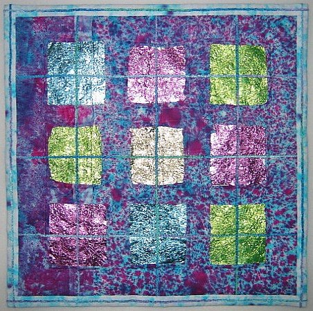
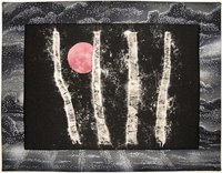
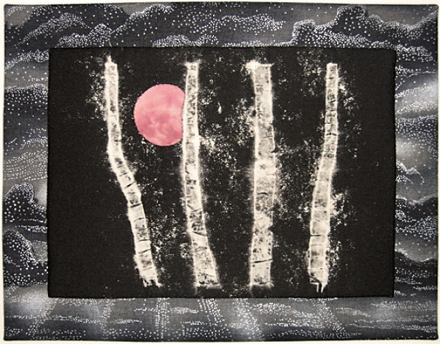
But now I feel I have reason to truly brag. Some of you already know this but for those who haven't heard, one of the quilts I entered in the Small Works II juried show was accepted! Ok, calm down, I thought. Yes, this is a big deal to you, but you have no idea how many entries were considered and how many were ultimately chosen. Then I found out: 275 total entries, 28 spots. This was definitely the affirmation I needed. I have always felt "June! June! Strawberry Moon" was a strong piece, and indicative of the direction I want to go with my work. I'm so glad I made the effort to get it finished out and entry sent off in time.

Ah, but fame does not come without a price! Now I need to submit not only an artist statement, but a bio, a resume and a high resolution jpg. Ok, I admit there was a moment of panic. I haven't even put the sleeve and label on this yet. The artist statement has been knocking around in my head for awhile so that's no big deal. I have several versions of a bio on file, but it hadn't been updated for 2 years, and my how my emphasis has changed since the last revision. Well, that really is good practice to think about who you are, where you've been and where you're going, so I spent an afternoon soul searching and tweaking. I found it a bit unnerving to see my most recent incarnation in print - may have to live up to it after all!

The real panic was over that resume. At first I was thinking I'd have to start from scratch and just what did they expect included?. I'd studied Lisa Call's website when she revamped it not long ago and was impressed with the way she presented all that personal and professional information, so went back to it to review. Ah, I realized I in fact do have the beginnings of a resume...I just never thought to call it that. So sometime in the next few weeks, I'll be spiffying up my professional packet.

I wish I could go see the exhibit, attend the opening reception, experience what it is like to have work hung in a gallery, but alas, all my travel dollars are tied up in my very quickly approaching house hunting trip to Idaho. If any of you are in the area in August (Small Works II is being held in conjunction with Lowell Quilt Festival), please go view my little work and let me know how it stands up to the competition!
Ayer Lofts Art Gallery
172 MIDDLE STREET LOWELL, MASSACHUSETTS 01852
A CO-OPERATIVE ART GALLERY
TELEPHONE : 978 970-3556


Sorry for the quiet...


It's not that I haven't been doing anything, but for some reason, I just haven't had the oomph to post anything lately. Guess I've been too busy catching up on e-mails, making travel plans and the like. I felt myself losing a bit of sanity so decided I had to get back to my old routine of studio time in the a.m., and regular life stuff in the afternoon. It really did make me feel better, and as I laid out Irish Eyes for basting, I actually felt like I was working again, even though this step is that part of the process I refer to as grunt work. Sometimes grunt work is ok. I felt so competent (unlike how I sometimes feel during the design process), have done this so many times that it just happens without a lot of thought.

Then it was time to quilt. I banished any guilt about stitching in the ditch with monofilament thread, loaded the CD player with "Yes" discs, and stitched away. It really did make me realize how pressured I've felt to free-motion quilt with decorative thread, even though I often prefer this more utilitarian and supportive style of quilting. There are pieces where I want the quilting to be more in your face, but I guess the pendulum has swung so far that direction in the quilting world, I felt obligated to keep up or be left behind. Frankly, I see many quilts now where the quilting really is the main emphasis and I don't like the way it takes over the design. Call this my little rebellion and a retreat into my comfort zone. Walking foot users unite!

I'm down to quilting shamrocks in the square-on-points. If you click on the picture for a larger view, you can see that I quilted the Cathedral Window arcs in the border using a (gasp!) colored cotton thread. That's an Oliver Twist hand-dyed 50 weight thread in just the right green, not so heavy as to overtake the quilt, and I'm using it on the shamrocks too, although my retiring self was tempted to put the monofilament thread back in. I should be able to finish the quilting tomorrow, and with any luck, have it bound and ready to send off to its new home by week's end.

Tuesday, June 20, 2006
Oh, My!


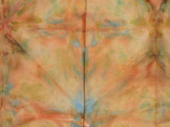
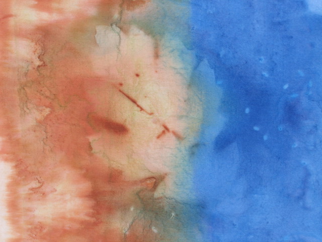
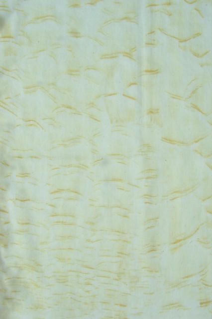
I was not being totally honest when I alluded to the fact I'd used up all the mixed and diluted paint from my paint play sessions. I actually had quite a bit of the brown and a smidgen of blue which sat on the bathroom counter teasing me. After about a week of getting irritated with the cart that was very much in my way but not moved back out into the hall because I was delaying putting everything away until I did something about that paint, I dug out the last piece of muslin, accordian-folded it, then did the triangle fold thing. Squirted the brown directly from the bottle along the edges and between the folds, squeezing the wetted fabric to help the paint disperse and spraying it with more water. Then I did the same with the blue, only this time running it along the inner folds and then squiggling it here and there until no more white showed and all the paint was gone. And since this was Setacolor paint, I couldn't resist setting it outside in the sun. That undoubtedly accounts for the really dark areas along one side.

The hardest part for me on this sort of process, be it with the paint or with immersion dyeing, is the wait until you can unfold the fabric and see what has happened. I waited until the next day, and then - my oh my! This is the sort of thing that makes my heart race, but then leaves me stumped as to what to do with it. I love this color, the way it shaded, the geometric design caused by the folding. And look what I found peeking out at me. Actually, there were two. The other looked more like a wolf face, but this one reminded me of a smiley face. There are other sections that one could construe as mask faces. This turned out very cool. Click on either picture for a larger view.


Saturday, June 17, 2006

The Last of Irish Eyes for a bit


No one chimed in with suggestions regarding my border dilemma, so I told my lazy bones to suck it up and add that narrow border before the wider one. I think I intrinsically knew that's what it needed, and now that it's done, I'm glad I made the extra effort.

Actually, I make many of my design decisions based on the amount of fabric on hand. In this case, I tried to get out of the narrow white border by checking to see if there was enough left of the white for the backing. Nope, a bit shy. But plenty to add 1-1/2 inch borders to float that busy center design. Dang, foiled again!

Now to contemplate quilting designs. Shamrocks for sure will be included - one in each square on point. Lots of stitching in the ditch, a trademark of mine. It's that outer border that has me a bit stumped. But at 4 inches rather than 6, I feel a little less intimidated. Maybe I can incorporate some Celtic designs.

Thursday, June 15, 2006

More Irish Eyes

Blame it on the dog. She is such a task master.

I hadn't planned to sew today. The morning was earmarked for running errands, the afternoon for computer time. But animals are slaves to routine, just as people are. When Jesse and I headed upstairs after lunch, she did what she usually does - stood in front of the studio door waiting for me to open it and get to work. Sometimes I'll do that even if I'm not planning to work in there just to get her off my back. (Her stares and sighs can make me feel so guilty.) She flops down in what little floor space there is and I go about my business across the hall in the bedroom set aside as an office. Depending on her mood, she may join me sooner or later (her couch is in the office). Today I thought, well, I need to take an updated picture of Irish Eyes for the blog, so in we went. Picture taken, I paused at the door and said, "You think I should sew, don't you? Well, maybe I should - just a little." As in, I'll just sew some of the blocks into a few rows. But just like my painting experiments, once I get going, I just can't stop. An hour and a half later, rows were all sewn into a top ready for borders and Jesse hung in there with me nearly the whole time. Eventually, she opts for the softer couch over the hard floor, but I must put out positive vibes when sewing that she picks up on and enjoys. She never seems happy with me when I'm on the computer.


Anyway, here are all my blocks arranged on the design wall before sewing them together. I made the remaining twelve 3 x 6 "sashing" units yesterday, another day that needed the calming diversion of repetitious sewing to keep me from having an anxiety attack over my impending move. (I'd finally bought my tickets for the house-hunting trip next month which moved this whole project from a "maybe it'll happen" fantasy to a more scary "I'm really going through with it" reality.) Once I'd arranged them around the outside, I was a bit disappointed. I'd gone from an interesting design with movement (click here for picture of that stage) to just a busy design. There was a momentary urge to replace them with white rectangles, but then what would I do with those pieced units? I'm really adverse to creating more bits and pieces needing a home and negating the effort of the day. Considering that this quilt is going straight to a friend's six year old, rationality won out and I will just make a note to myself to eliminate that outer round of pieced sashing should I make this design again.

You'll note there's a narrow strip of the blue fabric along the left side of the quilt. I'm trying to decide about borders. I'll use that fabric for sure, but at what width? One of my mock-ups included a 1-1/2 inch border of the green from the 4-patches, then a 4 inch blue border. Of course, I don't have any more of that fabric, but I could use white. But I'm really not motivated to do a double border. I just want to get this done and gone. So should a single border be 4" or 6"? I think I have plenty of fabric for either, but the 6" width feels intimidating when I think how I might fill it with quilting. Any opinions out there?

Margaret commented, "It must be a sheer pleasure working on this one!" In many ways, yes. I so enjoy working with batiks and hand dyes like the ones incorporated here. But I note that there's a certain uneasiness lurking as well. I've pinned it down to the white background. I don't use white much in my quilts, and as I thought about those that I have, I remember that same uneasiness when making them. You'd think fresh and clean would be a good thing, that dark and drab would be depressing. It seems to work the opposite with me. Maybe it's my black dog or the fact that I'm not overly meticulous with keeping up on housework. White you have to be so careful with in terms of keeping it clean. Every flaw and dog hair shows up glaringly. Any errant bleeding of fabric (or me!) is immediately apparent. White is unforgiving. Working with too much white makes me nervous and it's hard to relax. It's no wonder so many dark quilts were made in the 1800's. I can sense how anxious I am to be done with this so I can go back to mixing my batiks and hand dyes with non-white fabrics!

Sunday, June 11, 2006

Progress on Irish Eyes

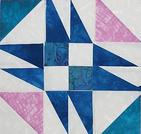
I was waiting for a phone call today, and since I don't have a separate line for my internet, that meant staying off the computer for awhile. So I started sewing the foundation-pieced sections of Irish Eyes. These 3 x 6 inch units are like stretched flying geese and act a bit like sashings between the 6 inch blocks. I got half of them done and arranged so you can see how the design is building. I'm quite pleased with the way the colors are working together.

As I mentioned in the previous post, rather than using one block as the original pattern prescribed, I looked at the finished top and broke it into units that made more sense to me in terms of ease of construction and elimination of unnecessary seams. The picture to the left is cropped to show what the original block pattern was. It made little sense to me to have those white areas butt up to each other when they could be a single piece of fabric. I also thought of the nightmare piecing where those points would meet and the bulk it would create. This, I think, will piece together much more smoothly, especially since the seams in the 4-patches and 1/2 square triangle units have been pressed open.

Friday, June 09, 2006

Fullness of LIfe


"The fullness of life does not come from the things outside us; we ourselves must create the beauty in which we live."
C. E. Cowman


I've been staring at this quotation for several months, knowing it is true, yet finding it hard to believe that a little outside beauty wouldn't make it easier. As in the accompanying picture that I've also been staring at for awhile on my computer screen, one I took last year on my jaunt out to the Pacific Northwest. This is Pend Orielle Lake, the place I want to move to, the geographic location that I want to believe will help me find fullness of life. Note, I say "help me find' not make it happen. How could I not feel better looking at this every day? Well, I wouldn't exactly be looking at this view, but I'd be very close.

This has been a frustrating week on the moving front, enough so that I found myself in the studio yesterday with a real need to work on something, anything. It felt as much an escape from the current reality as a rebellion against putting so much on hold. For no particular reason, I decided to pull out the pattern and fabric set aside for Irish Eyes (a belated gift for a friend's daughter). I wasn't happy with the greens I had available at the time I first pulled fabric for this and now they looked even less appropriate. But I've added a lot more fabric to my stash since then, so surely I'd have a better choice now. I also needed to find a border fabric, and with the Lone Star all pieced, a hunk of blue hand-dyed fabric is now freed up for other projects - this one! In the course of auditioning fabrics, I changed my mind about a number of things, and am now only using two of the fabrics I originally chose. And that is a good thing.

Although the idea for this quilt started with a pattern from a magazine, I've changed the breakdown of the units totally, eliminating unnecessary seams. Rather than using the same block set block to block, I'm working with two main blocks, some four-patches and a 3 x 6 paper pieced unit. That paper piecing is what I have left to do after today's session.


This is another brighter quilt done in pastels mostly - pinks and blues and greens on a white background, not what I usually think I work with. I'm slipping in batiks and hand-dyes which makes it feel a bit more of a creative endeavor. I think it will be a very pleasant, albeit fairly traditional, quilt when it is done. And one more project I can cross off my lengthy list.

Tuesday, June 06, 2006

A Day at the Races

I had a fabulous weekend with my friend at the Road America motorcycle races, in spite of the fact that the buff hunky racers were being kept under wraps. This trio of umbrella girls, though, were strutting around the grounds giving the guys quite an eyeful, putting up with their hooting and whistling and graciously posing for the cameras. I didn't realize I'd cut off their feet - those boots had 3" or higher stiletto heels! They were the antithesis of everything else going on there that day.

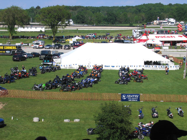
Road America is a beautiful facility - acres of rolling hills, grass and trees amidst which a 4 mile road racing track winds. It's spectacular for the riders and spectacular for the spectators. I wish I knew the attendance on that day - looking out over the infield we could see hundreds of bikes parked - every conceivable type of bike along with every conceivable type of rider was represented. Fans enjoyed seats in bleachers and along grassy slopes alike.


One of the draws of Road America is its policy of allowing all spectators access to the paddock - you can get within feet of the bikes and the riders. So we walked back and forth, up and down, looking for those hunky racers. But we arrived during the lunch break and it took sharp eyes to spot the racers returning on scooters from their motorhomes to the pit area. And I wasn't fast enough with the camera to catch them - barely fast enough to point them out to my friend. Pit crews though were in abundance.


And of course, the bikes were being readied in full view. Here is the defending champion's bike, but where is he?


Eventually, the riders had to come out, but then they either sat with their backs to us, put on their helmets, or were so surrounded by crew that it was hard to get a shot. I spotted a former race champion chatting with a young up and comer and got my first hunky racer shot. That's Dave Sadowski, and trust me, he's better looking in person than he is on TV. Don't know the rider he's talking to, but I'm sure he was giving him much encouragement and a bit of advice.


Then my friend pointed out this racer and said, He's good looking - take a picture of him. Yes, he is. That's Geof May, who after a stellar year as a privateer, finally got picked up by a factory team. Very young though for this old gal.


Finally, I spot the defending champion - Mat Mladin. He's from Australia, like many of the racers in this series. Also like many of the racers, he's married with children, very serious about his job and an all around nice guy. Sigh... And very hard to catch on camera. Luckily I set my camera for a huge picture and could crop out the junk and lighten up the image. I was able to point out other racers to my friend, but if you want to check out their good looks, you'll have to follow the links: Ben Spies, Ben Bostrom, Aaron Yates, Neil Hodgson are all right up their in the looks department. Neil is from the Isle of Man, and the series has also drawn racers from Venezuela, Ireland, England and Italy.

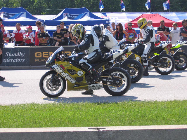
Well, enough looking - time to get racing! Here's the three riders for Jordan Motorsports Team. Yes, that's THE Jordan, as in Michael Jordon. He took an interest in a young black rider from Chicago and before he knew it, he was hooked on the motorcycle racing scene. He now has his own team which is finishing just outside the top 10 in most races. I heard that the same team that designed his sneakers are now designing the paint job and leathers for his team. No one else is running these kinds of colors.


The roar when these bikes take off is really something and they reach speeds near 200 mph. There's poetry in the way they swoop and dance around the track and each other. Racing is clean today and no one gets hurt, the weather is perfect and the venue inspiring. But eventually, we must join the rest of the crowd making their way out after the last race and head back to our motel room. While we weren't planning this to be a quilting weekend, apparently the motel saw us coming. Once settled in, I plopped on the bed and saw this. Just can't escape!!!


Ok, you can all stop laughing now. I'll get back to the "creative journey" soon. In fact, when I pulled up this picture of my friend and I in the paddock, I noticed the reflection in the sunglasses and thought, "I should be able to do something with that..." Well, maybe there is a quilt in this weekend.


Thursday, June 01, 2006

Off to the Races

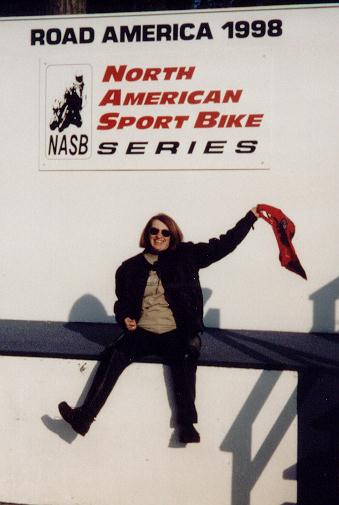
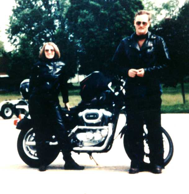
Tomorrow I head to the other side of the state for a weekend with a friend. Now usually when we get together, it is to sew or attend a quilt show or, when we were still in business, vend. No doubt we will talk some about our quilting and I'll be taking along my painted fabrics, but the primary reason we are getting together is to spend a day at Road America watching AMA Motorcycle Roadracing. My friend has had to put up with my enthusiasm about this sport, so I decided it was about time she experienced it for herself. I've attended races at Road America at least 3 times and wanted to go once more before leaving the Midwest. If this seems a little out of character, well it's not. I'd ridden two-up with my husband most of our married lives and loved it. The interest in racing can be blamed on same husband who agreed to include in our first motorcycle vacation several days at the NQA quilt show in Grand Rapids Michigan if an equal number of days were spent at the races in Brainard, MN. It wasn't long until I was hooked, and I continue to follow both the American series and the world series via television broadcasts. Here we are on that first trip.

There is the question of why I'd attend the races if I can watch them on TV. U.S. tracks aren't generally designed to see more than a few corners of the racetrack from any given vantage point, weather can be iffy, and concession prices are through the roof. Why not just stay home and watch it all from the air-conditioned comfort of my living room?

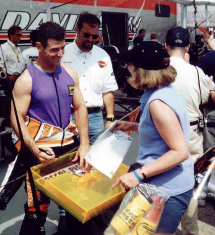
This is why. That's me getting an autograph from the Canadian racer Pascal Picotte when he rode for Harley Davidson. Look at those biceps. Look at that buff body. And he's one of the older racers. Yes, these riders are incredibly buff - have to be to wrestle those machines around a racetrack at ridiculous speeds and lean angles. So we're going primarily to walk the pits and ogle the racers. At our age, no one would take us seriously; it's just harmless fun. As my friend's husband says, If you aren't lookin', you ain't breathin'.

And the racing's pretty awesome too. Seeing the bikes up close, hearing how loud they are, getting a real sense for the speed, mingling with the other fans - it's just a different experience that enhances my enjoyment of the broadcasts. It's not unlike the difference between listening to a musical recording and attending a live concert, or looking at art in a catalog and seeing it for real in a gallery. There's nothing like the live experience!

And no, there's not a quilt in this. ;->

Wednesday, May 31, 2006

Just...Can't...Stop! Even more paint play

Really, I thought I was done for awhile, meant to put everything back on my cart and roll it out of the extra bathroom for awhile. Maybe if I hadn't read on Marion's blog that she likes to use up what paints she's mixed even if she's supposedly done painting for the day, I wouldn't have given in to my own tendency to want to do the same. Just a little of that teal, a bit more of the blue and quite a bit of the brown begged to be used up, and how could I resist on such a warm, dry and windless day?

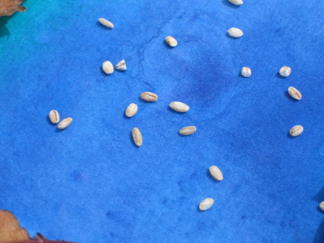
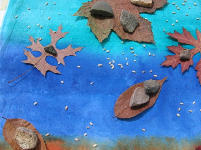
This time I covered my board with freezer paper to ensure a smooth surface. I had a plan - to lay the paint on thickly in bands, arrange a variety of my dried leaves on top and sprinkle the remaining surface with table salt and barley. Out in the sun it went. I could already see some interesting blending and diffusion going on. (Clicking on any picture will give you a larger version.)


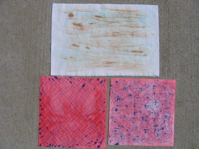
While I was waiting for it to dry, I decided I could clean up my brushes - the chip brush that spread the teal, the mop brush that spread the blue, and a foam roller brush that spread the brown. I've had that roller for awhile but was hesitant to use it, but no better time than now to see how it worked. My, I really liked it too! Anyway, I'd brought a small piece of white muslin down just in case I was inspired to do something else, so decided to see how much paint was still on that chip brush. Not much but it did leave some fine streaks on the cloth. I figured there probably was quite a bit of the brown in that roller foam, so rolled that next. The paint had collected in the end so I pushed really hard while rolling to get it out. More nice streaks. This could easily be a landscape background - more sandy beaches perhaps.


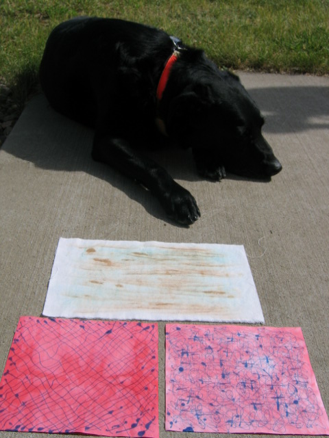
I wiped the remainder of anything on the brushes on my wipe cloth and dipped it in the rinse water and thought I was done. But no - not all of the blue had come out of its bottle, and I had a couple of squares of hand-dyed fabric on the cart plus some tips for that bottle...Oh why not? So I scribbled and drew wavy intersecting lines just for fun. As you can see, it took me a bit to figure out to keep moving or else I'd get a blot of paint. I can see that a thicker paint would be better for this technique.


This time I really did quit, and went to retrieve my sunprint. Oh, this turned out much better - except that the large leaf in the middle didn't print sharply. Many spots on this are nice, if I look closely I can see the effect of the salt in places and I like the shapes left by the barley. Two successful, fun sessions in a row? Can it be???


Monday, May 29, 2006

Painting again


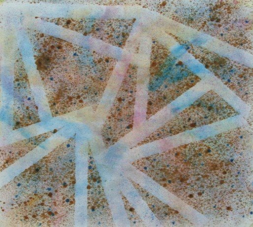
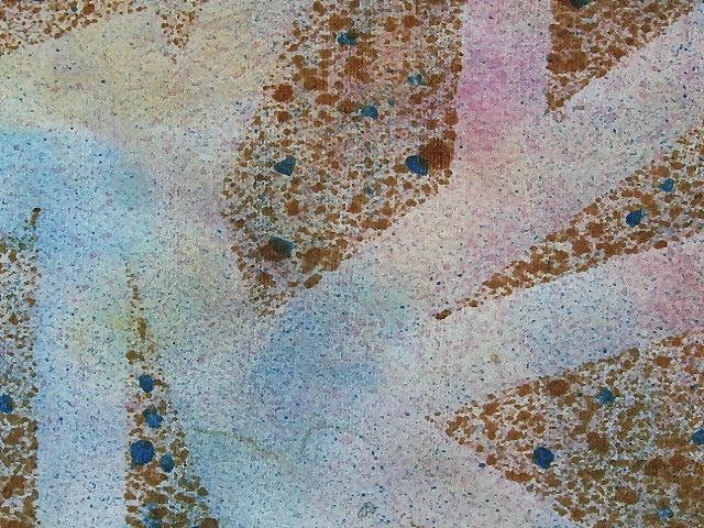
I may be near the end of this round of experimentation. Here you see the 3rd and last go round of the spiraling arcs fabric. I've added some cobalt blue with a little red mixed in it and also some red that was highly diluted. I was looking for a way to add more spots and blend the lighter areas a bit so tried different ways of spattering or sponging on a test cloth. Nothing was working. I finally took a dowel, dipped the end in the paint and used that to make larger dots around the darker areas. Then I spied the toothbrush I'd used to clean my shells; I'd totally ignored the most obvious and basic way of adding a fine spray of paint, a method learned in gradeschool, and all because I'd fixated on using spray bottles. I dipped the brush in the paint, stroked a plastic knife over the bristles and was amazed at how fine the droplets were and how easy they were to control. So I covered the entire piece with a spraying of the blue, then did the same with the red. I think it toned things down enough that I can use it, although the light areas are still a bit more of a contrast than I wanted. Enough with this one! Here's a close-up.

I also did more painting over that packing material, this time with dry unbleached muslin and a 1 inch flat brush. The first time I tried this, I'd stroked the brush back and forth. This time the fabric didn't stay in place, probably because it wasn't damp, so I ended up stroking away from me while I held on to the end. That worked very well to give me the crisp lines of texture that I wanted. I was going for a rippled sand effect and I think I got it. Not sure if the picture reads this way, but the fabric has a very "golden" look to it.

So more learned, more accomplished, more fabric ready to find its way into a quilt.

Sunday, May 28, 2006

Design Opportunities


Quilters who might otherwise despair when they make a mistake, or run out of fabric or something just doesn't go right on their quilt are encouraged to see it as a design opportunity. A little like making lemonade out of lemons. But it is often those unexpected "problems" that force us to think past the obvious and sometimes lead to a much better work in the end. Such may be the case with the quilt here - "Easter in America" (which is 15 inches square).

In my goals for this week, I wanted to finish sewing down the binding and needed to do something about the problem that cropped up - a shadowing through of the darker fabric of the top which made a distinct line down the middle of the binding. I considered couching on more of the chenille but decided instead I had the perfect beads that would actually pull some sparkle out into the binding. I hadn't been convinced that my choice of 1/2 inch binding in the light fabric was the best idea, so adding the beads offered a chance to improve that. I was working on turning the problems into a design opportunity.

Today turned out to be a day when sitting and hand sewing really appealed, so I finished sewing down the binding and got out the beads - purple and gold and green bugle beads. I sewed 8 or ten on and stepped back to admire the effect...and could see it wasn't right at all. The beads came across too dark, forming a very hard line that did not look as good as I thought it would. No real sparkle either - very strange. Not one to give up easily, I rifled through my beads and found a lighter bunch of seed beads. They looked nice scattered along the binding, so I started by sewing them in a line, but slightly apart, but again, It was too dark and not a pleasing look. So I tried sewing them scattered. Not only was this going to take a long time, it wasn't going to camouflage the shadowing problem very well and I didn't really like the look anyway. Well, so much for the "perfect" beads.

I gave the chenille another chance and could immediately see that this was going to work. Rather than machine couch it down, I couched it on by hand using monofiliment thread which allowed it to float on the bind. I left tails at either end of each side to be pulled around to the back and glued in place. I'm very pleased with the way this makes that wide light binding a more integral part of the piece. Let's here it for design opportunities!

Saturday, May 27, 2006

More Pondering


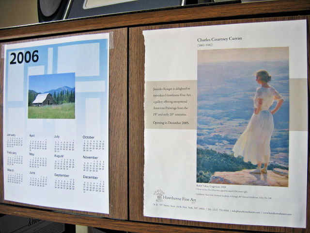
I've put up another picture to remind me of where I want to be in a few month's time. This painting by Charles Courtney Curran looks so much like a view near my chosen relocation spot that it took my breath away. I want to be that woman in the painting. I used to climb to such vantage points when I was young and there is nothing like it.

When I began my paint session on Thursday, I was riding euphoria brought on by the previous day's events. I'd successfully taken a major step towards my relocation goal, one I'd been dreading and putting off for many reasons. The next step is equally daunting but hinged on the results of this first one. I'd had a chance to share my experience, thoughts, fears, strategies with a friend, a venting which allowed me this momentary freedom from obsessive non-productive worry. Thursday was glorious with a sense of calm and confidence, efficiency and motivation. I couldn't help but wonder if this state of mind was a major player in the way I felt while working with the paints, for the lack of furrowed brow and for the general satisfaction with the session. Was I in an unsettled and worried state of mind on the days the painting did not go well?

The euphoria was short-lived. By Friday I was worrying again about the logistics of the move, putting off taking the next step. Don't want to know, don't want to know... As my mood deteriorated, so too did my positive feelings about the outcome of Thursday's painting session. This is stupid, I told myself. Nothing about the painted fabric has changed between yesterday and today. The only thing that has changed is how I'm feeling about myself.

Many artists, quilters, crafters comment that working in their medium can calm and uplift them, distract them from the worries and woes of the world, provide an escape from the inescapable realities of life. I've felt this myself. But now I am wondering if much of our success or failure can be attributed to our state of mind on any given day, if there are times when our craft does not overcome or distract us from that which is consuming our thoughts. Do those worries instead turn all we try to do into one more way to shake our confidence in ourselves?

I suppose a medical professional would diagnose me as manic-depressive and put me on something to even things out. Frankly, I treasure my highs enough that I'm willing to put up with the occasional lows. I'm convinced that without them, I would not have the revelations that I do, nor appreciate those highs when they come. In the low times, I remind myself that life is a series of peaks and valleys. How long you stay in the valley is somewhat up to you. The climb to the peak is always worth the effort. The view can take you away, bring peace, inspire, fortify and sustain you on the trip back down.

Another Paint Session & Ponderings


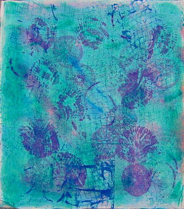
Here's before & after pictures showing the latest reworking of the blue/pink painted, then stamped fabric. Don't ask me why overpainting it with this green makes me feel better, but it does. Maybe it's because it got rid of light areas so the shells don't contrast as much. Maybe it's because this green is that teal green I'm so fond of. Whatever the reason, I'm done messing with this one. It no doubt will be cut up and incorporated into something else so I'm not going to worry about an overall balanced look anymore.

Thursday is when I did this, spent the morning mixing paints and reworking several of those pieces from the first painting experiment. While I combined paint colors to come up with more options and mapped out in my head what I wanted to try with which piece, I realized I was feeling more relaxed than my last session. I was pretty frustrated after that one (and after the first one too), but this time I had the distinct sense that I was getting somewhat comfortable with this process. Mmm, wondered if I'd just needed more time to familiarize myself with the tools and materials or if there was more in play here.

I decided that was partly it, but that also I'd gone into the session with quite a different mindset than on the previous occasions. I had not consulted my books or notes to set in my mind a particular look or technique. I had no preconceived ideas about what I wanted the outcome to be. I simply went at it with the idea of, let's try this and see what happens. It allowed real learning, both of the technical side and what tools, colors and effects appealed to me. It removed the inner critic for the moment so I could assess the effect not in terms of my skill or lack of it, but on less personal criteria. It provided that element of surprise I so enjoyed from my dyeing days. In the other sessions, I had said to myself, let's try this because it will give me this effect. And when it didn't, I was naturally disappointed.

So on piece one, I used the Setacolor Transparent Emerald Green because it looked to have a bluish tint to it. I broke out of my mind lock about what I could mix paints in and dug out some artichoke jars - small but wide-mouthed with tight fitting lid. Brushed it on with a 2" chip brush (would have used a larger one but the 2 inch fit perfectly into the jar opening) and immediately liked using it better than the wide foam brush. I concentrated more on controlling the amount of paint on the brush and the pressure while stroking to minimize obvious globs of paint. And I was delighted by the color - whether or not it looked good on this. Emerald Green is definitely a color I will keep in stock.

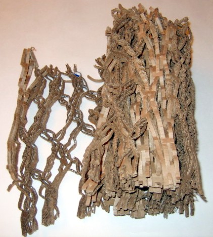
On to piece two. This packing material has been sitting on my kitchen table for some time. I'd noticed this slit corrugated cardboard being used in shipments from Amazon and eventually it dawned on me that it might make an interesting pattern to paint over. I pulled it apart and laid two sections of it on the work surface and covered it with one of the orchid tints. I used a spray bottle to dampen the fabric with water, then used a 1" mop brush to paint more of that luscious Emerald Green over it. Oooh - I not only loved the design that surfaced, but loved working with that mop brush.

This pattern suggested several things to me. First, I saw hills, then clouds, then ripples in sand. I think I'll take a piece of unbleached muslin and paint over it with brown to get that look of beach sand. After this dried, the green wasn't as dark and I'm not sure putting it over the orchid was the best combination - it seemed to change the color and bring out an orange undertone. It was the dickens to get a picture of it and I also messed around in Corel Paint Shop Pro trying to adjust the colors.

Now it was time to "improve" the piece with the spiraling arcs. I ironed some freezer paper scraps to it to act as a resist, hoping to form straight lines and angles. I poured a brown I'd concocted into a small spray bottle which formerly held eyeglasses cleaner. I didn't dampen the fabric at all because of the freezer paper, just started spraying. The bottle did not produce as fine of a spray as I'd anticipated. I tried different distances but it didn't help much - for my purposes, this is too heavy handed a look. So I'll look for a different nozzle with a finer spray if I do this again. Here it is before and after the freezer paper was removed.


When I removed the freezer paper, the brown looked too much like something one doesn't mention in polite company. Mother's with babies will know what I'm talking about, I'm sure. Also, the contrast between the spayed and resisted areas was a bit more than I intended. So this piece will get one more remake - perhaps spattering or sponging some dark blue over the entire piece. I've even hit upon an idea of how to use it as a background, so I am motivated to take the next step. I have to admit that part of the problem with experimenting with dyeing, printing, and otherwise making your own fabric is figuring out how it will be used.

This was going so well that I decided to try one last thing. I took another of the tints - that light blue one that was so pale you could hardly tell it had any color in it at all - and dampened it, then loosely bunched and rubber banded random areas front and back. Then I used the mop brush to apply Emerald green and a foam brush to apply cobalt blue mixed with some red. Again, it was pretty random, done to both front and back with varying pressure so some paint was lightly applied and heavier in other areas. Finally I spritzed the whole thing front and back with water to be sure the paints ran and diffused a bit.

The piece was finally dry enough today for me to take the bands off and spread it out. I couldn't wait to iron it, so these pictures still show the wrinkles in the fabric. Also, the pictures have a cast & darkness to them that I couldn't get rid of. The background remember is that light blue and since I used quite a bit of the Emerald green, the overall feel of the piece is more green. Anyway, I thought, this is more like it! I very much liked this effect. In the close-ups you can see how that mix of cobalt blue and red diffused much like a dye would. Because I worked from both sides of the fabric, each side has its own slightly different thing going on. This use of paints makes sense to me and I'm sure I will do more of it. It also makes me want to use that cobalt mix with salt.


Above is one side and then a closeup. Below is the other side and its closeup.


The session ended on such a positive note that I was motivated to tackle some of the mess in my studio that afternoon - one item on my list of goals for the week. I reworked my documentation form and printed off a bunch of them and even got a couple of them filled out. Also printed off some pictures for files and tech journal, so I am feeling pretty good about the week's work.