Showing posts with label June's Challenge. Show all posts

Saturday, January 21, 2017

Focus

Willow Leaves II - Sheila Mahanke Barnes 2007
Brace yourself - this is a long one. I had several lightbulb moments last year. I find these can be one of two kinds, either an "aha!" moment when a bit of information or visual input helps all the other pieces fall into place such that I finally understand what ever it is I've been struggling with, or the head-slap "duh!" one when I realize the information was right in front of me the whole time, and I can't believe I did not see this before.

The one I'm sharing today is of the later. I was reading yet another blog post about the basics of good design when it hit. The author stated that even abstract art needs a focal point, maybe several, be it a shape, a color, something. But of course (head-slap). And how many times have I read that same advice about creating a focal point? Numerous, to be sure.

As the lightbulb glowed, I realized this answered two questions I'd been struggling with for years: 1. What is it about so many art quilts that leave me cold and unimpressed as I view what looks like whatever was on the floor tossed on a background and stitched down, or a dozen clever techniques combined with little rhyme or reason? 2. What is it about several of my own quilts that leaves me uneasy and unsatisfied? The answer to both being, NO FOCAL POINT. 

In the case of my own problematic quilts, I realized that without focal point, what I had created was not so much a piece of art as a pleasing piece of wallpaper. And sure enough, when I went searching for that post mentioned above, I discovered that someone had already made this connection and blogged about it back in 2015 - Elizabeth Barton - who gives excellent advice on how to avoid the wallpaper look. I'm sure I read it when first posted but didn't make the connection to my own pieces. My years as a traditional quilter may be partly to blame. It's rare that a bed quilt really needs a focal point, although medallion-style designs create one by virtue of a centered main motif surrounded by one or more borders. Things that might fall into the category of decorative art also might not need a focal point - think wearable art, hand-bags and totes, padfolios and fabric bowls, placemats and tablerunners. Again, they might have a focal point but it isn't necessary to their visual appeal. But if it is going up on the wall as a piece of art, whether representational or abstract, it will really benefit from having a focal point.

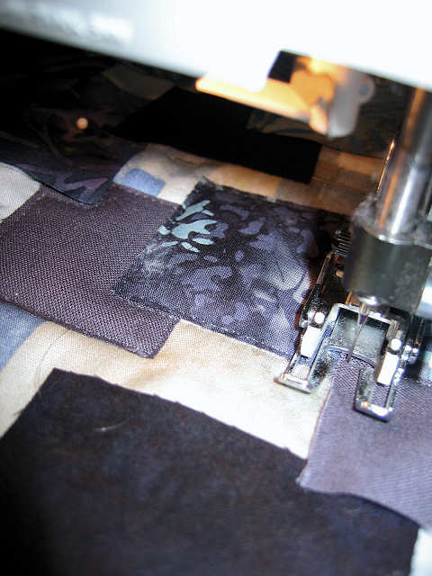
Willow Leaves I - 2005
I think I've been more concerned with other aspects when creating my more abstract pieces, primarily balance. Years ago I worked on an idea inspired by willow leaves scattered on the pavement after a rain. I'm fuzzy on the details of this first one but I'm pretty sure I marked leaf placements on the background before freemotion embroidering them. I know I spent a lot of time and angst on arrangement to avoid repeats in angles, then equal time in color placement. The leaves certainly do look scattered, but I don't think you can say there's a focal point. This piece did sell, and I was glad to see it go because I was never fully happy with my composition. My second try seen at the beginning of this post, came out better I think, and I do really like this version, done by using actual willow leaves to stamp the image onto the background with acrylic paint. Still, I've always viewed it with furrowed brow, sensing something was lacking. Oh yes, a focal point.

Bishop's Close Meditations 2009
Here's my other piece that always bugged me. I was attempting to do an abstract of a painting of Bishop's Close in Portland OR by June Underwood. We had challenged each other to create original works that then would be the inspiration to the other for a second piece. I was so dissatisfied with this piece that I did a second, more representational piece to counter my disappointment. You can read about both of the quilts and find links to the challenge here and here. I don't know if anything could have saved this piece, but if nothing else, I think if I'd grouped together smaller versions of the "meditations" floating upward, I could have created a focal point to make it more interesting and less wall-papery.

So really, abstract art isn't easy to design. Wassily Kandinsky said, "Of all the arts, abstract painting is the most difficult. It demands that you know how to draw well, that you have a heightened sensitivity for composition and for color, and that you be a true poet. This last is essential." David Hockney goes farther: "All painting, no matter what you are painting, is abstract in that it's got to be organized." In other words, as Sara Genn continued in an e-newsletter in 2014, "Balance, vibration, weighting, form and eye control, mastery of colour, areas of visual excitement and areas of paucity, grey to rest the eye and gradations: These design elements, when intuitively understood, can create a stand-alone magic. In abstraction, this intuition gets your work into the "best" pile." Oh, my poor Meditations quilt is so lacking in these!    

I more recently ran across a link that sent me to this: 5 Art Lessons from Bauhaus Master Paul Klee. Although the following quotation doesn't reference focus per se, it does once again, reinforce that abstract art isn't anything goes, but needs thought and observation from the real world. 
When Klee hosted classes in his home, he often required that students spend time observing the tropical fish in his large aquarium. The artist would turn the lights on and off, coaxing the fish to swim and hide, while encouraging students to carefully take note of their activity.

For those who know Klee as the “father of abstract art,” this lesson may seem surprising. However, Klee was deeply concerned with creating movement in his compositions. And he asserted that all artworks—even the most abstract—should be inspired by nature. “Follow the ways of natural creation, the becoming, the functioning of forms,” he taught his students. “Then perhaps starting from nature you will achieve formations of your own, and one day you may even become like nature yourself and start creating.”
I love this idea of learning how to create movement in a design by observing nature. If nothing else it validates all the time I spend taking photos and looking closely and sketching the natural world around me. This also reminds me of something Picasso said along the lines of you have to know what something looks like and can draw a realistic version before you can draw an abstract version of it. Whether that thing becomes your focal point or not, your composition best include one (or more) somewhere.

Azalea Mosaic 3 - In The Garden - Sheila Mahanke Barnes 2009
As I've written this post, I've taken a look through my quilt files to remind me of my abstract efforts. I have many that I think work fairly well, partly based on whether my initial reaction when the photo pops up is one of cringe or unease, or relaxed and smiling. I've tried then to take the ones that please me the most and see how they stand up to the design criteria mentioned throughout this post. I think my most successful are from my Azalea Mosaics series (1: still in progress; 2: Garden Path; 3: In The Garden; 4: Broken Promises - below; 5: Slippery Slope). I love how each turned out, but especially "In The Garden" and "Broken Promises". It was intuitive work which doesn't always end well for me, but with each one, I felt like I knew where I was going and when I'd arrived. I'd love to capture that again, maybe in my long dreamed of water series, and avoid making just wallpaper!

Broken Promises - Sheila Mahanke Barnes 2009


Tuesday, July 27, 2010

Three.....two......one......

Spring Runoff - Little Rogue
12" x 16" Art Quilt Framed
Sheila Mahanke Barnes 2010

Done! This was my last day to finish this if I wanted it in the "Art Aquatic" Exhibit at the Power House. (This is in conjunction with Pend Orielle Arts Council ArtWalk II). I beaded until I was sick of adding more, then went back to couching more decorative thread to highlight a few more areas and called it done. (Click on the picture for a larger version to see the detail.) I was so sure I did not want to put it in a black gallery frame, so spent some time last night and this morning auditioning fabric for binding, carefully cut and sewed it on, turned it to the back and pinned it for hand stitching, then turned it over for a look. Well, THAT'S not going to work. Although the color brought out the green organza in the water, it simply didn't have enough presence to balance the design. Maybe if it were wider? But no, I still felt it was all wrong. So I got out a frame, and sure enough, that is what it needed.


Time for lunch and a think. I didn't want to remove the binding, so I did something that may come back to bite me. With time growing short, I simply took the Plexiglas that comes with the frame, centered it on the back side of the quilt and pulled the binding around it, using buttonhole thread to lace it in place. Lucky me that I'd placed the stitching line for the binding at the 12 x 16 mark, same as the frame, rather than using the 12 x 16 dimension as the guide for lining up the raw edge. Otherwise, the binding would have shown on the front.


You may have forgotten, but this quilt is my response to June's April Challenge, the Little Rogue painting above. June and I have taken a hiatus, our lives presenting challenges that we decided were not conducive to sticking to our creative timetable. I might still be staring and avoiding this piece were it not for the exhibit deadline. I'd promised myself not to overwork my idea. Wait, that was, not over-think it, but I may have done both. I vaguely remember it starting out well, but along the way it became a struggle and a fight. I'm not sure who won this one. As for June, she is painting again, and I await her response to my April challenge.

If you are interested in the progression of this piece, here are links to the relevant posts:

2010/05/next-assignment
2010/05/challenge-preview
2010/05/continuing-with-challenge
2010/06/glacial-progress
2010/07/glint-of-inspiration
2010/07/lest-you-think-I've-been-goofing-off
2010/07/beading-commences

Tuesday, July 20, 2010

Beading Commences


I only wish this white sheer looked this white in real life. But the beads are helping to define it and the flow of water.

Sunday, July 11, 2010

Lest you think I've been goofing off...


Well, maybe a little. How can I not linger outside now that summer has finally arrived? Fortunately, the Little Rogue piece is at the hand stitching stage, and I've enjoyed extended afternoons on the porch working on it. Progress is slow but enjoyable as I hand-couch the braid into place. This is a bit of a meditative process, with little pre-planning at to where the braid will go. I let my fingers be led by childhood memory of how rivers flow and eddy, widen out and race through narrows.

Tuesday, July 06, 2010

Glint of Inspiration


Maybe it was the pep talk in yesterday's post. Maybe it actually was a ghostly presence nudging me along. Whatever it was, I seized on a little inspiration yesterday and moved forward on the Little Rogue piece. Sometimes it's just a matter of cutting into the fabric, knowing that even if it is precious (and the price of silk organza certainly makes it so in my book), the solution will never present itself until you do. I sketched a few lines on paper first, slid it under the organza and chalked the guide onto it, then free-hand cut with a rotary cutter to get that biggest piece in the middle. The rest were additional free-hand cuts following the original one, by guess and by gosh. I immediately liked where this was going.


So after cutting and arranging and pinning and arranging some more, I decided I had enough pieces down to start stitching. This is the part that's been hanging me up, but by now I'd discarded my worries that the stitching might show too much or compress the top in ways I didn't want. I was not going to get the feel of water flowing over rocks if I didn't attach it some way. It was a day to throw caution to the wind - how unlike me. I even did the monofilament thread zigzagging with the feeddogs down, not something I'm vary comfortable doing. Shayla (the artsy one of my multiple sewing personalities) had come back to take control. I'd been wondering about that perle cotton twisted with a metallic thread, and now that I had some of the organza sewn down, I think this will work well to complete the look I'm going for. My apologies that it is out of focus in the picture.

Between the first cuts and stitching of the final arrangement, something else happened. I've been going through the bookbinding books and am so intrigued by the simple ones that can be quickly constructed by multiple folds and some cuts. Esther K. Smith's book, How to Make Books, suggests recycling copy paper printed on one side to try out some of these configurations and quickly make little books that could even be sent to someone in the same way we buy greeting cards to cheer someone's day. I had a draft printout on plain paper of some of my quilts and it was calling to me to become a little book. Because of its light printing, I figured I could easily write text over the images and add doodles. The cropping of the images might drive what I added.


Here is the paper opened up and showing the slit in the center that allows it to configure into the little booklet. I could choose which part ended up as cover and started adding text.


My quilts were all turned on their sides which made it easier to forget what they were supposed to represent and deal only with the shapes in each small section. I've shot this section so you can see that the areas I filled in with zentangle-like markings as they presented themselves horizontally are actually trees from my Emily Carr Skies quilt.


I could sense that with where my thoughts were yesterday, this might be therapeutic. Still, I was a little surprised at where it led me. I know many artists do a quick warm-up before diving into their "real" project for the day, often in paper or fabric collage, but I've never been compelled to give those methods a try. But this felt like it could be my answer to a creative warm-up. The recycling nature of it appeals as well. And the result of pausing to do this before continuing with the day's work was another sticky-note admonition for the studio and my life: "Lose the fear." Ok, fine. And I moved on more confidently to that free motion stitching of the organza.

Thursday, June 10, 2010

Glacial progress


I'm making some headway, slow forward movement, incremental progress, getting a handle on one design while being flummoxed by the other. But at least I'm in there. This is my final arrangement of the pieces over the painted Misty Fuse ironed to the background. And here is where I'm flummoxed. I have a vague notion of a quilting strategy, got out a bunch of threads to audition.


I feel it needs punching up and thought to get out my Joen Wolfrom 3-in-1 Color Tool to see what the color wheel thought I should do. I'm liking the idea of adding some green, and a brighter, almost red fuchsia. And now that I'm not focusing on the Little Rogue challenge piece, I keep gravitating back to it. I've been testing fusibles, sealants and glues on the organza and a poly sheer of some kind...


...because I'm ditching the idea of manipulating a fabric into folds and leaning towards undulating strips of organza. The problem now is how to attach them. That poly sheer (which I like so much better than the tulle) frays like crazy, and the organza will too if the cut gets too close to true. How much stitching do I want to show, to create a hard line, to mash things down? How can I allow the organza to float, and not float away? If I can seal the edges, I think a few well placed beads might be the answer.

Thursday, May 27, 2010

Continuing with the Challenge


In working with June's challenge painting of the Little Rogue River, I promised myself I would not over-think or overwork it. One look at it and I could easily tap my own memories of time spent along similar rivers. What June captures is the dark undertones of water flowing over boulders, mostly blues shading towards black, but also a hint of dark green - mountain streams flow over beds of great variety, and sun and shadow play a part too. Spring run-off adds frothy white to the mix. I decided I wanted to continue working with the collage idea I played with in my challenge to June, breaking out of the neat and tidy arrangement and doing more overlapping of the shapes. I felt this would work well to portray an abstraction of the rocks mountain streams tumble over and around. To keep the shapes more irregular, I put a fresh blade in my rotary cutter and, from the fabrics I'd settled on during the auditioning process, cut random strips and squares freehand. I refrained from too much arranging and rearranging, reminding myself that some of this would be covered up later.


I let it sit overnight, and after viewing it fresh the next morning, decided no changes were necessary. This time I planned to attach the pieces by stitching close to the edge of each with monofilament thread - no fusible. I held the pieces in place with dots of glue-baste under each corner, then layered with batting and backing so that the machine appliqueing process would also be the quilting process. I don't usually use straight pins to hold the layers together, but with this small piece and the type of stitching I'd be doing, it seemed the simplest approach. My walking foot worked really well for the quilting process.


I wanted a lot of dimensionality so that my shapes would portray the feeling of boulders. Hobbs wool batting provided the loft I was looking for. I added quilting in the areas near the edge, following the shapes in the background print.


And then it sat for several days while I pondered the technical side of the next step: how to give the effect of the rushing water. Today I took the plunge and played with squares of white and blue tulle. Tulle does not photograph well, so it is hard to see what is going on here, but basically, I started pressing in creases and overlaps in each color tulle, then layered the blue over the white, folding some of the white over the edge of the blue. Tulle is springy so pins were necessary to keep things in place.


Once I placed it over my quilted background, I manipulated it some more, trying to get more of the look of a flowing river. But it looked blah to me.


Enter a piece of green silk organza placed behind the tulle (it's difficult to discern but the area above the tulle bundle that looks tan is that organza). It's mimicking that dark green water of June's painting and peeking through here and there creating more depth and interest.


But I'm not sure. I think I need to cut away some of the organza in the center. I need to add stitch to hold the bundle together and accentuate the sense of flowing water, but I don't know with what thread, or whether by hand or machine. I auditioned some threads including an embellishing thread from an Oliver Twist hand-dyed thread pack, then wondered if couching that thread directly on the background might be the better choice. Is the tulle addition too heavy, not abstract enough? The background doesn't show through as much as I'd anticipated. It has no luminosity, the netting giving a fuzzy effect not at all like water. Time to walk away and mull some more.

Friday, May 21, 2010

Challenge preview


I worked on my response to June's Little Rogue River challenge today. Last week I was digging out this fabric to make a sleeve for "Lights of Las Vegas" and thought it would make a good background for what I had in mind. The design and colors echo the theme I plan to pursue. I hate the term "serendipity" but that's what it was. I've pinned my paper window to it so I know exactly the size of the space I'll be working within.


The inevitable auditioning of fabrics - you can just see my print-out of June's painting on the upper left. Some of this got cut up and arranged.


And speculation about incorporating tulle or the silk organza I bought in Portland. I have an idea, but am not sure I can pull it off effectively. Mulling for now and will tackle it more tomorrow.

Thursday, May 06, 2010

"Lights of Las Vegas" Revisited


Hang out with people who stretch you, make you doubt yourself, hold you to a higher standard than you hold yourself, are kinder on you than you are on yourself, that can remind you of your brilliance and your blind spots. Find these people and invite them along to play.

I have several friends who match the qualities in the above quotation. June Underwood and Judi Kane who I visited last month are two of them. It is why I took along the finished but not finished challenge piece from February to show them. Something about putting it in a black frame like the rest of the challenge pieces didn't sit right with me. I auditioned different fabrics in different colors with the idea of binding it. I stumbled across a fabric that's been in my stash since near the beginning of starting a quilting stash and thought it met all the criteria I'd failed to find in other fabrics I'd tried. I was quite excited about it and eager to show June especially, but Judi too. I took it with the idea of getting their approval and sewing on the binding that weekend.

June immediately warned me off doing it. She gave compelling reasons, I countered with what I hoped were just as compelling reasons. June did not back off. Judi did not necessarily side with either of us but came up with her own take. I was confused, deflated, but value these two friends' opinions enough to say, "Well, I see your point. I'm going to have to think about this some more."

The next day at Judi's house, as we settled in to sew, I got it out and thought about what June had said. Judi wanted to know why I was letting June's opinion sway me. She asked specific questions, why was I resisting this option or that. Those questions helped me get to the bottom of my confusion. I let June's opinion "sway" me because I value it. It comes from more years of creating art than I have under my belt. It comes from advanced art classes, and reading, and critique groups. It is based in solid information more than on opinion, although it is difficult for any of us to divorce our opinion from unbiased analysis. I could understand her reasoning and had to decided whether to follow up on it or trust my instincts and follow my desires. I admitted to resisting the various options presented because I was tired of going a certain direction, wanted this piece to be finished differently. Not stuck in a black frame. Not bound in black (may as well just stick it in the frame then). But maybe this fabric wasn't the best choice. Maybe it was too busy. Judi helpfully pulled some fabrics from her own stash so I could see how a different color, one I said wasn't in my stash, would work. I could understand her reasoning, too. I could feel my resolve crumbling.

The experience of "inviting these two friends along to play" left me conflicted; this was not the right time to make the final decision. I folded up "Lights of Las Vegas" and worked on something else. Have let it sit on my work table since getting home. Have only briefly opened it up to contemplate it, quickly folding it up again, unwilling to face the decision. Until today. Time to quit avoiding it and make a bold move. Time to cut that fabric I was so excited about into binding strips, sew it on and see how it really reads on the quilt. Yes, I am stubborn once I get an idea in my head.

This is totally reversible, and I've just pinned it around to the back. Before I tell you my reaction, I'm curious about what you think. Come along and play. Does this edge finish add or detract from the quilt? If this were your quilt, how would you finish the edge? You can click on the pictures for a larger view. My apologies for the uneven lighting - the top is a little bit in shadow.


Tuesday, May 04, 2010

Next Assignment


June has sent along a painting of the Little Rogue River as my inspiration for our April Challenge. As usual, I ooh,and ahhed over it, and allowed my good feelings about it to block any thought of how I could creatively work with it. Oh, I had a few thoughts about white arcs and beading, but basically thought I'd better not look at it too much right now. Don't need to start on it right away, and I've been focused on getting my computer cleaned up and functioning properly again. Having succeeded there, I delved into catching up on my blog reading. Lo and behold, the right side of my brain got to work while I was distracted. A couple of things bubbled to the surface, and I knew I'd better jot them down before they disappeared into the recesses of my muddled brain. A couple of blog entries gave me ideas. More jotting. Gosh, I think I could dive right in on it now!

I've been working on straightening the studio as well as straightening out my computer. Frankly, it had become an undesirable place to walk into - fabric stacked on the floor, on the table, working space on that table reduced to mat size, things buried and hard if impossible to find. I've had so much nervous energy lately but difficulty focusing it on my sewing, or even this clean-up, but over a few days I've made real progress. It really was to the point that I couldn't continue with the Stack-n-Whack star quilt, or even very easily deal with the edge finishes on my last two challenge quilts. After yesterday's stint, a lot of table surface appeared, so maybe today I can actually do some work. A perfectly pristine studio may not inspire a lot of creativity, but an overly cluttered one can be equally uninspiring.

Addendum: After posting, I hopped over to June's blog and found she too had just blogged about our April Challenge. See what she has to say about color palettes, style and the benefit of working in challenge mode here.

Thursday, April 29, 2010

April Challenge for June

Untitled, textile 12 x 16 framed
Sheila Mahanke Barnes 2010

June & I decided, due to our individual renditions of "March Madness," to skip a month and resume our challenge in April. Time to produce a new original work to inspire the other. This is what I came up with, something that scratched a number of itches I've had of late: working with rectangles rather than squares, creating with a monochromatic palette, incorporating photo images printed on fabric with an inkjet printer, collage, and exploring further how thread color laid down in closely-spaced parallel lines effects and is effected by the color of the fabric it runs across.

I have several artists to thank for the way I approached this piece. Connie Rose gets the biggest nod for helping break through my block about using digital print images. I've been following her collaging, both fabric and paper, much intrigued. Then she embarked on a journey of incorporating digital prints into her collages. With this first effort, the lightbulb finally went on in my head. Use the digital print as the focal point, adding fabrics and shapes playing off what's in the print. Simple, right? But a simple concept I'd not put together on my own.


I have many photos I'd like to use pretty much as is. Above is a view that caught my eye, below it the cropped version. That cropped version got printed on fabric last fall and has been on my design while ever since, wondering where it should be used. With Connie as my guide, I now knew.


Another artist I follow, Annabel Rainbow, also dabbles in a type of collaging in some of her work. I've admired her backgrounds made up of overlapping oblongs. (You can view examples of this here.) I'm sure that is why my mind had wandered to working with rectangles. I couldn't remember exactly how she went about it, but I knew that in the end, it was all fused down. As I usually do, I probably combined features of several approaches I've run across to come up with my own version that went like this. I don't really like working with pre-fused fabric, so opted to lay out my pieces over a piece of Decor Bond, fusible side up. Positioned my digital print and started auditioning blacks and greys - my monochromatic palette. Only, the printed fabric image wasn't really black and white - I think it has faded a bit, developing a pale green tint just like the gradating qualities of my hand-dyed black fabric.


After much deliberation, trial and error, trading out of fabrics and shapes, I finally made myself say, "good enough" for this study. You can see the gray fabric got jettisoned and my new monochromatic palette became teal. I didn't overlap my shapes as I thought I would - will try that another time. I just overlapped them enough so there was no issue of the white base showing between the shapes. I fused the whole thing to the Decor Bond. The digital print was backed with Steam a Seam 2 lite since I would not be stitching over it at all.


With the Decor Bond as stabilizer, I started stitching, not quilting. I opted not to use any batting or backing since this will be slipped into a frame. This Sulky Ultra Twist thread looks grey & black, but really, the grey shades to that teal green just like the digital print.


And it's the only color thread I used, as I laid down rows of closely spaced parallel lines, most running horizontally but some running vertically as well for a little added interest. Over light fabric, it looks quite dark, over dark, it reads light. It nearly disappears over the large print.

Don't really have a name for this yet., except a reference to the site of the photo: Culvert at Chuck's Slough. Any thoughts?

Saturday, February 27, 2010

Lights of Las Vegas


"What is important is to keep learning, to enjoy challenge, and to tolerate ambiguity. In the end there are no certain answers."
Martina Horner

I'm not sure I enjoyed every part of this challenge, but I did keep learning while working through the process. I was reminded as I so often am that when working with quilts as my medium, there are indeed no certain answers, but many options that might work equally well. The key is to remain flexible and open, taking cues from one's source of inspiration, not becoming married to it. I tried the mantra, "It's only fabric," and I am getting so much better about cutting into "special" pieces, and more importantly, discarding them for something else if they are not working as anticipated. I still cannot discount my time invested, so after a certain point I find I cannot abandon a piece that is going awry. Giving up is not in my nature; I must work through to a satisfactory resolution, and many times I am so glad that I did.


Case in point: I could see that the bottom portion of the quilt was lacking definition - those squiggly lines merging into a more or less equal value section. Mere quilting would not pull out the separate sections, yet the individual colors were exactly what I wanted. To define them better, I used a rayon embellishment (narrow tube or braid) from a collection of Oliver Twist "One Offs'." I've used this before, stitching it down with a zigzag and didn't like how it changed the look of the braid. Although very narrow, I decided I could straight stitch down the center with invisible thread and maintain the flat look of the braid. Although a rather slow process, it worked!


The sky also needed more than just quilting to make it balance better with the rest of the design, and I happened to have that same braid in blue. I liked the idea of bringing the curves of the lower section up between the straightness of the rays by quilting the braid in an undulating line. The whole thing has an art deco feel to it, which seems appropriate for thoughts of Las Vegas.


It was easy to apply the braid along the edge of an applique piece, but I needed a guideline in this sky section. I drew it on using a Clover White Marking pen. I've used this before on quilts I knew I would wash, but this is the first time I've tested its claim to disappear with the heat of an iron. By golly, it does just that. I have my training wheels, I mean my walking foot on, and I was surprised how easily I could guide the braid and hold it in place with the tip of my seam ripper while the walking foot assured that there'd be no "snow plowing" or shifting of the quilt top. In places where I was not applying braid, I used either a navy thread or a dark invisible thread, all with the walking foot on.


So it is done...I think. As I studied it this morning, I wonder if I should run more navy quilting lines in the side triangles. And I haven't quite decided if this will go in a black frame like some of the others in this challenge, or if I will bind it. I'm leaning towards a dark blue binding, applied above through the magic of Paint Shop Pro. The plum is also an option, as well as something similar to the off-white & brown accent fabric. What do you think?


And again, for comparison sake, here is June's inspiration, "Seeing Las Vegas 2". All pictures click to a larger version.

Related posts chronicling how I got from June's painting to my finished piece:

Breaking a Block
Mulling
February challenge progress
Bit of a breakthrough

Thursday, February 25, 2010

Bit of a Breakthrough


As you probably gathered from my posts about June's challenge, I've been struggling and frustrated with executing my concept. I could barely do anything on it yesterday I was so depressed about how it was going. As I dropped off to sleep last night, I told myself I could not waste anymore time. Today was a totally free day, so I promised myself, one way or another, I'd finish the thing today. I woke early (a good omen), and continued my mulling over morning coffee. I was ready to run from the challenge, to junk this and start on something totally different. An easier (hopefully) but more predictable idea I had early on. But I gave myself a stern talking to, a pep talk as it were, and it worked. In the studio earlier than usual, I pushed through the unpleasant parts, focusing on the immediate task at hand instead of focusing on my worries about the outcome. I added the accent applique to the top portion, taped off the finished size of the quilt on my cutting mat, and positioned the top and bottom so that I could add those side triangles and everything be square. It's tricky keeping things lined up when you're not working with a grid pattern and this worked better than any other method I've tried.


I was already feeling better about the piece when I started this morning, but the real turn-around came as I was contemplating how to add some patterning to those side triangles. I wasn't sure I wanted to cut narrow pieces of fabric, but I also wasn't sure just quilting thread would do enough. Then I noticed the squiggly bit of dark blue that I'd cut out from under those applique shapes between the sky and sides. I free hand cut strips following the general curves of the cut-off, laid them over the plum and liked what I saw. I tried one in the dark purple I thought I would use, but it simply didn't contrast enough. I pinned these in place, appliqued them down with a zigzag stitch and invisible thread, gave it all a good press and layered it up for quilting.

Remember me saying I was working too hard, thinking too hard? Today, I was just doing, observing, noticing what was at hand, acting on gut feelings. Once those dark lines were added, I realized what was bothering me so much before. The design as I was rendering it in fabric had lost the energy of the original computer-generated design, and I had lost my energy too. Now the energy was back, both the design's and mine. I wish the colors photographed better but I think the photo does show how there's a lack of definition in the lower part. I have an idea for the quilting that should solve that and with any luck, really bring this design alive. Again, wish me luck!


Tuesday, February 23, 2010

February challenge progress


I bandied about several approaches to working with June's painting, but try as I did to break from the landscape image, I ended up right back with my photo-manipulated landscapey designs. Above you see the one I chose (printed in grey scale at full size) along with the fabric I chose for the "sky." I wanted to render the rays with thread painting, and since I planned to do this with the feed dogs up, I reasoned that starching the fabric and pinning it to a starched piece of muslin would be sufficient stabilization.


Here I'm auditioning fabrics that might go in the lower portion as well as threads for the rays. If you click on the picture, you might be able to make out the soapstone markings to guide my stitching.


I used just three colors of thread for my rays - the pink is an Oliver Twist hand-dyed cotton; the other two are King Tut variegated cotton thread. As you can see, I was wrong about the starching and muslin foundation being enough stabilization.
In retrospect, I'm not sure why I thought it would be. I only know that I didn't want to back this with a heavy interfacing as has become my habit, or use a tearaway or water soluble stabilizer. There's quite a bit of distortion and pulling up that I was unable to press out, even with steam. But I still think it is salvageable.


Time to move on to the lower portion. I'm trying a collage approach (or at least, that's how I'm thinking of it) to avoid using fusible web. To get the shapes, I'm using a take-off on a Suzanne Marshall applique method she dubs "takeaway applique." Your pattern is traced or printed onto ordinary paper and one section cut out. Trace around the paper section-turned-template placed on the appropriate fabric and cut out. By placing the uncut portion of the pattern into place, it is easy to position the applique shape by lining it up in the place where the pattern was "taken away." Hope that made some sense - it's really a handy lining up method.


The rust fabric is my base but in the center of my design there's a different color. Here you see that I've cut a rectangle of that different fabric and positioned the applique shapes on it so that I can deal with this as a separate unit. I stitched along the inner curve of the applique with invisible thread, then trimmed away the plum batik close to the stitching. I have to admit that I'm struggling with this color palette, at least as it was presented in the photo manipulation. and may or may not be represented in my fabric stash. I kept wanting to tend toward more peachy tones and had to remind myself that I didn't have to stay true to the printout. I knew I needed to darken the value of the side triangles and it was on the third time through my stash that this plum batik emerged as a possibility. There's hints of it in the rust batik. I think I need to incorporate some of the darker purple (on the right) with it to get the right balance. It actually looks like it works much better in real life than the way the camera presents it.


But first, it's time to finish up the bottom portion. Once my center unit was prepared, I decided to break from my careful positioning of the other pieces and work from the center out. Plus I decided I liked the back side of the rust batik better. Using my original printout as a visual guide, I eyeballed the placements and pinned them down. I'd intended to use a straight stitch in invisible thread along the raw edges, but opted for a narrow zigzag instead. Had all my fabrics been the tightly woven batiks, the straight stitch would have been ok, but the browns are a looser weave and I could see fraying was going to be a problem. Yes, one minute I can loosen up, the next I'm back to my normal up-tightness. Once everything was stitched down, I could cut away the excess base batik on the upper left and right.


Enough for today. This has been much more work than I'd anticipated. My brain doesn't seem to be on board with this project and I'm thinking hard when confronted with fabric and technique choices. It is not flowing, it is not going quickly, and at each step I see more that will have to be done or resolved in order for this to be effective and really work. I hope I can get there.