Showing posts with label Padfolios. Show all posts

Friday, October 07, 2016

They're done, they're done!

Blue Swirl Front
This current batch of padfolios are totally done now. I did opt to satin stitch the Blue Swirls with the same variegated thread as used on the decorative stitching. As I worked my way around the edges, I found myself saying, "What are you afraid of, Sheila?" Indeed, fear rules when I start making thread choices and often I have nothing to fear. Well, except maybe running out of thread and discovering the spool is old enough that the company isn't making this particular one anymore. That last part is true, and I nearly did run out of thread.
 
Blue Swirl Back
 My customer opted to buy just one at this time, and this is the one she chose.
 
Blue Swirl inside
I really like the batik of the lining, the swirls echoing the stitching on the front. This padfolio has a velcro closure.
 
Light Thistle front
The lavender ones stitched with the "lovely leaf" motif have been named Light Thistle and Dark Thistle. The pattern was only meant to be the one side, and when I mirrored it for my purposes, the way the top leaf did not join up made me think of stylized thistles. My placement of the pattern on the flaps did manage to match up with the pattern on the front when closed.
 
Light Thistle Back
Although that thread really is variegated lavenders, it reads pretty much white on this fabric. The more plum perle cotton wrap picks up on some plum undertones in the handdye.
Light Thistle Inside
I also picked up on that bit of plum with the choice of batik lining and pockets inside.
 
Dark Thistle Front
Here's the dark version which had hints of blue and teal behind the lavender which accounts for the choice of thread and perle cotton for the wrap closure.
 
Dark Thistle Back
Again, the variegation of the thread is not that obvious on this handdye, but in person, the effect is quite lovely.
 
Dark Thistle Inside
The lining was an easy choice but pockets caused some angst. I pulled many fabrics before cutting these, then nearly discarded them for something else. But nothing else presented itself and on second thought, I decided they worked just fine.
 
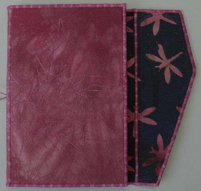
Red Maple 1 Front
On Red Maple 1 I positioned the fabric so that the reddest part was on the flap. I found a bead the same color to use in the closure as well as a decorative yarn for the wrap.
 
Red Maple 1 Back
Although I didn't think so when I pulled this fabric from my snow dyeing efforts, it has so much depth and interest with streaks of blues and near lavender playing with the reds.
 
Red Maple 1 Inside
Inside these dark reds with black worked well with the red in the cover.
 
Red Maple 2 Front
And although cut from the same fabric, the other Red Maple padfolio had a different vibe, slightly different colors, and called for a more pink bead for the closure.
 
Red Maple 2 Back
 A lot of depth in this part of the fabric too, but a softer red somehow.
 
Red Maple 2 Inside
Which required a totally different choice in lining and pockets. I'm still quite taken with this one and may set it aside for myself, at least for awhile. I've done this before with favorites before I've let them go.
 
I have another customer to show these to first, and then the rest will be available for purchase. Click on any photo for a larger view to see details.

Tuesday, September 27, 2016

And How Are Those Padfolios Coming?

They are coming along quite nicely, thank you very much! All decorative stitching is complete, linings and pockets chosen (taking less time for the perfect match-ups than usual), linings fused in place (you get a peek of them in the above picture), and pockets glue-basted in place. 


Here is what the "lovely leaves" quilting design looks like now that it is stitched out. I'm thinking perhaps I should have switched the threads, using the lighter variegated King Tut thread on the darker lavender fabric and the darker variegated King Tut thread on the lighter lavender. This is the struggle I have with nearly every project, often erring too far on the side of safety as I try to get that perfect balance of showing up enough but not too much. Well, these will not be hanging on any wall and the thread shows up differently in different light so I think the thread choice will be ok.


And here are the lavenders after their satin stitching. The camera struggles to get these colors correct and without brightening them up too much but I think this is pretty close. I always think the edges should be satin stitched with a darker thread like a dark frame so it is a challenge for me to stay with that lighter thread for the one on the right. But I like it!


That finishing touch of the edge finish on these truly can transform them. I have totally fallen in  love with the ones made from the "failed" snow dyeing experiment now that the satin stitching is complete.


Here is how I quilted the denim blue one. You can see how much I was influenced by my recent use of swirls on the baby quilts. There was a bit of a ray going on in the texturing of the hand-dye so I just went with it to guide my wavy lines which then were filled in with loops and swirls. I used a Mettler Embroidery thread which variegation did not change as quickly as the King Tut's so there are much longer stretches of the white than I expected.


Because of that, I am still dithering over what color of thread to use for the satin stitching on it. When I did a test to see what it would look like in a satin stitch, I wasn't sure I would like that going around the edge and especially how it would look running up the sides of the pockets which are a very dark blue. You can see in the sample how much the shorter changes in the King Tut thread effect the look of the satin stitch. When there is a lot of value change in the variegation, it almost becomes a stripe effect. This difference in color run lengths between brands is a good thing to keep in mind as you shop for variegated threads and consider how you most likely will use them. At any rate, I'm auditioning some dark blue solid threads while I feel myself being won over by the Mettler in spite of those long stretches before a change. Once I make that decision, all that's left is the closures. End is in sight!

Thursday, September 15, 2016

Freezing Up

How can one go from confident one day to timid the next? This is what is happening as I look at the prepared padfolio covers and ponder what designs to stitch on them. These hand-dyes have few visual clues to follow. Even the colors are throwing me a bit. I decided the red ones could get the maple leaf treatment like this one, and dug out the freezer paper templates I'd used before. It felt like it needed more, so I pulled my file of pressed leaves and traced some slightly larger ones to fill in. As for the rest, I was drawing a blank as I so often do. I don't want to keep doing the same thing so I pulled my ridiculously fat file of quilting designs started back when I was hand quilting. It holds patterns pulled from magazines as well as pictures from catalogs that could be turned into quilting designs and a few templates I've made. Bear in mind, I also have quilting designs in my many books as well as books that only have quilting designs in them. Somewhere in all that reference material must be an idea I can use or adapt, something that will trigger my foggy brain.


And yes there was. This is called "lovely leaf" - you can see it in the top photo and came from Quilters Newsletter Magazine, April 2003 issue. As I studied it, I noted how it was set up for continuous stitching and couldn't imagine myself being able to do it justice without markings to follow. As you can see, I traced it onto freezer paper and cut it out and have ironed it to the back portion of the padfolio cover. Perfect fit, and I will be using a dark blue variegated thread to stitch it. If all goes to plan, it will also go on the front cover and half of it on the flap such that when the padfolio is closed, the flap will perfectly complete the design.

So I'm moving slowly along, two stitched, two ready to go under the needle, one still undecided although I have picked fabric for its lining and pockets and possibilities for the others. Feels like I'm wasting too much time second guessing and holding back. So much for being warmed up!

Monday, September 12, 2016

Padfolios Again

The studio is up and running again after my major cleaning last week, and as much as I can't believe it, I'm working on padfolios again. After years of only selling one here and there, I suddenly can't keep them in stock. I've been out since mid May and hadn't planned to make more until later in the year - baby quilts and other things to work on, you know. But then I got a call from someone who had received a padfolio as a gift and wanted to buy some to give away as well. She was willing to wait until I cleared the decks a bit, and I decided to treat this more like a commission. She told me what colors she might like, I dug through my stash and cut a bunch of covers for her to choose from and we narrowed it down from there. Her favorites are on the right, the others on the left. She will probably purchase three but I wanted her to have a few more than that to choose from.

As successful as these made from the hand-dyed fabrics have been, I really wanted a break from making them (I think I made 15 or 18 of them between December and May). And yet, when I started going through my fabrics for likely candidates, I got excited all over again, and even pulled a few that were not in her color range. My thinking was that I may as well cut extras right now as long as I intended to make more this fall anyway. I haven't picked out linings and pocket fabric yet, but instead have started with fusing my customer's five fabrics to peltex so I can start on the stitching. After all, I'm all warmed up from those baby quilts.

Wednesday, April 27, 2016

The Lucky Recipient

Goodness - I am indeed humbled by the lovely comments made on my Post 1600. I may be giving away a padfolio but in return I too am a lucky recipient - of supportive and affirming thoughts. Basically, you said you like my blog for the same reasons I like it, which I suppose makes perfect sense. But I think this is an important point because many who blog, including me and some of the commenters, worry that we are not providing what our readers want or expect, that if we veer off our primary theme (no matter how interesting it may be), we will lose readers or make the ones who stay a bit grumpy - where are the quilts? Thankfully, it appears that many of you appreciate the variety I offer and also the detail I go into about my process. In at least one case, I discovered that through my blog I have been not only an ambassador for quilting but also an ambassador for the area in which I live. And apparently I have been the catalyst for continuing conversations elsewhere. Oooo - to be a fly on your wall!

To blog or not to blog - that is a question many ask themselves. I know some have gotten into it because they felt they had to - peer pressure you know - and don't really enjoy it or quite know what to share. My tendency would be to encourage giving it a try, partly because I love seeing what others are doing too, and because I think it can be a beneficial process. Still, it may not be for you so don't feel guilty about that. While my reasons for maintaining this blog have been many, and there have been times when I wondered if I was just talking to the ether, no one reading at all, in the end I've realized that one has to do it first and foremost for oneself. It's a bit like making quilts. If you do it because you love what you are doing and are getting something out of it, then it doesn't really matter if anyone else notices. But notice they will, because they will see something authentic and interesting and want to know more. Blog for yourself first, but of course, don't forget your audience - blog for them too. And perhaps like me, you will increasingly see how so many facets of your life affect and feed into your own creative journey.

Well, enough of the chit chat. I can tell you're chomping at the bit to know where that padfolio is going. Oh wait - you probably skipped down here to the bottom straightaway, right?  But if not, look below - the winner of the giveaway is:


Condolences to the losers - I wish I could send each of you a prize. I will be sending an e-mail response to your comment if an address is available. Thank you everyone for playing along and making me feel all warm and fuzzy. :-)

Thursday, April 21, 2016

Blog Giveaway Reminder

Lake Pend Oreille and Idaho's State flower - Syringa
 This is what it looks like right now in my neck of the woods. It's been hot and the flowering trees are flowering. What's it like in your part of the world?

There haven't been a lot of comments on Post 1600 where I am giving away one of my padfolios. But there's still time and your chances of winning are good! You have until Monday to leave a comment on that post telling me what you like best about my blog. Remember to include your name in your comment if you are logged in as "Unknown" or "Anonymous".

I limit my sales to within the United States but I'll ship my freebies anywhere. So if you are one of my international readers, this may be your only chance to own one of my padfolios. Plus I really would like to know what brought you to my blog and keeps you coming back. Pop on over and write me a quick note, and your name will go into the proverbial hat for the drawing next week.

Trees in bloom - downtown Sandpoint


Monday, April 18, 2016

Post 1600

This padfolio could be yours!
As I noticed I was coming up on my 1600th post, the number struck me as auspicious, worthy of pointing out, a perfect pairing with another Austin Kleon post I've been saving to share, and calling for a giveaway. It's the giveaway part that's been holding up this post. I've decided to go with this padfolio which, in all honesty, is what's known as a "second" - a product that in some way, generally cosmetic, doesn't meet the specifications of the manufacturer. That's what happened here, a cosmetic flaw that the public may not have recognized but which glared at me, one I've played with a bit to make less obvious before letting it out into the world. It doesn't affect its usability but I can't in good conscience take money for it. And so - I'm giving it away!

Some wonder if blogging has become passe, insisting that no one reads them anymore what with Facebook, Instagram, Twitter, etc. I still maintain that blogs are important and a richer, deeper, less fleeting expression worthy of the writer's, as well as the reader's, time. For someone who wants to "show their work" (as in the steps leading to the final product), it's a great format - at least it has been for me - and the feedback in the comments tells a fuller story than a simple click on a "like" button.  Started during a difficult time when I couldn't motivate myself into the studio, I used it as "someone" to be accountable to, "someone" who would be sitting out there wondering why I wasn't posting progress. More than 10 years later, I still feel a responsibility to my readers that often gets me off my duff and getting something done so I can blog about it. So thank you for sticking with me!

That brings me to Austin Kleon's blog post: 3 Reasons Why You Should Show Your Work. He's written a book on the value of showing your work and as is his way, he makes simple sense, no reason to be embarrassed. The following three reasons, I realized, are pretty much why I blog.
  1. Documenting your process helps your progress.
    Keeping track of what you’ve done helps you better see where you’ve been, where you are, and where you’re headed. It’s also a great way to hold yourself accountable — if you dedicate yourself to sharing a tiny bit of your process every day, you’re forced to actually do the work you should be doing.
     
  2. Sharing your process reaps the benefits of self-promotion without the icky feelings.
    People are often just as interested in how you work as much as the work itself. By sharing your process, you invite people to not only get to know your work, but get to know you — and that can lead to new clients, new projects, and all sorts of other opportunities.
     
  3. Building an audience for what you do creates a valuable feedback loop.
    Christopher Hitchens said the best thing about putting out a book is that it’s a “free education that goes on for a lifetime.” As you gain fans and followers by sharing your work, they will, in turn, share with you. Even when the feedback is bad, it can lead you down new paths.
 There you have it - great reasons to show your work, great reasons to blog about it. And now I'd like to hear from you. In order to qualify for the giveaway, leave a comment below telling me your favorite thing about my blog. Is it sharing of my process or what inspires me? Is it introducing you to other artists or bringing you along to exhibits? Perhaps you enjoy my "deep thoughts" quotations and musings, or discovery of tools and products or techniques. Whatever it is that brought you here and brings you back, that you look forward to seeing or hearing about, that you wish there was more of or even less of, I'd like to know. You'll have until next Monday (April 25) to add a comment, and if you are "anonymous" or "unknown" designation, be sure to add your name to your comment. I can't wait to hear what you have to say!

Tuesday, February 23, 2016

New Tool Tryout

"Nothing is so fatiguing as the eternal hanging on of an uncompleted task."
William James

I've found lots of distractions to keep me from adding the closure to the last of the "fresh" padfolios. As William James so wisely observed, these projects that get set aside for later eat at our energies whether we realize it or not. If nothing else, they can take up valuable space needed to proceed with the next task (or yet another uncompleted one). It wasn't going to be that big of a deal once I decided what to use, and yet there were still a few things to think through and try out before I committed. How to add the big bead to the flap was one of them.


It gave me the chance to test a recently purchased 1/16th inch hole punch. I can't tell you how long I've wanted one but the fact that it was to be used to punch plastic templates at seam intersection points should give you a clue. Back then they were hard to find, and then when they became easier to track down, I wasn't using that template method anymore. Still, I've had a a great desire to own one, and with my recent interest in bookbinding, I saw a potential rationalization for purchasing one. Only as an afterthought did it occur to me that it might work better than a large needle to make a guide hole for the elastic and perle cottons I've begun using on the padfolio closure. Would that tiny punch actually make a clean hole through two layers of fabric fused to Peltex? Yes! And I can't believe what a difference it makes when pulling the threads through. Not too big, not too small, Goldilocks has finally found something that is just right! And after struggling to thread these thicker threads through a needle, I finally got smart and dug out a dental floss threader to guide them through the punched hole and the beads too. Oh, I am a happy camper today.


Difficult to capture the true color of the large bead but it perfectly matches the denim-like blue in the fabric and decorative thread. A few blue glass beads have been added to the dangling ends of the thread wrap.


I love these batiks in the linings and pockets, love the way they pick up on the blues lurking in the predominantly purple fabric of the cover.


Out of the strain of the Doing,
Into the peace of Done.
Julia Louise Woodruff
Sunday at Home 1910

I'm being seriously distracted by a new idea and am possibly on the brink of a breakthrough with Adrift, so I really did need to finish this up. A corner of the work table clear again. The clutter of this and that related to the project returned to its drawers. Ahhhh - I can move on with one less unfinished task weighing me down.

Sunday, February 14, 2016

Threads - And The Last Padfolios

I've been having a conversation with Chris of chrissquiltinguniverse.blogspot.com about thread these last few days as she works on her latest quilt and I work on my latest padfolio. We both were bumping up against color and value choices as well as solid vs variegated, and even poly vs cotton when the stitching would be traveling over shifts in value of the underlying fabric. Will the thread I choose look jerky as it variegates, will it show up too much and become a distraction or not enough and get lost save for any texture it might create? Auditioning doesn't seem to help. I tend to lay a length of thread over where it will be stitched or "pool" it if the design will be irregular. Chris actually put in some stitches by hand on her current piece to test her choice, even though she planned to machine quilt. Both of us find that when the real stitching begins, the thread often does something entirely different than we expected. Chris could rip hers out (which she did) and try again; I on the other hand have to live with what happens on the padfolios because holes punched into Peltex (which is what the covers are fused to) when stitching are impossible to get rid of should one make a mistake and need a do-over. I do some testing on small pieces of fabric fused to Peltex to see what the thread will look like in a satin stitch and to test tension, but otherwise, it is often a hold-your-breath-and-hope-for-the-best proposition. 


In the case of the dark purple with blue accents padfolio, I thought the variegated thread would do the job of compromise over the predominantly dark fabric with a few lighter spot. Instead, I found it a bit distracting, showing up in a way I hadn't exactly foreseen. It made me wish I'd opted for the navy thread I'd considered but feared would read a harsh line over those light areas. So when I decided to cut another cover from the fabric to make up a second one (as long as I was making others for my customer to choose from), I'd do the stitching differently and with different thread. I was amazed that this section had much more visible purple in it, and that the lining fabric I'd used in the first one did not begin to look right with this one. Maybe I should use a purple variegated Oliver Twist - its changes more subtle than the King Tut I'd used on the first one and a seemingly perfect match. But again, I was afraid it would show too much and take over the show. Remembering my previous thought to stick with navy, I ended the back and forth and stitched away with an Aurofil solid dark blue thread. It barely shows except over some lighter areas, which I have to admit I thought I wanted, so why am I disappointed and ruing the fact that I did not use the purple thread? Just look at how lovely a closure cord I could have made with that Perle cotton if I had, but now it doesn't look right with the navy satin stitching. Sigh... It's the Goldilocks syndrome again - not too much this direction, or the other, searching for that perfect spot in the middle, but erring too conservative. I've now identified a blue decorative thread that may work, after stunning myself with the lack of any dark blue elastic or Perle cotton.


It doesn't take much variance in fabric to change how a thread will read. Here are the two padfolios I made for my customer who wanted the rich rust one that had sold to choose from. In auditioning the thread I'd used on the original over the one on the right (cut from the same piece of fabric but with much more light areas) and the one on the left which has less red in it, I was satisfied that it was the perfect thread for both. Yet when they were done, I'd wished I'd used a darker rust thread on the left one - something more like the darkest values in it. 


Granted, there's nothing wrong with the thread I used, but in hindsight, I wished I'd thought to go bolder so the leaves would show more. It ended up being the one my customer chose to buy, the thread I used having nothing to do with it. She got sucked in by the lining fabric - see above. The lining and pockets for the one she didn't buy are identical to the original Rich Rust padfolio.


I had better luck pleasing myself with the Burgundy Leaves padfolios. Love the thread I chose, the way it showed up on both light and dark areas but faded in and out as well. 


Subtle yet not having to be searched for to see. 


I dangled them in front of my customer and she bit, adding this one with dragonfly lining and pockets to her order. (We are old friends so I don't feel too guilty about that, especially since she tells me she's keeping it for herself while the rest will be given away.)


The second one is essentially the same, with flashes of texture falling in different places and a commercial leaf fabric for the lining. 


I was quite surprised that of the several toned pink prints I could have used on this one, none of them felt quite right with the one that eventually got the dragonfly lining. The subtleties of hand-dyed fabric: even when cut from the same piece of cloth, each section will vary enough to need a customized approach.


I'm thinking about putting some of the unsold ones in the exhibit that Masks will be going into. At that venue they have pedestals with enclosed glass cases for 3-dimensional items like small sculptures, jewelry and baskets that might otherwise "walk off" or be mishandled if out in the open. This has been the difficulty in figuring out where to display these locally - generally my options have been to display them in open wall racks or in a big basket on a counter or table. 

On the other hand, after pumping out 14 padfolios over the last couple of months - a group that I absolutely love - I want to be done with them for awhile and get back to other creative endeavors. Might be nice to just have a few on hand for my repeat customer here in town... 

Friday, January 29, 2016

A Few More Padfolios

With Masks complete, I've returned to padfolios. I had a request for the Rich Rust Oak Leaves after it had sold and I thought I might have a bit more of that fabric. But the nature of hand-dyes of this kind means one really can't duplicate an item. So I am doing my best to come close, plus provide the customer with a second choice in a similar but not as red of a rust. I've kept the quilting the same and plan to do the same scalloping of the flap edge. The lining and pockets will be the same on the "close" cover, but isn't right for the other one; its lining will be different.


And as long as I am making two - why not a few more? While searching for more rust, I found a luscious burgundy fabric in my inherited collection from my late friend. Not as highly textured as the fabrics in the first batch but just the right size to cut two covers, and I could not resist. I remembered a leaf cluster I'd picked up and pressed last fall with the idea of using it as a resist for art journaling (laying it on the page and spraying paint over it all to leave a negative image, not caring about getting paint on the leaves). I don't know what kind of tree it came off of, but it spoke to me. I got it out now and found the size workable for the padfolio. Because of the thin stem connecting the leaves, I couldn't make a freezer paper template, but found it easy to trace around it with soapstone (you may need to click on the photo for a larger view to see the markings). The variegated King Tut thread looked to have the burgundy and pink highlights I was seeing in the fabric, and I wanted the look to be subtle.

Front cover of Burgundy Leaves
Design on top of flap continues onto the back

This is another fabric that is causing me fits getting an accurate depiction of its color but this is fairly close, as is the way the thread shows up on it. In_Love!


Of course, now the stash must be dug through again for appropriate linings and pockets. This pic is from round one. The next day, I had additional thoughts and more fabric came out. Today I pretty much finalized the pairings (although still dithering a bit about the pockets on one), cut them to size and am ready to start fusing them into place.
 
I also cut another cover from the deep purple with blue highlights fabric - actually have quite a bit of that so had left out the buttons and Perle cotton with the idea of making up at least one more right away. But this time there looks to be lots more of the brighter purple showing through. The lining I used on the first one doesn't quite work so I've pulled out the batiks again, finding that the ones rejected for the first one are going to look beautiful on this one. It still needs quilting, and I'm still trying to think of a different way to quilt it other than the diagonal lines, so I've set it aside until I finish these first four that are ready for the final steps. 

Thursday, January 07, 2016

The Last of the Nine

Before I could put the finishing touches on this last padfolio of my group of nine, it sold! In fact 5 of the 9 have new homes, and I've been asked to make one similar to the first to sell. Goodness - that's getting the old year wrapped up on a high note and the new year off to a great start.


Part of the reason I wanted to use a cord wrap for the closure is because I did so little quilting on this one, leaving that center section devoid of any design I'd worry about covering up and in need of a little interest.


I'd decided to just thread the decorative yarn through the flap, leaving a loop on top to pull the ends through - I believe it is called a lark's head knot. Uninspired but would get the job done since I had no buttons that would do. My mind was still working on the problem though, doing a mental inventory of larger beads I might have in my bead stash. I was so sure I had nothing suitable that I didn't even look through the little boxes holding that sort of thing. However, as I was finishing up, my randomly roving eyes stopped on a small plastic bag sitting at the end of the table. It had several things in it that I'd set aside for a specific project, all in the rust and brown color family - a decorative pin, some leaf beads, chenille thread, brown Nymo beading thread (which was why the bag was out - needed that color of thread for Masks). I picked it up, wondering about the leaf beads, but instead spotted these beautiful glass beads. I slipped one on the yarn, snugged it up to the lark's head knot and liked what I saw.


 An overhand knot keeps it from slipping down the cord.


I wrapped the cord around, under at the bead and then pulled it back to the right to secure under the cord. I added a few beads to the end, securing them in place with more overhand knots. There are actually two colors of these beads, and only 4 of each. They were a gift from a quilting friend back in Wisconsin who knew how much I loved these colors, but confided she stopped at eight once she noticed how expensive they were! I don't know if I'll ever make that other project, or if I do, if I would use what I squirreled away in that little bag, so I have no qualms about these beautiful and perfect beads ending up on this padfolio instead.