Tuesday, October 22, 2013

Life Circles Round

I'm sure you remember that guava dye run I said my friend Sherrie would be wanting to steal from me. Indeed she did want to, but was willing to settle for a few strips of each color to incorporate into her signature wispy summer scarves which you can read about here. I duly complied. As for me, I soon spotted these shoes on sale for a pittance, covered in fabric the exact colors of the dye run. Yes, they came home with me, with spring fun dressing up in mind.  

As Sherrie was making up the first guava scarf, she had a "life circles round" moment involving our recently departed artist friend, Judi (which you can read about here). And then last week, Sherrie's scarf of my guava fabrics arrived in the mail, a thank you and reminder of the ties between us and Judi who got me dyeing in the first place. Sherrie didn't know about the shoes and hoped I had something in my wardrobe to wear the scarf with. Well...yes! And life circles round once more.


Friday, October 18, 2013

Disparate Items Coming Together

It can take an amazingly long time for the bits and pieces we collect for our art to suddenly become the answer to creating a new design. That is why we buy fabric and embellishments without knowing what we will do with them, keep sketchbooks, hold on to leftovers and unused bits of inspiration for so long. What you see in the picture above spans about 10 years. The beads were purchased around 2003 I think, when I was looking for something that would read as drops of blood. The larger ones didn't work and I didn't need many of the smaller ones, so they have been in my bead stash all this time waiting for another chance. The page of tears from my sketchbook was done on a particularly bad day back in 2007. And the marbled fabric was gifted to me by a friend when I told her how it reminded me of a marble wall at the Mayo Clinic. I had no idea what I would do with that marbling when it arrived, but while pressing yards of fabric last spring, mind wandering, I remembered the beads and thought how good the red would look against the yellow. While paging through the sketchbook, I ran across the tears. The two got me thinking about how much pain and heartbreak patients and family who come to the clinic go through, and I had the inspiration for my quilt.


So why didn't I dive right in since I had such a clear idea of where I was going with this? Well, a lot of reasons, but mainly I've been dithering over mostly technical issues. But I think I've resolved those, made up my mind about the various ways I could approach it and have taken my first stitches. I plan to stretch the finished quilt over a 12" square canvas placed in a floater frame and will just be adding beads to the fabric - no batting and no threadwork. Just simple and untextured like the marble it reminds me of.

Wednesday, October 16, 2013

Playing with Geraniums

Ever since I took those pictures of the geraniums on my back deck, I've been wondering what they might look like run through some of the filters in Paint Shop Pro. Unlike a lot of photos I play with, these had a very limited palette and not much variety in shapes either so I thought it might not produce anything of interest. Boy, was I wrong. So while this hemisphere gives way to the warm colors of autumn, I filled another spare block of time before dinner playing with the pastels of summer.


When I play like this, I don't actually manipulate the settings myself but use the "roll of the dice" feature, clicking through changes randomly chosen by the program until I see something I like, something that may have potential for inclusion in one of my fiber pieces. This setting of the topography filter produced the least amount of change, but one I really liked. I could see thread painting over this one or using as is as part of a fabric collage.


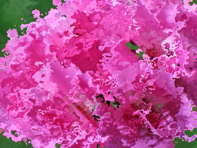
I usually get some interesting abstract effects when I use the distortion map filter but this time the only one that did much was the "wet fall leaves" tiled across the picture. It has turned my geranium into more of a carnation with those frilly edges.


This is quite a different look than I usually get using the ripple filter. Reminds me of refracted light.


The twirl filter is one of my favorites. I always seem to like what it produces. This looks so rich and yummy to me.


Wave is another one I use a lot but with limited colors and value, it was giving me some very different options. I could see this one printed out as a good basic fabric one could cut up for piecing or use as a border or binding.


I saved the kaleidoscope filter for last - it can tie me up for hours producing dozens of options I save because they are just so beautiful and intricate. But again - what would this limited photo produce. I needn't have worried. When this one flashed on the screen, I immediately wanted to put it on the cover of a padfolio.


But this one took my breath away and is perhaps my favorite. I want to print it on fabric and bead it!


I guess you don't need a lot of colors and contrast to get usable images through filters. As I mentioned above, some of these would be good candidates for thread painting. And I'm always trying to think of ways to use my vast store of reference photos in my quilting. As if the universe heard those thoughts, I recently won a drawing over on Terry Grant's blog for a copy of Sarah Ann Smith's dvd "Art Quilt Design From Photo to Threadwork." I must have some major karma going on here - seems I've been the recipient of quite a few give-aways of one kind or another this year. I have to say - it really makes my day and keeps my inspired! 

Monday, October 14, 2013

Leftovers

I can't seem to get past puttering and on to a "real" project in the studio for what seems like ages. (The garage has been the biggest beneficiary of said puttering as of late.) And I still have scraps of that strip-pieced band I can't quit playing with. You've seen the bookmark on the right. I decided to make a mug rug to go with it, getting it quilted and satin stitched in a small chunk of spare time before dinner last night. Now these are off to a special friend...

Sunday, October 13, 2013

Printing at Last

I finished cutting my last linocut of Lesson 1 last Wednesday but didn't get around to printing until yesterday afternoon. That's my repeat block and you can also see the paper version where I was testing various permutations. Remembered a trick from my Mariner Compass-making days and got out my mirrors to get an idea of how the repeat might work. In the background you might be able to make out the oak leaf block and the paper testing the design with a rubbing. I have to say I really like working with the Inovart Eco printing plate much better than the Blick Readycut Plate.


Since I am using what is supposed to be the master bedroom for my studio, there is a full bathroom off it at my disposal. I've played with painting and discharge in a similar extra bathroom in a previous rental so set up my print station in there. I wish the counter was a bit wider, but for what I will be printing right now, this will suffice. My print pad on the right consists of nothing more than some newspaper on either side of a piece of fleece, the dense kind that is used as padding in suit shoulders, not the soft kind that goes into robes and blankets. It's more like a dense poly batting than anything and seems to be the perfect balance between too firm and too soft. It's really nice having the water source right there.


So here we go. This is the 12" sample block, the paper proof in the upper left, the first print on fabric in the upper right. I didn't need to tweak the block but I did need to put more ink on it. The second print on fabric in the lower right came out perfect and I plan to brush Dye-na-flo paint over them later to add color. But I won't be printing more of these. I'll be cutting the block up into individual texture blocks as I anticipated. 

For this first round of printing, I'm using Speedball Fabric Printing ink which is oil-based but cleans up with soap and water. It smells so the bathroom fan was running and a window slightly open. Also, it needs to air-cure for a week rather than being heat set within 24 hours in order to be permanent on fabric. Had I known that before I ordered it, I probably would have opted for something else. A week is a long time to wait if you know what you plan to do with the fabric once printed. And black - it was suggested to get black but I wish now I'd gone for a dark brown or a navy or even a dark purple. Well, I'm using it up quickly so it won't be long until I can replace it with a paint of a different color.


On to my leaf blocks (one on either side of the same block) and the repeat block. Here is my paper proof. The leaf in the upper right is the first proof which showed I needed to cut away more between the veins. Lower left leaf print shows the improvement after that tweak. The background "noise" in the other leaf, however, is intentional - a suggestion of the teacher's to lend more organic interest. I must say I really like the effect. And you can see my traditional quilt background coming to the fore as I rotate the leaves around the center not unlike so many applique designs of the 1800's. The repeat block also shows my penchant for classic traditional quilt designs - I have a hard time moving away from symmetry and grids.


Here's how they look on plain white fabric, the repeat block turned in different orientations than in the test print. The leaf blocks are on a 6 inch square, the repeat block is a 3 inch square.

 Do you recall the fabric I tried to improve with overdyeing that I refused to show you because it was still pretty awful? I decided it was the perfect candidate for sacrifice, nothing to lose by using it here. I was curious about how opaque that printing ink was and also thought if so much of the ugly fabric wasn't showing, it would lend an autumn air to my leaf. The top one had a lot of ink on the block, the other was a second print without re-inking. The repeat block is printed in between the two - you may have to click for a larger picture to see it as I was using up what was left on the roller and pulling what ink I could off the blocks at this point.

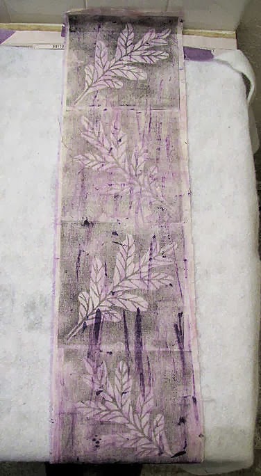
 I also dug out some random fabric I'd used the last few times I'd played with my paints - trying out some rubbing patterns, cleaning off brushes, that sort of thing. I can't reconcile what seems to me a lot of waste when dealing with inks and paints so this is my way of capturing all that I can before cleaning brushes and rollers and eventually I have something that can be used as a background in a postcard or other small piece. That's what this lavender strip is and again, I was just trying to get as much ink off the roller and plates before quitting for the day and washing everything up. "Purple oak leaves?" I thought to myself afterwards. What was I thinking???

Sunday, October 06, 2013

Linocut Progress

Thought I should give you a little update on my on-line linocut class progress. The first lesson includes three different exercises, the first of which is to mark off 9 squares on a 12 x 12 block and cut a different pattern into each square. This is to give practice in how each gouge works and to generally get a feel for how to wield this tool. On the surface, this didn't look like a big deal, but some of those textures took much longer to do than one might think.


I particularly struggled with this one, which was to look like arch-topped windows. The material that the Blick Ready Cut plate is made from is soft and easy to carve, but also rubbery, with a thin top layer that often defied flicking off. It sounded like a good idea - that top gray layer that would make it clear what your print would look like. But I found it problematic.


These circles also took a long time and were a challenge because of the rubberiness of the block. I found I could do better with them if I cut standing at my work table rather than sitting in front of my laptop. We are to print this block as a whole, an "interesting" background to print other designs on top of or we can cut it apart and use each texture individually. I'll do one print but I'm sure I'll be cutting this block up.


Exercise 2 involves carving negative and positive versions of a leaf. I have a commercial set of leaf stamps that include both kinds given as examples, so I was compelled to think of something different. And then, up pops a post by Annabel where she is using oak leaves to stamp images. It reminded me that I have a file with leaves I've pressed and maybe there are some oak leaves in there. Oh, I love it when my obsessive collecting is vindicated - I had far more oak leaves to choose from than I remembered. And oak leaves are tough things, even when dry. It was easy to trace around them right onto the block. This time I'm using an Eco Printing Plate (by Inovart) on the recommendation of Cynthia St. Charles and am having much better success with it. Still easy to cut but more substantial. Also, it is thick enough to cut on both sides. I couldn't decide between the two leaves you see on the plate so one will be cut as a positive (done) and the other will be cut as a negative on the flip side (drawn on and ready to cut).

The third exercise should go more quickly - just a small simple design that can be used as a repeat. I need to move along on these as I think the next lesson will be arriving soon and I still need to make prints on fabric. We have two weeks to work on each lesson and now I see why. This first one is so chocked full of information and exercises that one needs a couple of weeks to get through it and let it sink in.

Monday, September 30, 2013

Going Paperless

I am such a gotta-have-it-on-paper, need-a-hardcopy kind of gal that I often print out things that I could just as easily view on the computer screen. But one of my rationalizations for the laptop was that, unlike my big pc, it could sit in my studio at the ready and I would no longer have to print out reference pictures or directions in one room to have available in the other. It's a hard habit to break, this need for paper. I'm one of those underliners and highlighters and find it easier to flip through a sheaf of paper than scroll through a pdf file up on the screen. However, my first lino class lesson came in a pdf 23 pages long. I really wanted to print it off, pictures and all, but that's a lot of paper and a lot of ink. It has forced me to follow through with my original plan and frankly, in this case having my instructions and photo guides on the screen is working out better than the printed page. Knee jerk reaction averted.

Thursday, September 26, 2013

Ready for Class

I've been out of town, an extended weekend trip to see my goddaughter get married and then visit friends further down the line. My lino class with Dijanne Cevaal kicked off while I was away, but that is the beauty of an on-line class - you can go at your own pace and schedule. I didn't want to order my supplies too early and have them arrive while gone, languishing on the front stoop, but was a little dismayed at the anticipated delivery date when I did place the order - well into next week. Fortunately, the delivery service was quicker than that, my class supplies arriving from Dick Blick today! My first class pdf arrived via e-mail before I got home and so I am all set to dive in. I've skimmed the first lesson and already have been provided more information and instructions than I got in the entire 5 session hands-on class I took earlier in the year here in town. I like what I see and am excited to get to work.

And here is the obligatory picture of me with the bride and groom...


Tuesday, September 17, 2013

September Birthday Block

In the midst of working on the fabric postcards, I realized it was time to make another block for my nephew's "freedom quilt" - number 17! We are getting close to the end of this project. The first few years it was easy to pick blocks to represent some significant event in or tie to his life, but I must admit it is getting more difficult each year. He lives far away so I don't get in on much of what happens. This year, I knew he'd had a scary bout in the hospital and has aspirations to become a nurse, so I was tempted just to make him a red cross block. But that didn't seem like a very positive way to remember the year. Instead, I thought I could just elaborate on what I'd been doing with the postcards. I started by picking a background fabric to represent a landscape - much as I had done for Life's End. I thought I was picking a true batik, but when I peeled back the fabric, I realized it was actually a print with the "right" side much brighter than I wanted. Well, you know what they say about fabric - you've paid for both sides so you can use both sides! I used the more muted "wrong" side.


Yes, I had "mountain" triangles left - waste not want not they say. I keep going back to this theme of mountains rising out of a flat plain. Those South Dakota Badlands made quite an impression on me.  The smaller triangles are what was trimmed off where the bigger triangles overlapped. More waste not, want not.


I threw my usual caution to the wind and tried different colors of King Tut variegated thread to satin stitch my mountains to the background. No fusible here - just used dots of Roxanne glue to hold them in place and I used a tearaway stabilizer on the back of the block to keep the stitching flat.


And now to add some text. Yes, I did consider feeding the block through my printer - the carriage is wide enough to accommodate up to 13 inches - but no way was I going to risk a mishap with the otherwise completed block. Instead, I took the text formatted in Paint Shop Pro, mirror imaged it, printed it onto freezer paper and ironed it in place on the back of the block. Incidentally, the white you see on the back of the block is tearaway stabilizer trapped under the satin stitching.


Now using a light box, I could see the text in the right orientation and trace it on the right side of the block using a pigma pen. This worked so well and was relatively quick to do. Makes me look like I have beautiful penmanship!


And because I truly do have a difficult time throwing out bits and pieces, I turned this bit of thread testing for the sun on some of the postcards into a bookmark. Not sure who will get this yet, but I'm glad I didn't just toss it in the trash. 

Sunday, September 15, 2013

More Printing and Done

I wanted to finish the backs of my fabric postcards with the end of the sentiment printed on the front. This should be a piece of cake, I thought, as I could use a full sheet of paper covered with muslin and get two backs per sheet. On the recommendation of friend Mary Stori, I tried the alternate method to freezer paper - adhering the fabric to card stock with 505 basting spray. I think I tried this a long time ago and must have run into problems with it, leading me to use freezer paper instead. But Mary's instructions led me to believe this was worth a try. The basting spray goes on the card stock, the card stock on an oversized piece of fabric. Smooth the fabric to be sure it sticks evenly to the card stock with no bubbles, and trim off excess.


As an added precaution, apply painter's tape over the lead edge.


And it ran through the printer with ease. (This was formatted in Corel Paint Shop Pro, the outside lines serving as a guide for cutting apart.)


I didn't have quite the same success with the second one. Perhaps I should have put more basting spray on the card stock, or maybe I wasn't as careful with the smoothing. There were places where the fabric shifted and creased as it fed through. And when I pulled it off, my lines of text were no longer straight but rippled. For comparison sake, I ironed my last piece of fabric onto the heavy freezer paper and got about the same result - a total surprise. In retrospect, I think I failed to set one of the printer's properties to adjust for the extra thickness being run through it. I don't use this printer often and even though it is the same brand as the one that gets more daily use, the set-up screens and options are slightly different. And of course, I didn't take a minute to reference my notes from previous printing. This is what happens when you get cocky and are in a rush!


I always fuse my postcard backs to a piece of Decor Bond so I was able to carefully manipulate the wavy lines of text mostly back into shape. With that, it was time to assemble and satin stitch around the edges. Each postcard is slightly different. This one has a sun quilted on it.


Here's the whole set. I allowed myself to try out different colors of thread on each, both for the satin stitching around the mountains and around the outside edge. Now to add a personal note on the back and get these sent off.

Saturday, September 14, 2013

7 Years and No Itch

Today marks the 7th anniversary of my return to northern Idaho. I'm no longer at the original house I rented - things change, needs change - but I am still very happy with my decision to relocate here. At my current place, I've enjoyed a mostly private covered back deck where a tub of geraniums have flourished. They got a slow start, not blooming much at the beginning of summer, not at all in July and into August, while the violas and a plant covered in yellow blooms stole the show. By late August, those two started looking spent which was a disappointment because I was spending more time than ever on the deck wanting to enjoy some color.


And then the geraniums started putting forth buds, just a few at first. In the last couple of weeks they have exploded.


They are more colorful and beautiful than I could have hoped for. Fascinating to watch them unfold one small flower at a time...


...until the group of them form a ball of bright color.


They are a nice anniversary present for my soul. 

Wednesday, September 11, 2013

Giving Linocutting Another Go

You no doubt recall how disappointed I was in the hands-on linocutting class I took earlier this year. Felt I should have saved my money and taken the on-line course from Dijanne Cevaal. After reading Dijanne's course description and what each session would cover, I made up my mind that when she offered it again, I'd sign up. And I have. Anyone care to join me?

From Dijanne's Facebook page:
Updates; On-line linocutting class will start 22 Septemeber- there is still time to enroll- there are lots of exercises to hone your skills on fabric or paper. You will make more than a cute stamp... you will create linocuts from photos, combine different linocuts to make interesting fabric and collages. Cost is $60AUS- and there are four lessons delivered in fortnightly installments with a number of exercises in each lesson. If interested, e-mail me at dcevaal@gmail.com
Sample of Dijanne's linocuts in my collection

Tuesday, September 10, 2013

Adding Text

I thought I asked you guys to wish me luck? You didn't wish quite hard enough - my day of experimenting with adding text to my triangles was a bit frustrating and did not yield quite the result I was hoping for. I'm settling for the result you see above, one that does not show up as well as I'd like, but is the best I can do. Here's how I got there.


I started by making a scan of the triangle.


In Corel Paint Shop Pro, I used this as the background layer, sizing the canvas to match the actual size of the triangle. I added a vector layer to try out different fonts, wordings and arrangements of the text, seeing exactly how it would fit on the triangle when printed.


Here's another version with slanted text. The background layer with the triangle is still there, not visible at this point because I changed the opacity to keep it from printing. I could have deleted the layer, but I wanted to be able to bring it back up if I needed to adjust the text. Ready to print, I ironed each triangle onto a 3 x 6 inch rectangle of freezer paper - just big enough to hold the triangle - and adjusted the printer layout accordingly. I did print just a plain piece of paper first to check alignment and which way the triangle should be fed in, and then sent through the real thing. The first two fed through fine, although the printing hardly showed - even when I changed the text color. And then...there's little worse than the sickening scrunching sound of a paper jam. Yup, that small piece of freezer paper caught and wadded up tight under the printer head. The fabric came out fairly easily, but it took patience and gentle steady tugging to extricate the paper in one piece. Most of my employed years involved some kind of administrative aide work, meaning I have a lot of experience teasing paper jams out of a variety of printers and copy machines, so in a way, I was back in my element. ;-)


Lesson learned, I pulled out a full sheet of heavier weight Jenkins freezer paper, figured out where on the page to affix my triangle, reset the printer layout, ran a test paper through and successfully printed enough triangles for my postcards with no more jams. Good thing I have more triangles than I need because a few of them were not lined up quite right and the text positioning was off.


But as I said, the ink just wasn't showing up well on this fabric, so "enhancement" was in order. I settled on colored pencil fill and Pigma pen outlining although I probably could have gotten the lettering to pop more had I tried a little opaque paint. However, the way the day had been going, I sensed paint and a paint brush were not a good idea. For better or worse, I'm using these as is, ready to attach them to my postcard bases. (Click on any picture for a larger view.)