Wednesday, March 05, 2014

Some Thoughts and Favorite Artists

Bluebird Sketchbook Page by Mattias Adolfsson - Mattias Inks
I follow some artists who are not art quilters, always with an eye to what I can learn from them that would be useful in my own endeavors, and also just because I love what they are doing. With my own activities at a low ebb, this seems a good time to share some recent work that caught my eye. Above is a sketchbook page by Mattias Adolfsson of Mattias Inks, a freelance illustrator living in Sweden. He has a quirky sense of humor that I find appealing, populating his worlds with the most amazing creatures in such incredible detail. But I share "Bluebird" with you because when it popped up on the screen, my first thought was to wonder what he was doing showing us a quilt. Ah, no. It's one of his illustrations, finely wrought with stitch-like detail. Yes, it gives me ideas.

Richard Saja collaboration with Mother of Pearl

Richard Saja detail
Richard Saja of the blog Historically Inaccurate, is a textile artist I've shared before (see this post). He works mainly with toiles that he meticulously adds hand-embroidery to. He too has a bit of a quirky sense to his interpretations. He recently collaborated with the British fashion house Mother of Pearl, and you must see the results here. What caught my eye with this group is how effective adding color to just a portion of the textile can be, as in the example above. I guess I think all or nothing, but here, the unembroidered portions act as a frame to showcase his work as well as flatter the wearer.

Medallion I by Daniel Sroka

I have also been drawn in by the work of photographer Daniel Sroka, whose only quirk is that he produces extreme close-ups. He works with dried leaves or twigs or other things he picks up on his walks, studying them to reveal each's unique personality, a tiny bit caught in focus while the rest stays a blurred backdrop. Like me, he often sees images in ordinary objects: a seashell that suddenly looks like a slipper, a curled leaf becoming a chalice. Like other parts of the country, we got quite a bit of snow yesterday, which I only shoveled, not photographed. But Daniel was out on his deck capturing the most beautiful images of the snow and ice as they melted and sharing them here at Daniel Sroka Open Studio. See the entire set here

Are you inspired yet?

Finally, I want to share with you a quotation I ran across a few days ago. There's so much discussion about what is art and what is an artist and what should or shouldn't an artist be doing with his/her work. I liked what Dr. Daniel Siedell of King's College had to say in "5 Things Art Is Not", especially this:

"An artist does not paint a picture to express what she already knows or believes. She paints to learn something about herself and the world—something she doesn’t already know. Oscar Wilde wrote that the work of art "has an independent life of its own, and may deliver a message far other than what which was put into its lips to say." A work of art does not point back to its maker, but looks out to you the viewer. It’s not concerned with beliefs or thoughts of its maker. It’s addressing you and your heart." 

Tuesday, March 04, 2014

February Wrap

This won't take long. February is a short month to begin with, but my quilting really took it on the nose since so much of the month was devoted to all things sinus related. When I made out my list of things I might work on, I transferred the few things I didn't get to from the January list and added quite a bit more - very optimist. As I look at the list now, I see I only managed to cross off one thing, finishing the quilting and binding on the half-square triangle quilt. All else remained thoughts and dreams in my head - not totally bad. The art journaling is not part of the list since it is a weekly routine, & I did managed to stay faithful to it. I also don't note sketching activities like the Zentangles, although maybe I should. They were a good substitute in those weeks after the surgery when working in the studio simply was not an option. The snow-dyeing was an impulsive spur of the moment thing - I allow for that, and I must say it felt very good to be doing something - anything - with fabric again.

I want March to be different, of course. I'm planning on applying for ArtWalk again, so need to finish a piece or two for the application form due mid-April. Those pieces were on February's list, so they will top March's list. I have the makings of another padfolio ready to go (and a taker for it), so it too is on the list. In fact, I can pretty much scratch out "February" and write in "March" and be ready to go. Now, if the body will just match the willingness of the spirit!

Sunday, March 02, 2014

Art Journaling with Bubble Wrap

It's Sunday already and time for another spread in the Positively Creative Art Journal. I'm guessing there's hardly a reader of my blog that hasn't heard about stamping with bubble wrap, and probably many of you have actually tried it. It's been on my radar for years, and yes indeed, when I rummaged through my stamping/painting supplies, I found some small pieces of bubble wrapped tucked away. These are very small bubbles, and probably because of their age, a bit deflated. Still, they worked just fine. First step, stamp a few times across the unpainted page with one of the colors.


Second step, paint over the page with another color. Remember the nice swirls I said I got on a previous page but lost because I added more paint to more thoroughly block out the text on the paper? I used that same brush and color of paint here, and since the bubbles were not to be totally obliterated, I didn't have to worry about full coverage. The directions did say to wipe some of the paint off, but that wasn't necessary. The yellow did knock back the green a bit more than this picture would lead you to believe.


Third step, stamp with the bubble wrap again with a third color. I'd rinsed the first color out of the foam brush and thought I'd squeezed all the water out, but there was enough in there to leave the violet paint a little thin. A different effect that I did not dislike.

While the page dried, I reviewed the journaling prompt. I'd read through the lesson after finishing up last week's spread and had been thinking about Dale Ann's challenge to avoid using "don't", "no" and "not". Catch yourself phrasing something in the negative using one of those words, try rephrasing it in the positive. I know what she's getting at here, but I truly found it difficult to catch myself saying or thinking things that needed to be rephrased. Instead, I started thinking about how it feels when someone says, "Don't" or "No", and what might be a good response. I think that thought comes from my iRest Yoga Nidra practice of the last few months as well as my resolution word focus of "explore". How can you explore if you put up barriers of don't do that and this is not working? I roughed out a possible design so I wouldn't forget. 


As I prepared to add text to the page, I was happy that cut and paste was optional - not really in the mood to page through magazines for letters and words today. But I haven't been terribly happy with my printing on previous spreads. Wait! I have an alphabet stamp set! Time to get it out and use it.


I've really liked using the Gelly Roll pen but I only have it in white. My other pens have not always worked well on the acrylic paint and I've been frustrated by the limited number of colors on hand. So when I went to Staples to take advantage of their 20% off everything in your bag sale, I was hoping that they would have some gel pens in stock. I took a chance on this set by Sarasa, partly because of price and partly because of the variety of colors. They flow quite nicely and the retractable feature is quite convenient. The .07 point gives a thinner line than I'd hoped but so far that is the only drawback. According to the label, they are archival and acid-free, and I found they flowed across the painted surface without a glitch.


So I used a couple of different colors to help isolate the negative stamped words from the challenge response to them, and added some additional text borne of my yoga studies. The wavy lines filled in with cross-hatching didn't work quite as well as I thought they would, but I'm reminding myself that this is part of why I'm doing these exercises - to try things and see what works and what doesn't. Why not?!?


Oh, and one last thing. I decided to use a babywipe to clean off my stamps, and it was quite messy. Oh, let's stamp the excess ink off first onto this scrap piece of paper that has been saved to use in a future lesson. Ooh, I like that! And then I stamped on the babywipe and saw a good image come off. I swore I would not save these babywipes to incorporate into my art as some do, but here I am, my waste-not-want-not mantra leading me astray... 

Saturday, March 01, 2014

Snow Dyeing


Proof of how easily dye powder migrates
Snow dyeing has never appealed to me; it struck me as one of those jump on the band wagon fads which was enough to make me disinterested. Still, I've read the articles, studied pictures of results, tried to figure out its appeal, came to the same conclusion every time: puzzlement at its appeal and no interest in trying it myself. Really. I'm not interested. So many other things I'm more interested in trying. Perfectly happy with how I normally dye although there are some variations I'm curious to try. But not snow dyeing.

So why did I find myself last week with this sudden itch to give it a go? Well, there was the Quilting Arts Episode 1303 that I watched which demonstrated faux snow dyeing. Something about actually watching someone do it... Then I saw some fabulous results by a couple of bloggers I follow. I was beginning to see how their results differed from other ways of dyeing. And of course, there was the snow outside my door and an abundance of dye powders gifted to me over the past year. What did I have to lose?

Even with printed instructions from the Quilting Arts website in hand, I did a little research to see how others were going about this. Frankly, I questioned those first directions, knowing what I know about dyeing. Anyway, I discovered there are two ways people are approaching this. There are those who soak their fabric in soda ash and mix their dye powder with water and process their dyed fabrics pretty much as soon as the snow has melted. Then there's the other school that soak their fabric in soda ash and mix their dye powder with a water/urea mixture and batch the dyed fabric for up to 24 hours after the snow melts. I found instructions for the latter method on Pro Chemical & Dyes website. Now there's a trusted name. And I have a ridiculous amount of urea on hand. So I used these instructions as my guide.


Now I've seen some pretty ugly (in my eyes) snow dyes and some very beautiful ones as well. The ones striking me as not so great often seem to be the result of throwing too many colors together, or perhaps just not thinking through what the colors might look like together. I decided to consult my dye records to help me choose a direction. I just love the orangey rusts of the run on the right and could use some of it in my stash. That recipe called for strongest red, golden yellow and a bit of chino. I didn't have strongest red on hand so substituted basic red. The dye recipe on the left includes fuschia, bright blue and black, all on hand. No matter how these turn out, I should at least like the color combinations.

There are other variables to snow-dyeing. Pro Chem covers two of them. You can mix your dye stock into snow before covering your fabric with it, or you can squirt or pour the dye stock directly onto the snow after it has been mounded over the fabric. I was not in the mood to be mixing dye stock into snow in a big bowl or bucket, so I just squirted it on. Another method is to sprinkle dye powder onto the mounded snow. I wanted to try that method too. I decided not to make a big production out of this, but just do a few fat quarters to test things out. Always bothered by waste, I was happy to find in my research that many lay a piece of fabric in the bottom of the catch basin to soak up the dripping dye.
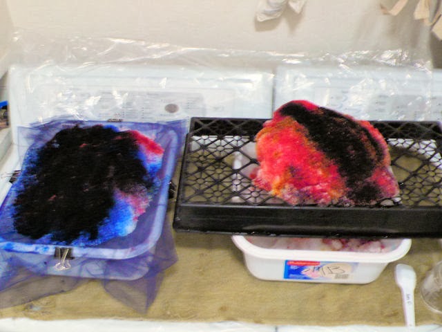
Tulle support on left, garden store tray support on right
Once my fabric was soaked, I moved the whole operation outside, and I am so glad I did. Even if I had not been sprinkling dye powder over the snow-mounded fabric (you can see in the top photo how that went), I still would have made a mess as the snow shifted and dribble past the edge of my tubs. Should have used larger receptacles. I must note that I really like the way the tulle (held on with binder clips) supported the fabric/snow. And for the first time, I used squirt bottles to mix the dye solutions, discovering as I vigorously shook the red that the top was leaking. Oops - can't believe I didn't get any on me but the snow looked like a crime scene with drops of blood. What must the neighbors think? I found it hard to know how much of the dye solution and powders to use but I eventually got everything squirted and sprinkled and wiped up enough around the edges to move inside for the slow melting process.


Before going to bed, enough snow had melted to cover all with plastic to keep the fabric from drying out while batching. All directions I read said this batching needed to be done at a minimum of 70 degrees. I barely keep my house at 70 degrees during the day, let alone at night. The one room that is warmer and has a floor vent is upstairs. No way I'm hauling this potential accident waiting to happen through the house and up there. I'll just have to trust that time and the barely bare minimum will be sufficient.


Ok, these look promising. Note the fabric lurking in the run-off in the bottom of the bins. Time to rinse, rinse, wash with Synthropal, set with Retayne and iron. And I was equal parts disappointed and happy.


This is the red and golden yellow dye solution result (I also sprinkled a little chino powder over the top). Pale, not very interesting textures, not unlike I could have gotten some other way, I'm thinking, and very pink. Some of the tanness I think can be attributed to the unbleached muslin that I used. They do warn that the dyes get quite diluted with the snow, but I did mix them about double strength. Perhaps I just didn't put enough solution on. Or perhaps it's that the dye powders are quite old.


Or not. Look at this great piece, the white cotton that was in the bottom of the bin. I just love this one.


On to the sprinkle technique, again done on unbleached muslin. If I remember correctly, I sprinkled the fuschia on first, then the bright blue over it, and topped it off with a little black. Again, pretty pale, pretty uninteresting to my eye (especially if you'd seen the successful snow dyes I'd seen on line).


There were only a few spots that remotely exhibited the texture I'd seen covering whole yards of snow dyes. There are so many variables with this process, including the water content of the snow you use, that I can't begin to analyze any of this in the hopes of better results should I try this again.


But oh my - look at what came out of the bottom of this second bin. I am in LOVE! And I have no idea why those places in the fabric that were not totally submerged came out pure blue. I would have thought some of the fuchsia would have wicked up into them.


This was the white cotton again. I might have gotten better results on the pieces directly under the snow had I stuck with white fabric, but that was one of the things I wanted to explore - how using an off-white instead of pure white base fabric will effect how the dye color reads. I'm most puzzled though, that none of these came out very close to the colors I was going for. I think that first piece is headed for an over-dye.

Will I do more snow dyeing? I'm thinking not. I really don't enjoy messy processes, let alone ones where I feel I have no control, and this snow dyeing was both. On the other hand, I have quite a bit of dye stock left, I'm catching my subconscious working out what ifs in terms of adding other colors, and it IS snowing outside...  


Thursday, February 27, 2014

"Orbit" - A Small Indulgence

"Orbit" by Mary Stori copyright 2014
It's small...it's beautifully rendered...it's a Mary Stori original...

And IT'S MINE!


Read more about it on Mary's blog here and here.

Wednesday, February 26, 2014

Art Journaling With Circles

I got sidetracked over the weekend, what with the start of the motorcycle racing season, the final events of the Olympics and that beautiful journal I began filling. There just wasn't time or motivation on Sunday to work on the weekly Positively Creative Art Journaling exercise. But rather than skip the week altogether, I've worked on it over the last two days. First step: paint the spread with a favorite color (the violet mixed with white). Second step: stamp circles on it with another color, in this case my green. Dale Ann suggested using a lid for this, applying paint to the lip with a foam brush. I had this little plastic cup sitting on my work station, the perfect size for my smaller pages, so I stamped away. Not every circle perfect, showing that a bit of care needs be taken in that application of paint. However, here, it matters not.

This lesson's theme was sort of a summary of the journaling done thus far, reviewing what we had written for the previous prompts of what makes you smile, laugh, grateful, things that are favorites. Reading through my pages was enjoyable on its own, and it was telling that "friends" showed up on every page (except the favorite color one, of course). So pick out enough of those words to have one for each stamped circle, cut them from magazines and paste in, then look for images that either visually match them or also express things that generally make you happy. (Remember, this is basically a happiness journal.) These images would be added as circles about the same size as the stamped ones.


I admit, I'm such a "follow the rules" person, and I've been trying to be a good student here, doing everything just as Dale Ann suggests. But a few times I've revolted (as I'm sure she would expect). Either because of a past less than successful attempt or because I just didn't care for how she had done her sample page, I found myself, albeit with some guilt, going my own way. Seriously, Dale Ann does encourage this, but as I said, my nature is more to be the good girl and do as told. Not on this one. Frankly, I didn't care for the way she laid out her circles and then added the circles of images cut from magazines and finally journaled between all that. I confidently went my own way. Some of my image circles were cut smaller to add needed visual variety, and I liked the look of some of them overlapping the stamped circles. As for the journaling, I kept it to short phrases inked directly around the outside of the circles. No need for deep thoughts about how I felt about this page and its contents. I needed a more joyful, playful approach as it had been that kind of week.

But wait, you may be thinking. I thought you were only supposed to be working with circles and I see some non-circular things in there. Yes, this was the beginning of the rebellion. The butterfly in the lower right corner was the first thing to go down, a sticker I'd jokingly said I'd earned after a really positive post-op visit with my doctor. I should have been embarrassed when the receptionist, straight-faced, handed me the basket of stickers to choose from, but I wasn't. (I also accepted a sucker.) As for that rectangle of batiks - I did try a circle of fabric first, but that space just called out for something long and narrow. Also, the glass of wine simply looked off in a circle, and again, the space dictated something a bit smaller - a more oval shape fit the bill. As a final touch, each circle and word was outlined in dark pen. Well balanced? Not really but overall not a bad spread. And as I viewed the finished product, I caught myself saying, "Now THAT was fun!"


Sunday, February 23, 2014

Challenge/Exchange

Autumn Trees Padfolio by Sheila Mahanke Barnes
Sometimes whining is a good thing. It either gets you some sympathy or a needed boot. As I've worked through two courses on Linocut blocks, I've done my share of whining, both on the blog and to friends. And it did garner a certain amount of sympathy. But it didn't really help resolve my biggest whine: why am I doing this and how am I going to use these blocks I'm making? And then someone gave me a boot. Fellow blogger Michele Matucheski of Sweet Leaf Notebook and I got in an e-mail exchange on the subject, me working through my litany of whines, Michele offering insights and support. A single comment from Michele shifted my thinking about my growing number of blocks; she offered that I was building a reference library to pull from, and that I didn't have to start big (like my idol Cynthia St. Charles), but could get my feet wet with some smaller journal-sized pieces. I'd not thought of my blocks as a resource, but as needing to know each individual design's purpose ahead of time. And yes, I'd been envisioning filling a yard of fabric, not small pieces. I speculated that hey, padfolio covers might be the perfect thing to shoot for. And that led to Michele challenging me to use some of my new linocuts as a surface design layer for my padfolios, sweetening it with the offer of a trade for one of her hand-made journals (a sample of which can be seen here). How about that for incentive, she asked? It was just what I needed - game on! And that is how the padfolio shown above came to be.


I've shown you bits and pieces of the progress on this, without revealing it was for the challenge. So let me pull it all together here. Like me, Michele has her hand in many interests. I first remember following her blog because of the fabric dyeing experiments she was doing. She also showed some of her quilting efforts. And hey - she's from Wisconsin where I spent 13 years of my life. An instant bond there. But she soon turned to sharing her work from a class on Photoshop Layers, transforming her photographs into lovely works of art, a group of which can be seen in this slideshow here. (And in our first exchange, I traded a postcard of my willow quilt for the postcard showing before starting the slideshow) Well, you know I have a thing for photo manipulation so I followed her progress with interest. It was natural that I include something photo-related on her padfolio. It turned out to be a cropped and tiled photo of a stand of trees in full autumn color near my house. Above is the original photo before my manipulations to turn it into a narrow band printed on cotton sateen.

But the real challenge was to use my linocuts. I had the line one from my texture exercise that always said tree trunks to me. I decided it was the perfect foil for the photo band. I tried both a solid dark grey and a lighter batik grey as background fabric for the linocut as well as another linocut. But it was the one at the bottom left in the above photo that won out.


But it wasn't enough - pretty boring in fact to my eye. I considered what adding stitch would do but in the end, I remembered Michele's talk of layers in the printing. I reviewed my texture blocks once more and, not without trepidation, chose a Versatex gold metallic paint to stamp the fan-like texture over the trunk lines. I was hoping it would mimic the look of the leaves in the photo, and the unevenness of my paint application played into that. This photo also shows the light grey batik and other texture blocks I experimented with but rejected for this project.


With cover fabric ready to go, the photo band was fused down the center and it was time to choose the lining and pocket fabric. I probably spend too much time on this particular part of the padfolio process but I do like the insides and outsides to go harmoniously together. With our common fabric dyeing link, I looked to my hand-dyes and found these perfect warm tones from one of my first dye experiments. Judi and I had included one of her friends in a session and she came bearing tone on tone fabrics. We were a little miffed that she had not followed our instructions for a muslin or similar cotton, but we had to admit, the results over the tone on tone were pretty wonderful. In this case, I used the "right" side on the pockets and the "wrong" side for the lining. 


Satin stitching with my favorite Sulky Ultra Twist thread (which unfortunately is no  longer being made) pulled it all together. The closing gave me fits though. I've been defaulting to velcro closings on my padfolios, but Michele had mentioned how much she enjoyed hunting for and using special buttons for her journals. Yes, I could not do a default closure for her padfolio. When I ran across my stash of antler buttons, I knew this was the perfect final touch. When I've used elastic or some sort of tie in the past, I've run it around the padfolio, but in this case, I did not want anything running through that photo band. I finally figured out I could stitch the butted elastic ends to the flap rather than try to thread them through the button holes and run the loop around vertically rather than horizontally to hold the flap in place, the antler button sewn on top of the elastic concealing the join. Success!

Sweet Leaf Notebook #116 by Michele Matucheski

And what did I get in exchange? This lovely journal from Michele, a nod to my years living in the "northwoods" of Wisconsin, particularly the area near Rice Lake. Fabrics include some from her journal quilt called "Marsh Sunset" (detail in the postcard) which reminds her of that area. The bits of fabric and chocolate wrapper are held with sheer fabric and it is filled with ample pages of the most luscious stationery paper. For additional information on how she made it, including an explanation of that metal piece on the front, see her blog post here.

I love these friendships I've forged through the internet. I don't know that I would have grown as I have as an art quilter had I not had the interaction with them through yahoo groups, blogs, e-mail and even Facebook. I thought my challenge days were behind me - you know, they had become more of a distraction than a help in recent years. But thank goodness, Michelle gave me the boot and this challenge. I'm not sure I would have explored my linocut printing had she not - it was definitely on artist-block hold. That little push got me going and gained me some confidence and direction. And I've gotten to know Michele even better. We keep discovering things we have in common, yet we are individual enough to keep our friendship interesting. Thanks Michele!   

Friday, February 21, 2014

More Sepia Tangling


Back to the button book and this pre-stamped page. This is a commercial stamp, one of those softer foam ones. I used a stamp pad with an aged brown ink.


And here it is transformed with just a little tangling and shading. I'm discovering that part of the appeal of Zentangling for me is that it is pure fantasy. Some of my favorites create these weird little worlds that are sometimes Escheresque.

Thursday, February 20, 2014

Sepia Tangling

Ready to Zentangle
I'm still a little on the slow boat to recovery, more upright but still not for very long at a stretch. Spending some time with my Zentangle supplies was the perfect answer to my need to be doing something creative today. Perhaps you remember, I succumbed to purchasing a pack of "Official Zentangle Tiles" (under the excuse that they now come in tan). Time to break them out and see what all the fuss is about (that's them on the right) and also try out a new tangle based on a spiral (referenced in my little notebook on the left.

I may be a visual artist, but I really like to hold a thing in my hand, feel it, heft it and closely study it from all sides to really understand what's going on with it, something you can only partially do from a written description or a picture. From there I can make better decisions about alternate choices and substitutions. I'd read about the advantages of these official tiles, and then what I could use to make my own, but I don't know enough about papers for that information to mean much. I just had to get my hands on the real thing.

I won't try to describe the tile except to say it wasn't what I expected, so I'm glad I purchased the pack. I can tell you that the paper in these tiles is made by a three hundred year old Italian paper making company called Fabriano. "Tiepolo" is 240-lb weight with a woven texture and is used by printmakers throughout the world. It is a beautiful thing to draw on. I didn't notice it so much with my micron sepia pen, but when I added the shading with a terra cotta prismacolor pencil, I could not believe how the paper pulled the pigment off the pencil even with the lightest touch. I've tried different kinds of paper for my colored pencil experiments, all leaving me in different stages of disappointment. What little I've done with the Tiepolo makes me believe good results with colored pencil are achievable!


As for the actual Zentangle I completed today, I'm pretty lukewarm about it. I didn't get the original spiral shape down quite like I wanted, and I'm not terribly keen on the tangle (called finery) I choice to fill it with. The smaller spiral works better for me. I hesitated to use Mooka in the spaces around the outside, as I hadn't had much luck with it in previous drawings. However, I did like how it worked here. Surprisingly, I was not overly inspired by working on the tan paper in spite of thinking that I would be. I'd done some sepia pen Zentangles on white paper that I really liked, so it was a surprise not to like this as well. One does have the option, though, of adding white graphite accents on the tan. I'll have to give that a try. And of course, I could also go back to a black pen and see how I like that effect on the tan.


Here is the back of an official Zentangle tile. Again, I'd read about adding the two lines to the back of homemade tiles, and I couldn't get a good sense of what that was about. It's a place to sign and date your Zentangle and add any other information you might like. I've been doing all my Zentangling in sketchbooks of various sizes so I've only been putting my mark with the date under it next to the finished Zentangle. It's a nice touch to be able to add this information on the back. Another feature of using the tiles is the ability to easily turn your work as you draw, and I must admit, that's a real advantage over Zentangling in a notebook of any kind. However, I did feel more pressure to produce a "good" design rather than just let the process flow unplanned. If I make my own tiles, there shouldn't be that block of preciousness as I subconsciously calculate just how expensive each little tile is.

To view directions for drawing "spiral" and some better renditions of it, see this Zentangle blog post on Spiral Love.  

Sunday, February 16, 2014

Recovering

I had sinus surgery last Wednesday, which with any luck will solve some of the recurring struggles I've had with energy and basically feeling lousy for, believe it or not, over a year. The ear/nose/throat doctor could not believe that no one had picked up on the sinusitis, considering how advanced it had become. Oh well, fixed now, and hopefully I am on the road to recovery. Just didn't realize how out of it I'd still be by now. Lot's of couch time, lots of catching up on TV, a little reading, and hey - why not? A very little Zentangling which was easily done while reclining on the couch. Above, the previously stamped page in my button book.


And here transformed with a few squiggly lines and some shading. I like it!


And now it is Sunday, and I'm still having to keep the activity pretty curtailed, but I managed to work on my Positively Creative Art Journal a bit at a time. First, paint the spread, supposedly with only one color, but I wanted to do something more interesting. than that. I used a different brush and got some really nice swirly texture with it. Then I added some white, just tapping the tip of the brush along the page to create specks and short lines. Unfortunately, it wasn't covering up what was already on the page. As I added a second coat, I lost the swirls completely, but I'm not too unhappy with the streaks I created alternating the gold and the white paint until I had good coverage.


Today's prompt was "What's your favorite word?" I admit, I'd looked ahead last week so knew this was coming. In fact, Dale Ann warned it might take some time to come up with a single favorite word as opposed to a combination of words. Knowing I had this surgery coming up, I considered several words of a positive nature like hope. But once the day arrived, there was no question of what my favorite word this week would be: FRIENDS! You see, I live alone, don't have a significant other, have no family close by, so can only call on friends when in need. I needed someone to drive me the hour to the outpatient clinic, wait around for hours, sign-off as my escort and take in all the post-op instructions, then drive me back. Then I needed someone who could monitor me for 24 hours, feeding and medicating me and generally making sure I was ok, doing what I was supposed to be doing. A lot to ask of a friend, but easier when two share the task. Thank you Meg and Robin, my art group friends, for coming to my rescue! And I can't forget to mention the additional friends who sent well wishes and emotional support, and checked up on me via e-mail, text and phone. They too are mentioned on my journal spread along with quotations about friendship that I've collected over the years.

And now I'm feeling the urge to revisit the couch. Let me leave you with this Friendship Blessing by John O'Donohue, parts of which I copied to my spread:

May you be blessed with good friends.
May you learn to be a good friend to yourself.
May you be able to journey to that place in your soul where there is great love, warmth, feeling and forgiveness.
May this change you.
May it transfigure that which is negative, distant, or cold in you.
May you be brought into the real passion, kinship, and affinity of belonging.
May you treasure your friends.
May you be good to them and may you be there for them; may they bring you all the blessings, challenges, truth, and light that you need for your journey.
May you never be isolated.
May you always be in the gentle nest of belonging with your anam cara - soul friend.

Monday, February 10, 2014

Time Line of a Quilt

Engagement Calendar from late '90's noting machine and hand quilting hours on same day

I've been keeping track of my quilting activities in American Quilters Society Engagement calendars like the one above since 1995. I'm an organization freak anyway, and it was about this time that I was getting really serious about my quilting, starting to keep records on the finished quilts per the recommendations of the day. But these calendar jottings became more than just a way to pin down the start and end date of work and how much time it took for the various stages. I'd jot down things like what technique I used and whether or not I liked it. Or I might note, like on the page above, that my husband had made a suggestion about something, and whether or not I'd taken his advice. As time went on, I also recorded quilt-related activities, trips, unusual weather, health issues that may or may not be keeping me from my work. In short, these calendars became diaries of my life as a whole, with quilting as its center.

I bring this up because I've just paged through years of these calendars searching for the documentation info on the recently completed half-square triangle quilt. I knew there were huge lapses between spates of working on it, and in reading the entries, it was easier to see why. I also spotted a major shift in time spent in the studio and how I worked. I've always had more than one project going at a time, but I'd forgotten how frequently I worked on as many as 4 different quilts in a single day.  There was a span of years where I juggled many balls each day, the activity coming across almost frenetic. All that changed once I moved out to Idaho.  I vaguely knew this had happened, but to read the details leading up to it all in one sitting made my conscious choice to simplify my focus sound less of a rationalization than I've been thinking it might have been.

circa 1875 charm quilt 80 x 80
So follow the time line of this latest quilt with me, and if you ever wondered why quilters stumble to answer the question "How long did it take you to make that?", this might help you understand. The idea for the half-square triangle quilt started with this picture of an antique quilt featured in a 1993 issue of Quilting Today. I was getting very interested in the history of antique quilts about then, as was the rest of the quilting world. I really can't remember if I saved it with the idea of making it someday (it did not come with pattern directions) or whether it was just to add to my growing files on old quilts. At any rate, I didn't follow up on the making part until April of 1999 when I used it as a way to try out a new-to-me "fast and accurate" method of making half-square triangle units for an entirely different project.

This method required layering two fat quarters together and cutting strips on the bias, so I went through my by-then fairly substantial fat quarter stash of reproduction fabric. I pulled quite a few and did the test run, thrilled that it worked as promised and leaving me with my first stack of units. But I had that other project to work on with its own half-square triangle units to make, so I placed the unsewn paired strips, the completed squares, the uncut fat quarters and my magazine cut-out with estimates of size and number of blocks into a shoebox for later. I did take one more day that year and one early in the next to cut more strips. In November of 2002, I got together with a couple of guild friends for a sewing day at which I asked their advice about the rest of the fat quarters I would need. They yea or nayed what I had brought until I had the 20 fabrics I'd need, all from a variety of reproduction fabric lines. I duly saved all the selvages as a record. It all went back into the shoebox, not to see the light of day for 8 years.

The Tetris Quilt by Sheila Mahanke Barnes 2014 - 64 x 74
So what did my calendar diary tell me about why this simple quilt saw so little progress since its fledgling start in 1999?  It wasn't that I didn't have time for quilting; my calendars show a lot of production. There were wedding quilts and baby quilts and quilts for friends or family just because. There were charity quilts big and small, and guild charity and raffle quilts that I worked on. There were quilts and blocks made specifically for contests which took time to track down, fill out paperwork for and prepare my entries for shipping. There were block exchanges with guild members and one with some cousins of mine. I got involved with a mini-group which met monthly to learn Baltimore Album style applique (a dozen completed blocks still tucked away in a bin). I made sample quilts for my friend's vending booth. I even machine quilted a friend's quilt in exchange for her husband's wood-finishing skills. I also spent a lot of time quilting up batting samples. Yes, it was full bore on.

And of course, if I wasn't actually home making quilts, I was off to quilt shows (sometimes to help my friend with her booth), shopping for fabric, taking workshops, going on retreats with friends. I organized workdays for my quilt guild and produced its newsletter for awhile. I learned the ins and outs of quilt software and later, of photo software, and of a new sewing machine to meet my growing machine quilting needs. While still doing a lot of traditional work, I was moving more and more into what could be termed as art quilts. I gained an interest in paint on fabric and spent time experimenting with surface design techniques. 

Detail of machine quilting - The Tetris Quilt
I could really see those calendar boxes fill to the brim, though, once I started teaching at the local quilt shops, demoing products and techniques, and presenting workshops at a few guilds. Not only did I make the samples for the stores plus step by step samples for the classes, I also worked up lesson plans and handouts and brochures. I'd forgotten just how many different classes I prepared for - some of which I never got the chance to teach, many which I only taught once. I remember the turning point when it stopped being fun and was taking me away from what I really wanted to work on. And yes, that comes through in some of the diary entries as well.

But life is not all about quilting, as reflected in other entries about disruptive relocations, snow to be shoveled, demanding pets, migraines, dental appointments, deaths. There were days I noted no sewing because of time I was volunteering to my church on a grant project. There were vacations (but not from quilting - I nearly always took something with me to work on) and house guests which provided breaks from the studio. There were impromptu motorcycle rides, racing to watch, and the hours of watching the horrors of the 9/11 attacks. In other words...life. When I'd get back in the studio, I'd forge ahead with whatever came my way, whatever idea suddenly seemed the thing to get going on, whatever outside influences caught my fancy. I started a blog to share it all. No wonder the bones of this quilt languished on a shelf in the closet - not really forgotten, but not high on the priority list that was always shifting.

And then suddenly, the entries stopped for a couple of months. It was 2006 and I'd moved back "home" to Idaho. When I finally got my studio set up, the entries no longer showed activity on multiple projects each day, but a more orderly look of days devoted to a single project. That conscious choice I mentioned earlier was to shut out the distractions that were keeping me from focusing on the art quilting I'd started dabbling in, and that meant no more guild involvement, no more hunting down shows to mail my quilts to, no more teaching and no more traditional quilting for awhile. Hmm, no work on the half-square triangle quilt then.

Eventually, I was able to bring some traditional quilting back into my life without it feeling like a distraction, and in 2010, I hauled my sewing machine and my shoebox to my friend's house in Hood River for a weekend of hanging out together. I was so excited about the progress I made while there that not long after, I spent time completing the remainder of the units. I neatly stacked the over 350 squares back into the shoebox because, you know, there were higher priority quilts to work on. And I was no longer multi-tasking in the studio like I used to. I was focusing mostly on preparing work for the local arts council exhibits, volunteering on its visual arts committee, and finishing up a wedding quilt years in the making. Then there was the 3 months with my friend at the Mayo Clinic in 2012 followed by yet another move.

The Tetris Quilt from the back
I was pretty emotionally spent by the time I was setting up my new studio space, not sure exactly where I wanted to go with my quilting and unsettled by changes at the arts council. I needed to work on something that didn't require a lot of thought, something that would be like comfort food, something that I'd neglected for too long but still really wanted to see finished. Of all the ufo's to choose from, the half-square triangle quilt fit the bill the best, was the farthest along. In late November of 2012, the shoebox came out, the squares got arranged on the design wall, and I spent many therapeutic days sewing them into a top and adding the borders. As 2012 turned into 2013, I picked out fabrics for the backing and got it all layered up for quilting. But once again it got set aside as I turned my attention to new quilts for ArtWalk and helping my friend finish her African quilt, picking up the pace in a way I hadn't for quite awhile, those calendar entries filling up the boxes with technique notations and emotions, struggles and death again. 

By July, I was itching to get going on it again and started the machine quilting. I nearly finished the quilting in August until my own health issues got in the way. But with another new year arriving, my drive to finish this quilt kicked in once more, and on February 6, 2014, it was finally finished, binding, washing and all. How many years did it take to make this quilt? Not counting from when I first got the idea, but from when I first pulled fabrics and started cutting, nearly 15 years. How many times did I move that shoebox from one studio to the next? At least 3, including a move to a different state. How many actual days did I spend time on it (be it 1 hour or 8)? About 49 days - less than two months. Mmm - now that's just a little depressing! But at least it's finally done, and in looking up it's timeline, I revisited so many memories, see more clearly where my creative journey has taken me, understand a bit better why I have no desire to return to that frenetic pace of life.   

Sunday, February 09, 2014

Quick Sunday Art Journaling - Color


"Mere color, unspoiled by meaning, and unallied with definite form, can speak to the soul in a thousand different ways."
Oscar Wilde

This week's Positively Creative Art Journaling exercise was so straight forward and quick that there's no need for step by step photos. The prompt was to choose your favorite color, paint the spread with just that color, fill one side with squares of that color cut from magazines, then journal about the color on the other side, using the above quotation if we wished. Well, you all should know by now that my favorite color is teal green (or teal blue will do as well), and the green acrylic paint I've been using is close enough to what I consider teal. I diluted it a little with water and found it was not covering up the print on the page enough so painted again with a bit more undiluted. Rather than cut squares of teal from magazines, I just went to my fabric stash, starting with my shoebox of 1-1/2 inch squares and strips, then moving on to my regular stash. I mostly used commercial prints but there a few hand-dyes and a batik too.

In the supply list, Dale Ann had included matte medium in the adhesives, but so far there haven't been any instructions to use it. Yes, I have a bottle of it, bought a long time ago when I started playing with attaching different things to my quilts like foil. Several experienced art quilters who also dabbled in collage recommended I try it, so I bought some, then never got up the courage to give it a try. Well, probably more accurately, I never really had a project that I didn't already have a way that worked, and I never bothered to just try it on a sample. That's been my MO, something about waste not want not including time. But you know - this is a year about exploration. So to liven up the lesson with something new, I decided to try the matte medium instead of the glue stick I've been using. I don't know why I've been so skeptical about it, even as I was brushing it on the page. But of course, it worked like a charm, although like the acrylic paint I'm using, I was surprised at how quickly I needed to work before it dried requiring laying down another coat.

I really didn't know how to answer the questions suggested by Dale Ann, meant to get me thinking about why teal is so appealing. How does it make me feel, for instance? Well, I don't know. I just know that if I'm in a clothing store or fabric store, scanning the wares, and my eye falls upon teal, I can't seem to take my eyes off it. It draws me like a magnet, and I can't say why. I think it is a color that makes me look good. I know I feel very comfortable and relaxed when wearing it. Ditto when I work it into my quilts, which oddly enough I don't do as often as one would expect of a favorite color. Maybe that's because I don't think of teal paired with anything else, except brown, black or white. It's a stand alone color for me, one I was thrilled to develop a dye recipe for, my very own teal. I may not be able to put it into words, but teal definitely speaks to me and in a good way.

What about you? What's your favorite color and how does it make you feel?