Showing posts with label Mixed Media. Show all posts

Thursday, April 25, 2024

Art and Not Art

 
Late in posting about my week of Flower Flow because of an annoying computer glitch taking hours of research and trial & errors to fix the problem. I am nothing if not stubborn and determined when this happens, and I am happy to say I appear to have found the fix and the old computer is speeding along doing everything it should. So that's the Not Art part, along with my return to knitting. After the bumps making that pair of socks, I found myself hesitant to dive into a sweater project, so I eased into it by swatching the three stitch patterns for the sweater. In all my previous years of knitting, I don't think I've ever knitted up a test piece to check gauge, just trusting that if I used the type of yarn and size of needles required, everything would turn out the right size. That may be why one of the sweaters I knitted for my tall husband with the long arms was so oversized that it could have fitted a linebacker over all his gear! I was pleased that this swatch showed I was right on gauge and the stitch patterns easy and providing a little interest. I've started the actual sweater now with the recently purchased mill end wool and am enjoying having my hands busy in the evenings while watching TV.


Now for the free workshop,, Flower Flow. This is the first section of the full class Laly Mille teaches, what they are now calling a "taster" with the idea that it might entice you to buy the course. I promised myself that this time I would not let any stage upset me, that I would stay open minded and not worry about my results. I allowed myself to have fun, and up until the very last step, it was fun. It started with "doodling" flower shapes with your non-dominant hand on papers that had been gessoed. I used some pages out of an old book and some blank receipts. I've never liked sketching exercises having you use your non-dominant hand but Laly demonstrated the difference in look when compared to ones made with your dominant hand. Not going for realistic here, not looking at reference photos, and using water soluble pencil and charcoal pencil that would be activated with gel medium to smudge and seal them. This was much more fun than I anticipated and the activation was magic!


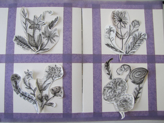
Next step was to cut or tear out the individual flowers and pick favorites to gather into 4 groups of posies which you could then audition on whatever you were using for a substrate. Rather than cut 4 pieces of 5 x 5 watercolor paper as I did for the last class I took from Laly, I decided to work in the big art journal sketchbook, taping off 5 x 5 inch areas to work in. Later you will see my arrangements changed a bit when gluing them down and I wish I'd checked this photo at that point.


Now to add some color to the bouquets with pieces torn from magazines. You can see I have a bit of a pink hangover yet from the color challenge with Laly. Can I help it if the first things I ran into as I sorted through the bin of papers were the pink leftovers from that challenge? I wanted to use the big rose but at this point didn't know which group to add it to.


Finally, we get to do some collaging, the thing I want to get better at. I heeded Laly when she said this was just to add a little something to the page and some texture, so I didn't go hog wild covering every inch. Besides, I had that feeling that little of this would show in the end. I just repurposed some of the scraps torn off the doodle flowers.


Laly always adds paint to soften and blend this stage of the collage. I just can't get the hang of this even after watching her do it several times. Again, I told myself not to worry because I was pretty sure this layer would be covered up. (I was right.) Still, good practice. And if you look closely, I used a neutral color of paint all around the edges like a frame which did still show in the end (although I wished I'd used the other color I was considering which was more like the dark yellowish papers).


Time to make the final arrangements of the bouquets and adhere them with gel medium. I could feel myself tensing up as I'm not comfortable with my arrangements not going down exactly as I've carefully put them together but I had to shake that off and be happy with the outcome. After all, this is supposed to be play, not some masterpiece. And this arrives me at the awkward teenage stage, the place where you look at what you've done and either think it is a hot mess (not what I was thinking) or you know it needs more but may not be sure what (exactly what I was thinking). Laly gave instructions of what to be looking for to change and improve, contrasts in value and shape to add, even permission to paint out what we didn't like, add in more collage elements, pencil in stems and leaves we might have collaged over. I started with those small strips of pink to balance out the strong pink collage elements. A good start and followed Laly's suggestion of adding some straight elements to contrast all the curves of the flowers.


At this point, I knew I had to walk away from it for a bit. Had a lot of racing to watch over the weekend anyway. When I looked at it again on Monday I thought, not so bad after all. And I'd had some time to think about what I might do to improve it. Most of my flowers were pretty smudgy grey and Laly says she almost always adds some white or black as a final touch, so I whitened up some of the darker flowers with white gesso (the white gel pen and the white Maribu art crayon were too translucent). Then I wanted to "pink up" some of the other blooms and add green too which I did with my Inktense pencils, so inspired was I with what happened with the water soluble pencil. Really rewarding seeing the dull color come to life when a wet brush is added. Finally I used a black micron pen to clean up some of the smudged or covered up with paint outlines of the flowers and leaves, penciled in one small bud on a stem, inked the words "bloom, blossom, flourish and grow" on the pink horizontal strips and spattered a little green ink over each. I'm really quite pleased with the outcome. Click on the photo for a bigger view of details - I've left that photo larger than usual.

My worktable looks a lot like it does after a quilting project is complete, only it's scraps of paper, glues and paint that needs picking up and putting away. Several people taking the class commented that now they know the value of saving every scrap of paper while I was thinking this is just like quilting where I can't throw out a single scrap of fabric. There are leftover doodle flowers too, two that I really like but are too big for the 5 x 5 format, some that could go into another arrangement, a couple I really should just toss, and Laly mentioned that the too large ones could just go on larger paper while the other leftovers could make yet another smaller piece or on the front of a card. I think my too big ones may go on another page of this sketchbook with background collage that is not hidden from view and the others into a posie that could go on a small book cover. We shall see. For now, I should move on to the baby quilt.

Tuesday, April 16, 2024

Resolved

Awkward Teenage Stage from February

Down to the last lingering project on my worktable, and irritated with myself that I'd not been able to move past being stuck, I spent some time over the weekend resolving the resolution word journal page. Goodness, high time to get on with it this many months past the beginning of the year. Above you see where I left it, still in an "awkward teenage" stage: ok but lacking. Addition of a few tan strips to balance the brown of the clock along with some hand written text helped but not enough.

Less awkward resolved version

Here it is after a breakthrough moment as I shuffled through my bin of collage materials and stumbled upon some possible solutions to get past the awkward stage. Still a little disjointed (I still struggle with covering up things I've strategically placed and softening edges for a less regimented look). But looking more complete.

Testing stamp & paint on Kraft Tex and gluing translucent bag images

One thing I didn't want to lose was the way the blue and yellow watercolor paint from the first layer gave this a bright positive feel. So I tended to paint around what was still showing through as I tried to blend or hide problem areas with periwinkle Fresco Finish paint. Not much improvement. There was a particularly troublesome area at the center top where the security envelop papers did not meet and I'd left some white showing at the end of one. The paint just sat there looking like it didn't belong. Finding a piece of fabric I'd stamped with a sun-like design I'd carved gave me my aha moment of what I could add to cover that area while adding more yellow to the spread. Then there was the translucent bag I'd saved that had swirls and stars on it. Would the translucent parts of cutouts actually disappear when gel medium held them in place? A test piece said yes!

Once I stamped that sun in the upper middle, I could see the solution to how to treat the narrow border around the outside of the spread. There were a few places where it had a bit of paint over it, and I wanted it to be clean white, so was considering painting over the outside with white paint. But now I could see that using the same yellow paint as the stamped image gave me the extra brightness I desired and cohesion too. The stamped image needed definition to show up on the security envelop paper so I outlined each part with blue micron pen.

Those stars and swirls really were the final touch that brought it all together. Added a few more encouraging words and am calling it good. Just in time to embark on another free collaging workshop with Laly Mille!

Tuesday, November 07, 2023

Finally Done With Pink!


Finally got a chance yesterday to take one last assessment of my Abstract Color Challenge and add a few finishing touches. I can't believe how much these little 5 x 5 pieces of "art" have grown on me. If thought of as a series, the order above is the order I had them laid out in as I worked on them. But as I removed the tape holding them to the table and looked at each individually, I was fairly pleased with how each stood on its own. Click on the pics for a larger view to study the details. I really like the look of the spatters and am ok with the bit of pen work I added.

In the meantime I ran across this quilt with what I feel is a stunning use of pink! It's called Hidden Gems by Gail Stepanek and Jan Hutchison.

And then I read an article about a wool and knitting festival on the Shetland Islands and was really taken with the pink and blue accents on this sweater, worn by wool felting teacher Ann Marie Anderson. I'm really gaining a new appreciation for the color pink!

Wednesday, October 25, 2023

#INKtober Continues As Does Color Challenge


Here is the latest page of #INKtober sketches, giving you a glimpse into my life last week. You might spot some urban sketching; looking ahead, the weatherman warned of a severe drop in temperatures this week so get out and enjoy the last few days of 70 degree weather at the end of last week and over the weekend.


So I grabbed my architecture sketchbook and headed over to the new houses across from the park on one of my walking routes to do two things. You might remember that the last time I was sketching at this location, I looked at my results once home and couldn't believe how off my roof was. I always take a picture of what I am sketching, and in reviewing it, I suddenly realized what was wrong. I'd been so focused on getting the eaves right that I totally forgot to add the peak lines of the roof. So that was the first thing I fixed. Then I moved a few houses down to sketch a straight-on view of a slightly different  house. I don't always do a pencil undersketch before inking in and adding color to complete the drawing but for these two I did. You can just make out the images on the toned paper. A youngish man (20's?) stopped to chat, and we soon were discussing angles, perspective and shading, him mentioning that shading is what he struggles with. How fun to interact with another sketcher.

Do you ever feel like you need a pep talk to get moving again on your art projects? As I felt myself continuing to resist working on the Abstract Color Challenge, I ran across this blog post by Daniel Sroka entitled Stop whining and make some damn art which was just what I needed! I've experienced the sort of self-doubt he describes and he is right: the way out to feeling good about yourself and your work again is to get back to work. Time to turn my awkward teenagers into something I could at least like and feel I'd made some good progress on. I added a few more pieces of collage, some ink and colored pencil highlights, some pink stamped on with bubble wrap, some pail pink paint in light areas and a bit over those strong pink pieces to knock them back a bit, then spattered each with brown ink. Ahhh, so much better (here's the "before" picture). I may add some handwritten text on at least one of them but I think these are pretty much done. I'll take individual pics of them when I'm sure.

I definitely like the pink glow they have now (not so obvious in the photos unfortunately) after applying this Fresco Finish chalk acrylic in Blush to the white areas and lightly across the strong pink. You might remember my epiphany about struggling with blending since all my paint colors on hand are strong and darkish and I never think to play with lightening them up by adding a bit of white. If only I'd think to add some pale paints to my collection. Enter Joggles.com having a sale on these very paints that were recommended to me by an internet friend years ago. I invested in 5 pale opaques: this Blush, Seaglass (which is a minty bluish green), Periwinkle (a lovely lavender), Eggshell (a nice off-white) and Buff (which is a bit sandy). That should cover all the bases.

While I feel better about these pieces, I know I have a lot to learn about collaging. I want to be successful on day one, have my pieces turn out looking as good as the teacher's examples, not be embarrassed to share them with the rest of the participants of this challenge. Not there yet. And then Helen Well's weekly blog post arrived in my mailbox, right off addressing this feeling of inadequacy in her Art Making Manifesto.

The more art we make the better our art becomes. The more art we make the more likely we are to develop skills and ideas. The more art we make the more confident we become in our decisions.  

Stop whining and make more art! It will get better and better with experience and experimentation. As she says, "Art-making is a skill, developed by practice and not an innate talent which we either have or don’t have. . . The idea of art being a ‘practice’ is right, we do indeed have to practice." Helen has a total of nine items on her manifesto list, all interesting and worth considering. Give it a look.

And right on cue, the weather took that plunge overnight. We didn't get much snow, just a little on the lawns that eventually melted as the day wore on, and we never got out of the 30's. I looked out the dining room window this afternoon, trying to make sense of the white on the tips of this small tree, looking like flowers or decorative lights.

A closer look and I could see that somehow, the snow had settled between the needles forming a ball that stayed while snow elsewhere had melted off.

I don't think I've ever seen this on this tree. Worth taking a picture.

Tuesday, October 17, 2023

Back To Pink & More #INKtober

To be honest, not much got done last week as I apparently was showing side effects of an RSV shot. Chatted with the pharmacist about it and he highly suspects it's because of the immune-suppressing meds I take. Still feeling it this week so am still taking it slow. In the meantime, I am perked up by my neighbor's Halloween decorations. That's my front door past the tree that we share so I get a chuckle each time I go out and see those skeletons relaxing in the chaise lounges.

Fortunately, the #Inktober sketches take little time or energy so I've been able to keep up with them. Here's the latest page. As you can see, there was a day of beautiful fall weather where I felt good enough for a walk at city beach, and then a total cloudy blockout of the hyped eclipse which in my area was an 80 percent one.

I kept popping into the studio in moments I felt a little better, inserting some postcards into the pockets of the challenge gratitude journal. I'm calling this "Gratitude, Memories, Things I Love" so that I can include things like these postcards of familiar sights sent to me after I moved away from the area back in the 1990s. Yes, I've been holding on to them that long, in the bottom of a stationery box. That's the Tacoma Narrows bridge peeking out. The greeting cards I used as wrappers have printing on the back that I'd rather not see so I have these small calendar cards from NWF that I will paste over it.

Someone from the challenge group shared this with us, suggesting we might like to include it in our journals. I decided I wanted it for my opening page. Still running into bits to add to my collection of things to paste on other pages.

Lastly, I decided I couldn't put off gluing down the pieces loosely arranged on my 4 pieces of watercolor paper for the abstract color challenge. Feeling I'm not really embracing making these abstract, and they are still in that awkward teenager stage, but today I experimented with where I might add a few small pieces here and there. Also thinking about ink spatters and bubble wrap marks and water soluble colored pencils. Still feeling cramped working in these 5 x 5 inch spaces. I like the lower left one the best, really just as it is, but must be brave about adding something more to give it depth and interest. Mostly, I'm ready to have these off the worktable. On the day I glued these pieces down, I covered them with wax paper and put them under books to dry, then sat at the sewing machine a bit to continue restitching the diagonal grid quilting on the 4-patch strip quilt while listening to podcasts. I'm almost done with the lines going in one direction and will feel much better about this project when I can flip the quilt and start stitching the other direction. And honestly, I'm so itching to start a knitting project, as if I don't have enough things going. Must be the autumn weather . . .

Tuesday, September 26, 2023

Succumbed Again . . .


I have plenty enough to keep me occupied, but say "free 3 day workshop" with an artist I follow and try to learn more from on the subject of mixed media art journaling and collage, well, I can't help but sign up. Knowing how Laly Mille presents these workshops, I knew what I was getting myself into time wise and that with each workshop being recorded, I could watch the videos according to my schedule. And my weekend schedule was full of motorcycle racing! Thus I haven't gotten very far on doing the actual work, but I'm already finding this Abstract Color Challenge to be helpful. I figured if nothing else, sticking with her direction to choose just one color plus some neutrals to work with would help simplify things so I could focus on other things. As you can see from the photo, I chose pink, not because I find it difficult to work with or a color I don't particularly care for, but because, unlike my go to's of teal and rusts, I tend to stereotype it as suitable for girlish quilts, not "serious" work, and difficult to sell if used in an art quilt. Time to get over that and see what I can do with pink.


I was surprised at how very much mixed media supplies I own or have pulled from magazines that are pink. Lots more to work with than I thought I would have. But before doing any work on the small 5 x 5 inch pieces of watercolor paper that would make up the series we'd be working on, we were to fill out a questionnaire about color. No, not questions like what are the three primary colors or what do you mix together to get green. No, it was more assessing how we work with color in general, what are your favorite colors and why, and when and why do you try new color schemes or combinations? My answers inveritably hinged on my experience working with fabric, but also pointed out my stumbling around with paints and what colors to have in my collection. She also sent us this link to Color Meanings which had a lot of info new to me. You might enjoy checking out what your own color preferences mean.

Next was doing some journaling in pencil across our watercolor squares, where I addressed pink directly, admitting that I love seeing pink sunsets and of course pink flowers as well, so why not more pink in my art? Day two we could start choosing collage papers and as usually, I floundered. Such a tiny space! She said it was so we would not be intimidated but I found it intimidating anyway because I always have such big ideas and big pieces of collage designs and have difficulty cutting them up/down. I had to sleep on it. Doing my usual mulling before dropping off, I came up with an idea and plan and got it going the next day. Needing to give it more thought and watch more workshop videos, it has sat in what Laly calls "the awkward teenage phase". Oh, yeah, lots of awkwardness there but with her next steps suggestions, I can see how to get past it now.


In the meantime, the birches out back have given way to autumn and our cooler weather, as have other trees in the neighborhood. We are to get quite a bit of rain this week so spending time reading and working on the challenge and getting back to sewing should be easy to fit in (she says with a laugh). I leave you with Susan Gaylord's wish:

"May autumn's bounty sustain and comfort us as the days shorten and the light recedes."