Wednesday, November 18, 2009

POAC'S "That Thing You Do"


Time again for another Pend Orielle Arts Council exhibit at the Power House here in Sandpoint. I have three art quilts in this one. If you make it to the opening reception this Friday, please introduce yourself - I'd love to meet you in real space!

POAC PRESENTS
"That Thing You Do"
All Media EXHIBITION

Nov. 20, 2009 - Jan. 4, 2010


Opening Reception

Friday, November 20, 2009
5:30 - 7:00 pm

Location:
The POAC Gallery, in the Old Power House
120 Lake Street, Sandpoint, Idaho

Hors d’oeurves & Refreshments
Provided by
Pend Oreille Pasta & Wine

Free and open to the public


Just in time for the Holiday shopping season, POAC’s That Thing You Do showcases the outstanding work of many of this area’s finest craftsmen.

Some of the more unique treasures include fabulous jewelry, intricate quilting and fiber arts, beautiful sculptures in wood and ceramic, breathtaking glass pieces, one-of-a-kind furniture pieces, and much, much more. An array of original works and media are utilized by these local and regional artists, and all are members of the Pend Oreille Arts Council. There is truly something for everyone, and for every taste.

"This area has many fine craft artists, and POAC wants to explore how their art is evolving" show coordinator Sally Lowry said. "Not only will there be new artists exhibited, but also various media that are not normally part of POAC shows. This is an excellent opportunity to view the breadth of artwork created by artists in our community."

The opening reception is free and the public is encouraged to attend.

Hors d’oeuvres and wine for the reception will be provided by Pend Oreille Pasta and Wine.

That Thing You Do will remain on display through January 4, 2010.

Tuesday, November 17, 2009

"Emily Carr Skies"


"Emily Carr Skies"
12 x 16 Art Quilt
Sheila Mahanke Barnes 2009

Here at last is my response to June's October challenge painting. Because I got so caught up in studying the way the painter Emily Carr rendered her skies, my name for this art quilt went from something about dancing trees to "Emily Carr Skies." It is 12 x 16 inches and has been mounted on foamcore board and framed.


The designing of this quilt has been a most interesting conversation between June, June's painting (above), Emily Carr's paintings and me. (For June's explanation of how Carr's work influenced her painting, see her post here.) First of all, the color palette is one I am naturally drawn to so it was easy to limit my fabric choices to those I could pick out in the painting (the more I looked, the more variety I spotted - an on-going conversation). As I studied it further, I was struck by something June said went she sent the painting along, about how Carr's cubist skies worked well with her swirling forests. I'd been noting trees both in nature and in artwork that depicted trees that seemed to be dancing. What if I could get the skies and the trees to dance together? And thus I had my answer to how to respond to June's swirling yet geometric design.


I spent quite a bit of time researching Emily Carr and her work, settling on the above two paintings of Carr's to work out my skies. I loved the idea of cubing the sky spaces as in the painting on the left and filling them with the blues and violets in June's painting. The painting on the right gave me my answer to how to quilt those areas, in undulating parallel lines. I worked at placing the colors and angling the quilting stitches to really get those skies dancing a bit like June had, sections ducking under others in something of a square dance reel.


June used a wide range of browns which was everything I needed for my tree trunks. I opted to leave them unquilted, partly because the quilt seemed busy enough without more stitch and texture being added, partly because unquilted they stand out from the surface increasing the sense of three dimensionality.

June's non-sky area is full of sharp angles. I wasn't sure if those green ones were mountains or trees, but in my design they became mountains. I would have liked to bring in a wider range of greens as June did, but I was afraid of losing my trees in the possible resulting chaos. Also, I really didn't have the greens in my stash to make it work. There are several ways I could have quilted that green area, but I decided to keep it simple and cohesive, mirroring what I'd done in the sky.

As in any good challenge, I learned quite a bit as I worked through various stages. I'd definitely work a sky that way again and carry it into the ground as well. I discovered weaknesses in my original drawing which I may revisit and revise in another quilt, and thought of different color combinations or treatment of the background that might make for a stronger piece of art. I definitely got the urge to piece curved seams out of my system for a bit!

Within the limits of this challenge, I am pleased with my outcome. June says I've done a good job of capturing the spirit of Carr's work without copying, and at this stage of my artistic development, I take that as high praise - thanks! For more detailed explanation of my process and the challenge itself as well as links to information about Emily Carr, see these posts:

More Play With Effects
Emily Carr
Poor Browns?
June's Jockeying
Return to Familiar Territory
Are We Dancing Yet?
Dancing Along
Quilting the Dance

And of course, clicking on any picture will give you a larger view.


Monday, November 16, 2009

Commercial Break


I've just added some new images and products to my cafepress shop. "Angel of the Rock" is now available on a greeting card (above) with a "guardian angel" message inside. Several of my recent fabric postcards can be purchased on greeting or note cards and traditional postcards.
There's a 2010 calendar featuring some of my birch tree quilts.


"Balance Check" and "Jockeying for Space" can now be found on ceramic tiles. Above is the framed tile, the other is a single tile 4-1/2 inches square.


Cafepress offers a great journal book in your choice of 4 different page styles. Mine features my "Simplicity" journal quilt on the cover.
There's even a messenger bag with "Azalea Mosaic 2: Garden Path" on the flap. I've also added the Azalea Mosaic image to a lovely lined lacquered wood box.

I've been very pleased with the quality of cafepress products and image transfers, so I can recommend them without reservation. Please take a look - maybe something will catch your eye - either for yourself or a gift:
http://www.cafepress.com/IdahoBeauty

End of commercial message...

Sunday, November 15, 2009

A Sunday Plug

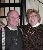
These are my good friends and spiritual advisers, The Rev. JP Carver and his wife, The Reverend Barb Carver. He's a priest and she a vocational deacon in the Episcopal church of which I am a member. They are embarking on a new ministry they have dubbed "Concierge Chaplain Ministry," As they explain it on their website, ccministry.org, it is a "ministry without a building, a ministry which goes to meet people where they are, both spiritually and physically, a ministry modeled on the Celtic principal of living your belief among people..."

I've added the link to their website, www.ccministry.org to my sidebar & hope you will take a look. If nothing else, you might be interested in JP's eclectic reading list here. Happy Sunday!


Friday, November 13, 2009

Quilting the Dance


I've spent the last couple of days quilting on my dancing trees challenge quilt. Step one: stabilize and define trunks with stitch in the ditch using a sumptuous silk buttonhole twist in dark brown. You can see how this subtle stitching makes a difference by comparing the unstitched area on the left.


Then it was time to stitch those Emily Carr skies. Perhaps you can see better my plan, how the placement of the different fabrics create an over & under swirling, thread color matched to the underlying fabric. The skies are dancing the Virginia Reel. Note how I worked out the direction of the stitching on one of my sample sketches.


I tested different green threads for the ground and settled on a rayon thread that looked good on both the dark and light green fabric. It didn't do much to blend the two but I decided that was ok. If I want to tone down the lighter green, I like June's idea of applying colored pencil.

So there's a ton of movement in the small quilt, and I'm thinking perhaps I should leave the trees alone. I'm afraid that if I quilt texture into them, or even just irregular lines, it will be too much. Any opinions? Ah, come on...you know you're dying to comment!

Monday, November 09, 2009

Dancing along...


I thought I'd be quilting this on Saturday, but I was still working out the greens in the bottom half. I'd originally thought I'd make each area between the trunks a different green, but I quickly realized that would be too much movement in the piece. Still, I felt one green across the bottom wasn't doing it either. June and Emily Carr both had a definite shaft of light slashing through their work (see this post), but my light source is much subtler. I spent a lot of time studying the play of light in my sky, envisioning where it might logically fall upon the landscape. It wasn't an easy call, perhaps made more difficult by the greens available to me. I'm hoping to tone down and blend the light green with quilting.

Saturday morning found me trying to decide whether the triangle near the center bottom should be the medium green or the dark green. I felt the dark green as you see in the above picture, didn't make as much sense but it was a tough call. If I'd doubted the importance of negative space before, working with this section of the quilt made a believer out of me. In the line sketch version, they did not shout so loudly for my eye's attention. Now that color was being added, I wished those center ones were not so large, or at least shaped differently. It might not have been such an issue for me if I could have cubed the spaces like I did some of the sky spaces.

I had a wonderful conversation with a non-artist friend who'd seen the above picture of just the top half. I was at an impasse with the greens and needed to clear my head. She gave me a rejuvenating image I couldn't get out of my head which got me over the hump of that impasse. Being a retired teacher who had chaperoned many a Friday night dance, she said the trees reminded her of kids dancing to techno-pop in a darkened room, arms waving in the air, each picking up the "fizz" of the lights from the stage (my sky) slightly differently. Having done my own share of chaperoning, I knew just what she meant and agreed! This energized image made working out the rest of the kinks fun again.

Wednesday, November 04, 2009

Are we dancing yet?


Today I faced the challenging piecing, so picked some high energy music to get me moving.


If you've been following along, you know that this piece will finish out at about 12 x 16 inches. As I was drawing the design, I didn't stop to think about the width of some of the tree trunks - I hadn't realized some were just a quarter inch wide. If I make another version of this at journal quilt size, you can bet it will be fused applique, not pieced!


This was the tightest curve I pieced today. It didn't look like it would be that bad, but it was. Many many pins to match and hold the pieces in place, and slow slow stitching. I was very relieved to turn it over and find no pleats or puckers.


Then it was suck it up time as I tried several ways of sewing those deep vees. Hand-piecing crossed my mind but I'm not sure that would have been any easier. I was wishing Ruth McDowell would drop by and offer to sew these for me. They turned out well enough (although close inspection by the quilt police might land me a violation or two).


And that's my sky, as many pieces sewn together into units as possible before moving on to the next step of picking out and cutting the ground fabric. What do you think - does my sky dance? I think it does. Can you see the cubist influence of Emily Carr?

I laid these out over a mid-value green batik and thought it read too busy - there's so much movement in the top portion as to make one dizzy. So I tried a darker one and thought it calmed things down nicely. That was before I broke for lunch and leaf raking/bagging and a walk. When I returned to a studio no longer bathed in natural light, the batik looked way too dark. I've cut pieces from some green painted fabric, but it may be too light - I need to wait until tomorrow to see how it looks in daylight. It's coming, June, it's coming...

Monday, November 02, 2009

Return to Familiar Territory


I struggled with a recalcitrant dance partner all weekend. The dancing skies weren't dancing as I'd envisioned.


Lots of fussy cutting leaving jagged edges and holes as I cajoled them to glide.


Lots of rejects - they didn't like the tango, wouldn't learn to waltz. They came dangerously close to being voted off the show (yes, I watch Dancing With The Stars). So I gave them a rest yesterday, and they reconsidered the dance, allowing me to lead at last.


Finally the pieces fell into place and I could begin what I've been waiting for, the chance to sit at the machine and piece! All straight seams in the sky are sewn and I will tackle the curved ones tomorrow. This is familiar territory, this kind of piecing, any doubt about the time spent marking banished with the ease of matching up units.

And then we'll see if we can get the ground to play along - it need not dance, just create a frame that shows off the main attraction of dancing trees and skies.

Friday, October 30, 2009

Poor Browns?


"I cannot pretend to feel impartial about colours. I rejoice with the brilliant ones and am genuinely sorry for the poor browns."
Sir Winston Churchill


My goodness, I find nothing poor about browns! I have a lovely array of brown fabrics, from batiks to hand-dyes to commercial prints. I had a great selection to choose from to evoke my different dancing trees.


Here are two more I'm considering to replace the dark tree in the center. Feel sorry for poor browns? I feel sorry for poor Churchill!

Thursday, October 29, 2009

June's Jockeying

"Jockeying in Underwood's Queue"
June Underwood 2009


It is quickly nearing the end of October, and June has shared with me her response to my "Jockeying in the Queue." She's blogged about it here, and I was relieved to read that she, too, has been dealing with a busy month and a late start on the challenge. She's done early only because she's off on an extended trip, and admits there's some editing she'd like to do when she gets back (and the paint dries). It would appear that the theme of jockeying this month applies to us in many ways.


So where is my response to June's October challenge, you may ask? It's not that I haven't been working on it; I have. In fact, I became so engrossed in the design process that I have only begun to choose and cut fabric the last few days.


I've set myself a technical challenge which has required a lot of tracing and transferring and enlarging of my pattern. My original sketch was journal size, and I decided to copy it to drawing paper so I could try out color placement with Prismacolor pencils. I first traced it onto tracing paper, then rubbed graphite on the underside along the design lines (right in the above photo). Then when the tracing paper was placed over the drawing paper, I could run over the lines with a dry ball point pen to transfer a faint impression of my design (left) which you might be able to see if you click on the photo.


I didn't have as much luck with the colored pencils as I'd hoped. Much like searching my fabric stash, I found I didn't have the colors or values of specific colors I had in mind, and only had modest success in blending colors. Still, the exercise pointed out places where I need to be careful about value choices in the sky and let me try out an idea for segmenting it. It also helped me see I needed a better distribution of the different browns for the trees. I made the connection that I could alter the color of the fabric with stitch, just as I was altering the color put down with the pencil with other colors streaked on. I could have played with this for days, but time was running out. It was time to enlarge my pattern to our predetermined challenge size of 12 x 16. Since I had scanned the original sketch, I was able to let my computer do the enlarging, printing out the quadrants full size for me to tape together.


I should have taped it to a light box or window. I had to trace it twice - once onto a large piece of tracing paper which I could then place on the light box so that I could transfer the design onto newsprint for my master pattern. Once that was done, I traced a mirror image version onto freezer paper which will become the templates.


Now I had a puzzle to decipher and a numbering system to devise. This entire pattern will be cut, the individual pieces ironed to fabric and the fabric pieces re-assembled into the finished top. With all the dancing and intertwining going on, I needed a plan. I divided the design into 4 main sections, then labeled the pieces within a section in something close to the sewing sequence. This code was transferred to the master pattern as well. I also added hash marks to aid in matching up the curving seams.


At last, I was ready to start construction, beginning with the trees (I had the least question about fabric choice with them). After ironing on a template, the fabric is marked along the edge of the freezer paper (seam lines) and hash marks are transferred to the seam allowance. I've perfected sliding a small ruler along the seam line while I trim away the excess fabric to give me 1/4 inch seam allowance along the curves. Yes, this is a tedious and time consuming process, but one I find worth it once I get to the sewing.


I quickly realized that, since I was not cutting and applying templates in sequence, I would have to find a way to keep track of the loose templates as I cut them apart. I'd pinned my master pattern to the design wall to help me keep track of placement as I cut out fabric; it was the perfect place to pin the extra templates until I needed them. The trees are all cut now, although I am considering changing the fabric in one of them - that is the beauty of this system. It is so easy to change a fabric if it isn't working well - I'll be able to see the complete composition before sewing a single stitch. Tomorrow I think I'll start on the sky - what I end up using there will influence the values I should use in the ground more so than the other way around.

I can see I will not be done by Saturday. I appreciate June's relaxed approach to our challenge. It is allowing me to revisit ideas and explore approaches that I might otherwise set aside until I had more time. Of course, we never do have more time. It is very hard for me to approach these challenges in an off-hand way, to dash something out as some can. No, I allow myself to get engrossed in the idea, in the planning, in the process. It's what I enjoy about quilting, and sometimes it's just not worth it to me to rush it.

Tuesday, October 27, 2009

Tulips for Dawn


I've just heard that a former guild sister is quite ill and as is our way, the guild is putting together a friendship quilt for her. I may be in Idaho and they in Wisconsin, but that hasn't stopped me from caring about them and wanting to make a block for this quilt. There were few restrictions on what one could make, and it didn't take much thinking for me to settle on a block with tulips. Dawn joined my Baltimore Applique group (an off-shoot of the main guild), which was a surprise, since she openly admitted she did little quilting, just loved quilts and the people and all that went with being a long-time guild member. However, she shared that she'd always dreamed of making a tulip quilt, had even bought a pattern or two, so thought this small group would be a good place to learn the hand applique skill she'd need. Once I knew this, I started noticing tulip patterns everywhere and even copied a few from my own collection for her.


One of the patterns I shared with her, if I remember correctly, is the Tulips quilt above. It is from the book Mini Quilts from Traditional Designs by Adele Corcoran & Caroline Wilkinson. This is a great example of why I find it hard to let go of books and patterns and fabric. I've not made any of the quilts in this book, and seldom make traditional designs anymore. I've had the fabric for quite awhile, a style I still like but which doesn't really work in my art quilts. Yet book and fabric was just what I needed for my block. I wish I'd had time to hand applique it, but the information came too late for that. Instead, it is fused with Steam-a-Seam Lite and I added machine buttonhole stitch around the tulips to define them a bit more. Four blocks joined in this swirl gave me the size requested for the friendship quilt.

God speed, Dawn, on this difficult journey. Wrap yourself in your sisters' love.

Friday, October 23, 2009

Another Exhibit


I feel like I'm stuck in a revolving door of exhibiting. Yesterday, it was taking down my ArtWalk exhibit, today it was putting up a different grouping at my church for our Oktoberfest/Art show tomorrow. ArtWalk went up at the end of July and I thought I would get a break. Then I received a notice of a September exhibit and hustled to finish my Bishop's Close pieces for it. For the church exhibit I'm using both some older pieces and ones from ArtWalk. But I'm not done yet...I've just received an invitation to exhibit during November & December, so again, I'll be pushing to finish a few new pieces. Whew! I'm glad to have so many local opportunities but I could use a break. I've had to do some creative shuffling of art work to keep all venues fresh.


Set up was easier this year than last as we are farther along on our renovation project. The wall my quilts hang on is only primed but that's a big improvement over the patched drywall of last year. The ladies helping today like asymmetrical groupings and packing the walls. I'm a little uncomfortable with it, but have to admit it does allow us to hang more work. Above are watercolor paintings by Susan Wall.


This grouping is more watercolors by Maureen Hackworthy.


And our photographer, Geoffrey Cant, is back.


Karen Applegate agreed to share her cross-stitch and needlepoint, although she is not willing to part with any of them. I know the feeling.

Several other members have contributed oil paintings, woven baskets and other art. We're hoping for at least as many sales as we had last year, but in this economy, you can't count on anything.

Thursday, October 22, 2009

Unfamiliar Territory


Remember these little Easter postcards I recently made? I got to thinking what a nice pair they made, and maybe I should frame them up together. I headed to Ben Franklin to scope out frames and colored mat board. I ended up bringing home this piece of scrapbooking paper instead as well as an inexpensive dark green frame. I didn't notice until I got home that the paper's pattern includes a heavy weave as if it were fabric. Even better!


My plan was to use double-sided tape to attach the postcards to the mat, but now I'd be attaching them to paper. I know very little about scrapbooking, so I called a friend who does. I knew I'd need to secure that paper to mat board, but with what? I was envisioning some special glue that wouldn't make the paper wrinkle, but she assured me I could just use my double-sided tape. Yeah! I really like the way it came out. (If you click on the picture, you can see the weave in the paper.) I'm putting this in my church's art fair this weekend and know how nervous some people are about no protective glass over art. My compromise is to slip the glass between the back board and the mat board. That way I can display it "naked" like I like, but assure a customer that the glass is included should they wish to use it.

Monday, October 19, 2009

More on Signature Style

Last week I shared a quotation airing the view that "A signature style is about consumerism, not art." (see this post). I withheld my thoughts on this, curious about how others might see it. I got three comments which pretty much agreed, provided "signature style" is synonymous with "sale-able style." . And then Wanda shared a link with me. As so often happens, another blogger, Elizabeth Barton, was musing the same issue in this post, albeit from the angle of risk taking (or not). It's short, so go take a read, then come back.

When I first came across the quotation accusing signature style of essentially making life easier for the consumers, I thought she had a good point. I went through a period of worry that I had not developed a signature style yet, because I equated it with earning the title of "artist" and thus the potential of sales. Then I worried about being pigeon-holed because my interests take me back and forth over the line between organic and geometric designs. What if I become known for my sinuous tree trunk designs to the point that followers will be dismissive when my work shifts to my other obsession of grids? I finally settled back to the reality of first I must please myself; if others are unsettled by fresh directions, there will be, perhaps, just as many excited by it. I'm not having to make a living off my art, so I am comfortable with that. Yet it does make it difficult to put together a cohesive "body of work" for exhibits. Doesn't matter much if you are in a group exhibition, but yes, for a solo show or to market, it's much easier to think in terms of work whose signature may make it all look alike in some way. Not the way many of us like to work.

However, I think Terry makes a good point that the author may not understand the concept of signature style, confusing it with saleable style. Following the links to the author's full objection, and to the statements on her website, it became clear to me that perhaps she was protesting too much. If she were truly confident in what she was doing, I think she would spend less time trying to bolster her position. It reminded me of my summary page to a gradeschool report on folklore. The assignment was to interview adults in the community for stories of a local flavor, things that might fall under the categories of old wives' tales or ghost stories or legends. Well, I was very uncomfortable asking adults for their stories, so my collection covered common stories I already knew fleshed out with ones I could pry out of mom & dad. That summary page was nothing more than justification for not having interviewed more people, and the teacher called me out on it. I had the same sense from this artist, that deep down she knew her art might be better if she were not pulled so many directions, but it was easier to rationalize it away with this argument of signature style basically being a bad thing inflicted upon artists by the consumer industry.

At this point, I'm going to send you to the website of Melissa Cole, who has definitely developed a signature style which is also a saleable style. I love her work, but I am a bit unsettled by how commercial her website comes across and how within a category, her work is so similar. There's an efficiency there that verges on production, and while no two paintings are exactly the same, some are so close that it takes a second look to define the difference. Seeing one of her salmon paintings in person made we want to own her work. After viewing her website, I lost the urge after the 4th time I thought I'd spotted the painting I'd seen only to discover it was just a variation. I feel funny making these observations, because she obviously is talented and successful. And yet...

Signature style develops from doing the work, from focus, from seizing on an idea and running with it until all options are exhausted or we tire of the exercise. It might serve us our entire creative lives, but more likely, we will find forks in the road of our creative journeys that will lead us into new territories and new signatures. Now there's something to be excited about. Whether or not we choose to create for a specific market as well is a personal choice.

Any more opinions?