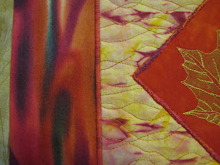
I certainly took my sweet time finishing up this piece, but it is now done and I am pleased with the many choices I made along the way, the what ifs and how shoulds that made me think I might never finish. I have to tell you it does not photograph well. If I get the gold right, the reds turn lurid and hurt the eyes. If I get the reds toned done, then the gold fades out. Either way, the pink tones in the shibori turn orange. The leaf shows more strongly in person, the outer gold being a perfect match and therefore bring it out. Yes, I need more practice and probably some lessons with my camera and photo software. This is close though. The only thing I'm a little unsure about is the proportions of the final "border" which is actually my mount system. As far as technique, this quilt is put together pretty much like Slippery Slope (see this post).

This was definitely a layer by layer effort. The leaf-printed charm was thread painted all on its own. The shibori square was quilted as a separate piece. The two were then joined by couching that yarn over the raw edge of the charm (no additional batting under the charm). The next layer, that commercial red print, first had Decor Bond fused to the back and the raw edges turned under before the quilted layer with charm was satin stitched to it using a YLI cotton machine quilting thread with a very subtle variegation. The final layer, the gold, also has Decor Bond fused to it, as does the muslin backing. A little glue baste holds the body of the charm/shibori/red print in place while thin strips of fusible along the edges secures it to the gold mount. No stitching along the fused edge, no batting under it either.
I could have done a pillow turn finish, but I wasn't up to it - there sometimes are issues getting a decent turn and an outside perfectly squared up, as it were, with the Decor Bond stabilizing, although I have done it a time or two. I also felt I needed a thin bit of darkness along the outside. After much searching and auditioning, I suddenly realized that, unlike commercial fabric, my mounting fabric was actually darker on the wrong side than on the right. It started life as one of those tone on tone white fabrics that ended up in the dye vat. That plasticy stuff they use to apply the design on tone on tone fabrics does not take the dye like the rest of the fabric, so the front reads lighter than the back. Just what I needed to finish off this look. I like the freedom that this mounting system gives me to leave the beautiful fabrics without any stitching/quilting, yet with enough body to hang perfectly. There's not much to take away from the centerpiece of the quilt.

No comments:
Post a Comment