Tuesday, April 30, 2019

Collaborative Thinking

I love my art group.

Not only does that monthly meeting drive me to do something when I'm in a slump or frustrated almost to the point of giving up on something, so that I'll have something to talk about or ask about when the time comes, the talking out loud and then hearing other takes, other ideas about how to proceed, can bring solutions into focus, spark even more ideas, take me forward in a way I often can't do on my own.

Such was the case with April's meeting. We had not met the previous month, which was a disappointment because I'd wanted to go over my ideas about the Dolphin Fountain quilt and some of the technical challenges puzzling me. And so that quilt sat while I did other things and even started piecing together ideas for a different fountain quilt. But now was my chance, and in getting a few things collected to take to the meeting, I actually answered one of my questions. But there was more I wondered about, how to use that piece of silk from the tie, and especially how to make it look like it was flowing down steps. I'd worked out in my head (while trying to drop off to sleep) that I might be able to mimic some dimension of steps by sewing little tucks into the batik, but I'd not actually tried manipulating the fabric. But I did now, in front of the group, and then started talking about how the silk might be arranged over the tucks and maybe a narrow strip of sheer added across at the top of each step. Others tossed in some tentative ideas.


And then, one of my brilliant group said, "You could attach the silk to the batik first, before folding and sewing in the tucks. Then it would offset the design automatically." Oh my gosh - she was right! And now so obvious. I still have some things to work out but this was such a big step forward on designing this quilt. And I'm not sure I would have gotten there without the kind of collaborative thinking that happens in my art group.

Friday, April 19, 2019

The Crux of an Idea

Well, this is weird.

After returning from that 3 months at the Mayo Clinic with my friend, after she was gone and I was going through her stash that I'd inherited, I came across this batik and added it to my "water wall" because it would be perfect to incorporate into a quilt highlighting the man-made pool on the Plummer House grounds. That pool was set back into a shady area thick with trees and ferns and vines, and I remembered the purplish colors reflected in the water along with the greens.


I'm thinking about this now instead of proceeding with the Dolphin Fountain because of an accidental juxtaposition of two fabrics from the last snow-dyeing. It was pure chance that I laid the fat eighth over the fat quarter and suddenly saw in it that Plummer House grounds pool. I grabbed the batik off the water wall to see if it worked with those two and saw that it did. Since this would be pretty straightforward requiring little working out of process (while the Dolphin quilt still has me pondering over technical approaches), I want to move ahead with this one before the inspiration fades.

Plummer House Grounds fountain - photo from an internet google

So I decided to take a quick look through my reference photos to remind me of the details of that pool and surrounding areas, and to my puzzlement, none of them bear out this memory of purple in the surroundings. Many of the photos, in fact, are very poor because of how darkly in shade the pool was, and apparently I was more focused on capturing reflections. So yes, this is weird, that my memory does not match reality. Maybe it's just my photos, I thought. So I also googled images of the grounds, and still no purple. In fact, I discovered this pool is actually a fountain, which was not running the day we were there. 

My photo from a blog post that showed up in a google search

Which brings up another weird thing. While googling those images, I clicked on one to discover it was from my own blog post about our excursion around the grounds. Have you ever had that happen to you, finding your own photos in a google search? You can read that post here and scroll down to see more photos and narrative about the water features. As I look at them now, I have no recollection of this fountain pool having that "unnaturally blue" look. But there it is in my photo, if not in my memory banks.


I'm taking it as a sign of artistic growth that I'm not letting any of this "reality" lead me away from my original design colors (although seeing that blue makes me feel better about the blue in the one snow-dye which I was feeling uncomfortable about, thinking it wasn't really accurate). I was thinking about this as an abstraction anyway, a hint at the real thing. And as often happens, scarcity of fabric will drive the design. As I pondered how to work with what I had, I already started wondering/worrying about the quilting, until I suddenly remembered this batik I bought maybe a month ago. I often catch myself picking up a fabric because the design on it strikes me as one I could translate some way in my own surface design efforts. I was taken in not only by those waves, but also by the colors within them - intriguing. And as it turns out, the batik itself is a perfect match to coordinate with the purple/green batik should there be any left. But what made me get this piece out and study it again was the thought that in those lines was the answer to my quilting design question, a much different kind of wavy water line than I've used before. Pretty exciting.

Wednesday, April 10, 2019

Another #DingsplatZ

Not sure this is much of an improvement over the first one. Or at least not particularly different or imaginative since I used some of the same tangles. I'd intended to have fewer loops than the first one but only decreased by one. So still working with a mostly rectangular space within the framework. And didn't quite get the auraing going right to produce an over under effect so added the lines within the auraing instead. This is what happens when you go into this with expectations! I do like adding the red and the leaves got a hint of green added to them. I do like my color.

Tuesday, April 09, 2019

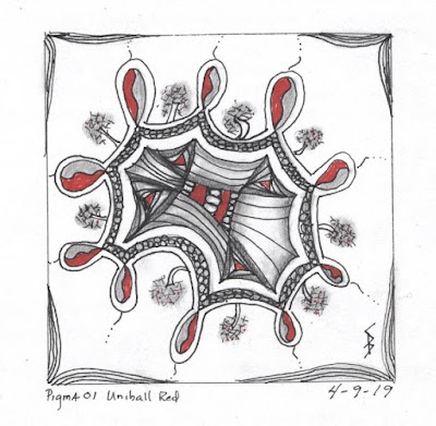
#DingsplatZ

Working on a Zentangle wasn't on the list of things I might do today, but before heading off to yoga, I watched a video by the Zentangle people working with something they call a dingsplatZ. It's another way to create a framework, they say, for the tangles you will add on your tile. I was so fascinated with the demos that all else was off the table when I got home from said yoga class. I spent a lovely hour working this up, lovely perhaps partly because it wasn't what I had intended to do with that bit of time, a guilty pleasure, and winging my schedule as it were. The framework or dingsplatZ is just drawing loops in a circle around the page with a single line that joins up, giving you an enclosed space to work within. They mentioned you could think of it as an ink splat too. Lots of "auraing" or echoing around that loopy line, building the framework around where tangles would appear. Placing some tangles outside the framework as well. Shading with pencil and highlights of red, since this was done in my "and then add red" sketchbook. The flourishes in the corners came about to cover up a place where my pen slipped under my template when drawing the outer square. (There are no mistakes in Zentangle, just opportunities.) One example of auraing around the loops put me in mind of the ratoon tangle which this looks somewhat like but is approached in a very different way. This was fun and I have another square drawn where I can try this again with that alternate aura like I see in ratoon.