Wednesday, January 29, 2014

Back To Textiles

I've been feeling a little guilty that I haven't had more fabric-related things to blog about lately. I simply got stuck the last week or so. But yesterday, the log jam that was my creative brain kicked loose, and the ideas as well as motivation are flowing again. And, I think it is all due to solving the closure issue on a padfolio. I can't tell you how much time I spent thinking, envisioning, experimenting, with no luck. It was a puzzle I could not get my head around although I was sure there was a simple solution. And when the solution came in a flash, I wanted to kick myself for being so dense. I wanted to use a button but I didn't want to use velcro to keep the flap in place. I was sure elastic was the answer, but I got hung up on thinking it should also attach the button to the flap. Why did it take me so long to realize I could butt the cut ends of elastic together and stitch them to the right side of the flap, then sew the button over the join to hide it? Well, now that it is done and has worked as well as I hoped, my mind is on to other things.

I keep talking about doing a water series this year based on my experiences in Rochester in 2012, and people keep saying they are curious to see what I'm going to do with it. Frankly, I'm curious too...and just a little bit scared. The idea hasn't gotten much beyond a jumble of reference photos floating in my head, this wall of "water" fabric that's been up for a year, and one firm design idea for which I've done just a few sketches. I think I know what images I want to incorporate in the series but I have no idea how I'm going to do that in an interesting way. The scared part is that I'll do this first one, and nothing else will follow. Or worse yet, I'll do this first one, struggle with it, end up unhappy with it and junk the whole series. My experienced side is trying to remind me that ideas do not flesh out until I start working - then the ideas and solutions often start flowing uncontrollably.


But where to start, even on this first design? I've mostly sketched on memory, but I decided I needed to look at my reference photos again to get a better sense of proportion in the odd-sized blocks I thought I'd be using. I need to start drawing it out closer to full-size and I need a kick-start. I chose one of the many photos I took of this fountain wall, thinking to have it up on the screen while I sketched, but the color was getting in the way. I took it into Paint Shop Pro, reduced it to grey-scale, then applied the pencil effect to it. I printed it out today and I can't believe how that print-out is getting my juices going.

While I was in that particular file of reference photos, I decided it might help my thoughts about the series and where I wanted to go with it if I pulled specific photos out of this rather huge file and grouped them in their own "water series" file. That process alone helped remind me of my original thoughts about the series and expanded my thoughts about what else could be included. Now I'm getting excited because I'm not just stumbling around in the dark, but have some solid ideas to work towards that I've organized for easy retrieval.

Of course, the problem with series is that the mind does not always go along with the idea that it must be disciplined and only work on this theme. Diversions are cropping up everywhere, vying for attention with promises of being straightforward and fast, or a way to warm up. Yeah, I know how that works - straightforward and fast often just leads me down a lengthy rabbit hole! However, "Upward Tick" is a Rochester-related idea I wanted to complete before launching into the water series. And it is on my January list of things to work on. I've already printed out a couple of possible mounts but had been dragging my feet about settling on a background and moving on. Well, today I cut a couple of backgrounds so the moving on can begin.

Tuesday, January 28, 2014

Shaking Off That Bad Feeling

I don't want you to worry too much about me after that last post. After publishing it, I went right downstairs to where I have my Zentangling supplies and worked on another ZIA in the button book. It was like cleansing the palette and calmed me right down. I started with the above pre-stamped page and another idea from the Zentangle people. They had blogged here about a photo of the inside of a beautiful Italian building and how the unique architecture gave them an idea. Banded columns could become the bones of a design with which to tangle within.


I'd been thinking architecture when I stamped this page, so I drew lines on either side of the stamps to turn them into columns, then added two horizontal bands to tie them together. The open areas were then filled with various tangles and shaded. Do you get a little feel for a wall that changes direction at each column? Or perhaps the space between columns are not walls at all, but open like a bell tower with netting keeping you from falling out.

I shared a quotation in the comment section of the last post, by the way, that made me feel better about my little travesty with the art journal. In case you didn't see it, I share it here, because it is a good thing to keep in mind as we work at our craft:

"Creativity is allowing oneself to make mistakes. Art is knowing which ones to keep."

-- Scott Adams, cartoonist

Sunday, January 26, 2014

Sunday Art Journal About Love

Yes, this week's Positively Creative journaling prompt is about what you love, and I've got to say, I'm not lovin' my results. I made several silly mistakes doing other things before I even started the exercise, a sign I should recognize as things being off and I should get out of the studio. But it's Sunday and I pressed on. Not much new in the way of technique here, just lightly paint the page (purple with a little white mixed in) and use a sharpie pen to make marks - any marks. "They may not even show after the next step," the directions said, which always makes me wonder why to do it in the first place? (You can see my attitude is not positive nor loving here.)


I've not used the yellow paint since the first exercise and thought it might look good over the purple, especially if a mixed a little white into it to make it paler before scraping it down the page. Well, THAT didn't work too well - it really looks horrid and didn't do much to cover up my marks. Since I'll be journalling when all the painting is done, I think they need to show through much less than this. You can see the blobs of white paint at the top of the spread, ready to be scraped over the yellow in an effort to lighten it while covering up the marks.


That didn't work either and I added two more layers of paint before calling it quits - the purple without any white mixed in, then more white over the top. Bleh bleh bleh. However, I'm remembering other spreads I questioned that actually looked ok as the backdrop for the "creative" stuff on top. Let's hope...


I really don't want to show you this, I'm so disappointed with it. A lot of the problem is with the colors I chose - I never should have paired that particular yellow with this purple, not in this way.  I'm remembering this same frustration back when I was playing with marbling and sun-printing and other painting on fabric. I only seemed to have a few colors that coordinated well with each other, the rest frustrating me at every turn. I'm having the same value struggles that crop up in my textile work. Those hyacinths faded into the background without help from a darkening pen, yet the lettering in black equally struggled to be seen on the page.  I even managed to copy the quotation given in the exercise wrong.

These sorts of setbacks are so demoralizing, making me want to give up on this class and toss it all. I recognize this feeling; it's these kinds of failures in the past that kept the paints in the cupboard for so long. It's realizing I've made these same mistakes before and apparently can't keep myself from repeating them. I know. Some of you are probably rushing right now to leave me a comment that this is not a failure if for no other reason than I have learned something from it. Don't try to make me feel better!!! ;-) Trust me - it is a failure and this spread in my happiness journal does not make me happy. However, it can be a failure AND teach me much. I've already run through a few positives, like sensing my comfort level with approaching paint itself increasing. And finding the teapot to symbolize the filling up in the quotation instead of defaulting to the ubiquitous heart symbol pleased me. But overall, I did not enjoy this process today, not even listing the things I love. Too focused on the thing I did not love before me!

Saturday, January 25, 2014

Artist Highlight: Meg Marchiando

Marta & Annabelle - "Quirkies" by Meg Marchiando
I'm still doing too much catch-up and not enough creating, although I've almost finished a padfolio for a challenge and have a second one in the works. Because it's for a challenge, I can't show it yet. So instead, I'd like to point you to the latest work of one of the members of my art group, Meg of Blue Turtles Art. She has just completed two pieces (right) for an exhibit which opened last night at Panhandle Bank in Sandpoint, Id. The theme is "Flowers and Fabric" but it is open to all media. It was interesting to see what the local artists came up with (and no, I'm not one of them). More traditional quilts than I anticipated, plus photographs and paintings of flowers as one would expect.

Meg with her "Green Man" quilt
When Meg and I first met, we were loosely doing similar work - nature inspired designs in a basic square or rectangular format with edge finishes more or less traditionally executed (the photo left was taken last February at our second art group meeting). We both have diverged from that since then, Meg in particular, as she has really found her voice in creating children from fabric and stitch. 


Meg with her original kid Jack in progress
Specifically, she wanted to create a boy that would be doing a handstand on an actual bicycle sculpture in her living room. She brought "Jack" to our third meeting (right) where we discussed hanging and finishing options. She worked out the logistics, using a stiff interfacing in lieu of batting and strategically-placed velcro in lieu of hanging sleeves. She really liked not having to applique her creation onto a background, and we encouraged her to pursue this. But there were so many questions: What do I call them? They're not really quilts. Will they be accepted in the exhibits and how do I hang them? Will anyone want to buy them and at what price? 

Meg at exhibit opening explaining her process

All those questions have been answered over this last year, and it is stunning to see how her kids have grown from fairly static and small (yet cute like the ones in her website banner) to larger versions exuding life and energy like Annabelle.  Read Meg's own description of her latest "girls" here.


A house "quirkie" by Meg Marchiando
Meg has also toyed with fishes, houses and snowflakes which you can find in her Etsy shop. You can also see some of them along with her other work and see our roots and progression in this post about our joint exhibit last year.


I have to say, it has been so exciting sharing this journey with her and a joy to watch an artist develop such a distinctive style that is being well received. It's also gratifying to have developed a supportive friendship with her (as well as the others in my art group), one in which we do not feel in competition but strengthened as we pursue our artistic endeavors. 

Tuesday, January 21, 2014

A Quick Zentangle

I've been fine tuning the studio since getting that new storage unit into place and today was more of a cleaning and straightening and trying out new locations for things that sit on top of my units day than it was proceeding with projects day. Getting closer to having a place for everything and everything in its place. So no sewing or printing or progress I can show. But I can share this simple Zentangle (or more accurately, Zentangle Inspired Art - ZIA) I worked on today. I'm feeling a tiny bit of pressure to get on with the sketching or drawing I said I wanted to do since I have all these new places to do it in. Yet what has been niggling at me for weeks is to get back to my stamped pages in the button booklet. This page has been open for some time now, the next one I wanted to attack.


Not long ago, I ran across a new tangle I wanted to try called quib. It seemed the perfect match for this page (that's it running through the middle). Today seemed the perfect day to break the block that's been keeping me from the sketchbooks. It's kind of a funny one to shade, but this will have to do for today. I wanted more on the page so I settled for the chain of leaves, added echoing and some tiny circles. Out of practice but warming up.

Sunday, January 19, 2014

Creative Sunday

Sunday again and time for another exercise from Dale Ann Potter's Positively Creative Art Journaling course. I recognize the technique we'll be using, although it is one I've only read about, never tried. Starts with spreading paint on pages again and instead of the foam brush I've been using, I decided to use this scrub brush - one I remember as favorite back when I was doing sun prints. I put a little acrylic paint on a palette, wet the brush and swished it around in the paint to dilute it a bit and painted away. Of course, that means painting another square on the sampler to use up extra paint (which I did after the next step, but this was a prettier picture to lead off with).


Then quick, while the paint is still wet, cover it with plastic wrap and moosh things around. It wasn't mooshing much. One thing I've noticed in doing these exercises is how quickly the paint dries on the page. Although I was quite quick with the wrap, I'm thinking I didn't put enough paint down, or get it on both sides of the spread fast enough to prevent areas from drying before I was ready. By the way, I have slipped oversized pieces of scrap paper under either page to protect the pages underneath, a trick I picked up from watching a Joggles video tutorial. To my chagrin, I'd noticed a blob of green paint  near the top of my first spread after finishing the second spread and I knew exactly how it had happened.


After sitting for a few minutes, the wrap comes off, lifting paint with it which you can transfer onto something else, in this case, a piece of copy paper. Not surprisingly, there wasn't much paint to transfer. Hardly anything came off on the paper.


And there wasn't much texture created on the page spread. Here is one section that did what it was supposed to. But you can also see that the paint did not cover up the writing underneath it.


So the directions said if this happened, just apply another color of paint and do the plastic wrap technique again. I put a little white acrylic paint on the same spot on the palette as the green had been, wet the brush just a little (but not enough to remove any green paint still lurking), and swirled it around on the palette. Just enough green mixed with the white to tint it and I generously applied this layer over the page. I used the same piece of plastic wrap over the spread and immediately could feel the paint was moving as intended, could see through the plastic what was happening. When I pulled off the plastic, I had a nicely textured page although there were still some areas where the underlying text showed (sorry - did not take a pic of that stage).


I'm not showing you the finished spread as it is mostly just text (including favorite song lyrics), hard to read and somewhat personal - as a whole not particularly creative in look. However, I did add some embellishment around the edge with Pigma Pen and Gelly Roll pen, inspired by Zentangle designs in my reference notebook. I'm liking that Gelly Roll pen way too much.

On the surface, these exercises don't seem like much, small in scale and not great works of art. However, I have noticed a shift in my attitude about using paints. I'm getting over the feeling that to get out the paints means a big chunk of time, lots of prep and lots of clean-up. Ok, I suppose you all knew that, but up until now, that is how I've been approaching any exploration of surface design, making it into a BIG DEAL. Now I see how one really can get out a small dab of paint and a brush, do a little something, be it stamp a few images or lay down some color, do a little rinsing and be on to something else.

Wednesday, January 15, 2014

More Printing, More Organizing, More Supplies

Here's what I've been up to this week. I assembled the new storage unit - well 2/3ds of it. When I hung my artwork, I didn't stop to think how tall it would be with the 3rd level of cubes. Since this picture, I've added a cube on the top left, and if I feel I need the additional space of the last cube, I'll have to take down a quilt. Nice to know I have room to grow. The fabric from the old unit has been transferred and my larger cuts of batiks moved from the adjacent unit which has rather narrow spacing between the shelves - those batiks would barely slide in and in fact, some of them were folded and shoved in between the flat stacks. This is definitely better.


I found this a rather clever assembly method. Absolutely no tools require, just a little grunt force to make sure the wire frames are seated all the way in. I've lined each shelf with a piece of foamcore board - personal preference.


While I was transferring batiks, I ran across a favorite grey one, realizing this was actually what I had in mind instead of the solid dark grey for my last printing session. This is not the first time I've made that mistake, believe it or not. No wonder I thought the results darker than I expected to go with my autumn trees print. Yesterday after some pondering and attempts at visualizing how different texture blocks might work, I bit the bullet and inked up the brayer again. Top to bottom is the previous squiggly block on dk grey, same block on batik grey, don't know what to call it texture block on batik grey and fan texture block printed over the previous lines or tree trunk block on dark grey. Actually, that last one I applied the paint, Versatex gold, to the block with a foam brush. I didn't mind the uneven print that provided and I think that it is my favorite. The fans sort of mimic the idea of dense leaves in the tree tops. I was very satisfied with this session.


Of course, there was ink in the brayer that needed expending. I tested a commercial stamp acquired from June (reeds) and played some more with my sunburst stamp. This fabric had already been used to test some stamps made from white glue on cardboard - really best used as texture plates. I liked combining the spiral and the sunburst.


And then to get the last of it out of the brayer, I tried more of the collection of commercial texture plates. Here's one on the grey batik. I do wish they were designed to repeat when you move them around on the fabric.


And another one on a cloth that has been taking the excess from paint brushes for a long time. I'll keep adding, no doubt. These generally end up as backgrounds to fabric postcards. The overall cloth usually looks pretty gruesome, but small areas are sometimes quite interesting.


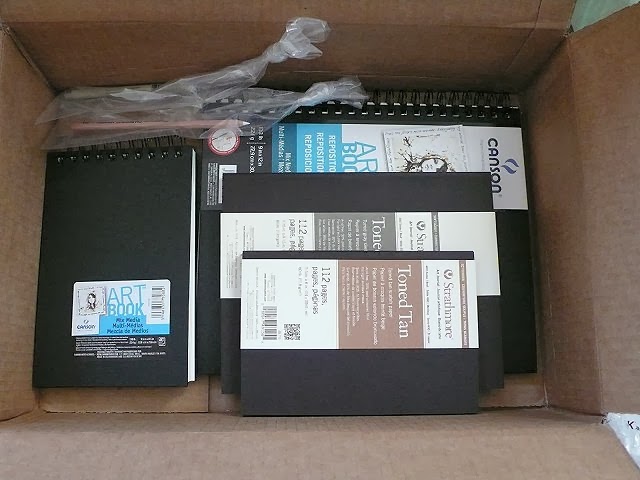
Today, my order of sketchbooks and journals arrived. Oh, Lordy - no excuses now! I'm trying out 2 sizes of Canson's Mixed Media Art Book, the larger of which has pages you can reposition, as in take out to work on and then put back in, or switch pages around which sounded like a nice feature. The pages are also perforated so if you create a masterpiece you wish to frame, it is easy to removed the binding edge. Both have 138lb paper (smooth on one side and more textured on the other) which has been reviewed as standing up better to paint and markers than other mixed media journals. Have I committed to experimenting with paint or what? And then, because I continue to search for the perfect sketchbook to inspire me, I sat up and took notice when I ran across a review of these Strathmore Toned Art Journals. Oh, am I a sucker or what? It's a little like laying down a wash so you're not faced with a white blank page, or so the theory goes. The 80 lb sketch paper is toned to mid-range value to let you get on with the light and dark values. That intrigued me so I decided to try one. Well, two. Because I couldn't decide between grey toned or tan toned and I also couldn't decided on  size. Now that I have them in hand they strike me as toned fairly dark so we shall see how well I like working with them. I may get more use out of that white chalk pencil than what I bought it for - highlighting my Zentangling on the tan tiles. Yes, indeed, I'm a sucker! 

Sunday, January 12, 2014

Structure, I Need Structure!

I am full of good intentions. Too often, I need outside help to carry through on them (my blog was started as one such device to keep me getting work done in the studio). My good intentions for this year include working with sketchbooks (other than to sketch out design ideas), working with paint and surface design, even getting back into Zentangling. I've taken Christmas money to buy paint, sketchbooks & journals, even some official Zentangle tiles (my rationalization being they are now offering them in tan and I've really enjoyed drawing with my sepia pen). The supplies are trickling in, including one I ordered for use with a 49 lesson mixed media art journaling course offered free from Dale Ann Potter. She is such an upbeat person (and I really want to be upbeat this year) and fearlessly creates art (as shared on her blog). Who better, I thought, to provide me the structure (i.e. boot) to explore mixed media collage/art journaling. The course is called "Positively Creative Journaling: 49 Lessons to a more positive life" and its purpose is to help you create a journal that will make you smile on days when you are not feeling happy. As a chronically "glass half empty" personality, this sounded like the perfect blend for where I'm at right now.

It was originally designed as a daily practice, but I've decided to do one lesson or prompt a week instead - something that will carry me through the year, letting me take a few weeks off for vacation or the unexpected and still keep to my commitment for the year. As I read through the introduction and supply list, I realized I didn't need to wait for the fancy mixed media journal to arrive; Dale Ann suggests one can also use something inexpensive like a composition book or an old book with pages glued and/or removed as needed. Hark! This little "Simple Diary" nearly went into the trash after a year of answering its quirky questions - nothing I wanted to keep there. And then I set it aside expressly with the idea of using it as the basis for an altered book. Its small size, I reasoned, would be less intimidating than a larger journal.


So I started my adventure last Sunday - Sunday has been designated as the day for this practice, a day when I would not try to talk myself out of it because of commitments or more important things to do. It's part of the needed structure and a positive way to start off each week! First lesson called for selecting 3 favorite colors and using one of them (slightly diluted) to paint the page spread with a foam brush. I had hopes that the paper in this book, because of its slick feel, would not react adversely to the wet medium, but it curled right up. After the fact, I glued a page behind either side for stability. Binder clips helped hold the pages open.


And as usual, I stood there with a brush with paint in it that I didn't want to waste. I grabbed the good print of my sampler lino block and dabbed in some color (this is something I've been meaning to do to this piece). Then I grabbed one of the oak leaf test prints and expended most of the rest of the paint on it. Now, back to my lesson.


The first pass with paint certainly covered the writing on the page. Next step was to use an old credit card to scrape a second color from top to bottom. Perhaps I dotted too much paint at the top or chose too dark or opaque of a color? (I'm using Liquitex acrylic paint.) One side I left partially covered, the other I gave a more even coat. I really did think more yellow would show through the green. Because I knew I'd be writing on these pages, I opted to add a third swipe to lighten up the green - white scraped from side to side and this time, using less paint. Ok, I think we're ready for the journaling part.


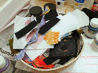
The journaling prompt was "What makes you smile?" and the suggestion was to cut from magazines triangles to glue across the top and words, pictures, whatever that fit the prompt. I have this basket of castoffs, things too big to toss but questionable as to where they will find a home. I know I started this basket with the idea of using it to collage or make small quilts (not all of it is fabric castoffs), but it has mostly just accumulated. I figured I could find some things in it to incorporate into the weekly exercises.


Here's my finished spread. I chose fabric rather than paper triangles to glue across the top. I have many saved little triangles and these are from my hand-dyes. They represent two of the things on my list of things that make me smile - the magic of unveiling the dyed fabric after processing and using up scraps. The squares of marbling were trimmed from "Tears of Mayo" when it was stretched over canvas and represent both using up scraps and unexpected gifts from friends. The picture of the hands giving a massage was in my little basket - need I explain why it made the page? The snowflakes and words came from magazines. I used a Pigma pen to outline the various components and write in the many things that make me smile, and called it good. I have to admit I got way too involved in this, spending nearly 3 hours in all as I searched for just the right things to add to my painted page and fussed with arrangement. And I enjoyed every minute of it, learning a few things too.


So it's Sunday again and time for lesson two. I was prepared for another long session but this one went pretty fast. Scrape paint down the page and remove some of the paint with a baby wipe. Gosh, I've been going to buy a box of baby wipes ever since last spring when I discovered how great they are for removing paint from your fingers. This lesson didn't require using both sides of the spread. Curious, I used the facing page to see how much of the paint rubbed from one side could be transferred from the baby wipe onto a fresh page. Quite a bit, it would seem. And on the painted page, it helped blend some of the areas receiving less paint.


Then it was back to the magazines to look for an image that could be used as a stencil. I didn't want to get sidetracked by looking and looking for just the right thing, so pretty much chose the first thing that would work - an outstretched hand. The journaling prompt was about gratitude, and I could think of several ways it represented that idea to me. I decided to stick with white to paint it, dabbing with a stencil brush but that really didn't work very well. Dale Ann suggested multiple ways to get paint down using this stencil and I could see that other methods would have worked better. I just started moving the paint with the end of the brush, which left it kind of streaky which was fine.


Here's the finished page, with my list of things I am grateful for today. These are pretty much the things I am grateful for every day, although on the harder ones it is easy to forget. The writing is done with a white Gelly Roll pen,  something I've not used before and had ordered for my Zentangling. I loved the way it wrote across the painted page and made my script look good. The arm and hand are outlined in black pigma pen.

Dale Ann has gone to great lengths to make these exercises a stress-free way to learn not only about these different techniques but about oneself as well. It's an approach that leaves me satisfied with the time spent and looking forward to the next session with the journal.

Friday, January 10, 2014

A Little Printing

In anticipation of doing lots more linocutting and stamping, I used some of my Christams money to buy more paint - lots of paint. Hope springs eternal, and I reasoned that I'd be more apt to do this if I had a paint that did not feel precious to me (like the Versatex fabric paint already in my collection) in quantities that said "Go hog wild!" You may remember how unhappy I was with the Speedball Fabric Block Printing Ink I purchased for my on-line class (very smelly oil-based ink that stayed tacky for months). So I did a little research and narrowed it down to three choices, eventually settling on Speedball screen printing ink for fabric based on information in a helpful comparison chart on the Dharma Trading Company site, and cost. I used it to test my freshly carved sunburst stamp on paper and am very pleased, both with the ink and the stamp. The stamp has since been cleaned up to remove some of the background noise.


Then I moved on to a different printing project that's been on my mind since before Christmas. You may recognize these two designs from the 9 block sampler from the lino class. I separated the individual designs as I didn't see me using the sampler, and I thought these two might compliment the autumn trees photo I printed on fabric. Overall a little darker than I think I want, but I particularly like the top one. I'll either try again with a different color of paint or perhaps I can brighten these up by adding to them, building up some texture. Regardless, I am very happy with the way the paint went on and didn't change the hand of the fabric (nor is it tacky).


So that's all the printing I wanted to do, but you know me - I just can't bear to wash paint down the drain. I looked at the various "paint rags" and test prints I had hanging in the bathroom and didn't see the point of rolling black over them, even if it were faint. Ah - what about putting something under one of them and brayering over the top. I remembered a set of texture plates I'd bought, meant for use with Paint Stixs. They work great with this paint and the foam brayer. Not sure I'm improving the underlying fabric though!


Not to worry - this is experimenting, nay, exploring. I had more paint to expend and more textures to choose from and decided to roll over the faint print I'd made of the 9 block sampler. Not very imaginative, but it told me what I needed to know - this is a good technique.

Thursday, January 09, 2014

The Word for the Year

Since 2008 I have given up New Year's Resolutions for a simple guide word to keep me on track throughout the year. If you don't know what I'm referring to, you can read about "Resolution Revolution" on Christine Kane's blog here. After what turned out to be a rather grueling year (where my word "persevere" held me in good stead), I returned from my holiday travels with an unexpected optimism about 2014. I started thinking about my word for this year right away, wanting to find something upbeat and happy to fit my renewed sense of optimism.

I go through stages of wanting and needing to soak in every inspirational quotation, article, piece of artwork I run across, gathering courage from stories of other's journeys that remind me of my own, casting about for things that will put me on track. I think this is ok, up to a point. But eventually the sponge that is me becomes too saturated for more, because suddenly I want the outside influences to stop, I want to turn off what has become distracting noise, I realize I must stop gathering and start doing. That's how I felt as 2013 turned to 2014 and I spotted blog posts recapping the accomplishments of last year and lining out what 2014 would look like. People started talking about their own resolutions and resolution word selection and I realized I did not want to know - not until I'd settled on my own. I didn't want to be influenced perhaps, or distracted from my own search & thinking about what I wanted the year to be like overall, and what direction my quilting would take. I didn't even want to check the list of possible words Christine provides. I wanted the word to come from deep inside me.

And it did. I can't remember exactly what I was doing when the voice in my head spoke, but I think it was while I worked through a prompt for an art journal spread (something new for me which I'll tell about in another post). "Exploration" the voice suggested. Yes, that's what I was doing at the moment - exploring a technique with paint on paper. But it didn't take long for me to realize two things. First, I'd started exploring some different things last year, like linocuts, and did not spend as much time on these things as I had wanted. As I thought about how I might spend this year, I knew I wanted to continue those explorations. Second, the more I thought about that word, the more I realized it summed up my whole life, from my first memories to the present. Whether it be artistic or cerebral endeavors, interaction with others, time spent in nature, vacations, cooking, photography, computers - I can hardly think of anything I do that doesn't have some component of exploration to it. I have a need to know, a craving for learning, a delight in mastering, a satisfaction in making connections while sifting through information that seems unrelated. I get cranky and sullen and even depressed, I can see, when life's vagaries interrupt my explorations.

Of course, it's not always uncontrollable life that's to blame. Sometimes I lose my nerve, let fear of the unknown keep me from risking security, find excuses to let inertia take over. That trip to the Southwest to immerse myself in a landscape so different from my usual source of inspiration? Gosh, it's a really long drive to make alone and maybe I can't afford to rent a place for two weeks and what time of the year would be best to go... Those surface design techniques I keep saying I want to try? It's so overwhelming deciding which to try and I'd hate to waste paint and fabric until I know more. I'd better keep reading up on it and gathering supplies...  The family history research and organization of photos/documents/letters I'd really like to make progress on? I'm not sure I can afford the time and where should I start and what should my system be... The parks and trails and scenic views nearby that I have yet to experience although they've been on my to-do list for a couple of years? Oh, I have a raft of reasons depending on the day - it's too hot, it's too cold, it's too late, I should find someone to hike with me, I can't afford the time right now... Yes, I'm great at procrastinating and talking myself out of things and avoiding change and risk. That's when I'll pull out my resolution word and remind myself that all of life is exploration, it is at the core of who I am and always have been. It's what makes life interesting and exciting for me and I need not play it so safe - whether it be with my art or any other part of my life. Explore...that's what I'll be reminding myself to do this year. That's what I'll be telling myself the next time I choke working through a quilt design or its construction, or when I'm tempted to put off the hike for another day, or when I stand in the office looking at the file cabinet of family memorabilia and history, or when I wonder if I should make some time for travel, or think I'm wasting my time with a computer program. Explore!    

Wednesday, January 08, 2014

Snow Day

I was to meet a friend for coffee today, but we decided to cancel as the snow piled up outside our windows. Not that we would have any trouble driving in it - it's the crazies we prefer to avoid! At any rate, it's the sort of weather that tugs me into the studio.


By afternoon, about 4 inches had piled up - no walk today. I got my exercise shoveling the driveway.


Hard to stay focused when glances out the window reveal this.


There are three deer who feed along the backyards of the townhouses on my street, then move away through the trees that buffer our view from the railroad tracks and highway nearby. They are coming more often these days as a new neighbor has been putting out corn for them.


I often only see one at a time but today all three were feeding along here, although I couldn't get all three in one shot. They look fat and healthy - well, it has been a mild winter.


Oh, yeah - I'm in the studio to work. I'm doing my darnedest this year to spend some time each day in the studio, even if it is only a few minutes (like detouring in there on my way to bed at 11:30 to stamp my monogram on the back of "Tears of Mayo"). Today my goal was simple and straight from my list for January: 1. Mount Tears Of Mayo in its floater frame and hang it along with other pieces of art and 2. Carve the sunburst block. I've been saving this bit of wall for a studio gallery but dragging my feet to fill it. The framing went quickly, the choosing and positioning of artwork to surround it did not. This still needs some tweaking, some smaller additions perhaps, but it is a start. I think these can easily be traded out for other groupings with different themes or colorways and not have to reposition hooks. Well, that's the theory anyway. A couple more pieces got up on different walls, and I'm considering the potential of expanses over the window and closets to get even more art out of the closet. 

That white bin on the left is due to be replaced by a larger wire cubes storage unit to accommodate my expanding batik and hand-dyed fabric collection and make the fabric now in the old storage unit more accessible (It will be repurposed for either stamping or dyeing supplies). I've been dragging my feet on that too as it will require shifting the rest of the storage units on that wall down a bit and that probably won't be easy. But it is on January's list too.

So I've had my lunch, shoveled my driveway, taken a break on the computer and will return to the studio to carve that stamp. Before I go, let me pose this question: 

What is it about others' castoffs that so draws us? 

My daily walks take me past not one but two secondhand thrift shops. They seldom have anything I need or am even interested in, although at one point in my life I quite enjoyed nosing about in them. And still, I feel the irresistible pull each time I walk by. Occasionally, I succumb, and then remember how little these places interest me anymore. Well, except for the silk ties. I checked the supply a month or more ago when the pull got the better of me - not many ties at all and none of interest (like I need more for my stash). Last weekend, the pull got the better of me, and again, I perused the store aimlessly and uninspired until I reached the tie rack. It was the celery green one that caught my eye, but it was all those yellow ties that sent me the half-block home to grab my wallet. You just don't often see lighter values, let alone yellow, in silk ties. As I went through the substantial offerings, I found other worthy additions to my collection as well as a couple of Jerry Garcia designs. I came away with 15 in all, 5 of which were half price, all the time lecturing myself that if I'm going to keep adding, I'd better start using. Sigh...I am hopeless.

Maybe not hopeless. As with anyone who seriously collects, I've moved from buying every one that I came across to weeding out the more common ones or ones with flaws and spots from my purchases, to walking away if the price is too high, to sifting through to choose only ones that fill a gap in my collection. I sensed I was mostly doing that last one this time, although I did add one that may not meet that criteria - because it paired so well with one of those yellow ones. I don't know how I'll use them together, but I really should.  

Come Ride With Me...Part 4

Are you ready for the return trip to Idaho? I boarded Amtrak in Bakersfield around four in the afternoon, the same commuter train, the same long slog through the San Joaquin Valley. I briefly had a seatmate who knew something about the area so found out that this is mostly farming - lots of different nut and fruit trees as well as grapes, garlic, and vegetables. I wasn't paying much attention on the trip down, but now I did see lots of trees that were probably of the nut producing variety. Still, not much to see so I mostly took advantage of the free wi-fi to catch up on e-mail and blogs. Going north, I did not have to do the brief bus connection, transferring instead directly to the Coast Starlight from the Martinez station. Fairly new relatively speaking and nondescript, this station struck me as strictly functional but clean and safe for my approximate hour layover. Well, slightly longer as again, Coast Starlight was running a bit behind. By midnight, I was snug in my roomette, sleeping in a bed while the train continued north to Portland.

View of frozen lake and snow-capped mountain from dining car

And thus, I commenced the much more civilized way to travel long distances by train. A roomette includes your own private compartment in a sleeper car (take the virtual tour here), a porter to attend to your needs including making up your bed at night and converting it back into seating for day, access to bottled water, juice and coffee pretty much anytime right in you sleeper car, meals in the dining car and wine tasting in the afternoon. The difference having slept horizontally in pajamas versus partially reclined in my clothes with a bunch of strangers was striking. Adding a roomette is not cheap, but oh so worth it. Much refreshed, I had breakfast in the dining car with this view (I think we were around Klamath Falls, OR), and amicable conversation with a couple from Salem and an elderly man from the Bay area who owns a condo in Sandpoint where I live. Small world syndrome.

One of the reasons Amtrak may run late on these longer runs is through no fault of their own; it shares track with freight trains who have priority. If there is single track and a freight train coming from the other direction, the Amtrak train must pull off on a siding and let it pass unimpeded. Usually these are short waits. But what if your train is headed into the mountains of Oregon and a freight train has broken down up ahead? Well, you have to wait until the train is fixed or can be moved off onto a siding. While eating breakfast, the train had come to a stop, and not on a siding. The announcement came that an 8000 ft long freight train was blocking the tracks ahead, broken down. Next we heard that the delay would be even longer since the crew sent to fix the train had reached the maximum time it could work during its shift, and now we were waiting for another crew to arrive. Another update informed us that the latest plan was to break the train into two parts to more easily get it to a siding. We sat for 3 hours while whoever worked on clearing the track so we could proceed on our way.


So what does one do for three hours on a train? Well, I was comfortable in my roomette, and feeling the urge at last to get out my sketchbook. I'd asked my 6 year old grand-niece if she would draw me a picture in my sketchbook before I left, telling her she could draw anything and use her crayons if she'd like. "Oh, pretty!" she commented about the cover (one I made altering the basic padfolio pattern I use), and then checked out the pen and pencil tucked inside. She only paused for a moment before taking off. I was most intrigued that her first strokes were to draw the leaves, then the stem, whatever that is at the base, and finally the petals. I definitely would have drawn the stem first, then the flower and then the leaves. She alternated between pen and pencil, even though there was little visual difference between the two. Next came the sun, the cloud and I think that's rain. Finally she signed her name followed by a heart - sweet! I shared that an artist always dates her work too and we added that under her name. I let that memory of watching her work, the satisfied look when she was finished, the total inhibition of the process inspire me to turn to a blank page.


Casting about for something to sketch without much enthusiasm, I remembered my Zentangles. Well, sort of remembered them. I have a little notebook where I've recorded many of the tangles and the sequence in which some of them are drawn. I haven't Zentangled for awhile, so I was struggling to remember designs and how to do them. But as you can see, I managed to do two - marveling at how they filled the time. I would not have been able to work on them had the train been moving - just too much movement to draw.


As I finished up the last of the shading, the train got underway. I watched the scenery, Oregon's lovely broad expanses and mountains thickly covered with conifers. No snow - it's been a pretty dry year.


And then it was time for lunch! I have always been impressed by the meals Amtrak puts out - as good as a fine restaurant with an amazing number of options. Dessert wasn't on my radar until I saw the waiters passing by with them. Oh yes, a beautiful round of strawberry cheesecake that was perhaps one of the best I've ever had.


During lunch the train had stopped again - that freight train still blocking the way. I returned to my roomette and did some stretches and a little more sketching (hemlocks with their distinctive drooping tips) and enjoyed my limited view (look - snow!). We lost another hour before getting moving again. But it meant I had ample time to attend the wine tasting, meeting another interesting group of people.

Amtrak train & bus station in Pasco, WA

I'd started to do some calculations now. I only had a two hour layover between arriving in Portland and boarding the train east for the last leg of my trip and my current train was at least 4 hours late. My previous experience has been that Amtrak will hold those connecting trains so transferring passengers aren't stranded. I was confident that I would not miss my train and have to wait til the next day's run. I was partly right. After the wine tasting, I got word that the decision had been made to get the eastbound Empire Builder underway, and transfer those of us connecting to it onto a bus when we arrived in Eugene. Yes, I know - a bus. But it was a pretty nice bus, there were only 15 of us so we could spread out, and Amtrak had bought food and drink for us. Actually, it wasn't much different to riding coach in terms of comfort. We hightailed it up I-5 and up the Columbia Gorge to make connections with the train in Spokane - about 9 hours away. We made one stop to let off passengers in Pasco, WA. 

We'd been driving through fog for awhile, and it had frozen to the trees around the station. So beautiful, and I would have missed it had the train been on time. Yes, always looking for the bright side.


We got ten minutes to stretch our legs and I spent it racing around the parking lot snapping pictures. (Again, I'm betting I was getting puzzled looks.) Then it was back on the road with an estimated arrival in Spokane of 1:15 a.m. I finished up the book I'd brought brought along and then got some sleep.

Empire Builder leaving Sandpoint ID for points east

The train was waiting for us in Spokane as promised and left pretty much on schedule. An hour later, I was stepping off in Sandpoint, right on time (middle of the night, 2:34 a.m.) Bye bye, Amtrak. Unbelievable considering how much time we were trying to catch up, even though Amtrak is known for building cushions into their schedules.

This is what I love about Amtrak. Rarely do they strand their passengers with canceled trains. They do their best to get them to their destination, even if it means busing them around problem areas to catch another train, even if they are running way late. They take care of their passengers, and the passengers appreciate it. If we were in a hurry, we would take another form of transportation. I haven't heard much grumbling amongst passengers in my travels. It's not necessarily cheaper than flying or driving (although sometimes it is), but we're not looking for cheap. We're looking for a different quality of travel. We only wish there were more parts of the United States serviced by Amtrak. Maybe someday - ridership increases with every year.

Thanks for coming along for the ride. And kudos if you've managed to read through my lengthy travelogue and not just look at the pictures. ;-) It was the break I needed and I'm ready to get back to the studio.