Thursday, March 30, 2017

March Art Group

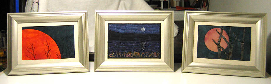
Sheila's collaborative project - yes, Virginia, that's actual size!
Amazing how time flies and how quickly these monthly meetings of my art group come up, pushing all of us, I think, to get a little work done to show and possibly get feedback on. I've been working in collaboration with a representative from my diocese to design and execute a liturgical stole for our new (and first ever) female bishop. I'd done some research for possible edits on the first design draft sent me, and without the meeting, might still be dragging my feet about printing out the things I'd found at approximate size for the stole. As always, the gals had insights and ideas that helped so much.

Just a few of Meg's snow dyes.

In truth, we moved the meeting from the 3rd Monday to the 4th Monday for member Rebecca who had a conflict on our regular day. Irony of ironies, she broke her wrist the previous weekend, required surgery and was not up to attending the meeting. However, our sharing of our snow dyes last month apparently started something. Two other members tried their hand at this using our information and the stacks of snow that have been slow to melt and just look at the results! Believe it or not, except for that gorgeous raspberry piece, Meg was going for skin tones with the different brown dyes she tried.

Terrie's folding results plus fabric in the bottom and a single layer scrunch

Terrie experimented with scrunching and laying mostly flat

Terrie too tried the snow dyeing, both the parfait method (some folded) and the single layer scrunched method. In one case she wanted to leave the fabric mostly flat and did not have a rack large enough. Instead, she placed branches in her big bin and rested the fabric on that. The darker parts along the ends are where the fabric draped down into the melted snow/dye.

Terrie's silk tie find

Detail of some of the tie fabric

Terrie also brought this silk tie piece she found, I believe in a second hand shop. Even though it has some "issues" she knew she had to purchase it and bring it home. The detail shot is of a couple of tie fabrics I particularly liked - very textured as if embroidered.

Bark cloth backing to the silk tie piece.

The backing is a piece of bark cloth - so popular in 1950's home decorating. Its design certainly has nothing to do with the front! There is no batting.

Vickie's latest project

Vickie is busy on another piece where she is trying out lots of things, including stenciling and stamping with blue Elmer's glue resist and flour paste for a crackle effect, all being painted over before being removed.

Vickie combines surface design techniques with machine and hand quilting.

The orange through the middle is dyed cheesecloth with netting over it to make the free-motion machine quilting easier. She has also added her signature big stitch hand quilting and has just started adding beads.

Robin's boro

Finally, Robin, who went on that fabulous textile tour in Japan back in January, shared a boro she is working on. I think she learned about this traditional Japanese mending technique on her trip and told us more about its history. I just love the look of this, the colors and fabrics that look so Japanese (some are traditional Japanese indigos) and the way she arranged the rectangular, square and round patches.


Look closely - the patches are not pieced nor are the edges turned under. Everything is overlapped and held in place with those rows of big stitches. In this one she has used a cotton batting but is finding it makes the hand quilting difficult. Next time she may forgo batting altogether. For now she's working on getting her stitches more even.

Robin's hexagon quilt - all hand sewn.

More handwork from Robin - this is a piece she started a long time ago, and like most of us, she's looking at her aging UFO's and pulling some out with an eye to finishing them. She has many many hexagons already cut and basted over forms. Now it is just a matter of continuing the whip-stitching of them together - an in-front-of-the-TV evening project - and considering how to finish it out (border?). We all sighed with her at the work before her but agreed that it is quite beautiful and has a Japanese feel to it. Well, it should because it includes a lot of traditional kimono fabrics!
 
We met at the bank where the POAC 100 Artist Exhibit is displayed so that following the meeting we could peruse the art and practice our critiquing skills. I'll share some of that art in the next post. In the meantime, hope you enjoyed seeing what we are working on. And once again, we all left quite energized.

Tuesday, March 21, 2017

Working in a Series or to a Theme?

Here is a less than flattering picture of me with Leaf Cluster I at the opening reception of Pend Oreille Arts Council's "100 Artists Exhibit" last Friday. The lighting for taking evening photos is terrible at this venue but not terrible for viewing the art. The place was packed, mostly with all those artists who submitted a single new work for the exhibit. I believe of the 100 artists members, nearly 80 do have a piece of art hung here, and the variety seemed to please the public who mingled with the artists. I got enough positive feedback on my little piece to confirm my feeling that working in a series based on my linocut would be worth my time and be favorably accepted by the viewing, and hopefully buying, public.


And so I've been thinking about the variations I could try out within the series. I did more quick test prints on paper, experimenting with different placements and angles within a 10 x 10 inch square, as my first thought on doing this series was to have them this size, wrapped around stretched canvas and mounted in floater frames. The paper here is actually 12 x 12 to represent that extra fabric needed for the wrapping. Light pencil lines delineate the 10 x 10 center and the paper has been folded to give me horizontal and vertical center line guides for placing the linocut when printing. Besides placement variables, there will be background (fabric) and paint color changes, and of course, stitching lines doing different things. But this is just the beginning, apparently. The more I muse in my mind and then do test prints, the more ideas spill forth demanding a larger format then 10 x 10, and even a different dimension than a square.

This idea definitely feels like a series, at least in the purist definition of the word: "a group or connected succession of similar or related things, usually arranged in order." Google "work in a series" and you'll find definitions and advice from various sources that are fairly similar to each other. From Clara Lieu: "For a series to work, you need to find a subject you are passionate about that is both open to variation and yet specific at the same time. A successful series should allow each individual work to be able to stand on its own, yet simultaneously relate to the rest of the other works in some manner." (The rest of her post is worth the read.) ArtBusiness.com doesn't care about your passion but more about making yourself understandable to those you want to buy your work: "...we need help deciphering what your art is about. So help us. Now the easiest way to do that is to work in series-- to create unified, cohesive, coherent, related bodies of work." This excellent article goes on to say that working in a series "...is not about repetition at all, but rather about being able to explore, investigate, examine or address particular ideas, themes, issues, compositions, concepts or topics in progressively deeper and more meaningful ways, and from a richer variety of perspectives than is possible by making just one or two... The knowledge and experience you gain from working within a well-defined set of parameters, while expressing yourself from a range of different perspectives within those parameters, allows you to nuance your compositions more subtly, purposefully and in greater depth and detail, and to communicate the results of your observations and explorations in more impactful, compelling and consequential ways." And all this, especially when presented as a compelling group, not only helps the viewer understand you and your work but "...at play also is the phenomenon of strength in numbers, of the whole being greater than the sum of the parts. In a good compelling series, there's a cumulative effect above and beyond each individual work being considered solely on its own merits."

While in Rochester MN I became fascinated with the sound and movement of fountains

I bring this up because, since returning from that extended stay with a friend receiving treatment at the Mayo Clinic in 2012, I've had every intention of starting a "water" series based on the unexpected influence the many fountains and other water features had on me while there. Someone mentioned I'd already started on a water series, pointing out how many of my quilts did feature water in some way. I think this confused me and what I had in mind for the series. I had a certain sequence in mind and yet I was not following it. I made one quilt somewhat out of sequence of the order I'd been mulling (Eisenberg Fountain) and went no further, allowing distraction after distraction and thinking I was still working on my series just because what I was working on included water (Adrift which is still not finished). Eventually it occurred to me that I was more working to a theme - that of water - than in an actual series. And I don't think they are the same thing at all. A group of artwork by many artists may work together in an exhibit precisely because they all include the same theme, say of water, but they are far from being what a series by one artist would be.

Of these 3 moon-themed pieces made for a miniature-themed exhibit, only the one on the right prompted a series based on the strawberry moon

The clincher to this line of thinking was running across a blog post by Shelly Stokes where she said, "Working in a series is really about what stays the same - and what changes." Ahh, so simply stated and clarifying for me. I could quit fooling myself that every quilt I worked on with water in it was part of my water series and admit they were merely ones falling within a favorite theme. The water series is actually something very specific in my mind and I have to remember that.

As for the leaf cluster, I really do intend to work through the variations pretty much as described by the ArtBusiness.com quotation and Shelley's simple description. Even though I keep catching myself saying out loud that I will be exploring "variations on a theme", (which with all this musing about series vs theme makes me nervous), I'm pretty sure I will be going down the series track, my variations focused on that single subject of a leaf cluster. My previous exhibit experiences are also influencing my desire to pursue this as a series to present as my offering for the upcoming ArtWalk. It's an event that has the option for presenting more individual pieces than most of POAC's exhibits, and I've been caught out before looking at the "collection" of quilts I've managed to finish and/or round up only to realize how they hardly went together to present a cohesive whole. We'll see if I can do more this time than just come up with a bunch of art quilts to put up.

Monday, March 13, 2017

Contour Lines

Diva Dance "Waltz" and variations
The Zentangle people came up with some variations on a theme that caught my attention back in December. Called "Diva Dance", the trio's first rendition, "Waltz", reminded me of mark making exercises I've seen that often end up looking like bark are water flowing. I've failed to get those kinds of images when I've tried it, so set the step-outs aside until I had more time to work with them. I have a tiny notebook where I copy in the step-outs for future reference, which gives me practice and a feel for the design before I use it elsewhere. I finally got around to doing that yesterday before sitting down with the newest of my sketchbooks and trying out different ways of working with the idea on a larger scale. Rick and Marie have started a video series of their working on a Zentangle with this one showing "Waltz" running under the rest of the design. I was amazed at how helpful it was to watch someone actually zentangling as he explains what he is doing.

Diva Dance variations "RockNRoll" & "Foxtrot"
Today I proceeded with the other two variations, "RockNRoll" and "Foxtrot". Zentangling is billed as a meditative practice and indeed, I found myself going into a meditative state, or at least a calmer state as I worked my way around each drawing. All of these are based on closely spaced parallel lines with the interest being the darkened "bumps" that forces the next line to curve out a different direction and creates holes and gaps. The more I drew, the more I was reminded of contour maps as well as the closely spaced parallel lines of background quilting and the echo quilting around applique motifs. No wonder I was drawn to these.

Normally one would use something like a Pigma Micron or Pitt pen to Zentangle but I wanted to use the Preppie fountain pen whose nib I usually find makes a thicker line than I want for sketching. But on this beautiful drawing paper in the Fabriano Venezia sketchbook, it works like a dream, and I am starting to understand why so many sketchers use fountain pens. You'll also notice bits of red here and there, added with a Pigma Micron 01 pen. This is a little experiment triggered by seeing a succession of black and white "urban" sketches where the artist added a bit of red - maybe just one door in a group of houses, or the flowers in a window box, or in one case a brushstroke across the top and down one side which had nothing to do with the scene being sketched. That limited pop of unexpected red elevated the sketch from interesting to mysterious somehow. At the very least, it got my attention when I otherwise would have moved on to the next sketch. At any rate, I was looking for a theme for this sketchbook, and since its cover looks somewhat like a red brick wall, it seemed the perfect place to see what would happen if I sketch in black "and then add red..."  

Wednesday, March 08, 2017

That Leaf Cluster

Nothing gets one in gear faster than finally getting around to opening exhibit documents to discover one has a little more than 2 weeks to finish a new piece of art for said exhibit. And so I got the needed boot to pursue a year old idea and see if it would work. It's mostly been the thought (i.e. fear) of mixing up paint to match the color in the leaf cluster I'd brought home that was holding me up. Time to bite the bullet and just do it! But I'd not even tested my linocut since carving it so that was the first order of business. Just inked with an ink pad and tested on plain paper.

Test fabric on top, "real" interfaced fabric, linocut and leaf cluster on bottom.

A week or so prior, I'd already fused the two pieces of batik to Decor Bond and pressed an additional large piece of the batik to use for trials. When I found that day with a bit of time in it to do this, I was afraid to pause for my usual checking of procedure for fear I'd lose my nerve and/or run out of time. It's been a long time since I worked through the on-line linocut course from Dejanne Cevaal but I was pretty sure I remembered enough to do some printing on the fly. Mostly, I wanted to try to apply the paint without getting any on the ridges this method leaves as you remove the background. I started with Speedball Screen Printing Ink in brown, adding black to darken it. But I needed to get some dark red in there too and found myself grabbing some Oriental Red Pebeo Setacolor paint to mix in.  I dabbed a bit on a small piece of the fabric and thought I had the color pretty close. I loaded up my hard foam brayer and started stamping, leaving the Decor Bonded strips to near last.


Normally the screen printing ink doesn't need diluting but I didn't stop to think that the Setacolor paint is normally diluted before use. That explains why the mix seemed thick prompting me to add a touch of water. And why when I picked it up off the palette there were peaks of paint standing out from the brayer. And probably why I was having a difficult time getting the solid coverage I'd envisioned. Not that this partial coverage isn't a nice effect, just that it was not what I had envisioned for my little art piece. I think it should have been thinned more.


I began to rue the fact I had not taken the time to review my lessons. And when a few days later this book arrived, one I decided to purchase on the recommendation of Dijanne, I wished I'd had it to consult before my printing session. Just paging through it makes me even more anxious to get back to linocutting and printing.


But in the meantime, I now had my leaf cluster printed on my batik, layered over Hobbs Thermore batting and muslin, ready for some stitching. I'd left out that spool of thread on the left because as it sat next to the batik and the actual leaf cluster, I just KNEW it was the perfect color for the stitching. Silly me. My first stitching would be to outline the leaf print and then maybe add a round or two of echoing. So fixated on this solid leaf idea, I decided I didn't want the variegated right next to it so used the solid burgundy on the small spool. Ok, it matched but did nothing else. So back to the variegated thread, which I did test on a scrap. But once I'd done a round of it, I wasn't so sure, yet my stubborn nature that had deemed it PERFECT prevailed. I started stitching across the background and after half a dozen lines could see that this thread that looked so reddish purple on the spool variegated to a decidedly lavender purple on the fabric. Rip rip rip! Maybe I need to go with the orange across the background, but in spite of it looking good on the sample, it too variegated to an unacceptable color (bright yellow!) and didn't look right as it ran across the browner sections. 

It's only 10 x 10 inches but taxed my abilities

I stared for a long time at my thread collection, willing the right color to magically appear where I was looking (yes, they are mostly arranged by color), and finally allowed my eyes to roam upward where I spotted the somewhat light burgundy variegated thread. Thinking it was too light, I gave it a try anyway and it turned out to be the best solution. I know some experts insist it's the value of the thread, not its color that is important, but I sure didn't find that the case here. Of course, all those lines of stitching I'd removed left needle holes, so the restitching had to be carefully done to hit or at least cover them. Yeah, what fun.


I realized I was so fixated on the burgundy thread because my original leaf had shone hints of deep burgundy along with a very dark brown. But once I got out of the poor lighting in the bathroom where I mixed the paint and did the stamping, I wasn't seeing as much red in the leaves as I'd intended. I pondered if I could paint over the leaves or in some other way add some red to them. In the end, I decided the safest experiment would be to try my Inktense pencils. Remember, I was working on a tight deadline and there was no time for starting over if I screwed this piece up. A simple way to work with these pencils is to transfer color from the dry pencil onto parchment paper or the shiny side of freezer paper, then pick up the pigment on a wet brush. I chose a stencil brush to see if I could work color not only on top of the paint but into the fabric in those areas where the paint didn't totally cover.


I think it made a little difference, but overall, this is still just a dark reddish/brown leaf. Again, nothing wrong with that and it looks good on this fabric, but it is not the color of the original leaf that got me excited when paired with this batik. Not to worry, I'll be doing this again and being more bold when I mix up my colors.


This really was intended to be a trial run for a possible series using this stamp. My idea is to wrap the finished work over canvas and put in floater frames. But because of the dimensions of the batik strips (which started as rejected padfolio pockets), there wasn't enough for wrapping. So I always knew this would go in a 10 x 10 frame. And when I do that, I always attached the finished piece (after zig zagging the squared up raw edges) to either watercolor paper or cardstock for extra stabilization. Knowing that, I didn't have to worry about burying the many thread tails that got pulled to the back., thank goodness.


Time to dig around in the closet to see what I had in terms of that board and I discovered an unopened pack of illustration board I totally forgot I'd bought. Normally I'd put a heavy needle in the machine and sew around the edge to attach quilt to board. But this board struck me as thicker than what I've used before so I hesitated.  Maybe I could just use some glue or . . . I remembered this roll of double-sided mounting tape suggested by a scrapbooking friend many years ago. Am I getting lazy or just smart? It's archival so let's just say I'm getting smart in my old age.


With the quilt permanently attached to the board, my "label" information can be penned on the back of it. When I do this rather than printing out a label, I use the initial stamp I carved as well. This frame had a Masonite back board rather than cardboard like so many cheap frames do, so it went on last. A business card with the name of the piece and price gets taped to it to meet the labeling requirements of the exhibit.

Leaf Cluster I by Sheila Mahanke Barnes 2017 - 10" x 10"

And here it is framed and ready to go (with no glass). I did have a black frame on hand but found a lovely mahogany brown one on a shopping trip that I think looks much better. I filled out paperwork yesterday and dropped it all off on time this morning. I do like it but have misgivings about its simplicity. Too minimalist? Will people view it with at most a "that's nice" or a shrug before quickly moving on? It's certainly not "great" art but I think it is ok "decorative" art. So I was a bit surprised and relieved at the accolades from the ladies checking in artwork today. They can be pretty deadpan as they do their job so to have them ooh and aah made me feel better and encourages me to keep working with this motif, exploring variations on this theme. 

Wednesday, March 01, 2017

It's March

Ok, say it with me. Where did February go? I know it's a short month anyway, but it got away from me as disturbingly as January did. I found myself hustling to get my March spread in the coloring pocket calendar done in time. This one really has few if any true repeats in the design, but I still found myself setting up a few guidelines of approach. For instance, all circles would be yellow. And the outer sections of petals and arcs would also be yellow. Any areas with black dots or other black designs would get the light green pencil while the same shapes sans black would get the darker green. And I also kept reminding myself to limit the number of colors. I wanted this to be a bit calmer.


I think those parameters served me well. That and the fact that I used this spread to try out some of the suggestions in the Colored Pencil Collage book that soon had to go back to the library. I know I've probably read some of this before, but this time I actually did what was presented to see if it worked better than what I've been doing. For instance, she talked about building up layers by varying the amount of pressure applied while either making small circular motions or long strokes. She described the amount of pressure in percentages, as in start with 10% pressure to cover the entire area lightly and then go back in to use about 30% pressure in areas you want to be darker. It never occurred to me to do anything but press hard from the start to get the color and value I wanted. I was amazed at how well this layering with lighter pressure worked, especially in the areas where I blended a brown and an orange in the petals. She also suggested testing all your colors with a band of light to dark pressure to see the variety of looks you can get in a single color, just by changing the value. I did this with the purple pencil where in the inner swirl I left one portion with a single layer while continuing to build up layers and darker value on the rest. That lighter value also fills in parts of the background where leaving it white was too stark. By using the very light value, I eliminated the need to introduce another color.

I also tried to add a little depth to the design by introducing shadows, a technique I learned with my Zentangling. At first I tried just darkening the value of the color to create the shadow but it didn't work very well. Last night I went over the overlapping areas with the black pencil and a very light touch. You might be able to see it if you click on the photo for the larger version. Safe to say this continues to hold my interest and is providing learning experiences and practice that I can certainly use.