Wednesday, October 25, 2023

#INKtober Continues As Does Color Challenge


Here is the latest page of #INKtober sketches, giving you a glimpse into my life last week. You might spot some urban sketching; looking ahead, the weatherman warned of a severe drop in temperatures this week so get out and enjoy the last few days of 70 degree weather at the end of last week and over the weekend.


So I grabbed my architecture sketchbook and headed over to the new houses across from the park on one of my walking routes to do two things. You might remember that the last time I was sketching at this location, I looked at my results once home and couldn't believe how off my roof was. I always take a picture of what I am sketching, and in reviewing it, I suddenly realized what was wrong. I'd been so focused on getting the eaves right that I totally forgot to add the peak lines of the roof. So that was the first thing I fixed. Then I moved a few houses down to sketch a straight-on view of a slightly different  house. I don't always do a pencil undersketch before inking in and adding color to complete the drawing but for these two I did. You can just make out the images on the toned paper. A youngish man (20's?) stopped to chat, and we soon were discussing angles, perspective and shading, him mentioning that shading is what he struggles with. How fun to interact with another sketcher.

Do you ever feel like you need a pep talk to get moving again on your art projects? As I felt myself continuing to resist working on the Abstract Color Challenge, I ran across this blog post by Daniel Sroka entitled Stop whining and make some damn art which was just what I needed! I've experienced the sort of self-doubt he describes and he is right: the way out to feeling good about yourself and your work again is to get back to work. Time to turn my awkward teenagers into something I could at least like and feel I'd made some good progress on. I added a few more pieces of collage, some ink and colored pencil highlights, some pink stamped on with bubble wrap, some pail pink paint in light areas and a bit over those strong pink pieces to knock them back a bit, then spattered each with brown ink. Ahhh, so much better (here's the "before" picture). I may add some handwritten text on at least one of them but I think these are pretty much done. I'll take individual pics of them when I'm sure.

I definitely like the pink glow they have now (not so obvious in the photos unfortunately) after applying this Fresco Finish chalk acrylic in Blush to the white areas and lightly across the strong pink. You might remember my epiphany about struggling with blending since all my paint colors on hand are strong and darkish and I never think to play with lightening them up by adding a bit of white. If only I'd think to add some pale paints to my collection. Enter Joggles.com having a sale on these very paints that were recommended to me by an internet friend years ago. I invested in 5 pale opaques: this Blush, Seaglass (which is a minty bluish green), Periwinkle (a lovely lavender), Eggshell (a nice off-white) and Buff (which is a bit sandy). That should cover all the bases.

While I feel better about these pieces, I know I have a lot to learn about collaging. I want to be successful on day one, have my pieces turn out looking as good as the teacher's examples, not be embarrassed to share them with the rest of the participants of this challenge. Not there yet. And then Helen Well's weekly blog post arrived in my mailbox, right off addressing this feeling of inadequacy in her Art Making Manifesto.

The more art we make the better our art becomes. The more art we make the more likely we are to develop skills and ideas. The more art we make the more confident we become in our decisions.  

Stop whining and make more art! It will get better and better with experience and experimentation. As she says, "Art-making is a skill, developed by practice and not an innate talent which we either have or don’t have. . . The idea of art being a ‘practice’ is right, we do indeed have to practice." Helen has a total of nine items on her manifesto list, all interesting and worth considering. Give it a look.

And right on cue, the weather took that plunge overnight. We didn't get much snow, just a little on the lawns that eventually melted as the day wore on, and we never got out of the 30's. I looked out the dining room window this afternoon, trying to make sense of the white on the tips of this small tree, looking like flowers or decorative lights.

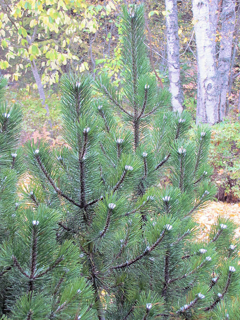
A closer look and I could see that somehow, the snow had settled between the needles forming a ball that stayed while snow elsewhere had melted off.

I don't think I've ever seen this on this tree. Worth taking a picture.

Tuesday, October 17, 2023

Back To Pink & More #INKtober

To be honest, not much got done last week as I apparently was showing side effects of an RSV shot. Chatted with the pharmacist about it and he highly suspects it's because of the immune-suppressing meds I take. Still feeling it this week so am still taking it slow. In the meantime, I am perked up by my neighbor's Halloween decorations. That's my front door past the tree that we share so I get a chuckle each time I go out and see those skeletons relaxing in the chaise lounges.

Fortunately, the #Inktober sketches take little time or energy so I've been able to keep up with them. Here's the latest page. As you can see, there was a day of beautiful fall weather where I felt good enough for a walk at city beach, and then a total cloudy blockout of the hyped eclipse which in my area was an 80 percent one.

I kept popping into the studio in moments I felt a little better, inserting some postcards into the pockets of the challenge gratitude journal. I'm calling this "Gratitude, Memories, Things I Love" so that I can include things like these postcards of familiar sights sent to me after I moved away from the area back in the 1990s. Yes, I've been holding on to them that long, in the bottom of a stationery box. That's the Tacoma Narrows bridge peeking out. The greeting cards I used as wrappers have printing on the back that I'd rather not see so I have these small calendar cards from NWF that I will paste over it.

Someone from the challenge group shared this with us, suggesting we might like to include it in our journals. I decided I wanted it for my opening page. Still running into bits to add to my collection of things to paste on other pages.

Lastly, I decided I couldn't put off gluing down the pieces loosely arranged on my 4 pieces of watercolor paper for the abstract color challenge. Feeling I'm not really embracing making these abstract, and they are still in that awkward teenager stage, but today I experimented with where I might add a few small pieces here and there. Also thinking about ink spatters and bubble wrap marks and water soluble colored pencils. Still feeling cramped working in these 5 x 5 inch spaces. I like the lower left one the best, really just as it is, but must be brave about adding something more to give it depth and interest. Mostly, I'm ready to have these off the worktable. On the day I glued these pieces down, I covered them with wax paper and put them under books to dry, then sat at the sewing machine a bit to continue restitching the diagonal grid quilting on the 4-patch strip quilt while listening to podcasts. I'm almost done with the lines going in one direction and will feel much better about this project when I can flip the quilt and start stitching the other direction. And honestly, I'm so itching to start a knitting project, as if I don't have enough things going. Must be the autumn weather . . .

Tuesday, October 10, 2023

Another Book Challenge & Some #INKtober Sketches

Last week was busy, and not a bit of pink abstract challenge in sight! Instead, I tried my best to keep up with my bookclub's latest open to the public challenge, this one called 5 Day Gratitude Journal Challenge. I watched the promo video and was feeling a little lukewarm about it as it is another coptic binding and I wasn't feeling the need for a gratitude journal. However, I was quite intrigued by the pockets it included and thought about a friend who might enjoy receiving such a journal. Those pockets needed a rather large piece of paper and many were using gift wrap for them so I looked through my box of wrapping paper and was surprised to find not only the book of William Morris Designs wrapping paper but also some pretty National Wildlife Federation papers, both which I had totally forgotten that I had. Signature wrappers were also called for and I had some blank butterfly cards I thought I could use. As I gathered them up, I also ran across things I'd not known what to do with but didn't want to toss that would fit into those pockets. Suddenly I was all in to make this book!

First order of business was to make those pocket wrappers. I cut one sheet of wrapping paper and did a trial run. Easy enough with a few folds, and although I didn't have time to make the other three on Day one, I did pick out a different design for each of the rest of them. Day one instructions finished the following day.


Only one day behind (which as these challenges generally go for me was really good), Day 2 instructions were for preparing the signatures which required some cutting down of 9 x 12 drawing paper to 6 x 12 for 6" signatures when folded. We were also encouraged to use pages from magazines as signature wrappers and interspersed within each signature. I used the greeting cards as my wrappers, trimming a little off top and bottom to fit and it not mattering that they weren't as wide as the signatures.


As for the interspersed magazine pages, also cut down to fit, I chose some pages of different paintings out of The Magazine Antiques. Some I put between pages, others I placed in the center of the signature. Like the greeting card wrappers, they did not need to span the entire page and the ones between pages of a signature did not even have to be folded down the middle - an example of that later.

Under weights those signatures went, and cutting bookboard was next. I really don't like cutting bookboard. It is a long and arduous process and by the time I got two cut, I was out of steam to cover them. I cut the pieces of cover paper and end papers to size as well as sorting through my ribbon stash to choose one for the closure before calling it quits for the day. Getting just a little more behind but got the gluing done the next day. Took the signatures out from under the weights, wrapped the covers in waxed paper and put them under the weights. Honestly thought I'd punch the sewing holes in those signatures before quitting for the day but again, discovered I'd run out of steam.

There's an instruction video for each day's assignment, only ten to fifteen minutes long but invaluable, so I'd been doing that too. On this next day it was time to make the punching template, another quick and simple process but that is all I did. Definitely slowing down! Then nothing on the day after, except I did spend time tracking down directions on-line for how to set my Crop-a-dile up for inserting eyelets. I'd bought one with a coupon once I'd seen members of the club using one to punch holes in bookboard and insert eyelets. I bought some eyelets, although of the larger size of hole it makes although I really wanted the smaller one. I'd used it a few times to punch holes in leather but that was about it. And in the process, I'd misplaced the directions - they are SOMEWHERE on my worktable, I'm sure! Anyway, having familiarized myself with its workings and getting it set up for my eyelets, I called it a day.

Now it was Monday, with the 5 days of the challenge having ended on Friday. Time to get to work. I'd been worrying about durability of the gift wrap on the covers (plus I'd experienced the same issue with wrinkles as I did the last time I used this type of paper), and decided I wanted to put a coat of acrylic varnish over at least the outsides. Once that dried, I took a big breath and punched the sewing holes in the cover and added the eyelets. I've been told that one can get eyelets with a longer shaft that will work better through the thickness of the bookboard, but of coarse I hadn't bought that kind of eyelet. And as others experienced, there was a splitting of the shank on the back, which by the way, the company warns about. I used my trusty tack hammer to beat down the rough edges. And today, I sewed the book together, with little problem. The too large eyelet holes turned out not to be an issue. A white thread would have shown off the stitches more but I rather like the blue.

Click on the photo to see the eyelets

A ribbon closure is a good choice for this kind of book. Not only is it already a little chunky because of those pockets, it will get fuller as things are added to those pockets and perhaps glued to blank pages, so it is starting out not closing flat (although not springing open as much as I feared since I tend to pull my stitches pretty tight) and will need the flexibility of a ribbon closure as I work in it. Because, once I started collecting things and found that William Morris paper, I fully embraced this book and everything about it and am excited to fill it not only with things relating to the gratitude theme, but also things I love and favorite memories. As for the friend who I originally thought I'd be making this for? I've already got some papers picked out for making a second one for her.


A look at the inside of front cover and back of pocket wrapper and how the pocket wrappers look side by side.

Here's an example of a magazine page that had a painting on each side. It is folded off-center and placed between pages of a signature.

And this is the part of it you see when you get to that page on the other side of the center fold. None of these magazine pages are glued down.

And finally, in the center of the last signature, I bound in this lovely handmade card from Jan in Wyoming which she sent to me after my back surgery. I'd been wondering where I could put it other than the top of my desk and this was perfect, certainly a reminder of a friendship to be grateful for.


As for #INKtober, I did think to skip it, what with these challenges to attend to. But flipping through the sketchbook I've been using for them, I decided it is such a good practice that if I keep each day's sketch quick, I could include it too. I even printed off the official prompts for this year, but then decided I wasn't that keen on a lot of them. Instead, I've reverted to a practice I was introduced to by one of the Sketchbook Revival teachers where you keep a daily diary by sketching an activity of the day. I am finding this so fun and so far, the self-made prompts have been easy to come by. That first one got me off to a rocky start, but each day seems to get a bit better. The eye needs training!


Tuesday, October 03, 2023

Revisiting Pink


True confession: I have not gotten back to my pink abstract challenge piece. But the last few times I was in the studio and took a glance at them, I was suddenly excited rather than puzzled or frustrated with what I saw. Sometimes you need to give yourself longer time away from a project you feel stuck over than you might think. I'm ready to start gluing down pieces and finishing these up. In the meantime, I've gotten curious about my past use of pink in quilts so thought it might be fun to take a look through my journey with it, starting with its obvious use in baby quilts. The quilt above was made for a nephew's baby, with the mother showing how she was decorating the nursery in pink and green. Green? Not only would I never think to use this color scheme for a nursery, for some reason pairing pink with green was a different concept for me, especially in a baby quilt. But nature obviously pairs pink and green so I embraced the idea and quite like the way this one turned out. You can read more about this quilt and its construction here.


This baby quilt was for one of my godson's little boys, and yes, I really do struggle with breaking out of the blue is for boys, pink is for girls thing, to the point that I worried about my use of pink here. But it was so obvious to use it with the blue fabric I'd chosen. No complaints from the parents, and I was told years later that the little boy was still taking this quilt with him to pre-school. Read more about it here.


One more, made for the baby of a friend who worked with my late husband and was so much help to me after he died. As in the previous quilts, I often use the excuse of a baby quilt to try out techniques and patterns and this one is no exception. It is actually based on an antique quilt so I dived into my stash of reproduction fabrics for this one, and I had plenty of a soft pink for the borders and sashings. Really enjoyed working on this one and love how it came out. Pre-blogging so no post I can send you to for details.


Ok, so verified that pink has always been a go-to when planning a baby quilt (although I was surprised at how many times I chose bright non-pink colors), and since I rarely bought fabric specifically for any of them, it's obvious I had a lot of pink in my stash. Not afraid of buying it, and in the case of reproduction pinks in particular, they are often subdued, muted, pale, and pair well with browns, as many of the reproduction prints of the late 1800s show with their pink florals on brown backgrounds. Here's a case in point, my I turned fifty Crow's Feet quilt. Look at all that pink and brown, at least 4 different prints, so soothing to my eye. I've made more than one antique reproduction quilt with these sorts of pinks. See more about it here.


But there is one I've made with a very strong pink solid bought specifically for it. I wanted to make an Amish-style quilt for one of my brothers, using Quilt In A Day Roman Stripes pattern. It's not clear to me at the moment why I chose this color scheme of pinks, purple and blues, but I suspect I'd seen a real Amish quilt with those colors. At any rate, the fabrics were pick from Hancock's of Paducah's large range of Kona cotton solids on my first trip to the AQS show. Another pre-blogging quilt, but I can tell you it was queen size and hand quilted and took me about 5 years to complete, during which we moved twice, once while the quilt was on the frame. And a bit of an outlier when compared to most of my quilts.


Pink slipped into some of my early smaller projects, like what became a combination applique and pieced table runner. If it weren't for the pink in the green print, I doubt I would have chosen pink for one of the heart rings. I later found a big pink teapot with 3 pink mugs in an antique store that matched the pink in this and couldn't resist buying it.


And this original design wall quilt ended up with pink as a background color, playing off the navy floral print with pink in it and pairing with burgundy. It was definitely the desire to use the blue with pink prints driving my pink background fabric choice, not the other way around. And to be honest, all that pink always has made me a bit uncomfortable in a quilt like this.


As I think about why so much pink in art quilts, I think it is because when one first starts dyeing fabric, Fuchsia is one of "primary" colors you work with. So there it is, so much pink everywhere. And as I started buying fabric paints in sets, the same was true; if not fuchsia, then magenta always included. So as I experimented, I just kept reaching for that color and ending up with more pink fabric to work with. In it went and afterwards I was not entirely happy. But I couldn't help using it and wasn't far enough along on my journey to know how to successfully alter it. Above are three such early examples as I tiptoed my way into making art quilts. The background of the first one was from an experiment Judi wanted to try where we painted dyes on fabric and batched them rather than the immersion dyeing method. I honestly didn't know what to do so just did a bit of spattering. This post tells how I attached those squares of foil. The second one's background was an experiment with paint but I used squares cut from a batik that had a mix of blue and pink in it (more here). The last one I think was paint, at least the green over the pink was paint. I was playing with doing a grid series based on nine patches. A fourth one got made using another pinkish painted background (see here and here.), 

And here's one last one from the painting experiments - a paint and twist and let dry technique which allows for the paint  to migrate to the folds. I could see a tree and an owl as I pressed it and so that is what I did with it, quilting to accentuate what was clear to me, mounting it on burgundy crushed velvet from clothes I made for my mother and me back in the 70's and framed (see here). For posts on some of the paint experimenting, see here and here. So much pink . . .

But, as I continued my art quilt journey, I think I became more sophisticated with my use of pink. The quilt above was on the vierge of being purchased by the young man who would later become my optomotrist, but he eventually backed away and said, "People think I'm crazy enough as it is to live in a house painted purple. I CAN'T add a pink quilt on a wall inside!" Here's where it began, with a kaleidoscope manipulation of a photo of a geranium and a piece of fabric that had been folded before going into the dye bath.

But one pink art quilt I make no apologies for is this one, the background being a surprise when pulled from the bottom of a bin where it had been soaking up dye dripping down through a rack of fabric being snow dyed. It became the "rose wine" to the "burgundy wine" in a pair inspired by Homer's reference to "sailing the wine dark seas" (see here). The squiggles are based on photos I took of sailboat masts reflected in the rippling water. I will never sell this one, and the pair hang over my computer so I enjoy them every day.

As I was scrolling through my photo files, I did run across a few padfolios done with handdyes leaning toward pink (scroll to the bottom of this post) but that's more like accessories in that a little pink or burgundy (or this lovely old rose) is really ok. In general though, my quilts have leaned mostly towards fall colors, a lot of rusts and browns and rich reds as well as ones with more blue and some golds. I've done pink, but again, pink does feel less appropriate for serious art unless used in moderation or to a specific theme. That must be the conclusion I came to, after all that painted and dyed pink!