Friday, August 28, 2009

Passing inspiration...


Whenever I go into town, I drive by this heavy equipment rental place. Usually there are 2 or 3 of the articulating cherry pickers parked there, their buckets at varying heights creating interesting angles. It never ceases to catch my attention and fascinate me. How can I interpret those angles in a quilt design?

Thursday, August 27, 2009

Binding tips

Here is Bishop's Close Meditations complete with real binding now. The colors keep changing on me - this photo was taken in the late afternoon sun, and as the quilt sits next to the computer, it looks correct. It's just one of those chameleon combination of colors that the digital camera can't decide what to do with. The binding is 1/2 inch wide, single fold and butted. I applied it in a way I don't usually do, so I thought I'd share the process.


Normally I steam the quilt top and square it up (trim off the excess) before applying the binding. But I had some concerns that led me to use a method where the trimming comes after the binding is applied. Since it is not quilted heavily at the edges, I was worried about the edges stretching out of shape after trimming. I was also very concerned that the binding be exactly even with and equally spaced away from those vertical seams. and itself a perfect even width. Because of the size (16 x 12), it was easy to lay the quilt on a cutting mat, line up the vertical seams with the grid on the mat, and lay down a ruler to guide placement of the side binding strips (cut at 2-1/8" wide and the exact length of the finished measurement). I used a walking foot to make sure nothing shifted while stitching, and inserted the bar guide in order to sew a perfect 1/2 inch seam.


Before adding the top and bottom binding strips, the excess quilt top along the sides has to be trimmed away. I lined the 1/2 inch mark on the ruler along the stitching line and trimmed with the rotary cutter. Press the binding away from the quilt top and measure the width to the raw edges of the binding. Cut your top and bottom bindings to this measurement.


Lining up the quilt withe grid on the mat once more, I placed the ruler in the proper place and lined the edge of the binding along it as before. Sew the seams and trim as for the sides. Press away from the quilt top.


Before turning the binding over the edge of the quilt to the back, trim away the top seam allowance at the corners to reduce bulk.


Now line up the raw edge of the binding with the raw edge of the quilt top. Press.


Roll the binding over the quilt edge to the back and pin. The folded edge of the binding should just cover the stitching where it was attached. There's no mitering at the corners, just fold over one side, then the other on top of it. Hand stitch in place, being sure to whip stitch the corners closed.

Wednesday, August 26, 2009

An Afternoon at the other beach...


When was the last time you laid on your back in the grass and watched clouds drift by? I really can't remember, thought I, as I did just that yesterday afternoon. It was my birthday, and unlike last year, the weather cooperated so that I could spend the afternoon at city beach doing a whole lot of nothing. I packed a lunch, my sketchbook, a novel and a blanket, stopped at Dub's on the way for a huckleberry milkshake, and settled in along the lake shore.


The park/beach juts out into the lake in a big semi-circle. There are several roped-off areas for swimming but I passed on that since the breeze off the lake was pretty cool. It was just nice to sit in the sun and take in the rippling water in all its various shades. Not only is it all shades of blue, it also picks up some browns & golds, and the sign makes an interesting reflection. Click on this or any picture for a larger view.


Between the two swimming areas is a portion of beach reserved for watercraft to temporarily beach. Many pricey homes have been built on the mountain in the background and you can also see where the railroad crosses the lake on the right.


Oh, look...surf's up! The speeding motorboats occasionally kick up wakes that send the gentle lapping water into more of a tizzy.


There are sailboats on the lake too, although yesterday there were only a couple. This picture was taken on a Thursday when they go out in mass for a bit of practice and training. The heavy haze is smoke - yes, we are still getting it from those British Columbia forest fires.


There used to be about 50 geese patrolling the grounds and leaving their droppings everywhere. Last winter they were lured into an enclosure so they could be transported to a farm far out of town. Much nicer now not having to pick your way through the dung. The gulls still make the rounds and leave less of a mess. This one was quite the contortionist as it preened itself.


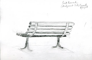
Between the grassy park and the sandy beach, there's a paved sidewalk for leisurely strolls or biking. The occasional bench along the walk allows for comfortable lake gazing. I'm contemplating adding such a bench to my next art quilt so brought the sketchbook along to capture a possible angle.


When I'd had my fill of gazing into space, sketching, soaking up the sun and reading, I strolled the length of that sidewalk, then made the return trip wading along the water's edge. The beach eventually gives way to some docks and a boat launch. For the texture nuts, this driftwood log catches the eye, especially late in the day as the long rays of a setting sun ramps up the contrast.


Behind the log is an arrangement of tree stumps, roots intact. Couldn't resist a picture of this one.

And that's an afternoon at the Sandpoint City Beach.


Monday, August 24, 2009

The other side of the challenge


Here is June's painting based on my textile piece Azalea Mosaic 5: Slippery Slope (see below). She calls it Sheila's Hydrangeas and it is 16" x 12" done in oils. Mmm...I chose to challenge her with azaleas and it inspired her to paint hydrangeas! Can you see the connection? See her blog post here to read more about it and her process.


I mentioned that I plan to do a second piece based on her painting - a less abstract version. June had a similar thought. What do you think of her other painting inspired by the same textile piece? Still not azaleas but I love it! To find out more about "Sheila's Daylilies" see June's blog post here.


Sunday, August 23, 2009

Bishop's Close Meditations


I finished the quilting on my response to June's Sunbreaks At Bishop's Close and simply couldn't wait to share it. That's right, it's not actually finished yet since I am considering binding it rather than just sticking it in a frame as originally planned. So what you see in the above picture is a photoshopped binding surrounded by a photoshopped frame. Close enough, and since I took a quick photo outside, the colors are much truer than in some of the previous in-process photos. I'm calling it Bishop's Close Meditations and it is 16" x 12" per our challenge guidelines.


After doing my research and spending lots of time staring at the above picture June sent of her painting, I settle on three things I wanted to bring into my design: 1) the impressionistic color palette of June's painting, 2) the wonderful curving line she created with the route of the water, and 3) a meditative feel since the purpose of a close is to provide a sacred and meditative space- all in an abstract manner. While my red is not as orange as the red in June's painting, and I've used much more of it in my textile piece, the other colors are very close to hers. I noticed the navy underpinnings on closer observation and was happy to incorporate it in my tulle squiggles.


The squiggles themselves are a take-off on her curves and are meant to represent the spirit world and those meditations wafting up to heaven. I wanted an ethereal feel, but after doing the bulk of the quilting, I could see that they were too ethereal, so went back in with that dark metallic thread as I thought I might have to and quilted around the shapes to help define them better. I am very pleased with the results.

Friday, August 21, 2009

Mulling


I feel summer slipping away, especially since last week's weather was more like fall. Temps are back up and I've spent time the last few days taking advantage of Sandpoint's beautiful city park on Pend Orielle Lake. It's a great place to walk, swim, sit, clear your head and mull things over.


Mulling is an important part of my creative process. Some may scoff and say I'm merely procrastinating (and Lord knows, I DO partake of a great deal of procrastination), but there are definitely times when it is best to take a breather and consider the possibilities rather than forge ahead merely to be making progress. It was this mulling by the lake after my day of designing that produced the realization I needed to use two sizes of squiggles on my June's challenge piece. I also became convinced that the navy tulle was what I wanted to make them out of. Yesterday I followed up on these hunches, cutting a few squiggles to test the idea. This does seem to give me the feel of spirits and meditations I'm going for. The stray squiggle at the top was a trial to see how stitching rather than fusing them down would work. I just couldn't see that fusing would be a good option.


I traced my squiggle shapes on scraps of freezer paper and ironed them to the tulle. It stuck reasonably well while I cut out my shapes.


Continuing to mull, what color thread would work best? I tried Sulky sliver opalescent and a regular Sulky metalic variegating dark green and purple. The darker thread gave more definition than I thought I wanted, plus showed any wavering of the stitching line. The opalescent more or less disappeared like a monofilament thread would, but added glints as well. I also thought it would work for the quilting. If once everything was quilted and I didn't think my squiggles stood out well enough, it would be simple to stitch around them with the darker thread. I stitched all the squiggles into place, and then it was off to the park again.


I don't have a lot to show for today's effort. The mulling continued as I cut batting and backing and layered it up using 505 spray baste. I was uncomfortable with the thought of all that glint over the top as I plan to quilt it. But I didn't think I had any other thread light enough for the job, getting a little hung up on what I had available in rayon threads (a bit of sheen without the in your face sparkle of the opalescent.) In the course of basting around the edges, I remembered a light blue King Tut stored separately from my other threads. That led to pulling two other cotton threads and laying them over the top as I traced with my finger where I thought my quilting lines would go. I think it is just what I want - giving just the right amount of definition and not overpowering the main design. I'll do some test stitching tomorrow, probably, and should have this quilted up in no time. The mulling has paid off.

Wednesday, August 19, 2009

Loosening Up


I started on June's challenge piece today with great eagerness. Been awhile since I've done more than putz around in the studio and it felt good to be designing again. I gathered up my reference printouts, cut a window viewer the size of the finished piece and went to work.


I had a few ideas that had formed since deciding to use one of the tissue paper sunprints. I drew on transparencies placed over the printout of said fabric to test some of these ideas before trying a full-size sketch. One of the promises I made to myself several years ago was to stay away from making predictable work. The direction this was headed felt too predictable, and frankly, not very inspired. I was spinning my wheels and realized it was time to loosen up.


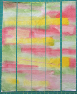
So I cut the paper into strips to experiment with another idea I had, one perhaps similar to bargello piecing. The bargello idea wasn't creating anything interesting, but merely flipping and rearranging the strips did. I wasn't confident enough, though, to cut up my one-of-a-kind fabric. Ah, but I did have a second one very much like it that I had no plans for and could test this idea on. Now I was really loosening up knowing that it didn't matter if this worked or not on this piece. In the picture above, it is cut into 5 strips.


And here some strips turned end to end and switched places.


I really liked what I was seeing so sewed the strips back together, pressing seams open. A much improved piece of fabric!


And here is how I used that window viewer to isolate the area of it that will be showing. One of the things I like about June's painting is the curve of the water. In the more abstract vision that surfaced in my mind, I could see these squiggles over the surface not unlike her curves. I thought of them as spirits or perhaps prayers - this IS a Bishop's Close I'm working with here. But how to render them? Stitching? Applique? I wasn't sure until today. I remembered the quilting stencil you see on the left, and knew that was the shape I had in mind. I cut a few out of newsprint just to see how it would look, and I definitely like it. The fabric on the right matches perfectly the water in June's painting, and looks so good with the colors in the painted fabric. But I'm not sure it's right for the squiggles. and don't know how else to work it in. I may cut the squiggles from the navy net - a piece of which is lying across the fabric in the lower right. I like where this is headed.

I must admit that my more predictable design idea is still playing in the back of my mind, and I may pursue that one as well. June, I have found out, did two paintings based on the textile piece I sent her. I sense one does need a warm-up piece and then something totally different.

Monday, August 17, 2009

G is for Glue Stamps


I'm still behind on the Surfacing Group's alphabet challenge, so while I'm supposed to be working on something beginning with the letter "P," I'm just now dealing with the letter "G." Following up on directions in a Quilting Arts Magazine e-letter, I tried making my own stamps with glue. The concept is simple - if squeezed on any surface, most glues will retain some dimension as they dry and leave a raised design that can be inked for stamping. The directions suggested using pieces of cardboard as a base and craft glue like Alene's. I also had some cheap school glue, so tried both.

The school glue was too thin and quickly flattened enough that getting a clear print was difficult. The craft glue, however did not. I had my usual control issue laying down the lines of glue, but the directions indicated that the unpredictability of the glue was part of its charm. I'm not sure I was that charmed, and my designs were less refined and detailed than what I normally like. Both glues took much longer to dry than the directions said. If you are going to try this, don't plan to use the stamps the same day as you make them unless you make them very early in the day and use them very late in the day. They dry clear, by the way, which means until they are inked, you can't really see the designs.


The nature of these stamps mean that they cannot be cleaned - you just let the paint dry on them and continue to use them until you no longer get a clear print. The directions also said these had to be placed on the table, inked, the fabric laid on top and a brayer run over the fabric to transfer the design. I did this on the first few tries, then decided I could see no reason not to use them like any ordinary rubber stamp. I used Versatex acrylic paint straight out of the bottle applied with a foam brush and pressed them onto the fabric - no problem.


While the stamps were drying, my mind wandered, and it occurred to me that these could probably be used for rubbings as well. So I gave that a try, first with Shiva Artist's Paintstiks, and then with a dry chip brush lightly loaded with the Versatex paint. That's the sample on the left. The craft glue ones worked very well for this.

I have to be honest here. There are certain products or techniques that everyone raves about, but try as I may, I can't warm to them or make them work for me as stellarly as everyone else implies. Paintstiks are one such product. This is the second time I've used them for rubbings, and frankly, I'm not feelin' the love here. I really prefer the effect of the dry paintbrush (the dark spiral). It just works better for me and gives me the look I like.

I can't just rinse out a brush, so the middle sample is me exhausting the paint on the foam brush with one of the stamps underneath. A little of the design comes through and some of the darker marks are where I turned the brush on edge and there was more paint to transfer. The sample on the right is the beginnings of a new paint wipe cloth as I squeezed the last of the paint out of the brush and dampened it to transfer even more paint. The ripply section in the middle was the product of placing corrugated cardboard under the fabric before brushing.

Sunday, August 16, 2009

In Praise of Plagiarism

"I'm very influenced by the tradition of painting and not at all self-conscious about identifying my sources. I actually steal things from people I can use...just blatant plagiarism."

Wayne Thiebaud, Wayne Thiebaud: A Paintings Retrospective (New York: Thames & Hudson, 2000)

Saturday, August 15, 2009

Faces


At last weekend's Arts & Crafts Fair I found a vendor selling these elk horn buttons. I don't run across these often, especially loose with so much variety of size, shape and color, so I didn't hesitate one bit to pick out a few to take home. Actually, this fair had 3 vendors carrying buttons, but this first vendor I ran across was the only one not pre-packaging them in nice uniform groupings of the whitest ones.

I really had nothing in mind as I sorted through the bin, vaguely thinking about use as actual buttons on something. But I soon found myself discarding the whitest most uniform ones for these yellower ones, especially any with interesting edges and shapes. And then...am I the only one that sees faces in these buttons?

Friday, August 14, 2009

Orientation

In the course of heat setting the sun prints yesterday, the fabric got turned to a different orientation than the way it was painted. I'm always amazed at how an image sticks in the mind, and how it doesn't even occur to me sometimes to check different angles. Excuse the color in these pictures - they don't look as intense in person. The one on the left with the bands of colors now running horizontally mimics June's painting more so than the vertical orientation. And the one on the right - well, as I had the tissue paper running horizontally to the bands of color, I didn't care for it much. But as soon as I turned it, it became a sunset with tree trunks angling to the sky. I can pick those out with thread painting, I'm sure.

Wednesday, August 12, 2009

Inspiration 1: Bishop's Close

This is my 1st assignment in the June and Sheila Let's Inspire Each Other Challenge (I should come up with a simpler name for what we are doing but there it is). See this post to read about our first in-person meet and how the challenge idea came about. June has chosen her oil painting "Sunbreaks at Bishop's Close" for me to base a textile piece on. Pretty appropriate subject matter for me since this is her rendition of the actual Bishop's Close of the Episcopal Diocese of Oregon in Portland, and I am an Episcopalian. A close, as I have learned from their website, is merely British terminology to describe an enclosed area around a church or other sacred space which provides a place for quietude and meditation. I've not visited this place which is open to the public, so I must rely on June and the pictures of Elk Rock Gardens on the website in gathering a little background info to spark an idea for my interpretation. More pictures can be seen on this webshots site.


I knew I wouldn't have time to work on my piece until now, but have had the jpg of June's painting as my monitor wallpaper for several weeks now. The thought was that I'd see it every day so my subconscious, if nothing else, could start working up an idea. My conscious certainly was coming up with any brilliant ideas, so I changed the wallpaper from a single centered image to the stretched version above. This had the effect of helping me see better the different colors and shadings she used. It also makes the scene seem more quiet and meditative to me.


When I got tired of that, I changed it to the tile setting. I thought tiling the image might generate secondary design elements like when you set traditional quilt blocks side by side with no sashing. Sometimes where the blocks meet, a star emerges, for instance. But I didn't see anything useful there.


When I did my tissue paper sun printing, I swear the choice of colors was strictly random. I wanted to do something different from the blues and purples and fuchsias I've done in the past. Once I removed the tissue paper, though, I noted how closely I'd picked up the colors in June's paintings. Mmm, maybe the subconscious had indeed been working on the problem. I tried to dismiss it, but even June picked up on it.


So it looks like one of these sun prints will be incorporated in my piece inspired by June's "Sunbreaks at Bishop's Close," but how is still murky. No doubt my subconscious is already halfway to the answer.

Tuesday, August 11, 2009

Post-Company

My weekend company left yesterday, but I am still trying to recuperate and get back to my normal routine. Head still too full of all we saw and did including - evening boat ride with prayer service, hitting most of the ArtWalk venues, dinner at Cafe Trinity at City Beach with a view that included the moon rising over the lake after dark, an outdoor concert featuring the Subdudes and Boz Scaggs, and strolling through the Arts & Crafts Fair at city park. My friends made several purchases of art, and I couldn't resist a little something either. The glaze on this mug from Klickitat Pottery captivated me, the mug felt good in my hand, and it was very reasonably priced, so home it came.

The weather may be cool and rainy the next few days, so perhaps the studio will see my face again...

Friday, August 07, 2009

A Rose


Finally, FINALLY, I have a lovely bloom on my Tropicana rosebush. This is one of several bushes given to friends 30 years ago when I heard the buyer of our house was going to rip all my rosebushes out. I chose to dig them out myself and distribute them to new homes. These particular friends lovingly tended it all these years with the intention of returning it to me once I settled in (bad reputation of moving every few years). They dug it up and gave it back to me last year. It survived the transplant and the winter, and is carrying on with this striking color. It really pops from a distance and lives up to its name.

Said friends are coming for a visit this weekend, so blogging with be suspended for a few days while I play. I'm very pleased the rosebush chose to put forth in honor of their arrival.

Thursday, August 06, 2009

Edna Boies Hopkins

Trumpet Vine by Edna Boies Hopkins 1915

The April 2008 issue of American Art Review had an article on Edna Boies Hopkins (1872-1937) primarily known for her floral woodblock prints. In the summer of 1915, she joined some friends and a growing colony of printmakers in Provincetown on the tip of Cape Cod. A core group emerged called the Provincetown Printers. Their most important technical development was the "so-called white line" or single block method. Rather than spend the time to carve individual blocks for each color in a design as in Japanese printmaking, these artists, including Edna, cut grooves into a single block to create separate areas of color. So instead of there being black lines printed by a key block to define the different areas, these prints had an unprinted space between colors. As the article states, the results appeared refreshingly clean and modern.

House and Blue Fence by Edna Boies Hopkins 1915

Upon reaching this point in the article, I took a closer look at the examples included in it and immediately saw what it was talking about. And I also felt this looked familiar, that I'd seen something similar by a more recent artist. Then it came to me...


This is "Village Green" by Cynthia St. Charles. Cynthia uses a glue resist on fabric to separate the different colors in her hand painted designs which are then turned into art quilts. It creates a similar white line. Don't you agree that it has a similar feel to Edna's work and comes across "refreshingly clean and modern?


Here's another example of Cynthia's work, "Pop Art Roses" (see full quilt here). In this case, she has filled in the white lines with a fabric marker. It still has the same feel, I think, as Ednas "Trumpet Vine." Both of these quilts were featured in Cynthia's article "Color Therapy: Glue Gel Resist" (Feb/Mar 2009 issue of Quilting Arts Magazine). When I contacted Cynthia to get permission to show her art quilts, she confided that she was not aware of Edna's work. So here are two artists working independently in different mediums and years apart but with similar results. I think that wonderful.

See more of Cynthia's glue resist work on her website here. She also maintains a blog Living and Dyeing Under the Big Sky, where she graciously shares the many surface design techniques she has experimented with and mastered. She is a true source of inspiration.