Sunday, April 29, 2007

April Journal Quilt

The calender theme for April is "Beginnings" with the quotation coming from Bruce Barton: "The most important thing about getting somewhere is starting right where we are."

And where I seem to be right now is in the midst of machine quilting curiosity and a desire to improve my quilting. The only way to improve is through practice and the only way to satisfy curiosity is by trying things out. Combine the two, and I just may get somewhere.

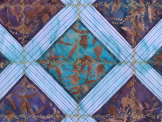
So April's journal quilt is a sampler of sorts, working through some of my curiosity - and current fascination with how thread color can change the look of the underlying fabric. I'm also intrigued with closely spaced parallel lines of quilting, like I used on Grid 3. I worked with both, all with free-motion quilting.


To more easily see the influence of the thread, I wanted to use a solid fabric. No doubt I should have used a less intense one than this hot pink, but I couldn't resist. Here you see the different colors of rayon thread I used. I was surprised that the red worked so well, but I think the purple is my favorite with this fabric color. And I have to say, I'm really liking the look of parallel lines of quilting, and especially liked these really closely spaced ones that waver a bit. Really sucks up the time and thread though. Click on the pictures for a larger view.

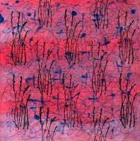
I also used this as a place to try out a new thread color and quilting stitch. This picture shows the King Tut variegated grey thread and my first attempt at the garnet stitch. I want to use this combination to quilt the fabric I leaf-printed with willow leaves. I particularly like this grey which is giving me the pavement look I'm going for. Here I loved the way the pink pops through.


One other new thing on this - when Superior Threads came out with "Bottom Line" filament polyester thread for use in the bobbin, I bought a spool. I'd been using Sulky's bobbin thread, which only came in black and white, and tended to be slubby. This looked shiny and smooth plus came in lots of colors. Of course, I felt I had to use up the Sulky first, so the Bottom Line has been sitting on my shelf. I usually use a fine cotton in the bobbin, but some metallic threads can cut right through it. As of late, I've been coming to my senses about all these things I've bought over the years only to store them away for the "perfect" time to use them. This is a very nice thread, and seemed to work fine with both the rayon and cotton thread. And since it is also advertised as an applique thread, I used it to hand stitch the sleeve on Grid 3. That seemed to work well too, although I'll have to check to see if it stretches under the pull of gravity.

Since this is just a sample piece, I won't be applying my usual 3/4" framing border, but will probably satin stitch the edges once the backing label is fused in place. The last time I tried that, I did not have great success. Since then, I've read a tip to make it work better, so want to try it out.

Friday, April 27, 2007

Never Say Never

This is a perfect example of why I can't throw out anything, why I find it hard to give up on work that may not be going well. You may recognize this as the leftovers from February's journal quilt, where I continued my exploration of a more casual curved piecing technique using bias inserts. As noted in this blog entry, I decided that once additional cuts and inserts were made, or if the curve was too extreme, things became problematic and I wasn't as enamored with the process as I thought I would be. Some of the sections were quite distorted, grainlines were off, and my sensibilities more comfortable with control and structure were upset.

So why didn't I toss these scraps instead of trying to make something out of them? Blame that basic traditional quilter frugality, that "use it up or do without" mentality learned from parents who'd lived through the Great Depression. Blame my basic curiosity and the love of a challenge. I simply couldn't waste even these small pieces, nor the time I'd spent on them, and I was curious to see if I could make these units work together some way. I decided the composition wasn't too bad. It reminded me of paths.

It's been sitting ready to quilt for several weeks and yesterday was its day. The plan was to use the threads and the quilting ideas I'd considered for the journal quilt, but rejected to keep it simple. It was a real joy to work through these ideas, and I'm so pleased with the results. I find I really like this little quilt (just under 13 inches). Sometimes I think I'm better at seeing the potential in something rather than coming up with a complete design idea. I can't imagine that I could have drawn this out of my imagination.


In the journal quilt, I used gold thread and an off/white & greenish yellow variegated thread. On this one I used a variegated red YLI 40 wt cotton machine quilting thread in the print fabric, and a dark green Mettler 50 wt cotton thread in the solid areas. I also used the green to highlight several motifs in the print.


As in the journal quilt, I used 3/8 inch spacing between parallel lines of quilting, following the various curves of the inserts, but I also quilted some of the same motifs from the print in the solid areas. This is something I learned from Rachel Clark, who specializes in quilted clothing. She talks about "reading" your fabric to get ideas for everything from applique or block choices to quilting designs. By pulling not just color ideas but pattern ideas from a focus fabric, the finished piece becomes more unified. I really felt it worked well on this little piece.


I can't believe how pleased I am with this - which by the way I've named "Pathways" - especially since it had such humble and not so successful beginnings. These kinds of successes from unexpected places is what makes me persevere through the next rough spot, or hang on to bits and pieces that seem silly to keep.

Oh, and are you wondering why I titled this post "never say never?" It has to do with the way I finished the bottom edge of the quilt. Yes, it really does curve. I must admit I've never much liked the way so many art quilts have uneven edges, as if the maker was too lazy to square things up and put a proper finish on it. I couldn't imagine myself ever doing that. Just not my style. Or so I thought. Ok, maybe it was that traditional quilter thing getting in the way again, but it was really bothering me that I'd be cutting so much off the bottom because of the way the pieces fit together, shorter in the center (see this picture). Actually, I considered following the wonky edges all way around, but I'm so uptight about this and there wasn't as much wonkiness on the other sides, that I just couldn't do it. So three perfectly straight and square sides are sharing space with one that's dancing just a bit, and I'm reminding myself, never say never.

Thursday, April 26, 2007

The Silk Tie Fairy Strikes Again...

I was expecting a package this week, but not from brother Mad Max. He snagged a couple more silk ties for my collection while cruising the aisles at Goodwill. Note the one on the right has my favorite colors - teal green and gold with a bit of rust thrown in. Ah...it is a reminder that I should start incorporating some of these wonderful silks into my current work. Perhaps this is the hint I was searching for? I've been feeling a bit unsure of direction lately - not that I don't have a lot to choose from. A friend refers to it as that nebulous time between projects when you are still elated at having finished one, but now must decide which of the many ideas and unfinished projects remaining should rise to the top of the priority list. Anything with silk sure doesn't feel like top priority right now, but maybe that's the problem. Maybe I'm focusing too much on "shoulds" and not even considering a little decadence!

Wednesday, April 25, 2007

Paint Job


I decided today was as good as any day to throw around a little paint. Up first - trying to create the look of a fog bank. I used Liquitex acrylic paint mixed with textile medium, adding just a touch of black and a little water to basic white. I wanted to see if I could get a swirly effect by applying the paint with a toothbrush.


I started with this batik. I mixed a small amount of paint and started applying it in circular motions. The first batch was too grey and didn't do much to alter the batik. Subsequent batches got lighter and I just kept working away until it looked like this.


I expected to get more texture from the toothbrush, but the paint seemed to go on thick for about 2 inches, then taper to nothing. I experimented with loading less on the brush and taking lighter strokes that gave me thin arced lines, but still only for a few inches.


Next I lightly painted sun streaks on the Chinese poem challenge piece. I dipped a rounded flat brush in slightly diluted gold Versatex paint and used a light touch as I moved across the fabric. Not sure it looks quite like I envisioned, but I do think it adds to the piece.


As long as I had paint out, I grabbed that square of fabric that's been squiggled with paint, stamped and over-painted and applied yet more paint. I taped it over the crepe wrapping paper I saved from Christmas, and used a chip brush to apply blue Versatex paint straight from the jar. Not a good plan - it was too heavy at the beginning of the stroke and petered out before I made it all the way down the square. It might have been picking up some of the texture from the crepe, but it was hard to tell. I dipped the brush in a little water and tried spreading a thin layer of paint while hopefully thinning out some of the heavier spots, but oops! Too much water! Not sure what happened there in the middle - it turned pretty purple. By now I figured I didn't have much to lose, so I used a q-tip to dab rubbing alcohol and eventually just shook drops off it. I think I can see a few spots where the top layer of paint moved away from the alcohol. Finally, I took a bamboo skewer and ran it across the fabric in wavy lines both directions. I could see the faint impression initially, but as the piece has dried, I'm not sure it's visible anymore. But I do think some of the stamping and original squiggles of paint faintly show through this new layer here and there.


Finally, I took a small piece of muslin, taped it to the crepe and rubbed the chip brush over it to use up the remainder of the paint in the brush. You can just barely see how it picked up the texture of the crepe.

Tuesday, April 24, 2007

Grid #3: Latticework

As promised, here is a full view of the now finished Grid 3 which has gained the subtitle of Latticework. The colors had to be adjusted with software; it didn't seem to matter under what light or setting I shot pictures, my digital camera wanted to read the teal green as teal blue. But I think this is pretty close now.

My own critique of this quilt (which measures 20" x 20") is that it is a bit tame, uninteresting in the color department, no real spark. Perhaps I should have been more bold with the type of yellow thread. No doubt the pink and teal combination still strikes me as not quite right as well. The pink did not get toned down nearly as much as I'd meant with the extra stitching. Click on either picture for a larger view.

I also think this would have benefited from a wider binding. Grid 1 & 2 both have half inch binding which seemed to help frame and balance them. I think I got lazy (or just rushed) and defaulted back to my typical (and traditional) quarter inch binding. But if I were to be honest, most of my more contemporary pieces have felt the need for a wider binding and usually get it.

As I held it up considering its faults, I momentarily considered adding something around the outside edge to create a wider ending - sewing this to a larger mount or even attaching prairie points. But no - this was an experimental piece that I've spent longer on than I meant to anyway, and I think I've learned all I need to from this piece.

I welcome comments - honest critiquing - as I'm still trying to figure out exactly why this not unpleasant quilt has disappointed me. I keep thinking it would make a fine throw for a small table rather than a piece I want hanging on the wall.

Monday, April 23, 2007

Goals for the Week of April 23rd

As usual, today I was doing a bit of catch-up from last week's list of goals. I did well, actually, except that I always forget just how long it takes to hand stitch binding, which I ended up doing on Grid 3. I think I thought I'd be doing it all by machine, but once again, I failed to cut the single fold binding generously enough, so hand stitching to secure it to the back was my only option. That meant that the sleeve didn't get sewn on until today. I also failed to catch up my documentation, so it too got done today. Everything else on the list got done.

This week will be a lot of this and that as I try to get several projects close to completion. Plus it will be time for another journal quilt come Saturday. So here's what I hope to get done this week:
  1. Apply paint "sun beams" to Chinese poem challenge.
  2. Paint charcoal batik with white acrylic to mimic fog bank.
  3. Layer Willow Leaves 2 for quilting.
  4. Quilt piece made from curved piecing experiment.
  5. Make journal quilt

Shaking off the last of Winter

April 18th of last year, I was reporting in on the way spring was shaping up in Wisconsin. Ok, so spring comes a little later to these northern climes of Idaho - at least this year. The last 3 or 4 days I've noticed buds and leaves trying their best to make a new start. In fact, what I thought must be leaves coming out on the maples were actually flowers.

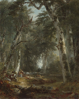
I love the lines of the tangle of branches in the background here.

It's been a bit windy, so no sooner had I shot some pictures than I noticed some of the blooms already fallen to the ground.

I truly don't remember this, though I surely must have seen it growing up. It was last year that I made this connection that trees other than the showy fruit trees and dogwoods and magnolias bloom each year to produce seeds and propagate. See this post from last year for a few examples.

I chalk it up to the fact that I must be more observant these days, what with my focus on trees and leaves in my quilting. I believe this is forsythia blooming next to, what else, a birch tree.


Thursday, April 19, 2007

More "Landscape & Memory"

My reading in this book (first reported in this post) has now brought me to familiar ground - the redwood and sequoia forests of Northern California. And as I suspected, with familiarity comes an easier read. And as the author points out some major differences in how Americans and Europeans viewed their sacred trees and forests, as well as how artists were using deep symbolism to express these ideas, I had to wonder if I'd been incorporating hidden meaning into my own tree-infested work.

Here are two main ideas Schama puts forth - extremely simplified and generalized by me. In Europe, a nation's forests often represented military strength. Not only did they provide timber for fleets of ships that made up the navies, but they provided fuel for the ironworks. In Keifer's "Vargus" it is noted that the boughs of the trees form an arch not unlike a military honor guard's swords.

On the other hand, Americans of the mid-1800's were seeing their woods of the West as sacred cathedrals, and so the arching trees became nature's equivalent of the Gothic Cathedral arch. Asher Brown Durand's "In the Woods" (below) "...which feature[s] birches bowed together in Gothic inclination" is a good example of this.


The discovery of the "Big Trees" and other larger-than-life natural elements in Yosemite fostered a growing national sense of the uniqueness of the American Republic and its link as "God's new Chosen People." Schama continues:

A generation earlier the forest had been represented in the popular imagination as the enemy. The eastern woods, after all, had been the habitat of the godless Indian...Beauty lay in clearance; danger and horror lurked in the pagan woods. The clearances were so extensive and so indiscriminate, though, that even as early as 1818 James Madison was protesting the 'injurious and excessive destruction' of timber. To a generation reared on Fenimore Cooper's forest romances, the miraculous appearance of western woodlands seemed to be a sign of God's forbearance, a second chance for America to understand the divinity inscribed in its landscape.

Almost 10 years after Durand's "In the Woods," Hudson Valley painter Worthington Whittredge painted "The Old Hunting Grounds." Again, we have birches used in an architectural way, but this time rising "like fluted columns to the arched, darker foreground trees...an illustration of the tradition which located the origin of Gothic pointed arches and vaults in the spontaneous interlacing of tree limbs." This is much different than Schama's comment about the birches pictured on the cover of Kiefer's book "barring" the way to the deeper woods or Kiefer's outstretched limbs evoking military swords raised in salute. These birches rather remind me of my Wisconsin ones. Kiefer's "barring" ones look like stands I see here in Idaho.

A closer look at Whittredge's and other artists' work of this era reveals they are loaded with additional spiritual associations. These are not just pretty landscapes. A broken stump and trembling birch leaves are emblems of death and new life, for instance.

At least one modern American artist, it seems, can see something more on the lines of Kiefer's "Vargus" in woodland scenes, with a look past the "pretty" exterior revealing deeper levels of understanding. I found this review of Christopher Lowry Johnson on Edward Winkleman's blog - definitely worth your time to pop over and read. What specifically caught my eye was this excerpt from TimeOut New York's full review:
But however romantic Johnson’s painterly style may appear, his scenes are anything but Edenic. The depopulated landscapes convey willful human abandon rather than untouched wilderness and are subtly entangled with contemporary issues of war and environmental disaster.

In the show’s most affecting work, Pines No. 5, Johnson portrays an awkward formation of evergreens, each decked out in Christmas tree lights, boughs heavy with dollops of snow. Softly advancing on the scruffy white ground under a gray-blue haze of twilight, these sad yet beautiful trees suggest an army of soldiers, bravely (or perhaps unwittingly) awaiting their demise. — Jane Harris

Back in the infancy of my blog, I spent several posts analyzing how I see and incorporate nature in my work. I tend to focus on individual lines, shapes, texture, details. If I do take in the whole in any way, I think I have viewed the woods as inviting, the trees dancing, the insulation from the modern world healing. I suppose that last one is a bit of a spiritual connection, but I don't recall sensing any architectural connection.

So what of my many birch quilts? I'm not aware of anything but portraying their appealing shape and stark contrast against various backgrounds that mostly portray seasons or moods: Birches in summer, Birches in the fall, Birches at night. Well, perhaps "Wild on Birch Street" hints at a tree with a bit of attitude as it bursts through a window - a bit of fun there - but I don't think allegory is a part of my interpretations. View some of these quilts in this post on "What to do with Inspiration."

This is making me feel a bit shallow, giving credence to the current argument that too many art quilters are not saying anything important with their work, not making any political statements, not imbuing their work with deeper meaning. Well, I readily concede that much of my work is probably more decorative art than fine art, and I have no problem with that.

Now that I think about it, though, I'm remembering some ideas yet to be executed that will hint at a deeper message for those who take a closer look. I guess they are still ideas because they will be more difficult to pull off, more difficult to work through emotionally than my simple play with lines and color. I've been working up my courage and my technical skill level to start these, and I'm getting closer all the time.

Results of Last Paint Scrunching

I promised to share the results of my little trays of dabbed and scrunched fabric. I really did approach these in a "splash and dash" manner, very unlike me. Just quickly diluted some Setacolor paint, grabbed a variety of fabric scraps and started applying the paint. As a result, I'm hazy about the details of each piece. Some the fabric was wet before applying the paint, others I think I did dry. Some fabric was unbleached muslin and some was very pale peach and pink hand-dyed. I blame you art quilters for influencing me with your more casual approach to experimentation!

To be honest, once the fabric had dried enough to open up, I was pretty disappointed with the results. On most of them, all the paint had run up into the uppermost creases, leaving no color elsewhere, not even in the other scrunched lines. This is not what I remember from the first time I tried this. I wasn't seeing anything of interest. At least, not until I ironed them to heat set them.


Here is how most of them came out. The two pieces on the right are hand-dyes. The navy obviously was too dark, so the red doesn't show up as much. However, on the small light blue one, the red made a nice pinkish impression over it. The one running along the top used red and green paint that was mixed together, then painted over a pale peach hand dye. The one on the left is the same paint over pale pink. Once ironed I could see how the green separated out in places - it looks more brown than green. The top one is a long strip that has a lot of variety to the way the paint migrated. The big one in the middle is unbleached muslin that was dipped dry into the waste water used to clean the foam brush and I really expected more color overall. Instead, it looks like all the paint went into a few areas. There's no fine veining like I got with a previous try at this.

I also had a long narrow strip that I twisted and a shorter fatter one of muslin that I loosely pleated. Again, the paint just didn't do much interesting, or so I thought. As has happened to me before, I saw nothing while each piece was horizontal, but once I turned them vertically, it was a different matter. I'm beginning to wonder if I'm a bit warped because I can manage to see trees and landscapes everywhere. Can you see the pink tree trunk in this one, gently twisting toward the top and splitting into two limbs?


And you get extra points if you see the landscape potential in this one. Think promontory of land jutting into a lake at sunset...


Monday, April 16, 2007

Goals for the Week of April 16th

I've been flying without a net for way too long - um, longer than I thought. According to my notebook, my last goal setting was done 5 weeks ago. Three items on that list, one of which I just did last week and one of which is still waiting. Now that Easter is over, the taxes are in the mail and yard care arranged, I suddenly have renewed drive and a clear idea of what I want to get accomplished over the next three weeks.

It's a sequential thing again. I need to get going on a piece for the church which ideally should be finished by June 1st. Tick, tock. I recently purchased fabric which may be perfect for the background, but it needs to be washed. I've been putting off washing it because the load will have several 2-plus yard lengths that I'll want to lay out on my work table when ironed. The work table still has bins sitting on it from my search for fabric to make crows feet blocks. I have two more blocks to cut out but didn't want to choose their fabric until I had the other blocks sewn and up on the design wall. Ergo, sewing the remaining 4 crows feet blocks moved to the top of the list today. Now that they are intermingled with the rest, I can see that I need more yellow, not more purple as I had guessed, so I am glad I waited. Tomorrow, I'll cut out the remaining two blocks, sew them and clear off the work table. The next step on that quilt can then be postponed.

Theoretically, I can finish off the week by binding Grid 3, and maybe even getting its sleeve sewn on. I'd love to get it up on the wall next to Grid 1 & 2 so I can better contemplate what I want to try next in this series. Finishing it would also mean I can clear more work table space and get some documentation done as well. Feels like a full, productive week ahead for a change.

So here it is in list form:
  1. Cut & sew rest of crows feet blocks.
  2. Process new fabric (wash, iron & store about 12 yds)
  3. Bind Grid 3 - apply sleeve if time.
  4. Update documentation files - SP Challenge and Grid 3

Saturday, April 14, 2007

Another Day of Crow's Feet


I like to steam my quilts before applying the binding - just to make sure all the shrinkage is out of the center before stabilizing those outer edges for good. Once that binding is on, the outside edge won't draw up much if any. And so Grid 3 got steamed today, and while it's drying, 4 more crows feet blocks got made. A lot more fun, I decided, than sewing on binding...

Just six more to go! These are taking me about 45 minutes each to sew together, by the way. Then I plan to sew a 2 inch strip around each block so that I can square them up to a uniform size. With so many people contributing blocks to this project, they naturally are varying a bit.

Friday, April 13, 2007

Another Take on Journal Quilting

I've been meaning to share with you my partner-in-crime's journal quilts but kept forgetting to ask her permission. Bear in mind we are separated by 1400 miles & two time zones so we don't talk as often as we'd like. Even the e-mails aren't as frequent as they should be, but once a month we have this journal quilt date to connect us. We e-mail each other pictures and explanations of our work, and within a few days, we're on the phone asking for more details.

While I've been working my way through a 2004 calendar of themed quotations, my friend, Judi, thought she'd like to experiment with interpreting her photographs into cloth. She received a digital camera for Christmas and started taking photos near her home. This is the one she chose for January.


And here is her textile version.


I no longer have the e-mail detailing her process, but as I recall, she traced the major lines onto interfacing and proceeded to audition various fabrics and cut them to the proper shape before fusing to the interfacing. This was a technique she didn't care for much, not really seeing its advantage over the more conventional fusible web method. She stopped here before adding any batting or stitching. She thought she might like to just stretch and frame this as is.

In February, she planned to use a photo taken at Olbrich Botanical Gardens in Madison, WI. But instead, she dreamed a quilt design she's sure was brought on by a recent conversation with a gal she works with. Like so many of us, Judi has always thought her perfect life would be one in which she'd quit her job and spend all her time making quilt art. However, during this conversation, she realized that she has always enjoyed her jobs in office work and would not be totally happy if she wasn't working with paper and numbers and computers and files. She needs both office stuff and quilting stuff in her life to feel balanced. In her dream, she saw a quilt that joined those two parts of her life into one "fabric" as it were - strips of fabric interwoven with strips of paper. Here is her interpretation of that dream.


In March, she diverged from her original plan again to work with a watercolor painting by her mother, Julia Zweerts Brownsfoot of Hood River, Oregon. The painting was done some time ago, and all Judi had to work with was her memory and a very faded photograph. On the left is the photograph and on the right is the color restoration provided by one of my software programs.


And here is Judi's rendition.


Again, this is applique, but in yet another method new to her. In this method, each pattern piece is drawn onto fusible interfacing and cut out. Then it is fused to the wrong side of the appropriate fabric and a seam allowance added as each piece is cut out. Finally, the seam allowance is turned to the wrong side, using the edge of the interfacing as a guide, and glued to the back. Then the pieces can be arranged on the background and stitched in place with a zigzag.

Judi found it difficult to get a smooth curve with this technique, and also to properly line up the various pattern pieces because there were no registration marks to follow. In the lower part of the design, she just cut out the pieces of interfacing-backed fabric on the pattern line for a raw edge look, but she doesn't really like a raw edge look when it ravels, and the interfacing allowed for raveling. All in all, she decided she'd rather use regular fusible, or Sharon Malec's freezer paper method.

But isn't it a gorgeous quilt?

Thursday, April 12, 2007

Today's Horoscope

Brings a wry smile to my face when my Yahoo horoscope is so spot on:

Trial and error is a very effective way to learn, so remember that if a few of your experiments go awry today. These aren't failures -- they are wonderful learning opportunities! There is a silver lining in every cloud that appears in your life, although some may be harder to find than others. Despite a failure here and there, you cannot give up your quest to try new strategies and see how they turn out. This type of curiosity is a valuable asset that will yield amazing results soon

Nearly done

Today I faced the last of the stitching on Grid 3. The first two in this series had specialty decorative threads couched along the vertical and horizontal lines through the squares. On this one I wanted to try stitching with one of my machine's pre-programmed embroidery stitches. I was pretty sure which of the two King Tut gold threads I would use but needed to try out some stitches.


The darker, more mustard yellow was making me nervous against the pink. So at the last minute, I gave the more muted one a try and it won out as did the undulating tulip stitch. It was the one that most looked like the leaves in the batik squares. Even so, I had resigned myself to not liking the effect once all those lines were stitched. I had no confidence that the yellow would look like it belonged on this quilt.

Once again, I experienced how a small sample can't really indicate accurately what the full effect will be. These lines of embroidery changed the whole complexion of the quilt, and for the better. Relief!

And once again, I've let a quilt take me on a roller coaster ride. From excited to disappointed, to encouraged to discouraged, from this is great to this isn't working to hey - I think I like this quilt. It's not the most exciting one I've made, but it has a pleasant quality to it. I tried taking pictures outside since the digital camera seems to balk at capturing the colors accurately inside, but these seem even worse. Full view with better color to come once the binding is on.

Wednesday, April 11, 2007

Anselm Kiefer

I've been slogging through a book by Simon Schama call "Landscape and Memory" and a slog it has been. This is not an easy read, particularly if you aren't familiar with European history which the author apparently assumes you will be. Lots of arcane references and foreign phrases, but I persevere because the tenet of the book is to connect ancient myths and landscape to our most basic social instincts and institutions. Since so many of my quilt themes of late center around nature, since landscape is such an integral part of my daily life, I figured it was worth a read.

Today's reading centered around Germany and highlighted a modern artist named Anselm Kiefer. His work is totally unfamiliar to me, yet it appears that my last journal quilt enlisted a device that he himself used. I quote from Schama: "In 1974 he drew on the national reverence for both wood carving and woodcut engraving to produce a series of prints in which 'Germany's facial types' were seen barely emerging from the grain of timber." Well, they do say nothing's new under the sun. And I didn't presume to think my idea to use a wood grain patterned fabric to thread paint my portrait of a wood worker was a unique one. But I didn't expect to run across such a similar idea.

This is from Kiefer's Hermanns-Schlacht book completed in 1977.

Here is another way he invoked "...the darkest grove of history [having] his block-heads emerge from the grain of German timber." Trees, especially the oak, were a big part of his art, his German heritage.

I had another surprise coming. Hermanns-Schlacht opens with this black & white photo that he took at the edge of Varus' forest. Schama describes it as "...a screen of white birches, thin and cage-like, barring the entrance (and the exit)...behind the line of birches, an infinity of blackness." I see stands like this now, those straight birches so rigid compared to the undulating ones I was used to back in Wisconsin. But I had never thought of them as barriers.

Towards the end of the chapter, Shama ties in Kiefer's works and political inclinations with the "cultural force of myth and magic..." more involved than I want to get here. But there were a few things he noted that I found worth thinking about:

"To be sure, myths are seductive things. A truly disconcerting number of those who have spent their lives codifying, narrating and explicating them have not gone unbewitched by their spell."

"So how much myth is good for us?...The real problem - what we might call the Kiefer syndrome - is whether it is possible to take myth seriously on its own terms, and to respect its coherence and complexity, without becoming morally blinded by its poetic power."

"Of one thing at least I am certain: that not to take myth seriously in the life of an ostensibly 'disenchanted' culture like our own is actually to impoverish our understanding of our shared world. And it is also to concede the subject by default to those who have no critical distance from it at all, who apprehend myth not as a historical phenomenon but as an unchallengeable perennial mystery. As the great Talmudist Saul Lieberman said when he introduced Gershom Scholem's lectures on the Kabbalah that became Major Trends in Jewish Mysticism: 'Nonsense (when all is said and done) is still nonsense. But the study of nonsense, that is science.'"

Tuesday, April 10, 2007

Stamps & Paint

I mentioned a bit ago that I was trying out some new stamps and painting too. Here are the results so far.


Here's the ink I used with the stamps. I don't like to think how long I've had this without trying it, but the reason I bought it was because it specifically mentioned it could be used on fabric.


I started with three squares of hand-dyed fabric about 7 to 8 inches square. Last year when I was playing with paint, I used a little that was left over to experiment with a squeeze bottle tip. The results on those two were less than spectacular - one problem may have been that the paint was too thin. The third square was one I'd been using a little like a drop cloth - testing a stamp or using up ink on a stamp in no particular pattern. Let's talk about that one first.


I had no clue if I could do anything with this one. But leave it to me to finally see a landscape in it. I few additions of the pussy willow stamp look like tall reeds or weeds to me. I can see the round hump of a mountain in the background, and a nearer slope to the right. I decided to stop right here and the rest of the landscape will be picked out in stitches.


I really was quite disappointed in this next one. The crosses and squiggles just didn't look as great as I'd hoped. The blue looks bland. It seemed a good candidate for the pussy willow stamp. I'd envisioned using this stamp as an overall design with staggering so that's what I tried here. I like this a lot.

But it needed more I felt. So the next step was to apply some paint. I used these two Versatex paints - cherry frost and orchid - painting them in curving bands using a one inch foam brush after wetting the fabric. I'm not crazy about the metallic flecks, but overall, I think this is an improvement and I can stop here.


Last is the square with the diagonal curvy lines. Again, this did not play out as effectively as my mind thought it would. Maybe the square stamp would work over it. I'm thinking I want to build up texture and depth, no one element really shining forth. Obviously, if I plan to use this stamp this way, registration is an issue. I'm wishing it didn't have the heavy square outline. It definitely needs darkening with paint so I used the same as on the previous one, trying to make swirls and blotches.


I'm not impressed. This piece of hand-dye is slightly darker in value than the previous one and the cherry frost paint is too close in value to it. I'm not getting the dark that I want.


Saturday I got out a different set of paints to see if I could darken this up again. I used two Setacolor paints - Oriental Red and Moss Green. The red looked quite dark in the jar, but once I mixed it up and dipped my probably too wet foam brush in it, it didn't change the overall color very much. Will have to do more to this one, I guess.


After the fact, it occurred to me that I could darken the red paint by adding another color - the moss green. I didn't apply it to my square, but instead, pulled some additional scraps of fabric and used up the little that was mixed on these. Here are my trays of scrunched and twisted scraps, ready to go out in the sun in the hopes of getting some sun printing effects along the creases. Results on these to follow.