
Saturday, October 31, 2009
Friday, October 30, 2009
Poor Browns?

"I cannot pretend to feel impartial about colours. I rejoice with the brilliant ones and am genuinely sorry for the poor browns."Sir Winston Churchill
My goodness, I find nothing poor about browns! I have a lovely array of brown fabrics, from batiks to hand-dyes to commercial prints. I had a great selection to choose from to evoke my different dancing trees.

Here are two more I'm considering to replace the dark tree in the center. Feel sorry for poor browns? I feel sorry for poor Churchill!

Here are two more I'm considering to replace the dark tree in the center. Feel sorry for poor browns? I feel sorry for poor Churchill!
Thursday, October 29, 2009
June's Jockeying
 "Jockeying in Underwood's Queue"
June Underwood 2009
It is quickly nearing the end of October, and June has shared with me her response to my "Jockeying in the Queue." She's blogged about it here, and I was relieved to read that she, too, has been dealing with a busy month and a late start on the challenge. She's done early only because she's off on an extended trip, and admits there's some editing she'd like to do when she gets back (and the paint dries). It would appear that the theme of jockeying this month applies to us in many ways.

So where is my response to June's October challenge, you may ask? It's not that I haven't been working on it; I have. In fact, I became so engrossed in the design process that I have only begun to choose and cut fabric the last few days.
I've set myself a technical challenge which has required a lot of tracing and transferring and enlarging of my pattern. My original sketch was journal size, and I decided to copy it to drawing paper so I could try out color placement with Prismacolor pencils. I first traced it onto tracing paper, then rubbed graphite on the underside along the design lines (right in the above photo). Then when the tracing paper was placed over the drawing paper, I could run over the lines with a dry ball point pen to transfer a faint impression of my design (left) which you might be able to see if you click on the photo.

I didn't have as much luck with the colored pencils as I'd hoped. Much like searching my fabric stash, I found I didn't have the colors or values of specific colors I had in mind, and only had modest success in blending colors. Still, the exercise pointed out places where I need to be careful about value choices in the sky and let me try out an idea for segmenting it. It also helped me see I needed a better distribution of the different browns for the trees. I made the connection that I could alter the color of the fabric with stitch, just as I was altering the color put down with the pencil with other colors streaked on. I could have played with this for days, but time was running out. It was time to enlarge my pattern to our predetermined challenge size of 12 x 16. Since I had scanned the original sketch, I was able to let my computer do the enlarging, printing out the quadrants full size for me to tape together.

I should have taped it to a light box or window. I had to trace it twice - once onto a large piece of tracing paper which I could then place on the light box so that I could transfer the design onto newsprint for my master pattern. Once that was done, I traced a mirror image version onto freezer paper which will become the templates.

Now I had a puzzle to decipher and a numbering system to devise. This entire pattern will be cut, the individual pieces ironed to fabric and the fabric pieces re-assembled into the finished top. With all the dancing and intertwining going on, I needed a plan. I divided the design into 4 main sections, then labeled the pieces within a section in something close to the sewing sequence. This code was transferred to the master pattern as well. I also added hash marks to aid in matching up the curving seams.

At last, I was ready to start construction, beginning with the trees (I had the least question about fabric choice with them). After ironing on a template, the fabric is marked along the edge of the freezer paper (seam lines) and hash marks are transferred to the seam allowance. I've perfected sliding a small ruler along the seam line while I trim away the excess fabric to give me 1/4 inch seam allowance along the curves. Yes, this is a tedious and time consuming process, but one I find worth it once I get to the sewing.

I quickly realized that, since I was not cutting and applying templates in sequence, I would have to find a way to keep track of the loose templates as I cut them apart. I'd pinned my master pattern to the design wall to help me keep track of placement as I cut out fabric; it was the perfect place to pin the extra templates until I needed them. The trees are all cut now, although I am considering changing the fabric in one of them - that is the beauty of this system. It is so easy to change a fabric if it isn't working well - I'll be able to see the complete composition before sewing a single stitch. Tomorrow I think I'll start on the sky - what I end up using there will influence the values I should use in the ground more so than the other way around.
I can see I will not be done by Saturday. I appreciate June's relaxed approach to our challenge. It is allowing me to revisit ideas and explore approaches that I might otherwise set aside until I had more time. Of course, we never do have more time. It is very hard for me to approach these challenges in an off-hand way, to dash something out as some can. No, I allow myself to get engrossed in the idea, in the planning, in the process. It's what I enjoy about quilting, and sometimes it's just not worth it to me to rush it.
Tuesday, October 27, 2009
Tulips for Dawn

I've just heard that a former guild sister is quite ill and as is our way, the guild is putting together a friendship quilt for her. I may be in Idaho and they in Wisconsin, but that hasn't stopped me from caring about them and wanting to make a block for this quilt. There were few restrictions on what one could make, and it didn't take much thinking for me to settle on a block with tulips. Dawn joined my Baltimore Applique group (an off-shoot of the main guild), which was a surprise, since she openly admitted she did little quilting, just loved quilts and the people and all that went with being a long-time guild member. However, she shared that she'd always dreamed of making a tulip quilt, had even bought a pattern or two, so thought this small group would be a good place to learn the hand applique skill she'd need. Once I knew this, I started noticing tulip patterns everywhere and even copied a few from my own collection for her.

One of the patterns I shared with her, if I remember correctly, is the Tulips quilt above. It is from the book Mini Quilts from Traditional Designs by Adele Corcoran & Caroline Wilkinson. This is a great example of why I find it hard to let go of books and patterns and fabric. I've not made any of the quilts in this book, and seldom make traditional designs anymore. I've had the fabric for quite awhile, a style I still like but which doesn't really work in my art quilts. Yet book and fabric was just what I needed for my block. I wish I'd had time to hand applique it, but the information came too late for that. Instead, it is fused with Steam-a-Seam Lite and I added machine buttonhole stitch around the tulips to define them a bit more. Four blocks joined in this swirl gave me the size requested for the friendship quilt.
God speed, Dawn, on this difficult journey. Wrap yourself in your sisters' love.
Friday, October 23, 2009
Another Exhibit

I feel like I'm stuck in a revolving door of exhibiting. Yesterday, it was taking down my ArtWalk exhibit, today it was putting up a different grouping at my church for our Oktoberfest/Art show tomorrow. ArtWalk went up at the end of July and I thought I would get a break. Then I received a notice of a September exhibit and hustled to finish my Bishop's Close pieces for it. For the church exhibit I'm using both some older pieces and ones from ArtWalk. But I'm not done yet...I've just received an invitation to exhibit during November & December, so again, I'll be pushing to finish a few new pieces. Whew! I'm glad to have so many local opportunities but I could use a break. I've had to do some creative shuffling of art work to keep all venues fresh.

Set up was easier this year than last as we are farther along on our renovation project. The wall my quilts hang on is only primed but that's a big improvement over the patched drywall of last year. The ladies helping today like asymmetrical groupings and packing the walls. I'm a little uncomfortable with it, but have to admit it does allow us to hang more work. Above are watercolor paintings by Susan Wall.

This grouping is more watercolors by Maureen Hackworthy.

And our photographer, Geoffrey Cant, is back.

Karen Applegate agreed to share her cross-stitch and needlepoint, although she is not willing to part with any of them. I know the feeling.
Several other members have contributed oil paintings, woven baskets and other art. We're hoping for at least as many sales as we had last year, but in this economy, you can't count on anything.
Thursday, October 22, 2009
Unfamiliar Territory

Remember these little Easter postcards I recently made? I got to thinking what a nice pair they made, and maybe I should frame them up together. I headed to Ben Franklin to scope out frames and colored mat board. I ended up bringing home this piece of scrapbooking paper instead as well as an inexpensive dark green frame. I didn't notice until I got home that the paper's pattern includes a heavy weave as if it were fabric. Even better!

My plan was to use double-sided tape to attach the postcards to the mat, but now I'd be attaching them to paper. I know very little about scrapbooking, so I called a friend who does. I knew I'd need to secure that paper to mat board, but with what? I was envisioning some special glue that wouldn't make the paper wrinkle, but she assured me I could just use my double-sided tape. Yeah! I really like the way it came out. (If you click on the picture, you can see the weave in the paper.) I'm putting this in my church's art fair this weekend and know how nervous some people are about no protective glass over art. My compromise is to slip the glass between the back board and the mat board. That way I can display it "naked" like I like, but assure a customer that the glass is included should they wish to use it.

My plan was to use double-sided tape to attach the postcards to the mat, but now I'd be attaching them to paper. I know very little about scrapbooking, so I called a friend who does. I knew I'd need to secure that paper to mat board, but with what? I was envisioning some special glue that wouldn't make the paper wrinkle, but she assured me I could just use my double-sided tape. Yeah! I really like the way it came out. (If you click on the picture, you can see the weave in the paper.) I'm putting this in my church's art fair this weekend and know how nervous some people are about no protective glass over art. My compromise is to slip the glass between the back board and the mat board. That way I can display it "naked" like I like, but assure a customer that the glass is included should they wish to use it.
Monday, October 19, 2009
More on Signature Style

Last week I shared a quotation airing the view that "A signature style is about consumerism, not art." (see this post). I withheld my thoughts on this, curious about how others might see it. I got three comments which pretty much agreed, provided "signature style" is synonymous with "sale-able style." . And then Wanda shared a link with me. As so often happens, another blogger, Elizabeth Barton, was musing the same issue in this post, albeit from the angle of risk taking (or not). It's short, so go take a read, then come back.
When I first came across the quotation accusing signature style of essentially making life easier for the consumers, I thought she had a good point. I went through a period of worry that I had not developed a signature style yet, because I equated it with earning the title of "artist" and thus the potential of sales. Then I worried about being pigeon-holed because my interests take me back and forth over the line between organic and geometric designs. What if I become known for my sinuous tree trunk designs to the point that followers will be dismissive when my work shifts to my other obsession of grids? I finally settled back to the reality of first I must please myself; if others are unsettled by fresh directions, there will be, perhaps, just as many excited by it. I'm not having to make a living off my art, so I am comfortable with that. Yet it does make it difficult to put together a cohesive "body of work" for exhibits. Doesn't matter much if you are in a group exhibition, but yes, for a solo show or to market, it's much easier to think in terms of work whose signature may make it all look alike in some way. Not the way many of us like to work.
However, I think Terry makes a good point that the author may not understand the concept of signature style, confusing it with saleable style. Following the links to the author's full objection, and to the statements on her website, it became clear to me that perhaps she was protesting too much. If she were truly confident in what she was doing, I think she would spend less time trying to bolster her position. It reminded me of my summary page to a gradeschool report on folklore. The assignment was to interview adults in the community for stories of a local flavor, things that might fall under the categories of old wives' tales or ghost stories or legends. Well, I was very uncomfortable asking adults for their stories, so my collection covered common stories I already knew fleshed out with ones I could pry out of mom & dad. That summary page was nothing more than justification for not having interviewed more people, and the teacher called me out on it. I had the same sense from this artist, that deep down she knew her art might be better if she were not pulled so many directions, but it was easier to rationalize it away with this argument of signature style basically being a bad thing inflicted upon artists by the consumer industry.
At this point, I'm going to send you to the website of Melissa Cole, who has definitely developed a signature style which is also a saleable style. I love her work, but I am a bit unsettled by how commercial her website comes across and how within a category, her work is so similar. There's an efficiency there that verges on production, and while no two paintings are exactly the same, some are so close that it takes a second look to define the difference. Seeing one of her salmon paintings in person made we want to own her work. After viewing her website, I lost the urge after the 4th time I thought I'd spotted the painting I'd seen only to discover it was just a variation. I feel funny making these observations, because she obviously is talented and successful. And yet...
Signature style develops from doing the work, from focus, from seizing on an idea and running with it until all options are exhausted or we tire of the exercise. It might serve us our entire creative lives, but more likely, we will find forks in the road of our creative journeys that will lead us into new territories and new signatures. Now there's something to be excited about. Whether or not we choose to create for a specific market as well is a personal choice.
Any more opinions?
Saturday, October 17, 2009
Emily Carr

June Underwood, October 2009
12" x 16" oil
12" x 16" oil
June has challenged me this month with the above painting, which itself is inspired by the work of Emily Carr. In this blog post, June shares that she has been studying the way Emily rendered skies. Skies can be problematic, "dreadfully banal unless somehow worked as part of the same problem as the rest of the ’scape." A sky can be a flat expanse of color with no variation in value or hue. Or it can be streaked or blotted with clouds that add interest. For the stitcher, they pose additional problems. Just what line of quilting makes sense over what is typically without texture or feature of any kind? Equally puzzling is what to do with the cotton ball nature of clouds that also rarely suggests texture that can be played up with stitch.

Images from the Vancouver Art Gallery website
This teaser was enough to send me off on another research expedition (thanks June! and you thought you couldn't come up with a subject as delightful as Anthony Trollope...) I'd looked at some of Emily's work before, when June was focusing on her trees, but didn't remember anything unusual in her skies. Now that I was looking for it, I found it. I saw the cubist-style rendering as in the painting "Vanquished" that June was working off of, and I also saw swirls which looked more like what June had actually painted. Click on the collage above for a larger view to study these two approaches.

In the e-mail that accompanied the photo of her painting, June commented on Emily's "swirls of forest." I remembered the "dancing" trees of Maryhill, and in studying her painting once again, I caught onto the idea of "dancing" trees and "dancing" skies. An idea for my June-inspired piece was forming.

I made this journal quilt in 2003, my feeble attempt to portray the perspective of looking up into the trees. I'd done several birch tree journal quilts that were pieced, but I wanted to try applique to get a more fluid and overlapped grouping.

A few years later, I started reworking the design in a more head-on perspective. I drew lines and erased and re-drew and erased some more. I was never happy with it, even though I kept tinkering with it off and on these past 3 or 4 years. I thought my last edit was as good as it would get, and now with the idea of dancing trees and skies, I pulled it out for the basis of my October challenge.

Maybe it was the hours spent manipulating June's painting earlier in the day, or looking at Carr's paintings & my Maryhill photos to decide which ones to print out as references. Whatever it was, instead of tracing the sketch for multiple transfers to drawing paper where I'd play with colored pencils (as was my plan), I found myself studying the lines and gaps. It needs a trunk here, I thought, or this one needs to curve a bit differently. The rest of the afternoon was spent in this methodical tweaking until I was quite pleased with the composition. The trees definitely danced more and I achieved the more complex interweaving which was my original intent. Amazing what a few years, a trip to Maryhill and a drawing class can do!
I used to piece the majority of my quilts, even ones with curved designs. It was a point of pride with me that I grew so proficient at curved designing and piecing. But I have flipped the other direction these last few years, more prone to appliqueing my ideas using various techniques. The last time I pieced a traditional block, I realized how rusty I'd become with such a basic procedure and how much I miss just sitting at the machine. So I had it in my head that this next challenge from June would be pieced not appliqued. I may have set myself more of a challenge than I intended, figuring out how this design can be pieced. But I think I'm up to it.

If not, this is my fall-back position. Of all the photo-manipulation effects I played with the other day, this mirror reflection is the only one that really stopped me dead in my tracks. Whoa...that is so dynamic, and so me. It too might be a little bit of a challenge to break down into pieceable units, but I think it would be worth the effort.
Thursday, October 15, 2009
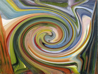
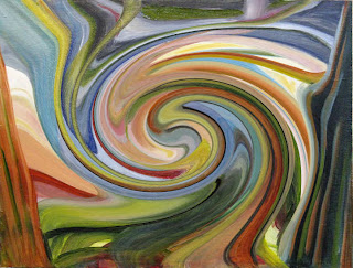
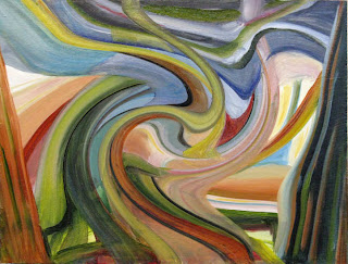
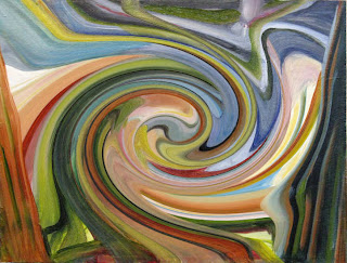
More Play with Effects

I blame Beth Wheeler for the way I spent the morning. Beth is introducing the art quilt world to the wonders of displacement maps in programs such as Photoshop & Corel Paint Shop Pro. I had my program open to print out some reference pictures for the next challenge from June (as you can see above) so I thought I'd see if PSP had this feature. I didn't spot it so I went to the help index, and sure enough, there were instructions for using this effect. I returned to the drop down effect menu and it indeed was there - I don't know how I missed it before. I tried it out on one of the pictures open on my screen, and...oh my. Curse you Beth! As if I don't spend enough time already playing with the more obvious effects at my disposal! Oh, this is really cool! I closed all the jpgs except June's painting (at the top of the paper in the upper center above) and started to play.
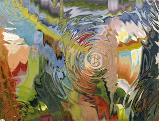
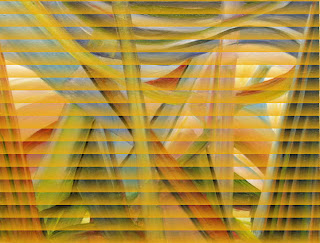
As you can imagine, the variations are many (you can choose from program maps or your own photos), but I particularly like the "puddle drops" displacement on this painting. This one is stretched across the painting.
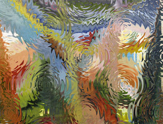
And this one is tiled across it.
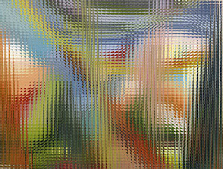
As long as I was there (famous last words), I tried to remember which effect I'd used in the past to distill the photo down to blocks of color. Mosaic glass wasn't it but I thought this was stunning (click on this or any photo for a larger view).
While browsing the help index, I ran across information about using the "effects browser." The what? Yet another option that was there all the time but that I'd failed to see. It's a way to preview en masse the effect of any and all manipulations to a photo. This struck me as a two-edged sword. It theoretically could speed the previewing process. On the other hand, I think making it easier only lured me to play longer.
But many of the results made me smile. This "bubbles and balls" effect reminds me of an Escher engraving.
How about looking out your blinds on a sunny morning to this view, compliments of the "sunrise blinds" effect?
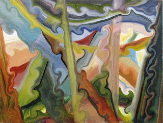
The "curlicue" effect might give June ideas of how she could rework her painting. She's well known for continuing to work a painting if it doesn't feel right.
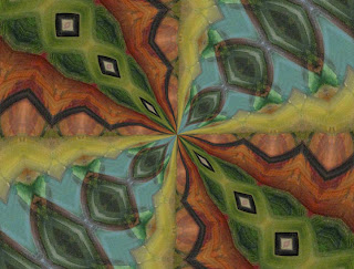
This "kaleidoscope" effect surprised me - they normally have a very crisp look but this one looks felted.
And finally, "twirls" going right and left, loose and tight.

As you can imagine, the variations are many (you can choose from program maps or your own photos), but I particularly like the "puddle drops" displacement on this painting. This one is stretched across the painting.

And this one is tiled across it.

As long as I was there (famous last words), I tried to remember which effect I'd used in the past to distill the photo down to blocks of color. Mosaic glass wasn't it but I thought this was stunning (click on this or any photo for a larger view).

While browsing the help index, I ran across information about using the "effects browser." The what? Yet another option that was there all the time but that I'd failed to see. It's a way to preview en masse the effect of any and all manipulations to a photo. This struck me as a two-edged sword. It theoretically could speed the previewing process. On the other hand, I think making it easier only lured me to play longer.

But many of the results made me smile. This "bubbles and balls" effect reminds me of an Escher engraving.

How about looking out your blinds on a sunny morning to this view, compliments of the "sunrise blinds" effect?

The "curlicue" effect might give June ideas of how she could rework her painting. She's well known for continuing to work a painting if it doesn't feel right.

This "kaleidoscope" effect surprised me - they normally have a very crisp look but this one looks felted.
And finally, "twirls" going right and left, loose and tight.


Sunday, October 11, 2009
Halloween Row Robin

I'm working on the next row robin to come my way, and once again, it belongs to a friend who follows the blog and would rather not know how her quilt top is coming along. I've been looking forward to this one arriving because I knew ahead of time that she had chosen a Halloween theme, and I had a pattern tucked away that I hoped would work. Good news - it will! And it is also a great opportunity to get out those orange fabrics that don't get much air.

So I can't show you my pattern, but I think I can safely share that it is applique, requiring many shapes to be traced onto fusible web, applied to fabric and cut out.

There's some fussy cutting too.

This is the starter row, part of a commercial pattern for a full size quilt. The pattern came with the row in case we needed some inspiration or Halloween characters to add. I'm the 4th person to add a row, and I have to say, I think we are putting together a better Halloween quilt than the original! Aren't I lucky to have it in hand when Halloween is only a few weeks away? It's getting me in the spirit...
Friday, October 09, 2009
Showing His Bias?
My newspaper carries Kevin McDonough's "Tune In Tonight" under the TV listings. It's a synopsis of what to watch and what might be a waste of your time that particular evening. I scan it to make sure I haven't overlooked a show I'd like to see.
Wednesday my local PBS station was airing back to back episodes of "Craft in America" and "Art in the 21st Century." Oh, double good, and I was looking forward to comparing how "craft" and "art" would be handled. I didn't need to read the longer-than-usual blurb to entice me to tune in, but I scanned it anyway.
I was a bit surprised by what I found.: 2 paragraphs devoted to "Craft in America" and the final paragraph a snub of "Art:21." "The artisans on 'Craft' tend to speak in a language as straightforward as their work and avoid the kind of academic jargon heard with unwelcome frequency on "Art in the 21st Century,' a survey of the contemporary scene." (Follow this link and scroll down to read the paragraphs praising "Craft")
So I watched these two programs with this jarring criticism in mind. "Art:21" was first and I made it through the whole thing without noticing any academic jargon. Mmmm, is it possible that I've immersed myself in the art world to the point that I don't even notice art speak when I hear it? Or was Mr. McDonough referring to the entire series as a whole?
Two episodes of "Craft" aired that night, "Origins" being the one highlighted in the review. The background music was nothing but folk, the kind of thing that conjures up the Appalachian Mountains. Most of the craftspeople highlighted spoke in a folksy, almost hillbilly southern drawl. I began to think Mr. McDonough had been charmed by the seemingly down to earth people interviewed, backed up by that music. I truly could not hear any difference in the actual words and concepts used by the "artists" vs "craftsmen" to express their art, inspiration and process.
I'm guessing Mr. McDonough did not watch the second "Craft" episode, "Process." It did not feature plain country folk, and these artists (yes, they even referred to themselves as artists) dropped more jargon than the artists featured in the "Art:21" episode. At least, that's what my finely tuned antennae picked up. Was his review showing a personal bias, or am I showing mine? If you saw either of these programs (they can also be viewed online), I'd love to hear your impressions.
Wednesday, October 07, 2009
Eureka! (and some postcards)

Look what I found in the Perle cotton I use when satin stitching the edges of fabric postcards. I keep overflow thread spools and various embellishing threads including these in a basket. Yes, I sort of looked for the Sharpie pen in that basket, but obviously only half-heartedly. I suppose I may have been using it to write on the back of the postcards I made back in April, but I didn't notice it was missing until mid-June. Must have gathered it up with the Perle cotton when I put it away. No matter, what was lost is now found and I am a happy camper.
So here are my 5 fabric postcards, all receiving their edge finish and labeling today. Two Easter ones (fussy cut novelty fabric with monofilament thread machine quilting picking out the details):

Two based on Bishop's Close From Afar (from leftover tissue sunprinted fabric):


And another Jockeying For Position (shapes trimmed from previous project arranged on paint wipe cloth):

Subscribe to:
Posts (Atom)