Saturday, April 30, 2011

Post 1000

Yes, dear readers, this is my 1000th blog post...hard to believe. On the other hand, I've been blogging since 2005...which now that I think of it, is equally hard to believe. Thanks for suffering through my ramblings, observations, frustrations and triumphs. I always hope that you will find something of interest, help or beauty here. And since this seems a momentous occasion, I think I should offer a little giveaway to celebrate. I have a favorite number...it is not too high...and that number comment to this post will receive a little gift. Since I moderate comments before they appear on the post, you won't know where you are in the queue, but I'll know when we reach the magic number.

I had other things I was supposed to be doing today, but instead I played with the above photo of one of those "ghost" leaves I talked about here. (click on any picture for a larger view) I found this last weekend as I was enjoying the warmer weather, out and about taking pictures. This is a posed shot, one that excited me because of how clearly the lacy-ness of the leaf showed up in the leaf as well as in its shadow. I take most of my shots on a 1600 x 1200 dimension setting and the finest resolution so that if I choose to zoom in to an area for cropping, I still have a clear image. Although I liked the framing of my original shot, I got to thinking there must be some areas I could zoom in on for interesting crops. So here is what you can come up with from a single shot.


And if you've been following me for any time at all, you know I can't resist running photos through various filters in my Corel Paint Shop Pro program. I started with a similar photo that angled the leaf slightly more and incorporated more variety in the stone backdrop. Here are some of the more interesting ones.


Seamless tiling.


Polar coordinates, rotated.


Vertical perspective


Twirl.


Lights.


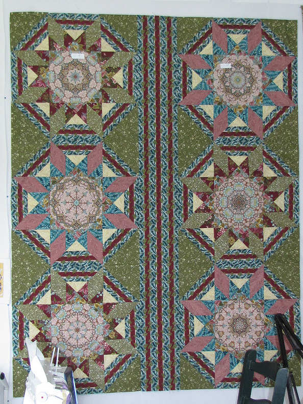
Can't stop until I've tried my favorites - first Kaleidoscope


Then pattern.


Finally, I was fascinated with the colors showing up beyond the darker center in this mosaic.

Hope you enjoyed this photo manipulation tour. Don't forget to leave a comment!


Friday, April 29, 2011

"All in the Family" Opening Reception Tonight!

In a few hours, I'll be heading off to the opening reception of POAC's "All in the Family" exhibit. See details in this post. Already I have gotten such positive responses to the coupling of my quilt and my brother's plant stand - I am so glad I decided to be a part of this. Cathie noted that she wished she could see the details on the plant stand better so here are a couple of shots that should help. Click on either for a larger view.

I couldn't find the e-mail that gave me the particulars on this when writing the previous post, but today I spotted it. There are 49 individually milled pieces and my brother noted that after making the first two as gifts, he swore he'd never make another one. All those individual pieces that must fit perfectly, all needing their finish applied separately before assembly, well, for the quilters among you, think a many-pointed spiky mariner compass, blocks with many Y seams, Baltimore Album blocks appliqued by hand...worth doing at least once, but is the fussiness worth repeats?

Apparently so. After seeing his first one, I knew I wanted one too, as a lot of my furniture is in this same mission or arts & crafts style. It took a lot of years to get one out of him, and he thinks he has completed 7 or 8 of them now, each slightly different. He and I agree on at least one thing about our art - we are not interested in production of multiple identical copies of a design. So will there be more? The artist speaks: "...in the absence of someone to shoot the artist when the masterpiece is complete, I'm thinking about the next in the series with some Art Deco influence. My god, will someone just shoot me..."

Oh, man, I've been there! Well, I don't think anyone's shooting him soon, so if you are interested in a stand like this, he says,
"I only do one-of-a-kind pieces but I'd be glad to talk about a commission to do a similar piece." Contact Max Mahanke - he's in the Raleigh, NC area. Oh, and if anyone decides to steal his design and make multiple knock-offs, he'll be coming after you!

Wednesday, April 27, 2011

Sneak Preview: POAC "All in the Family" Exhibit


I spent a good part of the day helping to hang Pend Oreille Arts Council's new exhibit, "All in the Family." POAC members were invited to submit artwork from family members to hang alongside their own. The response has been enthusiastic as many artists, including me, expressed long-held desires to do just that, but failed to find a venue in which to do it. The submissions were as varied and interesting as families are themselves!


Here's the check-in table. The group on the left are considering what to hang on the second level.


That's Karry Lensing, one of the show coordinators, on the left, helping clean the acrylic cover to one of the many display pedestals needed for this show.
Of the exhibit, she says “The goal of this exhibit is to celebrate the influence of ‘family’. Families are distinct, as are the art and artists POAC represents. This show is a really fun way to honor the love and creativity that are enhanced by the family dynamic.”


Here is my offering - my "Guys Ties...My Hand Dyes" quilt hanging over my brother's Arts & Crafts style plant stand. Not a good shot to show off the details in that stand, but it is comprised of over 45 separate pieces of mahogany and purpleheart. My quilt has fabric from my late husband's and father-in-law's ties.


Here is the family grouping of our Executive Director, Kim Queen. She does mosaics, as in the table and birdhouse.


This is acrylic artist Kathy Robinson's family grouping.


This family grouping includes one from a very young member as well as adults. There's even an "artist's bag" made from batiks and other luscious fabric, one pocket holding some very interesting hand-made brushes.

More info from the press release:

The exhibit features outstanding new works from more than 35 of POAC’s member artists, displayed with work from members of the artist’s families. The artists and the media represented in this exhibit are extremely diverse. Some of the more unique items on display – a beautiful hand-crafted violin made by Stefan Grimes, son of POAC artist Lorna Lent-Sommers. The violin will be played by Karen Pogorzelski during the reception. Artist-member Barbee Buchanan will exhibit one of her designs, alongside a hand-made surfboard created by her grandson. Watercolorist Karen McDonald will display a painting she produced of her father, paired with a 1928 painting produced by her father.


POAC PRESENTS
"All in the Family"
All Media EXHIBITION

April 29, 2010 - June 17, 2010


Opening Reception

Friday, September 24, 2010
5:30 - 7:00 pm

Location:
The POAC Gallery, in the Old Power House
120 Lake Street, Sandpoint, Idaho

Free and open to the public
All in the Family Newspaper Ad
For the first time, POAC is honoring not only the artist, but also the artistic family. Pieces displayed span generations as well as media. This show will capture your imagination and your heart!


Tuesday, April 26, 2011

Working Big...


Well, biggish, at least compared with the small format I've used for awhile now. The big stack n whack blocks are being set into a vertical strip quilt set, and it's time to cut the strips that will go on each side, top and bottom. Cutting long strips like these is so much easier when your fabric has stripes to guide you. And you have a large surface to work on. I chuckled at the suggestion of one of my friends who just visited; after seeing my studio in person and hearing my lament that I wish I could store all my fabric together instead of in the various bins, baskets and boxes it now hides in, she thought the obvious solution to be reducing my ping pong table to half its size. I know I keep saying I'm not going to make any more really big quilts, but I also know I have a few of these bigger ones in my "unfinished business" file. I refuse to give up this big flat surface even if that weren't true!


This is really coming together nicely (and the colors in this pic are reading pretty true). I've decided I really must miter the corners when I add the striped fabric around the outside. A big concession for me as I don't particularly like fussing with miters. And this isn't destined to hang on a wall or even spread over a bed. It will be on the small side of a lap quilt, and at best be folded over the back of a couch. But I think I would be unhappy if I just butted the borders. The miters should echo a bit the flow of the stripe around the stars. So I have paused to do some calculations - measure many many times, cut once. Because, baby, after all these years, I'm not going to find more of that fabric...

Sunday, April 24, 2011

Happy Easter


This sure isn't the Easter bunny, but it's what I saw when I opened the door early this morning. Lying a little too close to the front porch for comfort, I decided retrieving the morning paper could wait and grabbed my camera instead for a few quick shots.


This is the same moose I saw feeding in the slough yesterday. He looks old and slow and like he doesn't feel real chipper. These are magnificent, if a bit homely, animals. If he wants to hang out in my yard now and then, that's fine with me.


After weeks of truly cold weather and almost daily bouts of sleet, gropple and even real snow, yesterday and today have given us hope with sun and warmth enough to shed a few layers. I noticed that the slough looked quite different - there must be fresh water flowing into it now such that the bottom is visible. It usually isn't. The moose was feeding just to the left of this framing.


I couldn't resist zooming in to get these shots. Now what to do with them...


And looming over all, still plenty of snow on the mountains.


As I walked back to the house, I happened to look up and see these two having some fun. Not sure I've seen tandam flying overhead before.

Hope you've had a lovely Easter.

Thursday, April 21, 2011

Photo Shoots & Color Matching

"Strawberry Moon 4"
Art Quilt 8 x 10 framed
Sheila Mahanke Barnes 2011


Last week I braved 40 degree windy weather to try and get better photos of the three art pieces being submitted with my ArtWalk entry form. I really have been quite lazy about this picture taking thing of late, and have struggle to get accurate colors. I hoped that going outside on an overcast day would solve my problems. Well, only partly. The good news is that because I had blocked out the day for photo shoot and jpg preparation, I learned some different ways to adjust color in my Paint Shop Pro program which finally gave me much more accurate representation of my art.

"Strawberry Moon 2"
Art Quilt 8 x 10 framed
Sheila Mahanke Barnes 2011


With the artwork propped next to the monitor, I could see that the biggest challenges come from teal green which perpetually reads as blue. In both Strawberry Moon variations, there are fabrics with this green tint. In the first one, the background actually washed out to white. Any color manipulation merely gave it a blue cast. In the second one, the grey was reading more blue than green. With any of the one step fixes, I could not match that green tint well, and the pink of the moon would be totally thrown off. What I learned was to isolate different sections so that the color manipulation would only apply to the sections needing it. Maybe that sounds obvious, and in fact, I'd played around a bit with that in the past, but this time, I improved my skills in fine tuning the selected area and I used color adjust functions I'd not understood before. Now if I can just remember what I learned. Compare these to my previous photo of these two here.

"Fracture"
Art Quilt 12 x 16 framed
Sheila Mahanke Barnes 2011

I still struggled getting it right with Fracture. I felt I needed to apply a golden wash to the center part of it, as the lighter silks are just too white. Still, it is a better representation than the raw photo. And as you can see, I opted to submit it sans dimensional leaves. Time constraints did not allow me to fully assess whether their addition worked or not.


So after the photo shoot and preparation of the jpgs, I spent quite a bit of time arranging and re-arranging those leaves. I left them pinned in place as you see them above and moved the framed art around the house so I could see it in all kinds of light. Because it just wasn't working. The leaves weren't adding anything to the design. They weren't showing up over the pieced area as I'd anticipated. They were lovely but not for this piece. Even though part of what I hoped they'd do was camouflage some baubles in the satin stitching along one edge.

So finally on Monday, I moved it back into the studio, ready to remove the leaves and stitch it to its watercolor paper backing. And then I had second thoughts. The leaves suddenly looked like they should be there. I was caught off guard by what must have been my inner eye envisioning the upper leaves moved higher. Ok, I'll bite, I thought. I moved three leaves up and partially off onto the border and now it seems to be working. Still, I'm letting myself live with it for awhile before I stitch them down. And however I stitch them, it will be an easily reversible act in case my mind's eye changes its opinion. And why, in this shot quickly taken in the studio, do I suddenly get that golden glow with no color adjustment?

Fits and Starts

I am itching to get those big stack n whack blocks sewn together into a top. Goodness, it's been over a year since I pieced the last one. No wonder I'm getting tired of looking at them on the design wall. I've been hesitating over the fabric for the corner triangles, thinking I want a more blended look but unsure of which of the set-aside fabrics might give me the proper look. Aha! With three experienced quilting friends on their way last month, I decided to let them help me decide. We all agreed that the fabric indicated by the red arrows was the best choice.

So with the string quilt done and in the mail, yesterday I happily got out the fabric, cut my triangles and arranged them around the blocks. To my horror, they looked absolutely awful! Well, this wouldn't be the first time I'd auditioned large pieces of fabric only to find they read totally different when cut to size. Not to worry - I decided that the blue fabric in the star points would work better, do my blending thing. But this time, I only cut a few triangles to try out. It was better, but that blue reads stronger than the blue in the border fabric surrounding each star (contrary to how the photo reads), really fighting for attention rather than playing nicely.

I started leaning towards the green in the other star point. It would have worked, but now the blue star points pulsed more than everything else. Come on guys, don't you know your place in this design???

I finally settled on a slightly darker green in the same family. My subconscious tried reading to me from the quilter's book of rules - Somewhere in my quilting history, I seem to remember someone warning against introducing a new fabric to the mix, that it would stand out and not look right, and initially I had listened instead of trusting my gut reaction to that darker green nowhere else in this quilt.. But now as I tried a few triangles, I could see it matched the intensity of that blue (again, not really reading that way in the picture) and balanced it perfectly, plus played up the green leaves in the other fabrics. I quickly cut the rest of the triangles and sewed them on today, and I am SO pleased with the results. I now feel the quilt is coming together with a nice balance. I hope that continues as I add the alternating vertical strips of border print (the burgundy stripe circling the stars in each block).

Tuesday, April 19, 2011

The Something For Nothing Quilt


Well, almost nothing - it did require my time, but otherwise, this string quilt is all of scraps that otherwise would have been tossed, leftovers and donations. I actually pieced and quilted it last year, set it aside for more pressing things and never got back to it until this week. I was jolted out of my inertia by a notice that Quilters Newsletter will be collecting quilts until April 30 to be sent to Japan (for more info follow this link). Good enough for me.

I save strips of fabric at least an inch wide for these quilts and foundation piece them over newsprint that wrapped my possessions for safe transit the last couple of moves. The border is fabric I bought for a charity challenge with a heart theme - yes, it has hearts on it and they are just not my usual thing so I was glad this quilt nearly finished off what was left. The batting was excess trimmed off a guild charity quilt and was headed for the trash until I retrieved it - I had to butt several pieces together to make it wide enough but it worked. The backing is some chambray my mother-in-law passed along when cleaning out her sewing stuff. I nearly passed it on as well until I realized it would work fine on the back of this quilt. The quilting thread is also from my mother-in-law. The binding is from my shoebox of leftover 2 inch strips, some of it tail ends of actual binding, others just 2 inch wide strips from other projects.

"Make it do, wear it out, use it up or do without."

Wednesday, April 13, 2011

Sunday Brunch in New York

How fabulous a postcard is this to show up in my mail box today? Oh, dear niece, how I would love to join you for lunch, especially if you promise we can dress up like this! If only Brooklyn weren't clear across the country...

Le Barricou Cafe, Bar, Bistro menu

Monday, April 11, 2011

God's Palettes

This is partly for June, who is studying landscape artists and her own role in landscape painting, and partly for Sherrie, who loves the Southwest and may soon win me over to it. And for the rest of you too:

"The gratitude I have for being able to participate in the phenomena that happen when the light, weather, space and beauty of the Southwestern landscape come together is overwhelming. What I've worked to achieve through my art is that timeless moment of reflection, that meditative oneness when everything is silent. At the point of stillness, we realize we're a verb identifying with the forces of color, light and space. We're ever changing with actions and reactions to nature's assets. God provides us with the palettes necessary to mix our own colors, tones, hues and values. It's up to us to compose the feelings we want to project."
David Rothermel, The Artists Magazine, October 2010


Ok, this is not the Southwest, obviously, but my own "point of stillness" that is the rugged mountains of the north. This picture was taken on a family vacation up into Canada when I was in my teens. Mom, Dad & I take a quiet moment to drink in the near over-powering beauty of Waterton National Park at Lake Cameron. I will be forever grateful to my father for making time to take me to places like this, and then not just drive through but stop for awhile to reflect, to meditate, to watch as the landscape before us changed with the light and the weather. I've definitely been given the palette, am still working on composing what I want to project.

Here a a few more pictures from that vacation.


Sunday, April 10, 2011

Playing with Fire

I've been mulling this leaf thing over for quite awhile, and was grateful to Terry Grant for reminding me about what she calls ghost leaves - those that have progressed in their decomposition to the point of developing holes that make them look quite lacy and ethereal (see her post here). I wanted to make my sheer leaves look this way too and knew I could do that with a needle heated in a candle flame.


Oh yes, I like this a lot. Initially, I held the leaf between my thumb and finger, poking the hot needle through the fabric. But I didn't have quite the control I wanted that way, got a few holes bigger than I really wanted. So then I tried holding the leaf flat against my teflon applique sheet and tapping the hot tip against the fabric. This gave me smaller and more organic-looking holes. These may make it on the quilt, although perhaps not scattered over the center pieced portion as originally envisioned. These may look good out in the border. We shall see.

Saturday, April 09, 2011

Dimensional Leaves

One of the things I thought I might float across the surface of "Fracture" is sheer dimensional leaves, just barely tacked on. I had the gold sheer in hand, just wondered how I would technically pull off making stand-alone leaves out of it. I thought about fusing two layers together, but feared that would make them too opaque. I wondered if I could hoop it up with stabilizer and just straight stitch the outline and trim near it. Would that be enough or would the stitching be all wobbly and the whole thing limp and lifeless? As I pondered this technical problem, I discovered my answer in a Quilting Arts show on PBS. As I watched Heidi Lund demonstrate her technique, I could see I was on the right track. With her additional suggestions (available in pdf form on the website, TV series 200, episode 205), I gave it a go with excellent results.


As luck would have it, I'd recently received a sample of the very stabilizer Heidi used: Sulky Sticky Fabri-Solvy Water Soluble Stabilizer. I really had no idea what to try it on so I am glad for this direction. Peel it from its backing and smooth the sticky side on either the top or underside of the fabric. I was amazed at how well it stuck to this synthetic sheer, providing ample stability when placed in the spring hoop even though it feels quite soft.


If you use it on top as I did, you can draw your design directly on it. I'd placed a transparency sheet over my pieced center and drawn some leaves to make sure I was making them the right size, then just placed my hooped fabric over that drawing and traced. I'm using a Sulky Ultra-Twist Rayon thread in the top and a Madeira Polyneon thread in the bobbin to do the first round of stitching - as I had thought it is a free-motion straight stitch around the outside and along the veins. What I had not thought though was Heidi's second step of going back over the outlining straight stitch with a free-motion zigzag stitch. That is what makes this really work. Because my leaves are relatively small, I used a relatively narrow width of 1.5 compared to Heidi's 2.5 or 3 width.


Once the stitching is complete, it is relatively easy to trim each leaf close to that zigzag stitching before removing the stabilizer. Without the white of the stabilizer, it would be more difficult to get in close without accidentally snipping the thread. Now all that is left is to soak the leaves in warm water until the stabilizer magically disappears.


And here are my lovely leaves drying. I like the way many of them are curling slightly, just like real leaves would. Once dry, I have one more thing I want to try with them - stay tuned. I have to admit, I was letting myself be intimidated by the whole free-motion thing again but I really must stop that. Once I got going, my stitching was fine and I found these a lot of fun to make. I'm not at all sure that these belong on "Fracture" but if not, I will certainly find a use for them somewhere. And in the meantime, I have found a new stabilizer that I just love.