Wednesday, January 31, 2018

Still In The Limelight

Look! I'm on the cover of the local paper's monthly insert!

After my artist talk at the December reception, and after the request to put it in written form for POAC's website (yet to do), I got another request from POAC to be the featured artist for the local newspaper's "Neighbors" insert which comes out once a month. I gave the gal responsible for the article links to places on the blog that answered some of the suggested "prompts" in the e-mail request, and then because some of what they wanted to know was more personal than artistic biography, I ended up writing a "quick" summary of where I was born and raised (not far from here), schooling and jobs, where life took me both geographically and creatively, and how I ended up back here. I expected her to combine all that information into a cohesive article, but instead, she took just my summary and printed it as submitted, adding the photos I'd sent along. Nice to know my writing skills are still up to par!


I've gotten some feedback from local friends who saw the feature, all who said it was nice to find out more about me and my background. I don't think of myself as secretive about my life, but since those people have only known me since I landed in Sandpoint, it's not surprising that there are things that haven't come up in conversation. As for not including more about my art and process, I decided that's ok for this kind of article. I wanted to be sure to include what this community means to me and my art and why I chose to make it my home. My summary does that.

This article isn't online that I can find, but if you click on the photo, you should get a large enough image to read the text. Now I'm ready to crawl back into my cave and become anonymous again! I've never really wanted widespread notoriety through my quilting, except possibly recognition in some of the larger quilt shows and art exhibits I've entered over the years, and in those cases, the quilts were far away and in the limelight, not me who kept a low profile at home. I've always been happy to be a medium-size fish in a medium-size pond. Or as this great image on creativity says down in the corner, "a prized local cheese!"


Thursday, January 25, 2018

The Muse Is Back

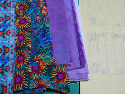
And so it begins . . .or so I think! Redrafted block and fabric for Eve's quilt
I don't know where my muse takes off to, but every now and then she goes on vacation, coming back refreshed. Sometimes a little TOO refreshed. Mine has been stirring up and turning over my brain for weeks with tantalizing ideas she presents as my eyes wander from the tv to a beautiful art note card propped nearby or as I try to fall asleep thinking of ways fabric might be folded for snow dyeing, or as I think through the technical challenges in the slice quilt, or as I scribble alternate block dimensions in the margin of a catalog by my wingback chair. And then there's the driving urge to get back to sketching and finish the course I paid for last April and still have 2 sections to finish. Usually when my brain is this overloaded, I end up doing nothing because I can't decide which to work on, something I call being on spin cycle because it can literally have me spinning from one thing to another as I change my mind. This time, the muse grabbed me by the scruff of the neck one day (when I'd run short on studio time which left me ready to put anything off to the morrow) and sat me down at the work table saying, "For Pete's sake, draft out the new dimensions on the block for the baby quilt . . . NOW!" Yes, it was THAT strong of a feeling, and so I did. But as is so often the case, once done my curiosity about what was in my stash to go with the lavender hand-dye got the better of me. Oh, that will only take a few minutes, and actually, it really DID take only a few minutes as I immediately found varying amounts of a collection that changed my whole idea of kind and color of fabric for this quilt. Exciting!


But I wasn't ready to dive into the cutting yet. No, I could feel a stubborn streak about the sketching coming on and the muse did not disagree, gathering up my sketchbook and plopping me in front of the computer to warm up with a hatching exercise in a Sketchbook Skool video on their blog which related to the very first segment of my course. I'd even left a few pages blank for more hatching practice before continuing to the next segment. I've been wanting to try this green ink in this sketchbook and have it in an "eyedropper" pen that I suddenly was having problems with. Couldn't get the ink to flow. Could see ink leaking out where it shouldn't be leaking. I took the pen apart, soaking the nib and feed in a small cup of water, fished them out, rinsed and reassembled the pen. Nearly tossed the water, but it was quite green. This is permanent ink and even diluted, I figured it might produce a nice wash over a mixed media page. I saved it and went back to my sketching course.


But every evening, I'd find myself staring at the art card and envisioning what kind of background I could paint/mark/collage for it. May as well start with that wash. Four years ago I bought a large Canson Mixed Media Art Book, one with pages that can be removed and put back in. Have I tried it? Of course not. But it should be the right size for what I have in mind for the card, and no time like the present to try out the paper and those ideas the muse keeps nudging me towards. Although the reviews and descriptions indicate it will take wet media and stay flat, I was probably using too much wet with my diluted ink and form brush. The paper curled right up, almost into a cylinder, but relaxed some once dry. I put it back in the journal and weighted it which has flattened it pretty well. There was still ink left and it occurred to me that when I experimented with making paper from recycled paper, one of my questions was how it would take fairly diluted paint. So I pulled out a sheet and used up the rest of the diluted ink on it, discovering that it went on well and didn't soak all the way through. It showed darker than on the mixed media paper (and as I started working the ink off the sides and bottom of the cup, the transfer to the paper towards the bottom was darker). Then again, the mixed media paper is white; my hand-made paper is a bit greyed with the added browns from the tea leaves. But I'm very pleased with this test run.


As for the fabric folding thoughts, they arose with the growing piles of snow outside. I don't really want to dye up more one-of-a-kind fabrics; I've not done anything with most of what I produced last winter. However, I do have pieces I wasn't that jazzed about, and have not gotten anywhere with thoughts of how to improve them with printing. But what if I just did various folds that would give interesting patterning over them like the kaleidoscopes? In a "tidying up" sorting through a very old file awhile ago, I'd run across instructions for folding and cutting 5 and 6 pointed snowflakes and set it aside to try at least the folding part to produce better kaleidoscopes in my fabric dyeing. And then at the January art group meeting, Rebecca handed out copies of folding techniques related to the indigo dyeing. The muse stood in the corner of the room, nodding her head. Get with it, girl, before the snow melts away! This time I plan to use the tip of ironing in the folds to see if I can get more precise delineations.

Using the ironing board to organize as the worktable is still cluttered.

I've been thinking about that slice quilt too, and how I can collage the water per the inspiration from Terrie's quilt, also from the January meeting (the muse could hardly contain herself). I couldn't find the very old article on using a non-fused collage technique in clothing (must have decided I'd never make that vest, nor collage fabric in a quilt - silly me), but I found someone else on line showing basically the same thing as I remember it so I think I am ready to give it a go. But my attention really is now focused on this baby quilt, in spite of the fact I thought I would "whip together" the slice quilt before moving on to it. I'm being challenged by it in the way I've always enjoyed working best: letting the fabrics on hand and the amounts of each available drive the designing. The hand-dyed fabric is half yards and right away I discovered I needed a yard just for the 6 long background strips in each block for a 9 block quilt. Hmmm. Well, the two middle steps in the gradation are fairly close and I've pulled in a purple from a different dye run for the shorter background strips, even though it obviously shades more red than blue. Cut in smaller pieces, I think it will blend ok. As for the prints, it's a similar story - enough of two, very small amounts of others and a need to dig through the stash again for one or two prints that will work with them. After dithering over two batiks that were reading a bit too bright, I ended yesterday by unearthing the perfect batik. Still lots of cutting and mulling to do before assembling but the muse seems satisfied with my progress. Enough to not mind when I close the studio door and sit at the computer for 15 or 20 minutes watching more videos from my on-line drawing class. 

It's been good, this bouncing from one focus to another, combined with a lot of cross-pollination. I'm making progress and my brain has stopped feeling like it is being pulled in too many directions to the point of pulling apart. The muse has been a bit like a dance partner, firmly leading through the steps of our particular creative dance.

Tuesday, January 16, 2018

Seeing The Familiar With Fresh Eyes - Art Group Monday

My art group hasn't met since October, and even then it was only a couple of us attending. Yesterday's meeting with near full attendance was a great way get the art year rolling. It's really easy for a group like this to devolve into a show and tell only exercise with an emphasis on finished work, and we've definitely had meetings like that. Not this meeting, as perhaps we hit that refresh button of mine after not seeing each other for awhile. And the photo above shows what is my first project of the year, and my first opportunity to try out this resolution word of refresh. I've received my assignment for a new slice quilt with those Wisconsin quilter friends of mine, in which I promised them I would loosen up my approach this time - same basic project but with a different image and a chance to hit the design refresh button! Already, old habits have me choosing fabrics to match the photo, but one of the quilts shown at this meeting got my mind thinking in a different (fresh) direction. You'll hear more about that later.


Also shared is the beginnings of that baby quilt I need to get made. I haven't gotten any farther than what I've already reported about drafting and altering the block design, but I did pull out the stack of "lavender" (but actually purple) fabric dyed last year that I plan to use for the background.


Rebecca had baby quilts on her mind too plus using them to get back into the groove of quilting on her longarm machine after breaking her wrist almost a year ago. As with any good baby quilt, it has some really fun motifs in some of the fabric. She pointed out that the sheep look a bit like donuts if you don't look closely.


She was the only one of us to take advantage of the recent snows to do some snow-dyeing. I don't think my camera captured the colors very well. She also shared an indigo dyeing kit she plans to break into once the weather warms a bit and its ideas for folding fabric to create interesting designs in the finished product.


She was looking to recreate a sherbet color she'd achieved last winter to use in this Flamingo quilt. It uses a curved block made with a specialty ruler and technique, and Rebecca, seeing the ruler, wondered if that block could create interesting designs in her art quilts. Seeing the pattern for the flamingos convinced her that it could.


Finally she shared a piece of African batik given to her by her sister, who bought it while on a medical mission to Zimbabwe. It is a beautiful piece done on a nice weight of fabric, but her question was, what do I do with it and those big design motifs? I have my own collection of African batiks and that is ALWAYS the issue it seems. My reply was my standard: use it as backing. But a better suggestion was to consider cutting the motifs out of the fabric to rearrange into larger motifs on a different background. 


Terrie dug out some old unfinished work that began life as samplers for a class she taught. Both of these are wool that need to go the next step to the felting process. She noted that one has many layers of wool and that she broke many needles trying to felt it by machine. In the class she had her students doing the felting by hand and thinks that is how she needs to proceed to finish it up. She also mentioned that one of the students was allergic to wool. Any suggestions for how that person can learn about the needlefelting without working with wool?


Terrie continues to be inspired by the daily drawing that some of us have done in the past (not in my case but others still are). She showed us the latest work in her sketchbook, a combination of trying out different designs for freemotion quilting and developing pattern designs. She said she'd started adding notes beside the drawings such as where the inspiration came from, what she liked and what didn't really work. She's got quite the reference book that keeps growing, even though she admits the drawing does not happen every day.


Besides being a quilter, Terrie has several business ventures including pattern designing, her quilting books, machine quilting service, teaching and running a small quilt shop, all out of her home (Moose Country Quilts). And so she is often ahead of us in knowing about new products and fabric lines. This day she was sharing the new Hoffman digital panels from their Spectrum series. I've had some questions about how the all-the-rage digital fabric prints actually hold up under use as no one seems to be addressing this openly. So Terry will see what she can find out.


Terrie also shared this older piece that was an experiment in depicting a scene using a non-fused collage technique. This is the quilt that got me thinking differently about how I might approach my slice quilt.


Because yesterday was a no-school holiday, Meg's daughter, Adele, got to join us, which may be more of a treat for us than for her (although she is always very attentive while we talk and occasionally offers insights). Now a Junior in high school, Adele has been wowing us with her drawing skills since our very first meeting. She does draw daily, I think almost exclusively on the computer now with the aid of a Wacom tablet, so let us scroll through what seemed like an endless collection of images. I asked if she ever printed them out, and she answered, rarely. She does share on instagram though. Ok, what young person does not?


Mom Meg came with a technical dilemma and a need for ideas. I mentioned when showing her piece for the fiber exhibit that she is working out ways to present her individual "quirkies" that make up the vignettes she's been attaching directing to the wall in a more user-friendly way for collectors. Not entirely happy with the results of temporarily attaching them to cloth stretched over stretcher bars, and wanting to provide more depth, she wanted to know what we thought about an idea which struck me as "turning the framing routine inside out". In essence, I think she is moving towards a shadowbox type of presentation, with three different levels - the thread-painted background, elements in front of the background and an element or two attached to the edge (or face) of the frame. Much discussion ensued and she came away saying the wheels were turning and it had been very helpful. We'll see where she takes this next.

I think that does it for our January meeting. It definitely felt like a kick-start to the new creative year. And hello to Rebecca's quilting friends in Wyoming! I know I fell down on the job of reporting these meetings last year so you could see what she was up. I'll try to do a better job in 2018!

Saturday, January 13, 2018

POAC Winter Exhibit: Abstracts

"Upward Drifting" & "Winter Wind Song" by Bob Lindemann
I know abstract art isn't for everyone, but I think some of it appeals to me because of  its visual link to some of the fabric I love like handdyes (I often look at a painting and think, and now it needs some stitch and maybe beads...) or because of my interest in the block designs in 1800s quilts (op art before op art became a thing with painters). With that in mind, here are the pieces in the abstract portion of the winter exhibit (aptly named "Beyond Form") that had me taking more than a quick look. The two above are large watercolor paintings that fit the category of looking like fabric I produce myself. By the late Bob Lindemann, the one on the left is "Upward Drifting" and looks like it uses the technique of scattering salt on the wet paint, something I've done when sun printing fabric. The blues and greens migrating upward and into each other are magical. The other is called "Winter Wind Song". Because of the terrible reflections in the glass, I wasn't able to get straight-on shots of either so I hope you can see what I am describing when you click for a larger view. I wasn't aware of Lindemann's long history with POAC until I did the google and found this article in the local paper which also features another one of his beautiful paintings.

"Petal" by Jeff Rosenkrans

I don't expect you to understand the appeal of this painting from the photo. It looks like not much, I suspect, unless you are standing before it and feel the brushstrokes gently arcing upward pulling you with them, the subtle shifting of hardly visible lines of color shading from yellows to oranges with some green interspersed. I doubt it would have the same effect if painted on a smaller canvas, and the fact that I was viewing it on a grey rainy day may have had something to do with the way it made me sigh and drink it in for as long as I did. Or maybe my appreciation was partly due to some very close-up photos I've taken of rose petals where I could study the delicate veining one seldom notices. At any rate, I found myself thinking, "Bravo!" for not mucking up this simple idea with too much detail. Sweeping colors rendered with a delicate touch.

"Waves on a Golden Shore" by Leslie Gadsby

This one drew me in with that wild splash of white, spray from a crashing wave, I decided, although just the shape and form leading the eye upward toward the echoing darker shape and teal blue above it was enough for me, no identification of what it really was necessary. But as I looked around the edges of the white, I noticed many subtle details in the background to confirm that initial impression. So much to look at in this painting by Leslie Gadsby.

"Besa Del Sol"


Here's another painting by Jeff Rosenkrans, but oh so different from "Petal". However, the story behind his process as told in his artist statement ties the two together and increased my appreciation of what I was seeing in this striking geometric design. Is that rippling water mixed in with such graphic elements? Yes indeed, and it was that surprising element that caught and held my attention.

"Winter Forest Floor" by Dan Earle

"Abstract II" by Catherine Earle

I like these last two, one by Dan Earle and one by Catherine Earle and both watercolors, for their placement of interesting shapes and color palette. A part of me envisions designing such images to execute in fabric but somehow I never get quite there. Guess it's time for me to quit looking and start doing the work!  

Friday, January 12, 2018

A Moderate Snow

View out my back door
You've seen the video, but what I was really doing during the snow storm yesterday was trying to capture an unusual way the snow was piling up on some of the branches, forming little balls that reminded me of beads that created an almost lace-like effect. Fortunately, we did not get the amount of snow predicted (it was a wet heavy one), but a "mere" 4 to 5 inches which in comparison to 10 is easy to clear off. Enjoy the photos!


Thursday, January 11, 2018

POAC Winter Exhibit: Miniatures

The Winter Exhibit is divided into three distinct categories: Fiber which you can view in yesterday's post, Miniatures which are not to exceed 10" x 10" in size, and "Beyond Form" or abstract. Today I share my favorites from the Miniature category, starting with this lovely watercolor leaf by Karen Robinson. I'm sure I don't have to tell you why it caught my attention.


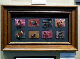
Then there's the metal work of Denys Knight, whose work continues to captivate me (I own one of her pieces). Last year she had moved to adding large glass beads from costume jewelry to her pieces, few of which resonated with me. But this grouping captured my imagination once more with the metal trees added on top of undulating backgrounds and her flame technique.


I like the "Sampler" which had richer colors than I think the photo shows. And more tree scenes! Click on any photo to see detail and read info on gallery cards.

As an aside, this is my view today - another storm that will last all day and perhaps leave as much as ten inches of snow in its wake. Frankly, I like it better than the rain earlier in the week . . .


Wednesday, January 10, 2018

Return to the Fiber Exhibit

Are you ready for some art? I made it back to the winter exhibit this week with fully-charged battery in my camera! As promised, I now share some of the other art and artists in the "Rooted In Fiber" portion of the exhibit (see the first pictures in this post. I'm starting out, though, with another shot of Charlotte Campbell's work, the large rawhide sculpture which looked to be turned differently and with better light on it so you can really see the fabulous image she produces using rawhide. (Remember to click on any photo for a larger view to see details and read information on any gallery cards.


You might remember Vickie Edwards from previous exhibits and posts about my art group. In these two pieces she's added interesting 3-d elements, mounted each piece on a painted canvas and placed the canvases in floater frames.


She adds a lot of hand stitching to her work, including on these pieces a blanket stitch to finish off the edges. So no wrapping around the canvas as I usually do when using this method of framing, but leaving a sliver of light grey of the canvas all around.


Another art group member, Terrie Kremer, shared these three music-themed works. Besides her extensive interest in the fiber arts, Terrie is quite involved in music. Check out the clef quilting around the top one, free-motion quilted without markings to guide her. Yes, I am impressed.

Beginning Point: Triangles by Terrie Kremer

Terrie also entered this piece in the abstract portion of the exhibit. I'm afraid my photo is a little washed out and I've done my best to fix it, but still, the green in this quilt pops a lot, is a very lime green. Called "Beginning Point: Triangles" it began as an experiment in a class or at a retreat (I've forgotten the exact details) and pushed her to cut and add and edit and then quilt with abandon to end up with a really interesting abstract design. I'll be showing you more from the abstract section in a separate post.

Work by Sue Graves

Sue Graves is a quilter I met through exhibiting together at these POAC events, and while she still does more traditional quilting than I do, she enjoys stretching herself a bit with more artistic endeavors and working with hand-dyed fabrics. I'm pretty partial to any design remotely like a mariner compass block, so it's not surprising that her "Supernova" caught my eye. I also liked her simple "Checks and Balances" that played with hand-dye gradations and the quilting on both.


Finally, I share this large and dimensional piece by a most diminutive quilter. I met Joanie Renkert through POAC in my first exhibit with them back in 2008. She really is quite short (well under 5 ft) but her fiber art is always BIG, sometimes bigger than she is (as I suspect this piece is).


She generally works with atypical fabrics, often manipulating them and adding 3-dimensional elements. I knew when I saw this it must be hers - talk about having a voice and recognizable style. She's got that nailed!

Stay tuned for a post of my favorites from the miniatures and abstracts in the Winter Exhibit.