
Here's what I've been up to this week. I assembled the new storage unit - well 2/3ds of it. When I hung my artwork, I didn't stop to think how tall it would be with the 3rd level of cubes. Since this picture, I've added a cube on the top left, and if I feel I need the additional space of the last cube, I'll have to take down a quilt. Nice to know I have room to grow. The fabric from the old unit has been transferred and my larger cuts of batiks moved from the adjacent unit which has rather narrow spacing between the shelves - those batiks would barely slide in and in fact, some of them were folded and shoved in between the flat stacks. This is definitely better.

I found this a rather clever assembly method. Absolutely no tools require, just a little grunt force to make sure the wire frames are seated all the way in. I've lined each shelf with a piece of foamcore board - personal preference.

While I was transferring batiks, I ran across a favorite grey one, realizing this was actually what I had in mind instead of the solid dark grey for my last printing session. This is not the first time I've made that mistake, believe it or not. No wonder I thought the results darker than I expected to go with my autumn trees print. Yesterday after some pondering and attempts at visualizing how different texture blocks might work, I bit the bullet and inked up the brayer again. Top to bottom is the previous squiggly block on dk grey, same block on batik grey, don't know what to call it texture block on batik grey and fan texture block printed over the previous lines or tree trunk block on dark grey. Actually, that last one I applied the paint, Versatex gold, to the block with a foam brush. I didn't mind the uneven print that provided and I think that it is my favorite. The fans sort of mimic the idea of dense leaves in the tree tops. I was very satisfied with this session.

Of course, there was ink in the brayer that needed expending. I tested a commercial stamp acquired from June (reeds) and played some more with my sunburst stamp. This fabric had already been used to test some stamps made from white glue on cardboard - really best used as texture plates. I liked combining the spiral and the sunburst.

And then to get the last of it out of the brayer, I tried more of the collection of commercial texture plates. Here's one on the grey batik. I do wish they were designed to repeat when you move them around on the fabric.

And another one on a cloth that has been taking the excess from paint brushes for a long time. I'll keep adding, no doubt. These generally end up as backgrounds to fabric postcards. The overall cloth usually looks pretty gruesome, but small areas are sometimes quite interesting.
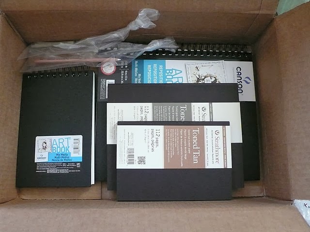
Today, my order of sketchbooks and journals arrived. Oh, Lordy - no excuses now! I'm trying out 2 sizes of Canson's Mixed Media Art Book, the larger of which has pages you can reposition, as in take out to work on and then put back in, or switch pages around which sounded like a nice feature. The pages are also perforated so if you create a masterpiece you wish to frame, it is easy to removed the binding edge. Both have 138lb paper (smooth on one side and more textured on the other) which has been reviewed as standing up better to paint and markers than other mixed media journals. Have I committed to experimenting with paint or what? And then, because I continue to search for the perfect sketchbook to inspire me, I sat up and took notice when I ran across a review of these Strathmore Toned Art Journals. Oh, am I a sucker or what? It's a little like laying down a wash so you're not faced with a white blank page, or so the theory goes. The 80 lb sketch paper is toned to mid-range value to let you get on with the light and dark values. That intrigued me so I decided to try one. Well, two. Because I couldn't decide between grey toned or tan toned and I also couldn't decided on size. Now that I have them in hand they strike me as toned fairly dark so we shall see how well I like working with them. I may get more use out of that white chalk pencil than what I bought it for - highlighting my Zentangling on the tan tiles. Yes, indeed, I'm a sucker!
3 comments:
Hi Sheila, thanks for this posting!
Beautiful printings, how good you have a spare room to store your goods!
And beautiful sketchbooks. Fortunately here in Guarulhos I have access to some of these materials.
A great week!!
Sounds like all the organizing is accomplished.....now no more stalling?? You'll take to those new sketch books just fine!!
Hi, Lucia. Yes, I am very lucky to have a space I can dedicate to my art explorations and all those supplies! For many years, I sewed in a guest room and had to use the dining room table for cutting and pinning. It felt like such luxury the first time I did not have to share my sewing with anything and could do it all in one room.
Post a Comment