"Democratic nations...will therefore cultivate the arts that serve to render life easy in preference to those whose object is to adorn it. They will habitually prefer the useful to the beautiful, and they will require that the beautiful should be useful."This is something Alexis de Tocqueville wrote circa 1835 in his book "Democracy in America." I ran across it as I was working on my padfolios, which sort of fit into the "beautiful should be useful" thing. Do you think it is still true (if indeed de Tocqueville was correct in his observations) that democracies prefer the useful? And is that why there are so many struggling artists? Have you been seduced into offering "useful" art in the hope of sales?
Sunday, September 25, 2011
Making the Useful Beautiful
Saturday, September 24, 2011
A Peek at "All Creatures Great & Small"

The opening reception last night for POAC's exhibit "All Creatures Great & Small" was so much fun. A good crowd came out, and we also had some adoptable animals from the local shelter wandering about. Well behaved dogs (and yes, one that had me rethinking my "no dog yet" policy) and a kitten doing what kittens do best - looking adorable. I took a few pictures after the crowds dispersed so you could see some of the variety a theme like this generates.

There are my padfolios in the case and Bill Klein's "chiken" watercolors: "A Bunch of Chikens," "One Big Chiken," and "A Chiken Chorus Line." Somebody's having too much fun.

Also submitting watercolors is Karen Robinson with "Airborne,"Toucan Can Too!" and "After the Bath."

This is acrylic on stone by Jan Welle. The copper and turquoise table that it rests on is called "Southwestern Table."

I absolutely love these photos by Rod Thompson. The top two feature sand dollars while the bottom one shows a starfish. You just can't see how wonderful they are from my picture.

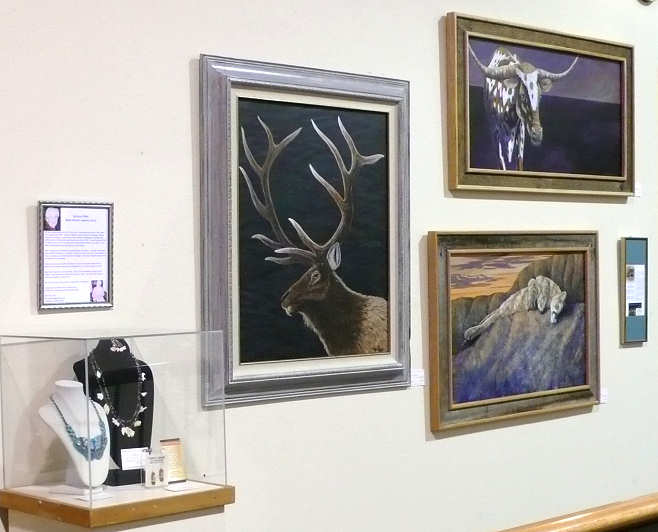
More watercolors, and some natural salt lick stones shaped by the tongues of deer and elk.

There were several pastel artists, including JoAnn Sandifur with her cat portraits.

Oh my goodness, did we all get a laugh from Randy Wilhelm's mixed media offering, "Beer Fish." The one on top is adorned with beer bottle caps.

And the body made from flattened beer cans.

Here are some watercolor paintings by Jean Spinosa.

I believe these are acrylics by Dan Carpenter, and in the case, jewelry by Darlene Pfahl.

A closeup of Darlene's jewelry.

Acrylics/Mixed Media by Connie Spurgeon. The one on the lower right is called "Cereal Killers."

On the right are acrylics by Jim Furlong. On the left are acrylics by Mary Alderete.

These are perhaps my favorites - soft pastels by Teresa Fisher. I'm not really a cat person, but the variety of colors she used in the cat fur is a lesson in itself. Remember to click on any picture for a larger view.

There are my padfolios in the case and Bill Klein's "chiken" watercolors: "A Bunch of Chikens," "One Big Chiken," and "A Chiken Chorus Line." Somebody's having too much fun.

Also submitting watercolors is Karen Robinson with "Airborne,"Toucan Can Too!" and "After the Bath."

This is acrylic on stone by Jan Welle. The copper and turquoise table that it rests on is called "Southwestern Table."
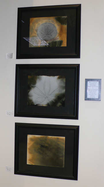
I absolutely love these photos by Rod Thompson. The top two feature sand dollars while the bottom one shows a starfish. You just can't see how wonderful they are from my picture.

More watercolors, and some natural salt lick stones shaped by the tongues of deer and elk.

There were several pastel artists, including JoAnn Sandifur with her cat portraits.

Oh my goodness, did we all get a laugh from Randy Wilhelm's mixed media offering, "Beer Fish." The one on top is adorned with beer bottle caps.

And the body made from flattened beer cans.

Here are some watercolor paintings by Jean Spinosa.
I believe these are acrylics by Dan Carpenter, and in the case, jewelry by Darlene Pfahl.

A closeup of Darlene's jewelry.

Acrylics/Mixed Media by Connie Spurgeon. The one on the lower right is called "Cereal Killers."

On the right are acrylics by Jim Furlong. On the left are acrylics by Mary Alderete.

These are perhaps my favorites - soft pastels by Teresa Fisher. I'm not really a cat person, but the variety of colors she used in the cat fur is a lesson in itself. Remember to click on any picture for a larger view.
Wednesday, September 21, 2011
"All Creatures Great & Small" Exhibit

I've had my head down since Friday, getting a couple of padfolios ready for POAC's next exhibit at the Power House in Sandpoint. Artwork was due today, and somehow, the deadline snuck up on me (i.e. - I had way too much fun in August and am still in vacation mode). I don't normally put creatures in my quilts, but I did have a couple of photos I'd taken this year that I thought would work well as padfolio covers. This exhibit theme, "All creatures great and small," is the first to come along that I thought my padfolios might be acceptable for. I didn't want to miss the chance to get them out there to see how they would sell.

I'm very pleased with how the "Summer Frog" turned out. It uses several shots I took of a little frog hanging out amongst my daylilies. Using my Corel Paint Shop Pro program, I did some cut and paste and collaging, but other than that, no real manipulation of images. (Click on any image for a larger view.)

I printed on a Kona pdf cotton instead of the muslin I'd used in the past - a little more heft and hopefully, durability. I am just stunned at the clarity and color matching I get with my Epson WorkForce 1100 inkjet printer and its pigment inks. I very nearly didn't add any stitch because of that, but didn't I say I needed to start adding more stitch to my work? I only needed to stitch a few lines to see I wasn't going to "ruin" it but in fact enhance it. Leaves are quilted with an Oliver Twist variegated hand-dyed cotton while the satin stitching is a King Tut variegated.

I always spend an inordinate amount of time choosing coordinating fabric for the inside and thread for quilting and edge finish. This batik won out over an equally good green that was perhaps a little too "quilt fabric traditional" for the outside. I'd still like to get away from the velcro closures, but I didn't leave myself enough time to experiment.

I really like working with the placement of images so that they show up on the flap.

The moose was a bit more problematic. I went back to the drawing board after printing off the single big moose shown at the top. When I folded the fabric as it would be with the padfolio closed, I wasn't sure that I liked turning it over to see a big moose butt on the back! So I mocked up another version sizing the moose down and flipping one image so that it would wrap around onto the flap. Mmm, now I had a cover with two moose butts on the back. The arrangement you see above came to me as I was drifting off to sleep Saturday night. Didn't feel I had the time for more computer designing, but I wasn't happy with what I already had. I like this better.

But alas, no moose poking a head around the flap.

And it left me with background space to fill. I tried a feature of my software program that removes a selected object and replaces it with your choice of a section of the photo. So I just removed the moose and filled in with what was above his back. Very cool, giving me an almost granite look. This print is not as sharp as the frog one, mainly because the original photo was not sharp - hey, it's a moose in a snow storm! Again, I was a bit concerned about how to quilt it, until I remembered my recent desire to get back to straight parallel lines. Echoing around the offset rectangles containing the moose gave a nice geometric effect. Or a meandering moose in a maze?

Again, a lot of digging through the stash transpired to find appropriate lining fabric. I found several but this was my favorite - reading a bit dark here. Same goes for the thread. The quilting is a King Tut variegated while the edge satin stitching is an Oliver Twist. Not sure I like the brown around the outside and almost wish I'd stuck with the dark grey ready to go on the machine.
Opening reception for "All Creatures Great and Small" is this Friday, September 23, 5:30 - 7:p.m. at the Power House. Below is the press release for the exhibit. Would love to see you there!
“All Creatures Great and Small” Exhibit opens September 23
The opening reception for the Pend Oreille Arts Council’s provocative new art exhibit will be Friday, September 23rd, from 5:30-7 p.m. in the POAC Gallery, in the Power House, 120 Lake Street in Sandpoint. Entitled All Creatures Great and Small, the exhibit features exceptional new works from more than 30 of POAC’s member artists.
“The theme of this exhibit is meant to get the creative juices flowing because it allows our exhibiting artists so much flexibility,” Connie Taylor, one of the co-coordinators of All Creatures, says with a grin. “The only restriction we placed on the artwork was that it not contain humans as a primary subject. Creatures can be imaginary, abstract, Fido, just about anything. There are some amazing, maybe even startling, creations here.”
The diversity in this exhibit is amazing. The artists’ interpretations of “creature” will astound you and give you many opportunities to contemplate your own definition of the word. This exhibit is a great opportunity for you to enjoy a wonderful trip into some interesting perspectives, ideas, and beauty.
The opening reception will include some special guests, courtesy of the Panhandle Animal Shelter. The reception is free and the public is encouraged to attend. All Creatures Great and Small will remain on display through December 2, 2011.
The Pend Oreille Arts Council exists to facilitate and present the finest quality experiences in the arts for the people of the Sandpoint area and beyond. POAC hosts performing arts events and visual arts events throughout the year. For more information, contact POAC at 263-6139, e-mail at poac@sandpoint.net, become a ‘Fan’ on Facebook, or visit the website at www.artinsandpoint.org.
Tuesday, September 13, 2011
Celtic Lone Star

As promised, here are some decent pictures of the big quilt for my nephew (click on any pic for a much larger view.). I used the Radiating Lone Star pattern from Template-Free Stars by Jo Parrott, and 4 different applique patterns from Philamena Durkan's book Celtic Spirals. I think some of the quilting designs are from her first book of interlocking Celtic designs. The fabrics represent pretty much every phase of my quilting journey, from pre-1900 reproduction prints to commercial batiks to my own hand-dyed fabric. The border fabric is an African cotton - something I collected for awhile - and the white is a millennium fabric printed with "2000". That fabric was a must as my nephew married in April of 2000, and this is his wedding quilt. It finished to about 87" x 87".

I really did start to plan this in 2000, and bought that millennium fabric that year, but life very much got in the way of me actually starting it until 2004. Then I worked on it in fits and starts, letting more life sidetrack me. My nephew and his beautiful bride have been so patient.

I actually made good progress on it, though, until I moved from Wisconsin to Idaho in 2006. At that point, I'd completed the top and begun the quilting - first some machine stitching to stabilize it, then moving on to the hand quilting with blue Oliver Twist hand-dyed thread. That hand quilting turned out to be a bear what with the batting I chose and some of the quilting done through an extra layer of fabric in the applique sections. Where once I had dreams of sending this off to a quilt show where it might win I prize, now I knew the quality of the quilting would never allow it to be a winner.

No wonder it took me a year to get it out again but only quilted a few days on it in 2007. The same happened in 2008, and in 2009 I didn't work on it at all. Guilt weighed heavy and I determined 2010 was the year I would finish it - for the 10 year anniversary. Ah, but good ol' life said otherwise, and although I did finish the hand quilting (or at least thought I had) and added more machine quilting, there was even more machine quilting to be done (and hand quilting too, it turned out).

Finally this year, it rose to the top of my priority list. Finally life calmed down and let me face the final stitching that had to be done. Finally, after 11 years of promises, the quilt is finished and on its way to my nephew.

Final tallies: I spent parts of 213 days on the design, construction, quilting and binding of this quilt. The various machine construction parts took up 13 days while that hand applique sucked up 76 days. The machine quilting took about 18 days (which includes several days just burying thread tails) while the hand quilting took 87 days. Granted, we are not talking 8 hour days here, but typically, a day of machine work would be 3-4 hrs while hand applique or quilting would be 2-3 hours. Are there a few things I might do differently if I were to make this again? Of course, but overall, I am very pleased with this quilt, and so relieved that it doesn't look dated after all these years. Also relieved to have another piece of unfinished business wrapped up.

Monday, September 12, 2011
Another Birthday Block

My nephew's birthday is Sunday, so it's time for another block for the Freedom Quilt. This pattern is from J. Michelle Watts' The Quilted Cross book and is called Celtic Cross. I've made it before in its original 15 inch size, but I only need a 12 inch block. Since the pattern in the book is not full-size to begin with, it wasn't much of a trick to enlarge it only as big as I needed. I took the quick way out, fusing all the pieces in place rather than hand or machine appliqueing. I plan to stitch along the edges of the applique during the quilting process. This is block 15 which means I am 3/4 of the way through this project. After the 20th block, all the blocks will be returned to me and I will have a year to arrange them into a finished top and quilt it for presentation on his 21st birthday.
The gold pieces are slightly smaller than the openings in the black piece, so the background shows through a little bit like grouting. I love the way this turned out. It's been so long since I've worked in the studio at all, this felt really good - even though I originally had planned a pieced block and was looking forward to the hum of the sewing machine.
The gold pieces are slightly smaller than the openings in the black piece, so the background shows through a little bit like grouting. I love the way this turned out. It's been so long since I've worked in the studio at all, this felt really good - even though I originally had planned a pieced block and was looking forward to the hum of the sewing machine.
Thursday, September 08, 2011
Vacation Trip - The People
Sometimes vacations are just about getting away, and thus about place. Others revolve around specific events or activities. And sometimes, it's about getting together with certain people. My vacation was a bit of all three, with the people being as important if not more so than the places and activities I so enjoyed. They represent so many stages of my life and though I've been in contact with them all via mail & phone & Facebook, it has been anywhere from a couple of years to over 40 years since I'd seen them. So here's to the people (and some of their pets) who made my trip so special!

I'll start with distant cousin, Laura. There was no one around to snap a pic of us together, so I asked, "How long are your arms?" Just long enough to get this cell phone snap. Our mothers were very close but by the time we came along, there weren't many visits between families. Laura thinks the last time we saw it other we were in our teens. We reconnected about 8 years ago when her sister contacted me for old family photos. We discovered we had quilting in common and the three of us did a block exchange (that's my "Cousins Quilt" ufo). It was wonderful to finally talk with Laura face to face and remember, this is family.

Debbie and I went to High School together, were in Latin Club, Honor Society and Booster Club. We'd had no contact since graduation until a year or so ago when we found each other on Facebook. To our mutual surprise, we now have quilting in common not to mention the fact that she lives in the Tacoma area as I once did. Debbie couldn't make it to our 40th high school reunion, but we had a little reunion of our own at the quilt show in Tacoma. It was so much fun viewing the quilt show with her, discovering we had the same tastes and opinions about the quilts. Having taught quilting classes in the area for many years, Debbie could use her local knowledge of the entrants to point out things to me I otherwise would have missed.

Larry and I met in 1975 at the Episcopal church camp on Coeur d'Alene Lake. I was freshly graduated from college and weeks from getting married when my future husband and I were asked to counsel at senior high camp. Oh well, what the heck? I had no experience with this sort of thing, so they paired me up with Larry who shared his vast experience and instilled confidence in me that I could pull this off. We've been close friends ever since, even as he stayed on "the west side" and we gallivanted around the country. 2001 was the last time we'd been together, and I must say, he's hardly changed a bit.

Then there's Donna. I can't believe I failed to get a picture of us together, but I love this one of her with Mr. Fishhead. Donna and I worked together for about 7 years in the '80's at Ted Brown Music in Tacoma and became like sisters. She's another friend who stayed put while I kept moving from place to place. We've never lost touch, but I was shocked to realize we haven't seen each other for probably 15 years. We had no trouble picking up where we left off.

A few years ago, I sent Donna one of my older quilts, an original design with hearts. I'd enjoyed it on my wall for many years and at that time I felt Donna needed a hug. Since I couldn't do it in person, I sent the quilt along to do it for me. She'd told me how it matched perfectly a red wall in their living room and that she planned to hang it there. It was the first thing I spotted when I entered the house. She has a smaller quilt of mine, made especially for her and it was a pleasure to see it again too.


I was amused to find Donna now has chickens and is contemplating starting a "backyard barnyard" business. The rooster's name is Arturo and his harem of hens are named after the Andrew Sisters.

Sherrie is the most recent addition to my circle of good friends. Although I knew of Sherrie and her quilting through a mutual friend, we only met a couple of years ago and immediately sensed we had a lot in common. We've been growing the friendship through our blogs and e-mails, but this was the first time just she and I have spent time together. I'd say the bond is pretty deep now! I can't thank Sherrie enough for inviting me over for the quilt show, then saying, Stay as long as you want. She knew I had friends in the area, maybe places I wanted to see again, and she was the perfect host, tour guide and chauffeur, not to mention a whole lot of fun to be with.

I'd actually not seen much of Sherrie's work and was mesmerized by what was hanging in her house. This was just one that I kept drinking in during my stay. Like those in the quilt show, her quilts made me realize I really need to start working bigger again.

Sherrie's pet of choice is Bunners, the rabbit. My previous experience with pet rabbits includes one my dad warned me against even as he handed it to me as an Easter present when I was about 5 (they bite and scratch with those hind feet so watch how you hold him), and a friend's that never seemed to be out of its cage. Not positive experiences. Bunners won me over, racing out to greet me in the morning (ulterior motive as he expected a piece of banana) and contentedly grunting as he nibbled food or groomed himself. No biting or scratching!.

And my goodness, how I enjoyed her husband Dave, who was quite the host and tolerated (or perhaps enjoyed?) my monopolizing his wife. Thanks for the beer, Dave!

These were the people I went to see, but there were a couple of strangers that factored into making the trip memorable. Here's my seatmate on the train between Seattle and Tacoma - Stu of the diamond willow canes and walking sticks. This was such a nice connection to make.

On the other hand, this was my seatmate on the way home between Everett and Spokane. You can tell she knows I'm not a kid person. I'd love to tell you she changed my mind about that, but she and her slightly older sister who soon took her place lived up to my worst nightmare of whiny bored children in transit. Ah well, that's what earplugs are for...
*****
I packed so much into my week away, but there's so much I didn't do that I thought I might. Didn't swim in Donna's pool or strike a yoga pose with Sherrie. Didn't get out my sketchbook or crack open the novel thrown in at the last minute. I failed to see the spectacular scenery my train route is famous for and visit the American Art Gallery (a frequent lunch break destination when I worked across the street). The Seattle Art Museum was closed the day we were in town, and we didn't make it to the original Starbucks either. Didn't eat at Frisco Freeze (there's a story there) and there are more people in the area to look up than I could fit in. And though we talked about it every day, I never got to pull out my handwork and stitch with Sherrie while sitting on her deck enjoying the view of Wollachet Bay (below). I'm definitely going to have to go back.

Wednesday, September 07, 2011
Vacation Trip - Quilts!

I know, I know. You thought I'd never get to the quilt show, even though it was the carrot my hostess dangled for coming that particular weekend. I considered joining this organization when I first moved back to Idaho, but at that time, they did not include Idaho in their definition of the Pacific Northwest. Harrumph - Idaho has always had this problem. Newly reorganized, now APWQ expanded region covers 18 states and provinces west of the Rockies, and I am now eligible to join. Perhaps I will before the next quilt show.
 Ferns in Living Color by Margie Davidson
24 " x 36"
I've been out of the quilt show loop since leaving the Midwest, and based on what I've been seeing in magazines of late, I was feeling a bit ho-hum about the show. Too much over the top just for the sake of over the top, weak design, art quilts that are more about throwing every technique in the book at a piece rather than thoughtful editing and that basic: strong design. I was pleasantly surprised and energized by what I saw, and took a ton of pictures for future reference. Not everyone, I've learned, agrees with me that this was a balanced show of overall high quality but I stand by that assessment. The juried and judged portion represented traditional, pictorial, innovative and art quilts, and there were many special exhibits to savor as well. The quilt above is from the traveling exhibit Living Color; click here to see the rest of that exhibit. I salute the organizers who did a fine job putting on a well-rounded exhibit reminiscent of AQS in Paducah.
As I sorted through the many photos, I realized that I photograph quilts for different reasons. Sometimes I'm drawn to something specific in the quilt, not needing or perhaps even liking the entire quilt. My intent is not to copy what I see within my own work, but more studying what is working well as part of my learning process. With this one, it was the Koi, rendered entirely in colorful thread on the black background, a very effective approach.
And in this one, it was the quilting detail of the feathers and the background quilting that I wanted to remember. Oh, and that magnificent rendering of red maple.
This quilt had many of these squares, each with its own collection of embellishments. Some were so unusual, others so commonplace, the attraction for me being in how they were attached.
 Red Will Make It Better by Sonia Grasvik
(detail) 33" x 47"
I was impressed by the variety of quilting motifs, especially the use of garnet stitch, effectively mingled.

Other detail shots are merely out of awe for the artist's mastery of something I can so appreciate but would not attempt in my own work - not my style or not my expertise. This was a triumph of trapunto, paint, pigment, inking and quilting. No wonder she named it "Hallelujah".
 Sinuosity by Patricia Howell
50" x 70"
I also record quilts in their entirety when the impact of the whole can stand on its own. Again, sometimes it is a matter of study, figuring out why it is working or appealing to me. I like the flow and balance of this, and of course, these are a bit "my" colors as well. Balance in my own designs is something I'm constantly struggling with.
 Wind Dance by Mary Goodson
47" x 28.5"
Paint & Thread
This one also struck me as an effective composition, and of special interest because of my fascination with windmills. I've been mulling how to work them into my own work, so it is interesting to see how others are doing it. I'm also about to embark on a series based on this same sort of rolling farmland. I will be approaching mine quite differently, but it is instructional to see someone else's interpretation. This is part of the special exhibit "Knotted, Dyed, Tied and Stitched" by the Columbia FiberArts Guild.
And then there are the pictorial quilts that left me so impressed with their realistic renderings, defying the fact they are two-dimensional works. I could believe I was standing on a bridge looking up this canal.

This large seascape took my breath away. Closer inspection revealed not only stuffed appliqued starfish and shells but real shells attached as well.
Not as large, but equally effective in giving a sense of actually being there. The curved perspective and color scheme were of particular interest for me. This uses a special construction technique of Janet Fogg's plus paint sticks to add 3D effects.
Yet another that made me feel I could reach into it, and surprising fabric choice/color palette.
And look! There are my colorful shipping containers, cranes and Mt. Rainier! This was such a beautiful thing considering the subject matter - docks and machinery CAN work, especially when their shape mimics that of the mountain.

 Upper Klamath Lake-Klamath Basin Vistas by Joanne Baeth & friends
Perhaps the most impressive quilts in the show were the three multiple panel landscapes in the APWQ Members Special Exhibit. These were a collective effort between Quilt artists from Oregon and California, recreating photographs by Jeremy Franklin. Each was heavily embellished to create a very realistic look. Unfortunately for me, the hall these hung in had dim lighting and it was next to impossible to get good shots, but I hope this gives you an idea of their magnificence.
Finally, let me share a more traditional quilt that knocked my socks off. The quilting alone would have wowed me, but this is another one using an inking technique. An original design requiring over 800 hours to complete.
Be sure to click on any picture for larger, more detailed views. I've provided links to the artists blogs or websites where available, so please go visit them to view more of their art. And if you'd like to see more quilts from the show, Del Thomas has posted on her blog better pictures than I came away with. Start with this post and work back through older posts to see them all.
As I said, my reaction to the show was not what I expected, and I am so glad that Sherrie prodded me into coming over for it. The art & pictorial quilts in particular elicited two responses from me: 1) a need to go home and cry, because they really were better work than much of what I've been doing of late, and 2) the desire to go home and get back to work, step it up a notch. What I saw confirmed two things I've been sensing of late about where my work should go: I need to work larger and I need to incorporate more stitch. (Oh, and also incorporate more surface design like discharge and resist.) I've been working so small as of late that with a few exceptions, none of my current work would have met the minimum size requirement for the small quilt category, let alone the large quilt. Part of the impact of the pictorial and art quilts, I realized, was their size. The other part often was the heavy stitching, in those tightly spaced parallel lines that I love. I'll still be working on my smaller designs that look so good framed, but my mind is percolating as to how I can take these ideas that I've worked more as studies, and turn them into the larger art quilts I used to make.
 Ferns in Living Color by Margie Davidson
24 " x 36"
I've been out of the quilt show loop since leaving the Midwest, and based on what I've been seeing in magazines of late, I was feeling a bit ho-hum about the show. Too much over the top just for the sake of over the top, weak design, art quilts that are more about throwing every technique in the book at a piece rather than thoughtful editing and that basic: strong design. I was pleasantly surprised and energized by what I saw, and took a ton of pictures for future reference. Not everyone, I've learned, agrees with me that this was a balanced show of overall high quality but I stand by that assessment. The juried and judged portion represented traditional, pictorial, innovative and art quilts, and there were many special exhibits to savor as well. The quilt above is from the traveling exhibit Living Color; click here to see the rest of that exhibit. I salute the organizers who did a fine job putting on a well-rounded exhibit reminiscent of AQS in Paducah.

As I sorted through the many photos, I realized that I photograph quilts for different reasons. Sometimes I'm drawn to something specific in the quilt, not needing or perhaps even liking the entire quilt. My intent is not to copy what I see within my own work, but more studying what is working well as part of my learning process. With this one, it was the Koi, rendered entirely in colorful thread on the black background, a very effective approach.

And in this one, it was the quilting detail of the feathers and the background quilting that I wanted to remember. Oh, and that magnificent rendering of red maple.

This quilt had many of these squares, each with its own collection of embellishments. Some were so unusual, others so commonplace, the attraction for me being in how they were attached.
 Red Will Make It Better by Sonia Grasvik
(detail) 33" x 47"
I was impressed by the variety of quilting motifs, especially the use of garnet stitch, effectively mingled.


Other detail shots are merely out of awe for the artist's mastery of something I can so appreciate but would not attempt in my own work - not my style or not my expertise. This was a triumph of trapunto, paint, pigment, inking and quilting. No wonder she named it "Hallelujah".
 Sinuosity by Patricia Howell
50" x 70"
I also record quilts in their entirety when the impact of the whole can stand on its own. Again, sometimes it is a matter of study, figuring out why it is working or appealing to me. I like the flow and balance of this, and of course, these are a bit "my" colors as well. Balance in my own designs is something I'm constantly struggling with.
 Wind Dance by Mary Goodson
47" x 28.5"
Paint & Thread
This one also struck me as an effective composition, and of special interest because of my fascination with windmills. I've been mulling how to work them into my own work, so it is interesting to see how others are doing it. I'm also about to embark on a series based on this same sort of rolling farmland. I will be approaching mine quite differently, but it is instructional to see someone else's interpretation. This is part of the special exhibit "Knotted, Dyed, Tied and Stitched" by the Columbia FiberArts Guild.

And then there are the pictorial quilts that left me so impressed with their realistic renderings, defying the fact they are two-dimensional works. I could believe I was standing on a bridge looking up this canal.


This large seascape took my breath away. Closer inspection revealed not only stuffed appliqued starfish and shells but real shells attached as well.

Not as large, but equally effective in giving a sense of actually being there. The curved perspective and color scheme were of particular interest for me. This uses a special construction technique of Janet Fogg's plus paint sticks to add 3D effects.

Yet another that made me feel I could reach into it, and surprising fabric choice/color palette.

And look! There are my colorful shipping containers, cranes and Mt. Rainier! This was such a beautiful thing considering the subject matter - docks and machinery CAN work, especially when their shape mimics that of the mountain.

 Upper Klamath Lake-Klamath Basin Vistas by Joanne Baeth & friends
Perhaps the most impressive quilts in the show were the three multiple panel landscapes in the APWQ Members Special Exhibit. These were a collective effort between Quilt artists from Oregon and California, recreating photographs by Jeremy Franklin. Each was heavily embellished to create a very realistic look. Unfortunately for me, the hall these hung in had dim lighting and it was next to impossible to get good shots, but I hope this gives you an idea of their magnificence.

Finally, let me share a more traditional quilt that knocked my socks off. The quilting alone would have wowed me, but this is another one using an inking technique. An original design requiring over 800 hours to complete.
Be sure to click on any picture for larger, more detailed views. I've provided links to the artists blogs or websites where available, so please go visit them to view more of their art. And if you'd like to see more quilts from the show, Del Thomas has posted on her blog better pictures than I came away with. Start with this post and work back through older posts to see them all.
As I said, my reaction to the show was not what I expected, and I am so glad that Sherrie prodded me into coming over for it. The art & pictorial quilts in particular elicited two responses from me: 1) a need to go home and cry, because they really were better work than much of what I've been doing of late, and 2) the desire to go home and get back to work, step it up a notch. What I saw confirmed two things I've been sensing of late about where my work should go: I need to work larger and I need to incorporate more stitch. (Oh, and also incorporate more surface design like discharge and resist.) I've been working so small as of late that with a few exceptions, none of my current work would have met the minimum size requirement for the small quilt category, let alone the large quilt. Part of the impact of the pictorial and art quilts, I realized, was their size. The other part often was the heavy stitching, in those tightly spaced parallel lines that I love. I'll still be working on my smaller designs that look so good framed, but my mind is percolating as to how I can take these ideas that I've worked more as studies, and turn them into the larger art quilts I used to make.
Subscribe to:
Posts (Atom)