Saturday, December 21, 2013

Holiday Break

I'll be spending the holidays with family, something I haven't done for quite some time. So besides being derailed by the usual holiday preparations, I've also been attending to all the little things one must when getting ready for a trip. The newspaper and mail have been stopped, end of the month bills paid, library materials returned and a book picked out to pass the time in transit, to name just a few of the things getting crossed off the to-do list. The closest I've been to my sewing machine has been to sew the hems of a couple of new pairs of pants for the trip, perfect fits except for length (unless I want to go buy some platform shoes...). I'm so used to spending the last couple of weeks of the year wrapping up projects or leisurely working on some low priority itch that I find myself a little torn emotionally. I am so looking forward to this time with family, and the trip itself while at the same time feeling a weird sense of loss about not being home to putter in the studio.

Well, that's just habit talking. We get into routines, forge traditions, feel off balance when we are pulled out of them, willingly or not. And then we return refreshed and ready to hit the ground running. At least that's what I anticipate for me. And for my readers, I wish a safe holiday, one in which you allow yourself time to enjoy your own traditions or share in others, carve out some quiet time for yourself, create or rejuvenate. See you in a week!

Thursday, December 12, 2013

A little printing and more cafepress

I'm down to the last few Christmas cards, some which will go with gifts, and so I took a bit of a break from writing yesterday to do some printing on fabric. (Sssh, don't tell anyone that some of these are presents!) I'm using cotton sateen that comes adhered to a stiff paper backing in a 24" wide roll. While my Epson Workforce 1100 does not accommodate rolls, let alone anything this wide, it will print up to 13" wide, and this particular backed fabric when cut to size feeds so well through it. The resulting prints look as sharp and true to color as if printed on photo paper - I just love it!

This printer hasn't gotten much use in the last couple of years, and when I printed something off on paper a few months ago, I got some odd lines running through my graphic. Printers that sit tend to develop heads that clog up. Sure enough, when I did a nozzle check, there were gaps in the test print proving that the heads required cleaning. I also took the time to check alignment to assure good clean and accurate prints. If this all sounds like Greek to you, I suggest you check the manual or help screens for your printer and work through these basic maintenance steps, particularly if you have been unhappy with the quality of your printing lately.

The difference between ICM & Adobe RGB settings

Another thing that is worth checking is the advanced setting for color matching and other settings found within the preferences or printer set-up (like unchecking "fast printing" and checking "envelop" to accommodate extra thickness). If what you see on your screen differs from what prints out, it may just be a mismatch of settings. I'd written down the settings that seemed to give me the truest color match on fabric in the past, but when I printed my first image, it was not very close. I checked the other settings I could choose from and decided to try a different one, and it was much closer to my screen image. Now for those of us just wanting to get on with it, all the time I spent yesterday morning cleaning and aligning heads and changing settings from the defaults might rankle, but with the price of ink and fabric, it is worth taking this time to get your settings right. I am so pleased with the results. And as so often happens with me, as long as I was set up and on a roll, I worked on and printed an image for my next art quilt. Holidays or not, the creative urge cannot be denied!

Angel of the Rock Journal through cafepress

And now for a commercial break. I've changed the image on another item in my cafepress shop. My "Angel of the Rock" art quilt is in a private collection, but you can enjoy it on the cover of this 5" x 8" journal. The journal is available with 4 paper options: blank, college ruled, dot grid or task pages. And does anyone use mousepads anymore? If so, perhaps you would like the mousepad I offer with the image of one of my journal quilts "Texture". Happy shopping! 

Sunday, December 08, 2013

Holiday Break

The creative journey is on hold as the studio work table has been taken over by Christmas card preparation. I do enjoy this process, choosing cards that resonate with image and sentiment, recapping the year in a letter for those I only connect with periodically from season to season, adding a personal note to show this is not just an automated process. I guess I enjoy it also because I love being the recipient of the cards and letters that show up in my mailbox each Christmas. It's a different kind of staying in touch from our ubiquitous electronic one, a tradition I doubt I'll ever give up.

I've also been busy updating my cafepress shop - it's not too late to order gifts in time for Christmas. My "Idaho Maple Leaves" image has been added to the tile coaster (available in both framed and unframed versions) and keepsake box. And you can now find my "Willow" quilt on notecards that can be purchased individually or in packets of 20.

Still available are t-shirts and sweatshirts, mugs and totes, stickers and magnets with my Idaho Beauty Block logo and motto (Quilting...an alternative lifestyle) as well as two calendars of my favorite art quilts and journal quilts. And don't forget the new items with oak leaf image recently added. Happy shopping!

Wednesday, December 04, 2013

Postcard Postcards

Oak Leaf Fabric Postcard - Sheila Mahanke Barnes 2013
I think I'm done making oak leaf fabric postcards for awhile. It's been fun and informative and just a little bit addictive. There may be more of these in my future, but for now it's time to move on. And as much as I might like to make one for each and every reader, that isn't going to happen! Instead, I've added an image of one of my oak leaf fabric postcards to some of the products in my cafepress shop. The next best thing to the actual postcard might be the picture on a photo postcard. They come in sets of 8 and can be purchased here. I've also added the image to a lovely mahogany tea/recipe box and a business card holder.

I know I've said this before, but I do plan on more updates to the shop. In the meantime, check out my two calendars of favorite art quilts, cards, mugs and gift items. Some of these may be going away soon.

Saturday, November 30, 2013

Mail Bag & More Thread Magic

Look what the mail has brought me this week - a large envelop from June stuffed with silk scraps, some commercial, some her own handy work. I'm a sucker for silk, and this little collection makes a nice addition to my silk stash. What will I make from it?

Constance Rose Artist Postcard

And this art postcard arrived as well from Connie, who is way more motivated than I am right now to be pushing her work forward with experiments in paint on paper. What a nice surprise to see it amongst the Christmas catalogs and bills. I am so blessed to have found these friends through the internet.


It's been a long time since I've had a day job, longer still since I was in school, so it always amuses me that I still have that "vacation" mindset, as in, we are celebrating Thanksgiving here in America which for many is a 4 day weekend, and I had pegged these 4 days to really hunker down and work on my commission postcards. Um, well, it's not like I had to wait for this block of time in order to be free to do it. But I can't break that habit, and just use it to my advantage. I'm on vacation and can get some work done! Sheesh. Anyway, I'm on the home stretch, doing the worst than mindless satin stitching of the edges from which I had to take a break. Again, I had to marvel at the magic that happens when different colors of thread are used in the quilting. The one in the above photo is partially quilted with the King Tut thread variegating from yellow to orange to green.


I didn't think this particular batik worked as well as the one above so these are not part of the commission. I don't know how well you can tell from the picture, but the one on the left is quilted with a yellow variegated thread while the one on the right is the yellow/orange/green one again. One glows, one shades to green. I love it. 

Friday, November 29, 2013

We Have A Winner!

Thanks to all who weighed in on my anniversary post, letting me know how & sometimes why you follow my blog, and in some cases, how you found me to begin with. It's obvious there's no one way to keep up with blogs, and we've all found a way that suits our personal styles. I'd reply to each of you individually if I could, but quite a few of the comments only have a "no reply" address. So you'll just have to trust me when I say how much I enjoyed reading these comments and am glad you enjoy coming along for the ride!

As promised, I've used a random number generator to pick one of you to receive a little gift of appreciation, and that person is magsramsay. You are one of those "no reply" people so please contact me with your address (you'll find the link under my profile). Congratulations!

Tuesday, November 26, 2013

More Postcards

To my surprise and delight, I have received a commission for a dozen of my oak leaf fabric postcards. The original background fabric was used up on the first set of 8, and there was nothing similar in my stash. However, the customer has total faith in my judgement of a replacement fabric. I've chosen two batiks, as he also doesn't care if they are not all the same. Of course, this means I will be returning to the bit of angst generated over choosing the proper color thread to quilt them with. The "perfect" combination may include some of the colors I've already tried, but I suspect there may be better ones as well. Let the play begin!

P.S. Don't forget to leave a comment on my anniversary post to sate my curiosity about how you keep up with my blog. I'll be making a random selection from those comments on Friday, and sending the winner a little gift of appreciation.

Sunday, November 24, 2013

Recurring Themes

"The creative memory is fickle and needs to be taken fresh. If you seize the day and go to work at the first flush of interest, you'll find your work and your creative ideas freshen up too. Just as the love of a certain medium can have a "life," so too can subject matter. Feeling they haven't exploited them thoroughly enough, they guiltily resist moving on. Sometimes they get stuck for months, even years.

The popular use of digital cameras makes it easy to put stuff in the can--sometimes without even looking at it--for another time. This can be a mistake. The important thing is to be wired, enthusiastic and alive in the moment."   

About the law of recent memory - Robert Genn Twice-Weekly Letter, Nov 21, 2013

I have a bad habit of not letting myself move on a new excitement if I feel there are current "ducks in a row" heading the list. Not necessarily the example mentioned here of thinking I must continue to explore an idea, but often more of a prioritizing that does not deal well with spontaneity. After what I felt was a failed sketching session (photo from which I am only revealing now, see below), I've done a lot of "mental" work to get a handle on what I wanted to draw for the balance and movement exercise for my lino class, but kept putting off the actual putting pencil to paper again to just pick something and work through it. I've let other things deemed more time sensitive stand in the way.


My brain apparently was having none of it. I opened a sketching program on my Kindle Fire only to discover I'd already sketched near identical sunbursts there as ended up in my sketchbook (above) a week or so later. Comparing the two sketch sessions, these paper and pencil ones struck me has having more potential than I originally thought. (The top ones were more efforts at sunflowers but I soon lapsed into the sun image.) Ok, but I still wasn't sure it fulfilled the parameters of the exercise or was something I'd use over and over as a stamp. Let's think some more.


While hunting for a photo reference "in the can" for another project, I ran across the ones I'd taken of farm equipment that showed up at my neighbor's. (Genn is so right about all the digital photos we take and put on hold.) I remembered how those curved even tines rotating around the circle intrigued me and boy, how similar to what I'd been sketching. Maybe I could just copy that...later, of course.


I have a bulletin board in my studio where I pin up bits of design inspiration (and a comic or two) from newspapers, catalogs and magazines - I guess the old fashioned version of Pinterest. Most of it has been up so long that I don't really see it anymore. And yet, as my mind contemplated how to render that spiraling sun image, I noticed this tacked in plain sight. It's been there for years - a recurring theme probably tied to my days of making Mariner Compass blocks. I'm starting to note a trend here.


A few days ago, I started reading "Batik for Artists and Quilters" by Eloise Piper. Paging through to feast my eyes on photos of work incorporating batiks, I landed on this quilt, "The Fire Within" by Vikki Pignatelli. I love her work and I think I have seen this quilt in person, or one of hers very much like it. Certainly I have seen it featured in one of the many quilting magazines I've subscribed to over the years. It is still a beautiful piece, all these years later...and then my eye zeroed in on the fact that I was looking at yet another swirling sun image, one with a quite interesting center to it. That pretty much did it - I think I am meant to cut a sun block and it is time to finalize the design on paper.


And so I did. I'd already drawn some 3 inch squares in my smaller sketchbook with the intent to keep trying out ideas until I hit upon one that worked. I tried half a dozen different ways to do those rays and think I am pleased with this one, pleased enough that I transferred it onto the block for cutting. This is a huge step for me to commit - like I said, I've been mulling this for weeks and letting other things stand in the way of just getting to it. I checked it with mirrors and I think it will look great as a repeat design as well. And my mind is freed up to contemplate the next exercise while I get back to my time sensitive list.


And as if I needed more confirmation that this was the design to use, once it was transferred and I went back looking through files for something else, I ran across this picture of a banner I spotted while staying in Rochester, MN last summer. Alright already! I'm making a sunburst stamp!!! 

P.S. Don't forget to leave a comment on my anniversary post for a chance to win a little reader appreciation gift.

Friday, November 22, 2013

Blogger Anniversary

Today marks the 8th anniversary of Idaho Beauty's Creative Journey blog. I always enjoy looking back at that first post explaining my reason for starting a blog and my intention for it. All these years later, my reason for blogging remains the same as does my intention, and the practice has proved its value just as I had hoped. I feel an obligation to my readers which pushes me along during the less than enthusiastic times but also a real connection that makes sharing the ups and downs more than an exercise. Your comments buoy me up, make me think, offer solutions I'd not considered, help me stay on track, and just generally remind me I am not working in a vacuum. I love being able to share my journey with you.

With the demise of Google Reader earlier this year, there was almost panic among blog followers to find a replacement feed reader that worked as well. I tried several until I discovered The Old Reader which indeed was nearly a carbon copy of Google Reader. It became so popular so quickly that its developers soon became overwhelmed by the sheer numbers of subscribers and reluctantly announced that it would have to cut off the subscribers like me who had recently joined. Much gnashing of of teeth ensued as we reluctantly went back to trying out other readers. But I decided to hang in there, lay low in the hopes that somehow I would be overlooked and spared. I never lost my access, and later found that someone with more resources had stepped in to take over The Old Reader and we were all spared. Amazing that such a little thing caused so much anguish and for me, ended in a sigh of relief.

I bring this up because, with a few exceptions, I don't have a good idea of how my followers found me let alone how they actually keep up with my postings. Have you bookmarked my site and check each day or every few days to see if I've added anything new? Do you use a feed reader? If so, which one? Do you only pop over to read posts that I have linked to Facebook and you are one of my Facebook friends? And if you do actually read my posts from the web page itself rather than from a reader, do you ever follow the links I have in the sidebar?

Leave a comment telling me how you follow my blog, and sometime next week I will randomly pick a name from those commenting to receive a little anniversary gift from me. Whether you've just started following me or have been reading my posts since the beginning, I value that you have chosen to come along for the ride.

Monday, November 18, 2013

Tears of Mayo

"Tears of Mayo" by Sheila Mahanke Barnes 2013
I completed the beading on Tears of Mayo this weekend and mounted it over a stretched canvas. It is 12 inches square and has no batting or stitching on it, just the beading. I did put a layer of Thermore batting between it and the canvas, just a little padding to fill up any space that might exist between the two taut surfaces. Through the magic of Paint Shop Pro, it appears to be framed in this photo. In truth, I need to order a frame for it - a floater frame deeper than the 3/4 inch canvas it is wrapped around. In the past I have found this acts a bit like a shadow box and almost protects the beads that sit above the surface.

You may click on the photo for a larger view. For information about my inspiration, see this post. Again, I must thank Mary Stori for sharing her marbled fabric that is the basis of this design.

Sunday, November 17, 2013

Watching a Sun Set

Every now and then one really should take time to enjoy the changing nuances of the sun setting at the end of the day. I allowed myself that break from my beading yesterday (or perhaps it was just procrastinating?) and found myself surprised by what unfolded. What initially caught my eye was not blazing colors or masses of clouds filling the sky. No, it was several of these elongated shapes back-lit such that the edges glowed around a dark grey mass.


As I broadened my focus, I noticed the peachy fluffs of clouds scudding rather quickly to the east while those elongated clouds remained stationary. The higher level of clouds had not picked up any of the color, and in an optical illusion, looked all in the world like they were scudding equally quickly to the west. I forced my eyes to stay steady on them, confirming that this was just a trick of the eye and that they actually were not moving much at all.


Now I was just enjoying those fluffy clouds floating along, and then I spotted the next surprise - some very black wisps in front or below them. I still don't understand how they could be, and I couldn't help taking lots of pictures of them.


Honestly, I started thinking "witches" for some reason.


Some of the cloud formation was bumping up like a thick fog against the mountain moving mostly north while the rest of it jutted out like fingers moving in a different direction.


Now I shifted my focus along that jut of mountain to this formation of clouds over Schweitzer Mountain.


And looking back the other way, a little south, I spotted this lone interestingly shaped cloud, still basking in the tints supplied by the ever lowering sun.


The sun was nearly down now, most of the clouds having moved off to the east, most color on what was left spent. Yet those elongated clouds that had first caught my attention continued to catch the last of the sun that made their edges glow, back-lit against a darkening sky.

Thursday, November 14, 2013

Slow Going

It takes forever to bead a spiral when using tiny beads like these. That needle is an inch long quilting between and the spiral will be 5 inches across when complete. These aren't exactly delica beads I don't think but similar. I got them from my favorite bead shop in Eau Claire, WI and I believe they were antique Czechoslovakian ones. They are not uniform in size and I'm struggling with spacing, but basically it is just taking a long time because they are so small. I spaced them out in a different section where I was doing small spirals, but with gaps one loses the spiral altogether. Fortunately, this is the only large motif using these. If it does not use up all that I have, I'm considering filling in the gaps on those other spirals with more beads.

Thursday, November 07, 2013

Rest of the Postcards

It's a wet dreary day so perfect for hunkering down in the studio and finishing up my oak leaf postcards. It would appear I need to apologize to my scanner - it helps to check settings when results are not as expected. I don't know how but the "unsharp mask filter" got turned off and that is why I couldn't get a sharp scan showing the stitching in the first group. Above is number 4 of the first set, and because it was so light, I chose a different color thread for the edge finish - an Oliver Twist hand-dyed cotton. I also did some inking to even out the way the variegation was reading.


The second set of four had a similar variance in the prints from light to dark and rather than stick with my "winning" thread combination from the first round, I decided to try out some other ideas. It occurred to me that since I'd spent so much time and effort cutting out those leaf veins which showed so well on the darker prints, maybe I shouldn't obscure them with colored thread. So these two got the veins quilted with invisible thread.


I also outlined one with invisible thread, the other with an Essentials thread color called Cedar. No discernible difference between the way the two read. The background on both of these is different from what I tried on the others too - a King Tut called Nile Delta - it has green mixed in with the yellow. My apologies for the colors being all over the map. The true colors are probably somewhere between the two.


On the lighter prints, I went back to quilting the veins and outlining the leaves with regular thread - the Cedar. Thinking to keep things simple and rather like it. And for a change of pace, I introduced green thread into the background.


This didn't work as well as I'd hoped, making for too busy of a background in my opinion. I was hoping the dark green Essentials Dark Olive thread would make the lighter leaf (bottom) stand out but it just adds more lines that read dark and not necessarily green. The other one (top) is a little better with the lighter variegated King Tut color called English Ivy.


It always fascinates me how thread color can change how the fabric it is stitched across reads. The postcards on the left read cool with that green thread in the background while the ones on the right read warm with the predominantly yellow thread in the background - almost like using two different colorways of the underlying print. Without color in the veins, the Cedar thread worked well for the satin stitched edge but to my surprise, the Turkey Red thread from the first set accented the other postcards better. It seemed to make that cedar thread in the veins pop out more, looking more red.

So that's it for these oak leaves for now. Most of them are being mailed off and the idea to group a set of them on a background for a quilt is for another day. I think it's time I got back to that beading project.

Friday, November 01, 2013

Oak Leaf Postcard Progress

I should know by now that whatever my first choice of thread color is, it will not show up like I think it will. Blendy blendy seems to be my curse when merely subtle is all I might be going for. After the first yellow I'd chosen failed to stand out from the background fabric, I grabbed a brighter spool and found the effect I was looking for. Was a surprise that it did not pop off the fabric more  - which was why it had not made the first cut in the selection process. Note how the combination of thread and paint has changed how the background fabric reads - no long so white and bright.


And so after trying various combinations of thread color, this in my mind was the winning combination: from left to right, YLI 40 wt machine quilting cotton variegated called Sunset to outline the leaf; Superior King Tut 40 wt cotton variegated thread called Chariot of Fire (#929) to stitch the veins, another King Tut variegated called Shekels (#985) for the background, and Connecting Threads Essentials 50 wt cotton thread solid called Turkey Red to satin stitch around the outside. Did I not predict one of the newly purchased Essentials would make it into these postcards?


Of course, not all of my prints were the same darkness. This one printed quite a bit fainter so I'm not sure the "winning" threads would have been right for it. However, it is the one with the more muted yellow thread that while ok, did not give the glow I was looking for. The outlining thread had much variegation in it and to help the leaf stand out more, I inked next to the stitched line with a brown Micron pen.


Here the winning combination is shown with my second favorite. It uses the YLI Sunset in the veins as well as the outline. Sorry that the stitching does not show up better in the photos - both the camera and the scans seemed utterly confused by the paint of the stamped image.


Due to time constraints, I only finished these three right now but I'll be working up the rest of the 8 soon - maybe trying some additional colors for the background. Before writing info on the back, I spun one around in all orientations, finding it difficult to decide which I liked best. So then I laid the three out together, each in a different orientation for comparison. And suddenly I saw a different way I could use my multiple prints - do you see it too? Yes, together arranged on a background to form a larger quilt for the wall. Exciting! Why did this not occur to me sooner? I've actually done it before with multiple prints from a commercial stamp, but that feels like another lifetime ago - when I was still in Wisconsin. I think I could do a better job now with all these additional years of experience. Well, one can hope... 

Monday, October 28, 2013

Color Palette Ideas

We've had several weeks of glorious autumn afternoons, brisk but brilliant with the color of turning leaves. I marvel at how I can look around in nature and spot color combinations I hadn't thought about trying or the richness and complexity within what on the surface looks a single color or value. So as I gazed up into the golden leaves, I saw they were not yellow, but many shades of yellow with undertones of green that still lingered. But mostly I was struck by how those yellows looked against that particular blue sky. I usually pair yellow with purple or oranges or browns, or perhaps with a dark blue but I don't think I've done it with that blue. Not sure why as this was a very popular fashion pairing back in the 60's. Dating myself here, but in junior high school these were the school colors, and the drill team I was on made blue outfits with gold accents - just these colors. Food for thought.
 
I went back with the camera on another day to capture this palette as well as to try to capture the overall brilliance all that yellow created. While panning this stretch of trees, zooming in and out, I noticed this lone bright green evergreen nestled within the golds. One does not expect to see such a fresh green this time of the year, and when I have paired my golden yellows with green, it would be of a more muted variety. More food for thought.

 When I returned from my walk Saturday, I headed to the studio to work on my oak leaf postcards. When I opened the blinds, the late afternoon sun highlighted more of my golden inspiration. I had no doubt these colors were in my stash (including the blue from the sky) but hadn't actually inspected it yet. Nature was nagging, though, don't you think? So I obliged by checking my hand-dyes which you see here, and my batiks too. No shortage of this palette amongst my fabrics!


But playing with that palette needs to wait. I have fabric postcards to finish. For practical reasons, I ended up cutting the printed fabric into two pieces and layered up one set of 4 (I use decor bond covered with leftover strips of Hobbs Thermore and then the printed fabric). You may remember that I was questioning having so many of these prints to work with - mostly wondering what I would do with the eight of them when finished (only one has a designated home at this point). It hadn't occurred to me what freedom I would feel having so many to work with as I considered thread colors. It may be a little difficult to see in the picture but each one has different combinations (the upper left is the only one that also has the background quilted). I always struggle with envisioning how a thread will actually read once stitched - even with the auditioning aide of "drizzling" thread from the spool across the fabric. With so many "blanks" I could use trial and error to guide the way. The first thread would have worked if the length and value variety of the variegation had been less. Other choices did not show up enough or too much in the wrong way. As it turned out, the thread I thought least likely to work well around and on the leaf turned out to be my favorite.


Speaking of threads, I'd placed an order with Connecting Threads to take advantage of their sale on their Essentials line of 50 wt cotton thread. You know how it is - you never have the right color of thread and this is such great quality at such a good price. I pretty much bought a spool of every color on sale - 20 in all, mostly various browns but also some blues, bright greens which I have few of and those orangey ones which I normally would say I would never use but know that I will. They arrived on Saturday too and might find their way into these oak postcards. Yum!


I planned to experiment with different background threads yesterday afternoon but when I returned from my walk, the power was out and was predicted to remain so all evening. Arghh - well-intentioned plans thwarted! There was still some daylight in my office so I gathered up my beading project to see if I could get something done before the light totally failed. As I beaded, I remembered a gift my brother had given me that might just prolong my beading time - a mini-mag lite with legs. I found it and attached it to the desk...


And it provided enough light to allow me to bead for several hours - to a point where I needed to mark another section which I was NOT willing to do in restricted lighting. It was time for dinner anyway and then a quiet evening reading by lamp light. If only I could have fixed a hot drink to sip while snuggled under a quilt.

For other examples of how I've brought nature's palette into the studio, see these posts:

More Nature Matching (beginnings of the poppies and peonies pairing series, one quilt completed)

Saturday, October 26, 2013

Dragging Feet Syndrome

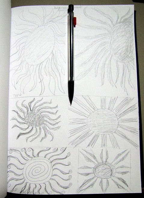
I've been having a tough time moving forward with the second lesson of my on-line linocut class, another one chocked full of good information, links and design issues to ponder. It includes an exercise that I've been eager to try - converting photographs to a design suitable for block printing. Yet to my total frustration, I am discovering that within my files of hundreds of reference photos, very few will convert to an effective dark/light value design. Too many medium values that I am not at the skill level to deal with. The exercise just before it helped me see better the nature of graphic design which is at the heart of linocuts - balancing the amount of light and dark space while keeping the design moving and interesting. Yes, harder than I thought. Even after several hours of sketching, going through my photo files and studying examples on-line yesterday, I still have not come up with something I'm willing to commit to carving into a block. I did run across a few photos that I successfully converted to black and white, so some progress there. And I took the plunge to carve a monogram, which was the first exercise in Lesson 2. You may recognize the conjoined letters as what I use on my Zentangles. I'm pretty pleased with the stamp (those little triangles in the "b" were a challenge), but it is about 1-1/2 inches in height - a little big for how I might want to use something like this so I may try something a little different on the back side of the eraser. (If you click on the pic, the stamp should show at actual size.)


In pondering why I was having such a hard time getting into the exercises in Lesson 2, I wondered if it were not because I didn't feel I'd finished what I'd wanted to explore in lesson 1. I was so unhappy with the ink I was using so wanted to try some of the paints I had on hand. I wanted to try different colors and printing on some of the fabric I'd pulled when discovering we'd be cutting leaf blocks. I'd looked at those 6 inch blocks and wanted to use the image for fabric postcards, which of course are 4 x 6, not 6 x 6. A partial leaf would be just the ticket so I used painter's tape to mark the 4 inch line and keep the paint off the part of the block I didn't want to print (tape is removed once block is inked). I have a lot of Liquitex acrylic paint from before I had a good source for paint specifically designed for fabric. I really need to use it up and this seemed a good place for that. I add textile medium to it to make it work better on fabric.


And my experiment was a success, in my opinion. This may be more postcards than I intended to make, but the size of the fabric was perfect for eight. Indeed, after I'd printed the first four, I thought to place the tape going a different way so the leaf would be turned in a different orientation and printed four more. Curiosity and indecision can lead to a lot of prints! The best thing though is I didn't have to endure noxious fumes and the printed fabric dries quickly. A quick heat setting with an iron and it is ready to work with within hours (although it should not be washed until air-curing for 7 days).


This fabric has specks of dull green in it - more so than shows in the photo. It just reminded me a bit of the forest floor. Of course, I could have mixed a second color on my palette so the leaves would not all be the same color, or blended the two to give a two-toned effect. But I plan to do some of that color variation when I add stitch to these, and you've got to stop somewhere with the play. I don't usually do mass production postcards, i.e. I tend to work on each as individual little quilts even if doing several similar ones at the same time. But in this case it makes perfect sense to layer this up as one piece for the quilting, then cut the stamped images apart to complete each postcard.


At one point I happened to look at the roller before adding more paint to it and saw parts of the stamp imprinted on it. Since I've not used a foam roller before when stamping, I'd forgotten about this added bit of design opportunity. I grabbed one of the pieces of fabric I'd used several year ago to wipe paint off foam brushes (that's the big spots oddly enough in the same paint color) and otherwise collect excess paint and rolled across it. The first swipe I'd pressed hard - more paint than I realized still on it and then it abruptly ran out once it circled full round. The second imprint transfer is above the first, using a lighter touch (click on pic for bigger view). Pretty cool, although as usual, I don't know what I'll do with it.