Monday, November 18, 2019

What Else Is Percolating

https://blogger.googleusercontent.com/img/b/R29vZ2xl/AVvXsEgfFNuFBecNHwBUvVrT8C6AsGdXH6AC_JMKUi6wDKcocroGn1mvinm6wtPyr_3bTh1oSDuPQbQYBfXyib0FFTPVWo2Mf4VtaoO1Hjj3oSeBcKKUC2glZN548Ne4L8wacXaFK7z2mw/s1600/snow+dyeing+experiments14.JPG

"Art is much more interesting and makes a lot more sense (at least for the artist, anyways) if you think of the finished works as just the remains — the “fossil record” — of a process of looking, thinking, making, etc."  Austin Kleon

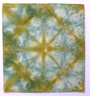
I loved this as I often refer to my cleaning of the studio/work table as being akin to an archaeological dig. But it also resonated because I am getting closer to starting a project whose idea germinated way back in February 2017 after a snow dyeing session. The piece shown above gave me the idea to quilt a labyrinth over the top of it. But it has taken over two years of thought, research, pondering of technique and materials, gathering of necessary supplies, hunting down a source for a key embellishment . . . You get the picture. And this is not unusual for me. When a quilt idea goes quickly from inspiration to completion, it startles me, and I wonder what I've forgotten to do. 

Here are the steps so far for this project:

Once I decided I wanted to quilt a labyrinth over the fabric, I researched labyrinths, finding different styles and eventually finding a square one that I thought would work. I bookmarked the site where I found it. I'd deal with enlarging and printing it out later.

I thought I had the perfect embellishment to go in the center of the labyrinth - a sparkly broach that had belonged to my grandmother. But when I placed it on the fabric, I could see it wasn't right at all. Neither were the bugle beads on hand that I thought would work. They were shorter than I remembered and not the right color either, to go with that sparkly broach OR the fabric.


In July 2017 I found myself in "the slightly bigger city" where there are several stores that carry large buttons. I brought these home to audition, the one on the right turning out to look perfect once placed on the fabric.

Now the hunt for bugle beads to go with it. I spent a lot of time looking on line and trying to find a bead store anywhere within a couple of hours of my home. No luck. I had no idea these longer bugle beads would be so rare, let alone not available in the smooth matte antique gold finish to match the button. That button sat on my desk in front of the computer screen for well over a year and the whole project ground to a halt as I worked on other art quilts and then got sidelined by that finicky nerve issue.


With company coming for the 4th this year, I decided it was time to clean off that desk a bit and there, buried under papers and notes, was that button. I've been thinking about this quilt again, wishing I could get going on it now that my nerve issue had calmed and I might be getting back to the machine before long. In a sudden fit of frustration, I set the search engine again, and to my surprise, the first website to pop up had exactly the bead I was looking for! Of course, I checked a few more websites too just in case, but soon realized it wasn't going to get better than this. I don't like buying beads on-line though when I need a specific color - beads are notoriously difficult to photograph - but I didn't have much choice. I held my breath until they came and proved to match the button perfectly.


Well, NOW I was running out of excuses not to proceed. That labyrinth pattern would need to be enlarged - I'd been sussing that out in my head for a long time - and because it needed to be around 16" square I'd either have to print it out in poster mode (multiple letter size pages) and tape the pieces together or take a copy to the print shop and have them enlarge it. I ended up dong both because the one I took to the printer was not the right labyrinth, although you probably can't tell the difference.

But now I started pondering the best way to transfer all those straight lines onto the fabric. I was leaning towards using Golden Threads quilting paper but really needed something that I could see clearly through to get it positioned just right over the pattern in the snow-dye. Suddenly, an option presented itself in an issue of Quilting Arts I was reading, using Press and Seal. I remembered hearing about using this cling wrap to aid in quilting a long time ago but didn't think it was for me. Now it sounded like a possible perfect solution. I still need to do a sample to make sure it will work, but I think this just might be the ticket.

But before getting to the quilting stage, I have long wondered if I shouldn't add a bit of border of some sort, probably of some of the other pieces of snow-dyes from the same batch. However, when finding my labyrinth patterns, I had saved one that had a Greek Key border and an interesting applique, and now I am thinking I may add a similar border around my little piece.
 

Here's another example bordering a square labyrinth. Of course once i get the border resolved, the quilting design positioned and the top sandwiched up, there will be a thread choice to make (have several in mind) so the mulling and pondering continues at every turn.

When I finish this particular piece, I know all this process I've gone through will not be evident, that most will not realize they are merely looking at the fossil record that goes back quite a ways. It's one of the reasons that makes answering that question, "How long did it take you to make?" so difficult to answer. Another reason, of course, is the distractions and diversions that keep one from working in a straight line from conception to completion. This will continue to be on hold now that I am focusing on my book binding club. But I wanted to assure you, working in fiber is not far from my mind . . . 

Thursday, November 14, 2019

Something New

mini 2 needle coptic binding 4-3/4 x 2-7/8
I've moved from sketching to bookbinding! This is the first project in the on-line bookbinding club I've joined. I can't tell you how long I've been wanting to try this coptic stitch binding; as per my m/o, sometimes I just need the right incentive. Yes, I could have found on-line tutorials or even a class, but I think this club is more my style, more apt to get me actually doing the work. It's more of a community with a forum and a facebook page depending on your preference and there is really something inspiring about seeing people posting their finished books and sharing what materials they used and any issues they had. So much information, such great tutorials. I am so please.


I've done a little what I think of as casual bookbinding, like my soft fabric covered journals and that recycled materials accordion book. But I've never worked with real book board, let alone learned how to properly cover a hard cover (in spite of the books I own or have read on the subject or the tutorials I've watched) or tried any of the fancier decorative bindings I've seen and admired. As I started in on the first tutorial, I was struck by the fact that, just like quilting, I had many decisions to make, much measuring to do that had to be accurate and even a little math to figure. It never occurred to me how much time would be devoted to preparation before I could get to the stitching - again, very much like quilting! While if I followed the instructions, at least I didn't have to choose what size of book to make and then figure all the dimensions for its various parts, I did have to decide what I was going to use to cover those book boards. Although I do have some suitable papers and eventually will try using fabric, I'd been lured to try a method of making faux leather from brown paper bags (another thing I've been meaning to try forever). The instructions I chose suggested using watercolor paints on the paper that had been crumpled, thoroughly wet with water and then spread out flat, I decided to try those Art Graf blocks instead which you can use like watercolor paints. Whether it was the brush I chose to use, my own unfamiliarity with them or just the nature of the beast, I could not get the wash gradation and blending that I was going for. Much of the brown of the paper ended up without paint and it still looked like a paper bag to me, not leather!

I used a 70lb drawing paper for the signatures.

Still, I decided on this first "practice" book, I'd use some of it. It held up to my gluing it into place and I liked using the orange thread with it. I may end up stamping something on the front cover to jazz it up a little. I had the same issue as many first-timers in my community in that the cover doesn't really want to stay closed even after putting it under weights. But in the live chat that is another great feature of the club, our fearless leader, Ali Manning, addressed the problem and gave us tips to prevent it from happening. I'm anxious to try the "level up" version which will be slightly larger and use 4 needles instead of two to sew it all together.

Tuesday, November 05, 2019

Final Week of #INKtober 2019

I just wrapped up those last 5 days of the INKtober drawing challenge yesterday. I have to admit I was losing steam and even a little bit of interest after four weeks of daily drawing, a feeling I remember now from past years of doing this challenge. But the creatures I'd picked as my final five were ones I really wanted to work with so even though I missed days and lacked some motivation, they got drawn. Some presented quite the challenge because the colors of ink I have on hand are limited, and it doesn't always work to try to mix them on the page. That parakeet is a case in point. Still, I'm pretty pleased with these last bestiaries.

When paging through the book for candidates, I thought this eagle was actually a phoenix rising from the ashes. Although there was another eagle candidate I'd still like to draw, I stuck with this one because of the drama. It was only recently that I spotted a similar one and realized this depiction was quite common in the early days of the United States where I live. In its double-headed version as well as one looking much like the one I've drawn, it was used as a sign of power, both by the church and by countries, becoming the emblem of kings and emperors. All varieties of eagles can be found on antique American quilts (including the two-headed variety - see two examples as you scroll down this page), some closely copying the eagle on the Great Seal of the United States, others looking embarrassingly like a chicken (if you are on Pinterest, there are lot of examples here). As for the bestiary eagle, it was regarded as the king of birds due to its strength and noble bearing, keen eyesight and mastery of the skies.

You might remember my basilisk on a mission. Well, I felt the same way about this parakeet, who not only looks on a mission but looks pretty angry too. According to the text, ring-neck parakeets like this one were highly prized as pets by wealthy Europeans beginning in the 15th century when they began to be imported into Europe from India and Africa. Exotic plumage and its ability to mimic human speech accounts for its popularity in spite of the expense of importing it. But by virtue of how often it showed up in the margins of manuscripts as early as the 13h century, it was already known to illuminators who added it to margins of manuscripts based on descriptions by Pliny, Solinus and Isidore. Towards the end of the middle ages, depictions became less exact between different varieties in the parrot family and more fantastical and colorful in general as they were used more for decoration than any kind of symbolism.


I've already discussed dragons in week three, but they come in so many varieties that I found another one to draw. This one was featured in a folio titled "Wild Animals, Wild Men, and Wonders of Ethiopia" in a chapter devoted to A Geography of the Cosmos: Observation and Myth. The Text notes that "the presence of animals in mythic places and dream spaces was not limited to the celestial domain. It was also strong in imaginary realms closer to humankind, those associated with wonders . . . and miracles... Since the first half of the thirteenth century, clerics had drawn a distinction between "natural" curiosities such as giants and fairies and everything pertaining to divine interventions. But the boundary between the two categories was porous . . ." The text that accompanies the illustration where my dragon appears shows how people of this era "delighted in fantasy" even though there were actual travel accounts available: "Ethiopia is a region . . . where there are a great many venomous beast such as serpents, basilisks, grand dragons and aspics, and unicorns . . . in Ethiopia there are people call Blemies . . . They have no heads on their shoulders and eyes and mouths on their chests . . ." Indeed, my dragon is hissing at a serpent with a human head while a unicorn looks on, looking ready to either attack or flee. Above them in the scene sits a rather glum man entwined with several snakes while further up there's a trio of those Blemies. An alligator drinks from a river beside them while over on the right and looking totally unconcerned about what else is going on around it is an elephant - a truly odd mix of images in an otherwise bucolic setting.

I've noted before that my choices have often been driven by some kind of quirkiness in the image. I had no idea what kind of animal my next one was, again, just flipping through the pages for ideas, so was very surprised to see it was a tiger/tigress, looking like no tiger I'd ever seen. According to the text, that really isn't a surprise because "The tiger we encounter in medieval manuscripts has very little to do with the real animal. Most often, it is a canine creature with a speckled coat shown contemplating its reflection in a mirror on the ground while an armored horseman flees in the opposite direction carrying a tiger cub." The idea of throwing down the mirror was to trick the tigress into thinking her reflection was her cub because otherwise, the tigress would be too fast to escape from. Tigers rarely show  up in manuscripts save to illustrate this story because they were practically unknown.

Finally, we have these two rabbits, looking decidedly unhappy. whether they are in a spat with each other or angry at something else, it's impossible to know but I couldn't resist the interplay between them. Rabbits and hares do show up quit a bit in manuscripts, often being chased by dogs. Hunting, after all, was a mainstay of the times. There is a sexual interpretation if it is a rabbit rather than a hare being chased because of a play on words of the Latin names, leading to the dog-chasing-hare being used in profane manuscripts. But generally speaking "these scenes of pursuit have no other aim than to adorn the page; they simply evoke one of the most prized activities of the medieval nobility. . ."

Thanks for sticking with me through another INKtober challenge. Thinking back on the experience, a few things stand out, although I'm not sure how they may factor into my textile work. I've been rather fascinated by how a slight change in the rendering of an eye (by changing the position of a pupil or the angle of the upper lid) can change an expression from angry to surprised to blank. Equally important in getting an expression right in a profile shot can be the angle of the head/snout/face. Take that Tigress, for instance, I changed the angle from top of head to tip of nose three times before I got it slanted enough, and when I did, suddenly I'd captured that puzzled and mesmerized look. As for the birds of the bestiaries, I've never seen so many big feet! I think of bird's feet as either being small and delicate or big talons. So many of these birds had feet that looked totally out of proportion.  Were they rendered that way on purpose, as a joke, because they didn't know any better, because fantasy ruled? I admit, it made drawing some of them more fun.

And now I'm anxious to exchange the time I've been spending on this sketching for a different pursuit. Watch for upcoming posts hinting at a return to art quilting as well as something somewhat new. 


Saturday, November 02, 2019

More Eco Printing


So pleased and fascinated by the results of my first eco-printing on paper experiment, I couldn't wait to give it another go, my mind churning with what ifs. Using a lighter weight and smoother paper than before (98lb mixed media paper vs 140lb watercolor paper), I got perhaps even better results. Talk about near instant gratification - I am in love with these papers. Still getting bleed-through which may just be part and parcel of this technique, but it is not always a bad thing, creating depth and ghost-like images on some sides. And so I've taken pictures and posted above both sides of the papers in the order in which they were stacked.


I struggled to get accurate color shots of these, tried tweaking them a bit, but the papers seemed to change color depending on what kind of light they are in. Wish you could see them in person. But in the meantime, as I was doing the reveal, I couldn't resist taking these before and after shots of this particular page onto which I scattered the small dark red leaves from a what I think is a barberry bush (very thorny). One of the "what ifs" that crossed my mind concerned the leaves used in my first session, saved and now crispy dry. Would there be any color left in them to transfer, especially in their dry state? What if I crumbled a leaf over the wet paper along with my fresh leaves? I tried it here.


And yes, there's still color transferring. I'm not sure where all that yellow came from but this is one of my favorite pages.


Another "what if" concerned adding some fabric into the mix. Would the weak alum solution that works so well on the paper be enough to transfer and hold images to fabric? I haven't washed these yet to see if what little did transfer will stay put, but I did get some image and color on the very pale hand-dyed fabric. To get sharp imprints I think I would need to have more pressure than I can get on the bundle with just cardboard on either side held by binder clips along the sides and a bit of weight on top while it steams. I also wondered if sandwiching fabric between papers might block some of the bleed-through from a page underneath. Difficult to tell but I don't think it made a lot of difference.


Here  is an example of the mirror effect one gets from two papers one on top of the other.


Here are close-ups of a few of my fabrics from this batch. The one on the left is a good example of how those dried leaves crushed and sprinkled over the paper creates a lovely effect that reminds me a bit of sprinkling salt over paint. I also used some wide blades of grass on that one (and also on the first paper in the top row in the second picture at the top of this post) and since those blades were very green, it was a bit of a surprise that the transfer of color wasn't also green. I was able to find a small willow tree with yellow leaves still clinging to branches and collected quite a few. One would expect them to transfer yellow color then, but as you can see from the paper on the right, instead it was a lovely brown - they really transferred well.


Some of the pages showed I am getting better at arranging my leaves.


And this one I love because of the way those dark brown images are not solid but full of tiny spots. Click on any photo to get a closer look.

The question still remains, what will I do with these eco-printed papers and where else might I take this experiment? Why exactly am I playing with this? Well, if nothing else, I am a curious person and processes fascinate me. But part of my "year off" from art quilting has been to make time to try things I've been wanting to try for a very long time but have not because I've felt I didn't have time while pursuing art quilting and exhibiting. Or, if I did not have a specific thought of how to use the results of my experimentation efforts, I had a hard time convincing myself I should set other things aside to pursue them. Yeah, a long-time problem of mine which I've managed to shake off quite a bit this year. Finally, at a point in my creative journey where not everything has to result in something show or gift worthy.

And that is why this excerpt from a recent Sketchbook Skool blog post rang true, something I've believed and practiced for a long time but often need reminding of:
Creativity isn’t about making something out of nothing.
 
It’s about combining existing ideas into fresh combinations. Taking inspiration from one source, borrowing from another creator, adding a new context, changing the mood, and flipping everything on its head. We need lots of different ingredients to make a tasty soup. 

As developing artists, our job is to gather firewood from many sources until inspiration sparks a flame. We need to stay curious, open minded, and explore.

So all the sketching, the playing with paint, the eco-printing, the waterfall chasing, it's my gathering of firewood, the hoping for a spark, staying alert for fresh combinations.