I mentioned a bit ago that I was trying out some new stamps and painting too. Here are the results so far.
Here's the ink I used with the stamps. I don't like to think how long I've had this without trying it, but the reason I bought it was because it specifically mentioned it could be used on fabric.
 I started with three squares of hand-dyed fabric about 7 to 8 inches square. Last year when I was playing with paint, I used a little that was left over to experiment with a squeeze bottle tip. The results on those two were less than spectacular - one problem may have been that the paint was too thin. The third square was one I'd been using a little like a drop cloth - testing a stamp or using up ink on a stamp in no particular pattern. Let's talk about that one first.

 I had no clue if I could do anything with this one. But leave it to me to finally see a landscape in it. I few additions of the pussy willow stamp look like tall reeds or weeds to me. I can see the round hump of a mountain in the background, and a nearer slope to the right. I decided to stop right here and the rest of the landscape will be picked out in stitches.
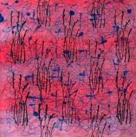
 I really was quite disappointed in this next one. The crosses and squiggles just didn't look as great as I'd hoped. The blue looks bland. It seemed a good candidate for the pussy willow stamp. I'd envisioned using this stamp as an overall design with staggering so that's what I tried here. I like this a lot.
But it needed more I felt. So the next step was to apply some paint. I used these two Versatex paints - cherry frost and orchid - painting them in curving bands using a one inch foam brush after wetting the fabric. I'm not crazy about the metallic flecks, but overall, I think this is an improvement and I can stop here.


 Last is the square with the diagonal curvy lines. Again, this did not play out as effectively as my mind thought it would. Maybe the square stamp would work over it. I'm thinking I want to build up texture and depth, no one element really shining forth. Obviously, if I plan to use this stamp this way, registration is an issue. I'm wishing it didn't have the heavy square outline. It definitely needs darkening with paint so I used the same as on the previous one, trying to make swirls and blotches.
 I'm not impressed. This piece of hand-dye is slightly darker in value than the previous one and the cherry frost paint is too close in value to it. I'm not getting the dark that I want.
 Saturday I got out a different set of paints to see if I could darken this up again. I used two Setacolor paints - Oriental Red and Moss Green. The red looked quite dark in the jar, but once I mixed it up and dipped my probably too wet foam brush in it, it didn't change the overall color very much. Will have to do more to this one, I guess.
After the fact, it occurred to me that I could darken the red paint by adding another color - the moss green. I didn't apply it to my square, but instead, pulled some additional scraps of fabric and used up the little that was mixed on these. Here are my trays of scrunched and twisted scraps, ready to go out in the sun in the hopes of getting some sun printing effects along the creases. Results on these to follow.

No comments:
Post a Comment