Showing posts with label Linocut. Show all posts

Monday, June 11, 2018

Chance

Results of a "I don't care" printing session last year

Chance: adjective 1. fortuitous; accidental

I'm well on my way to finishing one last piece for ArtWalk, one that has been fun to work on because every step along the way has been a matter of chance, and I often work best when solutions present themselves by chance rather than by me actively seeking them out. The picture above shows some of what happened when I abandoned my carefully planned stamping placements on specific fabrics and just grabbed some odds and ends that I'd put in my paint area for expending paint on brayers and brushes and testing prints. I truly did not care if any of these worked, and so they all mostly did, exciting me more than the prints I'd spent so much time working out. The one in the lower left has been on the design wall for a year, and as I worked on Sway, I thought its colors would work well with the other pieces I'll have in my exhibit. And because it was so small, I trusted I could actually get it done in time.
"Yes. Chance has always been my best assistant." Director Agnès Varda in Faces Places.

Sway played a part in choosing a border fabric. Frankly, I hadn't decided yet how I would approach this little 10" x 18" uninspiring piece of batik I'd stamped over. But when I put Sway up near it to audition binding fabric and moved a small piece of handdyed fabric from a collection auditioning for something else on another part of the wall to a spot in between the two, I suddenly saw how well it would work as borders for what I was thinking of as "Float". Certainly not enough for Sway binding but would it be enough for "Float"? Just barely; I could cut three 2 inch strips from it, one for each long side and the third cut in half for top and bottom. Close, very close.
“Chance favors the connected mind.” Steven Johnson, Where Good Ideas Come From: The Natural History of Innovation

From the get go, this piece had a problem. Because I was just stamping with no real intention, it ended up with nothing going on at the bottom. I've spent months wondering what I could put in there that would look like it belonged with the stamped features. I may have solved the border issue but I hadn't solved how to balance out the bottom. That is, until I was taking a quick look through a basket of batiks for a fabric I've used as piping in the past. Again, it was Sway that led me there, the piece I thought I might add piping to the binding of to spark it up a bit. It was total chance that I saw the leaf batik while fanning through and made the connection that the colors and size of the leaves might work on Float, piling up at the bottom and maybe floating alongside the leaf clusters. I spent some very happy dithering while cutting and arranging.

Top border sewn with a partial seam
I'd been doing math in my head, enough to know that the horizontal border strips would not be long enough to span across the quilt with borders sewn on both sides. Visually, if one is not going to miter a border (and again, not nearly enough fabric here for that) then it's better that the top and bottom borders runs all the way across rather than the sides running all the way to the edges. As I kept playing with the strips for best placement of the fabric color changes, a chance placement reminded me of a block technique that staggers the beginning of each side. The top and bottom border strips were just long enough to span the quilt and one side border, so that became my solution.


You work your way around, each border starting flush with the edge of the quilt and catching the end of the preceding border until you are back to the start where you've left a partial seam. Once the last border strip is sewn, the first strip's seam can be completed.
"More conservative minds deprive coincidence of meaning by treating it as background noise or garbage, but the shape-shifting mind pesters the distinction between accident and essence and remakes this world out of whatever happens." Lewis Hyde, in Trickster Makes This World


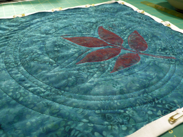
And there you have it, a small quilt progressing all by chance, and ready for quilting. This is the most color accurate photo.


Of course, I'd been thinking about using the same dark burgundy thread to quilt around the leaf clusters and lattice as I'd used on others printed with this same color of ink. A little dull and boring but that was all I'd come up with except the possibility of a light green like the batik. It was that leaf batik that showed me there were other options, time to try something different, and here are the threads I pulled for consideration


I was leaning toward the golden browns when I realized I was playing safe again. Yes, I said it again - go bold or go home! The yellow/red variegated King Tut thread won out and is really brightening up the quilt as well as tying in with the rust in the border fabric.


I've started quilting the lattice with the burgundy and it is really doing great things to sharpen up the design. I'm holding off on any more quilting on the leaves until that is all done. Perhaps you can see that faint blue of the print on the batik that is echoed in the batik leaves I fused in place. Depending  on how it looks when all other quilting is done, I may add some blue/green quilting to the leaves. It's a decision I think will be ok to make by chance. 

Sunday, May 28, 2017

Lazy Art

This is NOT lazy quilting
As I quilted Leaf Cluster II, following the lines in the batik as I had in the first version, the thought came to me that I was making lazy art. Is that a thing or did I just coin a phrase? It's not the first time I've worried that I was not being inventive enough or complicated enough when designing and then quilting an art quilt. I love the texture that builds when a lot of stitch is used but I also worry that on some pieces, too much stitch will take over and overwhelm the main design element. Strike that happy medium, I tell myself, plus feel confident enough about one's stitching skills to execute a more demanding laying in of thread in the background. When in doubt, when feeling timid, the amount of quilting often diminishes, and even when minimal amounts following texture or line in the fabric is called for, I wonder if I am just being lazy. When I launched into the next one, quilting circle after circle in a small pebble stitch (see above photo), I felt excited and sure. Nothing lazy about THIS quilting, was my thought.


But now I was faced with additional squares to quilt, and the timidity and doubt returned. After shuffling the squares (I'll do this one next, no this one...) I chose the dark blue one. I knew I wanted to give the feel of water so hoped some ever widening echoing around the cluster would imply ripples that form when something hits the water. But was I remembering that right? Apparently not, once I looked at some photos on-line. There they were, leaves floating on water, and not a single ripple next to them, but larger circles starting quite far from them. Ok, I can do that, but I think I need to put a couple of echo rounds around the leaf anyway. That red looks so dull (don't believe the photo). And while I think of those circles in the water as being white and shiny, in the pictures they were dark and not shiny. So I opted for a dark green and black Ultra Twist rayon thread and stitched away. I thought the sheen of the thread would catch the light but it didn't. I stitched next to it with a blue YLI Sliver thread and instead of being too overbearing as I feared, it sparkled just right.


So I had done what I so often do, adhere to reality instead of going with my imagination. And sparkly thread or not, I was still underwhelmed by the results - it simply needed more, and I wasn't sure quite what that more was. Perhaps a few sparkly beads in the wide space between the cluster and the first circle. Yup, that definitely helps. And then as I rifled through my bead box, I came across the brilliant red seed beads and laid the strands over the leaves. Ohhhh, that got my heart racing! I won't be beading them on that solidly, but doing more of a scattering of them across each leaf, the paint from the stamped image peaking through. When finished, I will not be thinking that this one is lazy art.


Before adding those beads though, I decided to quilt up what would be the 4th square for my ArtWalk submission, thinking I'd be less stressed about the extra time needed for the beading knowing three were definitely done. I did a bit of back and forth again about what kind of quilting to do - am I still thinking floating on water or just getting some texture in there? An article in a quilting magazine reminded of a bubble pattern I used on this quilt, and as I dug out my reference material, I also unearthing an interesting grid pattern I've meant to try that may be the answer for how to quilt another of the leaf cluster squares. Kicked myself a bit for not having paged through my many resources first  but instead only looking through the dark and cobwebby recesses of my mind. I'm not a hundred percent on board with how it turned out, especially that the thread may as well have been invisible thread for all it shows. But the "bubbles" do show up when the light hits it just so and the leaves pop enough that they can stand on their own pretty well. Not quite lazy art - I DID put some effort into it. :-)

Bubble quilting from the back

While all this was going on, all this mulling and uncertainty about the series and how to keep myself as well as my audience engaged in it, this Painter's Keys showed up in my mailbox under the unlikely heading of "Artistic License" since this is what it started with: 

“If you want to be an artist — try being artistic.” This deceptively minor slip of info was given to me by a fellow painter, Maurice Golleau, somewhere in Provence many years ago. I’ve come to realize that it’s the life breath of our business. In other words, don’t just paint the boat, paint the most expressive boaty-boat you can drag out of your reference or your imagination.

It goes on to list some ideas of how to do that, a list that perhaps all of us should post in our studios. Pattern integrity, or composition, is one of them and that is the main thing I have been playing with. But I could consider more on that list . . . (In a similar vein, this Painter's Keys arrived a few weeks later, sharing the author's checklist of things one needs to do and think about as one creates and concluding "This stuff is all about a personal search for truth within one’s own vision. Getting there is half the fun. If it were a recipe, everyone’s truth might be the same. Only you can make your checklist and join the search for your own truth. Start your checklist now.) 

The stumbling onto the idea of adding beading felt like a breakthrough in the midst of concerns that in spite of my minor variations, my efforts were a bit repetitive and verging on lazy. (If I were hand appliqueing those clusters, would I feel less lazy about the end result? I hate to admit that I would.) As the opening to the letter says, I need to not just reproduce this leaf cluster over and over, but I need to make the most expressive, artistic versions I can drag out of my own references or imagination. "Unless things modify or become other things, or in some way interact through colour, shape or line, they’re merely the straight goods, which tend to be boring to both artist and observer. Don’t be boring." See? That's exactly what I've worried, that I could easily get boring with this series. The beaded version feels a definite step in the right direction, not the straight goods, not lazy art, and not boring. Now to keep that up. 

Sunday, May 07, 2017

More Printing

Quilting from the back - Leaf Cluster III
I had sort of a punky week, but still got something done toward my ArtWalk goals. Over the weekend I had finished quilting the square I showed here. That garnet (some call it pebble) stitch leaves just the sort of texture I wanted but boy, does it take a long time. I think I spent about 3 hours over three days covering the 15" square, and used up almost 3 bobbins filled with the lighter weight Aurofil thread. After about 40 minutes I'd start getting rummy and have to take a break. I haven't mounted it yet as I am going to start a stack from which I will choose the "final four" to be framed. Two down, two to go.

Printed with slightly thinned Liquitex Acrylic paint - Naphthol Crimson

I did have one more square printed with the reddish black paint but it is a possible reject. Time to print some more leaves and try unadulterated red paint. While out walking, the wandering mind prepared for the session, considering which of my variations to use on each fabric, and surprising me with a couple more variations to consider. When I got home, I grabbed my paper prints and worked the placements out. I was quite pleased with all four squares I printed, including the two new variations, and a bit surprised that the red did not pop as much off the darker fabrics as I thought it would. Still, all very usable.

This one didn't photograph that well - much better in person

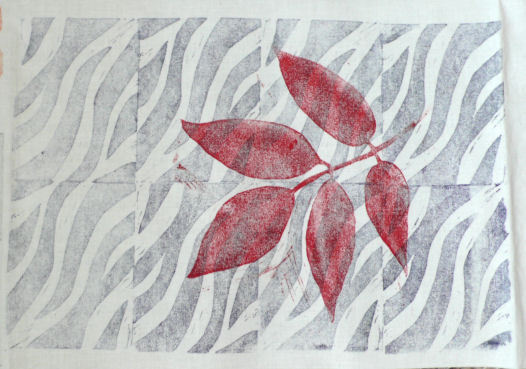
And of course, there was paint left to expend elsewhere. I pulled out some white muslin that I'd printed up during my first linocut class. The paint was poor, the instruction poorer, and I really didn't know what to do with this big piece that I'd covered with the wavy block a la Cynthia St. Charles. Let's print some big red leaves on it and suddenly that background printing looks like water! The red squares were an attempt to jazz up a secondary commercial stamp I'd superimposed with little effect. The paint pretty much covered it up but if I use this piece, I'll have to figure out something to make those squares look like they belong.


On the other end of the muslin I'd printed a smaller section with that wavy stamp and it got a single leaf cluster. I like this one too. But I'm thinking I'd like to give both of these a dip in a little dye to get rid of that stark white.

I'd intended to get the four new squares layered for quilting yesterday but as I said, I've felt a little punky all week and after standing at the ironing board heat setting everything with an iron, I decided to save that task for another day.

Sunday, April 23, 2017

Gearing Up to Print

I had confessed to my accountability friend that I really hadn't done anything yet towards getting any quilts made; all I'd been doing is thinking and planning. Bless him that he countered with "Planning is important. It's ok that you've been planning." But as I said in the last post, at some point planning becomes procrastination, a justification for dragging one's feet. I needed to get some fabric printed up. I'd soon have justification for my dread of this next step but in the meantime, I took a deep breath and mixed up some paint. I'd taken time to review my notes from the on-line lino class I took and the part about printing in that new linocut book, and had an idea why I had problems during my last printing session. I'd also thought a lot about how I might get more of a dark burgundy color than the first time. So with lots of confidence, I began. And right off the bat I stumbled. I thought I had the Speedball printing ink in red, but apparently I'd decided not to buy that because I had so much of this Liquitex acrylic paint on hand. Ok, I'll go with that then and add Liquitex black as long as I had some, already mixed with some textile medium. I'd use no brown this time, just lots of red with some black. The black seemed to turn my red brown, but I kept adding and adding black until it was the darkness of the leaf I was trying to emulate. I viewed it in natural light and it looked good.

Test print pinned to felt for experimental quilting.

I have small pieces of fabric lying about that have been test printed on and I decided to use one of those to test print the color of the paint. Looked good to me, showing red as desired.

There's a second version marked on the flip side I've not got around to cutting yet.

And yet when I printed on my 15 inch squares, the paint didn't look at all like the test print. It was back to brown, nearly identical to the original paint mixture that started with brown. Paint coverage on the linocut was very uneven and strange. And even though I had my reference prints at hand, I managed to mess up placement of painter's tape guides on several. I ended the first session with nothing usable, not even my carefully cut and fused triangles. So much for advance refreshing of my memory.

My studio is actually the master bedroom which has its own bathroom which I use exclusively for printing.

I really wanted to junk the whole idea, walk away from this grandiose plan for the leaf cluster. I guess the muses showed ME who's in charge! But the next day I decided I just needed to get back on the horse and give it another go, armed with the new lessons learned. I tinkered a bit with the paint, adding more red back in, taped my reference prints to the mirror and tried again. It went somewhat better, now that I knew what to look for as I inked up the block. I didn't mess up any placements this time but I was still disappointed in the outcomes. That paint took on a chameleon nature in that it changed color depending on the background it showed up on. And why should I be surprised? I already know that any color of fabric will read differently depending on the colors surrounding it. Why should paint be any different? I ended the session thinking I still did not have a decent print to work with.

When you don't care, everything goes well.

But at the end of any printing session, one will have excess paint on the palette and on the brush or brayer, and I hate just washing it down the sink. So I grabbed more small pieces of fabric I'd left in my print area, some already printed, and printed with abandon. So of course, all these "I don't care" prints turned out great! Here are two set out to dry. The one on the right is a highly textured grey batik and the one on the left is a rather nondescript greenish batik with the occasional hint of blue leaf. It was first printed with a piece of foam whose original purpose is a mystery. It is quite thick and I'd had it around for a long time wondering if I could stamp with it. Yes, I can! And quite well too.

Testing how it will look around canvas in floater frame. Same paint as all the other prints, the only time it looked black.

Sometimes you have to give what you've been intensely working on some space before passing final judgment, especially if you are as disappointed as I was. I gave it several days before I looked at my prints again to reassess. It also gave me time to reset my thinking, remembering my original plan was to do lots of prints, quilt them up and pick the best four for my ArtWalk exhibit. More importantly, I was reminded that right now, I only needed to finish one that I could take a picture of to submit with my application soon due. Surely I have ONE print good enough to fulfill this goal. And indeed, now that I looked at the group again, there were still duds, a few that might be saved, and at least two that turned out fine. Sometimes you have to remember the big picture. Sometimes you have to remember the intermediary steps.


This is one I decided will work, and will be quilted with a garnet or pebble stitch. The small piece is another one of the "I don't care" prints that I plan use somehow, probably combined with something else to make a larger piece.

Leaf print outlined with burgundy thread, auditioning thread for garnet quilting.

The stripey orange batik print is also ok, and I layered both of those up for quilting with Thermore polyester batting. The batik got decor bond fused to it first because it is quite thin compared to the Stonehenge cotton of the other one, and I felt it needed more stability because of the quilting I planned. And without much time to spare, I started the quilting on these before packing them and the don't care prints up to take to art group. Yes, that week I had TWO accountability parties pushing me along.   

Saturday, April 22, 2017

How I Gear Up

Goodness! I feel like I've left you hanging after my long discourse about working in a series and my intention to work with the leaf cluster image, exploring variations in the format of a series. Perhaps you thought I got sidetracked again, but no - I've been making progress, just not sharing it. Actually, I have been sharing it, sending weekly progress reports to a friend that I call on Mondays. I've used this kind of accountability enforcement before with him, and sad as it is that I can't always keep myself moving forward on my own, I'm fortunate to have someone willing to be that conscience asking each week if I've done what I said I would. These reports are brief with a few pictures and quick to compose because he doesn't need all the details I put in my blog posts and can ask questions when we talk. It's excellent motivation for me to get something done each week, a bit like the rush to pull something together for the monthly art group meetings, and it makes me feel like a student again, the one who puts off the homework assignments until Sunday night. The very first thing I needed to do was put together a "plan" for what I wanted to get made for ArtWalk (June deadline) and the annual Fiber Exhibit (sometime this fall). This was all floating around in my head with vague dates, but when the ArtWalk application arrived in the mail with its own earlier deadline in April, well,that is when I panicked and started writing stuff down. I needed to get at least one new piece completed to submit with my application and only had a few weeks to do it.


After jotting down my ideas for the two exhibits, it was time to get out the big sketchbook and start listing there the variation ideas that had been floating around in my head. And as is often the case, the more things I listed, the more things came to mind. Then I needed to start trying out some of the ways to orient the leaf cluster. I was thinking that I'd have to do more test prints on newsprint and not looking forward to cutting more paper to size and inking up my stamp. I get so tunnel-visioned that it took me awhile to remember that I could make photocopies of the stamp image to twist and turn and align in endless ways. Photographing the different variations would give me the lasting reference I would need in the future. This method would be quicker than stamping or sketching and give me the advantage of working with full-size motifs.


One of the things that occurred to me as I shuffled the photocopies around was that rather than be the focal point of a square quilt, the leaves might simply cascade down to form the currently popular long thin banner-like shape. And so I tried multiple renditions of that.


And that play led me to realize that the leaves might also form a border and not show up in the central part of the quilt at all.


From there, it was an easy transition to move a few leaves to form a rectangular shaped design.


Lordy, one could keep at this for a long time, but eventually it becomes procrastination. Time to start pulling fabrics and thinking about my ArtWalk plan - a minimum of four framed 10 x 10 inch leaf cluster variations. These will be wrapped over 3/4 inch deep stretched canvas so for simplicity sake, I cut squares about 15 inches square. The light fabrics would have the darker reddish-black paint while the darker fabrics got me thinking about a red and a green that would pop against them. They've been set aside for now, but each one for the dark leaf printing session got an arrangement pinned to it for reference.


Here are three ready to go, one with its reference paper having the size of the stamp cut from it in a particular slanted position. The others are placed using center lines or an outside line as guides but again, the reference print is pinned to one of the squares, and the top one will be stamped in the center.


I got the idea for that top one, whose background is pieced from triangles, while doing research on the liturgical stole project. Paging through a book on symbols, I spotted the unicorn superimposed on a very familiar patchwork design. I'd been thinking about cutting up that striped batik into different shapes and collaging a background, but this was much more exciting to me. And a good reminder that you never know where you'll find ideas and solutions for your designing. I printed out the image and pasted it into the sketchbook with more notes.


As I was sorting through fabric possibilities for the 10 x 10's, I ran across a few pieces the right size for larger quilts that would accommodate the entire leaf cluster print arranged in a fairly traditional 4-block design. These too have been set aside, but not without the paper variation reference. Because past experience proves I will not remember what I came up with this day weeks or months down the road when I get back to it.

So this is what I got done in the first week and a half, at the end of March and into the first week of April, after getting that wake-up call of the application due date. Planning is good, especially if the next step is working with paint which will dry up if you dawdle over what to print next, but eventually one has to quit thinking and arranging and planning, and move to the next step - printing. Time to stop dragging my feet and mix up some paint...

Wednesday, March 08, 2017

That Leaf Cluster

Nothing gets one in gear faster than finally getting around to opening exhibit documents to discover one has a little more than 2 weeks to finish a new piece of art for said exhibit. And so I got the needed boot to pursue a year old idea and see if it would work. It's mostly been the thought (i.e. fear) of mixing up paint to match the color in the leaf cluster I'd brought home that was holding me up. Time to bite the bullet and just do it! But I'd not even tested my linocut since carving it so that was the first order of business. Just inked with an ink pad and tested on plain paper.

Test fabric on top, "real" interfaced fabric, linocut and leaf cluster on bottom.

A week or so prior, I'd already fused the two pieces of batik to Decor Bond and pressed an additional large piece of the batik to use for trials. When I found that day with a bit of time in it to do this, I was afraid to pause for my usual checking of procedure for fear I'd lose my nerve and/or run out of time. It's been a long time since I worked through the on-line linocut course from Dejanne Cevaal but I was pretty sure I remembered enough to do some printing on the fly. Mostly, I wanted to try to apply the paint without getting any on the ridges this method leaves as you remove the background. I started with Speedball Screen Printing Ink in brown, adding black to darken it. But I needed to get some dark red in there too and found myself grabbing some Oriental Red Pebeo Setacolor paint to mix in.  I dabbed a bit on a small piece of the fabric and thought I had the color pretty close. I loaded up my hard foam brayer and started stamping, leaving the Decor Bonded strips to near last.


Normally the screen printing ink doesn't need diluting but I didn't stop to think that the Setacolor paint is normally diluted before use. That explains why the mix seemed thick prompting me to add a touch of water. And why when I picked it up off the palette there were peaks of paint standing out from the brayer. And probably why I was having a difficult time getting the solid coverage I'd envisioned. Not that this partial coverage isn't a nice effect, just that it was not what I had envisioned for my little art piece. I think it should have been thinned more.


I began to rue the fact I had not taken the time to review my lessons. And when a few days later this book arrived, one I decided to purchase on the recommendation of Dijanne, I wished I'd had it to consult before my printing session. Just paging through it makes me even more anxious to get back to linocutting and printing.


But in the meantime, I now had my leaf cluster printed on my batik, layered over Hobbs Thermore batting and muslin, ready for some stitching. I'd left out that spool of thread on the left because as it sat next to the batik and the actual leaf cluster, I just KNEW it was the perfect color for the stitching. Silly me. My first stitching would be to outline the leaf print and then maybe add a round or two of echoing. So fixated on this solid leaf idea, I decided I didn't want the variegated right next to it so used the solid burgundy on the small spool. Ok, it matched but did nothing else. So back to the variegated thread, which I did test on a scrap. But once I'd done a round of it, I wasn't so sure, yet my stubborn nature that had deemed it PERFECT prevailed. I started stitching across the background and after half a dozen lines could see that this thread that looked so reddish purple on the spool variegated to a decidedly lavender purple on the fabric. Rip rip rip! Maybe I need to go with the orange across the background, but in spite of it looking good on the sample, it too variegated to an unacceptable color (bright yellow!) and didn't look right as it ran across the browner sections. 

It's only 10 x 10 inches but taxed my abilities

I stared for a long time at my thread collection, willing the right color to magically appear where I was looking (yes, they are mostly arranged by color), and finally allowed my eyes to roam upward where I spotted the somewhat light burgundy variegated thread. Thinking it was too light, I gave it a try anyway and it turned out to be the best solution. I know some experts insist it's the value of the thread, not its color that is important, but I sure didn't find that the case here. Of course, all those lines of stitching I'd removed left needle holes, so the restitching had to be carefully done to hit or at least cover them. Yeah, what fun.


I realized I was so fixated on the burgundy thread because my original leaf had shone hints of deep burgundy along with a very dark brown. But once I got out of the poor lighting in the bathroom where I mixed the paint and did the stamping, I wasn't seeing as much red in the leaves as I'd intended. I pondered if I could paint over the leaves or in some other way add some red to them. In the end, I decided the safest experiment would be to try my Inktense pencils. Remember, I was working on a tight deadline and there was no time for starting over if I screwed this piece up. A simple way to work with these pencils is to transfer color from the dry pencil onto parchment paper or the shiny side of freezer paper, then pick up the pigment on a wet brush. I chose a stencil brush to see if I could work color not only on top of the paint but into the fabric in those areas where the paint didn't totally cover.


I think it made a little difference, but overall, this is still just a dark reddish/brown leaf. Again, nothing wrong with that and it looks good on this fabric, but it is not the color of the original leaf that got me excited when paired with this batik. Not to worry, I'll be doing this again and being more bold when I mix up my colors.


This really was intended to be a trial run for a possible series using this stamp. My idea is to wrap the finished work over canvas and put in floater frames. But because of the dimensions of the batik strips (which started as rejected padfolio pockets), there wasn't enough for wrapping. So I always knew this would go in a 10 x 10 frame. And when I do that, I always attached the finished piece (after zig zagging the squared up raw edges) to either watercolor paper or cardstock for extra stabilization. Knowing that, I didn't have to worry about burying the many thread tails that got pulled to the back., thank goodness.


Time to dig around in the closet to see what I had in terms of that board and I discovered an unopened pack of illustration board I totally forgot I'd bought. Normally I'd put a heavy needle in the machine and sew around the edge to attach quilt to board. But this board struck me as thicker than what I've used before so I hesitated.  Maybe I could just use some glue or . . . I remembered this roll of double-sided mounting tape suggested by a scrapbooking friend many years ago. Am I getting lazy or just smart? It's archival so let's just say I'm getting smart in my old age.


With the quilt permanently attached to the board, my "label" information can be penned on the back of it. When I do this rather than printing out a label, I use the initial stamp I carved as well. This frame had a Masonite back board rather than cardboard like so many cheap frames do, so it went on last. A business card with the name of the piece and price gets taped to it to meet the labeling requirements of the exhibit.

Leaf Cluster I by Sheila Mahanke Barnes 2017 - 10" x 10"

And here it is framed and ready to go (with no glass). I did have a black frame on hand but found a lovely mahogany brown one on a shopping trip that I think looks much better. I filled out paperwork yesterday and dropped it all off on time this morning. I do like it but have misgivings about its simplicity. Too minimalist? Will people view it with at most a "that's nice" or a shrug before quickly moving on? It's certainly not "great" art but I think it is ok "decorative" art. So I was a bit surprised and relieved at the accolades from the ladies checking in artwork today. They can be pretty deadpan as they do their job so to have them ooh and aah made me feel better and encourages me to keep working with this motif, exploring variations on this theme. 

Friday, March 25, 2016

Spurred Into Action

My art group met on Monday, which as usually spurred me into a late flurry of activity last week so I'd have things to share and get feedback on. So yes, despite no blogging about it, I have been getting a few things done in the studio. For instance, I finished cutting my leaf cluster block, rather fascinated with the design building up in the background. Those lines may or may not transfer, depending on how I ink the block - one of the characteristics of linocuts. I was waiting to blog about it until I'd had a chance to do a test print (ran out of time to do that before the meeting), but since this post is sharing what went on at our meeting, I'm letting you see it now. Expect to see this again in action.


Then there was that epiphany I believe I mentioned regarding Adrift. So excited to try it out but kept working on other things. I definitely wanted feedback if it worked at all so hustled to fuse two batiks together, one having these beautiful sprays of leaves to cut out. But would the cut-outs look right up in that corner where I've been stuck, the one where I could see branches or something. The leaves are on a dark blue background so I left a bit of that along the edges as I trimmed, knowing that if it didn't look right I could cut it away. I put the first spray up and . . . oh my yes!


The only problem is, these leaves change the feel of the piece. I no longer think those sheer leaves I meant to float on the water part (and giving the quilt its name) look right - ditto for the yarns I'd started cutting for the grasses along the bottom. Such is the journey a design idea may take and I think I just have to give in to it since those new leaves bring such life to this piece. Now note that arrow on the right.


It is pointing to a place on this strip of "test and paint expend" fabric where I'd tested a commercial stamp. I'd put it up there because a few weeks back I'd seen two photos on the internet showing these bushes with the bright red stems. I saved this one but can't seem to locate the other that was taken not far from where I live showing these bushes right along the water's edge, a splash of color against the drabber winter backdrop of dry grasses and leafless trees. More than the bright color struck me - I wondered if this was the answer to helping the viewer sense how wide an expanse of water I was seeing in my piece. Later, I had one of those accidental moments when I realized I actually had a stamp that might duplicate this look. The sample helped me see if the size and look were right. I decided they were. I stamped some bushes on the quilt right as it hung on the design wall - oh my, such an atypical thing for careful tentative me to do!


So by the time I showed it at art group it looked like this. Not sure the bushes look quite like I envisioned and I may add some stitch there but I like that I have the stamping as a base. Still need to do some arranging and perhaps adding of the leaves in the corner but the group loved that solution. They also agreed that the other leaves may have to go or be altered and we continued to puzzle over how many and how to group those floating leaves. The strands of yarns have been placed there only to show a thought of how some of the leaves might be "behind" the grasses which I am not planning on extending up that far. At any rate, exciting progress and more work to be done.


Now to the rest of the group. Robin has been playing with a new collage technique which is based on deconstructing old books. It is amazing what an aged look these all have.


The collages are built up on small gesso board, a product I was totally unfamiliar with but think I might like to try for mounting rather than stretched canvas. If you too don't know what that is, here's a source with detail description and pictures. Here you can see Robin has used not only the cloth from the book cover but pieces of the webbing used to hold the spine, something one doesn't see until taking a book apart. The writing is cut from old family letters.


She also incorporated bits of text from the books. In this case, we are amused by a bit of advice from an early 1900 book on Christian etiquette.


And this, she stressed, was the key to success, a mixing of the two allowing collage pieces to be moved around a bit before the glue takes permanent hold. Yeah, how often do we get that bit of text or photo in just the right place on the first try?


Meg of the giant tree has put aside her fabrics for the moment for sketching and making up color charts and general experimentation with various paints and pens. On these pages she is working on sketching the same figure from different angles and in different poses. 


She has a long-term goal of writing a children's story illustrated with her fabric "quirky" kids and animals, etc. so there will be a need to repeat a character turned in different directions. She noted this was much more difficult than she anticipated.


She's also been trying to work up in sketch a bird nest that can be added to her giant tree in the exhibit (she's already added a bird as our spring is progressing to that point). I'd brought along the latest Quilting Arts Magazine to show her two articles in there showing two approaches to making bird nests for/on art quilts. Frankly, I found them a little boring and dull (where are the bright strips of yarn and fabric birds incorporate into their nest building if they find them in your yard?) but thought it might give her some ideas. This discussion led Robin to get out a big wood box where she'd stored masses of yarns and embroidery threads gotten for a song from two male tailors shutting down their business. Yeah, Meg and I had some fun picking through that - she for her nest, me for my grasses!


We were successful in wooing Cheryl (who we discovered at the Triple Threat Exhibit) to the meeting, who arrived eager to get some help with this piece that's been on her design wall for at least a year. The base fabric is one she snow-dyed, the machine quilting some of her first (with an old machine that she now realizes held her back), the heart-shape silk flowers ones she deconstructed and reassembled on the top.


Once the final arrangement is in place, she will tack each flower with a few mono-filament thread stitches, then add beads in the center. What she needed ideas for was the quilting around the outside, how to flatten out the bubbling center and if the arrangement of flowers could be improved. We lost no time diving in with input and think she is a great addition to our group. She is pretty much self-taught in the art quilt part which she is relatively new to, but not afraid to experiment and go for it. See her current work that was in the exhibit here.

Well, this should keep you for awhile. Sadly, I must turn my attention and time to doing my taxes which will limit how much progress I'll have to show here. But I'll be back!