Thursday, April 30, 2015

Playing with Tyvek


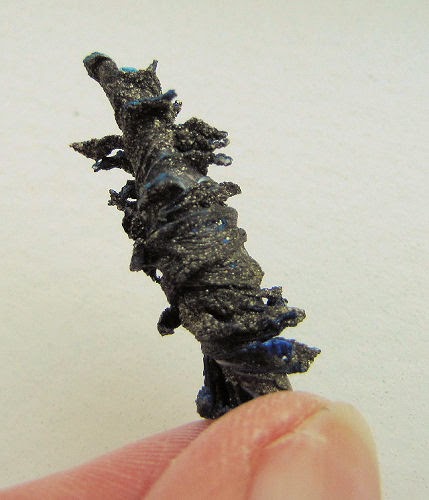
The monthly art group meeting was coming up. I'd been expending paint brushes, etc. on a piece of Tyvek instead of my usual scrap of fabric. I'd oohed and aahed over a brief Tyvek bead tutorial over on ...And Then We Set It On Fire blog (it also links to a youtube video), enticing enough to want to try it myself. It required a heat gun which I do not have, but Robin from the art group does (with invite to use it any time I want). It was just the right confluence of events during a lull in the studio - I've been wanting to experiment with making beads for a long time. So I prepped some beads to take to the meeting. I started by adding more paint to my Tyvek. The side shown above just had a bit of blue and black acrylic paint, so following the tutorial's lead, I completely covered it with blue Versatex paint which has a bit of metallic in it.


The flip side was well covered with black acrylic paint with a weak layer of yellow. My instinct was to paint over it with silver as I thought that would compliment the blue side better but with that coat of yellow...well, I hedged and used gold metallic Versatex instead. Made for a nice sheen.


Neither the video tutorial nor the blog one gave specifics and you know how I hate that. Just cut these long triangular strips (how wide???) and cut slits along the sides (how far apart? How far into the Tyvek?) Then just roll it up and secure the end with a pin. It was too difficult in the video to see for sure how she was doing it, but she did say to cut the slits on an angle and wrap around a bamboo stick. So that's what I did on half of mine which would be rolled with the black side out.


The blog tutorial however, cut the slits straight in and rolled on a knitting needle. Well, I was having none of the needle bit but thought it worthwhile to do the second set with the straight cuts, just to see if it made a difference. Even though the blog shows great close-ups, I still couldn't tell for sure how wide the strip was or how the slits were spaced. Convincing myself it doesn't matter, it doesn't matter, this is a trial. For your information, though, I decided I didn't want my beads huge so the triangle starts at about 1-1/2 inches wide. The first few I cut to a point, the rest I decided to blunt at the end.


Off I went to my meeting, where we all watched the magic as the heat gun was applied. Well, sort of magic. The loose strips made by slitting were slow to react and then when they did, I wasn't getting the same kind of lovely curling shown over on the blog tutorial. Frankly, I was very disappointed.


The feeling was not unlike when I processed my snow dyes that came out nothing like the examples I'd seen on line. When your expectations are in one place, even acceptable but different results can disappoint.


Of course, my analytical mind kicked in to troubleshoot. Perhaps by choosing a smaller bead size, those strips weren't long enough to curl properly. Or perhaps the slits themselves should have been deeper and farther apart.  This one just looks like a deformed pine cone to me.


Perhaps the problem is the colors I chose for front and back. Maybe I would have been more pleased with the silver rather than gold paint over the black. Even so, why is so little of the blue showing on these that were rolled with the black to the outside? Mysteries that only the great Tyvek gods can answer, no doubt.


I did have one pleasing result that I got by doing a loose twist of a scrap piece over a bamboo stick. It created a coil that I then pressed between an applique Teflon sheet. That place that bubbled up blue looks like a piece of turquoise. I have plans for this. But wouldn't you know it, when I tried to demo this for my group, a second piece did nothing but melt together - no bubbling, no holes. Again - the Tyvek gods were laughing at me!

If you've looked at the tutorials, you will know why my efforts disappoint. Here's an additional blog entry showing more beautiful beads so unlike mine. Oh yeah, there's one more step I can take that might redeem these. Part II coming up!

Monday, April 27, 2015

I'm In!

It's been a long time since I've had a quilt juried into an exhibition, longer still since I even tried. It was becoming a hassle, what with rising entry fees and shipping costs and getting that excellent photo to send along. But Sacred Threads is an exhibit I've wanted to be a part of since its inception. I just never had the right quilt ready at the right time to give it a go. That is, until this year. When the call for entries went out earlier this year, I sucked it up and did what I needed to do, because in my mind, I now had the two perfect quilts for this exhibit: Life's End and Bubble Prayers - Release.

Acceptance e-mails went out yesterday, and to my utter relief and pleasure, both of my quilts made the cut. To see a complete list of Artists and Artwork accepted plus info about the exhibit itself, go to Sacred Threads website here.

To say I'm excited is an understatement!


Wednesday, April 22, 2015

So Where Was I?

Oh yeah - before the sudden push to meet a deadline, I was working on my art journals. I was in a quandary - a silly one as it turned out. I'd let myself get locked into following an example (which side the crit sheet would be on) and when my painting of the spread resulted in not liking the side the example used for collaging, I fell into a tug of war with what I can only think of as the old me (one who follows directions to the t) and the emerging new me (one who veers off to do her own thing). With the break from working on it, now my reaction was why of course I would reverse how it was done in the book I'm following and use the side of the spread I really liked. The words of permission were staring right at me and yet I had hesitated.


This exercise from Creating at the Speed of Life was about color again, but working with just one - monochromatic is the term. I had fun checking the dictionary for other words starting with mono and then adding them around the page in phrases. And I also had fun adding familiar phrases that include the single color I chose to work with - blue. If you click on the photo for a larger version, you can probably make them out. The strip set at an angle is part of a bits-and-pieces-of-leftovers package sent from a friend. It nicely pulls together the blues leaning toward green (words cut from a newspaper and the watercolor wash around the edges) with the blues leaning the other direction on the color wheel. I adhered it to the page with gel medium which oozed out a bit in one area. Encouraged to add other media to shade and highlight the page, I worked some of the Inktense colored pencil next to the edges and couldn't figure out why when I ran a wet brush over that section and even tried pulling color directly onto the brush for transfer, it wasn't showing up. Then I remembered something Hilary said about a class she recently took, that gel medium could be used as a resist with water-based products like inks. Ohhhh....

Because I am allowed and in fact encouraged by the book's author to note what I didn't like about my page, I can tell you it's mostly the stamped "one only" next to the crit page. The spacing in "one" was much closer than I intended and I am still struggling to line the letters up evenly. Had the crit sheet been on the other side, or had I left room on the left where I collaged for those stamped words, I think it would have looked better. As it is, it doesn't quit fit in, kind of needs to be bracketing the other direction. But then I couldn't have shared that "o". Mostly though, I really like this spread.


Then it was back to the Positively Creative art journal. I'd put some paint on a page where I'd be journaling at the same time I'd painted the other art journal's spread back in March. This lesson included stripping paper from one side of a piece of corrugated cardboard to create a stamp for adding lines to the page. Not a new concept to me but one of those things I've meant to try but never got around to doing.  It was the only thing holding me up from getting on with this page.


Oh my - this worked like a charm! Before adding my journaling, I glued that scallop piece of cardstock along the side and top - it was what was trimmed off when I made a scalloped mask for a previous lesson. Waste not, want not you know. Even though the white contrasts nicely against the blue background, it got an extra boost from running a thin line of dark blue gel pen along its edges. I find I'm doing this a lot with the art journaling and that it is not unlike what I learned from Suzanne Marshall who often embroiders a stem stitch in black long the edges of her applique to make them stand out. As for the left side, occasionally I find something in this "Simple Diary" I'm "altering" that I want to preserve as was the case here. I used the Sharpie markers to block out the rest and make the yin/yang symbol. It somehow seemed to fit the questions and answers I preserved below it.

On a somewhat different note, Meg from my art group alerted me to this list of 20 Things To Remember If You Love A Highly Creative Person - I'm gathering she's feeling the need to post it at her house. I've read a lot of these what creative people are like things, usually finding much of it doesn't seem to apply to me. This one, however, rang too true, and I actually think I understand myself better now. And if you've read my previous post (written before reading this list), you can cross-reference some of my statements there. ;-)

Tuesday, April 21, 2015

Reception Postscript

"Three essentials to happiness in this life are something to do, something to love and something to hope for."  John Addison

My thanks to Robin from my art group for getting this picture of me at the Fiber and Quilts Exhibit opening reception on Friday. The turnout wasn't huge, but I did enjoy meeting some of the artists that were new to me as well as reconnecting with those I've exhibited with before. And as always, the viewing public that took the time to check things out showed their understanding of the mediums with their astute questions and observations. I got valuable feedback, blush-inducing compliments and literal thumbs-up from several of the men. They really liked my fountain wall, which both puzzled and pleased me. Most of all, this brief moment with my quilts in the public eye, interacting with both artists and art appreciators, talking about inspiration and process and technique, reminded me why I do this (create art) and why I chose this area to do it in.

Meg Marchiando's Kids & Gulls Quirkies

I apologize for not taking pictures of the other pieces in this show to share with you, but I did get this one of more "quirkies" by Meg, another friend from the art group. Her children still delight, this time chasing seagulls while also hoping to chase winter away.

"In order for people to be happy in their work, these three things are needed: They must be fit for it. They must not do too much of it. And they must have a sense of success in it."  John Ruskin

I'm not sure that I mentioned I've decided to opt out of ArtWalk this year. I have not been very "fit" for a long time, making it difficult to do the work "happily" for lack of both physical energy and mental clarity. Back in February, I finally got a diagnosis to what I've been piecemeal treated for these last 3 years, and could see that it would take time to right this. If I were to be realistic, my chances of getting my three pieces done by the deadline would either force me to work when I shouldn't or produce work I wasn't happy with due to rushing to deadline, or both. When presented the chance to be in this exhibit with its earlier deadline, I said yes because it was more important to me than ArtWalk and thus a reasonable trade, and I only needed to finish up the one new piece for it. It has given me that "sense of success". I am content with my choice.

Deadlines can be good; lord knows they have always pushed me to complete more quilts than I would without them. But they can also hem one in, limit options and push you to make poor decisions. I felt all those things as I worked on the fountain wall, working on days when I should have been off my feet, rushing my thought processes to reach technical solutions, finding myself resentful that I could not pursue an intriguing bit of family information come to light, not until that "stupid" quilt was done. I know I'm in trouble when I start referring to a quilt in progress as that stupid quilt!

So I am making good on my New Year's resolve to give exhibiting a rest this year save for one - I just changed my mind about the one I wanted to work towards. Closing the door on participating in ArtWalk suddenly made me see how many other doors would fly open with opportunities I've been putting on hold for so long, things I can do without stressing my body so much. I'll still work on my quilts when the mood strikes, just not on deadline and "not too much of it". Time to move on (or move back?) to other interests that also bring me joy. And the good news is I'm already feeling progress on the health front as treatment kicks in and am so thankful to recognize a clearing of my mind. What felt overwhelming to do, what my brain just couldn't think through a month or so ago, well - not so much most days now. The "brain fog" has lifted! Time to get happy!

Tuesday, April 14, 2015

POAC Fiber and Quilt Exhibit

Eisenberg Fountain: The Healing Power of Water - Sheila Mahanke Barnes ©2015
As promised, I may have a slightly better photo of Eisenberg Fountain for you, although it is hung at the exhibit near a light sconce so the lighting is a bit uneven. But it is truer in color and does not make the center portion so very dark, which it is not.

Sailing the Wine Dark Sea I & II flank Eisenberg Fountain at POAC Exhibit

Artist Statement
During a 3 month stint supporting a friend getting treatments at the Mayo Clinic, I discovered many fountains throughout the campus where we could retreat from the intensity of her schedule for a brief respite. We searched out other waters around town to restore our souls. Moving water has always calmed me but now I understood the healing power of water in a deeper way. Once home, I began studying water with an eye towards interpreting it in fiber: how it moves, how while colorless itself, it takes on the colors of what it flows over or is reflected in or is seen through it, and ultimately how moving water has healing properties.

The exhibit runs through June 5, 2015. The opening reception is this Friday, April 17, from 5:30 - 7:00 p.m. at Columbia Bank, 414 Church Street in Sandpoint, ID. I'm also displaying the two Sailing the Wine Dark Sea quilts from last year's ArtWalk. They didn't get a lot of exposure and the curator agreed it would be ok to include them.

Monday, April 13, 2015

Back To Spirals

I ran across a gif showing a string of spirals like the one above. I thought of my Zentangling and decided to add this to my little reference notebook of Zentangles. It has other uses of spirals but not this one.


I've been longing to work on another page in my little button book and decided this morning to get it out. I still have a few stamped pages I haven't added tangles to. This one, which I struggled to get a good imprint of, has puzzled me but now I see little spirals in the leaves. Let's add my new spiral string.


I perused various Zentangles that work as background filler and noticed one that was also based on a spiral. When I was all through, it was pretty busy, and I didn't think just some shading in pencil would solve that issue. Time to add some color! And this is where the fun began. Rather than just use Prismacolor pencils, I got out the water soluble Derwent Inktense ones. I colored in the leaf with Apple Green and added Leaf Green along the veins and the shadow areas.


Now I'm working it with a wet brush, smoothing out the pencil lines and trying to blend/smudge the darker green. The leaf on the right has had water added, the one on the left is untouched.


I liked this so well that I added the leaf green along the stems and curled leaves and worked some lighter washes along the echoed space over the string  of spirals. The spiral background filler needed shading next, was thinking I could do that in pencil when I remembered my water soluble graphite ones. So I lightly added some of that and smoothed it around with the wet brush. I can't tell you how much fun this was and another step in learning how to use these two product.

Don't know that there is any particular significance to it but this is my 1515th post.

Sunday, April 12, 2015

Diversions & Distractions

This is the front of the notecard that arrived in my mailbox last week. Isn't it the loveliest thing for my god daughter to send my way and cheer my day? No artist attribution on this Tender Hearts Greetings card but it reminds me of paper collage. But it could equally be rendered in fabric applique. I particularly like the angling spirals of steam.

I've been relaxing in my deadline-less days, playing catch-up on all those things one sets aside when focused on completing a major task in a limited amount of time. It's reset mode when I look around to remember what was happening before and where I thought I was going after. And a time when I can indulge in a few diversions and distractions, some worthy of sharing. How about some quotations from an The Artists Magazine July/August 2104 interview with illustrator David Macaulay?

"You piece this thing together and every point of focus is an opportunity for discovery, for trying something new, or actually rediscovering something you did years ago that worked well then and would work well here, so it's not as if you're inventing new stuff; you just want to approach the questions with freshness even if the answer you end up choosing is actually quite familiar and comfortable. If you approach the question with a kind of openness, you know it's still the right choice even if it's not new to you."

This struck a chord because of my recent digging out of a group of journal quilts from 2007. There were two techniques used over and over that I haven't used for quite a while, long enough that I'd forgotten how much a part of my work they were at that time. One might say I'd moved on, outgrown them, headed in a different direction, but instead, I wondered why I'd strayed from them and why I couldn't pick them up again to use to great advantage. Macaulay's words told me I certainly could and possibly should.

Near the end of the interview, he made this startling observation about photography - at least startling to me, turning the usual comparison between drawing and photography on its head a bit:

"Drawing is the way to get behind things. A photograph is a crude representation; it might contain detail, but it won't help me or the reader understand the subject matter."

Since sketching is moving its way up my list of priorities as I find myself taking fewer photographs, this was an interesting thing to run across. Also makes me rethink my use of photo references which I have a tendency to stick too closely to if I'm not careful.

Enough "deep thought" - time to send you down a rabbit hole if you so desire and if you use Firefox as your browser. I ran across an add-on called Copyright Infringement Finder. It shows up as an option when you right-click a photo and sends Google image search into high gear, theoretically to track down websites using that image. It was an amusing way to spend some time, but it proved that there are severe limitations with search engines. I clicked on photos of my finished quilts as shown on my blog and many times Google did not list that link. Other times it might list someone else's blog link but I couldn't find my image there having been sent to the blog site and not a specific post. It did pick up two of my quilts being pinned in Pinterest. I already knew my Celtic Lone Star had multiple pins there - now I know the number of pins is well over a hundred. The other quilt, Brilliance of the Night Sky, had a single pin. Made me feel good that at least one of my art quilts caught someone's eye.


The search results also show "visually similar images" which is where the weakness really shows up. I gather it's mostly picking up the color palette more than image, many of the ones I tried showing me images looking a lot like oriental rugs.  In the example above, I'd say none of the "similar" images look similar at all except in color.


For one of my Wine Dark Sea quilts, there were a few that tried to match the squiggles in some way. Clicking through pulled up image after image, even a few patchwork quilt ones.


When I tried one of my Azalea Mosaic quilts, it sent me to a page full of actual mosaic tile options. For my fountain wall, it recognized it as a stone wall, as you can see in the above picture. I suppose that should please me as that's the effect I was going for!


This is the one that amused me the most. My Moon over Pend Oreille Lake brought up only images of blue jeans pockets.

To test it further, I had it search on a quilt I made from a book, following the pattern pretty closely and it didn't pull up any images even remotely close. No one else has made that quilt and posted it to the web, nor images of it from its book? I also tried my quilt inspired by a famous painting that I know is on the web, my version uncomfortably close to the original. Again, nothing close. Because I am obsessive about these things, I tried searching on the image of the actual painting as shown on my blog. Of the over 400 hits Google picked up, my blog post was not among them. Neither did my quilt show up in the "similar" images, though other riffs on the painting did. So I'm not sure how helpful this add-on truly would be in tracking down culprits infringing on your copyright. But I could see how looking through the "similar" images might give you inspiration and some new ideas - as long as you don't actually copy them. 

Wednesday, April 08, 2015

And it's done...

Completed units of the fountain wall
...but remind me never to do this again.

Let's recap. I was going for replicating a fountain wall, the smoothness of the marble and the sectioning that created narrow troughs for the water to flow through to the next level. A firm quilt with little stitching. I'd gotten away with this on smaller projects where I'd created a mount out of fabric fused to Decor Bond that extended beyond the actual quilt like a border. Could I create an entire quilt this way? I divided my fountain wall design into sections the same as the actual wall and completed each as a separate unit. Now it was time to join them together. I had an idea...

Using the "road map" to line up units

On my sample, I'd merely overlapped sections and stitched along the edge. But I didn't like the look of that line of stitching and didn't want to cover up those beautifully finished edges with stitching either. Moreover, I realized I wanted those edges free and open to help with my illusion of the multi-layered wall. I could hand stitch from the back, a daunting thought, or...I could glue or fuse instead. I'd allowed for an inch overlap which would give me half an inch for fusible, half an inch free. Better yet, what if I added a spacer of felt to lift the overlapped section up a bit, increasing the illusion of a gap? I'd thought to start from the top with the farthest back layer, but realized I needed to join those sections at the bottom first to be sure the rest of the units lined up properly along the sides.

Stitching caused some shrinkage on some units

Oh, such a good thing I did. Joining those 3 sections in the lower right with satin stitching had drawn them up a bit, as laying this out on my master pattern showed. Not much but enough that it would have created real problems had I left it for last.

Building up the wall by fusing it together from the backside

I soon realized that the sections would become more and more unwieldy as I joined them, making it impossible to fuse the felt strips on. I also quickly found that if I did not press on a hard surface, I would get iron imprints in the interfacing. I missed my big ping pong table that was my work space in my previous studio for perhaps the first time since moving. I wondered how much heat my new resin tables could take. I also realized I needed to be working from the back side, not the front, so turned my master pattern over, happy that I could just see the lines without having to retrace.

Strips of felt set 1/2" back from edges

It was a plausible idea, this fusing together with the felt spacers, but what a nightmare. I was slipping a short board wrapped in foil under the overlapped section, using painter's tape to keep the sections from shifting, having a difficult time getting enough heat through the layers to activate the fusible. A second look at the directions indicated I needed to use steam, so I employed a damp press cloth which pretty much did the trick. But the felt, which was not as thick to begin with as I'd been thinking to create a visible gap, compressed nearly flat - even sections I had doubled up. Argh!!! Any places that fusible wasn't totally secured got a quick application of Gem Tac glue.

All units fused to each other at overlaps

Working my way up, carefully lining up the overlaps, I finally had all sections together.


Flipping it over, I held my breath that the fuses would hold, knowing they would be reinforced somewhat by the backing yet to come.


Here you can see the free edge, but if you follow the edge to the right, you can also see how it lays fairly flat against the unit under it. Not what I had in mind.


This section shows a little more shadowing, partly because of the direction of the light source.


I'd already fused Misty Fuse to an over-sized piece of synthetic felt for the backing. Now it was time to lay the quilt on it and mark around the edges with a chalk-o-liner. Then I trimmed off the excess felt 1/4" in from the chalk line so that the backing would not go all the way to the edge of the quilt. Wanting to preserve that realism of the wall, even when viewed from the side.


When I flipped the quilt over and arranged the backing over it for fusing, everything was perfect ... except for this. Another arghhh as I discovered something that had not occurred to me when I folded back the fabric at the two points where there were inside corners. Here raw edges and interfacing lie exposed by virtue of the backing not coming to the edge. Quick fix, though, with a small piece of the same fabric slipped under the backing and angled to run across the diagonal, neatly fused into place. Then it was a matter of working my way from top to bottom with an iron, fusing the backing, snugging it up against overlaps that made for an uneven surface. I did consider ways I might even out the different levels on the back before adding the backing, but it would have meant more measuring, cutting and fusing of whatever I might find to work, and frankly, I was running out of time and patience with this quilt! I was pretty tired of fighting with the Misty Fuse, which held well to the felt most of the time but kept failing on the bond with the back of the quilt. So I just went with what I had, ironing and ironing until it seemed it had fused in place. I was also tired of fighting with the Stiff Stuff which did not exactly live up to its advertising either. In an attempt to steam out places in it where shadowing creases and bumps and iron impressions had developed (this had worked on the small sample but failed on the larger piece), I inadvertently caused the Misty Fuse to release from the back. Arghhh combined with grrrr! More pressing from the back and I was just going to have to live with whatever was going on in the front. By the way, the table with a large beach towel between it and the quilt held up fine under the heat of the iron, although there may not have been that much heat getting through the layers.


I'd had plenty of time to think about what to do about the hanging apparatus. The last thing I wanted to do was hand stitch a long sleeve across the top, and I also felt I needed to add something along the bottom for stability. I'd thought about tabs, but then remembered about triangle corners. I made them from the leftovers of the fused felt, doubling them up so that the ends of the slat would be raised to the overlapped level of the center piece. I initially glued them down with the Gem Tac and weighted them until dry, then secured the top and side edges with hand stitching. To keep the quilt from bowing out away from the slat, I added the tabs similarly to the corners - a little glue, a little stitching.


Tabs all the way across might have been better, because the corners have no extra space in them to keep the 1/4" thick slat from causing a slight bulge from the front at each end - like what happens when you sew a sleeve flat against the quilt, causing the quilt top to roll rather than lie flat. But one thing is for sure; I don't have to worry about those slats going any!

 
Finally, I printed out a label onto one of the fabrics used in the quilt and fused that to the back with Steam a Seam - something I know will not lift off once properly fused.

Eisenberg Fountain: The Healing Power of Water

The other thing that has taxed my patience with this quilt is the inability of my cameras to get an accurate capture of its colors. I took this photo somewhat in haste and tried a little correction in Paint Shop Pro. I think it is close, although my sense is I'm still losing some of the warm overtones in the light fabrics. If those get right, then the color of the dark fabrics is totally off. I'm hoping to get a better photo of it while it hangs at the exhibition. At its widest point it is 49 inches and 32 inches high - kinda big for me these days.

Eisenberg Fountain - Detail of water stitching

From the start, I said this was a "concept" quilt, meaning I had a concept for a radically different means technically of constructing it. It was an experiment all the way, parts turning out just as I had hoped, other parts not quite as closely, and still others that didn't work at all. Plenty of coulda's, shoulda's and wish I woulda's, enough that I am a bit motivated to give it another go. You know how it is when you first finish a quilt. Now you can see what might have worked better, or just that with this experience to draw on, you think you might be able to make a stronger quilt. Or perhaps just a slightly different version to try out the ideas that came to you while working through this one. Lord knows, I've got a lot of fabric left over! But for this version, the important thing is that I finished it by the deadline and when I turned it in to the curator yesterday, she said it was beautiful. Really? Oh, yeah, this is the curator who doesn't just tell you nice things to make you feel good. If she says it's beautiful, it's beautiful!

Friday, April 03, 2015

A Gentle Passing

A favorite picture of me and my brother Max in 1995
A week ago, my brother Max died. No no, don't feel badly for either of us. It was not unexpected; in fact, he kept plugging along through various treatments far longer than his doctors anticipated ("resilient" is how they described him after multiple hospitalizations). He was quite philosophical about it, knew his chances of survival and what lay ahead from the outset back in 2012, would not rule out a miracle but didn't expect one either. Frankly, I expected him to rail against whatever higher being had dealt him this hand, but he did not. 

Last time together in 2005
We've lived on opposite sides of the country most of our adult lives so didn't get together often, but the last phone conversation we had was sweet, openly talking about his condition and treatment, comparing frustrations of our bodies letting us down when we have so much art we wanted to make, how it would have been nice if so many miles had not separated us all these years. I know he died peacefully with his son and close friends with him. I know one of his concerns when he came out of surgery was that I knew what had happened so I wouldn't worry when I didn't hear from him. We had our rocky moments, but I do know that he loved me, and some of the personality traits that had kept me at arms length for years had tempered - a silver lining to his illness. So, yes it is sad to have him gone, but no, I would not have wanted his suffering extended. It ended well.

The young Max who broadened my world  
I have other brothers, each different and playing their own roles in my life. Is it odd that these are the things I remember about Max from my youth? He introduced me to Aaron Copeland (probably concerned I was only listening to bad pop music). He shared books about religions of the world (probably concerned I'd become a blind follower of Christianity) While in the Navy, he wrote letters to me in addition to the ones he wrote our parents which made me feel pretty special (mom saved them and I retrieved them after she died - no doubt treasure there when I read them now).

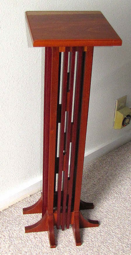
Mission-style Plant Stand by Max Mahanke
Our real connection, though, was the fact that we were the artists in the family, both dabbling - I with my textiles and he with his woodworking - until opportunity later in life allowed us time to get a bit serious about it. We had lengthy talks about following our muses, how neither one of us wanted to create for a market because what we really wanted to produce wasn't very mainstream. We compared working styles and discovered more similarities in technique and process than either of us would have thought. And yes, we groused about how we could never recoup our time, pricing always a conundrum. 

The Dragon Coffee Table by Max Mahanke

I'm hearing now that he was very proud of me pursuing my art. I knew there were pieces that he really liked, just like I liked so many of his, but that he was proud of me? Well, that reminds me a bit of our dad who found it very hard to compliment me to my face but told everyone else about what I was doing that made him proud. Go figure - a guy thing I guess. But now that I think about it, he may have done the big brother thing of ridiculing me over a lot of things, but he never disparaged my art efforts. He was nothing but supportive when it came to that.

2007 Journal Quilt - Sheila Mahanke Barnes

You may remember him from my thread sketch journal portrait. I chose a photo from many I took of him during our last visit in 2005 (had ideas of how to incorporate him in quilts as his visage had started to remind me of Tennyson And Walt Whitman). I had this idea inspired by a poem he shared by T. S. Eliot, using one of these images altered to swirl his long hair and surround him with the mermaids at the end of the poem. No, I have not attempted more than a quick sketch of the idea. 

Blending Mission style with Japanese influence

One thing that does sadden me is that no more of his quirky but beautiful furniture will go out into the world, and that we will never have the opportunity to have the joint exhibit I dreamed of. But I can continue on creating my own art, in my own quirky way, to honor his life, his memory. I can make that mermaid quilt and more.

Past, Present, Future Clock by Max Mahanke

I'm thankful that I badgered him into making one of his Mission-style plant stands for me, and that we talked enough about where some of my inspiration came from that he surprised me with a pen he made from birch wood. I have a few other small pieces like the turned corkscrews, and to my absolute delight, he sent me his ultimate quirky piece - the Past, Present, Future Clock - for my birthday last year. Every piece he made for me has wood chosen for its meaning for me. I am also thankful that I made him a quilt for his bed full of quilting designs that would have special meaning to him (back in 1999), a prayer shawl to stand in for me wrapping my arms around him while he tried to heal (2012), and more recently sent him one of my art quilts he'd mentioned he really liked. As this sentiment from the 1800's so aptly puts it, "Life is short, And we do not have much time to gladden the hearts of those who make the journey with us. So...be swift to love, and make haste to be kind." We could have been kinder and done more to gladden each other's hearts but I am so thankful we did what we did.

Possibly Max's last & best completed table
In this week since I learned of his passing, I've been flipping through my collection of poems and quotations, finding a few like the blessing above, that seem to speak to my feelings, or perhaps reminding me of hard truths, something I might end this post with. But instead, the perfect thing showed up in my feed reader, words from "Pyramid Song" by Radiohead. Not a group I follow, nor do I think my brother followed them, but I sure can place him in these lyrics. 


The song's melody is quite haunting and with these lyrics, I think it is a perfect send-off. Swift journey, brother. There is nothing to fear and nothing to doubt anymore.

Dapper Max in 2011