Tuesday, July 25, 2017

A Little Update

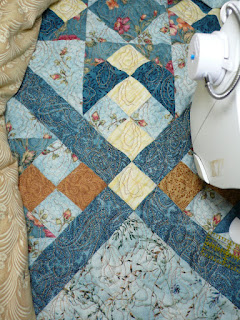
I am reveling in the summery freedom I am feeling this month. I think I have successfully squelched my guilt gene for the moment. I continue to work a bit most days on the fat quarter quilt but there's not much to share since I am just repeating this overall design of paisleys. Each addition of stitches looks the same as the last (except perhaps my individual paisleys are improving). This was a trial of this idea of picking a pattern that could be repeated in rows the length of quilt, ignoring seams I would normally stitch in the ditch or block patterns I would accentuate. So if I liked how it worked, I'd use this method again. If I didn't like it, not a big deal as this quilt is going on my bed. And it only took a few passes for me to start questioning my decision. Not sure I'm that thrilled with what I chose for my quilting pattern - putting a paisley in each of those small squares is making for very dense quilting and I'm not sure I like how it looks continued into the unpieced areas. And no surprise that my surety about thread color almost immediately changed too. Should I go blue or gold? Neither blends with every fabric and the gold thread seemed the most logical at the time. But the way it stands out on the darkest blues were bothering. However, it is growing on me, and probably when I pull it out from under the needle for the last time and give it a wash, I'll be fine with it.

There's been sketching too, and work on the next pocket calendar spread, though not enough as the end of the month is fast approaching and there's quite a bit still to color in. I added another item to my Comforts sketchbook. The heat of summer had me standing in front of the novelty icecream case and remembering how much I liked fudgesicles as a kid. So a box came home with me. A simple thing to draw, following a photo, not the actual fudgesicle of course, but it was a chance for me to work some more with watercolors and one of the new waterbrushes on paper actually meant for wet media. I've also been back to the park on my walking route, arriving just as the sun dips behind the mountain so I am not baking in the sun as I work on sketching a group of flowering plants. It was those purple spears that first caught my eye, and I decided it would be good practice to try to capture just the essence of these flowers with either watercolor or colored pencil. I opted for the pencils for simplicity sake, got the gist of if down on  site, then darkened the whole thing up later that evening while relaxing in front of the tv. 

One connection I've made since following this urban sketching movement is that my brain, being so detail oriented, often automatically strives to capture every detail of my subject exactly, or as completely and exactly as I can. Working with the watercolors and plant life, I have to let some of that go, don't have to draw every leaf and bloom, don't even have to do a line sketch first. This is good to practice and links to my textile work as well. There are times when I could and should back away from so much realism and detail and go for the soft blur of essence.

Speaking of soft blur of essence, I've been back out on the Pend Oreille Bay trail several time but sans camera. The views don't change much, and I was only slightly disappointed I couldn't capture the lovely blue sailboat anchored just off-shore. Sometimes you just have to let the "sharing" and "capturing" thing go and stay in the moment, experiencing the essence of what you are passing through. But I've not left you high and dry. See this post for my first hike on this trail that i DID capture and share.   
Wednesday, July 19, 2017

Successful Dye Runs

Dharma's Sky Blue, Moody Blue and Ashes to Ashes
I am very pleased with the results of my recent dye sessions using the new dye powders from Dharma. Here are the swatches on the worksheets, ready to file.

Sky Blue gradation plus overdyes with leftover dye stock

I did half-yard 4 step gradations which left me with about a quarter cup of dye stock left over of each color. On a separate day, I grabbed the "natural dye" pieces of muslin that barely had any color on them and some of the snowdyes from earlier in the year and used that leftover dye stock to overdye them in large yogurt containers. The camera washes out the lightest step so you'll have to trust me that it does have some lovely light blue on it. The large piece on top was the #2 tangerine snowdye in this picture, which I could find nothing to liked about it. Still not sure how usable it is with the sky blue overdye but I do see improvement. The partially covered piece below it was a muslin natural dye, rolled and accordion folded. None of the tint from the natural dyeing seems to have survived this overdyeing process.

Ashes to Ashes gradation plus overdyes with leftover dye stock

I love love love the Ashes to Ashes grey gradation. Again, the camera washes out the lightest step. My general impression is one of beautiful grey suede somehow. There are slight hints of the orchid I was seeing in the dye bath, but no doubt that it is grey. The large piece on the top is the other natural dye piece, the one that looked slightly pink,, but again, no sign of it after this dye process. I really love the texturing in this piece. The dark piece with all the red is I believe the middle snow dye in this picture. I'm seeing mountains in it, believe it or not, so it may become a wholecloth quilted landscape.


Here's that textured muslin piece again. You can see that there are hints of green in it too, but not in the lightest areas.

Moody Blue gradation plus overdyes with leftover dye stock

Last, here is Moody Blue. As I was ironing it, I decided that if I were naming it, it is what I think of as navy blue. It gave the most stupendous overdyeing of the other two snowdyes in this picture - the red on the right (but on the left in the above shot), the green on the left (but on the right in the above shot). I know I thought I could do something with the leaf-like texturing in the green one, or stamp it with leaves, and I also thought I could work with those red pieces, but I was never really sold or thrilled or motivated by them. Now with the overdyeing, I am.


I tried to be quite diligent with distributing the dye in the fabric well (technical term: mooshing) before setting the bags out in the sun. I was rewarded with good texturing with minimal white/light areas on most of the half yards, which is what I prefer for my gradations.


Perhaps this is why I only spotted one face staring back at me. Can you decipher the white dots and vague oval outline as a face with eyes, nostrils and mouth?

Ashes to Ashes on left, Cotton Black on right

Now with everything processed and swatches on the worksheets, I checked to see how these three dyes differ from what I've used before. Here is Ashes to Ashes next to gradations of ProChem Cotton Black. You can see the issue we had with the gradations shading to green. Although I wouldn't call it a neutral grey (which is something Dharma has come out with since I bought this), Ashes to Ashes still reads as grey throughout the gradation.

Ashes to Ashes on left, Better Black on right

Judi and I had also tried Dharma's Better Black to get a more grey gradation in the lighter steps. It still shaded towards either blue or green, but not as much as the Cotton Black did. Kinda grey, but we constantly had customers asking why we added blue or green steps in our black gradations. Again Ashes to Ashes still reads grey. And since I know it has some red and teal in it somewhere, I am curious what would happen to the darkest step with bleach discharge or dye remover. I have a commercial solid grey that does discharge to a lovely pink.

As for Moody Blue, it is very close to ProChem's indigo procion dye (not to be confused with true indigo dyeing) in spite of the fact that it looked different on the computer screen when I was ordering. Any difference is slightly evident in the lighter steps that look less muted, and it did take more rinses than Sky Blue - an irritating trait of indigo dye. If it remains available and I find myself out of indigo, I might substitute it instead.

Sky Blue on left, Bright Blue on right.

I also checked the on-line color of Sky Blue against my worksheets of various blues to determine if it was different. Again, at the darkest step the difference is minimal, but as the colors grade lighter, the difference begins to show. ProChem's Bright Blue was the closest, but starts shading towards turquoise or aqua, though it is slight. But Sky Blue looks to lean more towards a violet shading, more sky than water (we had given our Bright Blue gradation packs the name "pacific blue"). Definitely room for both in my stash.

Overdye with old indigo dye powder clinging to sides of jar

When I showed the photo of my dye run basking in the sun, I didn't say what that tall plastic jar was doing out there. It once held indigo dye powder, and it seemed to me that quite a bit still clung to the sides of the jar and underside of the lid. Enough, I wagered, to produce at least a lovely pastel tint, so I had saved it. It must be at least 10 years old. I thought there should be enough dye to tone down the white in this "I don't care" print made over an older printing from my first linocut class. That pattern I printed over now looked like ripples in water so adding some blue made sense. When I dumped it out of the jar, rinsed and eventually ironed it, this was the biggest surprise of the overdyes. The muslin had not tinted to blue but to the most lovely shade of lavender, and pretty dark too. I'd only minimally thought about if the printing could survive the dye process which includes several hot water soaks and hand rinsing, with a final go in the washing machine. But now that I was processing, it was foremost on my mind. I opted to do the final Synthropal wash and rinse by hand to save the piece from the extra agitation of the machine, but I do think there was some loss of the red acrylic paint. It didn't seem to affect the background printing and I'm not sure what kind of paint I used. Not too upset about any paint loss, though, as it frees me up to do whatever I want with thread painting or quilting over those leaves. 

Wednesday, July 12, 2017

And The Latest On The Fiber Front...

I did take a bit of a break from things art quilty after the leaf cluster push, but then I remembered I'd promised to focus on the bishop's stole once ArtWalk was off my plate. I edited the design given me after adding a bit to the width and stretching out the design area as well. Everything felt so very cramped. Still some areas to refine but at least I got my ideas for additions and improvements sketched in and as long as I was at it, pulled some fabric possibilities for the various areas. Cut swatches to glue in the appropriate areas and sent it off for approval. Haven't heard back yet and frankly I'm not in a big hurry to proceed. Still mulling how best to execute parts of it.


This is what I did on my July Pause day. I filled the studio with the sounds of Jimmy Buffet and sat at the machine running parallel quilting lines over this "I don't care" print. As you can see, I still have some thread tails to pull to the back and tie off, but since this will likely go in a frame, no burying to do. I was struck by how "at home" I felt at the machine with its familiar hum. I've spent so many hours of my life at the machine doing basic piecing that when I've been away from it for while, coming back to it again sometimes does for me what comfort food does. And I find myself thinking I really should spend more time at it doing basic simple things like this. I was hoping the diagonal quilting would quiet down or mask the business of the background printing but I was surprised to find that it didn't make much difference and rather blended in. Will have to ponder this more. The masking tape along the side was used as a guide when laying down the first line of stitching. When I pulled it up, some of the paint came up with it. Not the acrylic paint I used on the leaf cluster, but the Speedball Fabric Printing ink used in the test printing back in 2013. It smelled to high heaven and took several weeks in the garage to dry enough not to be tacky. After 3 years it should be air cured, plus it got heat applied to it when I heat set the new printing over it. I am so glad I tossed it and moved on to something else.


The fat quarter quilt is back under the needle. Did I mention that most years my July pause lasts more than that one day? Our wedding anniversary falls just a week beyond and so I have the whole week to "do what Allen might want me to do" in the studio, pushing "should be working on" to one side. This time I decided to make good on that thought late last year that if I just did a few rows most days, like the daily drawing I did for a month, rather than think I needed to designate big chunks of time to get it quilted in a backbreaking marathon, I'd be more likely to get it finished. I haven't managed every day, but most of them, spending about an hour and a half to freemotion quilt the two rows top to bottom. The steady progress is heartening, each session a little easier and better, and my body is grateful for the short stints.


I mentioned that I would be trying out the dry-erase pen soon, and I have indeed done that. I need to make a correction. The ink is not actually dry-erase, as you can see on my effort to re-familiarize myself with the fat quarter quilting pattern. I rubbed quite hard on that spot near the top and couldn't get it all to come off. The ink is actually called "waterase", indicating that once the ink has dried on the non-porous surface, it actually needs a damp cloth to remove it. If you decide to "erase" while it is still wet, the cloth needs to be very absorbent. The piece of 80/20 batting I used just moved the ink around on the board rather than soaking it up. Better to let things dry first. And actually, I think I like this feature of the ink, it's not rubbing off easily. And I do appreciate the finer line this pen tip gives me.


Last but not least, today I finally did some dyeing, trying out the new dye colors I bought last December. The fabric had been scoured and ripped into half-yard pieces for this dye session back when I was prepping fabric for snow-dyeing. It DOES take me a long time to get from a to b to c on most grand ideas I have! I went back to my standard low water freezer bag method to produce 4 step gradations of Ashes to Ashes, Sky Blue and Moody Blue. It's been really hot here, another day in the 90's, so I'm trying something I've not done before, although I keep reading about people doing it: leaving the bagged fabric in its dye bath sit in the sun all afternoon. That zap in the microwave before rinsing out my snow-dyes really did seem to have an affect on the results, so why not try a little natural heat on these?


And as a last bit of catch-up, though not fiber related, I finally transferred some plants I'd bought in May into their planters on the back deck sometime in June. (I here you thought I shared everything with you as it happens!) It's not much, but I can see it from the sofa and as I pass through the living room. I refused to buy geraniums again after the deer neatly trimmed all the blooms I'd nurtured off the plants last summer. I hoped they'd leave the columbine and bachelor buttons alone, and I scatter some "bee seeds" in the two small planters.


The first burst of blooms came and went and I feared that might be it, but the columbine rallied and is full of blooms again. The bee seeds sprouted and are almost big enough to thin, the extra moving into other containers. The deer haven't been a problem, or more likely, aren't browsing behind the house right now. 


They are so beautiful and give me such pleasure. I hope they will winter over.  

Monday, July 10, 2017

There Was Sketching...

You may recall that I tried to squeeze in some sketching assignments from a Sketchbook Skool class I signed up for while I was also working on the leaf clusters for ArtWalk. I haven't shared much of that with you, and while I still have 3 sections of the class to work through, once free of the ArtWalk deadline, I've done a few more urban sketches. This rabbit was my choice for the hatching homework from the first section. Somehow I got it all squat and rotund and the background hatching got off-kilter much like parallel or cross-hatch quilting stitches can. I was amused at how many students chose rabbits for this exercise. Well, it WAS around Easter time.

Moody Lane


I'd been waiting for the weather to get better so I could go out to sketch, these two apartment buildings being a juxtaposition I'd wanted to sketch for some time. It still was a blustery day when I headed out, sun often hidden behind clouds and a spit of rain on my open sketchbook surprising me when it was showing through. I do find this toned sketchbook somewhat difficult to work in, but it is the one I've designated for architecture, so there you are. I tried practicing some hatching rather than my usual smudged in shading. It's not as easy as one would think.

McNearney Park
 

The second section was about urban sketching and adding watercolor to line sketches in ink. Both of these were done late May at McNearney Park along my walking route but a week apart. I discovered that the Leuchtturm 1917 sketchbook is not at all suitable for watercolor as I had hoped. The pigment didn't spread but pretty much sank right into the paper, making it fairly impossible to do anything akin to a wash or blend, and it quickly pilled if I worked an area too much with the brush. Perhaps it would hold-up to a spray of ink as was demonstrated in the video that convinced me to buy it, but not to brush action. On the other hand, I did very much like using the waterbrushes I showed in the previous post and learned to use a very light touch on this paper in my testing. One thing we were to do as we sketched in a place near home that we passed by often was to take note of things we hadn't noticed before. This was a big ask for me because I'm constantly scoping out places for future sketching and generally take in my surroundings in quite a bit of detail. I sat in full sun on a boulder at the base of a hill, across from the fence I wanted to sketch, so it wasn't long until I noticed how hot the sun was on my bare arm taking the brunt of it. I also noticed some small bugs crawling around the rocks near me - not ants as I would expect but busy bugs of some kind that in my walking along the path I would not notice. And then there were the trees beyond the fence. I'd studied them before but this time I was more aware of how many different kinds firs and shades of green were represented back there. So yeah, drawing slows you down and makes you really look. The flowering tree was at the opposite end of the park, on a cooler day when sitting in the sun actually felt good. It's another attempt at mastering a brush pen.

Not so good and not so bad - pen and colored pencil
 Once I was freed from finishing up those leaf clusters, I really did itch to go back to McNearney Park to sketch this little log structure that is part of the children's play area. I was way too cocky about my ability to sketch it without some pencil work first. I'd thought about it for so long, planned my attack, and then blew it. Oh, the roofline is pretty good but I totally messed up the proportions on the walls. That front wall should be twice as wide, or probably the logs should have been smaller so that the wall would be proportionally shorter. Eating some major humble pie and couldn't wait to redeem myself by sketching another building long on my list. Actually, just that lovely fan beneath the gable is what caught my eye as I drove by, and every time since. I hadn't really noticed til I was well into the drawing that the house had been remodeled to add a big ugly black window under it. It spoils the sketch, and I suppose I could have found a way to leave it out. Maybe I'll try again and crop it out.


My mind also kept gravitating to a large tree I'd studied at a public garden in town earlier this year. I'd been intrigued with the way the texturing of the bark curved halfway up the trunk. I thought it might make for a good exercise in drawing the negative image, and I'd try again one of my brush pens to do it. Again, the day I planned this turned out to be overcast and blustery but at least I didn't get rained on. And of course, the curving in the bark was not as extreme as I remembered. Oh well, I'm here so let's get to drawing. It was much more difficult to keep track of the negative areas, and I frequently got lost. I moved around to the other side and tried again, with about the same luck. Pretty disappointing. Since I'd used my "and then add red" sketchbook, I played around with adding red with a Sharpie marker. I soon realized I could do a sort of hatching rather than just solidly color in. I must say, it improved my befuddling sketch.


Just the other day, I took some time to go through a suggestion for "creative warm-ups" I'd bookmarked for when I had more time. Basically it's working through various doodling ideas, and if nothing else, I figured it would give me ample practice working with the new Metropolitan fountain pen. I mostly tried to copy the examples rather than print them out or go my own way, and the waves in particular gave me a lot of grief. The whole page was underwhelming, until I remembered to add red (with a gel pen). That really perked it up!

Thursday, July 06, 2017

Shopping Spree

I've been on a bit of a spending spree the last few months. Some of it may fall into the category of retail therapy or just the sudden wanting to have (like the new expanded edition of Welsh Quilts by Jen Jones who I got to see when she brought her lecture and quilts to the US) while other purchases were spurred by recommendations (like The Grid Design Workbook as reviewed by Diane Gaudynski here) and the ever enticing sales and discounts. I'm such a sucker for things on sale, free or reduced shipping offers and coupons. But some of the purchases, while perhaps on sale or qualifying for a coupon, have been things I actually need. As I've been thinking how I would quilt the snow-dyed kaleidoscope, I went on a button hunt for the perfect one for its center. The ones shown in the photo above came from 3 different stores, the ones in the center being hand-made. I was sure that one of them would be the perfect choice, that is until the next store where I found the metal button on the right. I find hunting for this sort of thing on-line to be frustrating as you sort of need to hold the item in your hand to get the best idea of its size, color and appropriateness for your project.


Threads are kind of like that too, and while I was in the quasi-big city seeing my doctor, I not only found the buttons but also took advantage of some coupons at JoAnn's to stock up on thread. Nearly out of that sparkly blue thread used on one of the Leaf Clusters, but at 50% off, what else might I pick up that I can't get in my little home town? Again, it's so different standing in front of any thread display vs viewing on line. I swooned over the sparkly red and then noted they carried Sulky's PolyLite. I'd received a complimentary spool of it in a thread order awhile back and was surprised at how much I liked it. Now I stocked up on a few colors at half price...and no shipping! I also had coupons to apply to more clothesline for coiled fabric baskets and eco felt that I sometimes use in lieu of batting.


In the "new obsession gotta have" category, I've bought a new fountain pen and yes, the availability of that color was part of the appeal. It's a fine nib Pilot Metropolitan Pop, recommended as a good, reasonably priced entry level pen, and I can't believe how silkily it glides across the page. I've also been buying different colors of ink for the other pens in my collection, and added the two Noodler inks to my pen order partly because each came with a free pen. Yeah, I'm a sucker for free. And did you know you could buy refillable dry erase pens and ink? That's what you see on the right (the ink is mostly permanent on paper but wipes off non-porous surfaces). The tip is so much finer than the dry erase pens that come with the dry erase boards. I'd just bought a small board with the idea of practicing machine quilting designs on it but I've always struggled with that because of the pens that do not come close to matching the width of the actual quilting lines. It's getting a tryout this week.


Then there were the recommendations for brushes I gleaned from my Sketchbook Skool Class. Longing to add color to my urban sketches and admiring what others were doing with watercolor, I appreciated the handy information. Cheap Joe's is one of my favorite places to look for quality art supplies at reduced prices, and what you see here I think actually is from two orders and fails to include the glue brush and bookbinder needles that got ordered along with the waxed linen thread and awl, on sale of course. But back to the brushes; although I have a little travel set of good quality watercolors, I've been lacking in brushes to take with it. I'd heard of water brushes, and not one to be able to decide between sizes, got both a medium and large one. I have tried these out and they are wonderful in the field, and for what I do, probably wonderful closer to home. The big brush is a legit travel brush with a cap that slips over the other end to extend the length of the handle when in use. Most in the class questioned the teacher's use of such a big brush tip, but then watched as she used it to both lay in color in larger areas and then use the fine tip it comes to in detail work. I've not had a chance to give it a go and am hoping the teacher was right when it comes to my lesser skills. Even at discount and with nylon as opposed to sable bristles, it was not cheap.


My most recent purchase is simply a frill and my falling for a sampler set of brush pens. There are so many different kinds of brush pens on the market, and even though the two I have bought so far were the hands down favorite of different and vastly more experienced sketchers and letterers than I, I have struggled with getting the same kind of effect I see on line with either of them. Maybe I just don't know how to use them yet, or maybe there's something better suited for how I sketch and letter. These weren't any cheaper than if I'd bought them individually (but qualified for free shipping!), but at least I didn't have to pick them out. They are all by the Kuretake company out of Japan and with the exception of the Zig Cartoonist Mangaka Flexible and the Zig Clean Color watercolor Real Brush, there's no English on the packaging or pens. I'll have to keep close tabs on the packing slip and pen packaging so that if I really like one or more, I'll know what to reorder. I've seen that clean color watercolor brush pen demoed on the Joggles.com site here and I may be the most interested in that one as it comes in many colors and might be a substitute for watercolor paint in pans (for what I do). There's also one that is essentially a fountain pen with a brush end rather than a nib, so refillable with fountain pen ink. As for the others, there are a variety of tip sizes (which I suspect may be my issue with my other brush pens) and JetPens.com has a lot of information and even videos to refer to.

So with all these purchases, one might think I'm getting ready to dive into some big project. But no. It feels more like preparation still, gathering up a lot of things I've felt were missing should I get that urge to focus on bookbinding, sketching or that next quilt languishing on the design wall. Retail therapy, a weakness for deals, and that feeling we all get that if we just had more or better tools, we'd quit procrastinating! And perhaps I will. :-) 

Wednesday, July 05, 2017

My July Pause

Allen attempting a quite moment at Camp Cross
Every year on this day, about half-way through the year, I pause to spend some quality time with the memory of my late husband who died all the way back in 2000. I generally spend the days leading up to this anniversary considering how I might spend the day to best feel closer to him, whether it be listening to his favorite music or fixing his favorite food, paging through photos or just being alone with my thoughts. I often consider what I think he might like me to be doing that I've been putting off, like working on a specific project in the studio or getting out for a hike or a sit by the lake. I still think of him often, if not daily, in the course of my passing days, and sense his spirit remains close, guiding (or more often shoving) me along. But it is good to block out this particular piece of time for less distracted reveling in his memory.

I've been going through the posts I've written each year at this time, mostly to check to see what photos I've already shared, but this time I've also read what I wrote to go along with them. If anyone tells you that grieving has a beginning and an end with ordered steps along the way, steps that everyone goes through in the same way, don't you believe them. As I am now fond of telling others, the depth of our grief should match the depth of our love for the person now gone, and while it will lessen and change its shape over time, it will always be with us, as it should be. Grief is not something to get over. Grief is the way we deal with continuing to live without those we cherish, and help keep a part of them alive, and everyone grieves in their own time and way. Read those yearly posts of mine and you will see me hinting at this, how each year is a bit different and definitely done my way.

As for this year, I share with you a photo a friend sent me a couple of years ago, one I'd not seen but that this friend, was going through his 40 year old slides of our camp counselor experiences, knew I would want to have. Such a treasure as I have none quite like this, Allen sitting atop pilings at Camp Cross on Coeur d'Alene Lake. It's probably from the first year we counseled there, the session ending two days before our wedding (which is a whole other wonderful tale). In a way, it encapsulates his personality: a bit of a loner, often getting away from the crowd for some quiet contemplation; a risk taker (I'D never climb up onto those pilings!), pushing himself in so many ways to get better, learn more, do good for others; and I think he's giving the photographer "the look", one of challenge he often used and which worked pretty well on those campers we were counseling, and could keep me in line when I needed it too (although I was known to give the look right back!) It takes me right back to those early days of getting to know each other, and the magic of those few summers we spent time isolated at that camp on the lake.

Allen getting a wet hug from a his campers


Saturday, July 01, 2017

July!

I really enjoyed working on this July spread in my pocket calendar. After the dense designs in previous months, there was a real freedom and freshness to the individual flowers spread out and floating on a white background. Again, I found myself questioning how these flowers are colored in real life when I could determine what kind they might be. Eventually I let that go and just colored away with my cheapie pencils. One thing different I tried in an effort to give the yellow blooms some interest and dimension was to lightly pencil in some green along the lines and around leaves to create some shadowing. I've used a bit of orange or red before but it didn't seem right for this. But I wasn't sure about the green either, but I needn't have worried. I really like the look.