As I've noted before, working with photo manipulation software can be quite addictive. I've been playing more with the idea of coming up with additional designs I can print out for padfolios like the ones here. This time, I started with my day lily photo above. Its landscape orientation makes it easier to fit on my 8-1/2 x 15 inch template.

Previously I've done all the running through filters with the original image in its original size, then worked to make it fit on the longer orientation. This time I pasted the original image onto the padfolio template and stretched it to fit. Only then did I started playing with the filters with an eye towards designs that would look good as padfolios. Not all cool designs will work equally well I'm thinking. Remember that this fabric will fold at about the 5-1/2 inch mark and fold again to create a flap about 3 inches wide. I think this kaleidoscope filtered one would be pretty exciting, the center being offset on the back of the padfolio.

This kaleidoscope one is a bit tamer, but subtle can be nice too, and stitching will jazz it up.

Of course, if orange is not your thing, you can always play with the color adjustment bars.

And I couldn't resist running it through the "puddle" displacement map.

I perused my files of earlier photo manipulations and decided to work with this one based on azalea blooms. Rather than stretch or tile it as I've done before, I decided to play with varying sizes overlapping.


I have someone interested in some of these for the men in her life, so I was looking for colors and designs more applicable to that gender. My file of manipulations based on a photo of icicles provided some possibilities. Above are 2 different wave manipulations stretched to fit.


And these two use yet another wave manipulation. The top one uses the portrait orientation repeated side by side, but not sized down to fit the width. That allows the one on the left to be positioned slightly higher. The one below is the manipulation in landscape orientation and stretched to fit.

This one was the same icicles photo put through the pattern filter. It is tiled to cover the space to avoid the distortion that stretching would cause.

I'd also been playing with my pansy picture, the one I'd done a seamless tile on but hadn't come up with anything I liked. I stopped with this version, tiling the seamless tile across my template.

Then I got to work and stumbled on some great versions. This one quite stunning but I'm not sure it's padfolio material.

Another kaleidoscope I just love it reminds me of a china pattern.

This one was run through the displacement map filter set on wave zoom, but tiled instead of stretched. I played with the rotation a bit and really like what I came up with.


 Three equally likable versions run through the wave filter.
 And finally the "puddle" displacement map version - I have a lot to play with here! So a friend asked if, now that I have a printer that I can print my own fabric with, will I ever need to buy commercial fabric again? But of course! Woman cannot live by 13 x 44 inch fabric pieces alone! I doubt I'll ever not be enticed by batiks. No way could my limited imagination come up with everything I might need to pull off my quilt art. Not to worry, fabric stores - I'll be returning...

Having grown up in northern Idaho, I am well aware of the devastating fires of 1910 that burned 3 million acres of forest in Idaho, Montana and Washington over a 3 day period in August. This weekend marked the 100 year anniversary of what is sometimes called The Big Burn, and my hometown commemorated it with the unveiling of a memorial to the fire fighters who lost their lives fighting it. But the real reason I traveled to Wallace was to hike the newly refurbished trail to the mining tunnel where Ed Pulaski and his crew rode out the fire and lived to tell about it.

The Pulaski Tunnel Trail follows the West Fork of Placer Creek up a narrow canyon for 2 miles, gaining about 1000 feet in elevation in the process. I spent many hours of my youth hiking up old logging roads and scrambling up game trails in these mountains, but I'm no longer a youth, and haven't done much hiking of even modest trails for quite awhile. The length of the hike didn't worry me, but that elevation rise did. This benign start to the hike didn't fool me for a minute.

As I looked up the canyon, I was reminded of the prevalence of tall cottonwoods along the streams here.

And how tenacious the trees can be as they cling to near vertical slopes.

The narrow canyons are often shady the bulk of the day - perfect for lush ferns along the creek.

I was hoping to see lots of wildflowers, but there weren't many - the first open area along the trail sported these.

It wasn't long before the trail steepened. It wasn't long until I started to doubt I had the stamina to make it much past 1/2 a mile! Am I that out of shape, or could I still be recovering from the effects of that virus back in March. Yeah, that's it - the virus - that's the story I'm sticking with. A woman jogging back down the trail asked if I had any sugar in my pack - her uncle was up ahead and having "blood sugar issues." I didn't want to admit I was having issues of my own, so assured her I'd forge ahead and share a nutroll with him while she continued to her car. We conveniently found each other where there was a bench, and sat for a bit. Lingering to make sure he had sufficiently recovered was a good excuse to linger to make sure I had sufficiently recovered. With his encouragement, I decided to push on at least to the mile mark.

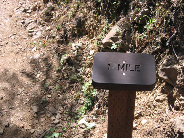
And here it is. They have thoughtfully placed markers every quarter mile which was very helpful in gauging one's progress and ability to make it to the top.

I don't know the elevation, but knew I was getting up a ways when I spotted these Indian Paintbrush - these bring back some great childhood memories.

There are still charred trees from that fire to be seen, this one right next to the trail, and looming quite tall.

The trail has climbed high enough to start getting some views, though I have to admit, no sweeping panoramas. Most places the canyon is so narrow one could easily lob a rock from one side to the other. The forests have grown back thick, these firs tall. There are the occasional open spots like the one on top of the mountain here. We could see one from our house and would watch elk through binoculars as they grazed or bedded down in the sun. The only wildlife I saw this day was a squirrel, and lots of butterflies.

The last part of the trail was very steep, but finally leveled out to reveal this encouraging sign.

And yes, I'd made it! All along the trail are signs like these, telling the history of the fire and Ed Pulaski in particular.

From the vantage point of the trail, one looks down at the mine tunnel opening, the small creek which afforded no shelter running right in front of it, again, a stone's throw from one side of the canyon to the other. It's not difficult to imagine the fires consuming trees on either side, acting like a chimney, and no escape for man or animal trapped there. Even more amazing to me than their survival in the cave is their trek back down that narrow canyon after the fires had died down. If you've seen pictures of the trees downed when Mt St Helen erupted, you have a good idea of what this area looked like. But add to the jumble of fallen trees blocking the way the fact that everything was still quite hot and the men's shoes already had the soles burned off. Most had bad burns, some were blinded. They walked three miles back to Wallace in that condition.

But for me, here's the confirmation that I had hiked the 2 miles up. What with my lallygagging , picture taking and frequent rest stops, it took me about an hour and a half - more than I'd estimated.

And my trip back down the canyon would be easy in comparison to Ed Pulaski's crew.

Although it was not all downhill. There are places where the trail does a bit of a roller coaster, so there were a few steep inclines on the way down, but nothing like the trek up.

You always see different things on the way down. I spotted these very tall snags which may or may not be from the 1910 fire. They were like spires.

One was very charred in the middle.

Every now and then, you can spot a rock outcropping.

The water in this creek is so clear you can barely see it in the photo - just beautiful.

A view down the canyon towards the trailhead.

Another view of the creek - brushed in for sure.

And look what I found as I neared the trailhead. This woman has the right idea! She knew she physically could not hike far up the trail, so sent her party along, grabbed a book (on the 1910 fire of course) and found this log to settle in on. She's also a native of Wallace, though lives in Montana now. Maiden name Nancy Horne and graduated a year behind my older brother. We shared stories of teachers we had in common.
By the time I headed down, a lot more people were on the trail, and I did even more lallygagging and picture taking than I did on the way up. Thus, it took me almost as long to get down as it did to get up. It was fun, though, to chat and find out each person's connection to the area, share my own. I was pooped, my feet sore, and was really wishing I didn't have a 2 hour drive home...
"Fear is lack of knowledge, is the space in an empty cup, fill it and fear will be gone. Creativity is the ability to believe you can fill that cup." Javi
Today was not about making great art, not even about making good art. Today was about getting in the studio and doing some work, proceeding past the staring stage, just picking up a spool of thread without much thought and beginning. I'm tired of looking at the two painted scraps and trying to decide what to do with them, not interested in setting them aside for later. They are standing in the way of the next project I want to do. So today, we dispatched with them, for better or worse.
 I began with the one with the most visible landscape qualities (to my eye). I'd decided what was holding me back was what color of thread to use. A spool of King Tut thread in variegated rusts and golds was sitting on the ironing board. I pooled a length over the postcard and decided why not? Not at all what I'd been thinking, but I liked the look in the upper section, outlining the mountains, the break in the clouds, swirling across the sky. I continued to use it to define the road and then started filling in that space. With what, was the question, and I found myself making small circles in the garnet stitch. Not exactly the look I wanted, but then I thought to overlap the circles. That gave me the more gravelly texture I was looking for. However, I was sorry I didn't use a different, lighter value thread. Too late - now what to do with the ground. Switching to a variegated green thread, I started at the bottom adding grass along the road. I moved up towards the mountains and tried to stitch in tiny tuffs of something. Not as successful. Moved back toward the grass and stitched in an intermediate size that I liked. But overall, it looked a little flat, a little confusing. Don't look too closely at the deer I added - it has a bum leg, but at least it adds something to the view, a focus and some perspective. It probably belongs in the mountains, not out here in the flatlands, but it was all I had. A good learning piece, I've decided.
 On to the next one. Today also seemed to be about letting go of an idea in order to move forward. Although I could still see the portal, I had to admit I didn't want to add more of the large garnet stitch to form a stone wall, partly because I didn't think the thread color was right. The heck with it, turn it vertically, remove the quilting and start thinking of this little strip of land with the big big sky towering over it. Maybe a row of trees along the ridgeline. No, that's not really a ridge. It's reminding me of the Palouse hills, and now I'm thinking a building in silhouette flanked by trees might be interesting. I sketched some to work it out but was dissatisfied with my house, pretty sure I was not getting the angles right. I decided to take a break and check my photo archives in the computer, look at the pictures I'd taken of the Palouse, see what kind of trees prevail, look up some barn photos for perspective. As I paged through these I stumbled upon some with windmills along the hill tops and suddenly remembered all the reference photos I'd taken at Maryhill Museum last year. Yes, windmills against the big big sky would be just the thing. Only the white thread did not stand out on the background as I'd expected. So I stitched around each with a black/grey Sulky ultra twist thread. They're a little wonky but at least I've made the first attempt at using windmills.

Somehow last week wasn't as productive as I thought it would be, but I did get started on some more fabric postcards. Annabel had shown an interest in my postcards and proposed an exchange the next time I got around to making some. That was months ago, and she has recently made good on her end of the bargain, so time for me to get with it. I wasn't sure just what I would work with, but after stalling out with one idea, I turned to some painted fabric trimmed off my two Bishop's Close quilts. I'd already made two nice postcards from them, so decided it was time to use up what was left - more clutter off the work table. I started with pieces already seamed, but needing a tad added to the width. In the example here, I inserted a narrow piece of piping, then thread painted a stream, tree and birds. It's what I was seeing in the random placement of the paint colors, a little landscape and I composed a scene not unlike one of the previous postcards. I've already had a comment that it has an Asian feel to it, being so sparse. I'm not totally happy with the water, and thinking I need to move on from these stark scenes. They're starting to feel creepy to me, like all of humanity has disappeared.
 So on to the next one. Again, the two seamed pieces were a little shy of width so another strip was added, no piping. I was in a threadpainting mood and had been trying to sketch out a poppy. Stem and leaves no problem, but I find poppies a little difficult to depict. I recalled having some poppy fabric so dragged it out, hoping I could trace or sketch a bloom from it. Trying to envision this threadpainted bloom in dark thread, not feeling it would look right, not sure about using multiple thread colors, yes I was unsure about the whole idea. And then it hit me - why not just fussy cut from the fabric and fuse it down? Duh! Then I could add thread painting over it. I cut from four different sections to get the bloom and stem/leaves that I needed and played with them until I was satisfied with the arrangement. I'm really happy with the way this one came out and am sending it to Annabel. She will be getting a snippet of my old work (fabric from the Bishop's Close quilts) and precursor to a new series I'll be launching soon using the color palette of poppies and peonies from my garden. Working with this poppy, even though it is unlike the poppies I'll be using as inspiration, feels like playing the prelude in a symphony: laying groundwork, opening a door, saying I've begun the journey of heading in a new direction.

I had a long strip of painted fabric wide enough and long enough for two more postcards, no piecing of scraps. They were supposed to be finished last week too, but I'm stuck. Both suggest something but I'm not sure how to pull that out so others can easily see it, and do so in an interesting way. The piece on the left already had a little quilting on it - a test area - and I can see it being extended upward to represent a wall. The yellow suggests a doorway. My idea doesn't seem enough. If I can't get excited about it, why should anyone else? Turned the other way, it becomes another landscape, narrow ground, large sky, but again, how to make it interesting, what to add? The one on the right even more so says landscape to me, a desert scene with a road in the foreground and stark mountains in the background. I couldn't bring myself to put needle to it. I don't have any sense of how to make it come alive with quilting. And so I've set these two aside for the moment. Maybe I should just settle for using them as backgrounds to a totally unrelated bit of applique.
 Finally, I must share with you Annabel's part of the exchange. Postcards are not her thing, but she was willing to give it a go. I didn't care what she sent me - just excited to have a piece of her work. She makes bookmarks to sell along with other small items at some of the local exhibits she participates in. Would a bookmark be equitable, she wondered? Yes indeed! It has every bit as much work in it as postcards and is functional as well. Thanks!
As always, you may click on any picture for a larger view.

This should look familiar. I made a similar padfolio for a friend and had enough fabric left from the fat quarter for a second one for me. Except I noted I wanted to finish the inside a bit differently. It's kind of hard to see in the picture, but I used the tie closure again, this time stitching it right into the side while satin stitching the pockets.

I wanted to make this one suitable for a journal or sketchbook insert so I modified the pockets to open at the side, not the top. I'd already cut fabric for the pen pocket, so seamed the sides and top-stitched it to the larger pocket on the left. I looked for spiral notebooks, but apparently they don't make them this size. So I moved on to the idea of a sketchbook that I could make myself. I found a pad of 8 x 10" sketch paper which, when folded in half, would be the perfect size.

Well, almost perfect. The 10 inch dimension included almost 1/2 an inch beyond the perforation, so the individual pages are a tad narrower than I wanted, but I still think usable. I used directions for making a basic codex from the book "Cover to Cover" by Shereen LaPlantz. Three signatures of 4 folded sheets each turned out to be the proper thickness for this folio. This is my first try at bookbinding as it were, and while I could have snugged up the buttonhole thread a bit more as I added each signature, I thought it turned out pretty well for a first effort.

I was undecided about whether to include a cardstock cover, but in the end decided the folio itself is supposed to serve that function. I also couldn't decide whether to slip both first and last pages into the pockets or just the last page into the right pocket. After taking this picture, I slipped the front into the pocket too and I think that is the way to go. Another option would be to sew the signatures into the padfolio itself, that space between the stiff Peltex acting as a spine. But for this first run, I decided I wanted something I could easily remove. If the drawings are worth it, once the pages are filled, I can remove it and add a special cover. Or separate the pages, keeping only those that I think are worthwhile saving.

Yes, here I am at post #900, pretty amazing considering that when I started the blog, I wasn't sure I'd find something to say even once a week or how long I'd keep it up. As long as I have readers, I guess I'll always be able to find things to share. Like how impressed I am with my first trial runs printing fabric with the new Epson Workforce 1100 printer. Everything I've heard about how different pigment inks like the Durabrites look on fabric compared to regular dye inks seems to be true. And no pre-treating the fabric! I used some of my poppy photo manipulations, printed a sample on matte presentation paper (propped against the monitor in the above picture), then on white cotton muslin. Virtually no difference in what I see on the screen, the paper print and the fabric print. This opens up a whole new world...

Of course, there was a tad of a learning curve. I set up the printer, installed the software, scanned the on-screen manual to determine features and procedures different from my other Epson, and decided to run a test by printing a few photos of recent quilts on glossy photo paper. Mmmm, they came out dark and cloudy and not too sharp - a few errant lines as well. So I ran the alignment function, tried turning off the high speed function and printed again. Better, but the dark, cloudiness remained (top). I spent quite a bit of time playing with the various settings in the printer software, thinking that my photo programs and the printer program weren't cooperating to sync up the colors. I printed quite a few before it occurred to me to try printing on the matte paper. Ah, that was perfect (bottom). I guess I should have believed Epson when it said to use the proper paper. While I have had no problem using this HP photo paper with the other Epson printer, apparently Durabrite inks are a different matter and simply don't work on it.

Other lessons learned - this printer does not like curling paper. Of course, the fabric must be adhered to something firm in order for it to feed properly, and my first attempt of ironing it to a double layer of Reynolds freezer paper was dicey - I couldn't get it to lie flat and there were some pretty ugly sounds coming out of the printer (but fortunately no jams). So I reverted back to my heavier freezer paper sheets by C. Jenkins (definitely worth the extra price). Since I plan to use this printed fabric in padfolios, it only needed to be 8-1/2" wide, but the length needed to be a non-standard 15" long. The printer allows you to create user defined sizes, so that was not a problem. However, the freezer paper was a standard 11" long. By overlapping two sheets, I was able to get my length, and this time it ran through the printer perfectly and quietly. I see that this freezer paper also comes in rolls and 12 x 15 inch sheets, so I guess I'll have to invest! I'm not sure if it was necessary, but I used the "thick paper" setting which I gather is usually used for envelopes. I also set up my user defined size for borderless printing. Worked like a charm. I am so looking forward to doing more of this.


 Three equally likable versions run through the wave filter.