Time for another update on my Sunday Positively Creative Art Journaling. This week's exercise went much better, no doubt because I had already revisited the issues that came up last week, put my theories to the test, and enjoyed a much better outcome. But before I get to that, I have to show you what I did to a spread between two previous exercises that I'd left unworked. I found that I didn't want to cover up that right-hand page of the original diary entry because of my laughable drawings of a woman, man and child, and because of the quotation in the middle of the page: "If one does only what needs to be done, one most likely shall never have fun." Something I constantly have to be reminded of. I covered up the rest of the page testing out how one might use a fan brush (one must be very careful not to load too much paint on it). I really didn't want to paint the other side and had run across this fun illustration of the white-haired woman on a motorcycle, so I found a mountain scene that would fill the page behind her. Some of my fondest memories are riding behind my husband on his motorcycle as we explored wooded and mountainous areas. Remember, this is basically a happiness journal.
As for working out my miscues of last Sunday, I decided I was approaching the paint backwards. Instead of adding a little white to lighten my colors, I should be adding a little color to darken my white. And this time, I laid down the yellow on the page first, then scraped the lovely lavender (or is it orchid?) over it. Now there's a spread that can be written over, and the marks made between layers are less obtrusive.
I was still feeling that yellow might not be the best pairing with the violet paint (I've been calling it purple, but I just now thought to look on the jar for the name), and wasn't sure what I'd be journaling over it. But in the course of paging through magazines for things for this week's exercise, I decided to cut out some pictures that had caught my interest before. Just to set aside for future use perhaps. But instead, they got pasted onto this spread. The one on the left reminds me of Jane Sassaman's work, and look - that yellow flower is the same mustard yellow I've been using on these pages. So in it went. As for the big half-flower on the right, it's a bit of a stretch to pair its color with the violet, but in some odd way it looks to be working. Plus there's that yellow center. So in it went too - let's not over-think this stuff. I think I'm going to add some Zentangling around these two images to embellish them. Even as is, they make me smile. By the way, both of these pages are to be viewed with the journal turned to landscape orientation.
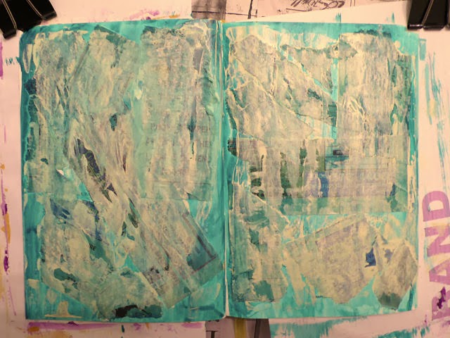
Now for this week's exercise which called for tearing pages from a phone book into strips and gluing them to the unpainted page. I'm wishing I knew what we are going for here as of course the next step will be to cover the page with a couple of layers of paint which "may or may not cover up the strips."
I soon found out. The tissue-like consistency of the telephone book pages soaked up the paint much differently than the paper they were glued to. Plus paint piled up along the edges of the strips. I was excited! The first pass of paint (white with a little green added) covered the printing more so than this photo would lead you to believe.
For the second pass of paint, I tinted my white with a little yellow which gave me a creamy color. I tried the scraping technique but found it hard to manage and get good coverage over the surface that was no longer smooth. And I found I wasn't too crazy about the cream over the page. Plain white would have pleased me more. I decided to use a baby wipe to see if I could even out the paint colors, and it helped some. Again, the camera lies a bit - the underlying paper strips do not actually show through as being that black.
I decided to go back in with more white slightly tinted with the green and a bit watered down which did even things out and lighten up the creaminess. Some lettering peeps through just the right amount and I'm really loving the extra dimension of the strips. Still questioning the yellowness but decided it was time to let it dry and start thinking about what to fill the spread with to answer the prompt of "what makes you laugh?"
I really enjoyed the journaling part of this, from searching magazines for pictures and words, to arranging everything on the page, to adding text describing things that make me laugh. There's a messiness to the background that still bothers me (personal aesthetic here) but overall I'm ok with it and what I learned from the process. The quotation is an anonymous one provided by Dale Ann:
"Laughter attracts joy, releases negativity and leads to miraculous cures."
May your day be full of laughter...perhaps starting with my fumbling art journaling attempts!


1 comment:
Sheila - I love this. It's a journal so it doesn't really matter but I love the way you are really seeing what colours work together. I have some sketchbook pages I hate, but they still have a place. Hilary xx
Post a Comment