Tuesday, March 31, 2015

Back to the Road Map

Master pattern road map guiding proper placement of overlapping units
My art group met early last week, giving me the thumbs up on my fabric choices for the fountain wall - not that there was much I could have done at that point if they hadn't. I'd fused fabric to the rest of the pieces of Stiff Stuff and done the satin stitching before the meeting. But it was a relief to have their approval along with substantiating reasonings. We also discussed the "water" stitching and how I'm thinking of joining it all together. So with much more confidence than I'd felt before their input, I've been forging ahead. As I completed more units, I realized I could use my "road map" (master pattern) once again, this time to arrange them in their proper spacing and overlap, a little like when building up applique pieces on a Teflon sheet over a master pattern before fusing into a single unit.


Had I known I'd be using the same fabric for the entire lower right and bottom section, I probably would have cut it in one piece. Instead, I had 3 pieces to join together, and that posed a slight technical issue to figure out. Because of the jog along the right side, I'd be butting two finished edges together, one shorter than the other, and satin stitching them together. What would I do when I reached the end of the shorter one so that the satin stitching would not just end, but wrap around to the back like on all the other units? After much thought, I decided that the corner on that short piece did not have to be mitered, but could be turned straight back. If I offset the satin stitching so that it just caught the edge of the longer piece, this would set me up to be able to continue stitching past the edge of the interfacing.


A bit tricky but with pins to guide where the interfacing ended, I could pull that extra turnover away from the other unit and only stitch on it.


Now that edge could be turned and fused to the back for a clean finish. Once that was done, I could butt the next unit to the left, matching the grout lines and satin stitching in the same way. What a relief to have that done.


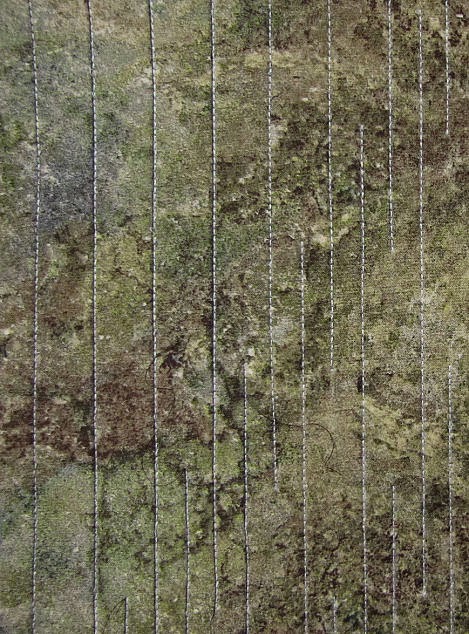
Now it was time to return to those straight water lines that weren't showing up well enough. I can't thank Mary Stori enough for her advice about going lighter or darker to make a line show up. I might still be trying additions of light thread, essentially adding light value on top of light value had she not reminded me of that truth. I tried the same grey as used for the grout - you know, being consistent. It helped but still did not give the contrast needed over the lighter areas of the fabric. The variegated metallic thread did even less. I got to thinking I'd rather use a rayon or poly thread anyway (the white thread is rayon) so checked to see what I had in black. But wait! As I opened my thread cabinet, I remembered my favorite thread - Sulky Ultra Twist. And I had some in two different dark browns. The difference in value was very slight so I was very surprised that the lighter one did not do as much as the darker one. In the above picture, the first white line on the left has the lighter value brown stitched next to it, the next 4 have the darker one.


I like the idea of the brown rather than black - again that consistency thing since there is the same brown in the fabric - but really, it's more the value. I put my ever present conservative thinking aside and proceeded to stitch the darkest brown thread next to all the white lines before I could change my mind. Even so, I worried that it was too much once I was done. But I had decided to "go bold or go home" and seeing it the next morning next to the upper water unit and its stitching, I felt they were showing up pretty much the same. I turned the remaining edges of both sections to the back, fusing them in place and ending any more question of further diddling. All units are now finished and ready for assembly. I've been rethinking my original idea of how I'd do this, as I was not satisfied with what I did on the sample. This is the week I have to try them out and commit.  

Monday, March 30, 2015

Another Faded Shed

We're having a sweatshirt-warm day today, too nice not to include a pause in my walk to sketch another shed along my route. This is on the same property as the shed I sketched here, but closer to the house. Not a garage - there actually is a garage right behind the house and painted to match it - but some kind of outbuilding for what was once a working farm perhaps. I think getting a car through the big doors would be tight. To give you some perspective, one would have to stoop to go through the smaller door. Like the other shed, it too still has some of the original white paint on the upper portions, but most of the boards are weathered and in some cases, nearly black.

I had such success using just graphite pencil and white charcoal on my last urban sketch that I decided to use it again on this. Partway through, I wished I'd brought a water soluble graphite pencil as well so I could smudge in those greying boards like I did on the other shed, but then I would have wanted to add more color too. This time I wanted to go for a simple pared down effect with a little shading from the graphite and let those white highlights shine. I added the streak of white along some of the trees in the background as I have before - such a nice touch on this toned paper - and the bit of snow still clinging to the mountain where the ski resort is. Poor ski resort - it had to close for the season this weekend. We simply have not had much snow.

I still find it interesting how much detail our brains filter out when generally viewing. I was well into the sketch before I noticed that metal bar leaning across the smaller door. Once focused on it, I then saw its very dark shadow angling the other direction. I didn't get much other shadow worked well into the sketch, but I was pleased and proud of that one. And it wasn't until I was totally done drawing and filling in the white areas with the white charcoal that I spotted the hinges and hasp on the doors. The hinges were gleaming particularly white so how had I missed them? I'm going to blame it on the fact that when I started sketching the sun was partly obscured by clouds, but as I finished up, it had broken free of them. Yeah, that was it, right? 

Saturday, March 21, 2015

Happy Quilting Day!


In case you missed it, today in National Quilting Day. Actually, this holiday has been expanded as of late and this year is being celebrated as a worldwide event including the entire weekend. Well, why not?

So you dang well better be doing something quiltie today, be it working in your studio, sewing with a group, demoing in public, viewing quilts somewhere or checking out some shops that will be more than willing to help you add to your stashes.

As for me, I'm moving forward on the fountain wall quilt. I've thought about all you've said in answer to my question about the variations I'm considering, plus input on Facebook and from my art group. I was rather surprised that there was not more differing of opinion. Variation 4 is the overwhelming favorite, and I have to admit it appears the best choice even though I still really want to do Variation 2. Variation 4 was still on the design wall this morning, so to be extra sure, I switched out some fabric into Variation 2. Yes, I like it, but my eye did the same thing I remember it doing every time I've had this one up. It moves toward a whiter vertical texturing in the brown fabric. It's a distraction that keeps the eye or at least my eye, from the focus of the quilt, which really is the dark water section in the middle. So onward!

What are you doing to celebrate Quilting Day?

Tuesday, March 17, 2015

Another Quandary

Reference photo of section of fountain wall
Trying to visual only takes you so far...

I had a bit of an epiphany yesterday concerning the bottom section of the fountain wall. Looking at my reference photo again in hopes of sorting out my confusion, I realized I didn't have to work two different fabrics into it just because I had physically divided the space and done so on my sample. It could be all the same fabric, broken up by the grout line stitching. Very possible that this newest brown fabric would not need any "improving" with paint. But I'd also considered a few other combinations and the image of each would not hold in my head long enough for proper comparison. Oh yeah, next epiphany - photograph each variation and view on the computer. Better yet - once in Paint Shop Pro, I could add lines emulating the stitching lines to come. I'd already seen how those lines changed my perceptions when I did them for real.

Variation 1

Bear in mind that the colors aren't quite perfect - some of the golden tones in the lighter fabrics have been washed out, but I think the values are fairly true. The top row and left hand side are actually complete; the sections on the right below the top row are the ones in question. Also remember that my point is to accentuate the step-down nature of the fountain wall, wanting to encourage the eye to move from upper right to lower left. In the version above, I added a strip of the fabric used on the lower left, because it was no where else and has that bluish grey that is in the top batik. Nice thought but it pulls the eye back to the right and strikes me as looking out of place.

Variation 2

Same version but with all brown at the bottom. Note that the fabric between the brown and the top row is the same as the top row fabric. I'm thinking that helps with the step down idea and swings the eye around if it tracks left to right from the top.

Variation 3

But I'm still bugged about having that greyish fabric in only one spot, so I've tried it in that position between the brown and top row. I feel that it stops the flow of the step-down movement, creating too much of a segment by segment effect. But I could be wrong

Variation 4

What if I let go of adding the brown altogether and surround my dark "water" section with the grey/tan fabric, reinserting the lighter stone fabric in between it and the top row? Not sure, not sure, not sure...

Paint Shop Pro composite of variations

In Paint Shop Pro, I can change the window configuration in several ways. I normally have it set to show one photo at a time if more than one is open, with tabs along the top that I can click to move from one photo to another. But I can also tile them in various ways, including like this so I can see these four versions side by side. I can roll back in my chair and squint my eyes or move in for closer inspection - a very helpful aide. And yet, I am still unwilling to commit. The waffle is between the bottom two in this screen shot of the horizontal tiling (or variation 2 and 4 of the individual photos). I've caught myself trying to base decisions on everything from employing design principles to justifying all the money I've spent on fabrics that might solve my problem. I've tried not to be too influenced by the original design inspiration photo or the sample that I made in order to be more open to options, but I can't deny they have both helped and slowed me down. I'm left in a bit of a muddle while at the same time knowing I am close to resolution.

So what say you? I could use an unbiased critical look and weighing in. Click on any photo for a larger view, then let me know. Oh, and ignore those bits of purple and orange around the edges - they belong to other potential quilts taking up space on the design wall. 

Top of the Mornin' To Ye!

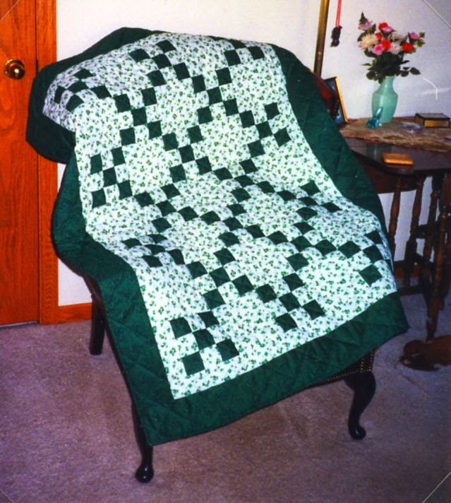
To honor St. Patrick's Day, I'm sharing this classic Irish Chain quilt I made back in 1999. A former co-worker had married a man named Shannon O'Toole and embraced all things Irish. Their dogs were named Shamus and Guinness. And then along came their first child, a daughter they named Riley Margaret. Well, of course I would make little Riley an Irish Chain quilt.


I believe I already had the shamrock fabric although I may have bought it specifically for this, and added one of the early and perhaps all-time favorite fabrics purchased to build a quilting stash, a rich dark textured green. I used Hobbs polydown batting because I thought a baby quilt should be puffy and this polyester batt was better than the other puffy batts of that era. I was still pretty new to free motion quilting and nervous about adding the shamrock motif to the spaces between the chains. I vividly remember trying a technique I'd read about - cutting the motif out of freezer paper, ironing it to the quilt top and then quilting around the outside edge of the freezer paper. I don't remember for sure if I free motioned or defaulted to maneuvering around it with the feed dogs up, but I do remember that it worked, and there have been other times I've used this same trick when I didn't want to actually mark on the quilt top.

During my recent delving into Celtic mystic poetry and stories, I came across this blessing by St. Patrick himself, who we are honoring today. It struck me as the perfect way to start every day. May it bring you strength to meet and greet whatever comes your way.

The Blessing of the Elements
St. Patrick
I rise today
Through the strength of heaven:
Light of sun,
Radiance of moon,
Splendour of fire,
Speed of lightning,
Swiftness of wind,
Depth of sea,
Stability of earth,
Firmness of rock.

Monday, March 16, 2015

In A Quandary

Art Journaling lesson on monochromatic
Bad enough that my fountain wall quilt has presented many quandaries. I'm finding this spread for my next Creating at the Speed of Life presenting one as well. Since the critique sheet was planned for the left side of the spread this time, I put less paint where I knew it would go, more on the side to be collaged. First coat is my pre-mixed acrylic paint, textured slightly with a blot from a paper towel. My blotting was inconsistent and thus very little texturing happened and will mostly be covered anyway with my collage elements that I've been collecting and playing with in spare moments. Next I was to add some watercolor paint around the edges in a darker blue. I'm still getting the hang of this watercolor thing and had a few surprises there but found it fun even if it got away from me a bit.

I think I'm about ready to start adhering the elements and add handwritten text, but I keep looking at the other side, thinking how much I like it and don't particularly like what happened on the other side. I know - this is a tiny tiny quandary in the grand scheme of things. But I find myself carrying on an internal argument about which side of the spread to use. Just another part of the creative process!

Sunday, March 15, 2015

And Then You Must Commit

Still moving fabric around on the design wall, but I came to the conclusion that I could do that forever. Just like coming to the point when I had to start cutting, I came to the point yesterday when I had to commit ... not to everything but surely to something. So I chose the top sections on either side of the center water section, applying Misty Fuse (did I mention how much I dislike Misty Fuse, and still do?) and fusing this latest Stonehenge fabric to the Stiff Stuff interfacing. I've been cutting the fabric a generous extra inch bigger all round than the interfacing pieces so there'd be no issues turning it to the back as you see here. Before turning, I satin stitched the grout lines, running them off the interfacing and onto the excess because the edges will be visible on all sides except where sections overlap. No worries about the satin stitching working loose or threads pulled to the back and tied off showing. Those exposed edges also meant mitering the corners was a must.

It took some trial and error to get things folded properly for a nice point, but I am pleased with the look. The fabric turned to the back has fusible so I could iron it into place. Where the miter folds onto itself from the right side where there is no fusible, I just glued it down with a little Gem Tac. Hopefully, this experimental construction method I'm employing will become clearer to you (and even to me!) as I progress.


I'm still no closer to having the proper thing for a bottom section of the wall. Several are in the ball park but lacking either the blue/grey or reddish brown to pull it all together. The batik above has never been right although I keep coming back to it because it has the right colors. I experimented with it to see if it could be altered a bit with Dye-na-flow paint. I had a Sienna that I thought might help and was VERY cautious in the application, watering it down quite a bit. The original batik is in the center, my two test pieces on either side. The difference is subtle, a bit of toning down, but the surprise was that the paint did not change those bright dots one iota. Can't figure out what's up with that.

Friday, March 13, 2015

1967 House Sketching


1967 house, corner of Kootenai Cutoff and Starr Lane
We've had a string of sunny 60-plus degree days and I've managed to take pretty good advantage of them. But it's to come to an end with some rain over the weekend, so this afternoon I paused on my walk to sketch this house. Its fascination for me is partly the unusual design - long sloping roof line, massive chimneys and oddly angled window - and partly that it sits squarely on the diagonal of its corner lot. My guess has always been that it was built in the sixties, and my other guess is that it did not always sit this close to what has become a main thoroughfare lined with commercial buildings.


Here's an aerial view so you can see what I mean, red arrow pointing to the house. When it was built (according to a google search, I was right - it was built in 1967), there may have been as dense a buffer of trees across either street as there still is behind it. It is not the lone residence - to the north you can see a few more houses perhaps of the same vintage, and out of camera range beyond that, a newer little residential development - the one that borders that shed on 3 acres I sketched last week. But in plain view are parking lots for a Home Depot, Frontier Communications, Wal-Mart and a strip of small businesses. How sad...I bet this was a prime location when it was built, and a somewhat innovative design.

I chose pencil today for sketching, adding only white charcoal to show off the house's still brilliantly white siding, and a little colored pencil for the fire hydrant. And guess what? I'm not going to complain about anything in this sketch. I am very pleased with the way it came out.

Wednesday, March 11, 2015

And Then You Must Cut

Getting closer to my vision
Been thinking how to proceed on the fountain wall, how perhaps I could fuse the one fabric I was sure about placement and sew those grout lines. But that would mostly be avoiding the obvious - that I needed to audition those new fabrics I bought and see where they might fit in. I'd held a few up already and noticed how it changed my perception of how the stitching in the middle section was showing up. When it comes to color and value, so much of it is relative - relative to what is placed next to it.

And not just what's next to it, but the proportions as well. At some point those large pieces of fabric folded somewhat to size and all your imagining won't tell you how it will read when cut in the proper shape. So today I started cutting in order to audition more accurately. I started with the fabric I was sure would go below the original Stonehenge fabric I knew would be at the top. But now that it was cut, it no longer read slightly darker, but slightly lighter, not what I wanted at all. So thank goodness I didn't jump the gun to fusing and stitching before I had all the fabrics worked out. Those two fabrics got switched, just like the two fabrics in the middle section I was so sure of.

I'm making progress but I still don't think I have quite the right fabric for along the bottom, and I tried several things. I may need to brave getting the Dye-na-flow paints out, or the watercolor pencils to customize the not quite right fabrics to make them just right. I know what I need (or think I do) but am not seeing it in my stash or my local shops. Can't really trust shopping on line.

Sunday, March 08, 2015

Good Day In and Out of the Studio

Stellar day yesterday, where ponderings became actions. After trying the addition of a second line of stitching right next to and with the same thread combo as the first to make my water lines show up more on the fountain wall piece, it was clear this wasn't the answer. Also, the stitching was reading a bit differently in the daylight coming through the studio windows than it did under just the artificial light of the night before. What I really needed to do was add the water stitching to the section that would be above, stitching of a different pattern, to see how that showed up. The two need to be balanced, and I don't want them to be overwhelming in the way they show up. Somewhere between in your face and not being seen at all is the effect I am going for. I'm considering adding some straight vertical lines within the "scallops" with a dark metallic thread and perhaps the same thread or the dark grey of the grouting along the lines in the lower section - more testing needed. Regardless, I was pleased at how easily and trouble-free this free-motion stitching went, especially as I was still using the combination of a rayon thread and a sliver metallic thread together through the eye of a single needle.


We're in a warming trend and I've been itching to do a little urban sketching. I'd scoped out this shed which lies along one of the alternate turns I make on my daily walks, intrigued by all that dark area which once had been all white. You might be thinking, this is urban? It is only a block off a busy street lined with businesses, a tiny bit of acreage that also includes a rundown house and no doubt was once a small farm. Now there's a small housing development behind it and commercial properties across from and beyond it. In fact, I was standing near a large For Sale sign - someone hopes to sell this land for further commercial development and there's every possibility this shed and its house will disappear. That's one of the tenets of urban drawing, to preserve the memory of buildings that may succumb to either radical remodeling or the wrecking ball.


So this is my version, as usual with the proportions off a bit, but I enjoyed working this up - a little more quickly, I noted, than I often do. I'd taken along a white charcoal pencil so I could work in the white areas on site, then added color pencil to areas once home. I also experimented with the water soluble graphite pencils I'd bought for art journaling. I suspected they might be the best way to work in those grey and black areas. They were fun to use and I was pleased that the sketchbook page handled the bit of wet medium without major buckling or seeping through the page. My favorite part of the sketch, though, is something I added right at the end. As I studied my reference photo, I noticed how those leafless trees were quite white with black shadowing defining them. So I added a sweep of white charcoal along one side of each trunk and branch. Against the toned page, it really makes them stand out.


So that very well could have been the end of my creative day, but it was not. Another itch that I haven't felt up to scratching has been to start on the next lessons in both of my art journals. The least I could do, I decided, was get the first bit of paint on the page. I had some blue acrylic paint mixed up with a retarder from the previous Creating Art At The Speed Of Life lesson so already knew that was what would go on the page for this next lesson on monochromatic. It could also cover the next page for the Positively Creative Art Journaling lesson. And I'd been waiting to have that paint out so I could try spattering a bit of it over this food box journal cover started back in January. I think I like it! Hmm - am I moving into my own blue period a la Picasso?

I don't know where all that energy, clarity and drive came from, but I'm glad I seized the moment. It's been hard for me to change years of a mindset thinking I needed big chunks of time to get started on something, and that I needed to complete something or at least sections in one sitting. Perhaps that's one of the things art journaling is helping me with. Sometimes you have to let the paint dry before you can move on. Sometimes you need to keep adding layers, but they don't have to be added all at once. Sometimes you just need to grab 15 minutes to make progress.   

Friday, March 06, 2015

Influences and Coincidences

Absinthe Drinker by Pablo Picasso 1902
I fell in love with Picasso's blue period back when I was on a college study tour that took me to Washington, D.C. and the National Gallery of Art. Several paintings from that period were on display and I was enough taken with the elongated figures and monochrome blues to purchase a print and a postcard from the museum gift shop. I practiced my drawing skills on this one shown above, The Absinthe Drinker, back when I'd taken a Drawing on the Right Side of the Brain class. I worked it up in pencil only, but that exercise of really studying the painting, the swoop of the line of the nose, the folds in the cloak, made me very familiar with that woman, and I also gained insight into Picasso's style here and one to come.

Deirdre of the Sorrows by John McKirdy Duncan

So when I ran across this chalk drawing by John McKirdy Duncan in a book on Celtic mysticism, I felt I'd seen this woman somewhere before. I was sure that this pose was very similar to that Picasso painting. Upon comparing the two, I definitely see a connection, the poses both speaking of a sort of despair, the profiles so much alike, both women wrapped in a protective cloak.

Hecate by William Blake 1795

Near the end of the book was yet another painting with a woman with a very similar look, this one Hecate by William Blake. Her cloak is not wrapped about her in the same way but there is that same profile perhaps looking even more so like Picasso's woman. I doubt that these three artists had any influence on each other (although I don't know that for a fact) so I find it a marvelous coincidence and a lesson to us all that these three women are so similar.

As an aside, as I researched these paintings, I was surprised to find that Hecate is available in a cropped version including just the humans in plate form. It seemed an odd choice for even a collectable plate.

Wednesday, March 04, 2015

Scale

I mentioned before that my sample for the fountain wall had some limitations. Primarily I wanted to try out technique and some stitching/thread choices. I knew, or at least suspected, that its small size would skew reading how well the fabric was working. But now I can see that even the stitching had not translated the same to the larger version even though I tried to keep spacing ratios similar. It's really the thickness of the thread, and probably the fact that I switched fabrics. At any rate, I'm wondering if I need to add a second line of stitching along each line now stitched. The "water" cascading down the surface just isn't showing up the way it did on my small sample. The larger scale appears to demand a thicker thread or line. I'll see how I feel about it tomorrow...

In the meantime, suggestions?


Sunday, March 01, 2015

Tar Patch Street Graffiti

I actually noticed these patches of cracks in the asphalt along my walking route last year. I noted how much some of them resembled graffiti and that they might serve as a design reference for surface design. Maybe I should take some pictures or even try sketching a few. But I wasn't very motivated to spend time sketching them, and I kept forgetting to grab my camera before heading out, and no - I do not have a cell phone that takes pictures. But today - today I finally remembered. I've not tweaked these in any way but can see how a little work in Paint Shop Pro might produce images for thermofax screens or patterns for lino cutting. What ordinary thing do you see on your daily route that your artist eye interprets as an interesting design element for future use?