Saturday, February 27, 2016

Where Ideas Are Born

In my experience there are two ways to approach design. One is to have a definite image or idea in your head; you know what you are going for, all you have to do is figure out how to transfer it from your head into reality using your medium and tools of choice. The other is to stumble upon something purely by accident, the cleverness of your eye recognizing that a random juxtaposition of things could turn into something wonderful. I've done both but I often think my better "ideas" that come together with the least effort are a result of design by accident. It's happened again, and is the thing that has been distracting me so. Here's the evolution thus far of what I hope will be a successful new piece of textile art. It started with these two pieces of fabric, cut for padfolio pockets but rejected. I moved them to the far end of the work table, a tiny bit of open space, in case they might be used on a different padfolio.

I couldn't help playing with them a bit, flipping one to get that offset look. It reminded me of a computer manipulation I randomly generated a long time ago and thought might be an idea to follow up on at a later date, pieced from strips of hand-dyed gradations. That corner of the table where things get sidelined is nearest the door. I walk back and forth past it dozens of times, and each time that fabric takes a few seconds of my attention, unwanted but inescapable musings of what I might do with this germ of an idea.

Days or possibly weeks later, while I was still enmeshed in padfolio production, I'd dug out that leaf cluster to use as a pattern for the stitching I'd do on the burgundy ones (see this post). That cluster was also demanding my attention, thoughts straying to other uses for it and how to make it a more permanent template. So when I was done tracing around it, I wasn't done with the idea of its potential and so did not want to file it away quite yet. Where to safely put this somewhat fragile thing until I could get back to it? Well, that is what that end of the table has become, the place to set things I'm not quite ready to put away yet but need to be out of the way. The only flat place was on top of the rejected pockets so I laid it there. Oh. OH! I never would have thought to do that intentionally or choose those colors, but boy did I like what I was seeing. I'd been considering revisiting a 10 x 10 stretched over canvas frame format for highlighting individually stamped leaves (see this post), so having these two things randomly pair up in pretty much that size was remarkable and timely. Maybe I would have hit upon this with more direct thought and auditioning, maybe I would have only frustrated myself as I floundered somewhat stuck with the image of the original pieces in my head. No doubt about it, though, this felt like a gift.

And gifts should not be ignored, although I knew I had to finish up those padfolios first. As with the fabric itself, now with the leaf resting over it, my eyes lingered longer as did my musings each time I passed that end of the table (and many times when I merely paused to turn my gaze that direction). How did I see that leaf cluster translated on the fabric? At the moment, with paint followed by some machine stitching. But it could just as easily be with applique. I could cut a template or make a linocut for instance. But whatever way I went, I'd need to copy the outline of that cluster. I thought about tracing around it as I had on the padfolio, but instead I decided to do a rubbing on tracing paper. 

I used a very soft dark 6B woodless graphite pencil which worked well to pick up not only the outline of the leaves and stem but the individual veins as well. In spite of my diagonal folds to help with centering and preserving of the cluster angle, I ended up trimming the tracing on two sides to center it.

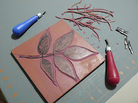
By now my mind was busy seeing ways I could use this cluster and a stamp made a lot of sense. Normally it's the other way around - lots of ideas for stamps but no ideas of how to use them. I got out my linocut tools and a big slab of Inovart Eco Printing Plate from which I cut a 7 inch block. I love this stuff for all the reasons stated on Inovart's website. Since I use a box cutter to slice through it, I always get out an old cutting mat (it may be a self-healing mat but blades like that can cut pretty deep, unlike a rotary cutter) and use a metal cork-backed ruler.

I figured my rubbing would transfer pretty well to the block surface and I was right. I remembered my bamboo baren purchased but not much used for my linocut class and used it to make the transfer. The back of a large spoon would work as well, but I was very impressed with that baren as I rubbed it in circular motions across the back of the tracing paper. There was enough graphite left on the tracing paper to transfer the image again on the other side of the plate. You know me - I have a hard time making up my mind about things, and while my original thought was to have flat leaves with no veining stamped on the fabric, the veins showed up so well in the transfer that I'm going to try a second version with veins. I can see a use for both.

I traced the outlines of the leaf cluster with a Sharpie pen, shading the areas that will be in relief. Now all that remains is the slow methodical, somewhat meditative removal of the areas that will not print as I reacquaint myself with the gouging tools. I love this part!

Tuesday, February 23, 2016

New Tool Tryout

"Nothing is so fatiguing as the eternal hanging on of an uncompleted task."
William James

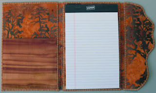
I've found lots of distractions to keep me from adding the closure to the last of the "fresh" padfolios. As William James so wisely observed, these projects that get set aside for later eat at our energies whether we realize it or not. If nothing else, they can take up valuable space needed to proceed with the next task (or yet another uncompleted one). It wasn't going to be that big of a deal once I decided what to use, and yet there were still a few things to think through and try out before I committed. How to add the big bead to the flap was one of them.


It gave me the chance to test a recently purchased 1/16th inch hole punch. I can't tell you how long I've wanted one but the fact that it was to be used to punch plastic templates at seam intersection points should give you a clue. Back then they were hard to find, and then when they became easier to track down, I wasn't using that template method anymore. Still, I've had a a great desire to own one, and with my recent interest in bookbinding, I saw a potential rationalization for purchasing one. Only as an afterthought did it occur to me that it might work better than a large needle to make a guide hole for the elastic and perle cottons I've begun using on the padfolio closure. Would that tiny punch actually make a clean hole through two layers of fabric fused to Peltex? Yes! And I can't believe what a difference it makes when pulling the threads through. Not too big, not too small, Goldilocks has finally found something that is just right! And after struggling to thread these thicker threads through a needle, I finally got smart and dug out a dental floss threader to guide them through the punched hole and the beads too. Oh, I am a happy camper today.


Difficult to capture the true color of the large bead but it perfectly matches the denim-like blue in the fabric and decorative thread. A few blue glass beads have been added to the dangling ends of the thread wrap.


I love these batiks in the linings and pockets, love the way they pick up on the blues lurking in the predominantly purple fabric of the cover.


Out of the strain of the Doing,
Into the peace of Done.
Julia Louise Woodruff
Sunday at Home 1910

I'm being seriously distracted by a new idea and am possibly on the brink of a breakthrough with Adrift, so I really did need to finish this up. A corner of the work table clear again. The clutter of this and that related to the project returned to its drawers. Ahhhh - I can move on with one less unfinished task weighing me down.

Sunday, February 14, 2016

Threads - And The Last Padfolios

I've been having a conversation with Chris of chrissquiltinguniverse.blogspot.com about thread these last few days as she works on her latest quilt and I work on my latest padfolio. We both were bumping up against color and value choices as well as solid vs variegated, and even poly vs cotton when the stitching would be traveling over shifts in value of the underlying fabric. Will the thread I choose look jerky as it variegates, will it show up too much and become a distraction or not enough and get lost save for any texture it might create? Auditioning doesn't seem to help. I tend to lay a length of thread over where it will be stitched or "pool" it if the design will be irregular. Chris actually put in some stitches by hand on her current piece to test her choice, even though she planned to machine quilt. Both of us find that when the real stitching begins, the thread often does something entirely different than we expected. Chris could rip hers out (which she did) and try again; I on the other hand have to live with what happens on the padfolios because holes punched into Peltex (which is what the covers are fused to) when stitching are impossible to get rid of should one make a mistake and need a do-over. I do some testing on small pieces of fabric fused to Peltex to see what the thread will look like in a satin stitch and to test tension, but otherwise, it is often a hold-your-breath-and-hope-for-the-best proposition. 


In the case of the dark purple with blue accents padfolio, I thought the variegated thread would do the job of compromise over the predominantly dark fabric with a few lighter spot. Instead, I found it a bit distracting, showing up in a way I hadn't exactly foreseen. It made me wish I'd opted for the navy thread I'd considered but feared would read a harsh line over those light areas. So when I decided to cut another cover from the fabric to make up a second one (as long as I was making others for my customer to choose from), I'd do the stitching differently and with different thread. I was amazed that this section had much more visible purple in it, and that the lining fabric I'd used in the first one did not begin to look right with this one. Maybe I should use a purple variegated Oliver Twist - its changes more subtle than the King Tut I'd used on the first one and a seemingly perfect match. But again, I was afraid it would show too much and take over the show. Remembering my previous thought to stick with navy, I ended the back and forth and stitched away with an Aurofil solid dark blue thread. It barely shows except over some lighter areas, which I have to admit I thought I wanted, so why am I disappointed and ruing the fact that I did not use the purple thread? Just look at how lovely a closure cord I could have made with that Perle cotton if I had, but now it doesn't look right with the navy satin stitching. Sigh... It's the Goldilocks syndrome again - not too much this direction, or the other, searching for that perfect spot in the middle, but erring too conservative. I've now identified a blue decorative thread that may work, after stunning myself with the lack of any dark blue elastic or Perle cotton.


It doesn't take much variance in fabric to change how a thread will read. Here are the two padfolios I made for my customer who wanted the rich rust one that had sold to choose from. In auditioning the thread I'd used on the original over the one on the right (cut from the same piece of fabric but with much more light areas) and the one on the left which has less red in it, I was satisfied that it was the perfect thread for both. Yet when they were done, I'd wished I'd used a darker rust thread on the left one - something more like the darkest values in it. 


Granted, there's nothing wrong with the thread I used, but in hindsight, I wished I'd thought to go bolder so the leaves would show more. It ended up being the one my customer chose to buy, the thread I used having nothing to do with it. She got sucked in by the lining fabric - see above. The lining and pockets for the one she didn't buy are identical to the original Rich Rust padfolio.


I had better luck pleasing myself with the Burgundy Leaves padfolios. Love the thread I chose, the way it showed up on both light and dark areas but faded in and out as well. 


Subtle yet not having to be searched for to see. 


I dangled them in front of my customer and she bit, adding this one with dragonfly lining and pockets to her order. (We are old friends so I don't feel too guilty about that, especially since she tells me she's keeping it for herself while the rest will be given away.)


The second one is essentially the same, with flashes of texture falling in different places and a commercial leaf fabric for the lining. 


I was quite surprised that of the several toned pink prints I could have used on this one, none of them felt quite right with the one that eventually got the dragonfly lining. The subtleties of hand-dyed fabric: even when cut from the same piece of cloth, each section will vary enough to need a customized approach.


I'm thinking about putting some of the unsold ones in the exhibit that Masks will be going into. At that venue they have pedestals with enclosed glass cases for 3-dimensional items like small sculptures, jewelry and baskets that might otherwise "walk off" or be mishandled if out in the open. This has been the difficulty in figuring out where to display these locally - generally my options have been to display them in open wall racks or in a big basket on a counter or table. 

On the other hand, after pumping out 14 padfolios over the last couple of months - a group that I absolutely love - I want to be done with them for awhile and get back to other creative endeavors. Might be nice to just have a few on hand for my repeat customer here in town... 

Wednesday, February 10, 2016

Trying Out New Things

I really do not know where the time goes some weeks. I've been working on that last set of padfolios I shared in this post - have one last one to stitch and then I will share those five. Am turning my thoughts to Adrift, and as I look for the last blog post about it, I cannot believe it has been a year since I folded it up with yarns and threads I hoped could be grasses. Good grief, I really DON'T know where time goes. I have hopes I can resolve my uneasiness with it now in time for this year's ArtWalk. In the meantime, I needed a break yesterday, a different place for my mind to wander. There's been a new Zentangle that caught my interest, and I'd finally gotten some ink for the second of the fountain pens which came with a cartridge converter.

Molygon tangle

I lost myself for over an hour on this and wish I could say I was pleased with the effort. The tangle is called molygon - another tangle that mimics familiar quilting motifs. There were many suggestions of fillers for the cashew shape and for some reason, the one I chose didn't come across on my version quite like it did on the official example. I'm wishing I'd chosen something different. I'm a bit on the fence about the ink color as well. I ran into the same problem selecting that from the many available to me as I do thread when I don't have something specific in mind for its use. I defaulted to brown - oh so me, right? But really, I was thinking about old documents that so often are written in a sepia tone and I think I will do some actual writing with this pen. The brown in my Pigma pen is really quite red and doesn't look as good on these tan toned papers as I thought it would. So brown it is, but it has turned out to be a very dark brown - so dark that as I was drawing with it, I had to double check that I didn't grab the pen with the black ink instead. But under better light as here, you can see it is definitely brown.

I still had some issues with the fountain pen on the paper this tile is made from. It is not perfectly smooth, and although I have not noticed this to be an issue with the micron pens, I kept feeling that the nib of the fountain  pen occasionally caught on the irregularities. And as with the other fountain pen, I often found my curved lines skipping and in need of going over a second time - I think it is due to the way I hold the pen. It happened less towards the end as I got used to the feel of the barrel in my hand. One thing I did like over the other pen is I am getting a slightly finer line which is better for working on the Zentangles and probably also for the sort of sketching I might do with it.