Friday, April 28, 2017

Wrapping up the Week

Yes, I bought yet another sketchbook. It sat on my coffee table for a week while I thought about how I might use it. Then it came to me - the anything goes sketchbook.


And yes, I signed up for a Sketchbook Skool class. Right in the midst of deadlines, I added something else to my plate.

What was I thinking, you well may ask? Well, in my constant quest for the "perfect" sketchbook, the video demoing this one implied it could very well be it. It's not recommended for wet media, but I trust the gal at Joggles who produces these videos of the products they sell, and she said as long as you went lightly, the pages could take some paint and ink. This has been my struggle with the sketchbooks I've tried - if they take wet media, then they don't work as well with pencil, and if they are great for colored pencils and pens, they will buckle with the least bit of moisture added. Frustrating when I want to spark up the colors or do blending when using the Inktense pencils or water soluble graphite. There are other features like that elastic band to keep it closed, and the size looked close to what I prefer, but I will not lie; the fact that it came in my signature teal green sealed the deal.

As for the class, I've passed up several at Sketchbook Skool because of timing. I just knew I had too many things going to devote to a class and that the class would probably be offered again when I'd be less busy. I'd watched the promo for this one (Exploring) and thought that yes, I could probably get a lot out of it but really, running mid April through May when I have this early June ArtWalk deadline, I'd be silly to sign up for it. And then the marketing genius e-mail arrived just days before the class was to begin: Did we mention, we'll NOT be repeating this class? It's now or never! I reviewed the course description again and checked to see what would be involved. Ah, it's an at your own pace class, with pdf's you can download, videos to watch, and all the material is available to students FOREVER (or at least as long as Sketchbook Skool exists on the internet). And again, I succumbed to a pitch.

Pencil and Pen hatching practice

The class includes sections using both wet and dry media so it didn't take me long to decide the anything goes journal would be used for the class assignments where, as the title of the class states, we will be exploring, and supposedly learning "fresh directions" for our sketchbooks. The paper in this sketchbook is quite different from any of my other sketchbooks. It almost feels coated and is very smooth yet the ink from my fountain pen flowed perfectly over it, not sitting on top of it; a Pigma pen works equally well. And a graphite pencil also likes the paper. Haven't tried erasing yet. I do love the size.

So I knew I could ignore the class while I worked toward my first ArtWalk deadline last Friday, and could then take a break to start reading through the materials. I suspected that the first section on creativity might be a lot of things I've already discovered and worked through, and I was right. Still, I found the material a good review, and there was at least one suggestion that was helpful enough that I drew a simple stick figure sketch in my sketchbook as a reminder -"Build a wall with a door between two parts of yourself, the maker and the judge. Shut the door and make stuff. . . open the door to show the judge what you've got...worse case scenario it's all junk, in which case you can close the door and go back to playing." Even in play, I often forget to silence the inner critique, and when something's on the line, like my printing session, the critic (or as the teacher calls it, the judge) looms large!


The meat of this lesson though was hatching/cross hatching. I've only worked with hatching a little and usually gave up on it to revert to regular shading. I did a page of practice hatching (see photo a few paragraphs up) after watching the teacher use various kinds on a drawing of a teacup. I was not quite prepared for my visceral reaction to teacup as subject, but after a month of drawing the mugs in my cupboard back in October, I find I cannot face another cup to draw! It was interesting though to watch him pointing out many things that I discovered on my own while drawing all those mugs.  Best of all, I can see how this lesson can be applied to the thread sketching I hope to do soon. I've chosen a different subject for my "homework" sketch, and might get to it this weekend.


I'll have to look at the lessons for this week as well, different teacher, different medium. But first I have to finish up the quilting on Leaf Cluster III. I opted for the lighter thread with the green cast and am very pleased with how this is working up. I pretty much need to finish one quilt a week, plus do a little more printing, to have the options I'll want when making the final choices and framing for what I'll submit to the exhibit.


Not a Sketchbook Skool assignment, but I've been wanting to add something to my Comforts Sketchbook for quite awhile. Having succumbed to yet another marketing ploy - the pies were on sale at my grocery store - I'd been working on this cherry pie for over a week (eating it, not drawing it). Was about to polish it off so took the time to do this sketch with colored pencils. This is a good example of paper that does not match the medium. Meant for multi-media, wet and dry, it's a little too textured so I can't get that smooth solid coverage that I can on a smoother paper. It helped to go over most of this with a colorless blending pencil. The pie pan is a bit out of shape but otherwise, I'm pretty pleased with my cherry pie slice.


Speaking of slices, surprising news came in the mail this week along with this photo. That slice quilt I participated in has won it's 3rd award in as many shows! The other two were 2nd place in its category but look at this, a blue ribbon at the quilt show in Muckwonago, WI! 

Monday, April 24, 2017

Meeting the First Deadline


Friday was the deadline for submitting my ArtWalk application, so that was the focus of last week. I got a bit of a boost from my art group on Monday who encouraged me to keep working on this series, that what I had done so far was showing promise. Like me, they especially liked the "I don't care" prints and I assured them I planned to do something with them once I got the four 10 x 10's done. I chose to finish quilting the orange batik leaf print for the application since it was about half quilted already and would finish quickly.


Because this is going over stretched canvas, I don't have to worry what the back looks like, i.e., didn't have to spend time burying thread tails once they were pulled to the back and tied off. I still ink "label" information on the back in the event the quilt gets removed from its frame and canvas someday.


I got out my favorite instructions for mounting onto a stretched canvas (this would work for stretcher bars or panels too). It requires some marking specific to the canvas you will be using, reinforcing stitching, measuring and cutting out at the corners before sewing them up to fit snugly when the canvas is slipped in. It makes for neat and bulk-free corners and ease in then stapling the rest to the back. See this post for details.

Leaf Cluster II Sheila Mahanke Barnes © 2017

I got as far as the reinforcing, measuring and cutting out the corners when I ran out of steam. Didn't have the concentration left for that next step of stitching the corners together let alone the final stapling to the back of the canvas. I decided to work on my artist statement instead. In the meantime, I realized that this photo showing the cutout corners would be easy to crop accurately and add a "frame" to in Paintshop Pro - good enough for the application. I had planned to do the mounting of all four 10 x 10's at the same time, after all were quilted anyway, so I didn't feel too badly about my cheat.

In addition to filling out the application form with basic information, I needed to update my artist statement (which always takes more time than one would think) and edit per application instructions the file names of the other two quilts that would be submitted (they like a sampling of 3 pieces to help them in assigning venues and although they know my work well and don't require the pieces to actually be in the exhibit, I always like to submit at least one new piece with two that aren't too old). I had planned to burn my files to a cd, fill out the form I'd printed from their pdf and drop it all off at the office on Friday since I had an appointment nearby that same day. But I noted that they preferred the image jpgs be e-mailed and I had that pdf that I discovered I could fill out right on the computer and save, so I opted to attach everything to an e-mail and send it off - a day before the deadline! What a relief to have that done.

I've given myself a few days off to catch up on some other things and relax a bit, but I mustn't get complacent. I've counted it up and I have about 7 weeks til the final deadline, the day everything must be done, framed, and delivered along with a second set of paperwork. Sounds like more than enough time to complete the quilting on 3 more 10 x 10's and get them framed up. Or even to make more prints to broaden the variations of the final four. Then again, don't get too cocky - one must always account for life intervening...

Sunday, April 23, 2017

Gearing Up to Print

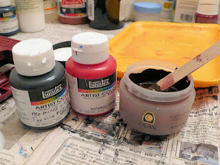
I had confessed to my accountability friend that I really hadn't done anything yet towards getting any quilts made; all I'd been doing is thinking and planning. Bless him that he countered with "Planning is important. It's ok that you've been planning." But as I said in the last post, at some point planning becomes procrastination, a justification for dragging one's feet. I needed to get some fabric printed up. I'd soon have justification for my dread of this next step but in the meantime, I took a deep breath and mixed up some paint. I'd taken time to review my notes from the on-line lino class I took and the part about printing in that new linocut book, and had an idea why I had problems during my last printing session. I'd also thought a lot about how I might get more of a dark burgundy color than the first time. So with lots of confidence, I began. And right off the bat I stumbled. I thought I had the Speedball printing ink in red, but apparently I'd decided not to buy that because I had so much of this Liquitex acrylic paint on hand. Ok, I'll go with that then and add Liquitex black as long as I had some, already mixed with some textile medium. I'd use no brown this time, just lots of red with some black. The black seemed to turn my red brown, but I kept adding and adding black until it was the darkness of the leaf I was trying to emulate. I viewed it in natural light and it looked good.

Test print pinned to felt for experimental quilting.

I have small pieces of fabric lying about that have been test printed on and I decided to use one of those to test print the color of the paint. Looked good to me, showing red as desired.

There's a second version marked on the flip side I've not got around to cutting yet.

And yet when I printed on my 15 inch squares, the paint didn't look at all like the test print. It was back to brown, nearly identical to the original paint mixture that started with brown. Paint coverage on the linocut was very uneven and strange. And even though I had my reference prints at hand, I managed to mess up placement of painter's tape guides on several. I ended the first session with nothing usable, not even my carefully cut and fused triangles. So much for advance refreshing of my memory.

My studio is actually the master bedroom which has its own bathroom which I use exclusively for printing.

I really wanted to junk the whole idea, walk away from this grandiose plan for the leaf cluster. I guess the muses showed ME who's in charge! But the next day I decided I just needed to get back on the horse and give it another go, armed with the new lessons learned. I tinkered a bit with the paint, adding more red back in, taped my reference prints to the mirror and tried again. It went somewhat better, now that I knew what to look for as I inked up the block. I didn't mess up any placements this time but I was still disappointed in the outcomes. That paint took on a chameleon nature in that it changed color depending on the background it showed up on. And why should I be surprised? I already know that any color of fabric will read differently depending on the colors surrounding it. Why should paint be any different? I ended the session thinking I still did not have a decent print to work with.

When you don't care, everything goes well.

But at the end of any printing session, one will have excess paint on the palette and on the brush or brayer, and I hate just washing it down the sink. So I grabbed more small pieces of fabric I'd left in my print area, some already printed, and printed with abandon. So of course, all these "I don't care" prints turned out great! Here are two set out to dry. The one on the right is a highly textured grey batik and the one on the left is a rather nondescript greenish batik with the occasional hint of blue leaf. It was first printed with a piece of foam whose original purpose is a mystery. It is quite thick and I'd had it around for a long time wondering if I could stamp with it. Yes, I can! And quite well too.

Testing how it will look around canvas in floater frame. Same paint as all the other prints, the only time it looked black.

Sometimes you have to give what you've been intensely working on some space before passing final judgment, especially if you are as disappointed as I was. I gave it several days before I looked at my prints again to reassess. It also gave me time to reset my thinking, remembering my original plan was to do lots of prints, quilt them up and pick the best four for my ArtWalk exhibit. More importantly, I was reminded that right now, I only needed to finish one that I could take a picture of to submit with my application soon due. Surely I have ONE print good enough to fulfill this goal. And indeed, now that I looked at the group again, there were still duds, a few that might be saved, and at least two that turned out fine. Sometimes you have to remember the big picture. Sometimes you have to remember the intermediary steps.


This is one I decided will work, and will be quilted with a garnet or pebble stitch. The small piece is another one of the "I don't care" prints that I plan use somehow, probably combined with something else to make a larger piece.

Leaf print outlined with burgundy thread, auditioning thread for garnet quilting.

The stripey orange batik print is also ok, and I layered both of those up for quilting with Thermore polyester batting. The batik got decor bond fused to it first because it is quite thin compared to the Stonehenge cotton of the other one, and I felt it needed more stability because of the quilting I planned. And without much time to spare, I started the quilting on these before packing them and the don't care prints up to take to art group. Yes, that week I had TWO accountability parties pushing me along.   

Saturday, April 22, 2017

How I Gear Up

Goodness! I feel like I've left you hanging after my long discourse about working in a series and my intention to work with the leaf cluster image, exploring variations in the format of a series. Perhaps you thought I got sidetracked again, but no - I've been making progress, just not sharing it. Actually, I have been sharing it, sending weekly progress reports to a friend that I call on Mondays. I've used this kind of accountability enforcement before with him, and sad as it is that I can't always keep myself moving forward on my own, I'm fortunate to have someone willing to be that conscience asking each week if I've done what I said I would. These reports are brief with a few pictures and quick to compose because he doesn't need all the details I put in my blog posts and can ask questions when we talk. It's excellent motivation for me to get something done each week, a bit like the rush to pull something together for the monthly art group meetings, and it makes me feel like a student again, the one who puts off the homework assignments until Sunday night. The very first thing I needed to do was put together a "plan" for what I wanted to get made for ArtWalk (June deadline) and the annual Fiber Exhibit (sometime this fall). This was all floating around in my head with vague dates, but when the ArtWalk application arrived in the mail with its own earlier deadline in April, well,that is when I panicked and started writing stuff down. I needed to get at least one new piece completed to submit with my application and only had a few weeks to do it.


After jotting down my ideas for the two exhibits, it was time to get out the big sketchbook and start listing there the variation ideas that had been floating around in my head. And as is often the case, the more things I listed, the more things came to mind. Then I needed to start trying out some of the ways to orient the leaf cluster. I was thinking that I'd have to do more test prints on newsprint and not looking forward to cutting more paper to size and inking up my stamp. I get so tunnel-visioned that it took me awhile to remember that I could make photocopies of the stamp image to twist and turn and align in endless ways. Photographing the different variations would give me the lasting reference I would need in the future. This method would be quicker than stamping or sketching and give me the advantage of working with full-size motifs.


One of the things that occurred to me as I shuffled the photocopies around was that rather than be the focal point of a square quilt, the leaves might simply cascade down to form the currently popular long thin banner-like shape. And so I tried multiple renditions of that.


And that play led me to realize that the leaves might also form a border and not show up in the central part of the quilt at all.


From there, it was an easy transition to move a few leaves to form a rectangular shaped design.


Lordy, one could keep at this for a long time, but eventually it becomes procrastination. Time to start pulling fabrics and thinking about my ArtWalk plan - a minimum of four framed 10 x 10 inch leaf cluster variations. These will be wrapped over 3/4 inch deep stretched canvas so for simplicity sake, I cut squares about 15 inches square. The light fabrics would have the darker reddish-black paint while the darker fabrics got me thinking about a red and a green that would pop against them. They've been set aside for now, but each one for the dark leaf printing session got an arrangement pinned to it for reference.


Here are three ready to go, one with its reference paper having the size of the stamp cut from it in a particular slanted position. The others are placed using center lines or an outside line as guides but again, the reference print is pinned to one of the squares, and the top one will be stamped in the center.


I got the idea for that top one, whose background is pieced from triangles, while doing research on the liturgical stole project. Paging through a book on symbols, I spotted the unicorn superimposed on a very familiar patchwork design. I'd been thinking about cutting up that striped batik into different shapes and collaging a background, but this was much more exciting to me. And a good reminder that you never know where you'll find ideas and solutions for your designing. I printed out the image and pasted it into the sketchbook with more notes.


As I was sorting through fabric possibilities for the 10 x 10's, I ran across a few pieces the right size for larger quilts that would accommodate the entire leaf cluster print arranged in a fairly traditional 4-block design. These too have been set aside, but not without the paper variation reference. Because past experience proves I will not remember what I came up with this day weeks or months down the road when I get back to it.

So this is what I got done in the first week and a half, at the end of March and into the first week of April, after getting that wake-up call of the application due date. Planning is good, especially if the next step is working with paint which will dry up if you dawdle over what to print next, but eventually one has to quit thinking and arranging and planning, and move to the next step - printing. Time to stop dragging my feet and mix up some paint...

Wednesday, April 05, 2017

It's April

The calendar is turned once more and I found myself rushing to color in the last bit on April's design in my pocket calendar. At first glance, I thought this would be pretty straightforward and decided to limit my colors to red and blue where there weren't leaves. Again, I set down a few guidelines: circles would be red, the outer loops and petals a dark value of blue, the others a light value of blue. But it wasn't long until I realized there was a great big ladybug a little below and to the right of center. And the big circles across from that weren't circles at all but cherries. It took me even longer to figure out what was going on with those very small oblongs - rain? Oh my no - they must be the seeds on the outside of strawberries, one next to the ladybug and spotted later, a cluster at the top and just the hint of one at the bottom. The more I colored, the more I studied, the more I figured out, and my red and blue color scheme went out the window. There are still a few areas that I have no idea what they are supposed to be. Maybe that's a melon under the leaf by the ladybug, and so I played with blending brown and yellow to make it look like one. I also blended brown with the bluish green, a very light touch with both, for a different look on the larger leaves. I'm ready to move on. May's design looks very simple in comparison.

I've also played a little more with the Diva Dance marks, this time taking a page in my "just add red" sketchbook to see what would happen if I inserted leaves rather than a darkened "bump" to change the direction of the  lines. Thinking about my "Adrift" quilt where I plan to "float" leaves on the water, only that piece is already quilted, leaves to be added after the fact. Perhaps another piece could have the water quilted after 3-dimensional leaves are secured, ensuring that the rippling lines go on either side and not under the leaf. In the top drawing, the leaves were put down first, then the parallel lines added from the top down. I occasionally added a swirl or spiral to see what that did. It was tricky getting the line to go around the leaf working this way and the lines seemed too close together to me. So I tried a different tact below, making the leaves a little bigger and drawing the line that would go on either side of each leaf first, then going back in to add more lines. Neither look like what my mind's eye had in mind. I read an article not long ago that suggested if you want to paint or draw realistic moving water, you need to spend a lot of time observing moving water. Maybe I need to do some more on-site observations.

Because I was adding red, I drew in some vertical lines to mimic the red-stemmed bushes that grow along the water in this area. I used the same gel pen as on the leaves but for some reason my scanner picked them up more orange than dark red.

Tuesday, April 04, 2017

Some Favorites from 100 Artists


POAC's Celebrating 100 Artists exhibit was/is a great success and particularly interesting because each of the around 80 artists who participated was allowed to submit only one piece. What would familiar artists choose to represent themselves? What opinion would I form of the artists for whom I was seeing their work for the first time? On this wall alone you see acrylic, glass sculpture, photography, and oil presented in different ways. Imagine viewing the variety on two levels surrounding the atrium of the bank building, natural light filtering down from the ceiling.

The Letting Go by Brian Sostrom

That first painting on the left in the top photo not only captivated me in its simplicity in creating a mood and allowing me to put my own story on it (click on the photo above to read the artist's statement), it also intrigued me by its use of acrylic painted on plexiglass which gives quite a different look. Can't really capture in my photo the fine detail in the water that contrasts with the ethereal nature of the rest of the painting.

Tree of the Fae by Clint Crawford

On the other end of that wall, second from the right, is a long-time favorite photographer, Clint Crawford, whose beautiful photographs become even more beautiful in the printing on metal. Again, difficult to get a decent photograph of this but I did find it rather breathtaking, partly because of its size, partly because of the perspective which has you looking down into the rich autumn colors.


I didn't take a full photo of the painting to the left of Clint's piece - just another waterfall that didn't particularly say anything to me, but I was rather intrigued with the way it was presented. Rather than being matted before being put behind glass in the frame, it was mounted with its soft and uneven edges in full view. I've seen this done once before and in both cases, I found it surprisingly effective.

Lovely on the Water by Lisa Cirac

Another example of unexpected presentation was this beautiful photograph by Lisa Cirac. The person I was viewing this with wondered if the first mat in this double-matted frame had slipped down, and then noted it wasn't centered horizontally either. At this point, Lisa stepped up behind us and explained that she'd been experimenting with different ways of matting her work and that what we were seeing was intentional. She admitted that the offsetting to one side was not working well, needed to be more exaggerated so it wouldn't look like a mistake. This is one of the things I really like about the opening receptions, this interaction between artist and viewer, and a somewhat safe place to try things out and actually get honest feedback about how they are working.

Hippy Truck by Lisa Turner

There was quite a bit of photography, both mediocre and exceptional. In the exceptional category may be this photo of a local "attraction". I failed to work around the reflection on the glass so you can't really see how impressive this composition is, to the point that I kept wanting to insist it must be a painting. Lisa caught the truck parked just so with the red house and red berries of the mountain ash echoing the red along the back of the truck. See a much better representation of it on her website here.

Pink Q-Tips by Christina Taylor

One last photograph, perhaps my favorite piece in the exhibit. I gauge these things by if they stop me in my tracks, hold my interest, get my mind trying to figure out just what it is that makes me want to take it home with me. I'm still having a hard time putting my finger on just what it is that, even on repeat visits, has me repeating my first reactions. I think it is the composition, the rise and fall of the peony buds against that softly blurred gray vertical lines of the fence background, and the burgundy and grey double matting. It all works so perfectly and gives off a peaceful but not boring vibe. I may indeed end up purchasing this one.

F.I.D.O. by Barry Burgess

How about some levity? I've shared this artist before, who delights in recycling computer parts to make his three-dimensional art. Look closely at the details. In this case, the computer keys used on the dog's collar spell out FIDO.

Sneaky Loki by Jeremy Holzapfel

And be sure to read the artist statement that goes with this one that made me laugh.

Eyes of Nature by Leata Judd

Another one to bring a smile to my face, as Leata Judd's work often does. She works in many mediums but this one is acrylic.

Take Flight by Steve Gevurtz

I was pleased to see a new sculpture by Steve Gevurtz and that he was demoing his technique at the reception. His female figures just fly!


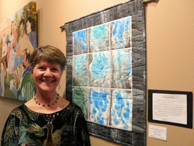
What also pleased me was to see so many of my small art group represented in this exhibit too. Here's Terrie Kremer with the rain piece she was still working on at our February meeting. I failed to get the title but did note that she had added some clear beads that looked like drops of water on the panes of glass.

Cycle de Luxe by Vickie Edwards

Vickie Edwards also hustled to complete her gold-leafed bicycle piece that she shared at the February meeting. You may remember that the next step was to be running a brayer with white paint over the entire piece. You can see that she did that, but she said it covered up the gold leaf too much and she had to redo it. Live and learn, she said.


And Rebecca True (on the left) used one of the snow-dyes she showed off in February as inspiration and background for her entry. I didn't get the name of this one either, but the theme was about the flowers that will soon be blooming once the snow has melted, just like the patterns that appeared on her fabric once the dye-covered snow melted away. She also said that if she were a painter, this still would have been wet when she dropped it off! Yes, we work right up to our deadlines! See this blog post about our February meeting to see these quilts in process.

The Unforgettable Tree by Meg Marchiando

Meg Marchiando, who is standing next to Rebecca, continues to make changes on her big tree. For this exhibit, the snow is gone off the limbs and leaves are starting to appear. There's a bird and a squirrel in those branches and below, a dog chases a kid.


Here's a closer view - check out the fabric she used for the soles!

I hope you will follow the links to many of the artists' website. Then you too can compare the rest of their work with how they presented themselves for this exhibit. You may find some surprises.