Sunday, February 16, 2014

Recovering

I had sinus surgery last Wednesday, which with any luck will solve some of the recurring struggles I've had with energy and basically feeling lousy for, believe it or not, over a year. The ear/nose/throat doctor could not believe that no one had picked up on the sinusitis, considering how advanced it had become. Oh well, fixed now, and hopefully I am on the road to recovery. Just didn't realize how out of it I'd still be by now. Lot's of couch time, lots of catching up on TV, a little reading, and hey - why not? A very little Zentangling which was easily done while reclining on the couch. Above, the previously stamped page in my button book.


And here transformed with a few squiggly lines and some shading. I like it!


And now it is Sunday, and I'm still having to keep the activity pretty curtailed, but I managed to work on my Positively Creative Art Journal a bit at a time. First, paint the spread, supposedly with only one color, but I wanted to do something more interesting. than that. I used a different brush and got some really nice swirly texture with it. Then I added some white, just tapping the tip of the brush along the page to create specks and short lines. Unfortunately, it wasn't covering up what was already on the page. As I added a second coat, I lost the swirls completely, but I'm not too unhappy with the streaks I created alternating the gold and the white paint until I had good coverage.


Today's prompt was "What's your favorite word?" I admit, I'd looked ahead last week so knew this was coming. In fact, Dale Ann warned it might take some time to come up with a single favorite word as opposed to a combination of words. Knowing I had this surgery coming up, I considered several words of a positive nature like hope. But once the day arrived, there was no question of what my favorite word this week would be: FRIENDS! You see, I live alone, don't have a significant other, have no family close by, so can only call on friends when in need. I needed someone to drive me the hour to the outpatient clinic, wait around for hours, sign-off as my escort and take in all the post-op instructions, then drive me back. Then I needed someone who could monitor me for 24 hours, feeding and medicating me and generally making sure I was ok, doing what I was supposed to be doing. A lot to ask of a friend, but easier when two share the task. Thank you Meg and Robin, my art group friends, for coming to my rescue! And I can't forget to mention the additional friends who sent well wishes and emotional support, and checked up on me via e-mail, text and phone. They too are mentioned on my journal spread along with quotations about friendship that I've collected over the years.

And now I'm feeling the urge to revisit the couch. Let me leave you with this Friendship Blessing by John O'Donohue, parts of which I copied to my spread:

May you be blessed with good friends.
May you learn to be a good friend to yourself.
May you be able to journey to that place in your soul where there is great love, warmth, feeling and forgiveness.
May this change you.
May it transfigure that which is negative, distant, or cold in you.
May you be brought into the real passion, kinship, and affinity of belonging.
May you treasure your friends.
May you be good to them and may you be there for them; may they bring you all the blessings, challenges, truth, and light that you need for your journey.
May you never be isolated.
May you always be in the gentle nest of belonging with your anam cara - soul friend.

Monday, February 10, 2014

Time Line of a Quilt

Engagement Calendar from late '90's noting machine and hand quilting hours on same day

I've been keeping track of my quilting activities in American Quilters Society Engagement calendars like the one above since 1995. I'm an organization freak anyway, and it was about this time that I was getting really serious about my quilting, starting to keep records on the finished quilts per the recommendations of the day. But these calendar jottings became more than just a way to pin down the start and end date of work and how much time it took for the various stages. I'd jot down things like what technique I used and whether or not I liked it. Or I might note, like on the page above, that my husband had made a suggestion about something, and whether or not I'd taken his advice. As time went on, I also recorded quilt-related activities, trips, unusual weather, health issues that may or may not be keeping me from my work. In short, these calendars became diaries of my life as a whole, with quilting as its center.

I bring this up because I've just paged through years of these calendars searching for the documentation info on the recently completed half-square triangle quilt. I knew there were huge lapses between spates of working on it, and in reading the entries, it was easier to see why. I also spotted a major shift in time spent in the studio and how I worked. I've always had more than one project going at a time, but I'd forgotten how frequently I worked on as many as 4 different quilts in a single day.  There was a span of years where I juggled many balls each day, the activity coming across almost frenetic. All that changed once I moved out to Idaho.  I vaguely knew this had happened, but to read the details leading up to it all in one sitting made my conscious choice to simplify my focus sound less of a rationalization than I've been thinking it might have been.

circa 1875 charm quilt 80 x 80
So follow the time line of this latest quilt with me, and if you ever wondered why quilters stumble to answer the question "How long did it take you to make that?", this might help you understand. The idea for the half-square triangle quilt started with this picture of an antique quilt featured in a 1993 issue of Quilting Today. I was getting very interested in the history of antique quilts about then, as was the rest of the quilting world. I really can't remember if I saved it with the idea of making it someday (it did not come with pattern directions) or whether it was just to add to my growing files on old quilts. At any rate, I didn't follow up on the making part until April of 1999 when I used it as a way to try out a new-to-me "fast and accurate" method of making half-square triangle units for an entirely different project.

This method required layering two fat quarters together and cutting strips on the bias, so I went through my by-then fairly substantial fat quarter stash of reproduction fabric. I pulled quite a few and did the test run, thrilled that it worked as promised and leaving me with my first stack of units. But I had that other project to work on with its own half-square triangle units to make, so I placed the unsewn paired strips, the completed squares, the uncut fat quarters and my magazine cut-out with estimates of size and number of blocks into a shoebox for later. I did take one more day that year and one early in the next to cut more strips. In November of 2002, I got together with a couple of guild friends for a sewing day at which I asked their advice about the rest of the fat quarters I would need. They yea or nayed what I had brought until I had the 20 fabrics I'd need, all from a variety of reproduction fabric lines. I duly saved all the selvages as a record. It all went back into the shoebox, not to see the light of day for 8 years.

The Tetris Quilt by Sheila Mahanke Barnes 2014 - 64 x 74
So what did my calendar diary tell me about why this simple quilt saw so little progress since its fledgling start in 1999?  It wasn't that I didn't have time for quilting; my calendars show a lot of production. There were wedding quilts and baby quilts and quilts for friends or family just because. There were charity quilts big and small, and guild charity and raffle quilts that I worked on. There were quilts and blocks made specifically for contests which took time to track down, fill out paperwork for and prepare my entries for shipping. There were block exchanges with guild members and one with some cousins of mine. I got involved with a mini-group which met monthly to learn Baltimore Album style applique (a dozen completed blocks still tucked away in a bin). I made sample quilts for my friend's vending booth. I even machine quilted a friend's quilt in exchange for her husband's wood-finishing skills. I also spent a lot of time quilting up batting samples. Yes, it was full bore on.

And of course, if I wasn't actually home making quilts, I was off to quilt shows (sometimes to help my friend with her booth), shopping for fabric, taking workshops, going on retreats with friends. I organized workdays for my quilt guild and produced its newsletter for awhile. I learned the ins and outs of quilt software and later, of photo software, and of a new sewing machine to meet my growing machine quilting needs. While still doing a lot of traditional work, I was moving more and more into what could be termed as art quilts. I gained an interest in paint on fabric and spent time experimenting with surface design techniques. 

Detail of machine quilting - The Tetris Quilt
I could really see those calendar boxes fill to the brim, though, once I started teaching at the local quilt shops, demoing products and techniques, and presenting workshops at a few guilds. Not only did I make the samples for the stores plus step by step samples for the classes, I also worked up lesson plans and handouts and brochures. I'd forgotten just how many different classes I prepared for - some of which I never got the chance to teach, many which I only taught once. I remember the turning point when it stopped being fun and was taking me away from what I really wanted to work on. And yes, that comes through in some of the diary entries as well.

But life is not all about quilting, as reflected in other entries about disruptive relocations, snow to be shoveled, demanding pets, migraines, dental appointments, deaths. There were days I noted no sewing because of time I was volunteering to my church on a grant project. There were vacations (but not from quilting - I nearly always took something with me to work on) and house guests which provided breaks from the studio. There were impromptu motorcycle rides, racing to watch, and the hours of watching the horrors of the 9/11 attacks. In other words...life. When I'd get back in the studio, I'd forge ahead with whatever came my way, whatever idea suddenly seemed the thing to get going on, whatever outside influences caught my fancy. I started a blog to share it all. No wonder the bones of this quilt languished on a shelf in the closet - not really forgotten, but not high on the priority list that was always shifting.

And then suddenly, the entries stopped for a couple of months. It was 2006 and I'd moved back "home" to Idaho. When I finally got my studio set up, the entries no longer showed activity on multiple projects each day, but a more orderly look of days devoted to a single project. That conscious choice I mentioned earlier was to shut out the distractions that were keeping me from focusing on the art quilting I'd started dabbling in, and that meant no more guild involvement, no more hunting down shows to mail my quilts to, no more teaching and no more traditional quilting for awhile. Hmm, no work on the half-square triangle quilt then.

Eventually, I was able to bring some traditional quilting back into my life without it feeling like a distraction, and in 2010, I hauled my sewing machine and my shoebox to my friend's house in Hood River for a weekend of hanging out together. I was so excited about the progress I made while there that not long after, I spent time completing the remainder of the units. I neatly stacked the over 350 squares back into the shoebox because, you know, there were higher priority quilts to work on. And I was no longer multi-tasking in the studio like I used to. I was focusing mostly on preparing work for the local arts council exhibits, volunteering on its visual arts committee, and finishing up a wedding quilt years in the making. Then there was the 3 months with my friend at the Mayo Clinic in 2012 followed by yet another move.

The Tetris Quilt from the back
I was pretty emotionally spent by the time I was setting up my new studio space, not sure exactly where I wanted to go with my quilting and unsettled by changes at the arts council. I needed to work on something that didn't require a lot of thought, something that would be like comfort food, something that I'd neglected for too long but still really wanted to see finished. Of all the ufo's to choose from, the half-square triangle quilt fit the bill the best, was the farthest along. In late November of 2012, the shoebox came out, the squares got arranged on the design wall, and I spent many therapeutic days sewing them into a top and adding the borders. As 2012 turned into 2013, I picked out fabrics for the backing and got it all layered up for quilting. But once again it got set aside as I turned my attention to new quilts for ArtWalk and helping my friend finish her African quilt, picking up the pace in a way I hadn't for quite awhile, those calendar entries filling up the boxes with technique notations and emotions, struggles and death again. 

By July, I was itching to get going on it again and started the machine quilting. I nearly finished the quilting in August until my own health issues got in the way. But with another new year arriving, my drive to finish this quilt kicked in once more, and on February 6, 2014, it was finally finished, binding, washing and all. How many years did it take to make this quilt? Not counting from when I first got the idea, but from when I first pulled fabrics and started cutting, nearly 15 years. How many times did I move that shoebox from one studio to the next? At least 3, including a move to a different state. How many actual days did I spend time on it (be it 1 hour or 8)? About 49 days - less than two months. Mmm - now that's just a little depressing! But at least it's finally done, and in looking up it's timeline, I revisited so many memories, see more clearly where my creative journey has taken me, understand a bit better why I have no desire to return to that frenetic pace of life.   

Sunday, February 09, 2014

Quick Sunday Art Journaling - Color


"Mere color, unspoiled by meaning, and unallied with definite form, can speak to the soul in a thousand different ways."
Oscar Wilde

This week's Positively Creative Art Journaling exercise was so straight forward and quick that there's no need for step by step photos. The prompt was to choose your favorite color, paint the spread with just that color, fill one side with squares of that color cut from magazines, then journal about the color on the other side, using the above quotation if we wished. Well, you all should know by now that my favorite color is teal green (or teal blue will do as well), and the green acrylic paint I've been using is close enough to what I consider teal. I diluted it a little with water and found it was not covering up the print on the page enough so painted again with a bit more undiluted. Rather than cut squares of teal from magazines, I just went to my fabric stash, starting with my shoebox of 1-1/2 inch squares and strips, then moving on to my regular stash. I mostly used commercial prints but there a few hand-dyes and a batik too.

In the supply list, Dale Ann had included matte medium in the adhesives, but so far there haven't been any instructions to use it. Yes, I have a bottle of it, bought a long time ago when I started playing with attaching different things to my quilts like foil. Several experienced art quilters who also dabbled in collage recommended I try it, so I bought some, then never got up the courage to give it a try. Well, probably more accurately, I never really had a project that I didn't already have a way that worked, and I never bothered to just try it on a sample. That's been my MO, something about waste not want not including time. But you know - this is a year about exploration. So to liven up the lesson with something new, I decided to try the matte medium instead of the glue stick I've been using. I don't know why I've been so skeptical about it, even as I was brushing it on the page. But of course, it worked like a charm, although like the acrylic paint I'm using, I was surprised at how quickly I needed to work before it dried requiring laying down another coat.

I really didn't know how to answer the questions suggested by Dale Ann, meant to get me thinking about why teal is so appealing. How does it make me feel, for instance? Well, I don't know. I just know that if I'm in a clothing store or fabric store, scanning the wares, and my eye falls upon teal, I can't seem to take my eyes off it. It draws me like a magnet, and I can't say why. I think it is a color that makes me look good. I know I feel very comfortable and relaxed when wearing it. Ditto when I work it into my quilts, which oddly enough I don't do as often as one would expect of a favorite color. Maybe that's because I don't think of teal paired with anything else, except brown, black or white. It's a stand alone color for me, one I was thrilled to develop a dye recipe for, my very own teal. I may not be able to put it into words, but teal definitely speaks to me and in a good way.

What about you? What's your favorite color and how does it make you feel?

Monday, February 03, 2014

Art Journaling Redemption

Time for another update on my Sunday Positively Creative Art Journaling. This week's exercise went much better, no doubt because I had already revisited the issues that came up last week, put my theories to the test, and enjoyed a much better outcome. But before I get to that, I have to show you what I did to a spread between two previous exercises that I'd left unworked. I found that I didn't want to cover up that right-hand page of the original diary entry because of my laughable drawings of a woman, man and child, and because of the quotation in the middle of the page: "If one does only what needs to be done, one most likely shall never have fun." Something I constantly have to be reminded of. I covered up the rest of the page testing out how one might use a fan brush (one must be very careful not to load too much paint on it). I really didn't want to paint the other side and had run across this fun illustration of the white-haired woman on a motorcycle, so I found a mountain scene that would fill the page behind her. Some of my fondest memories are riding behind my husband on his motorcycle as we explored wooded and mountainous areas. Remember, this is basically a happiness journal.

 
As for working out my miscues of last Sunday, I decided I was approaching the paint backwards. Instead of adding a little white to lighten my colors, I should be adding a little color to darken my white. And this time, I laid down the yellow on the page first, then scraped the lovely lavender (or is it orchid?) over it. Now there's a spread that can be written over, and the marks made between layers are less obtrusive.


I was still feeling that yellow might not be the best pairing with the violet paint (I've been calling it purple, but I just now thought to look on the jar for the name), and wasn't sure what I'd be journaling over it. But in the course of paging through magazines for things for this week's exercise, I decided to cut out some pictures that had caught my interest before. Just to set aside for future use perhaps. But instead, they got pasted onto this spread. The one on the left reminds me of Jane Sassaman's work, and look - that yellow flower is the same mustard yellow I've been using on these pages. So in it went. As for the big half-flower on the right, it's a bit of a stretch to pair its color with the violet, but in some odd way it looks to be working. Plus there's that yellow center. So in it went too - let's not over-think this stuff. I think I'm going to add some Zentangling around these two images to embellish them. Even as is, they make me smile. By the way, both of these pages are to be viewed with the journal turned to landscape orientation.


Now for this week's exercise which called for tearing pages from a phone book into strips and gluing them to the unpainted page. I'm wishing I knew what we are going for here as of course the next step will be to cover the page with a couple of layers of paint which "may or may not cover up the strips."


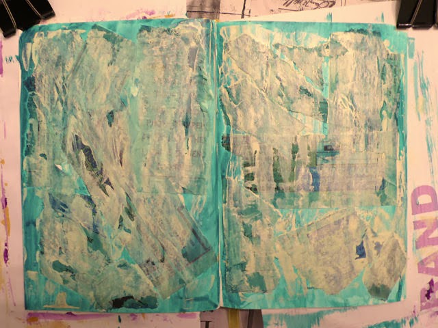
I soon found out. The tissue-like consistency of the telephone book pages soaked up the paint much differently than the paper they were glued to. Plus paint piled up along the edges of the strips. I was excited! The first pass of paint (white with a little green added) covered the printing more so than this photo would lead you to believe.


For the second pass of paint, I tinted my white with a little yellow which gave me a creamy color. I tried the scraping technique but found it hard to manage and get good coverage over the surface that was no longer smooth. And I found I wasn't too crazy about the cream over the page. Plain white would have pleased me more. I decided to use a baby wipe to see if I could even out the paint colors, and it helped some. Again, the camera lies a bit - the underlying paper strips do not actually show through as being that black.


I decided to go back in with more white slightly tinted with the green and a bit watered down which did even things out and lighten up the creaminess. Some lettering peeps through just the right amount and I'm really loving the extra dimension of the strips. Still questioning the yellowness but decided it was time to let it dry and start thinking about what to fill the spread with to answer the prompt of "what makes you laugh?"


I really enjoyed the journaling part of this, from searching magazines for pictures and words, to arranging everything on the page, to adding text describing things that make me laugh. There's a messiness to the background that still bothers me (personal aesthetic here) but overall I'm ok with it and what I learned from the process.  The quotation is an anonymous one provided by Dale Ann:
"Laughter attracts joy, releases negativity and leads to miraculous cures."
May your day be full of laughter...perhaps starting with my fumbling art journaling attempts! 

Saturday, February 01, 2014

January Wrap

For having 5 weeks, January whizzed by, nearing getting away from me. As the month came to a close this week, I reviewed my January lists of prospective things to do, and I was quite pleased to see so many items ticked off, or if not totally completed, at least a portion done. One long standing project stood untouched, though, and on the last day of the month I felt a tremendous urge to address it. Surely I could complete the last of the grid quilting on that half-square triangle quilt left in the machine back in August. And I did. For some reason, I thought I had more left to do than the couple of hours it took to finish it up.  Woohoo!

It's easy to get bogged down when working on a big project, feel like you will never reach the end of it as session progress appears to amount to little when only looking at the big picture. I think that's the way I was feeling about this quilting when I stepped away from it months ago. Now suddenly, I could see the light at the end of the tunnel and all I wanted to do was rush towards it. So today, I started off February by finishing the rest of the quilting. I'd thought a lot about what I wanted to put out in the borders, everything from a big thick braid (would have to be drawn out and marked on) to clam shells (have a stencil but still would require marking) to free motion leafy vines (didn't really want to free motion anything and didn't think it fit the rest of the quilt). I was beginning to regret not extending the diagonal grid quilting into the border (but that would have required marking - sensing the theme here?).

At some point last year, I finally got around to reading Quilts of Provence by Kathryn Berenson (have had it waiting in the queue for years) where I stumbled upon a possible solution to my dilemma. Several quilts were shown with borders quilted with closely spaced lines parallel to the edge. These were actually  channels through which cording was run whereas the rest of the quilt would have more open designs, often grids, acting as a secondary design element to "fanciful printed and woven silks and cottons." This is what caught my attention: "Quilting in the inner body of the piece retained warmth, and the corded border resisted wear." (emphasis mine) Ok, I wasn't about to cord a border, and my parallel lines of stitching are much further apart, but I liked the thought that doing the border this way might have a stabilizing effect. If nothing else, it would be quick, requiring no marking and no free motion wrestling. The guide bar that comes with the walking foot kept me reasonably in line, allowing me to finish up the quilting today.

So all that's left is to bind it (binding strips were cut and set aside at the same time the borders were cut), and that will all be done by machine as well. I'll be washing and air-drying it too to let the batting do its thing of shrinking and puffing and mitigating the many inconsistencies in my workmanship as well as enhancing the reproduction look. It won't be long until I'm out of the tunnel and this quilt, years in the making (started well before my 2006 move to Idaho), will be ready for use. February is off to a good start.   

Wednesday, January 29, 2014

Back To Textiles

I've been feeling a little guilty that I haven't had more fabric-related things to blog about lately. I simply got stuck the last week or so. But yesterday, the log jam that was my creative brain kicked loose, and the ideas as well as motivation are flowing again. And, I think it is all due to solving the closure issue on a padfolio. I can't tell you how much time I spent thinking, envisioning, experimenting, with no luck. It was a puzzle I could not get my head around although I was sure there was a simple solution. And when the solution came in a flash, I wanted to kick myself for being so dense. I wanted to use a button but I didn't want to use velcro to keep the flap in place. I was sure elastic was the answer, but I got hung up on thinking it should also attach the button to the flap. Why did it take me so long to realize I could butt the cut ends of elastic together and stitch them to the right side of the flap, then sew the button over the join to hide it? Well, now that it is done and has worked as well as I hoped, my mind is on to other things.

I keep talking about doing a water series this year based on my experiences in Rochester in 2012, and people keep saying they are curious to see what I'm going to do with it. Frankly, I'm curious too...and just a little bit scared. The idea hasn't gotten much beyond a jumble of reference photos floating in my head, this wall of "water" fabric that's been up for a year, and one firm design idea for which I've done just a few sketches. I think I know what images I want to incorporate in the series but I have no idea how I'm going to do that in an interesting way. The scared part is that I'll do this first one, and nothing else will follow. Or worse yet, I'll do this first one, struggle with it, end up unhappy with it and junk the whole series. My experienced side is trying to remind me that ideas do not flesh out until I start working - then the ideas and solutions often start flowing uncontrollably.


But where to start, even on this first design? I've mostly sketched on memory, but I decided I needed to look at my reference photos again to get a better sense of proportion in the odd-sized blocks I thought I'd be using. I need to start drawing it out closer to full-size and I need a kick-start. I chose one of the many photos I took of this fountain wall, thinking to have it up on the screen while I sketched, but the color was getting in the way. I took it into Paint Shop Pro, reduced it to grey-scale, then applied the pencil effect to it. I printed it out today and I can't believe how that print-out is getting my juices going.

While I was in that particular file of reference photos, I decided it might help my thoughts about the series and where I wanted to go with it if I pulled specific photos out of this rather huge file and grouped them in their own "water series" file. That process alone helped remind me of my original thoughts about the series and expanded my thoughts about what else could be included. Now I'm getting excited because I'm not just stumbling around in the dark, but have some solid ideas to work towards that I've organized for easy retrieval.

Of course, the problem with series is that the mind does not always go along with the idea that it must be disciplined and only work on this theme. Diversions are cropping up everywhere, vying for attention with promises of being straightforward and fast, or a way to warm up. Yeah, I know how that works - straightforward and fast often just leads me down a lengthy rabbit hole! However, "Upward Tick" is a Rochester-related idea I wanted to complete before launching into the water series. And it is on my January list of things to work on. I've already printed out a couple of possible mounts but had been dragging my feet about settling on a background and moving on. Well, today I cut a couple of backgrounds so the moving on can begin.

Tuesday, January 28, 2014

Shaking Off That Bad Feeling

I don't want you to worry too much about me after that last post. After publishing it, I went right downstairs to where I have my Zentangling supplies and worked on another ZIA in the button book. It was like cleansing the palette and calmed me right down. I started with the above pre-stamped page and another idea from the Zentangle people. They had blogged here about a photo of the inside of a beautiful Italian building and how the unique architecture gave them an idea. Banded columns could become the bones of a design with which to tangle within.


I'd been thinking architecture when I stamped this page, so I drew lines on either side of the stamps to turn them into columns, then added two horizontal bands to tie them together. The open areas were then filled with various tangles and shaded. Do you get a little feel for a wall that changes direction at each column? Or perhaps the space between columns are not walls at all, but open like a bell tower with netting keeping you from falling out.

I shared a quotation in the comment section of the last post, by the way, that made me feel better about my little travesty with the art journal. In case you didn't see it, I share it here, because it is a good thing to keep in mind as we work at our craft:

"Creativity is allowing oneself to make mistakes. Art is knowing which ones to keep."

-- Scott Adams, cartoonist

Sunday, January 26, 2014

Sunday Art Journal About Love

Yes, this week's Positively Creative journaling prompt is about what you love, and I've got to say, I'm not lovin' my results. I made several silly mistakes doing other things before I even started the exercise, a sign I should recognize as things being off and I should get out of the studio. But it's Sunday and I pressed on. Not much new in the way of technique here, just lightly paint the page (purple with a little white mixed in) and use a sharpie pen to make marks - any marks. "They may not even show after the next step," the directions said, which always makes me wonder why to do it in the first place? (You can see my attitude is not positive nor loving here.)


I've not used the yellow paint since the first exercise and thought it might look good over the purple, especially if a mixed a little white into it to make it paler before scraping it down the page. Well, THAT didn't work too well - it really looks horrid and didn't do much to cover up my marks. Since I'll be journalling when all the painting is done, I think they need to show through much less than this. You can see the blobs of white paint at the top of the spread, ready to be scraped over the yellow in an effort to lighten it while covering up the marks.


That didn't work either and I added two more layers of paint before calling it quits - the purple without any white mixed in, then more white over the top. Bleh bleh bleh. However, I'm remembering other spreads I questioned that actually looked ok as the backdrop for the "creative" stuff on top. Let's hope...


I really don't want to show you this, I'm so disappointed with it. A lot of the problem is with the colors I chose - I never should have paired that particular yellow with this purple, not in this way.  I'm remembering this same frustration back when I was playing with marbling and sun-printing and other painting on fabric. I only seemed to have a few colors that coordinated well with each other, the rest frustrating me at every turn. I'm having the same value struggles that crop up in my textile work. Those hyacinths faded into the background without help from a darkening pen, yet the lettering in black equally struggled to be seen on the page.  I even managed to copy the quotation given in the exercise wrong.

These sorts of setbacks are so demoralizing, making me want to give up on this class and toss it all. I recognize this feeling; it's these kinds of failures in the past that kept the paints in the cupboard for so long. It's realizing I've made these same mistakes before and apparently can't keep myself from repeating them. I know. Some of you are probably rushing right now to leave me a comment that this is not a failure if for no other reason than I have learned something from it. Don't try to make me feel better!!! ;-) Trust me - it is a failure and this spread in my happiness journal does not make me happy. However, it can be a failure AND teach me much. I've already run through a few positives, like sensing my comfort level with approaching paint itself increasing. And finding the teapot to symbolize the filling up in the quotation instead of defaulting to the ubiquitous heart symbol pleased me. But overall, I did not enjoy this process today, not even listing the things I love. Too focused on the thing I did not love before me!

Saturday, January 25, 2014

Artist Highlight: Meg Marchiando

Marta & Annabelle - "Quirkies" by Meg Marchiando
I'm still doing too much catch-up and not enough creating, although I've almost finished a padfolio for a challenge and have a second one in the works. Because it's for a challenge, I can't show it yet. So instead, I'd like to point you to the latest work of one of the members of my art group, Meg of Blue Turtles Art. She has just completed two pieces (right) for an exhibit which opened last night at Panhandle Bank in Sandpoint, Id. The theme is "Flowers and Fabric" but it is open to all media. It was interesting to see what the local artists came up with (and no, I'm not one of them). More traditional quilts than I anticipated, plus photographs and paintings of flowers as one would expect.

Meg with her "Green Man" quilt
When Meg and I first met, we were loosely doing similar work - nature inspired designs in a basic square or rectangular format with edge finishes more or less traditionally executed (the photo left was taken last February at our second art group meeting). We both have diverged from that since then, Meg in particular, as she has really found her voice in creating children from fabric and stitch. 


Meg with her original kid Jack in progress
Specifically, she wanted to create a boy that would be doing a handstand on an actual bicycle sculpture in her living room. She brought "Jack" to our third meeting (right) where we discussed hanging and finishing options. She worked out the logistics, using a stiff interfacing in lieu of batting and strategically-placed velcro in lieu of hanging sleeves. She really liked not having to applique her creation onto a background, and we encouraged her to pursue this. But there were so many questions: What do I call them? They're not really quilts. Will they be accepted in the exhibits and how do I hang them? Will anyone want to buy them and at what price? 

Meg at exhibit opening explaining her process

All those questions have been answered over this last year, and it is stunning to see how her kids have grown from fairly static and small (yet cute like the ones in her website banner) to larger versions exuding life and energy like Annabelle.  Read Meg's own description of her latest "girls" here.


A house "quirkie" by Meg Marchiando
Meg has also toyed with fishes, houses and snowflakes which you can find in her Etsy shop. You can also see some of them along with her other work and see our roots and progression in this post about our joint exhibit last year.


I have to say, it has been so exciting sharing this journey with her and a joy to watch an artist develop such a distinctive style that is being well received. It's also gratifying to have developed a supportive friendship with her (as well as the others in my art group), one in which we do not feel in competition but strengthened as we pursue our artistic endeavors. 

Tuesday, January 21, 2014

A Quick Zentangle

I've been fine tuning the studio since getting that new storage unit into place and today was more of a cleaning and straightening and trying out new locations for things that sit on top of my units day than it was proceeding with projects day. Getting closer to having a place for everything and everything in its place. So no sewing or printing or progress I can show. But I can share this simple Zentangle (or more accurately, Zentangle Inspired Art - ZIA) I worked on today. I'm feeling a tiny bit of pressure to get on with the sketching or drawing I said I wanted to do since I have all these new places to do it in. Yet what has been niggling at me for weeks is to get back to my stamped pages in the button booklet. This page has been open for some time now, the next one I wanted to attack.


Not long ago, I ran across a new tangle I wanted to try called quib. It seemed the perfect match for this page (that's it running through the middle). Today seemed the perfect day to break the block that's been keeping me from the sketchbooks. It's kind of a funny one to shade, but this will have to do for today. I wanted more on the page so I settled for the chain of leaves, added echoing and some tiny circles. Out of practice but warming up.

Sunday, January 19, 2014

Creative Sunday

Sunday again and time for another exercise from Dale Ann Potter's Positively Creative Art Journaling course. I recognize the technique we'll be using, although it is one I've only read about, never tried. Starts with spreading paint on pages again and instead of the foam brush I've been using, I decided to use this scrub brush - one I remember as favorite back when I was doing sun prints. I put a little acrylic paint on a palette, wet the brush and swished it around in the paint to dilute it a bit and painted away. Of course, that means painting another square on the sampler to use up extra paint (which I did after the next step, but this was a prettier picture to lead off with).


Then quick, while the paint is still wet, cover it with plastic wrap and moosh things around. It wasn't mooshing much. One thing I've noticed in doing these exercises is how quickly the paint dries on the page. Although I was quite quick with the wrap, I'm thinking I didn't put enough paint down, or get it on both sides of the spread fast enough to prevent areas from drying before I was ready. By the way, I have slipped oversized pieces of scrap paper under either page to protect the pages underneath, a trick I picked up from watching a Joggles video tutorial. To my chagrin, I'd noticed a blob of green paint  near the top of my first spread after finishing the second spread and I knew exactly how it had happened.


After sitting for a few minutes, the wrap comes off, lifting paint with it which you can transfer onto something else, in this case, a piece of copy paper. Not surprisingly, there wasn't much paint to transfer. Hardly anything came off on the paper.


And there wasn't much texture created on the page spread. Here is one section that did what it was supposed to. But you can also see that the paint did not cover up the writing underneath it.


So the directions said if this happened, just apply another color of paint and do the plastic wrap technique again. I put a little white acrylic paint on the same spot on the palette as the green had been, wet the brush just a little (but not enough to remove any green paint still lurking), and swirled it around on the palette. Just enough green mixed with the white to tint it and I generously applied this layer over the page. I used the same piece of plastic wrap over the spread and immediately could feel the paint was moving as intended, could see through the plastic what was happening. When I pulled off the plastic, I had a nicely textured page although there were still some areas where the underlying text showed (sorry - did not take a pic of that stage).


I'm not showing you the finished spread as it is mostly just text (including favorite song lyrics), hard to read and somewhat personal - as a whole not particularly creative in look. However, I did add some embellishment around the edge with Pigma Pen and Gelly Roll pen, inspired by Zentangle designs in my reference notebook. I'm liking that Gelly Roll pen way too much.

On the surface, these exercises don't seem like much, small in scale and not great works of art. However, I have noticed a shift in my attitude about using paints. I'm getting over the feeling that to get out the paints means a big chunk of time, lots of prep and lots of clean-up. Ok, I suppose you all knew that, but up until now, that is how I've been approaching any exploration of surface design, making it into a BIG DEAL. Now I see how one really can get out a small dab of paint and a brush, do a little something, be it stamp a few images or lay down some color, do a little rinsing and be on to something else.

Wednesday, January 15, 2014

More Printing, More Organizing, More Supplies

Here's what I've been up to this week. I assembled the new storage unit - well 2/3ds of it. When I hung my artwork, I didn't stop to think how tall it would be with the 3rd level of cubes. Since this picture, I've added a cube on the top left, and if I feel I need the additional space of the last cube, I'll have to take down a quilt. Nice to know I have room to grow. The fabric from the old unit has been transferred and my larger cuts of batiks moved from the adjacent unit which has rather narrow spacing between the shelves - those batiks would barely slide in and in fact, some of them were folded and shoved in between the flat stacks. This is definitely better.


I found this a rather clever assembly method. Absolutely no tools require, just a little grunt force to make sure the wire frames are seated all the way in. I've lined each shelf with a piece of foamcore board - personal preference.


While I was transferring batiks, I ran across a favorite grey one, realizing this was actually what I had in mind instead of the solid dark grey for my last printing session. This is not the first time I've made that mistake, believe it or not. No wonder I thought the results darker than I expected to go with my autumn trees print. Yesterday after some pondering and attempts at visualizing how different texture blocks might work, I bit the bullet and inked up the brayer again. Top to bottom is the previous squiggly block on dk grey, same block on batik grey, don't know what to call it texture block on batik grey and fan texture block printed over the previous lines or tree trunk block on dark grey. Actually, that last one I applied the paint, Versatex gold, to the block with a foam brush. I didn't mind the uneven print that provided and I think that it is my favorite. The fans sort of mimic the idea of dense leaves in the tree tops. I was very satisfied with this session.


Of course, there was ink in the brayer that needed expending. I tested a commercial stamp acquired from June (reeds) and played some more with my sunburst stamp. This fabric had already been used to test some stamps made from white glue on cardboard - really best used as texture plates. I liked combining the spiral and the sunburst.


And then to get the last of it out of the brayer, I tried more of the collection of commercial texture plates. Here's one on the grey batik. I do wish they were designed to repeat when you move them around on the fabric.


And another one on a cloth that has been taking the excess from paint brushes for a long time. I'll keep adding, no doubt. These generally end up as backgrounds to fabric postcards. The overall cloth usually looks pretty gruesome, but small areas are sometimes quite interesting.


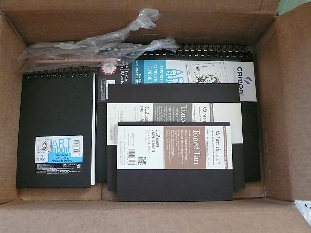
Today, my order of sketchbooks and journals arrived. Oh, Lordy - no excuses now! I'm trying out 2 sizes of Canson's Mixed Media Art Book, the larger of which has pages you can reposition, as in take out to work on and then put back in, or switch pages around which sounded like a nice feature. The pages are also perforated so if you create a masterpiece you wish to frame, it is easy to removed the binding edge. Both have 138lb paper (smooth on one side and more textured on the other) which has been reviewed as standing up better to paint and markers than other mixed media journals. Have I committed to experimenting with paint or what? And then, because I continue to search for the perfect sketchbook to inspire me, I sat up and took notice when I ran across a review of these Strathmore Toned Art Journals. Oh, am I a sucker or what? It's a little like laying down a wash so you're not faced with a white blank page, or so the theory goes. The 80 lb sketch paper is toned to mid-range value to let you get on with the light and dark values. That intrigued me so I decided to try one. Well, two. Because I couldn't decide between grey toned or tan toned and I also couldn't decided on  size. Now that I have them in hand they strike me as toned fairly dark so we shall see how well I like working with them. I may get more use out of that white chalk pencil than what I bought it for - highlighting my Zentangling on the tan tiles. Yes, indeed, I'm a sucker!