In April, I had a vision of what I wanted to accomplish for the entire month and broke it down week by week in one sitting, which was new and exciting. Up until then, I literally could not think beyond the current week, nor felt compelled to try. I thought perhaps this was a sign of growth in the goal setting department, a promise of becoming adept at making long range plans. I figured my list was pretty ambitious so I wasn't depressed or frustrated (much) when things did not go to plan. I ended up setting a few goals aside to address a couple things I hadn't foreseen. So in the grand scheme of things, I think May went pretty well, even though I was left with some items to shift into May.
I don't have big plans for May. In fact, I thought about not setting any monthly goals at all. I know I'll be concentrating on non-studio things all month, so any quilting or experimenting I do will be catch as catch can, tying up of loose ends, working on projects needing little decision making. But after considering it for a few days, I decided I could lay out a monthly plan anyway, just a few things to have listed so that if a spare moment presents itself, I won't be wasting time wondering what to do with it. As I said, there's plenty left from the April list to get me rolling and one new thing that's been on my mind for awhile:
I used paints from a Setacolor Transparent kit for sunprinting. All recommendations were to thin the paint with water in a two to one ration. I chose 4 colors to work with: #11 Colbalt Blue, #23 Oriental Red, #49 Fuschia and #13 Buttercup. I didn't want to mix up very much of any of them so used some very small plastic vials with openings large enough for the 1" foam brushes I planned to use. I was hoping the paint would pour, but it is so thick that it really didn't do that very well. I had a very difficult time figuring out just how much water comprised the 2 parts so I'm sure some of the colors were thinned more than others. Also, the buttercup didn't want to dissolve as I stirred - either with a plastic spoon or a thin dowel. Perhaps this all would have been easier if I'd been willing to make up bigger batches but I wasn't confident that I had airtight containers to store the extra for another session that might be days or weeks away.

Here are two attempts at sunprinting. I used a tightweave pima cotton taped to a plastic-covered board and wet with water. I used a separate foam brush for each color, randomly stroking it on. The oriental red and buttercup were used on the left; after applying in horizontal strokes that only minimally overlapped, I went back over it with buttercup vertically. I was going for a more orange color but these two weren't giving me that. Ditto for what was going on in the piece on the left. My dyeing experience led me to believe that if I brushed the cobalt and then the fuschia, I'd get more of a purple effect. Both colors were lighter than I expected except for a few of the brush strokes. In the future I'll be more bold and try mixing the undiluted paint to the colors I want before diluting it for painting and perhaps be more careful about the proportions of water to paint
The left side got a rather large maple leaf centered on it; the right side had various seashells placed on it. Then out into the sun they went. I spritzed them once or twice with water as they seemed to be drying pretty fast. As you can see, the leaf sunprinted nicely but the seashells hardly show at all. (Click on any of the pictures for larger view.) Also, I noticed that the folds from the garbage bag I used to protect the board sunprinted. Didn't really want that but doesn't exactly ruin the piece either.


I had one more square of this fabric so I grabbed a plastic bag and slipped a box lid into it which was just about the right size. This time I dipped the brush for the oriental blue in the little bit of buttercup left to paint arcs alternating with blue arcs radiating out from the center. This struck me as pretty boring so I tried a few swathes of fuschia too. I took it outside, spritzed it a bit and arranged clumps of selvages over the top. The selvages didn't sunprint at all, but the spritzing caused the paints to run together a bit more and apparently pool in the uneven surface of the plastic bag. I think that's what caused the darker spots and streaks. On the top above is the front side and below it is the back. I rather like the back better - softer and more blended - but those spots show pretty badly. A design opportunity?
 I obviously need more practice with my brushstrokes, controlling how much paint goes where. But for the rest of this session, I just wanted to try tinting with very diluted paint - using up what was left by dumping it into the container of water for wetting the brushes and fabric. I scoured some bleached muslin and while wet tore it into four squares. Starting with the blue, I pushed the fabric into the container getting it thoroughly saturated, squeezed out the excess, arranged it in offset accordion folds and laid it out in the sun. I dumped what was left of the fuschia in next, saturated another piece of muslin and squeezed out the excess and laid this one out flat in the sun with some of the seashells on top. At this point I added the end of the oriental red (all the buttercup had been used up) and saturated another piece of muslin, then arranged it slightly crumpled in the sun. All this to test the information I'd read that wrinkles and scrunches will also sunprint. Well, I did get some delicate veining, nothing very pronounced, so again, I think this would work better if the paint was darker and less thinned. However, I did end up with a pretty stack of pastels. In this picture they are sitting on my "wipe cloth" which was a piece of unbleached muslin wet in some places and dry in others. As I worked, I'd wipe off my hands or a brush on this cloth, then as I rinsed out my little vials when cleaning up, I poured the tinted water into a bigger cup and dipped the whole thing in that before drying in the sun. I'll keep using this that way until it becomes interesting.
 I had one more piece of muslin left and a bit of the blue/fuschia/oriental red mixture so I dunked it and scrunched it much as the previous piece, leaving it pretty wet, sprinkled some salt on it and have left it inside to dry out of the sun. Just wanted a control piece to see how much difference drying in the sun was making. It's still drying.
My general sense is that all these pieces need more done to them to make them more interesting and worth the effort. And that I've got a lot to learn about working with textile paints. Somehow, I find myself yearning for the Procion dye methods I'm familiar with (but don't have a place to work with at the moment). Yes, I'm still out of my comfort zone here.
I don't have big plans for May. In fact, I thought about not setting any monthly goals at all. I know I'll be concentrating on non-studio things all month, so any quilting or experimenting I do will be catch as catch can, tying up of loose ends, working on projects needing little decision making. But after considering it for a few days, I decided I could lay out a monthly plan anyway, just a few things to have listed so that if a spare moment presents itself, I won't be wasting time wondering what to do with it. As I said, there's plenty left from the April list to get me rolling and one new thing that's been on my mind for awhile:
- Play with painting on fabric (and possibly other surface design techniques)
- Make "Irish Eyes" (long overdue gift for a friend's child)
- Finish "Easter in America"
- Finish journal version of Easter
- Make journal interpretation of Wisconsin Spring
I used paints from a Setacolor Transparent kit for sunprinting. All recommendations were to thin the paint with water in a two to one ration. I chose 4 colors to work with: #11 Colbalt Blue, #23 Oriental Red, #49 Fuschia and #13 Buttercup. I didn't want to mix up very much of any of them so used some very small plastic vials with openings large enough for the 1" foam brushes I planned to use. I was hoping the paint would pour, but it is so thick that it really didn't do that very well. I had a very difficult time figuring out just how much water comprised the 2 parts so I'm sure some of the colors were thinned more than others. Also, the buttercup didn't want to dissolve as I stirred - either with a plastic spoon or a thin dowel. Perhaps this all would have been easier if I'd been willing to make up bigger batches but I wasn't confident that I had airtight containers to store the extra for another session that might be days or weeks away.
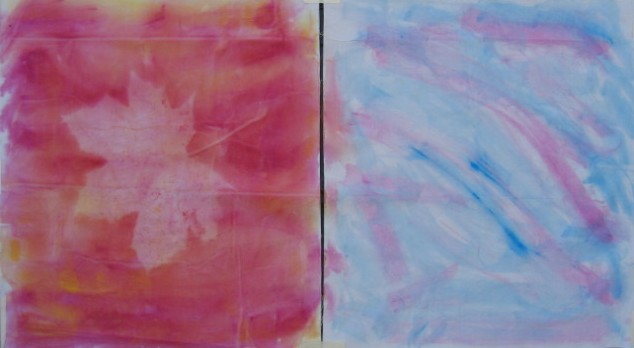
Here are two attempts at sunprinting. I used a tightweave pima cotton taped to a plastic-covered board and wet with water. I used a separate foam brush for each color, randomly stroking it on. The oriental red and buttercup were used on the left; after applying in horizontal strokes that only minimally overlapped, I went back over it with buttercup vertically. I was going for a more orange color but these two weren't giving me that. Ditto for what was going on in the piece on the left. My dyeing experience led me to believe that if I brushed the cobalt and then the fuschia, I'd get more of a purple effect. Both colors were lighter than I expected except for a few of the brush strokes. In the future I'll be more bold and try mixing the undiluted paint to the colors I want before diluting it for painting and perhaps be more careful about the proportions of water to paint
The left side got a rather large maple leaf centered on it; the right side had various seashells placed on it. Then out into the sun they went. I spritzed them once or twice with water as they seemed to be drying pretty fast. As you can see, the leaf sunprinted nicely but the seashells hardly show at all. (Click on any of the pictures for larger view.) Also, I noticed that the folds from the garbage bag I used to protect the board sunprinted. Didn't really want that but doesn't exactly ruin the piece either.


I had one more square of this fabric so I grabbed a plastic bag and slipped a box lid into it which was just about the right size. This time I dipped the brush for the oriental blue in the little bit of buttercup left to paint arcs alternating with blue arcs radiating out from the center. This struck me as pretty boring so I tried a few swathes of fuschia too. I took it outside, spritzed it a bit and arranged clumps of selvages over the top. The selvages didn't sunprint at all, but the spritzing caused the paints to run together a bit more and apparently pool in the uneven surface of the plastic bag. I think that's what caused the darker spots and streaks. On the top above is the front side and below it is the back. I rather like the back better - softer and more blended - but those spots show pretty badly. A design opportunity?
 I obviously need more practice with my brushstrokes, controlling how much paint goes where. But for the rest of this session, I just wanted to try tinting with very diluted paint - using up what was left by dumping it into the container of water for wetting the brushes and fabric. I scoured some bleached muslin and while wet tore it into four squares. Starting with the blue, I pushed the fabric into the container getting it thoroughly saturated, squeezed out the excess, arranged it in offset accordion folds and laid it out in the sun. I dumped what was left of the fuschia in next, saturated another piece of muslin and squeezed out the excess and laid this one out flat in the sun with some of the seashells on top. At this point I added the end of the oriental red (all the buttercup had been used up) and saturated another piece of muslin, then arranged it slightly crumpled in the sun. All this to test the information I'd read that wrinkles and scrunches will also sunprint. Well, I did get some delicate veining, nothing very pronounced, so again, I think this would work better if the paint was darker and less thinned. However, I did end up with a pretty stack of pastels. In this picture they are sitting on my "wipe cloth" which was a piece of unbleached muslin wet in some places and dry in others. As I worked, I'd wipe off my hands or a brush on this cloth, then as I rinsed out my little vials when cleaning up, I poured the tinted water into a bigger cup and dipped the whole thing in that before drying in the sun. I'll keep using this that way until it becomes interesting.
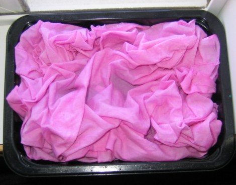 I had one more piece of muslin left and a bit of the blue/fuschia/oriental red mixture so I dunked it and scrunched it much as the previous piece, leaving it pretty wet, sprinkled some salt on it and have left it inside to dry out of the sun. Just wanted a control piece to see how much difference drying in the sun was making. It's still drying.
My general sense is that all these pieces need more done to them to make them more interesting and worth the effort. And that I've got a lot to learn about working with textile paints. Somehow, I find myself yearning for the Procion dye methods I'm familiar with (but don't have a place to work with at the moment). Yes, I'm still out of my comfort zone here.
1 comment:
It is good to learn new things though, isn't it? Even if they don't work out, you are one or two steps closer to getting it.
Post a Comment