Nan asked if one of the books I read during my surface design reading binge was "Off the Shelf" by Sue Beevers, and yes it was. It was the book that gave me the idea to, among other things, tint fabric using a few drops of paint in water. I had some time yesterday afternoon so decided to hand wash those 4 tinted pieces and press them to really see how they turned out.
I was a little suspicious of the oven method of heat setting I'd tried on them. The directions said to heat oven to 220 degrees, lay fabric on foil and place in oven, and turn off oven. Remove after 10 minutes. I divided the fabric on the two racks and when I opened the door after 10 minutes, some moisture steamed out but the fabric itself didn't seem warm enough to have heat set. Surely not as hot as fabric feels right out of the dryer or after ironing it. So it was with some hesitation that I dipped the first square into the tepid water with a little Orvus Paste in it. I was surprised at how much color released immediately into the water. Ok, so I suppose I should expect some. That's why I'm washing it, right? To removed any paint that didn't bond? But with my overly paranoid nature, it was enough to send me upstairs to iron the other squares. Since I had two pieces essentially the same color, I decided to heatset one of them,, leaving the other as my control piece. The last piece theoretically had been dipped in the least diluted paint, so it got heatset with the iron and I expected it to leave the most color when washed. It actually left the least. The two dipped in the same diluted die sloughed off about the same amount of paint regardless of the one having been ironed. The sloughing didn't happen immediately though, as it had with the first one. Frankly, I don't quite know what to make of it.
I ironed all four pieces while still damp and found myself pretty disappointed. The blue one was so pale and impossible to see any effect of having been folded and placed in the sun. Really no shading at all. The two of the same paint showed similar sunprinting of the wrinkles, even though one was laid flat, the other left crumpled. The delicate veining I thought I could see before washing was very pale and hard to see. The best piece was that last one that was the least diluted and least wrung out before allowing to dry crumpled. But even it left me feeling underwhelmed and wondering, Why bother? I may stamp or paint over these after all.
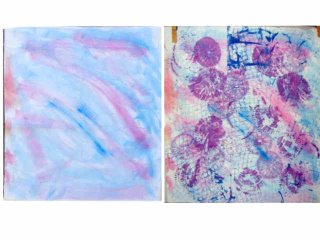
On to today. I wanted to rework the pink/blue piece and the multi-colored one painted in arcs radiating from the center. I set up, contemplated my strategy, mixed paint and got going - and only worked on one piece. Either there's a very steep learning curve here or this painting and stamping on fabric simply isn't my thing. I really did not like where this piece ended up. On the left is what I started with and on the right is what I ended up with. I hardly see this as an improvement.
 Ok, let's look on the bright side then. Utilizing some tips from my Yahoo Surfacing Group, I took a different tact in mixing my Setacolor paints which worked much better. I also was able to mix the purple I thought I'd get from painting with the blue, then the fuschia on wet fabric. Mix first, dilute second. I also darkened the cobalt a little by adding oriental red.
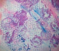 I used that darkened cobalt to add a netting texture over the whole piece. I did this by laying the net from produce bag on my work surface, laying the dry fabric over that, then rolling a hard rubber brayer loaded with paint over the fabric. As you can see, I wasn't careful enough with even loading of the brayer and got some globs here and there. I made two swipes side by side and that is exactly what they looked like, so I shifted the fabric a bit and continued rolling the brayer, but at different angles. I like that effect but I wasn't convinced it was enough and I wanted to get some purple in there. So on to the second idea I had for improving the overall design.
 One of my books had said it was possible to use real sea shells to stamp a shell design on fabric. It was suggested to lay the fabric on a one inch piece of foam to do this. I have a shoebox full of shells gathered from my days living a quick walk from the Pacific ocean, so grabbed a couple to experiment with. Again, controlling the paint coverage on the shell was tricky - some came out darker than others, and I actually liked the way it printed on a flat surface better than on the foam. I was more pleased with the back side of a sand dollar which is flat enough to use on an unpadded surface. Click on the picture for a closer look at the cool texture it left.
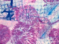
The problem was, of course, just where to stamp the shells and how many to stamp. After a point, I sensed more was not making it better, but you can't exactly remove them. Also, had I used several colors in varying values, it undoubtedly would have been more interesting. Perhaps these shells were really too large for this small piece of fabric? Whatever - it certainly wasn't going in the direction I'd hoped. This may end up being a cutter - taking the closeup pictures isolated sections that could stand on their own.
Or...I keep wondering if I could overpaint the whole thing with one color that would help pull it together. Someone was talking about "glazing" work, which is essentially adding a wash of color to unify many and provide depth. But what color would that be - perhaps green? Would a dash of yellow help - spattered or sponged? I may as well keep experimenting because I'm sure not happy with it yet.
The more I puzzled over this, the more I kept thinking, "I do better going from dark to light, not light to dark." I was thinking of the green, tan & black squares I'd stamped and the Versatex paint rolled over black fabric lying on netting. Painting and dyeing usually requires you to work light to dark by virtue of their relative transparency, unless using opaque paints. Perhaps I need to find the means to "work backwards" if painting on fabric is going to work for me.
I was a little suspicious of the oven method of heat setting I'd tried on them. The directions said to heat oven to 220 degrees, lay fabric on foil and place in oven, and turn off oven. Remove after 10 minutes. I divided the fabric on the two racks and when I opened the door after 10 minutes, some moisture steamed out but the fabric itself didn't seem warm enough to have heat set. Surely not as hot as fabric feels right out of the dryer or after ironing it. So it was with some hesitation that I dipped the first square into the tepid water with a little Orvus Paste in it. I was surprised at how much color released immediately into the water. Ok, so I suppose I should expect some. That's why I'm washing it, right? To removed any paint that didn't bond? But with my overly paranoid nature, it was enough to send me upstairs to iron the other squares. Since I had two pieces essentially the same color, I decided to heatset one of them,, leaving the other as my control piece. The last piece theoretically had been dipped in the least diluted paint, so it got heatset with the iron and I expected it to leave the most color when washed. It actually left the least. The two dipped in the same diluted die sloughed off about the same amount of paint regardless of the one having been ironed. The sloughing didn't happen immediately though, as it had with the first one. Frankly, I don't quite know what to make of it.
I ironed all four pieces while still damp and found myself pretty disappointed. The blue one was so pale and impossible to see any effect of having been folded and placed in the sun. Really no shading at all. The two of the same paint showed similar sunprinting of the wrinkles, even though one was laid flat, the other left crumpled. The delicate veining I thought I could see before washing was very pale and hard to see. The best piece was that last one that was the least diluted and least wrung out before allowing to dry crumpled. But even it left me feeling underwhelmed and wondering, Why bother? I may stamp or paint over these after all.
On to today. I wanted to rework the pink/blue piece and the multi-colored one painted in arcs radiating from the center. I set up, contemplated my strategy, mixed paint and got going - and only worked on one piece. Either there's a very steep learning curve here or this painting and stamping on fabric simply isn't my thing. I really did not like where this piece ended up. On the left is what I started with and on the right is what I ended up with. I hardly see this as an improvement.
 Ok, let's look on the bright side then. Utilizing some tips from my Yahoo Surfacing Group, I took a different tact in mixing my Setacolor paints which worked much better. I also was able to mix the purple I thought I'd get from painting with the blue, then the fuschia on wet fabric. Mix first, dilute second. I also darkened the cobalt a little by adding oriental red.
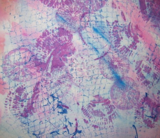 I used that darkened cobalt to add a netting texture over the whole piece. I did this by laying the net from produce bag on my work surface, laying the dry fabric over that, then rolling a hard rubber brayer loaded with paint over the fabric. As you can see, I wasn't careful enough with even loading of the brayer and got some globs here and there. I made two swipes side by side and that is exactly what they looked like, so I shifted the fabric a bit and continued rolling the brayer, but at different angles. I like that effect but I wasn't convinced it was enough and I wanted to get some purple in there. So on to the second idea I had for improving the overall design.
 One of my books had said it was possible to use real sea shells to stamp a shell design on fabric. It was suggested to lay the fabric on a one inch piece of foam to do this. I have a shoebox full of shells gathered from my days living a quick walk from the Pacific ocean, so grabbed a couple to experiment with. Again, controlling the paint coverage on the shell was tricky - some came out darker than others, and I actually liked the way it printed on a flat surface better than on the foam. I was more pleased with the back side of a sand dollar which is flat enough to use on an unpadded surface. Click on the picture for a closer look at the cool texture it left.
The problem was, of course, just where to stamp the shells and how many to stamp. After a point, I sensed more was not making it better, but you can't exactly remove them. Also, had I used several colors in varying values, it undoubtedly would have been more interesting. Perhaps these shells were really too large for this small piece of fabric? Whatever - it certainly wasn't going in the direction I'd hoped. This may end up being a cutter - taking the closeup pictures isolated sections that could stand on their own.
Or...I keep wondering if I could overpaint the whole thing with one color that would help pull it together. Someone was talking about "glazing" work, which is essentially adding a wash of color to unify many and provide depth. But what color would that be - perhaps green? Would a dash of yellow help - spattered or sponged? I may as well keep experimenting because I'm sure not happy with it yet.
The more I puzzled over this, the more I kept thinking, "I do better going from dark to light, not light to dark." I was thinking of the green, tan & black squares I'd stamped and the Versatex paint rolled over black fabric lying on netting. Painting and dyeing usually requires you to work light to dark by virtue of their relative transparency, unless using opaque paints. Perhaps I need to find the means to "work backwards" if painting on fabric is going to work for me.
No comments:
Post a Comment