Thursday, May 31, 2007

Now time for a chuckle...

I ran across these in an article in the December 2006 issue of American Art Review:
...the cynical [Ambrose] Bierce in The Devil's Dictionary defined painting as "the art of protecting flat surfaces from the weather and exposing them to to the art critic. Formerly, painting and sculpture were combined in the same work: the ancients painted their statues. The only present alliance between the two arts is that the modern painter chisels his patrons."

And possibly in response:

"A work of art is a conviction - one way or the other - an expression of estheticism, it is ever very largely a fiction - so, in a justified criticism, we can only ask if the result is justified by the effort expended in producing it." -Arthur Mathews

For Vanessa

This wild rose along the bike trail burst into bloom last week, bringing memories of my mother. Mom loved wild roses. To be honest, I think Mom loved all wild flowers, but she seemed to have a special love for these. Part of her childhood was spent on a ranch in the Dakotas; perhaps running across them later in life brought back a treasured childhood memory? They certainly do for me.

Weekends were often spent out camping, or at least taking a Sunday drive. Mom and I would follow trails into the woods, where she would point out and share names of all the flowers. (To my chagrin, I've forgotten many of them.) The roses, however, were usually spotted along the roadside as we passed the time waiting for Dad to scramble back up the bank from a fishing hole. The joy on Mom's face at finding them went beyond mere pleasure of something beautiful. She must have been seeing into a pleasant past as well.

Wednesday, May 30, 2007

And Judi's May Journal Quilt

There's an outside chance here that my journal partner, Judi and I are pushing each other more than we realize. The partnering was to help us really go through with the commitment, i.e., it's easy not to do something if you're not accountable to someone else. But neither of us wants to let the other down. We're certainly not in any kind of competition here, yet I sense we may be putting a little more effort into this because we are sharing the results with each other each month. Does that make sense?

I've always been impressed with Judi's artistic sensibilities and design work, yet when I opened the e-mail with her May journal quilt pictures attached, I was stunned. Here is her description of the process:

"I decided to make the dandelion leaves out of ultra suede. Thought I would try stitching in the veins before I cut out the leaves. With the fusible ironed on the back and the freezer paper pattern ironed onto the fusible paper it worked well stitching in the veins. Afterwards I cut out the leaves and pealed the paper off the back.


Next I auditioned background fabric and found one that I especially liked the sky part. I layered the background and quilted it...I tried doing the lines with the regular foot on the machine and the feed dogs and quilting foot in place. Actually worked quilt well on the wavy lines until I tried to do a circle. My stitches are quite even. For the ground portion of the background I did a variegated zigzag.


When the back ground was done I set it aside and pulled out the water soluble embroidery fabric. Drew the dandelion head on the soluble fabric and placed the dandelion head leaves between 2 sheets then, stretched in a hoop and started to stitch first the brown seeds in the center, then the white fluff starting with the outside ring and working in. When done I placed the puff in water for the soluble to soak off. There were a few places that the stitching didn't connect but I knew this could be fixed when attached to the top. I used the Esterita Austin's fusible web for attaching the puff to the quilt. At the same time I ironed on the leaves and stems. Went around the puff with more stitching and fixed the few areas that were too holey. Stitched on the leaves with smoke nylon thread. Then I made the yellow flower by stitching right on the top. Did a fancy leaf design in green around the edge...trimmed to a 16th of an inch and zigzagged around the edge in a darker shade of green to finish up."

By the way, that background fabric is one of her own hand-dyes. When we were dyeing together, she always made these wild colorful textured pieces while I was carefully making more conservative evenly textured ones. I loved her stuff and still do!

May Journal Quilt

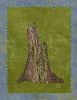
Of the dozens of pictures I've taken around the property this spring, one of a stump (dead for who knows how long) with new growth sprouting up around it seemed perfect to interpret this month's calendar theme, "Strength" and quotation from Hal Borland: "If you would know strength and patience, welcome the company of trees." Right up my alley, wouldn't you say?

The technique I experimented with, painted fusible web, is one I briefly tried a few years ago on a very small sample, and decided I didn't care for it, nor understand why it was all the rage among the art quilters. But I'd recently run across an article about it that made me want to give it another try, this time to create this stump. I had odd bits of WonderUnder fusible web left over from preparing the angel applique, so I'd painted them with acrylic paints a week or so ago so they'd have plenty of time to dry (see this post). I streaked on brown and an off-white and also mixed the two so there were at least three values of brown to work with.


Some pieces I could use pretty much as they were, others I shaped to form the jagged top of the stump and the curves along the bottom. I was guided by a full size printout of my original photo. Having that photo out slowed me down initially. My weakness is going for too literal of a translation when working from a picture, and I soon found myself spending too much time trying to find one or two colors beyond the green to emulate the mountain and sky. Finally I came to my senses, remembered that the stump was the focus of this design and I didn't need to clutter it up with a chopped up background. Of the greens, I opted for one a bit toned down and set aside the dusty blue I'd been considering for the sky to use later as the frame.


My most recent directions, plus another set I found in an older Quilting Arts Magazine suggested layering. One indicated leaving the paper backing on, the other not. I decided to apply each piece one at a time with the paper on. As I removed the paper and added more pieces, I protected the iron with a Teflon applique sheet. The same problem cropped us as I remembered from my first trial - the fusible would get shiny once the paper was removed and heat was applied again. But I kept building up the stump, with the thicker painted pieces a little less shiny. (If anyone knows the secret to avoiding this look, please share it!) The last few pieces I put on had very little paint and I finally started to see some of the texture talked about in the articles.

I didn't add any batting to this, backing it with Decor Bond (a very heavy fusible interfacing) only. I stitched around the outside of the stump and then lines up through it with King Tut variegated grey cotton thread. Then I stitched the shoots and leaves with Oliver Twist hand-dyed cotton thread in green. I finished it off by adding the blue "frame" and stitching the edge with a feather stitch.

After I'd done the fusing, I didn't think I liked it at all and the shine really bothered me. But after stitching it and standing back from it, I was amazed at the depth I got - which I'm sure I couldn't have done by painting directly on the fabric. I suppose I'll have to play with this some more. I really like this stump too, and would like to do it again with a different background (this one read a little darker than I anticipated) and some batting to bring out dimension.

As always, you may click on any picture for a larger view.

Tuesday, May 29, 2007

It Was That Kind of a Day...


So I took the tears and filled a page in my small sketchbook with them, making them useful, letting the rhythm of drawing the shapes, playing with the placement calm and distract me. Whatever it was that welled up inside me emptied onto the page and became ideas for something beautiful, not sad.

Thursday, May 24, 2007

Willow Leaves II


When you spend time auditioning fabrics, as I was doing yesterday and last week, there's not much to show for the time invested. So when I got as far as I could, I had an overwhelming urge to do something I could have success at and have something concrete to show for it. There's nothing like working at the machine if productivity is the aim, and I've been really anxious to get going on the quilting of Willow Leaves II. So I ended my day yesterday with an hour or so of machine quilting.

Now that's really saying something for me to consider a session of free motion quilting the road to success. I more often than not struggle with my machine quilting, and often am unhappy with it. But the stars must have been aligned, or I was just desperate. The session went flawlessly, and I experienced that calm the steady hum of the machine often gives me.

Willow Leaves II is one of my experiments with leaf stamping using Liquitex acrylic paint. First step in quilting would be to stitch around each leaf and up through the center. I did this with a lustrous brown Polyneon thread. Here you can see how nicely the quilting is beginning to define the leaves from the background.

This step went so well, I was more than ready to tackle the next step today. The background batik reads a little busier than I anticipated, so I thought if I heavily quilted it with the grey variegated King Tut cotton thread, it would be toned down and the leaves would stand out better. One of my goal for this series is to find ways to make the background look like pavement. In the first Willow Leaves, I used a squiggle stitch and monofilament thread (see here). It sort of gave that feel, but the clear thread was a mistake. After trying out this thread and the garnet stitch on last month's journal quilt, I was ready to be bold and use it here.

Well, it may not be any less busy than the batik itself, but it surely looks like pavement to me. I'm finding the stitch fairly forgiving, and relatively easy to get a rhythm going with. Any fullness is easy to quilt flat, and I don't seem to be getting any distortion. This may be more due to the batting than the stitch - I'm using Hobbs 80/20 black which is quite dense and stable itself.

I got almost half quilted today - the density of the garnet stitch makes it slow going and no doubt is using up tons of thread, but I'm really getting enamored of close quilting. This is tons more interesting than a meander or stipple stitch of the same density. I wouldn't want to sleep under a quilt stitched this way, but for wall art, or even a handbag, this is terrific.

Wednesday, May 23, 2007

Angel Progress

I've been reticent to write more about my angel quilt project, partly because I'm still waffling a bit. Not that I didn't get excellent feedback as I polled various groups about background choices. On the contrary, the conversations that developed out of my simple, "Choose one and tell me why" question resulted in an epiphany of sorts that sent me back to the drawing board.


More on that in a minute, but first, these two backgrounds were the hands down favorites in my poll. It didn't seem to matter much whether I was asking my blog readers (many of whom are traditional or art quilters), my quilting friends back in Wisconsin who know me well and have seen my work in person, or the members of the church for which this quilt is being made. However, all were at a disadvantage because they were basing their opinion on photos only, and we all know how different a photo seen on a computer monitor or printed on paper can be from the real thing. So while I didn't disagree with this outcome, I had the advantage of seeing how these worked when actually viewing them. And something was still off.


The border options I'd laid out weren't very serious since I had no clue what was going to happen out there. A lot of you picked up on that, noting that these fabrics just weren't right, or at least not in the proportions I was showing. This generated some great suggestions, some of which were already percolating in the recesses of my mind. I suppose the real turning point came when I received several suggestions to use a greenish leafy background and consider some additional design details that would play on the meadows and trees that permeate this area. That's when I realized I'd been fighting the urge to do what I needed to in order to make this angel quilt specific to this church and this area.


Why the fight, you may ask. I knew I didn't want to duplicate the original quilt, partly because I simply don't enjoy making something twice and partly because I didn't think it appropriate for this setting. I also thought I didn't want to make anything very complicated. Quick and simple, was my thought, but I should know better. My track record has been to take a simple idea and before I know it, turn it into something complex and, usually, much more interesting. But no, I kept telling myself, this project is a sidetrack from my intended game plan for the year, so I need to do it well, but do it simply. Thus, anything beyond an angel on a plain background with a simple border kept getting pushed aside. But it was obviously making me uneasy and sapping any enthusiasm I might have for this quilt.


Then came the epiphany. I was starting to entertain some of these more complex ideas, and subsequently getting excited about the quilt at last. But I still felt I was blocked. While discussing this with a non-quilting friend, it occurred to me that perhaps I couldn't pin down where I was headed with this quilt because I was still unsure about what the space in which it will hang and what the church itself would come to represent once in its new surroundings. We have decided to change the church's name and are still struggling to come up with one we feel accurately represents our developing identity. No wonder that I too was struggling with the identity of this quilt. I was working with a blank concept, my design had no theme. But now I was developing one. This angel had to be The Angel of the Rock, since the new location is near Rocky Point, and needed to reside at the lake. The quilt would not be me of 5 years ago when the first angel was made, but would represent me today with my emphasis on nature. Ahhhh - inspiration at last!


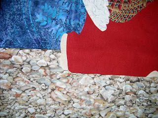
I couldn't wait to get back in the studio, put away all the fabric that would not be in this quilt and start looking for new pieces as well as new ideas for the overall design. One of the first things that happened as I put fabric away was I ran across a piece of rock fabric. I think this was the color I was looking for to help balance the colors in the angel's tunic, and it solidified my theme of Angel of the Rock. I placed it such that the angel was kneeling on it - the rocky beach of the lake. Next I took the hardest step - making that first cut. The dark blue batik was set aside and I cut a piece of the ethereal lighter blue for the upper portion of the quilt. Next, I found a more muted blue for what would become the lake. This matches the tone of the sky better. This picture is a little uneven but gives you an idea of how these will work with the angel.


I also found a zingier green and blue batik that I think I'll run up the sides in some fashion. But I ran into a snag finding a proper green to represent mountains behind the angel. So things came to a screeching halt while I re-thought this part. Today I tried several greens out of my regular stash, tried netting to alter tones, and again, just happened to stumble upon a fabric that may work better than any I've tried so far. Still, there's a problem with contrast - the angel isn't standing out quite like it should. So I spent a lot of time pondering. Could I apply a glow of paint around the angel? Could I make it stand out with thread or quilting? Should I fuse it to another fabric that would then be trimmed back so just a bit of it showed? That seemed the most reliable option, but again, what fabric, what color? I played a bit with the nettings - no - and was about to give up for the day when I wondered, what about yellow. I glanced over at the crows feet blocks still up on my design wall and spotted one with a lovely muted yellow in it. This sent me to my reproduction stash once more - you just never know where inspiration will come from or what odd fabric will be perfect for the cause. I think one of those pre-1900 repro fabrics is going to give me the slight glow and definition that angel needs.


I'm a long way from having this all figured out, let alone finished, but I decided I needed to take that June 1st deadline off the table. The church itself thought it had to have the new name in place before the move but has since found out that isn't true. It is being encouraged to take its time and get it right, because it will be a name to be lived with for a very long time. I'm realizing the same applies to this quilt. I shouldn't rush it, I need to get it right, because I and the other church members will be living with it for a long time.


Monday, May 21, 2007

And More Blooms...

It's been a dreary few days with weather turning quite cold, rainy and blustery. Spring? Doesn't feel like it today as I cranked up the Earth stove. But these latest blooms say otherwise:

Iris tall and graceful, full of complexity whe viewed close up. There are yellow one about to bloom as well.


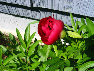
Peonies, the poor man's rose. Although if you check current prices, you will find they are quite pricey.


And strawberries????

Sunday, May 20, 2007

Play Day

Friday always feels like it should be a play day, although I don't usually use it that way. But this week I did. Time to paint that fusible webbing.


I tried this several years back after seeing it listed as a technique on art quilts, then seeing instructions in one of my books. I couldn't imagine why anyone would want to do this, what the advantages might be over painting straight on the cloth. My little sample still left me wondering. The paint transferred as a shiny hard lump. I ran across this technique again in the Feb/Mar 2007 issue of Quilting Arts Magazine ("Textural surfaces for stitch" by Jeanne Raffer Beck). I'm still not sure why the attraction to painting fusible web, but her caution to not overheat it during the fusing process "or it will get a shiny, plastic look" made me think I should try it again and I might get different results.

I suppose it was that article so relatively fresh in my mind and the odd shaped scraps of fusible left over from prepping the angel for applique that made me think to use this in my upcoming journal quilt. It will feature a large stump, and rather than use fabric applique or decorative stitching, I thought I might recreate the look of the rough surface with painted fusible.

I cut open a plastic bag and taped it to a piece of cardboard to make a work surface. Some of the pieces of fusible were curling a lot, so I secured them with a little tape. I used some Liquitex Acrylic paint left over from leaf stamping last fall. The brown and the off white, I decided, should blend well for the look I'd be going for. I also had some green ready to go, so used it as well.

I expected the fusible paper backing to react to the moisture of the paint, crinkling up and providing some texture - this is what I remember from my first try at this. But the paper stayed flat. On a couple of pieces, I tried applying water before the paint, but I still wasn't getting much crinkling. But I did like the effect of painting on the brown in long streaks and following that up with streaks of the off-white. We'll have to see if it looks as good once it's fused onto the background fabric.

This process didn't take long, so I found my mind wandering to bleach discharge. I had a question about whether bleach would have any effect on a painted surface. Conventional wisdom and friends with more experience than I said, No - bleach should not "discharge" paint in the same way that it discharges dye. Then, of course, the friends followed up with, "But why don't you give it a try anyway?" I used a Clorox bleach pen to squiggle lines over this square of fabric that's been giving me such fits. It has a fairly heavy layer of blue Versatex paint applied over a thinner layer of Setacolor paint. I let it work for a bit - at least 15 minutes.

As I stared at the squiggles of gel lying on top of the paint, I thought - what a waste to just wash that down the drain...I wonder if I can transfer it to a piece of fabric. So I grabbed a square of black cotton, carefully laid it on top of the painted square, pressed firmly with my gloved hands, then pulled it off. The bleach indeed transferred, and quite smoothly too.

This makes me believe that one could draw out a design in bleach gel on a smooth surface and press it onto fabric as in printing. The advantage to this over applying directly to the fabric, I think, is that the bleach would be hitting the fabric all at once, thus the discharging effect should be more uniform if working on a large piece. It would also allow for correcting of errors when drawing out the design.

I checked the backside of the painted piece, and it looked like something was happening. I rinsed off the bleach under cold water and something definitely had happened. I don't think the bleach penetrated the Setacolor paint, but the Versatex definitely had been breeched. Now, whether this was because of a less than great bond between the Setacolor and the Versatex or because the Versatex reacted differently to the bleach than the Setacolor I'm not sure.

Next I tried using the bleach pen to apply the gel to a rubber stamp. I felt the need to work fast, so my application wasn't very even. The gel seemed to moosh out to the edges to discharge more or faster than the inner part of the stamp. This fabric was originally dyed with Indigo dye from Pro Chem, then painted with Setacolor paint and scrunched. It's difficult to see if the bleach had any effect on that dark red Setacolor or not. I hadn't expected the indigo to discharge to pink but it's not out of the range of possibility.


Sucked In


Truly, the plan was to quickly run into the library to put in a request for a book, pick up the "Overlay" book recommended to me by Margaret, and be out in 10 minutes max, off to my primary destination. But I am a library junky, cannot cross the threshold and leave once more without perusing certain sections. I'm not sure, but I think I spent at least an hour looking around.

Admittedly, it's been awhile since I've been, and I've been feeling a bit of withdrawal as I've relegated my reading time to catching up on magazines. Ah well, the two extra books are more for looking at than reading. The one on the right is a slim book of photography from the mid 1970's, and yes, the photos remind me of the sorts of pictures I take myself for reference. The other is a 2006 surface design book with spiral binding so that it opens flat. I'm curious to see if it tells me anything that I can't already find in books on my own shelves.

Friday, May 18, 2007

More Blooms

These are on my part of the property.


Two large lilac bushes, full bloom just in time for the annual Spokane Lilac Festival Parade on Saturday.


Poppies and Bachelor Buttons along the foundation.


And a very large Mountain Ash.

And over at the landlord's...

This lovely wisteria


And apple blossoms, I believe.


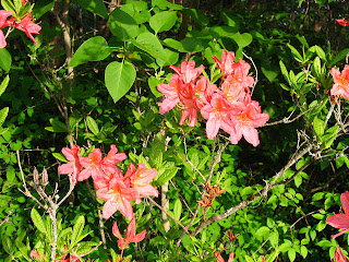
Azaleas of two colors.


And a very small rhododendron peaking out along the ground.


A string of bleeding hearts...


A spreading chestnut tree. The blossoms look boring white until you take a close look. Delicate pink touches were a surprise.


This last group is equally beautiful but I don't know what they are.


Now, it's time to get back to work!


Critters


This is for Cindy and her kids. When you live between the lake and the slough, I suppose you've got to expect visitations from critters like this.

But honestly, this turtle about gave me a heart attack as I was poking around under my front porch the other day - very well camouflaged in those leaves. The next day, it had managed to get in the fenced yard, and I think couldn't find its way out again. Dog Jesse helped by retrieving it from the far corner. Don't worry - no harm done, and I carried it down closer to the water. It was about 8 inches across and HEAVY! Just love that bright red accent around the edge of the shell.

Thursday, May 17, 2007

Nifty Little Wallet


Here's the bag that was on my goals list this week. The pattern is from Bits 'n Pieces and called "Knick-Knack Sack." It's really pretty simple, but I have so struggled with purses and bags, especially when it comes to inserting zippers. If someone else has figured it out, why should I waste my time re-inventing the wheel?

The pattern includes two sizes of zippered wallets. This one is the larger one and is about 8" by 4-1/2". It went together like a breeze (zipper included). Kudos to the designer for putting together directions that are accurate and easy to follow. I can't tell you how many times I've used hurriedly produced patterns with errors or minimal instruction, and it is so irritating. No wonder many beginning quilters get frustrated; when they work with a faulty pattern, they think the problem is with them, certainly not with the pattern.

The outer and lining pieces are fused together before sewing proceeds. No particular brand was recommended, so I used Wonder Under, which left the bag with good body but made the lower corners with 6 layers very difficult to turn and push out. If I were to make a suggestion to the designer, it would be perhaps to recommend a fusible. I'm wondering if something a little lighter might be better.

I see great potential for this simple design. Here I've used my leaf stamped fabric for the pocket. My fault that the leaves are trapped in the lower seam - I was thinking 1/4" seam allowance when in fact the pattern used 1/2" but with care, I can see how small pieces of specialty fabrics could be showcased in that pocket, or even in the body of the bag. I'm sure I'll be trying out more ways to use up little experiments in a practical fabric wallet!