Thursday, January 29, 2009

Getting Close


"Advice is what we ask for when we already know the answer but wish we didn't."
Erica Jong

Oh, this quotation is so true, at least for me, but today I am not asking for advice. I'm boldly showing you what I've decided to do! The picture above is a quick preview of how I anticipate Jockeying for Space will be finished out. I've loosely wrapped the batik fabric around a stretched canvas 12 x 12 inches and laid the trimmed quilt on top. I could just as easily make a mount out of the batik, but I wanted to try this other method of attaching a quilt to a stretched canvas that is now all the rage.


I always felt this quilt was not going to stand for perfectly squared up sides. This slight arc treatment is what I decided on - almost a cathedral window effect. I cut several frames from paper to test my idea, then realized I could just pin the frame in place and use the edge of the paper as a guide to run a line of stitching around the outside. Once that was done, I trimmed close to the stitching. Next step will be to sew this to the batik and couch yarn over the edge. I think I will lightly twist together the sari silk yarn and the dark blue chenille to make a visible outline.

Tomorrow I go on retreat...well, sort of. My Midwest friends are gathering again for a weekend of quilting but I'm not able to join them, at least, not physically. Instead, I plan to join them in spirit, pretending I am there with them, sewing away on a typical retreat project, checking in by phone throughout the weekend, and ignoring normal responsibilities. I've spent time this week "preparing" my project like one does, picking fabric, doing some math and cutting my pieces so that once I "arrive," I can concentrate on sewing. If I tire of that project, I'll pull out the wall quilt I took to last year's retreat and continue hand quilting it. It won't be the same as being in the same room with them, laughing and sipping wine and getting opinions and soaking in and giving out some oohs and aahs, but it's the best I can do.

Sunday, January 25, 2009

Studio Chaos


I haven't been updating you on what I've been working on because, well, there's nothing very cohesive to show. I've alluded to my random scrap sewing which has been going on since probably October. I sat down and did a bit more of it the other day because I'd really like to wrap it up and clear up this mess. Actually, this IS a little cleared; prior to the other day, the floor surrounding the drawer was more littered with fabric scraps.


I've quit being quite so random, and some of the little pieces are starting to look like something to me. Still need a lot of work to get them pleasing to my eye, but at least I'm seeing potential now. The one on the right is similar to the piece I used in "Unfinished Business" and it may get a similar treatment - leaving the edges untrimmed and raw but mounted on something different than batting. Haven't quite worked that out yet, but in it, I started to see trees in a forest. Quilting or thread painting could help capitalize on that image.


I finished quilting the triangle piece (Jockeying for Space) and I decided it was time to start auditioning fabric to mount it on. Now it looks like a minor explosion has gone off in my studio. My small bit of clear table now is laden with a basket holding fabric that got pulled as options. If you click on the picture, you should be able to see Jockeying lying on a somewhat bright batik that I am seriously considering...provided it doesn't compete too much. It's rival is a rusty batik that really brings out the triangles of similar color.


That's my basket of batiks in the foreground, resting on my ironing board and rendering it useless. On the chair are some possibilities that were considered but probably aren't the best choice. I forgot to angle the camera up to show what's on the design wall - three other options that are better choices. I started the auditioning on the wall, then when I pulled out the other basket, just worked on the table. Whatever I choose, I will choose it after I've seen how it looks back on that wall.

The rest of what you see in this picture is what happens when your second machine is in the shop. This is where my Viking Sapphire resides, snug in it's Dream World table extension. When it's in for repairs, as it has been for over a month now, the table starts collecting this and that like all the other flat surfaces in this room. That's birch bark, which I must figure out how to store, a quilting sample that is good enough to finish out and hang, a mini-iron I got for Christmas, & probably some other stuff. Clearing this is now a priority, because Viking finally gave up (or gave in?) and sent me a new machine which I picked up yesterday. I didn't expect to miss it as much as I did. Now I can hardly wait to get it hooked up and give it a spin, make sure I don't experience the same problem as I did with the original.

Finally, in the upper left you can see more pairings from my scrap drawer. The bigger one is saying, "portal" to me, as is one in the picture of the design wall. Just when I thought I'd stop and put this all away, it has captured my imagination again and I keep finding more and more strips in that drawer to sew together. Not sure when this will end, but as long as I have two machines again, keeping the old one devoted to this random piecing isn't really a problem. It's kind of a good exercise, is mindless yet makes me work at the same time.

Thursday, January 22, 2009

Anna Katharine Green

While I'm on the subject of furniture designers, I thought I'd share some ideas drawn from the work of Charles Rohlfs and his wife Anna Katharine Green. Green is well known for her literary skills as a Victorian mystery novelist while Rohlfs is ranked among the most innovative furniture makers of the early twentieth century. Green also pursued watercolor painting and the illumination of poetry. Joseph Cunningham in his article Anna Katharine Green and Charles Rohlfs: Artistic Collaborators, (The Magazine Antiques, December 2008) brings to light new scholarship linking this other side of Green to carved designs on early furniture by Rohlfs.

There's definitely a link between design motifs used on furniture and on quilts in the 18th & 19th centuries. Shells, fans, scrolls, compasses and many other motifs show up in near identical form on these items and at times you have to wonder who was influencing whom. So I am always on the lookout for design elements in furniture that I could incorporate into my quilting. In these examples, Green is credited with adding her flourishes to the Arts & Crafts sensibilities of Rohlfs' sturdy furniture. The one on the left resembles a plume and is similar to the ever popular "feathers" quilting design. This variation reminds me more of a swan.

It's exciting to look at Green's illuminations and see the direct similarity to a carved element on a bench or desk.


Click on this photo of a desk and explore the rich details, any of which could be adapted to quilting. Note the similarity of the serpentine lines to the ones in Green's illustration below.


Wednesday, January 21, 2009

Shoddy Work

From The Magazine Antiques again, this quotation from an article on furniture designer Gilbert Rohde:

"[Rohde] suggested [to Dirk Jan De Pree, founder of the Herman Miller Furniture Company] that the traditional designs of Herman Miller were not only grandiose and pretentious, but were also essentially stolen from earlier makers; and he pointed out that the company's manufacturing techniques - giving wood an aged look through artificial means and using decorative elements to conceal shoddy joinery - were fundamentally dishonest. As De Pree would later say, 'I came to see that the way we were making furniture was immoral.'"


I spewed my coffee on that last part!

But do these two have a point?

See examples of Rohde's designs here.

Saturday, January 17, 2009

More Triangles


I've spent a lot of time the last few days cleaning up jpg files on my computer, deleting some, moving others into folders and printing out copies of some for my documentation files. It's amazing how quickly the computer can start looking like my studio - a jumbled mess of good intentions! I couldn't resist squeezing in some time on the next "jockeying" piece using up triangles trimmed from other projects. This time, the background is one I did some rubbing experiments on with Shiva Paintstiks. I wasn't overly thrilled with the results so don't mind covering it up with the triangles and getting it off the table.

If you click on the picture above, you should be able to make out the navy blue tulle placed over the top to hold the triangles in place. I've not used tulle this way before and I'm hoping I'll get that floating effect I was looking for in the postcard version sans fusible web. A placed a few straight pins next to but not through the triangles to aid in holding them in place until the quilting is done. I started near the middle quilting along the outlines of the triangles (but not over any of them like I did on the postcard). Then it was on to filling in the background.


As you can see, I'm back to my love affair with straight parallel lines of quilting. I'm not doing much planning of the direction the lines run off to, just going with the flow and seeing where it leads.

Friday, January 16, 2009

Intention


The above is my response to an on-line challenge to create a small quilt that reflects my intention for the new year. It is called "Unfinished Business" and is made up of bits and pieces scattered about my work table. I have a lot of unfinished business, and as far as my art goes, I've been working since the middle of last year to clear my work table and design walls of all those half-done projects, leftovers that sparked new ideas and fabric pairings that intrigued that I've left out so they would not become more "out of sight, out of mind" ideas never seeing the light of day again.

My intention for 2009 is to continue to work through all this until the table and walls are clear again. No more unfinished business (ha!). There are so many good ideas languishing there, things I'm itching to try and finish and resolve. This isn't stuff I'm thinking I should finish just to be finishing. This really is stuff important to me. And this is the only way I could figure out to actually make decent headway on it.

Of course, with each thing finished, there's often more leftovers sparking even more ideas, but my plan is to work on those too in a much more timely manner than I usually do. I'm excited about working this way, and the bits of freedom gained as work finishes and bare table emerges exhilarate and propel me forward.


As for what's in this piece, it started with the stripset, one of a half a dozen or so I started randomly sewing together from a scrap drawer. I wasn't happy with the way it was going, but several pieces were ok. I just didn't know what to do with them, how to move them beyond ok and didn't want to toss them either. I'd salvaged the piece of batting from a quilting sample and laid the stripset on it. I couldn't bring myself to square up the piece, to get rid of those uneven edges top and bottom, found myself oddly intrigued by the seam allowances showing, the loose threads. I attached it to the batting by zigzagging around the edges with clear monofilament thread. But it needed more. I spotted some yarn ends trimmed from a project early last year and couched them on top through the stripset and batting. Then amongst the rubble I found the brown strip that had been trimmed from yet another quilt of last year. It had Decor Bond fused to it which is why it was still out on the table. Knew it would be good for something but hadn't decided what. I liked how the square of "quilt" looked on it. Then I found the narrow strip of batik and fused it to the brown strip leaving edges raw and extending it into a hanging loop at the top. I used glue to attach the quilt to this backing strip and called it done. While it is "finished" it is not "finished" in the way I would normally complete a quilt - there's no backing, no finished edges. It speaks to the impatience I'm feeling right now to get things done. The main part is 7" by 8" and the strip it is attached to makes it about 14" in overall length.

This is the second piece I've done where I've just sewn piecing to batting and left all raw edges exposed, including the excess batting. (See "Change" here.) I'm a little appalled at myself that this is becoming an appealing way to work since I've looked askance at other artists working this way. ;-) But in both cases, the work was reflecting emotion, emotion that did not want to be reined in by neat and clean finishes.

This will hang in my studio as an in my face reminder to get to work and deal with all that unfinished business.

Thursday, January 15, 2009

Shibori Play Round 2


I cut two squares from my shiboried piece from the last post to see what would happen when the gathering stitches run different directions from the first set. I stitched from the opposite sides as round 1 on one piece and diagonally across the other. This, BJ, is why I save the threads. They had nice big knots in one end already and were easy to pull intact from the fabric. Not having to pick up scissors to cut knew lengths and make knots saved some time. And besides, waste not want not is my credo. Those threads being the heavy buttonhole kind have lots of life left in them!


I wanted to add a different color and couldn't decide between cobalt blue and buttercup yellow. So I did one of each. This time I didn't wet the fabric first, just dipped the bundles straight into the jar I'd thinned the paint in.


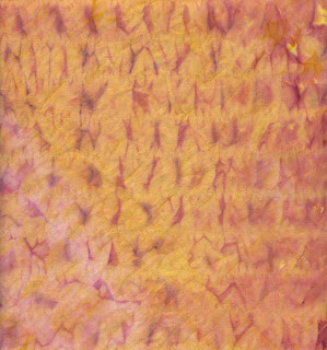
The results were better, I think, and I definitely like adding one paint color over another. This is the one with gathers made vertically and horizontally, front and back. Lots of texture.


And this is the one with the second set of gathers running diagonally, front and back. You can see the darker "v's" of the two colors pointing in different directions on both samples.


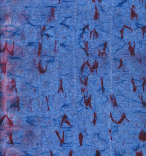
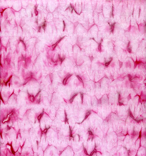
For comparison, here is the cloth after the first painting with fuchsia, front and back. Click on any of these pictures for larger more detailed views.

In thinking through why my results turned out so different from Margaret's, I decided one reason was the spacing on the lines of gathering. Hers were very close together, while I spaced mine about an inch apart. I'm wondering if machine gathering stitches would give an even different result.

Wil & BJ both counseled about pulling up the gathers very tightly, suggesting that might have been part of the reason for my results. (Read their comments here.) In my defense, I DID pull these up as tightly as I could (although I didn't pull again after the cloth was wet), and I DID knot off after gathering, although perhaps not as tightly as I could have.

As for Wil's question of why I wet the fabric before applying paint on round 1...faulty reasoning? Lack of research? Relying on my memory? In the past when using Setacolor, it was with techniques where I was instructed to dampen the fabric with water before applying the thinned paint. I reasoned that, like in dyeing, this would keep the paint from settling in one spot, would help it to reach all parts of it evenly. I figured out after the fact that his might be wrong which is why the second round was done without wetting the fabric. Then I read Wil's comment and my suspicions were confirmed...thanks!

Thanks to both of these readers for sharing their insights with me. I'm still pondering how much more of this I'll do. It's so time consuming putting in those gathering stitches - I can't imagine doing a large piece of cloth by hand. As I said, I have to admire the Japanese for their patience.

Tuesday, January 13, 2009

Shibori Play


As long as I had the paints out, I decided to follow up on a shibori technique that Margaret Cooter reminded me of on her blog here. However, as you will see, my experiment did not come out looking anything like Margaret's. I started with a 9" width of bleached muslin and placed a mark on each edge every inch along its length. Then I finger-pressed a fold at each set of dots as a guide for the stitching. I used buttonhole thread sturdily knotted at each end and made running stitches about 1/4" long. You gotta admire the Japanese who developed these shibori techniques. This hand stitching takes patience and time.

When all the lines are stitched, the thread is pulled up and tied off.


I had some thinned Setacolor paint left over from another project that I wanted to use up. There was just enough for this. I wet the bundle first, then dabbed the paint on both sides with a foam applicator. It dried overnight.


Before setting it in front of the earth stove to dry, I had a thought - to take this scrap of muslin and blot it on top of the bundle. I was intrigued with the textured pattern that lifted off. Very cool. Margaret got a similar result when she decided to iron her bundle between fabric to speed up drying.


I can't get used to the fact that paint pigment migrates up, not down as it dries. When I flipped the bundle over, I could see that this had happened.


Once dry, remove the thread. I was amused that Margaret had saved her thread, but when doing my own sample, I could see the wisdom in that and saved mine too.


And now you can see how differently my sample turned out. Could it be that I left wider spaces between rows of stitching or that I didn't draw up my gathers as tight? Or maybe mine looks different because it dried naturally. Hard to tell. There is some subtle texturing in the lighter background, but it certainly didn't come out as I'd expected. Remember crinkle cloth? That's what this acts like, all springy as you try to flatten it out.


I pressed it just enough to flatten it out a bit, ready for the next step. Yes, I'm going to take part of this strip and do more to it. The front and back look different, although it is a bit hard to see from this picture. The bottom section is one side - muted, the top section is the other side and has bolder spots where the pigment collected on top of the gathers. We'll see what happens next.


Saturday, January 10, 2009

"A" is for Alcohol


The Yahoo Surfacing group is running a year-long challenge, a little something to keep us trying out new ideas and techniques. Every other week, we experiment with something starting with a letter of the alphabet. For this first one, I chose "alcohol" as in rubbing alcohol which when applied to wet paint is suppose to do "interesting" things. My first trial shown above used silk painted with Dye-na-flow paint. I dipped a cotton swab in alcohol and dabbed it on the wet paint on the left and swiped it through the wet paint on the right. It did the "interesting" thing, which is to repel the paint pigment, creating a halo effect.


I was not as successful with the cotton sample where the alcohol was sprayed on, although when I switched to a marbling color, it spread and haloed. Click on the picture for a larger view and to read the explanation printed on it.


I tried a third sample using a different base paint - Versatex. I couldn't see that the alcohol had any effect on the paint dropped or brushed on it.

I think this is one effect I will leave to others. I liked what it did on the silk but at the moment, I'm not painting on silk or have a clear vision of how I would use this effect.

Friday, January 09, 2009

Living in the Moment

The following is from "The Third Jesus" by Deepak Chopra. The book's emphasis is what we can learn about spirituality from Jesus' teachings, regardless of our faith or lack of it. This comes from a section of exercises, this one being #12 based on the teaching, "So do not worry about tomorrow," and how to apply it, "Trust in the organizing power of the universe." Or, live in the present. The reason I share this is because I was struck by how useful this list of qualities is for working in the studio and making art:

If you examine it one quality at a time, the present moment is composed of the following:
  • Alertness - be awake.
  • Openness - or being free from expectations.
  • Freshness - not being overshadowed by the past.
  • Innocence - not judging from old experience
  • Spontaneity - allowing new impulses to come in without criticism or censorship.
  • Fearlessness - the absence of traumas from the past
  • Replenishing - the capacity to renew oneself from within.
This also fits right in with my resolution words of "freedom" and "calm," a very nice symmetry. If I stepped into the studio each day and embraced these 7 qualities, I think that "calm" and "free" is exactly how I'd feel.

Tuesday, January 06, 2009

Another Fabric Postcard


I said I was unsure about the postcard format but felt I needed to explore it more before making my final decision about it. So here is one that has been waiting in the wings since starting to play with this size. You can spot the beginnings of it in this post. It's called "Jockeying for Position."


The background is a scrap of muslin used to get the last of the paint off brushes after swishing them in water. The triangles are pieces of hand-dyed fabric trimmed off during paper piecing. I've layered the background with Thermore poly batting and Decor Bond, spray basted together. The Decor Bond's fusible side is facing down so that it will bond to the postcard back in the final steps.


I continue my hate relationship with Misty Fuse. Sorry, but I never hear anyone talking about the downside of it that I always struggle with. But I did want something light weight to hold the triangles in place. I considered trapping them under tulle but wanted to maintain the clear image and colors. I'll try that on the next one. Considered other fusibles, but knew the cutting around the shapes would be problematic since I didn't want to trim any fabric away. I hoped the Misty Fuse would be the easiest one to do this with, but I had trouble getting rid of the dark line of it around each piece. Plus it really doesn't fuse the fabric down all that well. In later steps the pieces kept popping up and needing to be ironed back down. Onward.


I played around until I settled on this arrangement, then fused them in place. I started by quilting around each triangle with a King Tut variegated thread - that's when the popping up of the shapes began. If you look closely at the first picture above, you can see that I went back in with invisible thread and stitched each triangle close to the edge so there'd be no triangles disappearing over time. Then I quilted parallel lines in the background, randomly changing their directions. The thread actually showed up a bit more than I intended, but I think it worked out ok anyway. The final step before finishing was to fuse decor bond to muslin for the back of the postcard, and fuse the two sections together.


Now to try something different to finish the edge. I followed Terry Grant's instructions in the April/May 2008 Quilting Arts Magazine (partially seen to the left). It calls for marking rather than cutting the finished perimeter and making the first pass of zigzag stitching over pearl cotton lined up over the marked line. Once the pearl cotton is encased, the excess is cut away carefully (and I DO mean carefully - it's too easy to snip the zigzag threads at the same time) and thread tails of heavy thread (like buttonhole thread) are pulled through the corners. These become nifty handles for encouraging the quilt to move under the needle at those corners. Now you can take one or two more passes around the outside edge. I used an Oliver Twist hand-dyed cotton thread for this.

I found this method gave me marginally better results than the way I've been satin stitching, but there's still too much peeking out of loose threads along the edge for my liking. Trim as I may, I couldn't trim them close enough and ended up inking the worst of them. Oh, but those thread tails are absolute genius! And it does make sense to do that first round of zig zag before trimming to size, much easier.

It was hard to see from the pictures in the magazine, but I finally realized that Terri was not doing a close satin stitch with this method and meant for the pearl cotton to be showing. I'd try this again with more widely spaced zig zag - for some pieces I think I would like it.


Monday, January 05, 2009

Resolution Word for 2009

Last year I tried Christine Kane's suggestion to choose a word rather than a list of resolutions to guide me through the year. In a nutshell, the theory is that resolutions only address the "do" level of your life in order to "have" certain things that you hope will lead to "being" a certain way. However, a more successful sequence is to start at the "be" level after which the "do" and "have" follow more easily. For me, it was freedom that I craved, so for years my resolutions were a list of things I wanted to get done. Oh, if only I didn't have all this stuff stacked up waiting for me, I'd be free from responsibility, free to go enjoy myself. Until I worked my way through the list, any freedom I did feel felt guilty. I didn't really understand that it was freedom I was working towards, just saw a long laundry list of things I should do that wasn't getting done.

Turning it on it's head, reminding myself that it was freedom I craved, I soon realized that procrastination was not a form of freedom, but that attending to anything that was in front of me needing attention was. It struck me as a bit of reverse psychology, and it worked - a wonderful motivator that allowed me to taste a little freedom each day without guilt but as a reward. When I remembered to use it, my resolution word of 2008, "freedom", worked like a charm.

I still have lots of stuff on my "to do" lists, did not get quite as unburdened on any level as I thought I would, so want to maintain "freedom" as a resolution word in 2009. But I need to add another resolution word to go with it, to help it work even better. Looking back at the year, I am aware of how much of my life is lived in fear. and its companion, dread. Fear of making a mistake. Fear of being late for an appointment. Fear of disappointing someone. Fear of getting in over my head. Fear of becoming disabled. Sometimes "fear" may be too strong a term for the feeling of unease, but at my very core, I am and always have been motivated by fear. Fear is even a subtle part of our daily conversations. "I'm afraid so and so's not in right now." "I'm afraid we're out of that product at the moment." "I'm afraid I don't know." We really aren't afraid, it's just become an automatic response, like when someone asks how you are, and you say, "Fine" without thinking. Fear is ingrained in us.

But fear is debilitating. Some fear is warranted, but I'm famous for getting myself all wound up over nothing, letting the fear and agitation paralyze me, wishing that if I just ignore whatever, it will go away or resolve itself on its own. I know better, of course; rarely are we so lucky that inaction, waiting long enough, allows a situation to resolve without making a choice, taking action. So how to combat this fear that works against my better judgment and keeps me from moving forward and attaining freedom? What one word could I invoke to banish my fear?

I thought looking at antonyms of fear might give me my answer. But mostly those are words like courage, and it's not courage I lack or am looking for. I have plenty of courage, once I give myself a good shake. No, I am looking for something to break the cycle of fear as the constant backdrop to my life so action and when necessary, courage can take over. This definition of fear gave me a clue; "Great agitation and anxiety caused by the expectation of danger; apprehension; panic; trepidation." Yup, me in a nutshell, all the sensations I let overwhelm me from time to time. The opposite of them, of agitation and anxiety and panic, I decided is "calm". If I can just keep an inner calm, then I see my day's activities flowing seamlessly, even when there are bumps in the road.

So I tried it out this weekend, checked to see if I could maintain inner calm even in the face of adversity and how did it change my thoughts and actions when I could. I liked what I saw, how it felt. I sensed freedom just around the corner.

So "calm" it is for 2009. Coupled with last year's "freedom", I think I have a winning combination to improve all facets of my life, including (maybe especially) what goes on in the studio.


Sunday, January 04, 2009

"Balance Check" Revisited


Oh, this was WAAAYYY too easy. I promised to show this TIFC from August again after getting it framed and here it is. The method I used to frame it comes from Gai Perry's book Do-It-Yourself Framed Quilts and was so quick and simple. All it requires beyond a rule and scissors is foam-core board, sequin pins, & a frame.


The nearest inch I could round the top up to was 14 " so I ordered pairs of 14" metal framing strips. The foam-core on the left (under the book) is cut to exactly 14" and I've chalked where the 14" edge will fall on the quilt. I'm always nervous about raw edges, so although Gai does not say to, I ran a narrow zigzag stitch along this chalked line to hold the layers together and control fraying. I fused a label on the back and gave it a quick steaming.


Next, mark the midway point on all four sides of the foam-core and also on the quilt top.


Starting from those midpoints, line them up and secure the quilt top to the foam-core with the sequin pins. (Sequin pins are very short and have a small head.) This foam-core is 3/16" thick and the pins have to go in at an angle so they don't poke all the way through. Work from the midpoints to the corners, adjusting as necessary until you've secured the quilt all the way around. Gai doesn't say how closely to space these pins, but I found I was putting them in about every 1-1/2 inches. When I was sure everything was the way I wanted, I pushed the pins all the way in. The lip of the frame extends out 1/4" so I did a check with a ruler to make sure all pin heads would be covered by that lip.


Now trim away the excess quilt right next to the edge of the foam-core. This was the most nerve-racking part, but all went well. I tried doing it from the back first but found it was actually easier to follow the edge of the foam-core from the front. Steady hands could probably rotary cut this excess off, but care needs to be taken not to cut into the foam-core.


That's it! Now the mounted quilt is ready to slip into the frame. The metal frame (this one is a NielsenBainbridge brand) has slots to hold the artwork so you assemble three sides leaving the top open. Once the quilt is in, slip the top bar on and tighten the screws.


The slot is bigger than the thickness of the board, so you could fill that in with cardboard, or just use these clips they provide with the frame to hold it in place. No diagram so I'm just guessing that this is the way to insert them. (You can just see some writing on the foam-core; I wrote the same info from the label on the back of the board as well.)


They also provide eyelets to slip in slots along the back - attach wire and your quilt is ready to hang. Not only was this quick and easy to do, it is totally reversible. Just loosen some screws, and it can be switched to a different frame, or if I want to finish it like a regular quilt, just remove those pins and add a binding or whatever.


Here's a detail shot of the beading (click on it for a larger version) - I chose to stop with the black and green and call it good. Both this and the full shot at the top were taken in not the best light conditions. On my screen the colors look a bit more saturated than I think they are in person. Yet another quilt I've had trouble with capturing the color accurately.

Saturday, January 03, 2009

Close-ups


Here's a little exercise you may find fun. I took my cue from Felicity's "Up Close and Personal" post here. What we think about ourselves and surroundings may be different from what the camera sees up close. I took these in the room I use for an office/guest room. The one above is the view out one of the windows which has blinds. Seeing this on screen suggests ways to break up a design with horizontal strips.

Below is the chair I use at the computer. It's from an antique English table and chairs set. The angles of the legs and crossbars puts me in mind of Escher and some of his impossible designs.


Here's another antique - a junior size bentwood chair.


The room as two desks. This lamp sits atop a small roll-top I use for bill paying and letter writing. It's from the early 1970's, which makes it, if not an antique, at least a collectible by now!


Here are some of the basic supplies I keep on this desk. That calculator is also a collectible I think. I'm sure I've had it since the late 1970's. I discovered it is powered by a lithium battery, which I had to replace a couple of years ago. For as much use as this calculator gets, I'm amazed that battery lasted at least 20 years.


Couldn't resist zooming in on the keypad. Funny how things look one way to the naked eye, another way through the focus of the camera and yet another when viewed on the screen. I suddenly see inspiration for my ongoing grid series in this picture.


The other desk holds the computer, printer, printer supplies, reference books and files. This is looking straight into the printer, where the paper spits out. The rectangle on top has several different slots for various media cards.


And here's that window again, but reflected in the computer monitor.


Sitting on the desk is this Thesaurus. I've been searching it for a resolution word for 2009. Love these graceful curves.


Next to the desk sits the surge protector full of plugs.


This is a unique clock...it has a zero hour...


I still haven't put this box away from the art show back in Oct/Nov. I often label boxes the easy way, with magic marker.


You may want to click on this one for a larger view - it's a lamp shade.


And this is an old style glass shade for the overhead light.


I've inherited a collection of wildlife prints, all signed by the various artists. I'm still not comfortable signing my work on the front.

So what do these pictures tell you about me that you didn't know or might seem contrary to the way I portray myself?