 Untitled, textile 12 x 16 framed
Sheila Mahanke Barnes 2010
June & I decided, due to our individual renditions of "March Madness," to skip a month and resume our challenge in April. Time to produce a new original work to inspire the other. This is what I came up with, something that scratched a number of itches I've had of late: working with rectangles rather than squares, creating with a monochromatic palette, incorporating photo images printed on fabric with an inkjet printer, collage, and exploring further how thread color laid down in closely-spaced parallel lines effects and is effected by the color of the fabric it runs across.
I have several artists to thank for the way I approached this piece. Connie Rose gets the biggest nod for helping break through my block about using digital print images. I've been following her collaging, both fabric and paper, much intrigued. Then she embarked on a journey of incorporating digital prints into her collages. With this first effort, the lightbulb finally went on in my head. Use the digital print as the focal point, adding fabrics and shapes playing off what's in the print. Simple, right? But a simple concept I'd not put together on my own.


I have many photos I'd like to use pretty much as is. Above is a view that caught my eye, below it the cropped version. That cropped version got printed on fabric last fall and has been on my design while ever since, wondering where it should be used. With Connie as my guide, I now knew.

Another artist I follow, Annabel Rainbow, also dabbles in a type of collaging in some of her work. I've admired her backgrounds made up of overlapping oblongs. (You can view examples of this here.) I'm sure that is why my mind had wandered to working with rectangles. I couldn't remember exactly how she went about it, but I knew that in the end, it was all fused down. As I usually do, I probably combined features of several approaches I've run across to come up with my own version that went like this. I don't really like working with pre-fused fabric, so opted to lay out my pieces over a piece of Decor Bond, fusible side up. Positioned my digital print and started auditioning blacks and greys - my monochromatic palette. Only, the printed fabric image wasn't really black and white - I think it has faded a bit, developing a pale green tint just like the gradating qualities of my hand-dyed black fabric.

After much deliberation, trial and error, trading out of fabrics and shapes, I finally made myself say, "good enough" for this study. You can see the gray fabric got jettisoned and my new monochromatic palette became teal. I didn't overlap my shapes as I thought I would - will try that another time. I just overlapped them enough so there was no issue of the white base showing between the shapes. I fused the whole thing to the Decor Bond. The digital print was backed with Steam a Seam 2 lite since I would not be stitching over it at all.
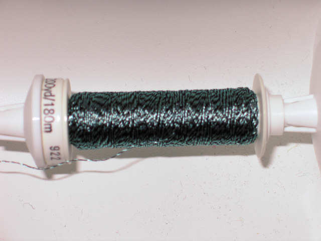
With the Decor Bond as stabilizer, I started stitching, not quilting. I opted not to use any batting or backing since this will be slipped into a frame. This Sulky Ultra Twist thread looks grey & black, but really, the grey shades to that teal green just like the digital print.

And it's the only color thread I used, as I laid down rows of closely spaced parallel lines, most running horizontally but some running vertically as well for a little added interest. Over light fabric, it looks quite dark, over dark, it reads light. It nearly disappears over the large print.
Don't really have a name for this yet., except a reference to the site of the photo: Culvert at Chuck's Slough. Any thoughts?
4 comments:
Looks good! Maybe something to do with slate or a pathway!
Thank for the mention Sheila! Perhaps my first instinct for liking this when I saw it on Facebook, was because of the connection with layered oblongs? Anyway, I love it and think you have achieved something unique and gorgeous! I think the monochrome thing can be very difficult to pull off but you've made it work brilliantly here.
Sheila -- I have to admit (despite my aversion to gray) that I really like it. It's tranquil and has a Japanese feeling. Now try it in turquoise!
Thanks everyone! Annabel, I'm glad you see it as unique since I was playing off one of your trademark looks. At least I ran my oblongs horizontally as opposed to your vertical ones. ;-) And Sherrie, you are not the first one to comment that it has a Japanese feel to it. Not my intention, but I'll take it! Oh, yes - I DO need to try this sort of thing in different colorways, and turquoise is a favorite color of mine. Very southwest so I am not surprised you'd suggest it...
Post a Comment