Friday, May 30, 2014

Fighting Quilt Intimidation

Working on that little rings quiltlet was just a ploy to avoid facing my wine-dark seas quilts - one that backfired on me, if you hadn't noticed! Since posting the fabric here and announcing this was the next one up, it immediately started to intimidate me. First I looked through the dozens of pictures I took looking for just the right mast reflections to use as patterns. Suddenly, nothing looked as I remembered - intimidation one. I finally settled on three images and spent quite a bit of time using different methods to isolate the reflections with as little background as possible - to save ink when I printed them out. This did not go as smoothly as it has in the past - intimidation two. But I finally decided I just needed to print something out. Looking at those thin squiggly lines on the computer monitor was unnerving me (I didn't remember them being that thin), so printing them enlarged to full pattern size should settle me down. Ack! They were still thin and unnerving - intimidation three. So they were set aside while I worked on something else.


But I am running out of time if I want these two done for my ArtWalk exhibit, so today was the day I simply told myself to just start, and trust that my idea would work. I settled on a pair of reflections, flipped over the printout and traced around the shapes so that I would have a reverse image to trace onto fusible web. I found the tracing calming, and even though that little voice in my head kept whispering, "What were you thinking? Are you sure the proportions are right? Is this really the set you had in mind?", now that I was actually working with the pattern, I could see this was going to work.


I'm using Steam-a-Seam II for my fusible and traced my pattern pieces without having to use a light table. Each piece is numbered per the numbering on my master pattern. Some of them are  uber small. Trying not to hyperventilate here...


Long long time ago, I cut similar fusible web-backed narrow pieces, following a vine pattern on a fabric. I was reminded of that as I made my first cut, reassuring myself I hadn't totally lost my mind. The quilt intimidation was finally under control as I arranged the first squiggly piece on this fabric hand-dyed by my late friend, Judi. I'm using a Kona cotton which is a little heavier weave than some quilting cotton. I found the ease with which I could see the weave a godsend as I arranged those wild and stretchy pieces, easing them into place by keeping the weave straight across.

A second reflection has since been cut out and arranged on the left side of the fabric since the picture above was taken. It had the smallest pieces, but I managed to cut them all and get them placed. The tackiness of the Steam-a-Seam II is another godsend when working like this. I kept checking placement with my master pattern, pulling up a piece not quite in place and pressing it back into position with a finger, all while working on my design wall. I have a few more mere dots to add and I think this will be ready for the final fuse and quilting. It's so nice when the main fabric does so much of the work for me.

Thursday, May 29, 2014

Art Journaling a Woven Page

I'm really late posting about my last Positively Creative Art Journaling assignment. This is actually from, not this last Sunday, but the Sunday before. I did finish it up last Sunday and was ready to post about it yesterday only to have no internet service the entire day. But I'm here now! We start with the paper above, one that was supposed to collect the paint removed with plastic wrap in an earlier lesson. So little paint transferred that I've been using it ever since to blot brushes and bubble wrap and alphabet stamps. Now we get to tear it into narrow strips for weaving.


Do you remember weaving baskets from construction paper in grade school? That's what this exercise reminded me of. The instruction here recommended also tearing colorful strips from magazines or other painted paper, but my book is so small I had plenty of strips and didn't necessarily want to jazz things up any. 


We were only to use one page as opposed to a page spread, but again because of the small size of my book, I knew I would need both sides. And I had more of that page left to rip up so did so in small irregular chunks to add to the other side of the spread. Both the woven strips and the chunks got glued down and painted over with a diluted coat of paint. I really questioned being able to write over the woven side as the exposed edges curled right up. But I figured it must be possible or Dale Ann would not have asked us to do it.


So I was right on track time-wise to start my journaling...but found myself hesitating. I was feeling a strong urge to add an interesting border, not just write and write. Was leaning towards a Zentangle, but feeling short on time to look through my little reference notebook for something suitable. I suppose I could start with the journaling, just leave room around the edges for the border to be added later. But I also found myself putting off the journaling itself because of the prompt: List 10 things you convince yourself you don't have time to do...and then do one of them and journal about how that feels. Well, coming up with the 10 things wasn't hard. But that following week was one in which I felt under a time crunch, one in which I felt I must do these other things and only sigh at what I really wanted to be doing. So if I wrote down my ten things, I'd have to carve out time to do one of them and I couldn't bring myself to do it. Plus I wanted that fancy border! So that is why this is so late in getting blogged about. And finishing up the journal page including adding the Zentangle border took care of TWO things on my list. Ok, maybe that was a bit of a cheat, but I'm still under a time crunch!

Forgive me for blurring my journaling again, but it IS personal journaling, after all. There were only a few spots where the pen hung up on the woven part of the page. I hope you can see how nice the right side looks now that the writing is on it. This is one of the harder lessons for me to learn about creating these backgrounds for the journaling. To me they often look so horrible by themselves, yet rather nice once things are added over them.

Tuesday, May 27, 2014

This is not art...

Former Sandpoint, ID Post Office
So there I was, sitting on the curbing, sketching the building across from my doctor's office, when I hear a man say, "Sorry, this is an art-free zone." I look up at the passing pedestrian and with a smirk, assure him, "Trust me, this isn't art." His chuckle confirmed this was just another good-natured exchange that so often goes on between strangers in this little town.

This is the entrance to what was originally a federal building housing the post office, Forest Service and other government offices. It opened in 1928 and is one of two buildings in town of the Spanish Colonial Revival style - something not commonly found in northern Idaho. Done in pencil, I tried to sketch fairly quickly, not get bogged down in too much detail. But as so often happens, the closer I looked, the more surprises I found in those details, which I then had to include - some of it a bit wonkily. And despite my best intentions, a little color got added once home.

There's more to this building I'd like to sketch (including gargoyles!) so I'll be returning. 

Saturday, May 24, 2014

Searching For a Technical Solution

Alright, me pretties..I'm in need of some technical advice. I finalized the arrangement of rings on this lovely scrap of batik, using a few dots of Roxanne Glue Baste to hold them in place until I could trap them under tulle. Or that was the plan, having auditioned some colors and thinking the peach tulle would work perfectly. However, once I draped the tulle over it the next day, I was surprised that it muted the whole thing. I like the bright colors in this and do not want them darkened or muted or knocked back in any way. So out came the supply of tulles and sheers and there simply was not any that did not alter the intensity of the colors in some way. What worked for the background altered the rings, what kept the rings mostly intact altered the background. I am not interested in compromising here, so I must find another way to approach this.

Luckily, I was working on this to have finished to show at my art group yesterday, so was able to get one suggestion for solving my dilemma, but I am curious to hear from those of you with some collage experience. My main problem is the lack of fusible on the back of the rings and their narrowness making stitching them down impossible. I can probably slip additional glue under them but can't be assured of complete coverage and permanent securing - and there are bits that can fray. And I really really really don't want to alter those colors darker or lighter.

What I wouldn't mind is if it ended up without any stitching on it at all. Although I had planned on layering it with thin batting and doing some quilting, my plan for its final presentation has always been to attach it to either mat board or foam core board an inch or so larger than its finished size and placed in a frame. But if there's a stitching solution, I'm open to that too.

So with all that in mind...any suggestions?

Tuesday, May 20, 2014

Sucked Down The Rabbit Hole

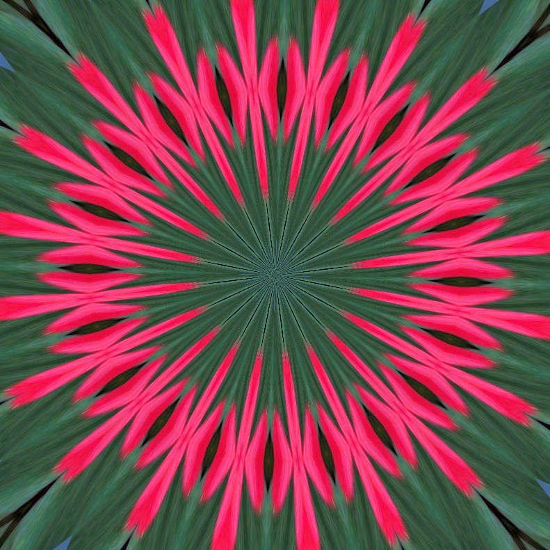
Last year I chose pink geraniums for my splash of color on the back deck. This year, I've gone for what I think of as the more traditional red plus a pale peachy version. Remembering the interesting designs those pink ones generated with the effects filter of my Corel Paint Shop Pro software (one of which went into Reverberations), I naturally wondered what I could come up with by using this picture with more colors to work with. I now have 50 kaleidoscope variations and 21 other types of photo manipulations off this one photo, as always finding it hard not to try just one more.


One thing I've noticed in the past with the kaleidoscope, something which became a bit of a frustration with the one used in Reverberations, is that what should be a round design ends up with top and bottom spokes cropped. I thought this might be due to starting with a rectangular image, so was careful to crop my photo into a perfect square. This is the first manipulation that flashed on the screen which made me think my theory was correct.


I usually use the "roll the dice" feature which simply means each time I click on it, the software randomly changes the settings. When the next random image popped up, I was back to the cropped spokes. I decided it was time to start playing with those settings myself, see how they could change the image. I soon discovered one of them worked like a zoom control - I could move in closer or pull out, reinstating a full circle in the design. I could have pulled out even further on this one, increasing the number of rings.


Often the random settings have an odd number of spokes giving an off-kilter feeling and making it impossible to match at the corners should one want to line up multiples for an overall pattern as in patchwork blocks. So I played with changing those to even numbers, watching how the rest of the design altered as I went up or down with the numbers. You know how I like symmetry.


These four were generated by merely changing the number of orbits, I think. I should have taken notes. I also played with something called radial suction but I don't think these were the result of that.


Sometimes the random setting would generate something off kilter even with an even number of spokes, like this one. I never did figure out what to change to bring things back to center. I do admit that it brings a dynamism to something that otherwise might feel a bit stagnant for all its punch.


After saving a manipulation, I undo it in the edit function before going back into the effects menu for another variation. I'd noted that the edit menu included the option to repeat the kaleidoscope as well as undo it. This is what I got when I did that to the previous version. I didn't expect so many of these to have such a Christmas feel to them.


I think these two were also the result of repeating...or maybe that radial suction thing.


I started getting some richer toned ones more star-like than circular. This one even has highlights that make it glow.


Then we went totally green with a patchwork star. By using that scale factor setting that let me zoom out, I got a version that started to feel like a dahlia quilt pattern.


And when I repeated the kaleidoscope on the original zoomed in version, I got this slightly more refined star.


Then there was a big surprise when this essentially black and white and coral art deco-ish one popped out.


I guess you can see why it's so hard to stop - you just never know what great variation the roll of the dice will come up with next. But I have a couple of other favorite filters like wave. I fooled a bit with some of the settings, but overall ended up taking what I got with little tweaking on my part. So I will just let you enjoy more of the results without commentary.


Wednesday, May 14, 2014

Glorious Day to be Out and About

What is this thing?
The temps shot up today, making my day out running errands especially nice and enticing me to add some extra excuses to keep from going home. First on my list was picking up coffee at Evans Brothers Coffee Roasters. It's located in what is now being call the Historic Granary Arts District - follow this link to find out more and see a pic of the old co-op building which I've tried sketching (and will no doubt sketch again). I've been wanting to sketch this thing in the parking lot between their establishment and the old co-op mill, but the last few times I've been over here it's been raining. I've been doing so much sketching sitting in the car, having to periodically run the windshield wipers to see out the window - I wanted to wait for better weather. Evans Brothers fling open a roll-up door to their espresso bar and put out picnic tables when the weather is nice like today. So I had the pleasure of sitting in the sun sipping coffee while I sketched. I used sepia pen (thus the few stray lines that should not be there) and added colored pencil once home. I can see now that I have the real thing side by side, I could add a lot more dark brown to that rusty tank. And it should be stouter for sure.

Glasswork by Glenda Kochen

Next on my list was to check out the latest exhibit at Panhandle State Bank, Local Masters. I had to agree - these works are truly masterful. Feeling the nudge to get back to work and up my game a bit after viewing these. But first! Still too glorious a day to go home, so I headed to city beach for a walk. Water levels are coming up and I noted a few boats in the visitor slips. Won't be long until the water and park are full of people enjoying summer activities.

Coldwater Creek retail store in Sandpoint, ID

Just one more stop before heading home. Sadly, Coldwater Creek, the women's clothing retailer born and based here in Sandpoint, is closing its doors for good at the end of the month and liquidation sales are in full swing. One last chance to add a few favorite pieces before they are gone forever.

Labeling artwork and foamcore board mount

So I've had my day out and it's time to refocus on the studio. I'm in the process of mounting my two Upward Ticks onto foam core board before slipping them into black metal frames. When I print out labels for my quilts, I include an image of my business card with the Idaho Beauty block logo and contact info. But when I frame a piece or use a backing light enough, I often just ink the label info onto the back. It's always irked me that I didn't have a stamp of at least the block logo to add. That was what was partially behind the monogram stamp I designed for one of my linocut class assignments. I found an archival ink pad recently in blue and have tried it out here. I like the way it works.


And finally, these two pieces of fabric may be what's up next. I seem to be going into my water series sideways, not working on the ideas from my time at the Mayo Clinic as I had planned, but being diverted by fabric that is sparking other water-related ideas. The fabric on the left is one from my snow-dyeing experiment while the one on the right is from my late friend's stash of specialty dyes. When I ran across that one with its squiggly lines, it reminded me of pictures I took of boat masts reflected in the water. I knew I wanted to use that image but hadn't worked out exactly how. These two fabrics will be the background for two versions, keying off a phrase oft repeated in Homer's Iliad and Odyssey - sailing the wine-dark sea. Yeah, it wasn't on my list for the month, but it feels right to get going on it.  

Tuesday, May 13, 2014

Art Journaling With Ephemera

After working out the kinks on Upward Tick, I worked on my weekly Positively Creative Art Journaling. This week's exercise is sort of a check-in on where we are on this particular day - both mentally and physically. I haven't done my journaling on that yet as I I've been waiting for the spread to dry, and since it won't be done in a clever way worth sharing, I'm just going to share the process of preparing the spread. It was reminiscent of a previous exercise which I had liked - gluing down torn strips of paper and then painting over them. In this case, we were encouraged to collect ephemera from the previous week. I added trimmings from Upward Tic (including a couple of those rings and a piece of tulle). While ironing some of the fabric from my friend's stash, I picked up some fusible on my iron (had thought I'd cut it all away - oops). I'd cleaned it off with a specially treated sheet that is a little like a dryer sheet only stiffer. I pulled it out of the trash and cut a piece from it that had wrinkled up and creased. I've also been sorting through old tax files, shredding and tossing what no longer needs keeping. There was a receipt from a fabric store purchase, the register printout which I put on the left under the tulle, and one of those yellow receipts forms for hand-writing the particulars - I tore a portion off the bottom to place on the right. All pieces were adhered to the page with matte medium.


Painting over these things is hard for me. I find I don't want to obliterate them, but that is the point, for them to become just part of the background, only parts of them visible and recognizable. I started with a light coat of slightly diluted white paint and could see that was not going to be enough. So I mixed some violet paint with the white for more coverage, but as you can see, I still went for a light touch, especially over the fabric (which is knocked back more than this picture would indicate - the overall effect is prettier, trust me). I'm tempted to go over it again lightly with a third color to even things out, but I think I will just get to the writing instead. Yes, I know I've created places that will be difficult if not impossible to write over - the tulle and that cleaning sheet, but I was seduced by the real texture they would add. I'll either be writing very small or writing very little about where I am at today!

Update: To my surprise and great pleasure, that tulle took lettering just fine. Both gel pen and sharpie worked, ink bleeding through the holes to the matte medium-covered paper beneath. And the paint as is looks just fine now that writing has been added over it. I'm pleased.

Monday, May 12, 2014

Something Quilty

Dear readers, you deserve something fabric related after suffering through my sketching and art journaling efforts of late. I've been inching along on the original Upward Tick the last few days. I finalized the arrangement of circles, using a dab of fabric glue stick to hold them in place while tulle was overlayed and pinned for the final stitching. Time to contemplate whether clear or smoke invisible thread would be best, and do I have to free motion around the circles? I've done this on one other art quilt (Jockeying For Space) so pulled it down off the wall for a close look. So much for my memory. I was quite surprised to find I'd used a dark purple cotton thread along the edge of each piece, and the stitches were too uniform for them to have been free-motion stitched. Lightbulb moment - of course! My Upward Tick circles would benefit from an outline of dark thread. I used a black Aurofil 2 ply 50 wt cotton which is quite thin - perfect!.


Next step was to fuse Decor Bond to the back of the photo-printed fabric that will be the "mount". This gives it more stability and heft for both attaching the quilt part to it and for the framing step. Sometimes I use glue baste to hold the little quilt in place once I've centered it on the mount. This time I used 505 spray baste (and quickly remembered why I started using the glue instead). A narrow zigzag stitch with mono-filament thread attaches it permanently to the mount, and this chenille decorative thread couched along the edge with clear mono-filament thread provides the finishing touch and accent that helps pull things together. For all intents and purposes, this is finished, but I'll show it in its entirety when it is in its frame.


You may remember that I mentioned trimming down the circles. While I was doing that, watching the rings stack up on the table, I of course wondered if there was anything I could do with them. I started playing with interlacing them like the rings of the Olympic logo. Eventually I tossed them on this scrap of fabric I'd set to one side, another idea in the offing. This is why a perfectly tidy studio may not be the best environment for creativity - at least for me. I need things OUT and in my line of sight so these happy accidents can occur.

Saturday, May 10, 2014

National Train Day

Historic Sandpoint Train Depot - 2008
Longtime followers of my blog know I have a thing for train travel, convenient for me since Amtrak stops in my town. We have a depot with Gothic overtones that has been shut to the public for years as it crumbled into disrepair and waited for word of rescue. That word finally came earlier this year but it will be some time before this historic station will be fully back on its feet. With any luck, it will be restored enough to allow passengers to wait out of the weather by the end of the year. Read more about that here.

Historic Sandpoint Train Depot - sketched 2014

What with that buzz, I was a little surprised that no event was scheduled here to celebrate National Train Day. No matter - I've been wanting to get over to the station to do some sketching, so I used this "celebration" to do just that. This is the view from the parking lot (very nearly the same angle the photo was taken from), done in pencil and across the spread of the sketchbook - a first for me. Tricky moving across that ditch. Of course, I can never resist adding some colored pencil when I get home.

For more views of the station, scroll down to the bottom of this blog post.

Wednesday, May 07, 2014

Fiesta Bonita

I've been puttering mostly - straightening up the studio, continuing the washing, ironing and "filing" of my late friend's gifted stash (I'm down to the last bag!), and taking the next steps on Upward Tick. I've trimmed down the circles since I've ditched the idea of hand appliqueing them on, tweaked the arrangement, checked to make sure I like how it looks under that blue tulle and will probably start the final stitching tomorrow. In the meantime, I took an hour for another sketch of a business along my walking route, although I actually drove to a spot where I could park and sketch while sitting in the car. I struggle enough as it is, and while I can do it, sketching while standing can take some of the fun out of it. Plus it was spitting rain that day and I didn't want to wait for the weather to clear. I went back to pencil, a softer one than I was using before, and this session went pretty well, although there are still some off angles. It was a great exercise though. The colored pencil was added once I got home. And yes, that really is the backdrop to the restaurant, at least from this angle. The white at the top right is the snow that still clings to Schweitzer Mountain, although the ski resort is now closed for the season.

Sunday, May 04, 2014

Art Journaling Energy Drain

This week's Positively Creative Art Journaling lesson is about how to deal with those things that sap your energy. Boy, am I familiar with this topic. I had to come to terms with some serious drain on my energies back in 2010, the sort that left me angry, resentful, toxic, eating myself up. I got on top of it over time through my studies with a local yoga teacher, although I can still backslide if I'm not careful. More recently, it's been health issues causing energy drains. This has been a bit harder to deal with since it is something a bit out of my control. Still, my yoga teachings have stood me in good stead, although I still have times of frustration. Finding ways to cope with people and things you know drain your energy is well worth one's time - no matter how we may do our best to avoid known energy drains, we can't totally eliminate them from our lives.

I liked this lesson, which started with journaling on the unpainted spread about what drains you and how that makes you feel. Yeah, get it out! Then paint right over it because we're not going to dwell on that. We're going to dwell instead, journal on the painted page how to avoid letting people or situations drain the energy out of you. I first ran across this technique of freeing oneself from negative thoughts at a church camp I'd been asked to counsel at. I really knew nothing about counseling high school kids, but was assured I'd be teamed with someone who did, and it was a great experience. One night as we sat around a campfire, the kids were asked to write down essentially what they felt were their sins. I wasn't sure where this was going, and was surprised when the kids were then told to toss their lists into the fire. Poof - sins gone as if they'd never happened, a powerful visual of the intangible idea of Christ's forgiveness. Since then, I've run across this same idea in non-secular applications, a way to let go of the past and forgive oneself. 

Here, there's really nothing to forgive, and some of those thoughts about what drains me peek through the paint (not as vividly as the camera picked up), reminding me to stay a bit on guard for their possible return. But keeping them in check are my thoughts about how to counter them, which called out for a few cutouts from magazines to augment them.

What drains your energy? What tricks have you come up with to cope?  

Saturday, May 03, 2014

Tis May and Time for a Wrap-up

"Reverberations" by Sheila Mahanke Barnes ©2014
Once again I find myself wondering where the month slipped away to, but not so much because I feel I didn't get anything done. On the contrary, I'm particularly pleased about my work on Reverberations and that it was finished so quickly (Actual completed version above!). I'm also pleased to have a resolution to the problematic Upward Tick so it can be finished in time for ArtWalk rather than be abandoned. Quite a few things got crossed off that list I made at the beginning of April, the one I felt so disconnected from as if someone else was filling it out. Still plenty to carry forward into May, but this time, I feel like it's more than a reminder list, it is A PLAN. And this is good. Lots of things coming together in my head, a feeling that I know what to do and how to do it, I just have to get to it.


In the meantime, I continue to be enticed by sketch. I was reminded by a post on Susan Gaylord' blog about a simple booklet one could make from a single piece of paper, even one otherwise headed for the recycling bin. While watching tv the other night, I played with a piece of mail to make a couple of these booklets and have started drawing on them. Sometimes you can use what's printed on the page as a jumping off point as I did here when I first tried this out. If you'd like to try your hand at making your own booklets to fill, Susan explains how to make one with a decorated "cover" and shares a video of her method on this blog post.

And not that I needed justification for my renewed interest in sketching, but it was delightful to run across this article, Why You Should Stop Taking Pictures on Your Phone - And Learn To Draw, about the benefits of sketching over taking photographs. This debate has a long history, it turns out, and this article quotes John Ruskin as well as offering a link to a free digital copy of his book on drawing. Here's a taste of Ruskin's wisdom:

‘Let two persons go out for a walk; the one a good sketcher, the other having no taste of the kind. Let them go down a green lane. There will be a great difference in the scene as perceived by the two individuals. The one will see a lane and trees; he will perceive the trees to be green, though he will think nothing about it; he will see that the sun shines, and that it has a cheerful effect; and that’s all! But what will the sketcher see? His eye is accustomed to search into the cause of beauty, and penetrate the minutest parts of loveliness. He looks up, and observes how the showery and subdivided sunshine comes sprinkled down among the gleaming leaves overhead, till the air is filled with the emerald light. He will see here and there a bough emerging from the veil of leaves, he will see the jewel brightness of the emerald moss and the variegated and fantastic lichens, white and blue, purple and red, all mellowed and mingled into a single garment of beauty. Then come the cavernous trunks and the twisted roots that grasp with their snake-like coils at the steep bank, whose turfy slope is inlaid with flowers of a thousand dyes. Is not this worth seeing? Yet if you are not a sketcher you will pass along the green lane, and when you come home again, have nothing to say or to think about it, but that you went down such and such a lane.’