I'm somewhere between restless and listless, focused and dreamy. Maybe it's a bit of spring fever, me needing a change of scenery when the scenery isn't seeing much change. However, I was quite delighted last week to see that the access road running from my sidewalk route along the dog park was now free from snow, even the big pile at the entrance gone and I could spend at least part of my daily walk on softer (but not muddy) ground.
Part of my restlessness no doubt is tied to these art journaling spreads I want to complete before clearing the work table so I can cut binding and square up the baby quilt. This first one goes back to the altered book I've been working in, that smaller format that sometimes feels cramped. The theme is the one I thought I was going to use for Laly's retreat but turned out to be unsuitable for that. Still, I had images set aside and a few things I wanted to try out in this place where it doesn't matter. First up, covering the text on the page with teabags. I keep saving them, keep wanting to use them because their color is part of my personal palette, but so far I haven't been terribly happy with what I've tried with them. I had really hoped they would knock back the text more but once the gel medium was dry, they were very transparent.
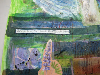
Next I arranged my images and there went any interesting things the teabags might be adding as my images pretty much covered the spread. I used a pen similar to a Flair pen to write around the images why what they represented would never be pursued. You can probably make out the "Get Real!" I wrote at the top which was the thing that dawned on me after I'd collected them as dreams I could pursue. The image in the lower left is cut from a postcard. I'd wondered if perhaps it was too thick to use, and it definitely was. Now I know. Sorry for the glare.
Now I wanted to see what would happen if I covered the spread with the thin layer of a napkin, something that was shown in one of my handmade book club lessons. In that case, everyone was using white napkins with colorful images. The white turned translucent when adhered with gel medium but I wasn't sure my plain dark teal napkin would still let the things on the page spread show. So I did this small sample and it looked like it would work.
What didn't work well was getting the napkin on the page. I used the suggested ways of gluing a little at a time but a napkin is quite unruly, would not go down where I wanted and I kept pulling it up to rearrange. I think that caused two things to happen: 1) I think the gel medium on the napkin pulled up some of the ink off the images and 2) I think even though I tried hard to get an even application of gel medium over the page, some of it may have dried before the napkin hit or wasn't there at all. Most of the images are very difficult to see and some text showed right through while other didn't - a very uneven application. Well, I DID want to knock things back and give a dreamy quality to it, as evidenced by the two words I added on top of the napkin: Me Dreaming. The camera had a difficult time deciphering all this and I tried to fix it as best I could so you could get the idea. But overall, this was not a successful experiment and I am very unhappy with the result. But now I know - using napkins is not for me! Teabags are still in the mix.
I had better luck moving on to my big art journaling sketchbook. I'd not done anything with the covers initially, but had since come up with an idea for them. I have some spray acrylics and lots of stencils so I went to work. I used a light and a dark blue, repositioning the stencil 180 degrees before spraying with the second color. Very pleased with how this came out. Again, the camera was struggling, making the left edge of the cover much lighter than it really is.
Never one to waste, I decided to see if I could transfer the paint on the top of the stencil after each color application onto the back cover. Not a lot of paint so the transfer is very light but that's ok for the back.
And now while the paint was out, I opened the sketchbook to a blank spread and created my first layer for a new journal page. I'd been thinking of ways I could add paint as a first layer other than with a brush which I'd not enjoyed or had much luck with during the retreat. I had planned on trying a brayering method I've seen but now with the success of the spraying on the cover, I decided to spray away on this spread. And I am SO happy with the look.
That dark blue is just what I wanted to set off that moon image that I'd wanted to use on my retreat page. Now it works perfectly for a new optimistic travel spread and I've started "auditioning" more images. Maybe collage isn't really the look I want, as I find myself reluctant to even think about what could go in the "blank" spaces around my images. We'll have to see how this evolves.


