Friday, June 13, 2008

Bonnie Zahn Griffith


One of the joys of visiting Walla Walla these days is the opportunity to view work of local artists as displayed in downtown stores and galleries. Waterbrook Winery's tasting room on Main Street is one such location I particularly enjoy. It is currently showing through July 25 the paintings of Bonnie Griffith in an exhibit aptly named "Summoned by the Landscape." This artist certainly has the rendering of local area mastered. Her artist statement says in part: "My goal is to create work that invites the viewer to "step into" the painting and experience the scene--walk along the road, hike a trail, sit by the river, watch a storm manifest on the horizon--just escape for a moment in time." Having just driven through some of the areas shown in her paintings, I can easily say she is successful in capturing place and mood. It was as if I was back behind the wheel cruising through those hills.

Referring to my photos in the previous post, June commented that she had no idea the hills of the Palouse could be so green. I'm guessing her impression of the area is more like Bonnie's painting "Red Barn" above. In fact the majority of the paintings in this exhibit showed this late summer/fall and a few winter renderings. To be honest, I had forgotten myself that it could be so green. But it is a farming area, and those fields of wheat and alfalfa and peas, etc. have to be green some time!

One of the things my friend and I noticed was how much more impact the paintings that were quite wide and narrow had over the ones more nearly square. It increased that feeling of open expanse, the miles and miles of nothing except for an occasional farm house. It served to emphasize it in the same way that a long and narrow orientation makes a cliff or mountain look higher and more looming. Orientation does matter, does effect the mood and theme of landscape art in particular. In Bonnie's portfolio, the thumbnails are square regardless of the actual dimensions of the paintings, so take the time to click on a few of them to see the effect of those wide and skinny proportions.

Thursday, June 12, 2008

Through the Windshield


I'm back from my jaunt to Walla Walla. I don't always enjoy the twisty swoopy drive through the Palouse hills, but this trip I truly did. The intensity of the greens from the new shoots against brown earth, the dappling effect of the sun making its way through partly cloudy skies kept my senses thoroughly stimulated. Be sure to click on the pictures for a larger view to get the full effect.


I regretted not having my camera at the ready the last time I drove through this area, so this time it was ready to go on the seat next to me. No time or way to frame my shots - this was true point and shoot photography! Still, it's a wonder I didn't end up in the ditch....ssshhhh, don't tell anyone.


I was hoping to capture that hillside that inspired this sketch, but the lines of the plowed furrows no longer really showed now that the seeds had sprouted. Still, there were some wonderful curves and contrasts to catch.


And bigger than life cloud formation.


At one point I swooped over a hill and spotted this houseboat. I couldn't quite catch it, so looked for it on the way back knowing there was a place where I could pull over to get the shot. I was disappointed that they had moved it closer to the road by then - I guess they worried that people would not see the "For Sale" sign on it. As I first saw it, sitting in the middle of a field, miles from any body of water, it made me think of Noah's Ark, abandoned after the flood waters had receded. Do you suppose Noah put up a "For Sale" sign, too?


This last picture is of bluffs near the Snake River. All along the descent to the river, there was this green the color of lichen, although it wasn't lichen. As I said, the variety of greens I saw was surprising and stimulating. My senses definitely got an injection of possibilities direct from nature.

Sunday, June 08, 2008

More Nature Matching


I'm taking off for a few days, but before I go, I thought I'd share another color pairing from nature. The rich red peonies and bright orange poppies next to my house fairly shout for attention these days. The poor iris haven't got a chance to be noticed except as an afterthought.


I pulled a petal from each and found perfect matches from my stash. My favorite red is a commercial batik (which the camera did not pick up well & no amount of manipulation could make it true, although it is better); the orange that fits well into my default palette of rusts and browns is a sunprint from South Africa. Normally, I would choose a red with more of a red cast than a blue cast to pair with the orange (if I thought to pair them at all), so I was surprised that my reaction was, "Mmm, these could work together."

Saturday, June 07, 2008

Matching Fabrics to Nature-Another Approach


My machine that I do all my free-motion work on went in for servicing yesterday, making me feel at loose ends. As if I don't have plenty I could work on without it, but it is unsettling all the same to have it missing from the studio. So I found myself continuing to play with this idea of the azaleas as palette inspiration. If you are unable to actually bring nature into the studio as I illustrated in the previous post, here is how you can use your photos to pin down your colors. I started with a close-up shot of one bloom (shot at high pixel size) and cropped it so no other colors intruded (photo above).


Then I applied the pixelate effect in my Corel Paint Shop Pro program. I set it for relatively small symmetrical squares which showed just how many different yellows and greens are represented in that flower. Even some browns snuck in. This could easily be printed out to use in the studio when pulling fabrics (or if you're lucky enough to have a computer in your studio, you could match from the screen image.


The problem with photo manipulation programs is that there are so many things to try. "As long as I'm here," is what I found myself saying, and ran my photo through quite a few things. Ahem, over 20 different kaleidoscope versions generated by the random button got saved, including the one above.


Some of the kaleidoscope variations had no yellow in them at all.


And an amazing number of versions with an art deco feel popped up.


This last one is from the ripple effect.

Bringing Nature Inside


While I spent the week marking and basting sashings for applique, and working through the last few issues on my TIF piece (neither activity generating blog-worthy reports), my mind has been pondering a new color palette. The azaleas bloomed and I found myself intrigued by the juxtaposition of the three colors they represented. At first, it was just the buttery yellow and the classic azalea color (tangerine?) I considered in combination. Then I noticed the purple blooms not fully opened. This is a color scheme I probably would not pull together out of my head. It's a bit tropical in nature, without being loud and splashy.


I easily get stuck in a rut when choosing colors for projects. It is probably fair to say that my default palette is one along the lines of my autumn pieces - rusts, browns, golds, blacks, a touch of rich green. Next favorite often pulls in blues with yellows or reds. Note "or" there - I often have trouble pulling in a third or fourth color unless a let a fabric do it for me, like the batik in Flow. I seem to be thinking a lot in black and white lately, my design ideas more like pencil sketches in my head. I want to try something, then let myself get stuck choosing the "right" fabrics to carry it out. Or bore myself by picking the same combinations. So while this color combination with green for a background may not seem revolutionary to you, it jarred something loose in me. I could see them from my studio window, and found I couldn't concentrate on the project at hand until I'd pulled a few fabrics to mirror those shades.


A few days later, I remembered to grab the camera to record the combination before the flowers faded. It'd be just like me to let the inspiration disappear before I actually acted upon it, then wonder just what it was I thought I was trying to do. I erroneously thought that once images were safely saved, my mind would refocus, but this idea just wouldn't let go. Why wait to print out my pictures to verify fabric selection when I could cut blooms to bring into the studio? That's when the real fun began.


I was amazed at how closely I could match the blooms from my stash. Usually I am missing at least one key color. Hand-dyes and batiks readily spanned the values. But what to make from them? That's an additional problem I've been having lately, being inspired by a set of colors or fabrics with no idea how best to show them off. This time, brain still churning away without my permission, two ideas presented themselves. One is an older idea, an exercise of sorts from a book that never got tried (because I clutched on choosing fabric). The other is a more recent idea captured in my sketchbook and even colored in. It seems to be winning out, and my subconscious is eager for me to get going on it, flipping through ways to execute it, doing all this planning while I work on other things. In fact, I can tell the technical direction it is going is directly influenced by the applique I'm working on right now. It is flowing like Flow did, and making me feel that antsy-ness to get to work that has been more off than on as of late. Tis a good feeling.


Monday, June 02, 2008

Transferring Letters To Fabric


Today I inked a poem onto the front of my Chinese Poem challenge. It's one of many translations of the poem which inspired the design. Here you see part of it, applied with a black Pigma Micron pen size 1.


Now before you rush to compliment me on my penmanship, you should know that I traced from a computer generated copy using a font called Echelon. I printed a mirror image onto freezer paper so that I could iron the freezer paper to the back of the quilt top.


The freezer paper stabilizes the fabric so the pen has an easier time gliding over it. The letters in reverse are now the right direction as light from underneath illuminates them.


Sometimes I use a window as my light box. Other times I use my clear acrylic surround for my sewing machine. The space between two of the legs is just wide enough to slip my portable Ott lamp between. It lies flat under there and provides a strong yet not glaring light.

I'll let this sit overnight, then heat set the ink before layering it for quilting. I like the Pigma pens because the ink is archival and permanent. They come in many colors and tip sizes to produce everything from a very thin line like here, to wider brushstroke-like ones.

Sunday, June 01, 2008

Sunday Play


I've joked to myself that I've needed "hand" therapy this last week. Not the type of therapy to ease the pain of an injury to the hands, but the type of therapy to relax & calm my whole self. Hand sewing usually has that therapeutic effect on me, and while nothing in particular was going on to make me tense or worried, I kept reaching for it. Anything, it seemed, to keep from sitting at the machine. I even hand sewed the hems of a pair of pants that needed shortening! Today the weather turned cold and rainy so my hand therapy took the form of playing with Shiva Paintstiks.

I've been wanting to do a rubbing of that cross since I got it for Christmas. As you can see from the picture above, its highlights transferred quite nicely. Then I chose a rubbing plate from a set I'd bought when I purchased the paintstiks to fill in around it. I may go back in with acrylic paints to add a yellow glow around the cross.


I tried a different rubbing plate and a lighter paint on this piece but wasn't happy with the results. So I slipped another pattern back under the fabric and rubbed with the darker paint. Better.

I'll need to work more with these oil-based paints before I make a judgement about them. Right now, I'm sitting on the fence. And thinking about reading up on them. I found this tutorial which may be of help (This Is My Brain On Quilts blog). And of course, I have magazine articles and books that reference them too. Aren't you proud of me that I didn't waste my play time today doing research?

Friday, May 30, 2008

Installations, Cohesive Work, and Other Thoughts


The POAC exhibit will be coming down in a little over a week (you have through June 8th to view it), and I finally got back to study it without the distraction of lots of milling people. I promised to share better pictures and some additional thoughts about the exhibit and reception when time allowed; after studying all the art quilts with the eye of a viewer and not an exhibitor, I find some of my initial impressions hold, while new discoveries surfaced.

One of the things I originally wanted to comment on was the way my two pieces were hung. I knew the two pieces would fight if hung together, and hoped that those hanging the show would see the importance of giving them some distance from each other. First lesson learned - do not count on someone else solving your problems. As you can see from the picture above, most of the small work was grouped together on one wall. As I observed it during the reception, my first thought was, now why couldn't they have traded the position of my work with the dark blue one on the right? In fact, that whole wall did not seem well thought out. Granted, they had some breaker boxes to work around, and a wide variety of colors and styles to make work in one space. Still, the rest of the installation showed more thought to juxtaposition of pieces, and did not necessarily hang both of an artist's pieces together.
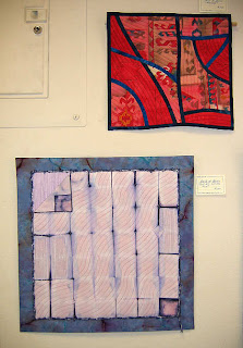

So I stood there thinking, this is a good lesson learned. When selecting pieces for consideration into an exhibit, they should relate better to each other, show some cohesiveness, have something going on in them that would be a clue that they belong to a particular artist. There's nothing similar about these two pieces. And then I saw it. Although in one they are undulating and in the other straighter, both works have the parallel quilting lines spaced approximately 1/4" apart. Interesting!


A particular quilting style tied together another artist's work, even though the pieces themselves were quite different. Above is Marilyn Henrion's Etude #6 and Fugue #1. One hung on the balcony while the other hung on the stair landing, but the large circular quilting immediately let you know these two pieces might be by the same hand.


There were others who used the wider spaced parallel lines as I had, but in such a different way on such stylistically different work that I don't think anyone would think them mine. Pat Budge used it to great advantage on her Edges #4: Fissures. Here they go off in all directions to emphasize the varied shapes in her design. Any more narrowly space and it would have been overkill or lose its impact, any wider and it would not have done its work.


Rita Hutchins also used parallel stitching lines, alternating both wide and very narrow spacing, dependent on the space to be filled. I greatly admired Follow the Yellow Brick Road above also because it is totally pieced, and the smallest of those units is less than an 1 inch square. It had a certain freedom in that the squares and rectangles were various sizes and not perfectly formed, yet when looking at the piece as a whole, it isn't chaos and all randomness. The heavy quilting around the tiniest squares made them pop in more than one way.


My last example of the use of parallel quilting lines is Brian Dykuizen's Fractured Female. If you click on the pic for the larger view, you should be able to see the effect of the variegated thread he used. With the quilting lines angling across the piece in a fairly regimented way, some of the variegation left an impression like rain.


Kay Hall's Sundown was my overall favorite at the reception. I was surprised that I didn't like it quite as much seen in daylight. It seemed to loose some of its depth and saturation, and the quilting I thought so perfect now struck me as not quite right. I simply didn't remember the very light ribbon like motif across the sky, and it made no sense to me on this second viewing. It is still an impressive piece, though.


One of the most talked about piece at the reception was Kristine Calney's Tidal Tresses. It may have been where it was hung that led people to believe this was something just thrown together. Or it could have been the traditional quilters in attendance who were whispering that this couldn't have taken any time at all to make. As you can see from the detail shot, this is made up of blocks where strips of fabric 1/2 to 3/4 inch wide have been laid down and stitched through the center, leaving raw edges slightly raised and ragged. It was only in different light and thorough study that I could appreciate what went into the planning and execution of this piece. Not haphazard at all with a lot of intertwining of strips to play out her tidal theme.


The other most talked about piece was Joan Renkerts What's That In Your Pocket? As I commented in my reception review, this was the one piece that really pushed the definition of a quilt. In fact, I really do think it falls in a different category all together, but technically, I suppose it meets the definition.

Overall, I think the exhibit is successful in meeting its theme "Art Quilts: Beyond Tradition" yet there were several things going on at the reception that impressed me as muddying the waters again whether quilts can really be art. While the art quilt being raffled off was unquestionably a piece of art, the book they had in the silent auction was not about art quilts, but about a modern technique for making traditional quilt designs. And I literally cringed when I overheard one of the exhibitors going into great technical detail of how she rendered her piece. "Yikes!" I thought, "This is what quilters do at quilt shows, stand proudly by our work and answer all those questions from fellow quilters about how we managed to do what we did." I don't know it for a fact, but it's hard for me to believe that artists in other mediums do this at their openings. I doubt that those attending such openings would even think to ask such technical questions. I know my non-quilting friends who attended weren't asking such questions of me. I suppose that was when I realized that the reason so many people attended the exhibit opening was because the quilting community had come out in force. I erroneously believed the art community and its supporters as a whole would be attending, and realized that it was their opinion and impression that I was hoping to learn, not the quilting communities opinion. I already KNOW what the quilting community and even the art quilting community thinks. It's the rest of the art world I want to know about and learn from.

And with that thought, I conclude with a comment from a friend who is neither a quilter nor an artist, but someone who enjoys and collects art. She took one look at Marty Bownes quilt (shown next to Joan Renkert's quilt above), and said - "Don't like it, it looks like a baby quilt." Well, that took me off guard because I'd been admiring the artistic qualities of that very quilt. So I had to ask what about it gave her that impression. "It's the size of a crib quilt and laid out in blocks like a crib quilt." Ah...then I could see it, and thought this excellent information to remember in my own designing. A simple change in orientation or number of blocks would have dispelled the crib quilt look. But as a quilter, the similarities had not registered. Perhaps the very same design done in some other medium would not have evoked the same response, but since we operate on a fence between the quilt world and the art world, I think we need to be conscious of little things like this that might impede our being taken seriously as artists. It's the very thing driving art quilters who work small to mat and frame their work, the better to dispel any confusion about this being art.

Wednesday, May 28, 2008

More Stitching


I put in three more hours of stitching on the tree trunks and think I am done with the thread painting. I seemed to be "in the zone" today, and finishing up the moss had a hypnotic quality to it, just circled away without much thought. I felt I was finally getting the hang of it, having learned not to keep such a straight "line" and leaving some holes. I don't think it shows well in the picture, but I used three values of green, working the middle value in to soften the starkness of the very darkest. The very light minty green is the threadlace lichen - I've just placed them on here as they probably will be attached after the quilting.

Kimberly wanted to see a larger view of this piece, so here it is - first before the thread stitching:


And after as it looks today, the jpg cropped to way I think I will trim it in real life, although I have to admit, I really like that tight shot up top. Still haven't quite decided how I will shape and place that overlay of willow leaves on sheer:


Annabelle praised me for my patience, but I think it was more my stubbornness that kept me going. My feelings about this have been up and down throughout the process and I've had to take major breaks from it, both to reassess where I was headed and to gather up my resolve to tackle it again. Looking at the before and after pictures, it's easy to see that the threadpainting transformed a flat plain piece of fabric into tree trunks. But during the process, the progress was slow to come and not easy to see. Couple that with the fact that what was happening on the cloth was not what I'd envisioned in my mind, and you can see why I despaired along the way, wondering if the effect I was going for was really happening.

Once I accepted the fact that it wasn't going to look like my original concept, but still looked like tree trunks, I could better judge my results. All of you who commented with thumbs up at how it was developing certainly helped me reach that point. Once again, I learned that I must see and judge my work for what it is and not for what I hoped or envisioned it would be.

Friday, May 23, 2008

Stitching, Stitching


Here's the other thing I worked on this week - my March Take It Further Challenge. Yes, March... I'm trying to shade my fabric with thread painting to create the detail of bark and moss on these tree trunks, and it has not gone as I anticipated. After hours and hours of stitching back and forth on this thing, I needed to give it a huge break after adding the white thread - see detail picture below. (This was the one color I'd been avoiding because I thought it too stark, but which turned out to be just what I needed to bring out some highlights.) My session this week was to start adding moss.

One reason I let it sit was that I was contemplating how to render the moss. With green velvet? (I thought I had some in my scraps, but couldn't find it.) With more thread lace like the lichen? (Because I'd need so much, I wasn't thrilled about that idea.). I finally went to Ben Franklin to see if they had some fake moss I could stitch in place. I found something on a fine wire base and brought it home, but I couldn't bring myself to use it. Not only would it create too much dimension compared to the rest of the quilt, I found the green mossy bits shed off the wire quite easily. I returned to Ann Fahl's book for inspiration and found it. No more straight line thread painting, but tiny circle thread painting. This is a bit like the garnet quilting stitch (see this post for an example), except the circles are quite small and filled in with stitching. The motion is a bit like the thread lace motion, but for some reason, I'm tolerating it better done directly on the fabric.


Ann warns that this will take quite some time to do, and she's right, but you know me - I soldier on no matter how long something takes if it gives me the results I'm looking for.

Testing, Testing


It always take me a bit to get back into the swing of things after a trip - so much catching up to do and the lovely lingering afterglow from a great vacation to savor. But I did get back into the studio last week, if only for a few days. Rather than store away the projects I took with me and dive back into any of my art quilt projects, I decided to take another step on the applique project I worked on at the retreat.

Although I still have a few design details to work out in the borders, the sashing pattern is ready to go. I was curious to see if a method I learned a few years back would work on this project, so rather than complete the designing process, I went straight to preparing the applique for stitching.

As I often do, I'm combining methods from several experts. The idea to design the vine and leaves as one unit comes from Elly Sienkiewicz in her Baltimore Beauties and Beyond book. It appealed to my lazy nature in that I wouldn't have to figure out how many yards of bias to cut for the vine and I wouldn't have to trace and cut out tons of individual leaves. One rectangle of my applique fabric per sashing or border strip background is all I need. Simple, simple simple.

Wreath of Strawberry Leaves rendered by Jean Stanclift

However, Elly has you trace your pattern on freezer paper, cut it out and iron it to the right side of the applique fabric where it stays as the guide for turning under the seam allowance as you sew. On the Wreath of Strawberries Leaves block I made using this method, I struggle with the freezer paper popping off, and eventually used sequin pins to hold the freezer paper in place. Not the best method for a project that may be a long time in the making. So I wanted to try Jeana Kimball's method which, under her class supervision, worked beautifully. It's a little labor intensive, but once all the prep is done, the appliqueing is a breeze.

You start by tracing the entire applique pattern on the back of the background fabric using a lightbox. Then you position the applique fabric on the right side, pinning in a few places to hold it in place, and stitch a short running stitch exactly on the drawn lines from the back. This is done with cotton hand quilting thread and one of her larger straw needles - a size 8. (See picture at beginning of the post.) Yes, this is time consuming, but the beauty of it is, when these basting threads are removed, they leave holes that act like perforations, and the seam allowance rolls right under along them. Even Jeana was skeptical when she first saw this method, but once you try it, the advantages over other ways to mark and turn applique becomes obvious.


I appliqued just enough of this sashing piece to be sure this method is right for this project, and it seems to be working as planned. The basting stitches come out just far enough ahead of your stitching to allow turning under, and as both Elly and Jeana recommend, the excess applique fabric is trimmed back to a narrow seam allowance also just a bit ahead of the stitching. This helps keep fraying of the applique edges to a minimum.

Even so, I didn't have to take too many stitches to realize I'd done it to myself again, staying true to my subconscious motto of, "Wait! How can I make this harder for me?" The dark blue on the medium blue is reminding me of when I hand quilted a black background with black thread - so hard to see what you're stitching, even with really good light. And yes, those leaves are pretty small, there are a lot of them, and the turn into the stem is pretty tight. This is fussy work and isn't something I'm going to complete any time soon, even if I work diligently at it. However, I really am all about process, I love hand stitching, and I know I wouldn't be happy with the look of a faster method like fusing. For me, it's as much about the journey as it is the destination. Good thing, huh?