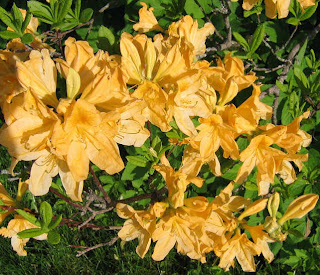
My machine that I do all my free-motion work on went in for servicing yesterday, making me feel at loose ends. As if I don't have plenty I could work on without it, but it is unsettling all the same to have it missing from the studio. So I found myself continuing to play with this idea of the azaleas as palette inspiration. If you are unable to actually bring nature into the studio as I illustrated in the previous post, here is how you can use your photos to pin down your colors. I started with a close-up shot of one bloom (shot at high pixel size) and cropped it so no other colors intruded (photo above).

Then I applied the pixelate effect in my Corel Paint Shop Pro program. I set it for relatively small symmetrical squares which showed just how many different yellows and greens are represented in that flower. Even some browns snuck in. This could easily be printed out to use in the studio when pulling fabrics (or if you're lucky enough to have a computer in your studio, you could match from the screen image.
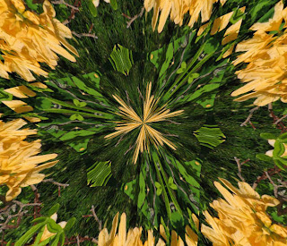
The problem with photo manipulation programs is that there are so many things to try. "As long as I'm here," is what I found myself saying, and ran my photo through quite a few things. Ahem, over 20 different kaleidoscope versions generated by the random button got saved, including the one above.
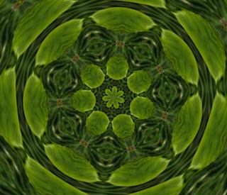
Some of the kaleidoscope variations had no yellow in them at all.
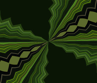
And an amazing number of versions with an art deco feel popped up.
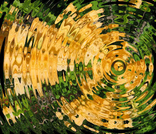
This last one is from the ripple effect.
No comments:
Post a Comment