Wednesday, May 20, 2009

Playful Diversions

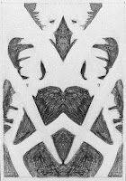
I got sidetracked yesterday as I was preparing my negative space drawing for posting here. As I thought more about how negative space can be an interesting design on its own, I wondered how this drawing might react to some of the effects in my Corel Paintshop Pro software. How different would my results be with this basic black and white drawing from the color photos I've played with in the past here, here and here? I started with the final rotation of the drawing seen above.
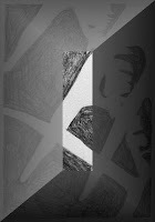

This is buttonized, an effect I hadn't tried yet. This got me thinking about that technique of using a "view finder" to move around a picture until you find an interesting section. Also, I can start to see what would happen if I played with fracturing or overlaying a separate geometric design and changing values within the different spaces.

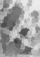


I noticed there was a brushstrokes effect. Ok, so how would a pencil drawing look with brushstrokes? One of the random settings produced this, which I then could not resist colorizing in one of my favorite palettes. This is the sort of thing I've been thinking about trying with actual paint and brush, so must give it a go.
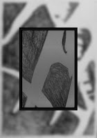

Magnifying lens is another effect I hadn't tried. I like this idea of making a small portion larger and superimposing it on the actual design. I've done the opposite of this - taking a detail and superimposing it smaller which is also effective.
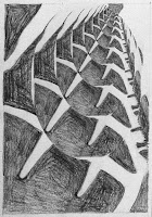

I had no idea what the feedback effect would do - it was perhaps the most surprising.
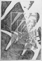

Here's another feedback at a different setting. I really like these.
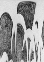

And how cool is this polar coordinates one?
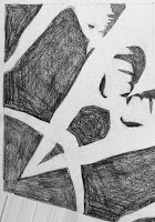


The rotating mirror reflection effect reminded me about playing with my actual set of mirrors. Do you see primitive faces and figures in these?
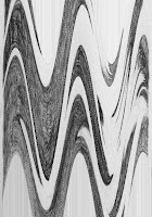

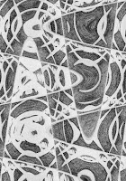
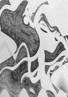
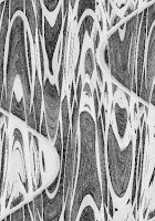
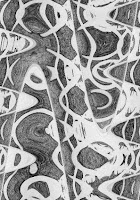
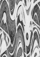
And finally, my all-time favorite...the wave effect. I just keep clicking the random button and seeing things I love. This and the kaleidoscope effect quickly showed how differently I responded when no color was involved. More waves below.

Tuesday, May 19, 2009

Drawing Studio Session 4 - Negative Space

Another Monday, another drawing session - this time with a bit of drama. Our teacher got stuck in construction traffic making her over an hour late. So we muddled forward with phoned-in instructions we didn't clearly understand and didn't truly catch what we were supposed to be doing and why until she finally arrived. It was more focus on negative space, this time eliminating all detail in the object we were drawing. Can you guess what my still life was composed of?


Once the basic outline of the still life was sketched in, and then the space around it darkened in, we were encouraged to view those spaces as interesting shapes in and of themselves. The teacher picked up mine and turned it this way and that, really liking those spaces. So you won't have to twist your head, I've rotated my drawing for you.


Have you guessed yet what it is? The composition placed in front of me was overlapping antlers with a feather threaded through the prongs.


We used the picture plane again to trace the outline before drawing on paper. This was more difficult since the plane could not be rested on the object we were tracing. In the first drawing, we simply drew the same size as the picture plane, but on the second one, we went back to drawing at a larger scale. You can see the cross hairs on my second assignment (kitchen utensils "interestingly" arranged) which create a grid like is on the picture plane to facilitate in that enlarging. I still find this very hard, so the teacher suggested I do a quick sketch to get the general shapes in position, then go back and fine-tune to a more accurate rendition. That suggestion helped a lot. As you can see, I didn't get much beyond that sketching out, so have some "homework" to do this week.


Intellectually, I know what negative space is. Yet every time I run across that term as a design tool, I haven't really gotten what it means, why it is as important as positive space, nor how I can use it for design ideas. The teacher admitted that this exercise was very simple, but because of its simplicity, it would help our brains get used to seeing the negative space on its own. I do sense that I am starting to get it, to move out of the intellectual realm as I experience "making" negative space. Something tells me that I would see it more clearly if the negative space were left white and the positive space darkened. I've noticed that my eye often see the reverse of what most people first see in images that can be viewed two ways. For instance, when looking at pictures of old quilts, the quilted motifs often look sunken instead of raised up as they truly are. I seem to see receding images. and really have to work at making the image pop the other direction. Maybe that's why I struggle with this negative image stuff. How do you see?

Sunday, May 17, 2009

Test Run


I've had so many distractions and diversion in the last week or so that I couldn't get much done toward my art. But yesterday I spent a big chunk of time at the sewing machine and it was wonderful to be working again. Of the several things I could have worked on, I chose to proceed with my sample to try out ideas for finishing up the Azalea Mosaic. I was curious about the effect of adding meandering vines across the quilt, as if looking at a mosaic tile pathway in a garden. I didn't want it as quilting, I figured, because I wanted it to look like it was growing naturally up and over the tiles, not flattening them down. So I fused some leftover squares to extra background fabric and stitched away.


But first, I tested some of my machine's pre-programmed embroidery stitches on a scrap of fabric. You can get an idea of what a stitch will look like from the manual and the screen on the machine, but I can't really tell exactly what it will look like until I've stitched it out. The first tests were done in an old cotton thread I care nothing about, ditto for the fabric & no stabilizer. Since the squares are fused giving some stability, I wanted to see how badly the fabric might pull up without stabilizer - for the areas between the fused squares. The final test (far left) was done with the actual thread I planned to use - an Oliver Twist Hand-dyed cotton. I settled on the pattern on the far right, but wanted it to look a bit more free flowing, so on the left you can see where I tested increasing the stitch length. You can also see that I penned the identifying stitch number above each stitch, and then noted the length changes. I'll keep this sample for future reference.


How often have I auditioned threads, thinking I've come up with the perfect one, only for it to disappoint me on the real thing? Often, and in this case, I'm thinking this may have been more effective with a green somewhere in value between this one and the dark green I used for the actual quilting. Of course, that's a color I do not have on hand. But I do love the overall effect. There was a bit of distortion because of not using a stabilizer, but I was able to press it out. Not sure I could do that properly on the larger piece. And I have no desire to remove stabilizer from this type of embroidery - so time consuming and you never get it all out. Wouldn't want to use water soluble stabilizer, but perhaps one that disappears with heat would be the answer.


Click on the picture above and you should be able to see that darker green thread (a Sulky rayon)and the quilting. I used a slightly wavy pre-programmed stitch with width reduced and my walking foot to quilt between the fused squares. I was afraid that since the quilting was done after the embroidering, it would show in an unwanted way where it crossed over the lighter green thread, but to my surprise, it did not. Very pleased about that. And the vines do give the organic look of rising and falling as they move across the tiles.

While I like this effect on this small version, I don't think I would like it all over the larger quilt even if I had a suitable darker thread. And of course, I doubt I have enough of this thread to cover the larger quilt - story of my creative life. Maybe I can think of a different way to add a little garden feel to it, but I don't think this is it. I can also see that this quilting stitch doesn't quite make the squares pop like I wanted, even with the Matilda wool batting. But I am pleased enough with these results that I plan to finish this up and mount it much in the same way that I did Twisted Tree. Nothing ventured, nothing gained - this was a definite gain.

Saturday, May 16, 2009

Browne's Addition Tour - Bricks & Gingerbread

One last look at the architecture in Historic Browne's Addition, this time strictly from a design perspective that might cross over into my own art, and yours too. As always, click on any picture for a larger view.

Under my feet - cobblestone streets peaking through, brick paths in different configurations.


And when my eyes looked up, brickwork and details only necessary to please the eye.


Slightly skewed and sagging carriage house doors, well worn.


These steps to nowhere...this is behind & below the museum, but once must have led to a fine house. Or perhaps a shortcut between houses for impatient children, or the beginnings of a path into a wooded retreat.


Speaking of fine old houses, so many of them exhibit "gingerbread" trim. Note the similarity between the sunburst's rays over the porch and the swirls in the trim below. This was a bit unexpected that seemed to say of the designer, I don't have to do this like everyone else.


And last but not least, a bit of nature's "architecture." I was so intent on capturing details of one of the houses, that I nearly missed the fact that I was standing right next to this highly textured tree. It was quite large (the fence you just see in the pic is about 4 or 5 ft tall) and the bark texture equally large, unlike the finer texturing I'm used to seeing. Deep grooves, shadows and light, lines intersecting at all angles. It begs to be drawn.


Friday, May 15, 2009

Browne's Addition Tour - Patsy Clark Mansion


This fabulous Italianate is the Patsy Clark Mansion built in 1897 and designed by Kirtland Cutter to be the "most luxurious mansion ever" after a directive from the owner. It is a true tour de force. Quoting from the Spokane Historic Preservation Office website:

Cutter traveled around the world, collecting materials and furnishings for the house. The exterior sepia sandstone is from Italy, the brick was made in St. Louis, Missouri, and stained-glass windows were made by Louis Comfort Tiffany in New York City. Patsy Clark lived in the mansion until his death in 1915; his wife Mary remained in the house until 1926. Eugene Enloe, an investor, purchased the house and later sold it by 1950. The house served as the Francis Lester Inn, a restaurant and event house until 1982. It was then restored as Patsy Clark's Restaurant. Spokane architect Dennis Young was commissioned to design the project, at a reported cost of $233,000. In 1995, Chuck Quinn sold Patsy’s to a group of Spokane businessmen, and, within a year, one of the group members, Steven Senescall, bought out his partners and become sole owner. Mark and Monty Danner, also owners of the Clark House at Hayden Lake, Idaho, purchased the restaurant in November 1999. The restaurant ceased operations in 2001 and the building was purchased by the law firm of Eyman, Allison,Fennessy, Hunter, and Jones in February 2003 who are restoring it to former glory."

I remember when it was a restaurant, and I think my husband and I even blew the budget to eat there once - a very long time ago! I have to agree that the law firm is being a good steward. Enjoy the many fine details of this building (click on any pic for a larger view). Perhaps some of them will make their way into your next quilt. I know they have my mind cranking away.


Even the side/back of the building is impressive with its large carriage house.


When I looked more closely, I could see this connecting "bridge" leading from the second floor of the carriage house directly into the main house. So often carriage houses were far removed from the main house.


Across from the Mansion is Coeur d'Alene Park where this lovely Russian influenced gazebo resides.


Thursday, May 14, 2009

Browne's Addition Tour


The Northwest Museum of Arts & Culture is located in the historic Browne's Addition which was platted in the 1880's and intensively developed for well-to-do clients around the turn of the century. According to the Spokane Historic Preservation office: "Within its boundaries is a concentrated architectural aggregate including nearly every residential style fashionable in the Pacific Northwest between 1880 and 1930." After viewing what the museum had to offer, I took a stroll around this neighborhood to, quite frankly, gawk at the incredible late 1800's homes still standing and lovingly maintained. I knew there'd be inspiration in the details too. (Click on any picture to see those details better.) The house above was the first one I spotted on my way to the museum that made it clear there'd be more to my day than exhibits viewed indoors. It is the E. J. Roberts Mansion built in 1889 in the Queen Ann style (see a view of the front of the house plus some of the rooms here). The home remained in the family until the death of their only daughter in 1959. The mansion subsequently became a rooming house, a group home, and apartments. It has been undergoing a rigorous restoration process for the last 23 years and recently opened to the public as a Bed and Breakfast and Event Facility. That explains how someone could afford to own and live in this behemoth. See here for more information about the history of this house.


On the opposite corner was this Queen Ann. I can't track down any info on it, but I remember the plaque saying one of its special features was the rounded bay and multi-windowed copula. It looked off though, especially that rounded bay. I think all the windows had been replaced by modern versions in spite of its National Historical Registry designation.


Making a quarter turn to look at the opposite corner, I spotted this spire. Knew it had to belong to a carriage house.


Here's the house it belongs to - The Hussey-Borgenson House built in 1887 & 1889 in what is considered "a superior example of the Queen Anne style of architecture." This is looking at the back of the house. Click on the link above to see the front of the house. Check out the chimney detail, adding to the overall impact of the house's design.


With its barn/stable/carriage house, they are two of the oldest and most intact domestic buildings in Spokane. Here you get a sense for how big the carriage house is.


It always amazes me what attention to detail many of these older buildings exhibit. Rather than settling for a plain cap on the chimneys, decorative caps were designed and installed.


I was particularly fascinated by this design resolution for the chimney brickwork. I don't think I've seen bricks angled like this before. But maybe I just wasn't looking.


With my love of curves, I rather liked these under the window bay.


Kitty corner from this beauty is this rather garishly painted (in my opinion) house that I thought might be a wannabe. It didn't strike me as anything special, but apparently it is, being a Queen Ann with a two story window bay and multi-gabled roof line. It's the Olmstead House built in 1899 for a former Spokane mayor.


Just down the street from these two I happened upon this group of row houses and was perplexed. They looked in keeping with with the late 1800's time frame of the surrounding houses, yet I wasn't sure this sort of thing would have gone up on this spot back in those days. I decided it must be a very well done recent addition, carefully designed to fit in with the neighborhood. After all, it sits on the edge of the bluff with a fabulous view. and I found that hard to square with what looked like a partially commercial building. I later found information in Spokane: A City With Historical Style by Margaret Krause French & Nancy Gale Compau copyright 2000 indicating that these are townhouses built in 1891 or earlier.


A few blocks up the hill from these I found the Westminster Apartments, looking all in the world like a huge resort one should find in the Alps. I'm not sure when this was built, but French & Compau note: "The first apartment houses in Spokane were very large units. They usually had a living room, dining room, two or three bedrooms, a kitchen and bathroom...Some apartment houses even had rooms for servants to live in and had their own restaurants for the apartment dwellers." Sign me up - I could see myself living in either one of these places.


At the opposite end of the street from the E. J. Roberts Mansion, I found The Finch Mansion built in 1897 and designed by Kirtland Cutter and Karl Malmgren in the Neoclassical style. Talk about totally different. It was remodeled into apartments in 1927 - one of the first luxury apartment buildings in Browne's addition. It didn't look to me like it was still apartments, but maybe in 1927 they did it more tastefully than they did in later years. It sits on a bluff at the end of 1st street overlooking the Spokane River - what a view!


These swags so typical of Neoclassical designs are also found on many many quilts.


Next door I spotted this Mission Style carriage house. The swoopy profile of the roof line on both front and back of the building is what amused me most.


And this is the house it belongs to. Next door to it is a Tudor revival - obviously no zoning of styles here!

I'm saving the last house I found for a separate post - it is just that spectacular.


Wednesday, May 13, 2009

Last of the Cutwork Applique

Here is the 4th block for the row robin challenge I'm participating in. It is the second of the two designs from the Sisters Challenge quilt. After completing the last of the reverse applique parts today, I sewed the blocks into a row, using a batik provided by the owner for sashing between the blocks. I think you can see how well my batik goes with it, even though the color in the photo isn't as true as the one in the scan of the block.


Then I attached my row to the owner's row, inserting sashing in between. Aren't her Celtic blocks wonderful? Click on either picture for a larger view.


Tuesday, May 12, 2009

Drawing Studio Session 3 - More Hands


This week's class was frustrating for all of us. I hesitate to even share my results, and we all agreed we are sick of drawing our hand! This time we rested a masked off piece of glass on our hand and traced the outlines onto the glass. The glass also had a single vertical and horizontal line running through the middle. The exercise was to experience using that simple grid to make a proportionally larger drawing of what was on the glass. More studying of relationships and negative space aided by the simple grid repeated on our larger rectangle on the drawing paper. This proved harder than we expected - the eye did not want to make the leap to the larger size.

In addition, we laid down a ground with a graphite stick before starting to sketch. Once we'd gotten the hand sketched as accurately as we figured we could, it was time to "play" with shading. We could make areas darker with the graphite pencil or use the kneaded eraser to lighten areas. I really struggled seeing the light and dark areas of my hand, and now can see some places I could lighten up that I'd missed yesterday. The teacher suggested I could rub out along the outside of the hand to make it pop off the background more, and once she rubbed a spot, I finally got the idea. I had fun with the eraser making swoops and hash marks to give energy to the background. But my poor hand still looks pretty deformed and lifeless to me...

We started a second hand drawing (preceded by groans from all), this time holding something "interesting" in the hand. I chose my cell phone which allowed my fingers to be curled - a much more attractive pose. Not enough time to get very far on it, and I assume we will continue working on it next session.

We were encouraged to turn our work upside down if we got stuck, as well as to concentrate on getting one quadrant at a time right. Amazing how much the upside down orientation helps one to see how to fix something out of whack. The teacher also focused on seeing the negative space rather than the line itself, and I felt I was finally starting to get that. Another helpful technique.