Tuesday, March 17, 2015

Another Quandary

Reference photo of section of fountain wall
Trying to visual only takes you so far...

I had a bit of an epiphany yesterday concerning the bottom section of the fountain wall. Looking at my reference photo again in hopes of sorting out my confusion, I realized I didn't have to work two different fabrics into it just because I had physically divided the space and done so on my sample. It could be all the same fabric, broken up by the grout line stitching. Very possible that this newest brown fabric would not need any "improving" with paint. But I'd also considered a few other combinations and the image of each would not hold in my head long enough for proper comparison. Oh yeah, next epiphany - photograph each variation and view on the computer. Better yet - once in Paint Shop Pro, I could add lines emulating the stitching lines to come. I'd already seen how those lines changed my perceptions when I did them for real.

Variation 1

Bear in mind that the colors aren't quite perfect - some of the golden tones in the lighter fabrics have been washed out, but I think the values are fairly true. The top row and left hand side are actually complete; the sections on the right below the top row are the ones in question. Also remember that my point is to accentuate the step-down nature of the fountain wall, wanting to encourage the eye to move from upper right to lower left. In the version above, I added a strip of the fabric used on the lower left, because it was no where else and has that bluish grey that is in the top batik. Nice thought but it pulls the eye back to the right and strikes me as looking out of place.

Variation 2

Same version but with all brown at the bottom. Note that the fabric between the brown and the top row is the same as the top row fabric. I'm thinking that helps with the step down idea and swings the eye around if it tracks left to right from the top.

Variation 3

But I'm still bugged about having that greyish fabric in only one spot, so I've tried it in that position between the brown and top row. I feel that it stops the flow of the step-down movement, creating too much of a segment by segment effect. But I could be wrong

Variation 4

What if I let go of adding the brown altogether and surround my dark "water" section with the grey/tan fabric, reinserting the lighter stone fabric in between it and the top row? Not sure, not sure, not sure...

Paint Shop Pro composite of variations

In Paint Shop Pro, I can change the window configuration in several ways. I normally have it set to show one photo at a time if more than one is open, with tabs along the top that I can click to move from one photo to another. But I can also tile them in various ways, including like this so I can see these four versions side by side. I can roll back in my chair and squint my eyes or move in for closer inspection - a very helpful aide. And yet, I am still unwilling to commit. The waffle is between the bottom two in this screen shot of the horizontal tiling (or variation 2 and 4 of the individual photos). I've caught myself trying to base decisions on everything from employing design principles to justifying all the money I've spent on fabrics that might solve my problem. I've tried not to be too influenced by the original design inspiration photo or the sample that I made in order to be more open to options, but I can't deny they have both helped and slowed me down. I'm left in a bit of a muddle while at the same time knowing I am close to resolution.

So what say you? I could use an unbiased critical look and weighing in. Click on any photo for a larger view, then let me know. Oh, and ignore those bits of purple and orange around the edges - they belong to other potential quilts taking up space on the design wall. 

Top of the Mornin' To Ye!

To honor St. Patrick's Day, I'm sharing this classic Irish Chain quilt I made back in 1999. A former co-worker had married a man named Shannon O'Toole and embraced all things Irish. Their dogs were named Shamus and Guinness. And then along came their first child, a daughter they named Riley Margaret. Well, of course I would make little Riley an Irish Chain quilt.


I believe I already had the shamrock fabric although I may have bought it specifically for this, and added one of the early and perhaps all-time favorite fabrics purchased to build a quilting stash, a rich dark textured green. I used Hobbs polydown batting because I thought a baby quilt should be puffy and this polyester batt was better than the other puffy batts of that era. I was still pretty new to free motion quilting and nervous about adding the shamrock motif to the spaces between the chains. I vividly remember trying a technique I'd read about - cutting the motif out of freezer paper, ironing it to the quilt top and then quilting around the outside edge of the freezer paper. I don't remember for sure if I free motioned or defaulted to maneuvering around it with the feed dogs up, but I do remember that it worked, and there have been other times I've used this same trick when I didn't want to actually mark on the quilt top.

During my recent delving into Celtic mystic poetry and stories, I came across this blessing by St. Patrick himself, who we are honoring today. It struck me as the perfect way to start every day. May it bring you strength to meet and greet whatever comes your way.

The Blessing of the Elements
St. Patrick
I rise today
Through the strength of heaven:
Light of sun,
Radiance of moon,
Splendour of fire,
Speed of lightning,
Swiftness of wind,
Depth of sea,
Stability of earth,
Firmness of rock.

Monday, March 16, 2015

In A Quandary

Art Journaling lesson on monochromatic
Bad enough that my fountain wall quilt has presented many quandaries. I'm finding this spread for my next Creating at the Speed of Life presenting one as well. Since the critique sheet was planned for the left side of the spread this time, I put less paint where I knew it would go, more on the side to be collaged. First coat is my pre-mixed acrylic paint, textured slightly with a blot from a paper towel. My blotting was inconsistent and thus very little texturing happened and will mostly be covered anyway with my collage elements that I've been collecting and playing with in spare moments. Next I was to add some watercolor paint around the edges in a darker blue. I'm still getting the hang of this watercolor thing and had a few surprises there but found it fun even if it got away from me a bit.

I think I'm about ready to start adhering the elements and add handwritten text, but I keep looking at the other side, thinking how much I like it and don't particularly like what happened on the other side. I know - this is a tiny tiny quandary in the grand scheme of things. But I find myself carrying on an internal argument about which side of the spread to use. Just another part of the creative process!

Sunday, March 15, 2015

And Then You Must Commit

Still moving fabric around on the design wall, but I came to the conclusion that I could do that forever. Just like coming to the point when I had to start cutting, I came to the point yesterday when I had to commit ... not to everything but surely to something. So I chose the top sections on either side of the center water section, applying Misty Fuse (did I mention how much I dislike Misty Fuse, and still do?) and fusing this latest Stonehenge fabric to the Stiff Stuff interfacing. I've been cutting the fabric a generous extra inch bigger all round than the interfacing pieces so there'd be no issues turning it to the back as you see here. Before turning, I satin stitched the grout lines, running them off the interfacing and onto the excess because the edges will be visible on all sides except where sections overlap. No worries about the satin stitching working loose or threads pulled to the back and tied off showing. Those exposed edges also meant mitering the corners was a must.

It took some trial and error to get things folded properly for a nice point, but I am pleased with the look. The fabric turned to the back has fusible so I could iron it into place. Where the miter folds onto itself from the right side where there is no fusible, I just glued it down with a little Gem Tac. Hopefully, this experimental construction method I'm employing will become clearer to you (and even to me!) as I progress.


I'm still no closer to having the proper thing for a bottom section of the wall. Several are in the ball park but lacking either the blue/grey or reddish brown to pull it all together. The batik above has never been right although I keep coming back to it because it has the right colors. I experimented with it to see if it could be altered a bit with Dye-na-flow paint. I had a Sienna that I thought might help and was VERY cautious in the application, watering it down quite a bit. The original batik is in the center, my two test pieces on either side. The difference is subtle, a bit of toning down, but the surprise was that the paint did not change those bright dots one iota. Can't figure out what's up with that.

Friday, March 13, 2015

1967 House Sketching


1967 house, corner of Kootenai Cutoff and Starr Lane
We've had a string of sunny 60-plus degree days and I've managed to take pretty good advantage of them. But it's to come to an end with some rain over the weekend, so this afternoon I paused on my walk to sketch this house. Its fascination for me is partly the unusual design - long sloping roof line, massive chimneys and oddly angled window - and partly that it sits squarely on the diagonal of its corner lot. My guess has always been that it was built in the sixties, and my other guess is that it did not always sit this close to what has become a main thoroughfare lined with commercial buildings.


Here's an aerial view so you can see what I mean, red arrow pointing to the house. When it was built (according to a google search, I was right - it was built in 1967), there may have been as dense a buffer of trees across either street as there still is behind it. It is not the lone residence - to the north you can see a few more houses perhaps of the same vintage, and out of camera range beyond that, a newer little residential development - the one that borders that shed on 3 acres I sketched last week. But in plain view are parking lots for a Home Depot, Frontier Communications, Wal-Mart and a strip of small businesses. How sad...I bet this was a prime location when it was built, and a somewhat innovative design.

I chose pencil today for sketching, adding only white charcoal to show off the house's still brilliantly white siding, and a little colored pencil for the fire hydrant. And guess what? I'm not going to complain about anything in this sketch. I am very pleased with the way it came out.

Wednesday, March 11, 2015

And Then You Must Cut

Getting closer to my vision
Been thinking how to proceed on the fountain wall, how perhaps I could fuse the one fabric I was sure about placement and sew those grout lines. But that would mostly be avoiding the obvious - that I needed to audition those new fabrics I bought and see where they might fit in. I'd held a few up already and noticed how it changed my perception of how the stitching in the middle section was showing up. When it comes to color and value, so much of it is relative - relative to what is placed next to it.

And not just what's next to it, but the proportions as well. At some point those large pieces of fabric folded somewhat to size and all your imagining won't tell you how it will read when cut in the proper shape. So today I started cutting in order to audition more accurately. I started with the fabric I was sure would go below the original Stonehenge fabric I knew would be at the top. But now that it was cut, it no longer read slightly darker, but slightly lighter, not what I wanted at all. So thank goodness I didn't jump the gun to fusing and stitching before I had all the fabrics worked out. Those two fabrics got switched, just like the two fabrics in the middle section I was so sure of.

I'm making progress but I still don't think I have quite the right fabric for along the bottom, and I tried several things. I may need to brave getting the Dye-na-flow paints out, or the watercolor pencils to customize the not quite right fabrics to make them just right. I know what I need (or think I do) but am not seeing it in my stash or my local shops. Can't really trust shopping on line.

Sunday, March 08, 2015

Good Day In and Out of the Studio

Stellar day yesterday, where ponderings became actions. After trying the addition of a second line of stitching right next to and with the same thread combo as the first to make my water lines show up more on the fountain wall piece, it was clear this wasn't the answer. Also, the stitching was reading a bit differently in the daylight coming through the studio windows than it did under just the artificial light of the night before. What I really needed to do was add the water stitching to the section that would be above, stitching of a different pattern, to see how that showed up. The two need to be balanced, and I don't want them to be overwhelming in the way they show up. Somewhere between in your face and not being seen at all is the effect I am going for. I'm considering adding some straight vertical lines within the "scallops" with a dark metallic thread and perhaps the same thread or the dark grey of the grouting along the lines in the lower section - more testing needed. Regardless, I was pleased at how easily and trouble-free this free-motion stitching went, especially as I was still using the combination of a rayon thread and a sliver metallic thread together through the eye of a single needle.


We're in a warming trend and I've been itching to do a little urban sketching. I'd scoped out this shed which lies along one of the alternate turns I make on my daily walks, intrigued by all that dark area which once had been all white. You might be thinking, this is urban? It is only a block off a busy street lined with businesses, a tiny bit of acreage that also includes a rundown house and no doubt was once a small farm. Now there's a small housing development behind it and commercial properties across from and beyond it. In fact, I was standing near a large For Sale sign - someone hopes to sell this land for further commercial development and there's every possibility this shed and its house will disappear. That's one of the tenets of urban drawing, to preserve the memory of buildings that may succumb to either radical remodeling or the wrecking ball.


So this is my version, as usual with the proportions off a bit, but I enjoyed working this up - a little more quickly, I noted, than I often do. I'd taken along a white charcoal pencil so I could work in the white areas on site, then added color pencil to areas once home. I also experimented with the water soluble graphite pencils I'd bought for art journaling. I suspected they might be the best way to work in those grey and black areas. They were fun to use and I was pleased that the sketchbook page handled the bit of wet medium without major buckling or seeping through the page. My favorite part of the sketch, though, is something I added right at the end. As I studied my reference photo, I noticed how those leafless trees were quite white with black shadowing defining them. So I added a sweep of white charcoal along one side of each trunk and branch. Against the toned page, it really makes them stand out.


So that very well could have been the end of my creative day, but it was not. Another itch that I haven't felt up to scratching has been to start on the next lessons in both of my art journals. The least I could do, I decided, was get the first bit of paint on the page. I had some blue acrylic paint mixed up with a retarder from the previous Creating Art At The Speed Of Life lesson so already knew that was what would go on the page for this next lesson on monochromatic. It could also cover the next page for the Positively Creative Art Journaling lesson. And I'd been waiting to have that paint out so I could try spattering a bit of it over this food box journal cover started back in January. I think I like it! Hmm - am I moving into my own blue period a la Picasso?

I don't know where all that energy, clarity and drive came from, but I'm glad I seized the moment. It's been hard for me to change years of a mindset thinking I needed big chunks of time to get started on something, and that I needed to complete something or at least sections in one sitting. Perhaps that's one of the things art journaling is helping me with. Sometimes you have to let the paint dry before you can move on. Sometimes you need to keep adding layers, but they don't have to be added all at once. Sometimes you just need to grab 15 minutes to make progress.   

Friday, March 06, 2015

Influences and Coincidences

Absinthe Drinker by Pablo Picasso 1902
I fell in love with Picasso's blue period back when I was on a college study tour that took me to Washington, D.C. and the National Gallery of Art. Several paintings from that period were on display and I was enough taken with the elongated figures and monochrome blues to purchase a print and a postcard from the museum gift shop. I practiced my drawing skills on this one shown above, The Absinthe Drinker, back when I'd taken a Drawing on the Right Side of the Brain class. I worked it up in pencil only, but that exercise of really studying the painting, the swoop of the line of the nose, the folds in the cloak, made me very familiar with that woman, and I also gained insight into Picasso's style here and one to come.

Deirdre of the Sorrows by John McKirdy Duncan

So when I ran across this chalk drawing by John McKirdy Duncan in a book on Celtic mysticism, I felt I'd seen this woman somewhere before. I was sure that this pose was very similar to that Picasso painting. Upon comparing the two, I definitely see a connection, the poses both speaking of a sort of despair, the profiles so much alike, both women wrapped in a protective cloak.

Hecate by William Blake 1795

Near the end of the book was yet another painting with a woman with a very similar look, this one Hecate by William Blake. Her cloak is not wrapped about her in the same way but there is that same profile perhaps looking even more so like Picasso's woman. I doubt that these three artists had any influence on each other (although I don't know that for a fact) so I find it a marvelous coincidence and a lesson to us all that these three women are so similar.

As an aside, as I researched these paintings, I was surprised to find that Hecate is available in a cropped version including just the humans in plate form. It seemed an odd choice for even a collectable plate.

Wednesday, March 04, 2015

Scale

I mentioned before that my sample for the fountain wall had some limitations. Primarily I wanted to try out technique and some stitching/thread choices. I knew, or at least suspected, that its small size would skew reading how well the fabric was working. But now I can see that even the stitching had not translated the same to the larger version even though I tried to keep spacing ratios similar. It's really the thickness of the thread, and probably the fact that I switched fabrics. At any rate, I'm wondering if I need to add a second line of stitching along each line now stitched. The "water" cascading down the surface just isn't showing up the way it did on my small sample. The larger scale appears to demand a thicker thread or line. I'll see how I feel about it tomorrow...

In the meantime, suggestions?


Sunday, March 01, 2015

Tar Patch Street Graffiti

I actually noticed these patches of cracks in the asphalt along my walking route last year. I noted how much some of them resembled graffiti and that they might serve as a design reference for surface design. Maybe I should take some pictures or even try sketching a few. But I wasn't very motivated to spend time sketching them, and I kept forgetting to grab my camera before heading out, and no - I do not have a cell phone that takes pictures. But today - today I finally remembered. I've not tweaked these in any way but can see how a little work in Paint Shop Pro might produce images for thermofax screens or patterns for lino cutting. What ordinary thing do you see on your daily route that your artist eye interprets as an interesting design element for future use?


Saturday, February 28, 2015

Three Things To Stop Doing and One To Do

While you're waiting for me to make some showable progress, do take the time to watch this short video from a gal who has quickly become a favorite of mine - how Angela Walters has such sage advice at this young age and in such a warm inviting way is beyond me! I particularly like her story about her quilting grandfather which reminded me a bit of my good friend LeAnn and her father back in Wisconsin. Enjoy! 


One of the reasons I don't have anything new to show is because I've spent the last few days pulling together what I needed to enter a couple of quilts in this year's Sacred Threads show. That included setting up properly to retake photos that were initially shot quickly in not the best lighting resulting in less than true colors.

I've wanted to have a quilt in this exhibit since its inception, but never quite coordinated a suitable quilt with the call for entries timeline. But with the making of Bubble Prayers - Release and Life's End, I've been waiting patiently for the next call, feeling strongly that I wanted to share these quilts in this venue.

I haven't felt the need to enter any kind of exhibit, juried or not, requiring hefty entry fees, really good photographs and shipping to faraway places since moving to Sandpoint, where I've found ample exhibiting opportunities through my local arts council. But this is different, this is a very special exhibit, and these are special quilts about a very special person. Crossing fingers one or both will make the cut.

Wednesday, February 25, 2015

Best Laid Plans

Still auditioning fabrics
Just when I think I have it figured out, I go second guessing my decisions. With all my interfacing pieces cut and ready for fabric to be fused, I began to waffle over which of those two dark fabrics should go in the middle, which on top. The batik was always the one fabric I was so sure of and now I wondered if it should be on top. I finally stopped myself, just go with what you originally felt strongly about. It never occurred to me that I didn't have enough fabric to cover that spot! Well - that made things a bit easier. As I studied the other Stonehenge fabric, I noticed that in some places the mottling definitely moves at an angle, much like the quilting I plan to do over it, so fate must be on my side here. I chose a spot where that showed up the most.


I'd wanted to make all the rest of the fabric choices now so I could do all the fusing at once, then do all the quilting at once, then do all the satin stitching at once. But I was still struggling to find the right piece to go in the lower right and bottom sections. I did end up purchasing more fabric but it occurred to me that I'd know better which was right once the quilting was on that center section. I could feel myself resisting working "out of order" but because of my out of the ordinary construction method, I can actually do this quite easily. I started marking the quilting lines, trying out a new product as my usual marking tools weren't showing. This chalk pencil by Roxanne seems to work well. I don't know what the binder is, but it does not brush off like other chalk-marking products I've used. I was a little concerned that the lines might disappear as I maneuvered the piece through the machine so perhaps this is good. Just so I can remove any visible marks after stitching, which I should be able to since it says it's water soluble. Yes, I should have tested first but I have a certain trust in Roxanne products. Fingers crossed that this does not become an issue somewhere down the line. By the way, these come in a 4 pack - 2 white, 2 grey. Does anyone have experience with these?


As I studied my sample as I worked, I suddenly remembered that this stitching I was marking would be emulating water flowing down over the stonework and I needed to satin stitch the grout lines first. After trying several settings, I settled on a 6 width and .8 length - it looks great!

Friday, February 20, 2015

Fun at the Art Group

Still seeking feedback on Adrift
My art group met earlier this week, minus Donna unfortunately (check out her Facebook page to see what she's been up to creatively). The day job has Mondays tied up for a bit so we were tasked with taking lots of pictures for her. I hauled out Adrift again along with some tree limb patterns from previous quilts I'd dug out of storage. Nothing is exactly right, and it's about time I bite the bullet and start sketching something specific for that space in the upper left. I did get one good observational suggestion from Meg's daughter (quite an artist in her own right and joining us because of the school holiday) about where to start the branch (lower along the side than I'd been thinking). The consensus though was I'll know better what to put in that corner once I work up the grasses and reeds along the lower right edge.

My 2007 Journal Quilts

Meg had mentioned an interest in pairing inspirational quotations with some of her art quilts which reminded me of the year's worth of journal quilts I did using quotations from a calendar as a prompt. This was back in 2007 and each month also was a challenge to try a new technique. I'd forgotten that I'd done so much thread sketching and thread painting that year, and had to think hard on some of them as to how I'd proceeded. Because of my penchant for record keeping, each quilt has info about technique and process printed on the backing like a huge label. So I could read off the quotation from the back as the girls viewed the front and scan for answers to their questions rather than try to dredge it up from my faulty memory.

Meg's latest birds and some feathers

Meg continues to work on her "quirkies" - essentially stand alone appliques that go directly on the wall rather than on a background fabric. Currently she is playing with feathers for a commission and continuing to develop bird images, having figured out a single body shape that can become different poses depending on where the wings, tail, beak and eyes are placed. Some of these may end up in the branches of a large quirkie tree she's working on. See this blog post for a peak at her process.


Most of the birds have wire legs/feet. I'm particularly partial to this one with beads strung on the wire legs.


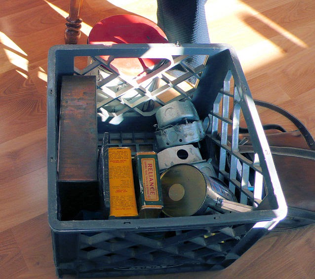
Robin wowed us with her collections of metal tins, canisters, and other odds and ends found at garage sales and building supply resale stores. 


She was looking for ideas of how to arrange them somewhat collage style within that copper square. So many of the same principles one applies to fiberart, we decided, to be applied here, even though we don't have the slightest notion of the mechanics of doing it! But Robin has a good eye and loves working with unconventional materials in a trial and error way.


She's got a great eye for working with fabric as well. We'd seen this small wall quilt at the last meeting and answered some of her questions about the netting she wanted to put over the top to trap some tiny snippets here and there. 


Now it is all stitched and a really stunning little art quilt.

So proud and grateful to have these ladies as friends and artist support.

Wednesday, February 11, 2015

Creating a Road Map

I've decided to set Adrift aside for the moment (more mulling and perhaps a burst of inspiration needed to "cowabunga" into the next stage) and get back to the fountain wall. After all, I've worked out most of the technical issues on the sample and have the full-size pattern drawn out. The big pattern plus all the fabric laid out in the auditioning process are taking up a full 3/4 of my work space. Time to start cutting and fusing.

But I can't just start cutting the interfacing following lines on my pattern. Some of those pieces overlap others. And some of the lines are actually stitching lines. Time to start measuring and making notes. Right away, I realized it would be helpful to color each unit to more easily see where the divisions are. On a whim, I'd bought a set of crayons and never used them; now they seemed the perfect thing to quickly shade in the sections. Next I numbered each section, noted whether or not I had to add overlap to the measurements, then measured away. Horizontal and vertical measurements are written in each section plus transferred to the number list on the left for quicker reference.

Then I drew the outline of each section with pencil onto the Stiff Stuff interfacing that will be the bones of this quilt. Overly cautious, you ask? I thought so, but if nothing else, I wanted to be able to change the layout should I find my first go didn't fit the amount of interfacing I'd bought. What actually happened was I'd made mistakes in transferring measurements to the list, and in one measurement itself. Yes, after drawing all the sections, I went back and double checked all measurements finding one huge one (2 inches short) and several small ones. After re-drawing some lines and triple checking, I'm fairly confident all is correct and I can proceed to cutting. I am SO glad I created a road map to work from.

The next step will be fusing fabric to these pieces of interfacing. I had planned to use Misty Fuse, even though I am not a big fan, and don't find it easy to use. But I have quite a bit of it and the wide widths may come in handy. It worked fine on the sample but now I am worried about the large sections which will have no stitching on them. One of the things I had problems with on other projects was the Misty Fuse lifting in spots, regardless of how well I'd ironed it down. Now I'm wondering if it might pop loose from unstitched areas as big as 21 x 9. If you're a big user of Misty Fuse, I'd appreciate your input on this.

Since the fountain wall idea is part of what got me thinking about doing a water series, I thought it appropriate to use this post to send you over to Annabel Rainbow's blog post about working in a series. She says pretty much everything I would say about it, and perhaps better. I particularly liked her mentioning that working in a series is not doing the same thing over and over, and it certainly is not boring. Go check it out: 

http://annabelrainbow.blogspot.com/2015/02/working-in-series-some-thoughts.html

Sunday, February 08, 2015

Degrees of Wonderfulness

Under consideration for rendering grass & reeds
I stopped by an artist friend's house the other day, Adrift in tow. I'd offered to let her try out some fabric markers I had on hand and she'd offered to let me raid her stash of decorative threads and yarns. She'd seen my last blog post on Adrift so knew where I was at in the questioning department. But nothing takes the place of seeing something in person, especially when in need of an opinion and perhaps an idea or two. I had questions about my perspective reference elements beyond "do you have better yarns than I do to represent grass" and could best talk about them with the quilt in front of us. I left still not sure exactly how I will treat these areas, but as I had hoped, my mind got a little unstuck and I got some good feedback. As my friend said, sometimes it just helps to talk these things through out loud, regardless of whether you come to specific conclusions.

In the course of this discussion about my quilt, we talked a bit about difference in designing styles. In this case, the design inspiration started with that shibori fabric; it's often a piece of fabric that sparks ideas for me. I remembered those unused leaves in a bin and thought aha! Perfect for making this idea of the water shibori complete. But of course, it was not complete and I didn't know what to add. Much later, I came across the hand-dye and thought aha! Add that to the top and the design is complete. But once I started quilting, I realized it was not complete, it needed more. And that is where I'm at right now. I realize that if I finished it up with no more additions or fiddling, many people would say how wonderful and beautiful it is. But I would know it needs more.

And so in this talking it through, I discovered a bit more about myself and my way of designing and looking at other quilts. I realized that I very often go through three stages:
  1. Most people think it's wonderful just the way it is. Perhaps it IS wonderful on some level, but I know it is not truly wonderful.
  2. I think and think and mull and study and suddenly, aha! I'm onto something and I start moving forward on the work. Again, I find many people would find it wonderful at this stage too, but I'm still bugged by something. I know it is not as wonderful as it could be.
  3. I finally have that breakthrough moment, where the "I'm on to something" becomes "I know what that something is" and I can/do make it happen. Now the quilt is truly wonderful, something special, and I am happy.
Believe me, every quilt I finish does not achieve the third stage status, try as I might. Some concepts start out well but are beyond what I can figure out, or I'm under time constraints that don't allow me to continue pursuing the "onto something" until I fully realize it. That's part of the learning curve, like it or not (and often I do not!).  Adrift is at that I'm on to something stage and I'm having a difficult time grabbing on to what that something is! But I sense I am close.

As if to confirm this insight and make me feel better about my plight, the very next day I ran across a similar thought voiced by painter Nicholas Raynold in an interview with The Artist's Magazine. Among the fundamental principles that he feels will help students when they run into trouble while developing their pictures, he includes letting the painting evolve.
"The construction of a painting evolves, in the same way our understanding of seeing deepens as we become more familiar with a subject; the picture advances from crude to refined, from dull to brilliant, from simple to complex."

A part of that evolution I would say is another of his principles: thinking through problems.

"If you feel that something isn't right, don't just hack away at it. Stand back, think it through and try to resolve whatever it is."

Also pertinent to my discussion with my friend, where I admitted that I felt the need to look at pictures of grasses to be reminded how they bend and entwine, the principle of trusting eyes over memory.

"Don't trust that you'll remember the intricacies of a line or brushstroke."

And you should not be surprised that I like that he stresses the benefits of slowing down in the last section titled "Slow is Good", favoring accuracy over speed and the importance of solid observational skills. 

"Always be attentive to what you're doing..."

Some of the advice in this article (May 2014 issue) is geared to students participating in a workshop situation as is this next quotation. Still, I think it a good one to take home to the studio.

"Everyone is at a different place in his or her painting career. Each has a different set of problems to resolve. Workshops last a limited time, so if you grasp just one sliver of illumination that moves the struggle forward - then you've achieved success."

Thursday, February 05, 2015

Analogous

View of quilting taken from an angle
I finished the quilting on the shibori piece, mostly pleased but not at all sure I sent my lines the right direction in that section on the left butting up against the red in the upper center. The fabric will not respond kindly to picking out and restitching so I am stuck with it. However, I've been considering adding some branches along the top as a perspective reference and most recently have thought to put them on the left. That's what that little sprig of threadwork over tulle is all about. Certainly not the right size, but it's got me thinking about stitching up a larger spray to emulate perhaps a cedar branch. It would be fortuitous if its placement helped distract from a distracting piece of quilting.

Struggling for a decent leaf arrangement

I've been calling this "the shibori piece" for so long that I nearly forgot my original inspiration and name. After fully quilted, I meant to add these 3-dimensional leaves as if floating on the water, which spawned the name "Adrift". Guess I've gotten a little adrift myself over the months since starting it. I just pinned these on to get them on the quilt so I could further consider additional references. You can see a bit of yarn in the lower right corner - I'm wondering if I can use them to make grass or reeds in the foreground. I like the balance I think I would get from those two reference elements being in opposite corners with the water obviously flowing from the other direction between them. But I'm not at all happy with the current placement of the leaves. Suggestions welcome.

Painting swaths of analogous colors with the help of scalloped cardstock

So what has this to do with "Analogous"? With this quilting done, I've returned to the art journaling. My next lesson in Creating Art At the Speed of Life is one on analogous colors; pick a favorite color and the colors on either side on the color wheel and watercolor paint those across the page. I was tempted to work with my often default teal (blue-green) but I've been using that combination a lot lately in the journaling. Let's pick something else I'm drawn to and work with all the time. Oh yeah - orange in all its autumn rusty golden glory. Like that "guava" dye run and the one-off piece with the same dye colors from my last dye session. And like the fabrics in "Adrift" that I'd just been working with. Funny how I've never consciously thought in terms of their position on the color wheel when choosing to work with this grouping of yellow-orange/orange/red-orange. I just knew they felt so right together, very natural.

There's more to add to this page, of course, but while it was drying, I switched to the other journal, searching through my newly started stash of art journaling materials for pictures to arrange on that purplish spread before adding my responses to the prompt. I'd forgotten I'd pulled the scene below from a magazine and stashed it there, but it confirmed my draw to this analogous grouping and how well it works. Analogous on the brain and not even aware of it!


I'm remembering now one of the reasons I decided to buy Pam's book and work through it. You see it in the picture above - a little self-critique form. "Rah Rah" and "Everything you do is wonderful" support only gets you so far. At some point, if you want to improve, you have to be honest and put a critical eye to what you have done. Pam doesn't want you to just play and explore and create a beautiful little art journal. No, she wants you to play and explore and then assess what you have done - the good, the bad and the ugly. And also think about how you could apply what you have just done to your regular work, something I'm often unclear about, although the doing might have been fun. And I so appreciate that. Yes, I'm often hard on myself, and in time can admit something might not be as bad as I initially thought. But dang it, don't whitewash it to spare my delicate feelings. (Yes, that was a bit of a rant.)

I'm slightly disappointed that there is not more specific instruction in how to use some of the supplies, like the watercolor paints. Total novice here and was unsure what was meant in the mixing directions. I've since done the inevitable google search and see where I went wrong. I guess for art journalers, they already know these basics, like I know how to use a sewing machine? And now that I've tried this analogous exercise, I can see I need a lot more experiment and play with them (practice), and perhaps some better quality paints. On the other hand, I'm just doing exercises in a workbook, not thinking of become a watercolor artist. Gotta keep this in perspective!