Thursday, January 12, 2017

The Slowness of January

I've been doing the slow putter of straightening, not just in the studio where it takes on the characteristics of an archeological dig, but in other rooms of the house, and I suppose, in my life in general. To some extent, I enjoy this process, this sorting through and filing/putting away or tossing, the rediscovery of things I'd forgotten about, the reminder of loose ends that I now have time to tie up. It does mean, though, that there is little creative progress or productivity to share for now, save my "coloring book" pocket calendar.

It too has been a kind of slow putter, taking a break now and then to study the design and settle on the next color to add. It's been an interesting endeavor, pointing up something I have known for some time is a weakness of mine, the attitude at times that a thing has to be done all at once, and if I don't have that big of a chunk of time, not starting it at all. All or nothing, which in some cases is necessary, but in  most is not. This no pressure coloring has been more enjoyable than I anticipated, and although I likely could finish a page in one long sitting, it has helped me see the value of not doing that, of taking instead a slow, thoughtful and extended approach. Those few minutes I'd steal before setting off on the next task of the day were little treasures. And I must admit, when I've pulled out the calendar when out and about, and it falls open to this first page, even in its incomplete state, it gave me a surge of joy - so colorful! And any thought of wasted effort, I decided, has not come into play because this is an item that I actually use, unlike a coloring book that would only sit on a shelf.

So January is done and I'm fairly pleased with my color choices and particularly like this swirling design. What do you think? And here is February, waiting for me to make that first color choice. I'll admit, it's overwhelming me a bit!


Thursday, January 05, 2017

The Christmas Gift

Master pattern for Silhouette Trees

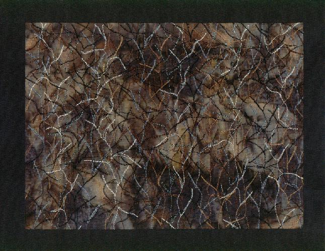
Remember the silhouette trees I was working on for a Christmas gift? Well, it didn't get done in time to be received by Christmas. Heck, it didn't get DONE by Christmas. In fact, I just barely got it to my friend before the year ended, the package arriving around 6 p.m. on New Year's Eve - that's cutting it close. But he loves it (and the candle) as I knew he would, and I am very pleased with how it turned out, very glad I opted for the photo view looking up through the branches at the sky. That's my master in the photo above, the areas of the photo to be used all blacked in with a Sharpie pen.

Traced Steam-a-Seam on fabric ready to cut out

I also did some blackening on the reverse so I could see better to trace the shapes onto Steam-a-Seam, my fusible of choice for this sort of thing. It has a tackiness to it that holds applique pieces onto the background as you arrange them but not so much that you can't reposition pieces. It also does not require stitching along the edges once fused in place. I knew I would not be stitching on these pieces, many of which would be very small and narrow, so this was a must.

Karen Kay Buckley's "Perfect Scissors"

I remembered how tedious and somewhat difficult cutting the zig zagging reflection pieces for my Sailing the Wine-Dark Sea quilts was and had taken someone's suggestion to try a pair of applique scissors with serrated edges. I tracked a pair down, Karen Kay Buckley's "Perfect Scissors", in a small applique size that also had Teflon coating, but I had not yet had the opportunity to try them. Oh, what a difference! I could definitely tell that the serrated edges were making the cuts with more ease and precision, and I found the large openings in the handles so much more comfortable - no rubbing after extended sessions of cutting.


Just goes to show that the right tool can make all the difference. I could easily get into all those tight spots and small curves. And these "Perfect Scissors" were not very expensive as good quality scissors go.


My master pattern slipped under the piece of hand-dye for the background, and I could just make out the shapes to help guide me with placement of the applique pieces. Did not have to be exact but boy, did that help move things along.

When I'd traced the very small openings in the parts of the trees that would be in opposite corners, I wasn't sure I'd be able to get in there and cut them out, and I was willing to live with that if that was the case. But the very sharp points and thin blades of these scissors allowed me to get in there and remove even the tiniest of them, even through the fusible and its paper backing. Very different from the Teflon Fiskars applique scissors I've been using.


Once all pieces were in place and permanently fused, I penciled in the rest of the branches that were too small for applique and would be stitched. I used basting spray to hold it to the felt taking the place of batting, and the stitching began. I stitched alongside but not through each branch and out onto the background to make the spindly branches. This quilting of the little branches reminded me of a journal quilt I made many years ago, an abstraction of sorts of a winter scene looking into a thick wooded area that was all bare branches. I found it very enjoyable stitching.


Here it is all done and from the back so you can see just how much stitching I put in it. The color of the felt, by the way, ended up to be important as the hand-dye was transparent enough to be altered by what color was underneath it. I tried several and like this brown the best.


Now for the mount and attaching the quilted section to it. After all those batiks I had strewn about the table as possibilities, I soon realized I just needed to go with black, either the same hand-dyed black of the trees or... I looked through my commercial black stash and found this wood grain print which read just the slightest bit lighter than the tree black. No need for fussing with the thread either. I used the same Aurofil 40 wt cotton thread as in the quilting to satin stitch the edges before centering on the mount and attaching it with a straight stitch right next to the edge of satin stitching.


Here's another view of some of the stitching. While I was working away, wouldn't you know I kept running across other people's photos of bare trees in silhouette against sunset skies - on blogs, on Facebook, in books. In fact, if you are a tree nut like me, you might like to track down my latest find at the library, taunting me from the "new books" display: Ancient Skies, Ancient Trees by Beth Moon.

"Silhouette Trees" by Sheila Mahanke Barnes ©2016

Once mounted the quilt measured 13-1/2 x 15-1/2 inches, and in my mind is the perfect compliment to the candle, just as I had envisioned. Whether or not they will be displayed near each other is in question, but I'm so happy that candle inspired me to work up this design, and that I chose a photo that did not duplicate the candle itself. (Click on photo for a larger view.)

I ended up not working with the second piece of hand-dye concurrently as I thought I might so can make another of these right away if I choose. But I'm thinking I won't want to make an exact copy after all, but choose another photo and view to work from. I'm quite pulled to a photo with a vertical orientation but also like one of the landscape oriented ones too. We'll have to see what strikes my fancy when I get organized and back to serious studio work. 

Sunday, January 01, 2017

Another Year Begins


It occurred to me, as I thought back on 2016, that it had been a year of enduring for me. My resolution word for the year had been "light" and I did try to remember to bring light into not just my immediate world but the broader world as well. But for much of the year, light abandoned me as circumstances arose leaving me unable to do much more than endure these unexpected things. Endure symptoms from unresolved and new medical issues. Endure the side effects of drugs meant to make things better, waiting for them to kick in. Endure the frustration of my limitations that kept me out of the studio so much, from traveling, from the trails I love to hike. Even the sudden popularity of padfolios, which surprised and pleased me, became a matter of enduring because health issues and drugs made it so difficult to ramp up the energy and focus to make them. Then beyond myself, endure the empathetic sadness for others' losses, my heart breaking for the people I love, a weighty sorrow for strangers all over the world. And let's not forget, endure the toxic and crazy political campaigns and the aftermath of the election. Days and days when sending light into the world was the last thing on my mind, and all I could do was endure until the light came back to me. And it would come back, but it was difficult to hold onto. Many would agree, even with its bright spots, 2016 was a tough year.

And I'm not so sure that 2017 won't be more of the same for me as well as the rest of the world, a raft of things that can't be predicted or changed but only endured. And while that may sound pessimistic if you only consider the first definition of endure (suffer something painful or difficult patiently), I knew at once it was the perfect resolution word for me as I saw a certain optimism in it and a means to survive. I believe optimism is the way we are going to get through the coming year in the face of so much negativity, refusing to succumb to the doom and gloom we are constantly barraged with, not giving up when confronted with personal trials and challenges, but enduring through it all as in the second definition (remain in existence; last). I find this idea of enduring inspirational because really, is that not what life is about, understanding that, good or bad, if we endure in terms of this other meaning of to last, we have won at least one battle? And while much that bothers us on a daily basis comes and goes, the important thing is that we remain, steady and calm and enduring.


This may also sound pessimistic, but I am keeping my expectations low this year. I know that goes against all the inspirational hype about setting goals and shooting high, but it was quite discouraging to set out into 2016 with such high hopes for my health and modest goals that never panned out. It almost made enduring more difficult, thinking of the things I'd hoped to be able to do and couldn't. This year I will still hope for the best but not set the bar very high. That way whatever does get done, whatever progress gets made, whatever improvements come along will feel like a gift, and that which stays the same will not feel like such a defeat. I think I can be more at peace with how the year plays out if I approach it this way. And I intend to remain in existence, to last, to endure to the end.

*   *   *   *   *   *   *   *
Previous resolution words:
2008 - Freedom
2009 - Calm
2010 - Focus
2011 - Refocus
2013 - Perseverance
2014 - Explore
2015 - Fearless
2016 - Light
 

Saturday, December 24, 2016

Wednesday, December 14, 2016

Fads and Crazes

As a general rule, I have never been one to jump on the latest bandwagon, go gaga over the latest fad. So my reaction to the adult coloring book craze has been lukewarm. Oh pulleeze, I remember thinking. And yet the enthusiasm for this craze has not waned. My initial feelings about it have not changed either, as I see others hoping to get in on the monetary gains to be made by offering coloring opportunities beyond the basic coloring book. Just...not...interested... mostly because I don't need someone else's designs to color in, have plenty of creative outlets to keep me busy. And yet, I have recently purchased a pocket planner with blank designs to meditatively color in. My excuse is that I only had three designs to choose from - one with horses, one of Italy and this one. Nothing against horses or Italy but they were not compelling. The flowers, even left black and white, at least appealed.

I still can't figure out why this craze suddenly took off like it did as similar coloring books have always been available, just not marketed to adults. I remember back to 2012 when I accompanied my friend Judi to the Mayo Clinic. We had both brought along some things to fill the time with something a bit creative - yarn for knitting, sketchbooks for drawing, things like that. We were both ripped from our studios with this trip and could not create like we would at home. One of Judi's friends understood this and gave her a coloring book, pages of flowers as I recall, thinking it would fill that need to be working on something. Judi tried a page or two and then threw it down in disgust. I sensed it felt like busywork to her and she stated that it was boring just coloring in someone else's designs. I could see her point. One of my gal's in the art group told a similar story about her daughter who as a child would take a page she was supposed to be coloring in, flip it to the back, draw her own version and then color that in. 

I've been trying to remember my own feelings as a child working with coloring books. I mostly remember designs with children in them, perhaps flying a kite or playing with a dog or picking flowers or standing near a house. I remember carefully choosing the right color for the knowns like blue for the sky, green for the grass, flesh color for the skin. I don't remember how my mind worked for the parts where there were options. I do remember keeping the colors within the lines. See? These are the same traits I exhibit to this day, an aesthetic possibly in my genes, and I'm sure I argued with or at least looked with disapproval at classmates' work that broke the rules I was adhering to. At any rate, perhaps the adult craze is so popular because people have good memories about their coloring days and have not allowed themselves to pursue anything very creative for awhile. Or don't feel they are talented enough to work without guides. Or recognize the therapeutic value of working with a drawing and coloring it in and this is a quick way to access that.


Whatever the reason, I guess I need to ease up a bit on my eye-rolling whenever I see yet another product geared toward adult coloring. I told myself I didn't have to color in those pages (one design for each month). Then again . . . I had this set of cheap colored pencils bought years ago with the idea they could be used to try out different color schemes when drafting out designs on paper. Only twelve colors rather frustrated me and they've been sitting unused ever since I started investing in good quality Prismacolor pencils in many colors. I wouldn't "waste" those good pencils on something like this, but perhaps the limited selection of the Crayolas would be a challenge and they'd finally get some use. And in my usual meticulous way, I am working through the motifs that will be green, which in this case are in repeats of four, in odd moments here and there, before choosing the next motif and color to attack. Yes, there is something oddly meditative in the movement of the pencil laying down the color. There's also something a little guilty about it too. I really should be working on something else. But I am rather enjoying working with these shapes. And I have lots of time to finish this prelude to January.  

Saturday, December 10, 2016

Hatching A Plan

Once I have a design in mind, all sorts of questions arise, usually starting with what size will the piece be, what shape (square, rectangular, odd) and in what orientation (landscape or portrait). When starting from a photo, my brain gets stuck on the dimensions of the photo, unless I've played around with cropping it. And often I can't see beyond the image on the screen to envision the quilt finished any way but borderless. So while I studied my photos and chose a few to work with, I sensed panic about deciding the proper size to make this so that it proportionally worked nicely with that candle and then whether to face or bind it. I also mulled what technique to use, generally the second question that arises. And what about batting? How much texture might I want as I quilted around trees and extended branch lines? Would outlined branches puff up while the narrow ones represented by a single line of stitching sink into the surface? These are the kinds of questions that can immobilize me.

And then I realize the answer was right under my nose - or rather on the wall of the vary room where I sat studying photos on the computer. The photo above is of a pair of highly stitched images of The Palouse in southeastern Washington; instead of batting, I used an ECO-FI felt (which gives some but not a great deal of texture) and then attached the finished design to an interfaced fabric mount. Goodness - size, shape, "batting" and finishing questions all answered at once! I could move on.


I've decided to go with the photo looking up through the branches, although I printed out a second one for later use. I reduced both photos to 2 color (merely changing to black and white does not give you a black and white image, but one with too many values of grey for my needs). To save ink, I printed them as drafts - I just need some kind of road map. I quickly realized that the original photo had a major branch running nearly up the center which was very distracting (see first photo). I played around in my photo-manipulation program until I had it moved farther off-center, as you can see above.


Then I spent some time with the print-out, tracing around major branches and thinking about which of the smaller ones would just be lines of stitching. Getting familiar with the design with the idea that I will not necessarily use this as a pattern but as a guide. I'm considering free-cutting some of the shapes - I've done that before with success.


Inevitably, one must stop tweaking the design and start auditioning fabrics. The brown piece at the top is the felt and I'm still deciding about which orangish fabric to use. I thought using a solid black for the trees was a no brainer, but it seemed too stark and things started leaning a bit Halloweenish. As I pulled possibilities for the border mount, it became clear that I needed a black that wasn't so black and found a hand-dyed that I think will give me the subtle difference I was looking for. By the way, most of the border fabrics in this picture have now been rejected for half a dozen better options! The final decision will have to wait until the center is done and ready to attach. Oh, and I can't really decide between the two oranges so I have cut a piece of each and will work them up simultaneously. Hey - I always need new pieces for the local exhibits - it will be time well spent and give me options.   

Friday, December 09, 2016

A Small Bowl & A Not So Small Revelation


I finished up this small bowl yesterday, same basic design and fabrics as the previous Sea And Sand bowl, except this time I wanted to make a shorter version with just two fabrics. When all the rounds were sewn, I meant to finish in the simplest way, grading the end of the closeline before the final rapping with fabric strips so it would blend into the beginning of the round and not leave a noticeable raise or bump along the rim. This is a little tricky and I did not do the best job of it on the other basket, hiding the imperfection with that handle.


I actually left the bowl in the machine overnight while I thought about this, mostly because as I studied the basket, I wasn't sure that where I had planned to end would make a smooth transition. But I think it was more than that. I think it was a bit of boredom. I just wanted to do something different from a plain finish. And so I played with continuing to wrap and stitch the clothesline but not to the basket, then looping and spiraling that length of line into something decorative. It required hand-stitching, which I've been avoiding but no other way to do this, and it was as tedious and awkward as I'd anticipated. I like the results though, and was pleased to find a bead to attach at the center of the spiral.

Approximately 6-1/2" across & 2" high. Still love the look hand-dyed fabric gives.

I think a lot of what I've been doing in the last year or so can be traced back to boredom. I've always thought of my impulses to try new things as more curiosity, but lately these urges to do something different have not always risen out of that excitement of "oh - what would it be like to try this idea" - that "what if" part of creativity. Instead, the feeling is more one of truly not interested in doing the same thing over and over or working with the same medium over and over. I think this is the first time I've been aware that my restlessness may indeed have roots in boredom. And boredom may be a good thing if it pushes me along in my explorations. 

I'm delighted with the way this bowl turned out. I enjoyed the process, finding it relaxing and meditative as I always do. I'm sure I would have been a little disappointed had I not put in that effort to create a more interesting finish. But I do wonder a bit why boredom has been stalking me. And I can hear my English & Latin teacher mother now, as she stood in front of her class responding to students complaining they were bored. "Bored? I'm not here to entertain you - you're here to learn!" 

Right mom. And learning I am . . .

Wednesday, December 07, 2016

Spreading Light

The day before Thanksgiving was exceeding dark and gloomy, more so than the two previous days, and it was getting to me. I couldn't shake off a feeling of doom, a sinking into depression, no particular reason sending me down that road save perhaps the weather. Then the postperson showed up at my door, handing me this happy colorful envelop with this lovely shawl inside. My mood immediately perked up! The sender would not have known how much I needed a bit of brightness in my life that day.


It is a souvenir of my cousin's recent travels in South America, something she found while in Chile. She often looks for textiles for me on her travels outside the U.S. She confirmed what I've often heard, that much of the fabric she ran across was of poor quality, so she hoped I would like this instead. You might wonder how this black wool shawl could cheer me up, but it did because that bird and the flowers popped right off it (more so than I think the photo would suggest). The crocheted edging in rainbow yarn particularly made me smile. And don't you appreciate a piece that is handworked even more when you yourself have made things using that method yourself? That's how I felt as I studied the embroidery on the bird and that crocheted edging. As for the flowers, I'm not sure of the method - tatting perhaps - and they may actually be commercially made and added. But all in all, I found this so delightful and appreciated my cousin thinking about me as she traveled from country to country. Wrapping it over my shoulders is like a hug from her.

We need to spread light right now. It's not just that we are in the season where nights begin in late afternoon and the brief emergence of light from the sun may be shadowed by clouds and storms. The political climate in so many parts of the world looks dreary, the needs of so many seem insurmountable. How can we keep a positive outlook, not sink into despair and hide away hoping it will pass without terrible repercussions? Well, another thing that came into my awareness recently struck me as a good thing to keep in mind, still makes me smile as I read it. Perhaps it spreads a little light for you as well.

From "Reasons To Stay Alive" by Matt Haig
Spread light! It's good for you and everyone around you!!!

Saturday, December 03, 2016

December

I have some hard and fast rules about things Christmassy within my home. There will be no playing of Christmas music, no writing of Christmas cards, no setting out of decorations before the calendar flips to December. I did none of these on December 1st, although as I headed out on errands I realized I needed to switch out the cd's in the car for holiday ones. Instead, there's been a bit of straightening up going on this week, making way in the studio for work on a few Christmas gifts - another basket, a small art quilt, perhaps a fabric postcard. Also a bit of unearthing in the office, where I tend to stack things I've printed or articles I want to reference in a blog post on the futon couch which sits too close to my computer chair. Perhaps if it were a longer reach, I'd just tend to these things right away. Instead, here at the bottom of a pile is a The Artist's Magazine from April 2015 with an article earmarked that I know was on the couch because I wanted to share. (I don't think it has been sitting there that long - I got way behind in my reading of this magazine I subscribe to so likely it has been there just this year.) And that article coincidentally addresses the very thing I've been struggling with regarding this gift of an art quilt.

Just like the candle, or so I thought until I saw it again

It started with spotting a wickless candle (shown at the top) in a catalog. An LED light flickers inside, back lighting the design on the translucent cylinder. It is bare tree branches against a sunset. I am so about trees and immediately envisioned a companion piece made by me that could hang near this candle. The person receiving these would get the connection to one of my artistic signatures. I started looking through my vast archive of photos, knowing I'd taken a photo similar to the image on the candle. There it was, but I'd forgotten that the sky was not the vivid orange.

Playing with camera settings - saturation not true to life

But no matter; I also have ones with that orange sky, taken from my upstairs window, looking out over the houses in my development. Scraggly pine trees poke up above the roofs, I cannot shoot the sky without these other things intruding. While waiting for the candle to arrive, my mind started seeing it like this photo. I started thinking I could take the easy way out and just print one of my photos to fabric, then enhance with some stitching across the sky, up the trunks and out the branches, maybe add a few more trees. Call it "View over Lupine Street". Would leaving the dark corners of the rooftops add or detract? And then a whole lot of insecurities flooded in, mostly about the worry of ruining the printed photo with stitching that might not look right, black thread that would not blend, having to stop and start the sky stitching at the trees, on and on. I got very attached to the photos, did not want to alter them. But if I didn't add stitch, what would be the point of printing on fabric? Why not print on photo paper, frame and be done? Well, because I am a textile artist. Panic and freezing up set in.

Fading colors and scraggly trees - boring now

Then the candle came. I put in batteries to try it out. The sky was not as rich in color as I remembered. It was more like the photo above. I was disappointed, thought the candle must be misrepresented in the catalog and online, and I took another look there. To my surprise, it was my brain that had started to misrepresent it. Worse yet, when I went back to dredge up the reference photos I'd found, they too didn't look like I remembered. By now I'd worked myself away from the idea of printing unaltered photo to fabric, instilling a bit of confidence that I could indeed find an appropriate piece of hand-dyed or batik fabric and do a bit of thread sketching of the trees. But still, I wanted to work from one of my "perfect" photos. And none of them were perfect anymore. I wanted to trace the tree branches onto the fabric so I would "get it right" but the images weren't what had settled in my head. Now I wondered why I ever thought the one with the scrawny pines was compelling as is. I've been set free a bit to pursue that image that has developed over time in my imagination. A scary bit of freedom for me, but one that may lead to something exciting, or at least, more gratifying. And perhaps a throwing away of crutches.

A wider shot of a previous photo - an urge to copy

Which brings me to the article in the magazine. It was about Alyssa Monks who teaches classes in how to "consult photos while creating paintings that have lives of their own." (A rather extensive description of this class can be found here and worth the read.) "The aim of this workshop is to help students create a painting that surpasses the intrigue of the photograph and does not rely heavily on it as an image simply to copy or as a barometer against which to judge the final painting. The painting is its own journey; the photograph is merely a tool in the process." I readily admit, this has been my issue with starting from a photograph, that attachment that leads to copying. I really needed to hear this right now.

Photo-manipulation of snow-covered branches - a step away from preciousness

I remember feeling most uncomfortable when I read this article detailing the process she puts her students through. I would not be starting with a photo if I did not wish to end up with something similar (at least, that's what I tell myself), but Monks is pushing her students to go farther, to almost abandon it or at least look past the obvious details for a more spontaneous rendering, capturing "the essence of the subject and ...the intimacy of the human touch beyond the smooth photo-realistic image." She ends up doing a lot of layering which obliterates in a way that "helps create atmosphere and lessens the preciousness of the drawing." Ah yes, the preciousness factor. My precious original photo.

A different orientation - which way should I go?

But this particular piece I want to make is inspired not just by my photos but by that candle, and in some way needs to be fairly similar if this will work as I intend, as side by side companion pieces. I can see now that I need not copy, but I do need to have something similar. And I can see the wisdom of Monks' final words in the article: "Once the medium and material are understood, the photograph holds you back as it influences too strongly toward a specific and limited finish. Too heavy a reliance on it disallows for much creativity or discovery, hindering the flow of experimentation beyond merely copying and honing a skill. For this workshop, my goal was to help you see the possibilities and to move beyond the photograph into invention and imagination and more discovery. That's what we enjoy about seeing and making art when the craft is inevitably no longer satisfying on its own." 

A different kind of tree shot from a different perspective - potential!

As I thought more about how to approach this little piece, I did experience that inevitable spark of variations I could pursue. Granted, it was partially in response to an attempt at a cavalier attitude should my initial attempt end up badly. My skills are fairly honed (but in some cases rusty) at this point, so it should be no surprise that my mind flits from technique to technique, format and finishing options, and perhaps to things I've not tried. I need to keep fear in its proper place and approach this with curiosity. As Monks says, "There are amazing discoveries that will only happen if you let go of your expectations. I like to paint something just because I'm curious enough about what it would look like made of paint." And isn't that what drives so many of us working with fiber, that thought of how we can capture something in our own medium of fabric and stitch? It's our curiosity that begins our journey, and our letting go of expectations that allows us to go fabulous places with it. I may not go far down this particular path of working with this tree image, but I am a bit more ready to give it a go.        

Monday, November 28, 2016

Thanksgiving

Last Thursday, we in the US celebrated Thanksgiving Day, and besides fixing turkey, my personal tradition includes baking a mincemeat pie. I do as my mother did and buy a jar of filling rather than make it from scratch, but pop it into a pie crust I've made using my mother's recipe. She actually didn't have a crust recipe, just threw the ingredients in amounts that looked right into a bowl and added water to mix until it was the consistency she wanted. But when I married and realized I didn't know how to make a pie, I begged her please to translate that into a written recipe for me. She did her best, pouring flour into the bowl, then measuring and recording the amount, and paying closer attention to how much of the other ingredients she was adding (just salt, shortening and water). She warned me that Crisco shortening would not produce the best, flakiest crusts like lard would, but would be an ok substitute. She also warned about working the dough too much before rolling it out - too much handling would make the crust tough. She was right on all counts.

But isn't pumpkin the traditional Thanksgiving pie, I hear you ask? Yes it is, and my mother made it too for our family feast. And I always ate some of each, although I was never that keen on the pumpkin, preferring the mincemeat instead. Every year I'd do the same, why I'm not sure, maybe tradition having something to do with it, or following along with what everyone else was eating. If everyone else liked it so much, then it must be good, right? I was well into adulthood before I took my last bite of pumpkin pie and admitted, I just didn't care for it.

Here's the funny thing though. I'd been doing the same as my mother, fixing both kinds of pie each Thanksgiving, and my husband and I were eating both kinds without complaining before I had my little epiphany. My husband looked at me and said, You don't like pumpkin? I love pumpkin but really don't like mincemeat pie. Really! Why had neither of us admitted this for the many years we were married? Tradition and a little of not wanting to hurt the other's feelings I think. We both gave each pie one more try the next year, just one bite, looked at each other, shook our heads no, and never again touched the pie we really didn't care for.

And since that day of swearing off pumpkin pie, I realized it wasn't just the pie I didn't like, which I'd decided was because of its sort of custard base and I don't care for custard. I just didn't like the taste of pumpkin regardless of what it was in. Now I was free from trying to like pumpkin bread, pumpkin cookies, pumpkin-spice lattes! There's so much good food out there I DO like, I hardly need to consume things I am at best lukewarm about.

So if you are an all things pumpkin lover, by all means, enjoy all things pumpkin. But don't try to convince me how good these things are because they simply aren't to me. Give me mincemeat instead! And so a slice of mincemeat pie has been added to my comforts sketchbook, using the fountain pen with the brown ink, which seemed very appropriate. The pen worked really well on this paper, and I used a little trick I saw on-line of turning the pen over essentially using the back side of the nib in order to draw narrower lines on some of the shading and texturing. I'm getting pretty comfortable with this pen now, and I'm wondering why it was giving me so much trouble initially.

I also had a thought of an advantage of drawing food. No matter how good or badly the sketch turns out, you can always enjoy eating the subject matter afterwards!

Friday, November 25, 2016

Artgraf Experiment

As long as I was in an experimental mood in prep for the art group meeting (see previous post), I decided to do a quick test run of the ArtGraf blocks I'd bought quite awhile ago. I'd been playing with water soluble graphite pencils with intriguing results, and when I saw these, in "my" earth colors, at greatly reduced "new product" price, well, I had to buy them. And not so much for my sketching forays, but as I so often do, wondering if I could use them on fabric. The graphite pencils became permanent on paper after wetting. Perhaps these colored ones would work the same.


So I went about laying down color and wetting in various ways on a strip of white muslin that I'd ironed to freezer paper to stabilize it. The blocks are shaped like tailor's chalk so you can pick them up and draw using the edge or pull across in a wide band as I did here. Hard to get even coverage. Then I tried dabbing and pulling a wet foam brush across the section in the middle. No control. The last test on the right was with a wet one inch flat brush that was used to pick up the color directly off the dry block like you would a watercolor pan, and brush across the fabric. Also difficult to control. But you can see better how the ArtGraf reacts like the Derwent Inktense watercolor pencils - the color comes to life when it is activated with water.


I decided not to let that first swath go undampened, and tried a dauber to see if that worked better than the foam brush. It did.


Also on my mind was whether one could mist the Artgraf with water rather than apply the water with a brush. Besides laying down color in a swath, I also decided to try drawing a few lines with the edge of the block. 


My mister laid down a heavier spray of water than I thought it would, but at least I could see that it was a method that could work. There was some wicking of the color along the edges of the drawn lines but the lines themselves stayed quite visible. I also tried wetting the fabric, then drawing and dragging the block over it. Apparently forgot to take a picture but it worked fairly well. Where I dragged the block, the color eventually wicked into the damp area where I had not applied color.


The other thing I was curious about was if I could use these to make rubbings. I have several tjaps and had seen that they could be used this way, so I picked one with a fairly dense design. I covered it with a strip of white muslin taped to the top and held the other end as I dragged the block over it. Yes, it did indeed pick up the pattern. But what would happen when I dampened it?


I used the dauber again, because it held the least moisture and could be pounced along with some control. I quickly saw I had to use very little water or the color would wick and I'd lose the pattern. I really thought this product would give me more control over adding color but it did not.

Chart showing ArtGraf applied dry, dry then wet with brush, picked up from block onto wet brush and applied.

The real question, though, was if the color would bind to the fabric. And once dry, I quick rub with a piece of white muslin showed that the color rubbed right off. I was puzzled. I went back to my sketches where I'd used the water soluble graphite and it was not rubbing off. I read again the test run article that I'd pulled from a magazine that clearly stated this had binder in it. Perhaps it binds to paper but not to fabric. So I quickly did up a sample color chart (which I needed to do anyway) and found that some of the color also rubbed off once dry. And then it hit me, and I'm almost embarrassed to admit this. All this time I was thinking ArtGraf was colored graphite (which indeed many sites that sell it describes it this way) when in fact, according to the manufacturer Viarco's website, it is pure pigment with binder in the form of blocks. Yeah, the combination of working with the graphite pencils and seeing "Graf" in the product name along with possibly an erroneous product description allowed me to block out all else that was being said about this product. Now I understand why the videos and descriptions I'd been watching and reading kept saying you could use this like watercolors as well as draw with it before adding water, just that it left a slightly different look than watercolor. Sheesh.


And can you believe it, I had this epiphany AFTER I'd ordered up the "new" primary color set of ArtGraf blocks - red, blue and yellow - because yes, they were on sale. (Have you figured out yet I am a sucker for sales?) I had something I wanted to add to my comforts sketchbook and thought I'd work with the ArtGraf to get more familiar with it, and that red would come in handy. Well, the new colors came, and now that I understand what they are, it still was a good idea to play with them in this sketch today. I must confess I still do not have steady hands and used a different brush than I've used with my watercolors in this sketchbook so things are a bit ragged. While I like the idea of using the ArtGraf like a watercolor pan, I'm not sure it is as easy to work as watercolor - again, that may have been the brush. I didn't take a lot of care with this sketch, really wanted to use it to try some things out regardless of how the result might look. Thus, the darker than I'd meant spots on the lid (and there I was, sketching those ellipses again!) which are because I was being too slap-dash with the water soluble graphite up there. And rather than define the edges of the cup in pen or even dark pencil, I wanted to make a background wash of the ArtGraf to define it. I wondered if I could transfer the dry pigment onto a dry brush (I already knew how easily it transferred to my fingers when holding the blocks), and I could. A stencil brush seemed to work the best, although perhaps I just should have used my finger. Then I lightly brushed it with a damp watercolor brush and called it good.

What can I say? Now I know and I can go on from here. I'm still wondering if there's a way to "fix" the ArtGraf to fabric - I'm thinking soy milk since it is the binder for natural pigments (yes, another experiment waiting in the wings that I was researching along with the natural dyeing). Or perhaps I should get back to the machine and fabric not needing surface design added!