
Here's before & after pictures showing the latest reworking of the blue/pink painted, then stamped fabric. Don't ask me why overpainting it with this green makes me feel better, but it does. Maybe it's because it got rid of light areas so the shells don't contrast as much. Maybe it's because this green is that teal green I'm so fond of. Whatever the reason, I'm done messing with this one. It no doubt will be cut up and incorporated into something else so I'm not going to worry about an overall balanced look anymore.
Thursday is when I did this, spent the morning mixing paints and reworking several of those pieces from the first painting experiment. While I combined paint colors to come up with more options and mapped out in my head what I wanted to try with which piece, I realized I was feeling more relaxed than my last session. I was pretty frustrated after that one (and after the first one too), but this time I had the distinct sense that I was getting somewhat comfortable with this process. Mmm, wondered if I'd just needed more time to familiarize myself with the tools and materials or if there was more in play here.
I decided that was partly it, but that also I'd gone into the session with quite a different mindset than on the previous occasions. I had not consulted my books or notes to set in my mind a particular look or technique. I had no preconceived ideas about what I wanted the outcome to be. I simply went at it with the idea of, let's try this and see what happens. It allowed real learning, both of the technical side and what tools, colors and effects appealed to me. It removed the inner critic for the moment so I could assess the effect not in terms of my skill or lack of it, but on less personal criteria. It provided that element of surprise I so enjoyed from my dyeing days. In the other sessions, I had said to myself, let's try this because it will give me this effect. And when it didn't, I was naturally disappointed.
So on piece one, I used the Setacolor Transparent Emerald Green because it looked to have a bluish tint to it. I broke out of my mind lock about what I could mix paints in and dug out some artichoke jars - small but wide-mouthed with tight fitting lid. Brushed it on with a 2" chip brush (would have used a larger one but the 2 inch fit perfectly into the jar opening) and immediately liked using it better than the wide foam brush. I concentrated more on controlling the amount of paint on the brush and the pressure while stroking to minimize obvious globs of paint. And I was delighted by the color - whether or not it looked good on this. Emerald Green is definitely a color I will keep in stock.
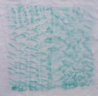
 On to piece two. This packing material has been sitting on my kitchen table for some time. I'd noticed this slit corrugated cardboard being used in shipments from Amazon and eventually it dawned on me that it might make an interesting pattern to paint over. I pulled it apart and laid two sections of it on the work surface and covered it with one of the orchid tints. I used a spray bottle to dampen the fabric with water, then used a 1" mop brush to paint more of that luscious Emerald Green over it. Oooh - I not only loved the design that surfaced, but loved working with that mop brush.
This pattern suggested several things to me. First, I saw hills, then clouds, then ripples in sand. I think I'll take a piece of unbleached muslin and paint over it with brown to get that look of beach sand. After this dried, the green wasn't as dark and I'm not sure putting it over the orchid was the best combination - it seemed to change the color and bring out an orange undertone. It was the dickens to get a picture of it and I also messed around in Corel Paint Shop Pro trying to adjust the colors.

Now it was time to "improve" the piece with the spiraling arcs. I ironed some freezer paper scraps to it to act as a resist, hoping to form straight lines and angles. I poured a brown I'd concocted into a small spray bottle which formerly held eyeglasses cleaner. I didn't dampen the fabric at all because of the freezer paper, just started spraying. The bottle did not produce as fine of a spray as I'd anticipated. I tried different distances but it didn't help much - for my purposes, this is too heavy handed a look. So I'll look for a different nozzle with a finer spray if I do this again. Here it is before and after the freezer paper was removed.


When I removed the freezer paper, the brown looked too much like something one doesn't mention in polite company. Mother's with babies will know what I'm talking about, I'm sure. Also, the contrast between the spayed and resisted areas was a bit more than I intended. So this piece will get one more remake - perhaps spattering or sponging some dark blue over the entire piece. I've even hit upon an idea of how to use it as a background, so I am motivated to take the next step. I have to admit that part of the problem with experimenting with dyeing, printing, and otherwise making your own fabric is figuring out how it will be used.
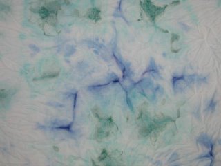
 This was going so well that I decided to try one last thing. I took another of the tints - that light blue one that was so pale you could hardly tell it had any color in it at all - and dampened it, then loosely bunched and rubber banded random areas front and back. Then I used the mop brush to apply Emerald green and a foam brush to apply cobalt blue mixed with some red. Again, it was pretty random, done to both front and back with varying pressure so some paint was lightly applied and heavier in other areas. Finally I spritzed the whole thing front and back with water to be sure the paints ran and diffused a bit.
The piece was finally dry enough today for me to take the bands off and spread it out. I couldn't wait to iron it, so these pictures still show the wrinkles in the fabric. Also, the pictures have a cast & darkness to them that I couldn't get rid of. The background remember is that light blue and since I used quite a bit of the Emerald green, the overall feel of the piece is more green. Anyway, I thought, this is more like it! I very much liked this effect. In the close-ups you can see how that mix of cobalt blue and red diffused much like a dye would. Because I worked from both sides of the fabric, each side has its own slightly different thing going on. This use of paints makes sense to me and I'm sure I will do more of it. It also makes me want to use that cobalt mix with salt.


Above is one side and then a closeup. Below is the other side and its closeup.


The session ended on such a positive note that I was motivated to tackle some of the mess in my studio that afternoon - one item on my list of goals for the week. I reworked my documentation form and printed off a bunch of them and even got a couple of them filled out. Also printed off some pictures for files and tech journal, so I am feeling pretty good about the week's work.
2 comments:
On the shells piece - now the pink peeks through just a little; I think before it was too close to the purple and too much of a contrast to the blue -- the teal evens it out and binds the whole piece together. Taking out the white seems to help in lots of circumstances!
That packing material would look good laid on a quilt and stitched into...then maybe drybrushed with acrylics... just a thought... And good for you for persevering with this. I sometimes think we struggle more with ourselves, than we do with the cloth.
Post a Comment