Thursday, April 30, 2009

Subconscious At Work

There was one exercise we didn't get to during the first session of my drawing studio on Monday - drawing a corner of a room. So I did it today at home. This is a corner of my bedroom. I didn't do much with light and shadow, and totally ignored the wood grain in the oak armoire. The exercise basically is to capture architecture - lines and perspective. A little wonky, especially the big pot on the floor.

Perhaps I've been doing too much introspection lately. Perhaps I'm too aware of the research that would assign a motive to our every action. But it's too late to put the genie back in the bottle. My already analytical nature has seized upon some of these ideas and I find myself pondering...is my subconscious trying to tell me something through the smallest, most insignificant decisions I make throughout the course of the day?

It was this drawing studio that got me thinking along these lines again. I was the first to arrive so had my pick of seats. As I walked towards the farthest one down the table, then watched another student pick one right next to the teacher, I wondered what that said about each of us (Myers-Briggs uses questions about seating choices in typing personalities). I noted my sense of intimidation as the teacher passed out drawing paper larger than a typical notebook size; drawing small feels safer somehow, filling a larger space not only more challenging but more difficult to keep private. By now I was actively playing the what is my subconscious trying to tell me game as I wondered if there was any significance to my desire to turn the paper on its side (beyond the fact that it would let me draw smaller). Just the fact that I was having to draw within this rectangle felt confining, effecting how I would approach the assignment. That may be why I enjoy quilting so much - because I can choose the dimensions in which I work. Does this go back to my old issues of control?

Then there's the matter of my most recently completed art quilts. As I was preparing my entry for ArtWalk 2009, I reviewed, via photos, what I had available to include with my entry form. I decided Freud would have a field day analyzing my output. Even though ideas for the pieces had been on my mind for quite awhile, and the decision to work on them when I did arbitrary, they eerily mirrored my feelings of the last 6 months. There was Balance Check, named that because I'd been watching so much gymnastic competition on TV. Now I could see it also might represent my on-going but recently heightened struggle to balance the various parts of my life and their responsibilities as well as the questions about how much time to devote to my traditional inclinations vs my art quilt ones. Unfinished Business was not so subconscious in what it was meant to represent, but the way I put it together was very much not the way I work. What am I unknowingly suppressing that leaped out there? Jockeying for Position and Jockeying for Space are similar in theme to Balance Check, except a bit more indicative of how frantic I was feeling, trying to juggle so much and starting to feel out of control. Sailing surprised me the most; it was quick and simple, I thought, because I just wanted to get it done. Once I saw it on the computer screen, it changed. Now I saw a lone sailboat far out to sea, not one of many boats I see on my lake. Yikes! I knew I'd just gone through a period of feeling very alone, very isolated. Had that slipped from my subconscious into this fabric postcard without me realizing it?

I can only surmise that I don't have nearly as much control over my art as I'd like to believe. Actually, I already knew that on a certain level. When I quit trying quite so hard is often when things start coming together. In fact, this is the premise behind the left brain/right brain thing. I guess I'd better get used to it.

Wednesday, April 29, 2009

Marking tips


As I marked the remaining two blocks in my cutwork series, it occurred to me that there are several marking tips I haven't shared with you yet. The very nature of fabric (stretchy and unstable) creates a bit of a problem when you draw the tip of a pen or pencil over it. One of the earliest suggestions I ran across to help negate this problem was to lay the fabric over a sandpaper board especially designed for the purpose. These were expensive and a little hard to track down at the time, so an alternate suggestion was to glue a very fine grit sandpaper to the inside of a file folder - instant grippy surface easy to store and transport! In the meantime, I've discovered some other strategies that work well and take advantage of things you probably have on hand.

First, just the surface of a cutting mat may grip the fabric better than the surface of a table or desk. Layering over another piece of fabric also helps improve grip. My favorite, though, is to use the backside of a square-up ruler to which Omnigrid Invisi-Grip has been applied. Invisi-Grip is a clear plastic material a little like vinyl that sticks to the ruler without benefit of any adhesive. In turn, it keeps the ruler from sliding around on your fabric as you run your rotory cutter along the ruler's edge. So naturally, the Invisi-Grip will keep the fabric you are marking from sliding around as well.

Another useful stabilizer for fabric is...freezer paper! I wouldn't necessarily use this strategy here, but I have used it, ironed it to the wrong side of fabric, when I wanted to write text, say to make a label. An added advantage is that you can draw lines on the dull size of the freezer paper to act as guides for text placement. I've even printed my text in reverse on freezer paper so that, with the help of a lightbox, I can just trace the letters onto the fabric (as in this post).

In the picture above, I also show a great aid for marking circles - a circle template. These can be purchased at office or art supply stores as well as some quilt shops and have many sizes of circles cut into a single template. Just choose the right size and run your marker around the hole.


And now for an applique tip I know I forgot to mention. When you have sections of a design that will be done as reverse applique, cut a small slit in the center of the area that will be cut away BEFORE you layer it with the background fabric. Although if you are careful, you can pull apart the two layers enough to make a small snip when you are ready to applique the section, there's always the chance you might slip and cut through the background as well. Sad sad day if that happens after hours of stitching on your block. Easier to make the little snips in advance.


Tuesday, April 28, 2009

Another Cutwork Block


Just completed block 2 of 4 cutwork blocks for the row quilt exchange. This is a design that I adapted from a quilting design in Pepper Cory's book, Mastering Quilt Marking.

And with this, I am back on schedule. Two blocks left and two weeks left in which to make them.

Monday, April 27, 2009

Drawing Studio


Today was session one of a 5 week drawing studio I've signed up for. with The Arts Alliance. I've taken no formal art classes since a summer school potpourri back in junior high school. I drew quite a bit after that exposure, then dropped away from it as other activities drew my interest away. Once I realized the pull to making art quilts, I also realized how inadequate my drawing skills were. I bought a sketch book and forced myself to start drawing out ideas, if for no other reason than to capture those I couldn't actually photograph. It is true that the more I use a sketch book, the more confident I become about roughing out design ideas or capturing simple shapes and ideas. But I've wanted more and have been looking for the right class, the right timing to declare myself a beginner and get some basic training.

You'll note I've called this a drawing studio, not a drawing class. The instructor is taking this 5 week session to introduce us to the concepts in Drawing on the Right Side of the Brain by Dr Betty Edwards. In other words, she will not be so much teaching us techniques of how to draw a face or a flower or a landscape, but be guiding us through exercises to discover how to see, which should automatically improve our drawing skills as well as give us tools to improve whatever kind of art we make. The class takes all levels and includes a lot of individual attention. With "six beginners" and three "continuing" students, no one should get lost in the shuffle. This format is so perfect for me. Plus I anticipate that much of what we'll be doing will dovetail nicely with some of the personal and artistic growth reading and writing I've been doing the past year.

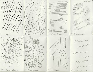
And it's also perfect that I should work through this in a class setting as opposed to the way I normal learn - by teaching myself through books. Although there is a workbook I could buy that would take me through the same exercises (and more), I just know I would not do them. The first exercise we did today (the 8-1/2 x 11 subdivided paper shown below) was just such an exercise that, on my own, I would no doubt blow off. Even in a class setting, I felt myself resisting "looking inside and drawing how you really feel about..." This is analog drawing, and right now there are a few of those emotions I'd rather not think about. So I started with an easy one (femininity) and worked up to the harder ones. By the time I was done, I felt I had to take a breather. It was similar to the emotional release I sometimes feel writing morning pages.


This sort of drawing can reveal a lot - which may be why we resist doing this sort of exercise - and the resulting drawings produce amazingly common imagery. We compared our drawings to those in her book, and it was startling how similarly people express things like "joy" and "energy." Nearly every drawing for "peaceful" was wavy horizontal lines, not unlike ripples or waves in water. Because so many of my lines were coming out curved and not unlike so many freemotion quilting patterns, I wondered how much my quilting was influencing the images I was compelled to draw. Apparently, not that much. These are universal images.

Then we had to do self-portraits, with the caveat that the instructor understood the look we were giving her. This and the subsequent drawing of the hand are only to be used as a benchmark of our current skill under no instruction. I've tried hands before, and I know how difficult they are to get right. This hand was comically deformed for the first half of its existence; I improved it some but the fingers aren't really long enough. The self-portrait is a little scary - I purposely took on a dour expression. The hair is perhaps the best part, but it is quite faint here because I didn't have time to go back in and darken it up. Actually, I was rather surprised at how well I did in this exercise, something I've never tried before. The nose was a real problem and I finally gave up on it. I also think, like the fingers, the face is not long enough. It looks too round and squished for how I think of it, but perhaps it's truer than I'm willing to admit.

In subsequent weeks we'll return to the hand drawing exercise, but with instruction, and in the end, we will compare these first drawings to the last ones to see how all we've experimented with and learned during the 5 weeks has altered how we see, and thus, how we draw. I am truly excited!

Sunday, April 26, 2009

Change


Now here's change I can believe in! You know how coins collect in your wallet until the weight of it tells you there must be enough to actually buy something? I was going out for coffee and wondered if I had enough change to pay for a cup. There were 7 quarters in there, (along with ten dimes, a few nickels and some pennies). The U.S. mint has been issuing state quarters since 1999, 5 new state designs each year until all 50 states had their own quarter. So I wondered, how many different states might be represented in my wallet?

To my surprise, there was only one duplicate - I had two Georgia quarters. Nevada was the closest state represented. The others were from the east: Connecticut, Rhode Island and Delaware.

And then there was one of the old design with the eagle on the back, a Washington quarter. It was from 1965, and I decided to keep it. Not much silver in it - it is of the later "sandwiched" type, so really not worth much. Still, it's been circulating for over 40 years and perhaps deserves a rest.

Saturday, April 25, 2009

More on Freezer Paper Patterns


Here's another way to use your cutwork freezer paper pattern - just leave it ironed to the fabric, using the edge of the paper as your turn-under guide. Personally, I don't like this method as well. With these fabrics, it's a little hard to tell when I've turned under far enough. But beyond that, as I roll the block in my left hand to facilitate holding the area being stitched, the freezer paper can start to lift off the fabric.


Not all freezer paper is created equal. Some sticks much more aggressively than others, and this heavier freezer paper from C Jenkins is one of them. Still, as you can see, I soon had places popping up, either requiring frequent returns to the iron or adding extra sequin pins to hold points in place. A pain. But you may find this works for you, or at least for certain applique. It is worth trying, especially since you can revert to marking with a pencil should the freezer paper refuse to stay in place.


Remember my Jeana Kimball applique basting method? It occurred to me that a freezer paper pattern could be used to facilitate that method too. It could be ironed to the wrong side of the background fabric, and traced around (as opposed to using a light box) to provide the line for subsequent basting. Or, as you see here, the basting stitches can be put in along the edge of the pattern as it is ironed to the right side of the applique fabric and layered over the background fabric. I've added this basting to the center of this second block because of a recommendation in the Baltimore Beauties & Beyond book that I'd forgotten about. According to Elly:

"There is a slight tendency in cutwork applique to push the applique inward so that it 'puffs' a bit. It works fine in onlaid applique, but not as well in inlaid [or reverse] applique where some distortion may occur. For success, baste around the block's center."

Friday, April 24, 2009

One down...


...three to go. Actually, I'm a little behind in the schedule I worked up to have all four done by May 15 when I have to send them on to the next person. I'm allowing a week for each, but spent half of the first week doing the prep work on all four. So maybe I'm not behind after all. Then again, I chose to work on this one first (a modified Anita Shackelford design) because it had the simplest outline. Two of the three remaining have more points to deal with and so probably will take longer.

Regardless, I am enjoying working on these. I'm also remembering that it is easier for me to estimate time needed to complete something like this than it is some of the art quilt designs I come up with. This is very straight forward familiar territory...my art quilting is still sometimes a mystery.

Wednesday, April 22, 2009

Cutwork Applique - Step 3 plus Cutting Loose


Cutwork is one of the simplest appliques to do. Once you make your pattern, transfer it to your fabric and use a few safety pins to hold the fabric to the background, you are ready to stitch. I'm partial to YLI heirloom silk thread for my applique - a few neutral shades on hand allow you to work with nearly any color fabric, partly because of the fineness of the silk - it nearly disappears as you snug up your stitches. There are several different applique needles that I use depending on the project. In this case, I'm using Roxanne sharps #11 - they are short like a quilting needle.

One drawback to the silk thread is that it tangles badly. I use beeswax on cotton thread to control it, but felt it was too heavy handed for this fine silk thread. I've been hesitant to try Thread Heaven in spite of its good reviews, but my frustration finally won out. I tried it for the first time yesterday, and all I can say is, it's pure magic! If I'd read the product information sooner, my fears about using it would have been banished right away.

The only other thing you need is a sharp pair of small scissors to cut away excess fabric as you go. Because the applique shape is not cut out completely beforehand, it won't stretch out of shape. The stability of the square of fabric cut away a little at a time is what allows the minimal pinning as you go. You only need about 3/16th of a seam allowance, easy to eyeball, and the needle turns the fabric under along the line you've drawn, your thumb holding it in place as you make a few stitches. Just work a few inches at a time, cutting, turning, stitching, moving your pins along as you progress and trim some more. Inside curves will need a little clipping nearly to the seam line so that the allowance can roll under smoothly.

I worked on this while waiting for my car to be serviced. I thought I'd make a little more progress, but a woman also waiting for her car interrupted me after a time to ask questions. It's always a pleasure to share, and also to hear people's own quilting stories. The most lovely moment was, when after a pause, she hesitantly asked if she could touch it. Of course, and I handed it over. The only quilt this woman had made, and she qualified her story by acknowledging it wasn't really a quilt, was one she made for her son to take to college - made from a pretty sheet and tied with yarn. But she certainly was an admirer of quilts and looked closely at my block, fondling the fabric.

After my car was done, I went to see a small art quilt and doll exhibit nearby. It was a bit of a disappointment, partly because there were so few quilts, uneven in quality, and partly because I'd seen about a quarter of them before in other area exhibits. So I had plenty of time for my next stop - a park along the river. It was just too warm and wonderful of a spring day to go straight home. The last time I'd been to the falls for which Post Falls, ID is named, was in the mid '70's with a couple of college buddies. We clamoured over the rocks downstream, and I managed to drop my Instamatic camera into the water. My friends retrieved it, but most of the pictures from that day were ruined.


Thirty years later, this area has well maintained trails and a few places of fencing for safety sake. Good thing because I'd not worn proper hiking shoes. The trail started up through open area where many yellow and purple wildflowers were in bloom.


I love the rocky terrain of this part of Idaho.


I was surprised at the bright green moss on this tree which was very much out in the open.


Ponderosa pine bark is a wonderful orangie brown and so interestingly textured.


I didn't like the sound of this...all the while hearing the roar of the river in the background.


And then I was at the river - well, actually at the edge of a bluff overlooking it.


I'm so disappointed that these photos don't give a true indication of how high up I was, or the power of the water pouring through the narrow passage.


Apparently I looked quite the tourist as I took my pictures, because a nice man asked if I knew about the little cave down by the water's edge. No, in fact I did not and would have gone back the way I came had he not told me about the alternate route. It gave me a better view of the dam preceding the falls.

By the time I got home from my day out (dare I call it, my artist date out?), I was pooped but it was still so nice that I changed into a pair of shorts and dug out the lawn chairs so I could sit on the porch, relaxing with a magazine. What a great day!

Monday, April 20, 2009

Cutwork Applique - Step 2


These steps follow the basic ones I learned in Elly Sienkiewicz's book Baltimore Beauties & Beyond. And yes, I had to dig the book out and refresh my memory. Step one is to make the freezer paper pattern (see this post). Next, cut your background squares. I cut these at 9 inches to give me wiggle room for squaring them up to 8-1/2" after appliqueing.


Then cut the same size square from your applique fabric. This batik is a recent acquisition, proving that it is important to purchase fabric when it catches your eye, even if you have no immediate plans for it. This one goes nicely with the batik the row owner is using for sashing. Elly's book is open to the page instructing me to press diagonal lines into the fabric square.


The lines help perfectly center the freezer paper pattern on the square - just line up the diagonal creases in the paper with those on the fabric. The waxy side is placed face down on the right side of the fabric. The iron creates a temporary bond between the two. If the freezer paper isn't adhering as firmly as you'd like, try using a hard surface covered with aluminum foil under it. I've covered an extra shelf with foil and it works well.


If you've never tried it, you may doubt that the edge of freezer paper would be thick enough or firm enough to use as a tracing guide but it is. Use any kind of marking pencil that shows up. If you're feeling really confident, you may even mark around the freezer paper with a permanent fine line pen like a Pigma Micron pen. I'm not that brave...or confident that I will be able to turn under the edge of the applique consistently enough to hide the line.


The freezer paper leaves no residue when you pull it away to reveal your markings. Sometimes a single pencil color will not show up everywhere on your fabric. If you look closely at the upper left, you can see that I marked that inner oval with regular pencil.


Now that your pattern is transferred to your fabric, layer it onto the background square and use small safety pins to hold the two together. One at each corner and one in the center inserted from the back is all you need. I know that too is hard to believe, but in this method, you use three sequin pins around the immediate area you are appliqueing, moving them as you stitch, and it's all you need for this kind of applique. Yeah! No basting!

Saturday, April 18, 2009

Spring Yard Work


Yard work trumped applique today. I felt I could no longer ignore the remaining leaves that didn't get bagged last fall. Here are 8 bags of them...and I'm not done yet.


On the plus side - finally! The daffodils are opening. I brought three into the house to enjoy.


And to my surprise, this pansy from last year wintered over and is blooming in the little bed in the back. Pansies are not supposed to do that in Northern Idaho, and this bed was stacked high with snow all winter. But it also gets quite a bit of sun early in the day, so perhaps it is more sheltered than I realize. For what ever reason this plant survived, I am thankful and excited!

Friday, April 17, 2009

Cutwork Applique


I've been sitting on the next round of the row robin challenge I'm involved in since April 1st. Other things to finish up first but now I am free to get going on it. What arrived was a row of 4 Celtic applique blocks, beautifully done in earthtone batiks - oh be still my heart! I had a bit of a panic there, the responsibility of adding something that wouldn't ruin this wonderful start. There seemed no other answer than to add another row of applique, so that is what I'm doing. Do I have time to hand applique four blocks? Probably not. Am I going to rise to the challenge anyway? You bet!

Going through my books and files for ideas, I came across three cutwork patterns I'd saved and not used yet, the right size and I think a good balance for the Celtic ones. It was fairly simple to design a 4th one to go with them. Above is a picture showing from left to right the steps to making a pattern that can be traced around.

First, cut a square of freezer paper and fold it into eighths. Unfold it and trace 1/8th of the pattern onto the non-shiny side. I use a pencil for this, but if you have a steady hand, you can use a permanent pen.

Refold into eighths and staple next to the lines to hold the folds together.

Now cut along the lines - just like making construction paper snowflakes when you were a kid, right? Save those off-cuts; they can be used as negative image stencils or masks for bleach discharge or painting.

Finally, remove staples and open to reveal your beautiful pattern. If you are not fully happy with the design, you can refold and staple and make additional cuts until it's just the way you want.

With any luck, tomorrow I'll show you how to use this freezer paper pattern to easily transfer the design to fabric.

Thursday, April 16, 2009

Constructed Color: Amish Quilts

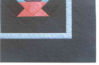
Cactus Basket by Sheila Mahanke Barnes 2000

I've long had a love affair with The Magazine Antiques, finding much information and inspiration within its pages. But I have long been frustrated with their limited website. As long-time readers know, I have often shared bits and pieces of articles, wishing I could link you to the website and more info, but that info simply wasn't available online.

That is, until now. The Magazine Antiques has revamped their website to make it more interactive and to reflect more of the content found in the monthly magazine. And so, I can share with you a link to more information about and pictures of three quilts from the Constructed Color: Amish Quilt exhibit at Textile Museum in Washington, D.C. through September 6, 2009. Enjoy!

As for the quilt here, it is one of two quilts I made based on an Amish quilt I'd seen in a book (and NOT a part of the Textile Museum exhibit). Back in 2000, I didn't have a digital camera yet, so excuse the quality of these photos. This version was machine quilted with mono-filament thread using authentic Amish quilting designs. I was unable to see how the original quilt designs but I felt it important to use the best information I had to select something appropriate. The basket includes some hand-dyed fabric, not very authentic but necessary if I were to match the colors in the original quilt.


Monday, April 13, 2009

Role Model of a Different Kind


Meet Natalie in a Blue Skirt. I first encountered Natalie in the late 1980's when I worked in downtown Tacoma, WA near the Tacoma Art Museum. I regularly took advantage of the Museum's weekly free admission day, spending quiet lunch hours enjoying special exhibits and pieces from their permanent collection. It was on one of these visits that I turned a corner and came face to face with this rather large oil painting by William Glackens.

I'd been going through a rough patch for a long time, working at a job that started well but became increasingly stressful and demoralizing. Money was in short supply as was my confidence. Frustration on so many fronts filled my days.

And then I met Natalie. She appeared to represent everything that I didn't have but longed for: wealth, success, sophistication, happiness and an easy confidence. She looked like nothing could fluster her, there was no haughtiness or exclusivity in her demeanor. She wore her accomplishments modestly. She was comfortable in her own skin. Oh, I longed for such self esteem at a young age to move confidently and independently through life.

You may not see those things as you gaze at this portrait. I admit that my reaction says a much about where I was at emotionally at the time as it does about the artist's intention. Still, this rendering gave me hope. I found myself thinking, if Natalie, who must have lived in the 1920's, could achieve these things, so could I. I wanted to take her home with me, a constant reminder of what I could become if I only believed in myself and had courage.

I stopped at the gift shop before leaving and discovered that Natalie's portrait was available on a postcard. I was so excited, and even chatted with the cashier about how taken I was with this painting. She agreed that Natalie in a Blue Skirt was a mesmerizing piece of art and that the Museum was lucky to have it in its permanent collection. The postcard went up on my desk at home where I could see it every day, gathering strength from it on the darkest days, a constant reminder of what I could achieve. I found the courage to look for a more suitable job, and started taking a more active role in the course of my life, not leave so much up to fate. Although everything has not been smooth sailing, and my restored confidence was shaken more than once since getting it back, Natalie has always been there to remind me to get back on my feet and keep trying.

Have I achieved the wealth I wanted and felt she exuded? Hardly, but I'm certainly not struggling like I once was. I have wealth abounding in non-monetary ways though. I've achieved success in ways not measurable by income. And as I look at Natalie now, she seems to be saying, hey - that's what I've been trying to tell you all along. It's not the money that makes me confident and self-assured. No, that all comes from the inside, and no amount of money can buy it.

Saturday, April 11, 2009

Easter Greetings


Wishing all my friends and family a blessed Easter.

(And lots of chocolate bunnies...)

Wednesday, April 08, 2009

Remembering the '70's

Here's the second painted piece which suggested a tree trunk to me. (See this post from 2 yrs ago for how I did it. I do take awhile to put my experiments to use, don't I?) For lack of a better name, I've called it Twisted Tree, although it doesn't look as twisted now that it is quilted. This one I did not do any thread painting on, just layered it with Thermore poly batting and quilted it with an Oliver Twist hand-dyed cotton thread. To give it more presence, I sewed it to crushed velvet which I then stretched and pinned to foam core board as in Balance Check. Rather than putting it in a metal frame, I bought a standard 10" x 20" wood frame and removed the glass. Click on any picture for a larger view and you may be able to see the texture in the velvet.

This little owl is what was giving me fits last week. The paint had left brown oblongs with two white dots over them which looked like an owl to me. But getting the outline shape right was another thing. I finally gave up on my memory of what a horned owl looked like and got out my bird book. I tried two different brown threads, each leaving too dark of an impression. I finally realized the owl should be more of a ghost image and used the same Oliver Twist I'd used to quilt the rest of it.

As for the crushed velvet...it is from 1970 when I bought quite a bit of it to make a skirt & vest for me and a dress for my mother. When we no longer wore those outfits, I snagged them for my stash of crazy quilt fabrics. After making a few blocks, I realized I was never going to make a crazy quilt but have kept the fabrics together for when I need something shiny or velvety. I planned to cut my background for this little quilt from the skirt, knowing that there'd be a nice wide piece in the front. What I didn't think about was just how short skirts were back in the 1970's - there was barely 18" of length to work with and I needed 21! So it was on to deconstructing Mom's dress. Even though both the front and back had seams running down the middle, there was just enough width and plenty of length.

I used a different tact in attaching the quilt to the velvet than I have in the past. Rather than finishing the edge of the quilt and attaching it to the base in one step, I satin stitched the quilt edge separately (after using Fray Block as in the previous post). Even when stabilizing the base fabric with Decor Bond, I've noticed a bit of pulling, and I definitely couldn't stabilize the velvet with a fusible interfacing. So with the quilt edge all nicely finished, I could spray a little 505 Spray baste on the back and center it on the velvet. Then all I needed to do was run a straight stitch along the inner edge of the satin stitching. It worked perfectly.

You can see that I'm trying to get braver about signing my work on the front. Since this piece was mounted to foam core, there's no actual label on the back of the fabric. All information is written on the foam core. I really needed to have something on the quilt itself. So I penned my initials and the date.

Monday, April 06, 2009

Seasonal Diversion


I've spent the last few days working on these Easter Postcards. I must admit I was partly inspired by the book Positively Postcards by Sabel & O'Donnell. I picked it up from the library on a whim, and was soon captivated by it. I particularly like it because, unlike so many books, it has some good basic and specific information about how to approach making fabric postcards instead of general instructions and then patterns to copy. To illustrate the various approaches, the book is chocked full of beautiful examples, each with a brief description of how they were made. These many examples alone would make the book worth owning and gave me some good ideas of things I might try.

The one in the upper right is the simplest, just using a piece of novelty print that is quilted around the main motifs. I added one of the frame designs from the book to make it a little more interesting, cutting it from another fabric from that line and fusing it down and satin stitching the inner edge. I cut it large enough to turn to the back and glue in place, like I did on my first year of journal quilts. Although I liked not having the satin stitching around the outside, I didn't like messing with the glue and the resulting lumps on the corners so will probably not do this again.

The one below it is a simple stacking method to build up borders without actually piecing them. Each fabric is cut slightly smaller than the base one, and while the book instructs you to use fusible web to hold the layers together, I just layered them with the batting and did a basting stitch around the edge of the smallest one to hold them in place until I could satin stitch around the raw edges. I also quilted around the rabbits in the center fabric.

The other two were just experiments with piecing different shapes together to get my 4 x 6 size, then adding applique, quilting and in the case of the top one, machine embroidery stitches.

Breakthrough! I had a small epiphany prior to finishing the edges of these last three. You may recall that I have been less than happy with the results of my satin stitched edges. One of the reasons I picked up the book was in the hopes it could tell me something new that would solve the problems I've been having with stray threads poking out and needing to be trimmed or inked into submission. Unfortunately, the author went along with everyone else, accepting the fact that there would always be threads to trim and spaces to ink. Well, that's just unacceptable to me, which is one of the reasons I tried the method of turning fabric over the edge in the first postcard.

I resigned myself to struggling once more with an edge I wasn't happy with, and in fact, quit early on the day I made these, because I just couldn't face that last step. Better to take a break and think it over. That turned out to be a good move, because in the meantime it dawned on me that I could probably solve my problem of poking threads by applying Fray Block by June Tailor around the edges of the postcards. This product goes on as a liquid and dries to a clear plastic that locks in threads. It is similar to Fray Check by Dritz but it dries softer and more flexible. I was both surprised that I had not thought of it sooner, and apparently neither had anyone else offering instructions for satin stitching edges of small quilts and postcards. I suppose if you've never sewn clothing or used a serger you might not know about this product. May I recommend that you immediately add it to your arsenal of of quilting supplies? Because it absolutely solved my problems with getting a clean satin stitched edge. The extra stability along the edge of the fabric made turning corners easier and seemed to make the satin stitching stay in line - few gaps to ink and no loose threads to trim!

Thursday, April 02, 2009

Jockeying for Space


Having a bit of a whoohoo moment here. After getting sidetracked with the row robin project, I finally got back to finishing Jockeying for Space, i.e., stretching the finished quilt onto stretcher bars. You may recall I ended up with a somewhat awkward size of 13 inches square and had to search the Internet for stretchers that length.


What I ended up getting were not the usual artist stretchers, mitered at the corners, but needlework stretchers. To be honest, I like the way these join at the corners better. The whole frame is much more stable and holds its squareness better than the mitered bars I tried.


Since this was cut generously for a 12 x 12 frame, it just barely wrapped to the back of the 13 x 13 bars. I used a combination of tacks and staples to secure the fabric, backed with Decor Bond. Since I am not fitting this in a frame, I think it would have been better to use staples all the way around. But since I was so close to the edge, the stapler was a little difficult to use. Next time I'll plan better, right?


I was pretty happy with the folds I managed at the corners. I have a method I want to try where you actually stitch a seam at each corner, but I wasn't about to try it on this today.


While this has been waiting for stretcher bars and time, I came across this yarn. I know I auditioned it before and rejected it, but now it seemed to be just what I needed to make me happier about the first line of couched yarn. I considered gluing it on, but I wasn't 100% sure that I was going to like the effect.


The yarn is thick & thin and I could envision having lots of trouble positioning it without getting glue all over my fingers and other places I didn't want it. I certainly wasn't going to machine couch it on after my disappointment with the way the yarn looked. Sometimes hand stitching is the only and best way to get the kind of control and reversibility one needs. Waiting to do this until it was stretched was a bit of unforeseen brilliance. It was very easy to lay the yarn in place and couch it with invisible thread. In order to get the colors to fall where I wanted, I had to double the yarn on the corners, and the hand stitching made it a lot easier to manipulate that and make it look natural.

The picture at the top is a quick pic I took to show this addition of yarn and see if you too think it was a good move. Go here to see what it looked like before adding this. I'm not sure the color in that picture is quite right - the batik always looks more intense to me in these pictures than in reality. Also, the lighting isn't very even. But I really couldn't wait one more day to share it with you.

By the way, the yarn is Waikiki by Crystal Palace Yarns, a 62% viscose, 38% cotton blend. Because the color changes every few inches, it knits up fabulously. Here's a slightly different colorway knit using a lace stitch and #10 needles - this scarf is about 8 inches wide.