|
| Carla Sonheim Box Journaling |
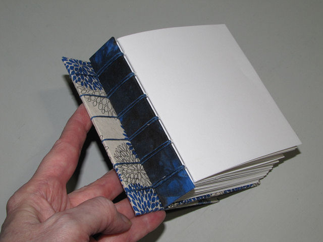
While many unaccustomed to having so much free time on their hands are searching the internet for ways to fill it, I am in my usual state with so much pending and so much free stuff cued up to watch. Since my last post I've been head down getting through the Sketchbook Revival videos - 13 days of two lessons a day from as many instructors. The late start and few days when I could only get through one of the day's videos had me concerned about getting through it all before it would disappear. Fortunately, they always tag on extra days for catch-up, and I need them! Some teachers are repeats from last year, but most are new, and I am super pleased with how my handmade sketchbook is working out. One of the repeat teachers, Carla Sonheim, started off the sessions with a look into how she uses a box journaling technique to help her set the tone for her day.

Carla, of the sidewalk cracks jump starter of last year, also showed a similar exercise, this time with putting down blobs of paint on the page, one using a spatula and one using a credit card, then assessing the blobs for images. I had no trouble spotting a dragon-like creature in the top one, mostly just tracing around darker lines or patches. The bottom one was easy too. The lines and dark areas of that blob immediately reminded me of a flower and again all I had to do was use my pen to draw over the lines to make it obvious. This is the sort of "see an accidental image" thing I instinctively find myself doing a lot. Carla's take on this is that it can help you make the next mark which would be unexpected or something you otherwise would not have thought of. I can attest to that in my study of images in hand-dyed fabrics.

There were others giving suggestions of how to get to the crux of what you want to do with your creative time and how to stay on track. I didn't think I'd be interested in Chetna Mehta's commitment worksheet and discipline chart but after watching her video, I can see how this could really get me organized and back on track again, partly because it includes all parts of your life, not just the art part. So I may be spending some time with it.

Stephanie Lee relies on Word Wisdom to do what she calls calibrating her thinking which clears the fog and helps her get to the bottom of what's true and what isn't in the story she's telling herself. She does this with a word or two or a quotation that has caught her attention and then on further thought might not be as true for her as she originally thought. This gave me the chance to tie into a quotation that's been bugging me for awhile, sussing out the parts of it that work for me and the parts I don't think are helpful.

Several of the teachers jump start themselves with fun exercises like Noah Scalin's 100 dots - just 100 dots placed randomly on a page which you connect as you start seeing shapes or images. At first I was seeing nothing, and then I seemed to be seeing nothing but hexagons. I admit, I got influenced by what he was doing with his dots which were becoming a face as I began to get the hang of the exercise. This is one of those lateral thinking exercises that while you are concentrating on the exercise at hand with no particular outcome in mind, your brain unbeknownst to you is generating random stuff that might come out later as useful, or even generate something on the page that will be useful at a later date. He has a whole slew of similar activities to get that brain thinking new ideas.

Another teacher with ideas of how to shake ideas out of a too muddle brain is Mary Beth Shaw who works with "doodle sketches" art journaling. I first heard of this basic method as a design tool from art quilter Michael James but never had much luck with it the few times I tried it. It's based on making random lines across the page, then seeing how you can use the shapes formed. In Mary Beth's version, you collage and paint and stencil in these shapes and pen over some of the lines, paying attention to color, balance, and variety. Obviously, this is one I have yet to finish but I'm game to give it a try with my acrylic paints and stencils.

I really enjoyed Tamara Laporte's Quirky Happy Houses warm-up of last year and she was back this year with Quirky Birds which she uses to help herself and her students "embrace you, quirks and all". Her quirky birds are MUCH quirkier and elaborate than mine but I just couldn't get into the way she was approaching hers. I realized fairly quickly that I was making an owl (whereas hers could not be defined as any recognizable kind), but she kept saying, embrace whatever it is about yourself that you might be embarrassed about, a part of your personality you might think you should suppress, OWN whatever it is in this drawing. As I worked through my owl, thinking about how realistic it was compared to her bird and I didn't care, that was me, lightbulb moment - this is what she was talking about. I sat back, thought, yes, you are a very stodgy bird dressed up in your vest, and a bit precise too and I think that is pretty much me these days. I have more to do on this one too, which has a combination of pencil, watercolor, colored pencil and pen being used.

Watercolor seems to be very popular and there were ample sessions to work with it. The Doodlewash guy, Charlie Shields, was back, focusing this year on doodle-painting food. He showed us how to draw and paint whipped cream (and yes, mid-stream he admitted, "Huh, I think I just showed you guys how to draw a poop emoji - sorry about that.") which can be added to any dessert, but in this case a cupcake, I need to go back in and add the watercolor.

However, on Juliet Meeks "Paint Expressive Florals" there was no underlying sketch and I just followed right along with her demo. I obviously need more practice but I at least felt I was starting to learn different ways to use the different brushes. She supplied an inspiration photo, them promptly said she'd decided not to follow it very closely, and I wish I had paid more attention to the photo than to her rendition. But of course, I can always do this again. And I found it somewhat similar to a "paint a bouquet of flowers" from last year done with acrylic paints.

I learned even more watercolor techniques with Chiara Mazzetti and was relatively pleased with my rendition of her winter landscape. She stayed pretty true to the photo of a similar winter landscape she provided and by following her step by step instruction, I learned a lot about when to wet areas first, what order makes for the best results and when using crumpled cling wrap can make for interesting texture on a painted area.

And then there's my poor sunflower. It's supposed to be an end of summer withered one, but like Juliet, Ildiko Karasay deviated from the inspiration photo she provided, and I was so busy following her on screen that it didn't sink in until too late that she had substituted black for brown and done her leaves completely different from the photo. Never mind that my loose beginning sketch of the petals came out wonky and I goofed up on the leaf shapes. Well, if nothing else, it was an interesting lesson in layering watercolor from light yellow to the darker orangier shades. There was one other flower session, using regular colored pencils and watercolor pencils but it required working with a real petal from a flower so I decided to try that later when there are some blooms to work with. Yes, I took copious notes.

I always find it interesting to see how illustrators work and this year we had two different sessions on that. Last year, Nina Rycroft showed us how to draw a dog and then alter that basic shape to put the dog in different poses and animations. This year she showed how to go from a real rabbit to different types of illustrated toy rabbits and then again, how to make slight changes to turn it and animate it. You can just see my pencil sketch on the left, following Nina's directions.

For a different approach to illustration, Melissa Lee shared "fun exercises to get you started on developing character." She walked us through how to work with different basic shapes like a rectangle, a heart and others to end up with a head with a face. She also gave some tips of how to draw bodies for those heads, using block shapes to begin and remembering basic body proportions, after which you can start altering to make thinner or fatter or shorter bodies.

But a type of illustration I got really excited about learning more about was presented by architect David Drazil. I've long drooled over the urban sketches done by architects and now know a few of there secrets. David provided warm-up exercises and tips for drawing straight lines, circles, hatching, trees and shrubs and basic body shapes in proportion. I don't like adding people to my urban sketches as a general rule, but he explained how architects will use the addition of human figures both for storytelling and to help show the scale of buildings or landscaping as in our exercise drawing of a wall. Actually, pretty useful information.

And then things got messy. Karen Stamper was back. She's the one who had me flooding my page full of glued down strips and torn pieces of papers, masking tape and washi tape and some shapes from labels with inks to create a background for sketching. I liked my backgrounds too much to sketch over them but was fascinated by the process. Now she offered a dive into creating a wild garden in black, grey and white. And the messy part was laying down graphite pencil, crushed charcoal (I used my Art Graf since I didn't have charcoal) rubbing it in with your finger, and white oil pastel (I used Paint Stix) to act as a resist. We also were to tear a rough leaf shape out of a small piece of paper to use as a stencil, placing it here and there over the page while rubbing charcoal with your finger through it to make black leaf shapes. I was lucky to have an indoor plant to steal a couple of fresh leaves off of because then we were to press those into a black ink pad and stamp the image on the page. While the leaf was covered with a piece of paper while being pressed on the pad, ink still gets on the fingers when picking it off and placing it on the page. But goodness, I was so surprise and pleased with the delicate and clear image it left. Of course with collage, nothing goes to waste, so the scrap paper placed over the leaf on the pad now had a clear white negative leaf image surrounded by smudges of black ink. Those got collaged down and veins inked on. Lastly, any additional details. leaves and vines were added in pen, and the Art Graf used to draw heavy black grass lines. I really liked how this was turning out.

But that wasn't the end. No, Karen wanted the final step to be adding slightly diluted ink over the page, not as much as in last year's exercise, but enough that I wasn't sure I wanted to do it, having that "I don't want to ruin it" feeling I often get. But I forged on and bummer, I DID feel it ruined it, or at least made it into something different that I did not like as much. I lost the stark whiteness of the collaged leaves that I had liked so much and the ink pooled around the edges so that they no longer blended seamlessly with the background. I left a few areas unpainted with ink, as it looked like she did on hers, to mimic a bit of light coming through. Her very final act was to take a stick and dip it in ink so she could draw heavier briar-like branches across the page. I have a squared-off bamboo stick I decided to try and it worked really well and added a nice finishing touch. This exercise, I decided, was all about building up layers which frankly I am not very good at, so I learned a lot by doing this and seeing it build in front of my eyes.

Also messy, this "expressive portrait play" by Melanie Rivers. If you can believe it, the undersketch is done with your non-dominant hand, following her step by step instructions (she starts with the nose, moves to the eyes and eyebrows, then down to the lips before drawing the outline of the head and adding ears, neck, shoulders and hair). Then with two colors of acrylic paint plus white, you paint in the dark and medium value areas and highlights WITH THE FINGERS of your non-dominant hand. Honestly, I didn't like finger painting as a kid, like the thought of it even less as an adult, and that particular day, I just couldn't bring myself to get out the paints and take this next step. But I'm gearing up for it because I rather like her results!
There were two session on lettering, each very different, each of interest since I've wanted for a long time to be able to do some of the fancy or more interesting lettering on some of my pages. Amanda Arneill showed her method of getting a brush lettering look with a regular pen while Joanne Sharpe focused on "whimsical watercolor word art" using a paint brush for bold letters, a drop and mingle approach for using two colors together and just going for it with a waterbrush. Lots of ideas for practicing your lettering in your sketchbook from both and Amanda offered additional free lessons which I will look into.

I'm not going to mention the teacher's name for this one because it was such a lame presentation. She was using gauche instead of watercolor which is something I've wanted to learn more about how to use but she gave no instruction whatsoever, and was one of those who seemed to forget people were watching as she just worked on her spread which was supposed to be demonstrating how to fire up your art journal. Well, there was nothing very fired up about what she ended up with and very little suggestions for us students. She did provide some vintage images to download which is where I got the dog illustration. I'm not much on vintage (which she apparently is) and didn't have any vintage portraits on hand to copy how she started her spread. I have since found this vintage-ish lady which I think will work well with the dog and have been thinking how to put my own twist on what she presented in order to get an art journal page I will like. It really was just basic collaging and background painting.

So I'm guessing if you are still with me, you may be feeling as tired right now as I felt as I watched my final video with the organizer of this event, Karen Abend. Just like last year, Karen suggested we use any of the techniques or combination of techniques we'd worked with through this series to make our final page, using a quotation for inspiration. Luckily, while I was looking through my little bin of collage materials, I ran across several of these plaque quotations I'd cut from catalogs, and one just immediately conjured up an image to go with it. It too needs more work (darkening around the plaque, maybe some stamped spirals), but the quotation, in case you can't read it says, "A simple act of kindness creates an endless ripple." This is so appropriate I think for the times we are living through. Even in our locked down state, social distancing when out reality, we can still engage in simple acts of kindness. It will make all the difference in the world.
One last word. Please, no comments telling me how talented I am. I just followed instructions, step by step, as I watched the demos. I really think almost anyone would have just as good if not better results if they did the same. Now if any of this gets channeled into a good original piece, THEN you can tell me I'm talented! And if you are interested in seeing a taste of last year's lessons, this blog post will do the trick.

Carla, of the sidewalk cracks jump starter of last year, also showed a similar exercise, this time with putting down blobs of paint on the page, one using a spatula and one using a credit card, then assessing the blobs for images. I had no trouble spotting a dragon-like creature in the top one, mostly just tracing around darker lines or patches. The bottom one was easy too. The lines and dark areas of that blob immediately reminded me of a flower and again all I had to do was use my pen to draw over the lines to make it obvious. This is the sort of "see an accidental image" thing I instinctively find myself doing a lot. Carla's take on this is that it can help you make the next mark which would be unexpected or something you otherwise would not have thought of. I can attest to that in my study of images in hand-dyed fabrics.

There were others giving suggestions of how to get to the crux of what you want to do with your creative time and how to stay on track. I didn't think I'd be interested in Chetna Mehta's commitment worksheet and discipline chart but after watching her video, I can see how this could really get me organized and back on track again, partly because it includes all parts of your life, not just the art part. So I may be spending some time with it.

Stephanie Lee relies on Word Wisdom to do what she calls calibrating her thinking which clears the fog and helps her get to the bottom of what's true and what isn't in the story she's telling herself. She does this with a word or two or a quotation that has caught her attention and then on further thought might not be as true for her as she originally thought. This gave me the chance to tie into a quotation that's been bugging me for awhile, sussing out the parts of it that work for me and the parts I don't think are helpful.

Several of the teachers jump start themselves with fun exercises like Noah Scalin's 100 dots - just 100 dots placed randomly on a page which you connect as you start seeing shapes or images. At first I was seeing nothing, and then I seemed to be seeing nothing but hexagons. I admit, I got influenced by what he was doing with his dots which were becoming a face as I began to get the hang of the exercise. This is one of those lateral thinking exercises that while you are concentrating on the exercise at hand with no particular outcome in mind, your brain unbeknownst to you is generating random stuff that might come out later as useful, or even generate something on the page that will be useful at a later date. He has a whole slew of similar activities to get that brain thinking new ideas.

Another teacher with ideas of how to shake ideas out of a too muddle brain is Mary Beth Shaw who works with "doodle sketches" art journaling. I first heard of this basic method as a design tool from art quilter Michael James but never had much luck with it the few times I tried it. It's based on making random lines across the page, then seeing how you can use the shapes formed. In Mary Beth's version, you collage and paint and stencil in these shapes and pen over some of the lines, paying attention to color, balance, and variety. Obviously, this is one I have yet to finish but I'm game to give it a try with my acrylic paints and stencils.

I really enjoyed Tamara Laporte's Quirky Happy Houses warm-up of last year and she was back this year with Quirky Birds which she uses to help herself and her students "embrace you, quirks and all". Her quirky birds are MUCH quirkier and elaborate than mine but I just couldn't get into the way she was approaching hers. I realized fairly quickly that I was making an owl (whereas hers could not be defined as any recognizable kind), but she kept saying, embrace whatever it is about yourself that you might be embarrassed about, a part of your personality you might think you should suppress, OWN whatever it is in this drawing. As I worked through my owl, thinking about how realistic it was compared to her bird and I didn't care, that was me, lightbulb moment - this is what she was talking about. I sat back, thought, yes, you are a very stodgy bird dressed up in your vest, and a bit precise too and I think that is pretty much me these days. I have more to do on this one too, which has a combination of pencil, watercolor, colored pencil and pen being used.

Watercolor seems to be very popular and there were ample sessions to work with it. The Doodlewash guy, Charlie Shields, was back, focusing this year on doodle-painting food. He showed us how to draw and paint whipped cream (and yes, mid-stream he admitted, "Huh, I think I just showed you guys how to draw a poop emoji - sorry about that.") which can be added to any dessert, but in this case a cupcake, I need to go back in and add the watercolor.

However, on Juliet Meeks "Paint Expressive Florals" there was no underlying sketch and I just followed right along with her demo. I obviously need more practice but I at least felt I was starting to learn different ways to use the different brushes. She supplied an inspiration photo, them promptly said she'd decided not to follow it very closely, and I wish I had paid more attention to the photo than to her rendition. But of course, I can always do this again. And I found it somewhat similar to a "paint a bouquet of flowers" from last year done with acrylic paints.

I learned even more watercolor techniques with Chiara Mazzetti and was relatively pleased with my rendition of her winter landscape. She stayed pretty true to the photo of a similar winter landscape she provided and by following her step by step instruction, I learned a lot about when to wet areas first, what order makes for the best results and when using crumpled cling wrap can make for interesting texture on a painted area.

And then there's my poor sunflower. It's supposed to be an end of summer withered one, but like Juliet, Ildiko Karasay deviated from the inspiration photo she provided, and I was so busy following her on screen that it didn't sink in until too late that she had substituted black for brown and done her leaves completely different from the photo. Never mind that my loose beginning sketch of the petals came out wonky and I goofed up on the leaf shapes. Well, if nothing else, it was an interesting lesson in layering watercolor from light yellow to the darker orangier shades. There was one other flower session, using regular colored pencils and watercolor pencils but it required working with a real petal from a flower so I decided to try that later when there are some blooms to work with. Yes, I took copious notes.

I always find it interesting to see how illustrators work and this year we had two different sessions on that. Last year, Nina Rycroft showed us how to draw a dog and then alter that basic shape to put the dog in different poses and animations. This year she showed how to go from a real rabbit to different types of illustrated toy rabbits and then again, how to make slight changes to turn it and animate it. You can just see my pencil sketch on the left, following Nina's directions.

For a different approach to illustration, Melissa Lee shared "fun exercises to get you started on developing character." She walked us through how to work with different basic shapes like a rectangle, a heart and others to end up with a head with a face. She also gave some tips of how to draw bodies for those heads, using block shapes to begin and remembering basic body proportions, after which you can start altering to make thinner or fatter or shorter bodies.

But a type of illustration I got really excited about learning more about was presented by architect David Drazil. I've long drooled over the urban sketches done by architects and now know a few of there secrets. David provided warm-up exercises and tips for drawing straight lines, circles, hatching, trees and shrubs and basic body shapes in proportion. I don't like adding people to my urban sketches as a general rule, but he explained how architects will use the addition of human figures both for storytelling and to help show the scale of buildings or landscaping as in our exercise drawing of a wall. Actually, pretty useful information.

And then things got messy. Karen Stamper was back. She's the one who had me flooding my page full of glued down strips and torn pieces of papers, masking tape and washi tape and some shapes from labels with inks to create a background for sketching. I liked my backgrounds too much to sketch over them but was fascinated by the process. Now she offered a dive into creating a wild garden in black, grey and white. And the messy part was laying down graphite pencil, crushed charcoal (I used my Art Graf since I didn't have charcoal) rubbing it in with your finger, and white oil pastel (I used Paint Stix) to act as a resist. We also were to tear a rough leaf shape out of a small piece of paper to use as a stencil, placing it here and there over the page while rubbing charcoal with your finger through it to make black leaf shapes. I was lucky to have an indoor plant to steal a couple of fresh leaves off of because then we were to press those into a black ink pad and stamp the image on the page. While the leaf was covered with a piece of paper while being pressed on the pad, ink still gets on the fingers when picking it off and placing it on the page. But goodness, I was so surprise and pleased with the delicate and clear image it left. Of course with collage, nothing goes to waste, so the scrap paper placed over the leaf on the pad now had a clear white negative leaf image surrounded by smudges of black ink. Those got collaged down and veins inked on. Lastly, any additional details. leaves and vines were added in pen, and the Art Graf used to draw heavy black grass lines. I really liked how this was turning out.

But that wasn't the end. No, Karen wanted the final step to be adding slightly diluted ink over the page, not as much as in last year's exercise, but enough that I wasn't sure I wanted to do it, having that "I don't want to ruin it" feeling I often get. But I forged on and bummer, I DID feel it ruined it, or at least made it into something different that I did not like as much. I lost the stark whiteness of the collaged leaves that I had liked so much and the ink pooled around the edges so that they no longer blended seamlessly with the background. I left a few areas unpainted with ink, as it looked like she did on hers, to mimic a bit of light coming through. Her very final act was to take a stick and dip it in ink so she could draw heavier briar-like branches across the page. I have a squared-off bamboo stick I decided to try and it worked really well and added a nice finishing touch. This exercise, I decided, was all about building up layers which frankly I am not very good at, so I learned a lot by doing this and seeing it build in front of my eyes.

Also messy, this "expressive portrait play" by Melanie Rivers. If you can believe it, the undersketch is done with your non-dominant hand, following her step by step instructions (she starts with the nose, moves to the eyes and eyebrows, then down to the lips before drawing the outline of the head and adding ears, neck, shoulders and hair). Then with two colors of acrylic paint plus white, you paint in the dark and medium value areas and highlights WITH THE FINGERS of your non-dominant hand. Honestly, I didn't like finger painting as a kid, like the thought of it even less as an adult, and that particular day, I just couldn't bring myself to get out the paints and take this next step. But I'm gearing up for it because I rather like her results!
 |
| Amanda Arneill practice sheets |
 |
| Joanne Sharpe bold and colorful method |
There were two session on lettering, each very different, each of interest since I've wanted for a long time to be able to do some of the fancy or more interesting lettering on some of my pages. Amanda Arneill showed her method of getting a brush lettering look with a regular pen while Joanne Sharpe focused on "whimsical watercolor word art" using a paint brush for bold letters, a drop and mingle approach for using two colors together and just going for it with a waterbrush. Lots of ideas for practicing your lettering in your sketchbook from both and Amanda offered additional free lessons which I will look into.

I'm not going to mention the teacher's name for this one because it was such a lame presentation. She was using gauche instead of watercolor which is something I've wanted to learn more about how to use but she gave no instruction whatsoever, and was one of those who seemed to forget people were watching as she just worked on her spread which was supposed to be demonstrating how to fire up your art journal. Well, there was nothing very fired up about what she ended up with and very little suggestions for us students. She did provide some vintage images to download which is where I got the dog illustration. I'm not much on vintage (which she apparently is) and didn't have any vintage portraits on hand to copy how she started her spread. I have since found this vintage-ish lady which I think will work well with the dog and have been thinking how to put my own twist on what she presented in order to get an art journal page I will like. It really was just basic collaging and background painting.

So I'm guessing if you are still with me, you may be feeling as tired right now as I felt as I watched my final video with the organizer of this event, Karen Abend. Just like last year, Karen suggested we use any of the techniques or combination of techniques we'd worked with through this series to make our final page, using a quotation for inspiration. Luckily, while I was looking through my little bin of collage materials, I ran across several of these plaque quotations I'd cut from catalogs, and one just immediately conjured up an image to go with it. It too needs more work (darkening around the plaque, maybe some stamped spirals), but the quotation, in case you can't read it says, "A simple act of kindness creates an endless ripple." This is so appropriate I think for the times we are living through. Even in our locked down state, social distancing when out reality, we can still engage in simple acts of kindness. It will make all the difference in the world.
One last word. Please, no comments telling me how talented I am. I just followed instructions, step by step, as I watched the demos. I really think almost anyone would have just as good if not better results if they did the same. Now if any of this gets channeled into a good original piece, THEN you can tell me I'm talented! And if you are interested in seeing a taste of last year's lessons, this blog post will do the trick.