Thursday, March 26, 2020

Sketchbook Revival and a New Sketchbook

Handmade journal modeled on the purchased one on the left
When the e-mail arrived announcing this year's version of Sketchbook Revival, my first thought was to sigh. I still feel like I have so many things I am frantically trying to catch up on; do I really want to commit chunks of time for 13 or so days watching videos and doing exercises in a sketchbook? But I had to admit that I enjoyed the information and discipline learned from last year's immersion so opted in, knowing I could skip what wasn't helpful or things I already knew, and take advantage of whatever new info from a wide range of instructors might be presented, all for free. One small catch of course. The Strathmore multi-media Visual Journal that I used last year got pretty much filled and my many other journals wouldn't quite fit the bill. Am I going to have to order one, I asked, sighing once more. Heck no! Of course, I could make my own while trying out a new binding from my Handmade Book Club. Yup, kill two birds with one stone.


I studied that commercial journal that had served so well for last year's lessons and decided it would be my model in terms of kind of paper and size. Not needing it to be any more sturdy than for use here at home, I decided to reprise my cereal box "boards" covered with tissue paper. Boy, was I excited when I found the teal tissue paper and the beautiful printed one. Not enough of the teal to do two layers scrunched and I didn't really want to add a lot of texture anyway. So after gessoing the boxes, only one layer of tissue paper was smoothed into place and it was enough. The smoothing wasn't perfect so there's a bit of wrinkling here and there but basically, not much texture. The teal became the outside of the covers while the print became the endpaper on the inside. Taking a cue from a tutorial on how to use paper napkins on substrate, I used acrylic varnish to cover both sides of the board to give the tissue paper extra protection. What I have on hand is high gloss, which probably would not have been my first choice, but it actually mimics the gloss of the commercial journal covers.
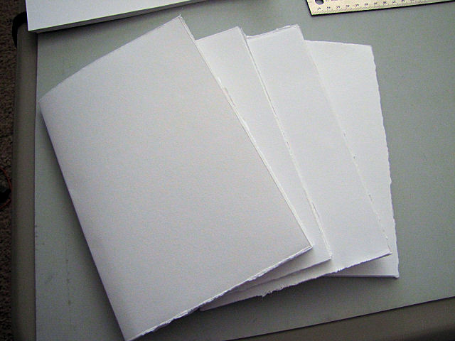

I checked my paper supply because yes, I'm starting to have a stash of it, and had a couple of choices in multi-media paper. The least waste when cutting down to size would be in using a pad of large sheets where I could get 4 pages out of each sheet. Rather than cut, I tore the pages to size which left rough edges (deckles) and I decided there was no point in trimming them smooth once they were stacked and folded into signatures. These four signatures would have given me about the same number of pages as in the Strathmore journal but at the last minute I decided to add four more signatures to accommodate the binding stitching I'd be doing. Besides, all that tearing was a bit therapeutic considering all the closures and stay at home recommendations finally descending on my little community.


Once the boards dried and they, along with the signatures, spent some time under heavy books, everything got their sewing holes punched, and I set up on the small table where my laptop resides so I could follow the video tutorial on what the teacher was calling the dragonfly stitch.


That dragonfly stitch - I'm not the only one that struggled with it. I was wishing we'd added the back cover first since I did a much better job on it than I did the front cover. Just look at the beautiful printed tissue paper! It makes my heart sing when I see it.


Once the front cover was on, the rest of the signatures went on much faster than I anticipated and quite easily. On each end is a kettle stitch which is what we used on the first books - 2 and 4 needle coptic binding - and supposedly is a sturdier stitch than the chain stitches in the middle which are more what I think of a coptic binding looking like, all done with a single needle.  If you look closely along the edge of the top board, you will notice a slight buckle. I had the same thing appear on my other cereal box board book. I think it's a failure to get the paste evening distributed and all the way out to the edge before putting to two pieces and their cardstock stiffener together. Recycling is a nice idea, but I may have to rethink using these boxes in the future.


I think my stitches got tighter with each signature I added so the book doesn't close totally flat. But flat enough for my purposes. This is a working sketchbook, not meant to be fancy although those deckle edges make it a little bit so.


I nearly used the French Link binding again because I know for a fact how nice and flat the pages all open and that is pretty important in a sketchbook like this. However, I'm still catching up on binding tutorials so I didn't really want to repeat a binding yet, and I'm not sure how rugged that French Link would turn out to be over time. Decided to trust that this Dragonfly Stitch binding, essentially a coptic stitch binding, would lie just as flat. And it does! The dark line down the middle is the stitching thread in the center of the signature, a grey thread which was the only color of the appropriate weight of thread I had on hand. Yes, if I keep this up, I will no doubt be accumulating a different kind of thread stash from the quilting one I already have.


And in spite of feeling like my stitches got tighter as I went along, the spacing between signatures is fairly consistent and not too much of a gap. I am very pleased.  The book, by the way, measures 8 by 5-1/2 inches.


It's a bit exciting to be starting this year's Revival in this book I made myself, covers in my favorite color. Better get cracking and see if it really works. The videos started on Monday and I have yet to watch one.

Tuesday, March 24, 2020

National Quilting Day Results

Honestly, this doesn't look like much progress on my chosen project for National Quilting Day, but in fact, this is more quilting activity than I've done in months. If you heard any strains of hallelujah, it was probably my machine being so happy to be turned on and running. Most of my time was spent finding fabric and cutting it up in preparation for some sewing. Egads - half square triangles! Do I even know how to do that anymore? And where is that nifty tool that draws the diagonal sewing lines across the paired squares? I couldn't find it anywhere and had to revert to just drawing a single line from corner to corner. I even had a moment when I wasn't sure which button to push to set the machine for quarter inch sewing. I was pretty pleased with myself to get that little stack of half-square triangle units sewed, pressed and trimmed to size.

Sample blocks and patterns from a long ago class I taught

I wasn't flying totally blind though. I pulled out a file from my teaching days where I had stowed sample blocks and a pattern. My late friend Judi had worked up these two versions of this split nine-patch block and I made them up for samples for her hand-dyed fabric booth. We didn't have a lot of success in selling the patterns but I think the sample quilts sold a lot of fabric. As you can see, I worked up both a scrappy traditional fabric block and a more subtle contemporary version in batiks. I had the file at hand because I've been intending to make enough of those batik blocks to use as background for a tree silhouetted against a moon art quilt. I'd just been digging around in my blue batiks to make that book cloth so I thought that was the version I'd be working on. But I decided it needed more care in selection and placement of fabrics than the traditional scrappy one, so those are the kind of fabrics I dug out of my stash.
 
With soothing jazz music in the background and the hum of the machine, I spent the afternoon in a small bit of paradise, being reminded how much I enjoy working on this type of project.

Saturday, March 21, 2020

National Quilting Day!

The third Saturday in March is designated as National Quilting Day, a chance for quilters to either gather in groups for a sewing day, do public demos or just dedicate some hours to their personal quilting at home. Well, most of us are sheltering in place anyway these days, so there's little excuse for not getting into your studio and doing some quilting today. And I spotted this idea on Facebook, to hang a quilt outside today to cheer your neighbors. Well, I don't have a way to do that but I do have this printout of the Idaho Beauty Block that I hang up when the art group needs to differentiate my house from the identical ones up and down the block. So my shingle is out and I think I am going to cut some fabric and sew up a few blocks. Won't you join me?


Friday, March 20, 2020

Trying New Things

I meant to post this earlier in the week but got distracted. I'm still working away on books, and this photo represents several days of trying out some new things. And for a change, they were all successes! I know it doesn't look like much but as I've mentioned before, things take longer than one would think, having to be very meticulous in measuring and cutting and factoring in drying time for the glue. And just like in quilting, I end up spending time searching stashes for coordinating papers and fabrics. It rather delightfully sucks me in. Anyway, here are my trials and triumphs:

I made wheat paste so that I could try making my own book cloth from a commercial batik in my stash. Wheat paste is archival, reversible, and has a longer open time than PVA glue. It adheres a light strong paper like rice paper to cloth to stabilize it and protect it from the glue used to adhere the cloth to bookboard. Worked like a charm! The bookcloth went on the spine and as end paper of the boards for the next tutorial - secret Belgium binding (bottom boards).

Then I mixed a little of it into my PVA as our instructor suggests to extend the PVA's open time, using this to glue on cover papers and end papers - what a difference! Since I am still learning, I tend to work more slowly so having the glue dry more slowly is really helpful.


I also tried putting the glue on the board rather than the cover paper as we'd been shown in previous lessons and liked that method a lot better than putting the glue on the paper. We were shown this alternative because of that narrow spine board which otherwise would be more difficult to cover and again, for the benefit of us new to all this as a perhaps easier way to get the board centered on the paper and leaving the corners to be mitered free of glue for that cutting.

I had read a suggestion from Kaija at paperiaarre.com to punch holes in the book board BEFORE covering them for a more professional look (follow this link and scroll to the end, but she gives many of the same good tips that our club teacher does before this one) https://www.paperiaarre.com/7-tips-professional-looking-handmade-books/ I didn't actually shave off the bumps as she suggests but did sand them down some, and found that glue does go down in the holes when putting it on the board rather than the cover paper and that seems to help the paper and end sheet pushed into the holes stay in place. I felt I got a much neater look.


The smaller boards along the top were extras I cut during the first coptic binding tutorial. I reworked some of the cover paper I made (wet scrunched paper bags rubbed with Art Graf), stamping the grass motif over it and then sealing it with matte medium. That layer of matte medium really made a difference in handling as I glued and pulled it around to the back, giving the paper more durability.


I generally like to work on one book at a time, but I'm doubling up right now as I signed up for this year's Sketchbook Revival course and realized I did not have to order a sketchbook but could make my own. So the next post will show you how I am going about that.


Saturday, March 07, 2020

Before and After Shots

Still Winter . . .
I've been struggling a bit with a cross between cabin fever and spring fever. February was just cold for the most part. When the sun did come out it was still cold and often windy. When it wasn't sunny it was often rainy. Now I'm not one of those who starts whining in February about how long the winter has been because I know darn well that in this part of the country, winter isn't over until April, and sometimes not even then. But since our snow has been sporadic and all that's left are some dirty piles pushed up by the plows, and nothing is budding out or even pushing up yet, my walks along my usual route have been bleak and soul-sucking. So when the sun did come out a few weeks ago, I headed to city beach for a different view that I hoped would perk me up. Even colder there with the breeze off the lake, but at least I was looking at something different, and I was a little surprised at how many people were there doing the same.


I do get some delight when the sun comes out from my collection of rocks that sit on a ledge below my house number. I don't think you can tell from the picture, but many of these have flecks of mica in them that make them pick up the sunlight in sparkles. Most of these have been snatched up on my walks because of an interesting shape, lines of different kinds of rock within a stone or a pleasing color. Since I live in a development where all of the townhouses are identical, This pile of rocks helps visitors delineate mine from the rest.

Before

And now the before and after promised in the heading. I continue to carry out small experiments in my 4-needle coptic binding book. You may remember me showing a spread where I painted brown ink over the paper. I decided to try a technique from the Sketchbook Revival Series, but pared down to this. Labels were suggested as an easy thing to use as a resist or to be left in place when flooding a page with inks. I remembered having some large labels bought for shipping, not realizing they were removable, more made for labeling a bin for instance. Maybe I can cut some tree shapes and apply them to the page, add diluted black ink I'd saved over and around them, and then remove them once the page was dry. It should leave me with brown trees on a darker background.

After

And it did! The black ink pooled at the edges of the label trees, defining them nicely.

Before

But because of my thing for birches, I wanted to try the same thing starting with a white page. I decided to set it up facing the somewhat failed experiment of dropping ink onto a wet page and use the same green ink.

After

This time I had some seepage under the edges of the label trees, probably because of them being used already. But I still like it.

Waste not, want not

By now the label trees were nicely colored from the two inks I'd used and still had quite a bit of stick to them. I couldn't bear to throw them out, so I found a page with a very faint string-pull image and place them there. I may need to add a little glue stick to the ends, but for now, they have a happy place to live.

All these pages have the potential to be worked into more, or may stay just as they are.

Sunday, March 01, 2020

Long Stitch Binding With Slit Covers


I've used a variation of the long stitch when making my blank journals (thanks to Michele at Sweet Leaf Notebook for giving me one of hers that I've used as a guide) and it is a very simple a quick way to put a book together. This version with the slit cover is supposed to be equally quick and easy but I struggled a bit with it. Sewn-in signatures would flop around as I tried getting my needle in the right place and pulling thread through, then keep turning the book to the back to tighten up stitches. Eventually it dawned on me to get some clothespins out to hold those unruly signatures to the cover while I worked sewing in the next one.

I'm still on the fence about Kraft-Tex in general, but as I worked sewing the signatures in, I came to like the feel of it. However, I struggled with getting the slits in the spine cut because, as I always forget, black is impossible to see things like stitching and in this case, pinprick awl marks on and I couldn't get a clean cut through on the first swipe. I think that is why there's some white showing at the slits. The bottom one in particular I KNOW got cut in two places close together with a sliver having to be removed. As much as I like green, I couldn't believe I had no suitable green thread, but the black's ok, particularly since I don't really like the look of the thread wrapping over the head and tail of the spine in this binding.  Also, it requires the signatures and covers to be identical heights unlike other bindings that require the covers to bit slightly longer, the extra providing some protection to the edges of the signatures.

A fairly usable size at 6-14 x 4-14 inches

I've been using drawing paper or watercolor paper in my other books, but this time I decided to use just a plain paper that might make for a good writing surface. I have quite a bit of 25lb cotton rag Resume paper left over from the days of submitting one's resume printed out on fine paper and submitted by mail. Does anyone require that anymore? That paper makes for a very special feel over just copy paper. The strap is what I trimmed from the cover, and frankly, I don't really like the slits on the cover for it to thread through. I was considering velcro and might change to that. 

Honestly, I doubt I would use this binding again. Besides not liking the look, it doesn't lay open and flat as that French Link binding does (not sure why) But in the meantime, lessons learned, preferences hit upon, and a nice little book to add to my collection.

Sunday, February 23, 2020

Working With Kraft-Tex

Of the many things I've purchased over the years and seldom if ever used is a collection of stencils. I blame the Joggles.com lady and her enticing tutorials. Thanks to the the next binding I'm tackling in my Handmade Book Club having the option of using Kraft-Tex as the cover, I'm taking this opportunity to put two of these stencil to use. 


I bought a roll of black Kraft-Tex a year or more ago, not too sure about how I would use it but everyone was talking about it so I succumbed. Bookcovers was one of my thoughts as well as using Paintstiks on it, and now I had not only instructions but a whole slew of ideas generated by the others in the club. This is not Paintstiks, but Art Crayon, a freebie from the same enticing lady. I used a stencil brush to transfer the creamy pigment from the lipstick-like tube to the Kraft-Tex. I am thrilled. 

I planned to stencil the other half of this Kraft-Tex with acrylic paint, and a few days later, on my way to the table, stencil in hand, I managed to knock over a full glass of Mango juice with beetroot powder added. Very red. Very thick and sticky. Very everywhere as it tipped and spilled onto the sewing machine table where I'd set it, the other sewing machine table next to it and my thread cabinet which sits on the floor in between, before tumbling off the table to spill the rest of its contents on the rug. Yes, rug. My studio has carpeting. Well, so much for creative endeavors THAT day. And I am still hitting the major stains with the rug shampooer which is doing a great job of pulling it up. 


Kinda took the wind out of my sails though, and I didn't get back to trying the second round of stenciling until today. (Do NOT look at the carpet . . .) This time I used a round foam dabber to pounce the paint through the stencil. The red is Liquetex acrylic paint and the more orange color is Speedball screenprinting paint. I am thrilled with this too. I expended most of the leftover paint in the space on the left that will be leftover after cutting the green stenciled area to size. Just pressed that dabber onto the Kraft-Tex to make circles.

I didn't wash this Kraft-Tex before stenciling. I wanted to maintain a smooth look rather than a more textured leather look which most prefer. It's bowing from being rolled, even though I put it under weights for several days so we'll see if that causes any problems or can be rectified some other way. I do need to cover the Art Crayon with something since, even though the manufacturer says it dries and won't smudge after 24 hours, I can rub color off a sample I did shortly after I got the Kraft-tex. I've tested a workable fixative product called SpectraFix (yes, blame that lady again) and I like how it works and doesn't show on the black like matte medium does. 

Sunday, February 16, 2020

What Happened Here?

I'll tell you what happened here. I succumbed to a Facebook post by my neighborhood quilt shop showcasing these dotted batiks. Now, do I need more of these favored batiks for my stash? No. But did my brain say, oh just walk down and take a look - you might need more when you get back to your water series? Yes. And so I did. What the heck. Call it retail therapy during a dreary part of winter, or supporting your local quilt shop, or reverting to old habits. Whichever, there I was, standing amidst a wonderful array of batiks, focusing just on dotted ones, and shopping like I used to when I was actually using up fabric!

But what else happened here is taking a next step. A few weeks or more ago, I stumbled across the sketchbook designated for water series ideas, buried and so forgotten that I actually was stumped by it until I opened it. Oh yes, I should leave it out, but I didn't. Then last week, a post on Charlton Stitcher's blog reminded me of the value of working out ideas in a sketchbook, just as I had intended when I started this Water Series sketchbook. As I prepared these new batiks and some less recently purchased ones for pre-washing, I cut a strip from each one to capture on a page of the sketchbook an idea that had been formulating as I picked each of these out. And just like that, it was saved for later, and just in the handling and positioning and jotting of a few notes, my brain continued to work on possibilities. And in looking back a few pages, I found an idea that could easily be carried out by two of my new batiks. We, or at least I, become static without physical engagement.


I've mostly been what I consider puttering this week. Printing out and organizing tutorials for the next books, watching some tutorials on the use of Kraft-Tex which I plan to incorporate into the next bookbinding lesson, and working here and there on additions to the 4-needle coptic binding book. I came across the triangles and strips when cleaning up my workspace a bit. They were trimmed from the paper used to cover the boards of this book, so it seemed appropriate to find them a home in it. Here they are glued over a spread that had a teabag adhered to it. Think of the arrangement as abstract trees, trees and leaves being the overall theme of the book.


I'm adding some text here and there too, some hand written and some printed from various sources. I've been holding on to that spiral with the person in the center for a long time, having copied it from a John Berger book. So simple but it resonated somehow, and with this quotation from Shakespeare calligraphied by Susan Gaylord, I felt this was one interpretation. As you can see, I've printed out some other things to include within these pages.


When I showed this page before, I mentioned I thought I'd write something over the trees. A perfect quotation presented itself on a post by an urban sketcher: "Trees are such good companions that their size never frightens us." In fact, in my experience, the bigger the tree, the more awed I am by it and want to get in close under what feels like protection. That is, unless there is lightening and/or high winds! I wish my small children were drawn a bit better but the roughness of the watercolor paper and my lack of expertise with a brush pen fought against me. Still, I think I get my point across: These are big trees and the children do not fear but welcome their existence.


More real dried leaves are finding there way onto the pages. This one still needs adhering down with matte medium.


And I'm still playing with ink on several pages. This one is ink brushed onto dry pages with a little water added afterward and is ready for more additions while another page shows more success with the dropping of ink onto a wet page. I like the smallness of the pages so I don't have a chance to get too carried away or overwhelmed by whatever idea I'm trying out, and that indeed, it has become a place to experiment. I can spend a few minutes with it, and often can only do one quick thing because of drying time needed. It's good discipline for me. 

Saturday, February 08, 2020

In Love With The French Link Binding

First off, I lied. I wanted to convince myself that the light rub of Paint Stix did the trick toning down the tissue paper and highlighting the wrinkles. But each time I came into the studio and saw it, my nose crinkled up. The rub of green just looked dirty to me. 


So I pulled out some acrylic paint after all, thinned it down, and practiced on the parts that would be the inside of the covers until I was sure I wouldn't get too dark of a layer that would totally obscure the print. You can see how much darker this front inside cover is, and the back inside cover is even darker.  I'm much happier with the outside of the covers now and it shows the texture much better.


So with all parts measured and cut and punched with sewing holes and the outside part of each cover carefully slit, it was time to thread a needle and start stitching. I had to laugh at our teacher starting out the video instruction with apologies for how long the preparation was (and I made it even longer!), but now we could get down to the fun part. And she was right. While this stitch looks complicated, it really is not, and was a joy to do.


Once all the signatures and covers were sewn together, the ribbon ends were fed through the slits to the inside of the folded covers (the long middle one also traveling back out near the edge), it was time to get fiddly again. Lots of glue to hold a piece of cardstock stiffener inside each folded cover before more glue to adhere both sides together, hiding those ribbon ends. Of course, the book, essentially finished, must quickly go under weights until the glue is firmly dried.


When I pulled it out from under the weights today, I was so pleased with how it looked, and the covers are nice and firm, almost as if they were made of bookboard. Best of all, the book lies perfectly flat as you page through it and the gaps between signatures is slight (partly because of the fineness of the thread I used). It is such a usable size at 5" x 7" and I have to tell, you, every time I open it, I just want to grab a pen and start writing! 

Sunday, February 02, 2020

Prepping For Another Bookbinding

The next bookbinding in my Handmade Book club is the French Link, one that, like the coptic stitch, I've admired and wanted to learn. And it might actually be done were it not for a hitch in what to use for the soft cover. I'd planned to use more of my eco-printed watercolor paper but found that the grain ran the wrong direction. So now what? I'd already chosen the ribbon that the binding is stitched over, and the thread so wanted something that would go with them. Looking at what others had used, I considered using some of my paints and a stencil to create a cover, which suddenly felt overwhelming (I have many stencils and paint colors to choose from). Or I could just paint some paper and sponge a second color over it - I've done that before with success. Or, I could once again kill two birds with one stone and try another texture producing technique I'd bookmarked which uses tissue paper. But instead of doing it using a sturdy w/c or mixed media paper, I dug through my collection of food boxes until I found one the right size with grain running the proper direction. Yes, even cardboard has grain apparently.


I've worked a little with boxes like this and know that you need to put a coat or two of gesso over the slick printed side before proceeding.


Most of the tutorials for this technique use white tissue paper but I'd saved this printed kind and wondered if some depth could be created by layering several pieces since tissue paper is not opaque. Nothing to lose by trying.


One tutorial used PVA, another gel medium, to adhere each layer of tissue paper, doing a bit of scrunching to create wrinkles rather than smoothing out the tissue paper. I opted for slightly watered down PPA (Perfect Paper Adhesive) and used 3 layers instead of two (because I had that much tissue paper and was going for those images shadowing through). It was difficult to stop myself from smoothing each layer out. Once weighted and dry, the tissue paper is trimmed one half inch beyond the edge of the substrate so that it can be turned to the back. I used glue stick for this step because each of these will be folded in half with a piece of cardstock in between for extra stability of the covers.


To be honest, the floral motif isn't very "me" and it was a bit bright and white for the tan ribbon I have set aside. Plus the wrinkled texture wasn't really showing. The tutorials had one last step of painting their white tissue paper to bring out the texture, but I feared I'd just cover up the print too much without really highlighting the lines of the wrinkles. After much thought and experimenting with a couple of options, I decided on applying this dark green Paint Stix using my finger so that the application would remain light while still darkening the wrinkles. Kind of hard to tell from the photo but perhaps if you click for the larger view you will see the difference between the piece on the left and the piece on the right that has Paint Stix worked over it. It has done the trick to make these go better with the ribbon, but I am very much on the fence about the look of the texture and the way the flowers shadow through the top layer.

In between these various steps to prepare the covers, I folded and trimmed to size the signatures. Now at last I am ready to punch my holes in signatures and covers, add slits to the covers and start sewing it all together. 

Saturday, January 25, 2020

Lingering Curiosity

Geez, what a nag! However, putting up this "GO!" sign on the outside of the door to my studio (rather than putting it up inside the studio) is having the desired effect. A little well-placed guilt can be a good motivator - lol. I've yet to set up a schedule for my activities so I know I am not getting as much done as I could, but I have been snagging bits and pieces of time to follow up on things I've had questions about or do small steps toward a bigger project, partly because of that reminder on the studio door.


We'll start with this that I'd been curious about, one of the pieces of brown paper bag that I colored with Art Graf - a water soluble graphite - in my first attempt at faux leather. I wasn't happy with the way the Art Graf worked and couldn't get the blending I expected when a wet brush was applied. But never one to waste things, I pondered how I could improve it for use covering another book board. I settled on stamping over it randomly with a commercial stamp inked with a permanent ink pad. Nice! Even though the Art Graf is supposed to be permanent after wetting, it seemed to me that bits of it had a tendency to rub off. So now that it had been stamped, I could satisfy my curiosity of how it would look if I painted a protective layer of matte medium over the entire thing. I had heard from others that although matte medium is supposed to be "matte", it often leaves a bit of shine anyway, and that was true in this case (as you might be able to see some reflection in the lower left). I think I would try something else in the future; I'm not keen on the look or feel but it will be fine to cover a book board with.


With matte medium on my brush, it was time to move to another thing I'd wondered about. I'd resolved the issue with the 4 needle coptic book not closing, thanks to a tip from a member of the handmade book club I joined (wet the folds of the watercolor signatures slightly and weight under books again), and I've been eager to work in it, inspired by those pages of eco-printing. Encouraged by the success with crumbling dry leaves onto paper before bundling for eco-printing, I wondered if those crumbles would stick to a page coated with matte medium.


It did not work so well. The dry bits would only stick if pushed into medium and trying to do it with my finger only meant that many stuck to that finger rather than the page. I finally got enough arranged and tried dabbing more matte medium over them, only to find many stuck to the paint brush as they had to my finger. I eventually got them off the brush and on the page and let it dry. Only then could I get another layer of matte medium over them to pretty much hold them in place. But they did not make a particularly interesting page, so I went on to my next bit of curiosity: could I take a dried leaf and stick it to the page? I'd read that one could do that with a pressed leaf (but no guarantees that it wouldn't decompose under the medium), but my leaf had not been pressed, still had some curl in it. Well, slather on the matte medium and see what happens. The medium somewhat hydrated the leaf so that it became soft and pliable. I coated the page where the leaf would go and coated the back of the leaf, placed it down and used a brush to add more medium while flattening the leaf. It had some spring to it though and wouldn't stay flat on the page, so I placed a piece of wax paper over it, closed up the book and put it under weights until it was dry. Everything appears to be well adhered now.


I'd been removing tea leaves from used bags and had a small stack that I decided to adhere to various pages in my book. Ohhh, they look ever so good on this watercolor paper and continue the colors of the eco-prints. There were two large ones that could span the center of a signature so down they went with matte medium (and no shine).


I tore the sealed edges off smaller ones and set them on point. Something else will be placed over them probably. Maybe more leaves? Or maybe I will doodle around them or try some watercolor paints.


Really liking the soft edges left from tearing, I tore one bag into several strips for one side and just overlapped two bags on the opposite page. Then I adhered the squiggles that are the backing paper of fusible after cutting shapes for my Sailing the Wine Dark Seas duo. My thought was I'd use a technique by Karen Stamper learned during that Sketchbook Revival course where the next step has you drench the page in different inks and possibly remove strips like the squiggles to reveal the white page underneath (scroll down about midway to read about it). But I've rather fallen in love with this page just as it is and may set up a different page for the drenching.


Speaking of ink, I thought this book might be a good place to try yet another technique I've seen the results of and thought would be fun. Perhaps you have seen this or even tried it yourself. Very simple in that you take a string or piece of yarn, coat it with paint or ink, lay it over the page in a winding back and forth manner leaving a tail, close the book over it (or place another piece of paper over it) and pull the string out. I resorted to winging it here drawing on my memory of what I'd seen awhile ago on-line and found that there IS a slight learning curve. My goal was to end up with something looking somewhat like a tree, and yeah, my first one does, somewhat. But there was perhaps too much ink on the yarn I used, or I pressed too hard holding the book together when I pulled on it, or both. 


Here's another one with the soaked yarn I used. Better but I kept ending up having to pull really hard most of the way through to get the rest of the yarn out, so again, probably holding the book closed too tightly.


So Much Ink! I kept going - waste not want not and maybe things would get better - until only faint lines were being produced. I'll go back into these - I have ideas for text over the inked parts on the darker ones for instance.


This is the last thing I tried while I was working with ink. I'd seen a tutorial using ink instead of watercolor paint to create a serendipitous landscape. Like some Procion dyes, some inks will separate into several colors when dropped onto a wet piece of watercolor paper. So first I created a sample page of the four fountain pen inks I have on hand. None separated into different colors, just lighter or darker. The black maybe did a tad but nothing like the ink in the tutorial. Still, stubborn as I am, I followed his technique on the bottom of the page with my green ink (because it fit the color theme developing in my book) before trying it for real. Ehh. The ink didn't want to move, maybe I didn't get the page wet enough. I fiddled. I decided to go ahead in the book anyway.


Not even remotely like the example in the tutorial. Seriously, follow the link above and see for yourself. Not to be totally thwarted, I plan to try again but using the black ink instead. Like I said, I'm stubborn!

More ideas, more to be curious about, more to come as I work in this little book and elsewhere.