
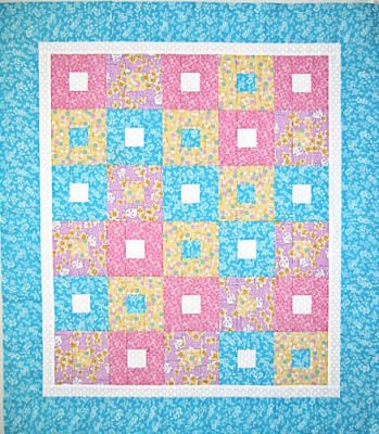
There's not much I do that I don't try to make into a learning experience. Such was the case with the little project I took on Friday when I wasn't feeling so hot. This is a pattern called "Cobblestones" (sorry, can't remember what book it came out of) which called for 3 values of blue plus yellow for most of the centers and inner border. As you can see, I took liberties with the color scheme, using only one blue (the fabric I rescued) adding a purple and pink from a collection of reproduction 1930's fabric. The yellow is also repro thirties, but I used a white for the inner border and some centers. Choosing those other colors to go with the blue was the learning experience. I have always struggled with fabric selection, as what I think will work when laying out the yardage often looks quite different when cut up and spread out in different proportions.
On the left is the original set of blocks. I had rejected a stronger pink thinking it would overpower the blue, but once sewn into blocks, that pink blended right in with rest of the 30's fabric. Even with the blue borders in place, I didn't think it worked. If you think about Depression Era quilts you've seen, you'll recall how all the fabrics rather blend together, and I should have remembered that. But the quilt was destined for charity, so I was going to chalk it up to experience and finish it up.
By Sunday, I was feeling pretty good and in the mood to sew, planning to join the blocks and add the borders. But that color problem was bugging me. It dawned on me that the blocks worked up so quickly there was no reason why I couldn't make 8 more blocks in the brighter pink and see if I liked it better. The results are on the right and indeed, this created the balance I desired. I don't often "fix" problems like this, but I am in a learning mood these days, and am more open to taking the time for trying something different even if it means more work. I really should have that attitude more often.
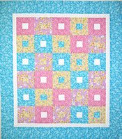 I'm also trying to learn features of my Corel Paint Shop Pro program, so spent some time manipulating these photos. I'm not sure the top one does justice to the colors in the quilt. Here is the finished top with possibly truer colors. The purple is still a little off, but you get the idea. I like it so much I've decided not to give it to charity, but to a friend's little newborn.
1 comment:
That's turned out well! Possibly the depression era quilts have got their soft look through fading over the years.
And I love the concept of RESCUED fabric. Sounds valiant, heroic. As soon as the plumber's been, I'm off to the thrift store to try to rescue some more!
Post a Comment