I was right about needing to put some distance between me and my Changing Perspective piece and giving my brain a chance to reset - see Wednesday's post. First, I looked at a picture I took of the last arrangement of leaves (a safety net in case I played more with the arrangement and couldn't get back to the last one I thought worked). Mmmm, ok, better than I remembered and certainly photographed better than I expected. Then I braved the studio, opened the shades, and in the light of day inspected my progress. Although the piece still has problems (i.e., if I were to do it again, I can see places to improve), I decided it's working well enough to not be an embarrassment. Yeah, I know that sounds like faint praise, but I'm judging it against several different criteria: how successfully it matches my original inner vision, how well it will "read" viewed in the virtual exhibit on www.fiberartsconnsocal.org, how it will compare to the other entries in the exhibit, and finally (and probably the most harsh judgment), how it fits with my personal progress and goals for my art.
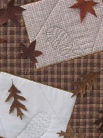
 I tried shifting a few of the leaves but basically, I decided any more fiddling would only be avoiding the inevitable - time to face the last scary part of the quilt and attach those leaves. And what's so scary about that? Well, I planned to glue them down with Beacon Fabri-tac, a quick setting and very permanent glue. In other words, if I glued a leaf down and changed my mind about its placement, well, tough luck. That baby's there to stay. I carefully removed the quilt from the design wall (the leaves were only held in place by the natural grab of fabric to fabric) and placed it on the table so that I could lift a part of each leaf and apply a bit of glue down the center. I wanted the edges of the leaves free so that they retain the realistic look of real leaves resting on the ground. This was a slightly different effect from what I wanted of the single leaf on each square. In that case, I wanted the leaf to actually float off the surface of the quilt. I achieved this by sewing a thick button to the quilt with nymo beading thread, then using a thin straw needle to run a thread between the fused layers of the leaf and snugging it down onto the button. Actually, I was surprised I could get the needle in between, and only tried because I definitely didn't like having a little stitch of thread showing on the top of the leaf. I did try gluing the leaf to the button, but it didn't seem to get the bond that would assure me the leaf would not pull loose during the rigors of the repeated hanging and shipping it will be subjected to as this exhibit travels for the next year. The thread gave me peace of mind, and I slipped a little glue under there as well for added security. Here's a close-up of the center portion where you can sort of see how these leaves lie and shadow. Click on the picture for a larger view.
There was one other really scary part of this quilt that I worked on Sunday - adding lettering to the quilt. Because of my inexperience in this area and the fact that I quilted and applied the binding first, I decided the safest and easiest way for me to do this was to stencil the letters on using fabric paint. The quickest way to make the stencil was to compose it on the computer, print on freezer paper and then cut out the stencil. I'm always amazed at how eagerly I settle into what others might consider fussy and tedious non-creative work, but I was amazingly relaxed and really enjoyed cutting away the lettering with my exacto knife.
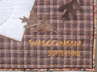
I have to admit that the lettering is one thing I'm not happy with. It was difficult to gauge how big to make the letters, even though I ran off a sample of two different sizes to hold up to the quilt. I opted for the slightly smaller size and now think the larger lettering would have looked better. Paint color was another issue. I tried several things on a sample and seemed to only have colors that were too dark or too bright. I definitely did not like the look or feel of the Liquitex acrylic (although if I'd taken the time to dilute it and maybe mix it with another color, I may have liked it better). I'm definitely in love with Versatex paint right now and thought the creamy looking gold would be just the thing. I was very surprised and disappointed that as it dried, it turned a very metallic gold, not at all the look I wanted. I also tried some Lumiere acrylic, but I wasn't thinking when I bought the "Exciter Pack" - I had meant to pick up the opaques, not the metallics. Mmmm, what to do? Well, I also had some Dye-na-Flow which is more like an ink, and thus doesn't have the coverage of the thicker acrylics so wasn't useful on its own. However, a little Golden Yellow painted over the Lumiere toned down the metallic sheen; unfortunately it was a brighter yellow than I wanted. So I tried overpainting that with a little Dye-na-Flow Brick. Now I was closer to the color I wanted. So I ironed my stencils in place and painted away. I got an acceptable result, but not as refined a look as I'd like. I would have loved to have been able to free-hand paint in script instead, but I'm just not there in my abilities. I still felt the lettering needed something to define it better and did that by inking around each letter with a brown Micron Pigma pen. Here's a close-up of one of the lettered areas:
Another problem I encountered was with how the quilting thread used to define the footprints showed up. In the snow area I felt it was too dark. A comment from June Underwood about painting over stitches she was unhappy with in one of her pieces encouraged me to give it a go on mine. In truth, it probably would have been faster to take out the offending stitches and carefully restitch with another thread, but instead I went back to the Lumiere paint and carefully painted a little Pearl White over the grey cotton thread. It wasn't totally opaque which was fine - I just needed to lighten up the grey a bit - and it lent a nice frosty sparkle. The other footprint turned out not to show up enough, so I experimented with light inking next to the quilting line using a black Micron Pigma pen. Amazing how much difference that made.
If you click on the above picture for a larger version, you can see the hand-dyed Oliver Twist thread used for the satin stitching. Again, I couldn't believe I didn't have a better color on hand, but this was definitely the best of what I had. Like the lettering, it just didn't have the definition I expected, so I ran a line of straight stitches right next to it using a silk buttonhole twist thread in dark brown. Once again, amazing how such a little touch made such a difference. You can also see in this picture how I used a narrow brown piping in the binding - another accent that really helped.
When the on-line exhibit is ready for viewing, I'll post the link so you can see the full quilt along with its artist's statement. In the meantime, I hope all this process information has been of interest. I learned a lot, and now am reveling in the sense of freedom now that I am through with this project!
 I tried shifting a few of the leaves but basically, I decided any more fiddling would only be avoiding the inevitable - time to face the last scary part of the quilt and attach those leaves. And what's so scary about that? Well, I planned to glue them down with Beacon Fabri-tac, a quick setting and very permanent glue. In other words, if I glued a leaf down and changed my mind about its placement, well, tough luck. That baby's there to stay. I carefully removed the quilt from the design wall (the leaves were only held in place by the natural grab of fabric to fabric) and placed it on the table so that I could lift a part of each leaf and apply a bit of glue down the center. I wanted the edges of the leaves free so that they retain the realistic look of real leaves resting on the ground. This was a slightly different effect from what I wanted of the single leaf on each square. In that case, I wanted the leaf to actually float off the surface of the quilt. I achieved this by sewing a thick button to the quilt with nymo beading thread, then using a thin straw needle to run a thread between the fused layers of the leaf and snugging it down onto the button. Actually, I was surprised I could get the needle in between, and only tried because I definitely didn't like having a little stitch of thread showing on the top of the leaf. I did try gluing the leaf to the button, but it didn't seem to get the bond that would assure me the leaf would not pull loose during the rigors of the repeated hanging and shipping it will be subjected to as this exhibit travels for the next year. The thread gave me peace of mind, and I slipped a little glue under there as well for added security. Here's a close-up of the center portion where you can sort of see how these leaves lie and shadow. Click on the picture for a larger view.
There was one other really scary part of this quilt that I worked on Sunday - adding lettering to the quilt. Because of my inexperience in this area and the fact that I quilted and applied the binding first, I decided the safest and easiest way for me to do this was to stencil the letters on using fabric paint. The quickest way to make the stencil was to compose it on the computer, print on freezer paper and then cut out the stencil. I'm always amazed at how eagerly I settle into what others might consider fussy and tedious non-creative work, but I was amazingly relaxed and really enjoyed cutting away the lettering with my exacto knife.
I have to admit that the lettering is one thing I'm not happy with. It was difficult to gauge how big to make the letters, even though I ran off a sample of two different sizes to hold up to the quilt. I opted for the slightly smaller size and now think the larger lettering would have looked better. Paint color was another issue. I tried several things on a sample and seemed to only have colors that were too dark or too bright. I definitely did not like the look or feel of the Liquitex acrylic (although if I'd taken the time to dilute it and maybe mix it with another color, I may have liked it better). I'm definitely in love with Versatex paint right now and thought the creamy looking gold would be just the thing. I was very surprised and disappointed that as it dried, it turned a very metallic gold, not at all the look I wanted. I also tried some Lumiere acrylic, but I wasn't thinking when I bought the "Exciter Pack" - I had meant to pick up the opaques, not the metallics. Mmmm, what to do? Well, I also had some Dye-na-Flow which is more like an ink, and thus doesn't have the coverage of the thicker acrylics so wasn't useful on its own. However, a little Golden Yellow painted over the Lumiere toned down the metallic sheen; unfortunately it was a brighter yellow than I wanted. So I tried overpainting that with a little Dye-na-Flow Brick. Now I was closer to the color I wanted. So I ironed my stencils in place and painted away. I got an acceptable result, but not as refined a look as I'd like. I would have loved to have been able to free-hand paint in script instead, but I'm just not there in my abilities. I still felt the lettering needed something to define it better and did that by inking around each letter with a brown Micron Pigma pen. Here's a close-up of one of the lettered areas:

Another problem I encountered was with how the quilting thread used to define the footprints showed up. In the snow area I felt it was too dark. A comment from June Underwood about painting over stitches she was unhappy with in one of her pieces encouraged me to give it a go on mine. In truth, it probably would have been faster to take out the offending stitches and carefully restitch with another thread, but instead I went back to the Lumiere paint and carefully painted a little Pearl White over the grey cotton thread. It wasn't totally opaque which was fine - I just needed to lighten up the grey a bit - and it lent a nice frosty sparkle. The other footprint turned out not to show up enough, so I experimented with light inking next to the quilting line using a black Micron Pigma pen. Amazing how much difference that made.
If you click on the above picture for a larger version, you can see the hand-dyed Oliver Twist thread used for the satin stitching. Again, I couldn't believe I didn't have a better color on hand, but this was definitely the best of what I had. Like the lettering, it just didn't have the definition I expected, so I ran a line of straight stitches right next to it using a silk buttonhole twist thread in dark brown. Once again, amazing how such a little touch made such a difference. You can also see in this picture how I used a narrow brown piping in the binding - another accent that really helped.
When the on-line exhibit is ready for viewing, I'll post the link so you can see the full quilt along with its artist's statement. In the meantime, I hope all this process information has been of interest. I learned a lot, and now am reveling in the sense of freedom now that I am through with this project!
1 comment:
Congratulations!!!
It must feel wonderful to be done.
I really love the leaves - they look quite realistic - looking forward to seeing the fullview pic!
Post a Comment