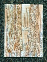
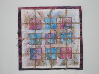
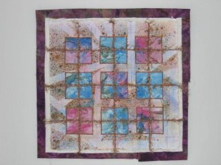
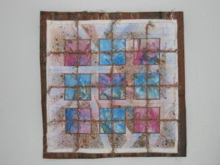
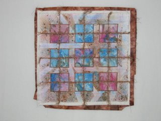
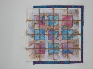
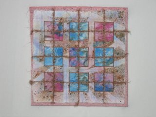
Remember me saying that all kinds of wonderful things transpire in my brain when ironing my processed fabric? I had three days to test that theory and I was not wrong. My mind wandered to how I'd approach the journal quilt come Saturday and tentative decisions were made as well as noticing that one of the fabrics I was ironing would make a perfect backdrop for the piece.
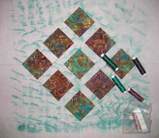
More exciting than that though, was some problem solving that surfaced regarding the challenge quilt due at the end of February. As I ironed, this is what I stared at off and on:

On the right is the sun printed fabric from last year. It's yet another piece that was painted in the opposite orientation but when I turned it this way, I suddenly saw sky, mountain, lake and beach. On the left are the three challenge fabrics that I have to incorporate into my piece. Lucky me that they were in the same color range as the painted piece I wanted to use. The theme of the challenge only states that the word "sun" or "Prairie" has to be included in the title. My friend who wanted me to do this challenge with her suggested that we add several rules of our own. Her contribution was that the quilt also had to have something to do with where we wanted to move to as at that time both of us were trying to figure out how to get relocated to the Pacific Northwest. My contribution was that we both had to incorporate one of my painted pieces.
I easily could have made my version without using any other fabric than that painted piece, so I've been a little unenthusiastic about working in these other pieces. But hours of idle thinking and staring produced answers to that dilemma plus a nifty way to proceed with the design process. Maybe I'd cut out those clouds and applique them here and there. Trite, but the sun in the next fabric could be cut out and appliqued on as well. The last one might work as a binding. But before I do anything, I have to remember that there are size limitations in the rules. My painted piece is too long and narrow.
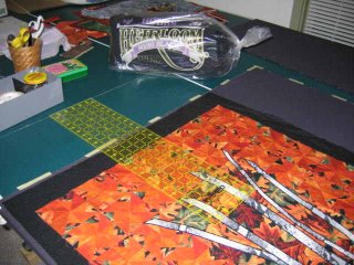
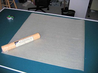
I was trying to think how I could figure out what portion of my piece to use without actually drawing on it or cutting fabric yet. I usually work with newsprint if I want to sketch out ideas to size, but that didn't seem like the best way to approach this. It occurred to me that I had rolls of Golden Needles Quilting paper on hand. Essentially, it is the kind of tissue paper that clothing patterns are made from, so it is see-thru yet sturdy enough to tape, pin and draw on. The maximum size the quilt can be is 24" x 24" so I taped two 12" wide x 24" long pieces together:
Then I placed this over my painted fabric to determine how much of the length I needed to eliminate. I lightly sketched in major design lines that I'd have to work around, like where the "mountain" and "lake" meet and some of the sunprinted leaves.
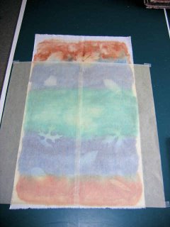
Lightly is right; you can barely see the pencil lines in this picture. This piece is so similar to my view that I next tried to think how I could add more details to make it interesting. I can see the "long bridge" so I decided to sketch that in. All of a sudden, I had perspective as if I were looking down on the lake from a hillside. Now I was getting excited.

I've always thought I should add a tree somewhere, especially because there is a single tree that blocks an otherwise unobstructed view of the lake. I tentatively sketched a partial tree on the right, then remembered that my fabric was lacking a bit in width. I think ultimately I'll add the trunk on the edge to provide the additional width and drape a branch or two into the center. Balancing it all might be tricky, but then I'm used to my pieces coming out unbalanced and then having to tweak them.
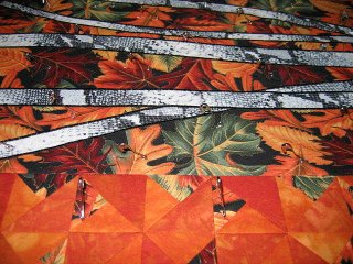
The final aha solution came as I was continuing to study that mottled yellow orange fabric. Mmmm, how much like autumn leaves colors. I think I'll add a few leaves to augment the shadowed sunprinted ones. Yes, the hours of ironing produced good results.
More exciting than that though, was some problem solving that surfaced regarding the challenge quilt due at the end of February. As I ironed, this is what I stared at off and on:

On the right is the sun printed fabric from last year. It's yet another piece that was painted in the opposite orientation but when I turned it this way, I suddenly saw sky, mountain, lake and beach. On the left are the three challenge fabrics that I have to incorporate into my piece. Lucky me that they were in the same color range as the painted piece I wanted to use. The theme of the challenge only states that the word "sun" or "Prairie" has to be included in the title. My friend who wanted me to do this challenge with her suggested that we add several rules of our own. Her contribution was that the quilt also had to have something to do with where we wanted to move to as at that time both of us were trying to figure out how to get relocated to the Pacific Northwest. My contribution was that we both had to incorporate one of my painted pieces.
I easily could have made my version without using any other fabric than that painted piece, so I've been a little unenthusiastic about working in these other pieces. But hours of idle thinking and staring produced answers to that dilemma plus a nifty way to proceed with the design process. Maybe I'd cut out those clouds and applique them here and there. Trite, but the sun in the next fabric could be cut out and appliqued on as well. The last one might work as a binding. But before I do anything, I have to remember that there are size limitations in the rules. My painted piece is too long and narrow.
I was trying to think how I could figure out what portion of my piece to use without actually drawing on it or cutting fabric yet. I usually work with newsprint if I want to sketch out ideas to size, but that didn't seem like the best way to approach this. It occurred to me that I had rolls of Golden Needles Quilting paper on hand. Essentially, it is the kind of tissue paper that clothing patterns are made from, so it is see-thru yet sturdy enough to tape, pin and draw on. The maximum size the quilt can be is 24" x 24" so I taped two 12" wide x 24" long pieces together:

Then I placed this over my painted fabric to determine how much of the length I needed to eliminate. I lightly sketched in major design lines that I'd have to work around, like where the "mountain" and "lake" meet and some of the sunprinted leaves.

Lightly is right; you can barely see the pencil lines in this picture. This piece is so similar to my view that I next tried to think how I could add more details to make it interesting. I can see the "long bridge" so I decided to sketch that in. All of a sudden, I had perspective as if I were looking down on the lake from a hillside. Now I was getting excited.

I've always thought I should add a tree somewhere, especially because there is a single tree that blocks an otherwise unobstructed view of the lake. I tentatively sketched a partial tree on the right, then remembered that my fabric was lacking a bit in width. I think ultimately I'll add the trunk on the edge to provide the additional width and drape a branch or two into the center. Balancing it all might be tricky, but then I'm used to my pieces coming out unbalanced and then having to tweak them.
The final aha solution came as I was continuing to study that mottled yellow orange fabric. Mmmm, how much like autumn leaves colors. I think I'll add a few leaves to augment the shadowed sunprinted ones. Yes, the hours of ironing produced good results.

